Note: the latest follow-up to this article can be read here and here.
On the 2nd of May 2015, a family of three were killed in an accident that involved six other vehicles racing on the DUKE highway, Kuala Lumpur. Two of the vehicles were involved in the collision that led to the deaths. Witnesses at the scene were unable to identify the number plates of at least three of the six vehicles. It is believed that the number plates were customised.
In 2016, to battle the increasing use of custom number plates to evade speed cameras or to reduce readability, Malaysia’s Road Transport Department also known by its Malay acronym JPJ and the Deputy Transport Minister at the time, Datuk Aziz Kaprawi announced that the JPJ will “implement a centralised production scheme for new standardised licence plates in the second half of this year, using metal plates with stamping” as implemented in Singapore and Thailand.
Later that year a workshop with stakeholders was held, and in 2017 it was reported that, “The government has plans to embed microchips in vehicle registration plates in a bid to put an end to vanity number plates.”
After the fifteenth General Election on the 9th of May 2018, the incumbent government of six decades was ousted from power. How the in-coming government, with its budget tightening agenda will effect the implementation of the above plan is not known. Nevertheless, there may be a small window of opportunity to propose a typeface that is designed specifically for number plates in Malaysia.
A Proposed Solution
My first attempt at designing a number plate typeface began in 2004. However, progress was limited to visual research. My interest was rekindled when I began to see the proliferation of a large variety of typefaces used for number plates in Malaysia. It dawned on me that there needs to be standardization of typeface for such an important identification feature of vehicles on the road.
Should the new government proceed with the standardization proposal by the JPJ, I would argue that it should involve the creation of a typeface that is unique, legible, readable, and designed specifically for use in number plates. As such, it would be necessary for typeface designers like myself to become involved in this process since we have the required expertise to provide designed solutions. For a new design to be effective, it is important to revisit existing number plate typefaces currently in use:
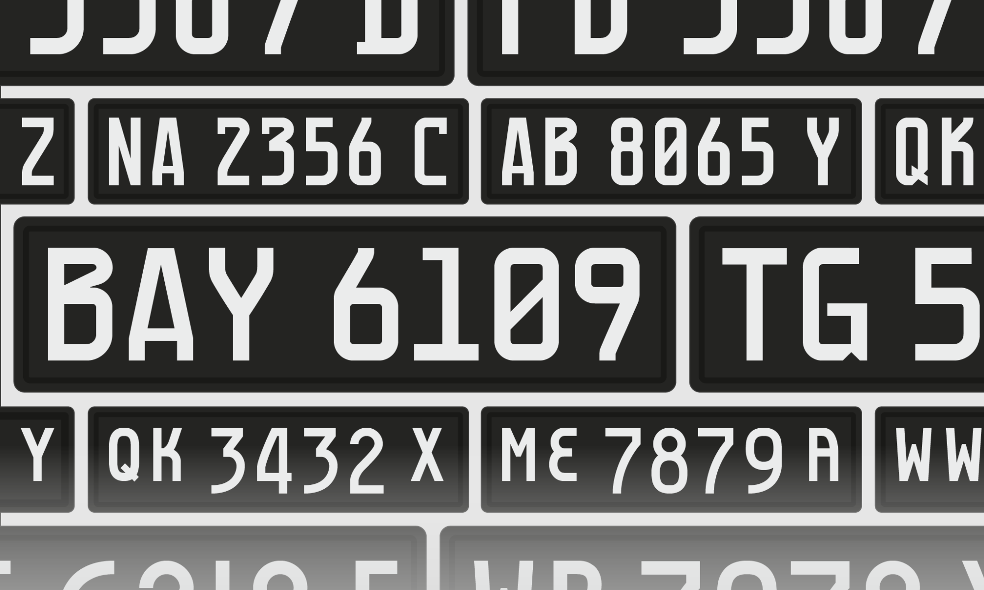
The preexisting choices range from a squarish typeface to a more rounded typeface. There are more variations out there with the advancement of printing technology, that being said, these two; square and round typeface forms tend to form the bulk of number plates used in Malaysia.

Square Euro version: The above is the Euro typeface (FE Schrift) for number plates. It is a relatively good design and has an inherent quirkiness to it, with its large serifs for the numeral 1 to address counterspace and the strange but distinctive zero. The W’s diagonal strokes seem stunted but are distinguishable from a distance.

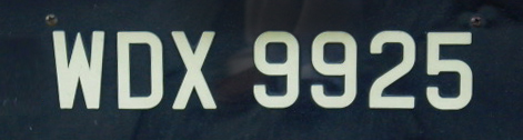
Square Euro-type version: The above is similar to the Euro number plate but upon scrutiny it seems to be modelled after UK’s ‘Charles Wright’ number plate typeface. Firstly the diagonal strokes of the W are a lot thicker, potentially impacting legibility and readability and secondly the numeral 5 has a diagonal stroke that breaches the bowl, probably to differentiate it from the letter S. The letter D’s horizontal strokes exceed the vertical stem stroke probably to differentiate it from the number 0.
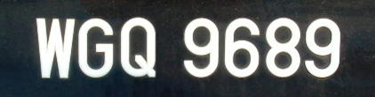
Semi-Square with rounded characteristics: The above number plate typeface seems to straddle between its square and more rounded cousins. The W’s diagonal stroke is more pointed when compared to the Euro-type version. However the loop of the numeral 9 is similar in style with the rounded version below, but a little more squarish in nature.
Ubiquitous rounded version: The above number plate typeface is the most common in Malaysia and I refer to it as the FMT (factory manufactured typeface). It seems to be the go-to face and probably the most cost-effective option for vehicle owners that aren’t looking for anything fanciful. Some suggest that is a descendant of an older vintage version British number plate (see below) but lacks the panache and has a more utilitarian streak. The Wikipedia page describes it as a “compact version of Arial Bold“, this is probably because in the Road Transport guidelines, the authorities have used Arial Bold to stipulate the parameters. To those discerning individuals, this ubiquitous version is not Arial Bold compact or otherwise. I suspect the road transport authorities themselves do not have digital version of this typeface. The FMT was probably designed by a local manufacturer back in the day.
![]()
Vintage version British number plate
This self-initiated project attempted to provide the JPJ with a possible number plate typeface that does its best to adhere to the Malaysia Motor Vehicle Rules (Registration and Licensing, 1959). The designed typeface would need to be legible and readable from a distance of 50 to 75 feet. It also requires the alphanumerics to be aesthetically pleasing and suitable for the type of vehicles produced nowadays.
Dealing with the aesthetics of a large population is nearly impossible. Even so, by analysing the range, a deeper understanding of the strengths and weaknesses of the existing number plate typefaces was formed. In my view, the designed typeface needed to lie somewhere in between the rounded and squarish forms. Therefore, the challenge was to look for ways to merge these two characteristics in a seamless and attractive manner.
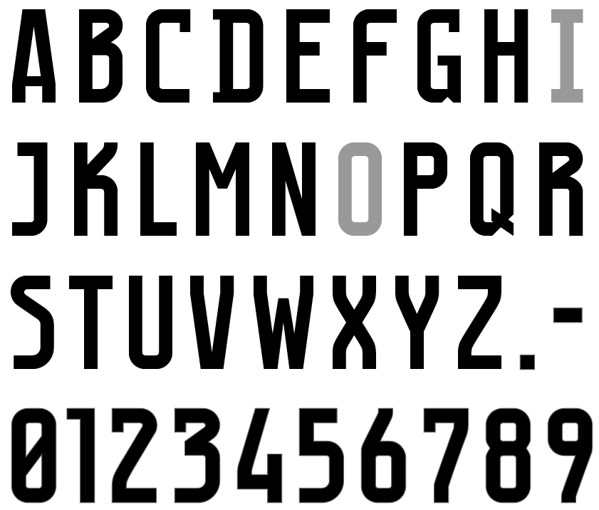
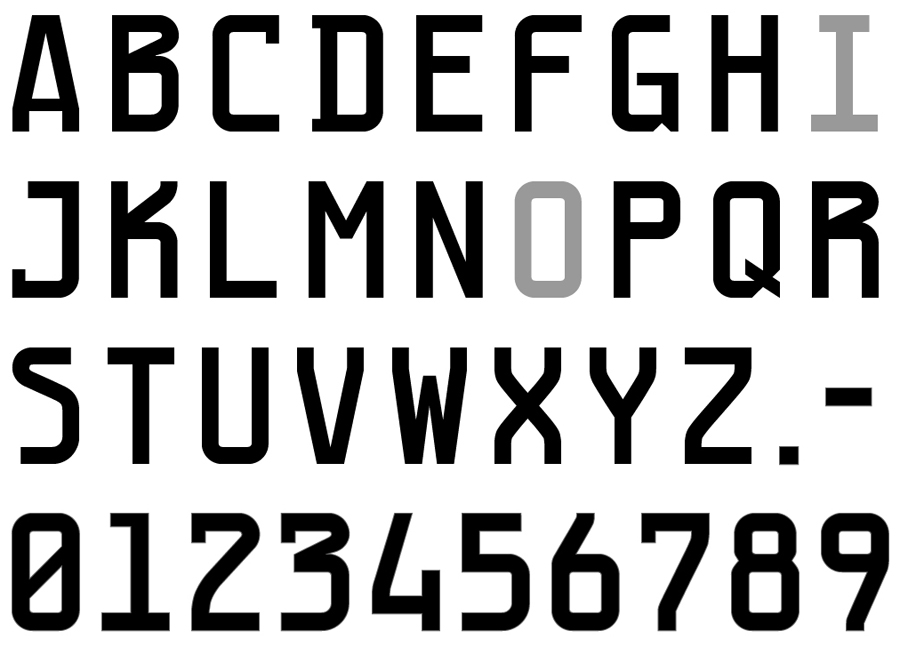
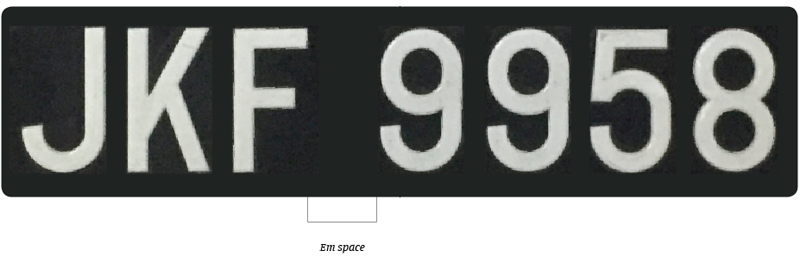
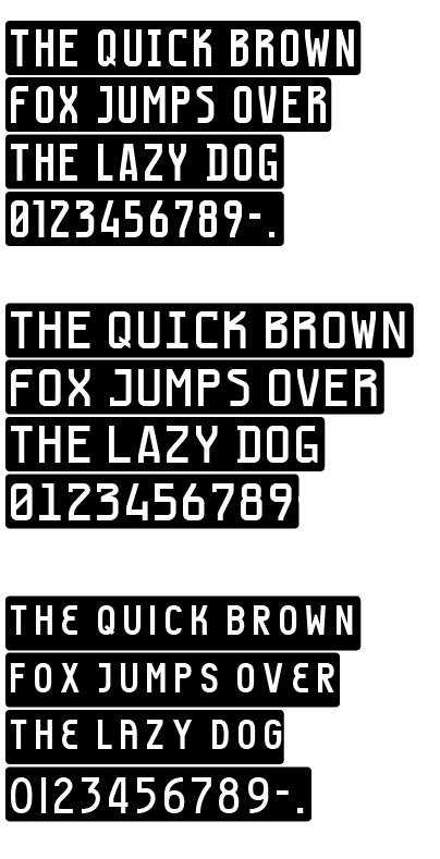
The resulting outcome were MYNO and NOMY, both names are a play on the words: Malaysian Number Plate. MYNO and NOMY are the intellectual property of Vinod J. Nair and is copyright protected. The Typefaces were designed specific for vehicle number plates. There are no punctuation or lowercase letters included in the design as there isn’t a need for it in Malaysian number plates other than the hyphen, which is used in diplomatic plates. Future editions may include a limited number of punctuation.
MYNO Typeface
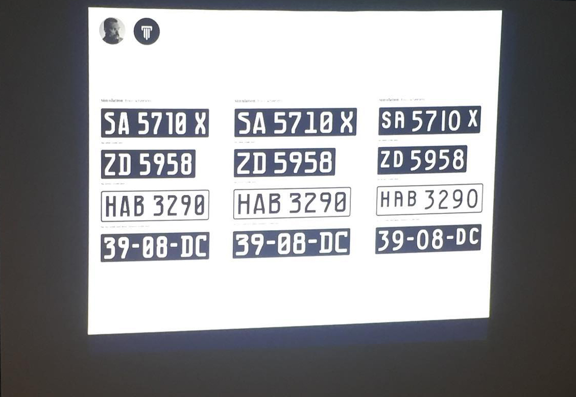
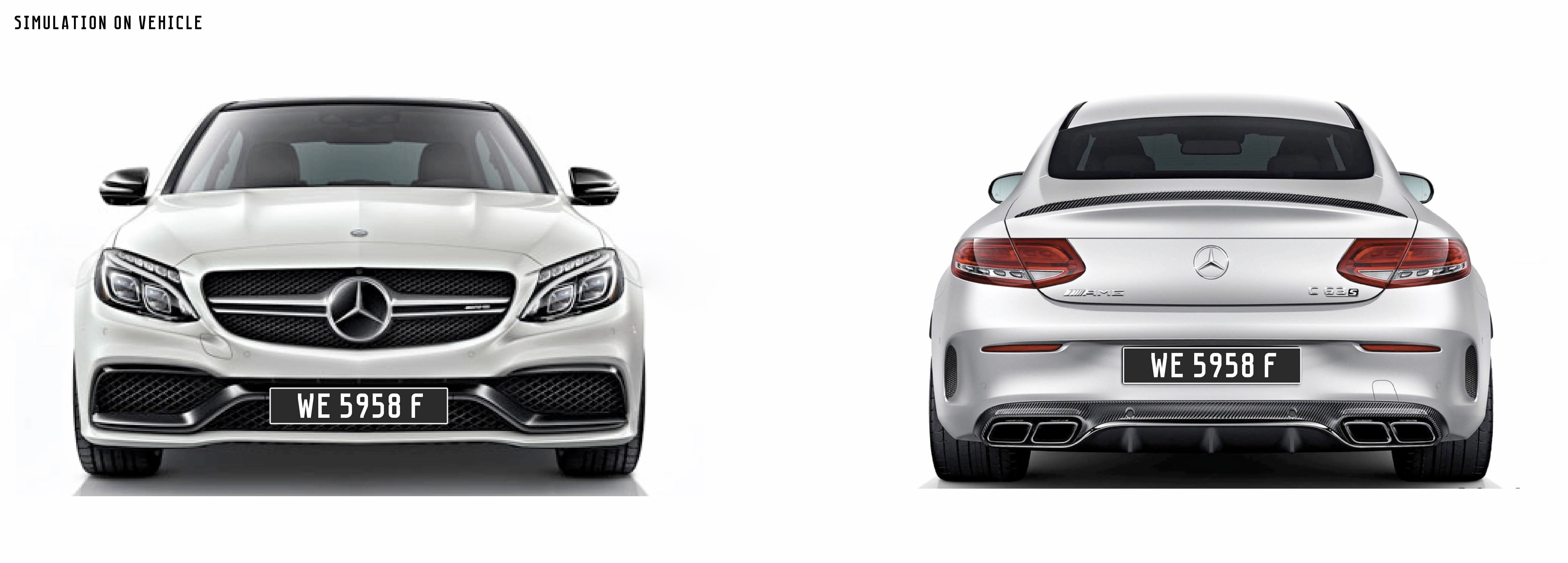
The following introduces MYNO typeface and in various simulations.
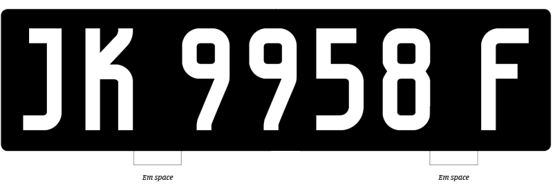
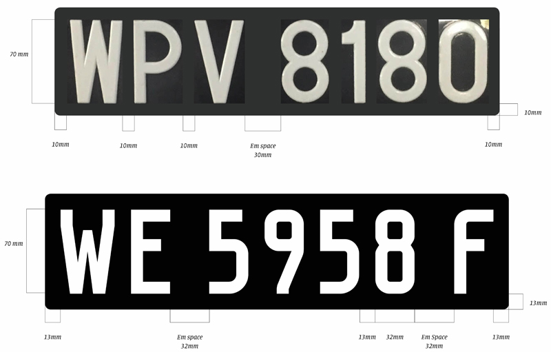
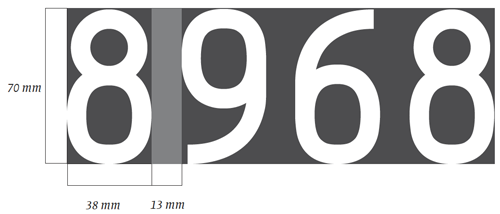
Number plates before 2016 consisted of 3 letters, 4 numerals, and an em space (word space). Since 2016, it consists of 3 letters, and 4 numerals, but one out of the 3 letters comes after the numerals. Therefore, there is an additional em space to contend with. An em space is a word spacing and occurs between the letters and numerals.

To accommodate the additional em space (and possible addition in future of an additional letter), a slight reduction in the width of the numerals was considered to avoid a cramped or larger number plate.
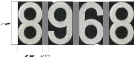
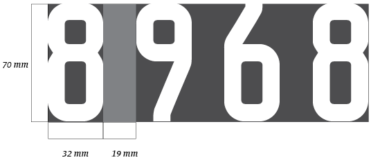
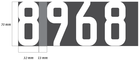
The current numeral width is prescribed at 40 mm, however, the MYNO numeral width is 32 mm to allow for more letter space (13 mm) between the numerals and also to accommodate the additional em space in the new number plates. The increased space between numerals, from 10 mm to 13 mm, will result in better visibility and readability from a distance. The reduction in width and increase in letter space has little or no impact on the overall width of a number plate, in fact, there is actually some space savings.
When designing the letters and numerals, it was important to ensure differentiation between the various letters and numerals. Often there can be confusion between characters at smaller sizes or at a distance; numeral eight (8) can be mistaken for the letter B, numeral 5 can be mistaken with letter S and so on. Having said that in Malaysia the letters I and O aren’t used in car number plates for fear they may be mistaken for numerals 1 or 0.

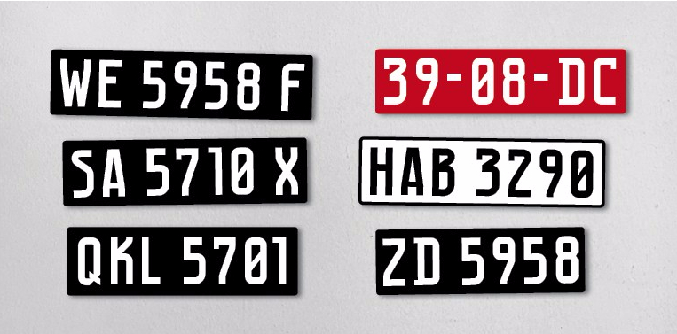
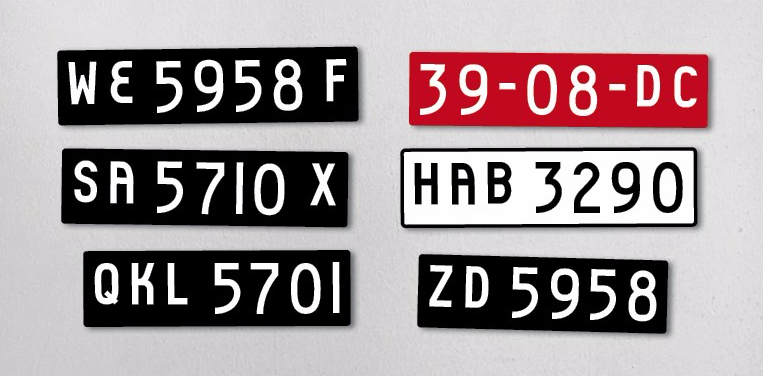
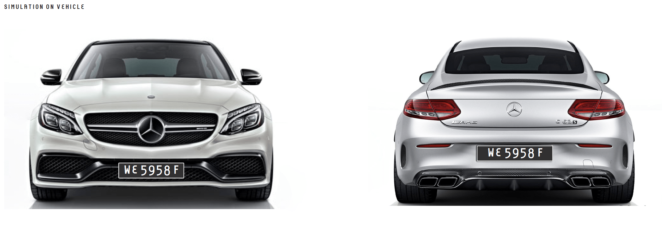
The following are simulations of the MYNO number plate typeface for different states, occupations, vehicle type, et cetera.
An Update
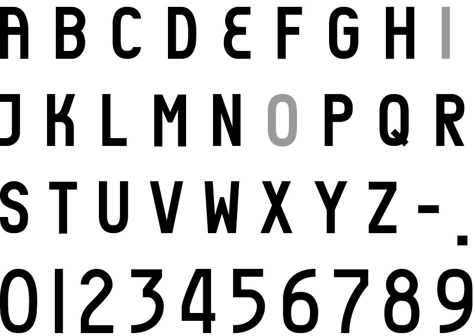
MYNO Extended
MYNO Extended alpha-numerals, A-Z and 0-9. A recent update has been made to the MYNO family called MYNO Extended. This is a further option for the authorities to consider. The extended version was created due to potential criticism that MYNO, when compared to the current number plate typefaces used in Malaysia, seems condense and therefore could affect readability at angles. To overcome this—should the authorities or decision makers take this into consideration—an extended version was created as seen above.
NOMY Typeface
The outcome in NOMY is markedly different and the alphanumeric type setting of the number plate, highlights this distinct difference. The capital letters are reduced in size when compared to the numerals, this would not only allow for space savings but also easy identification or distinction between the letters and numerals.
The following introduces NOMY typeface and in various simulations.

In Conclusion
It is hoped the design proposal made herein will be deliberated by the JPJ and the transport ministry. There are many countries and organizations where typefaces are designed for specific use/s which promotes individuality, identity and consistency in communication. It also displays a level of professionalism and farsightedness by the concerned authorities as they showcase their awareness in the importance of design that is unique and customised for a purpose. What is needed is not just any solution but a designed solution.
As such it would be a good opportunity for Malaysia vis-a-vis the JPJ and the transport ministry to adapt a progressive approach to solve the issue of standardization starting with MYNO or NOMY number plate typeface.
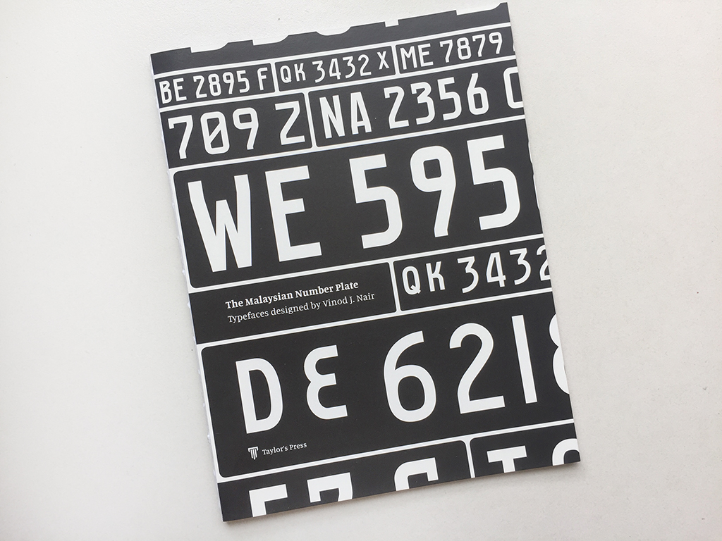
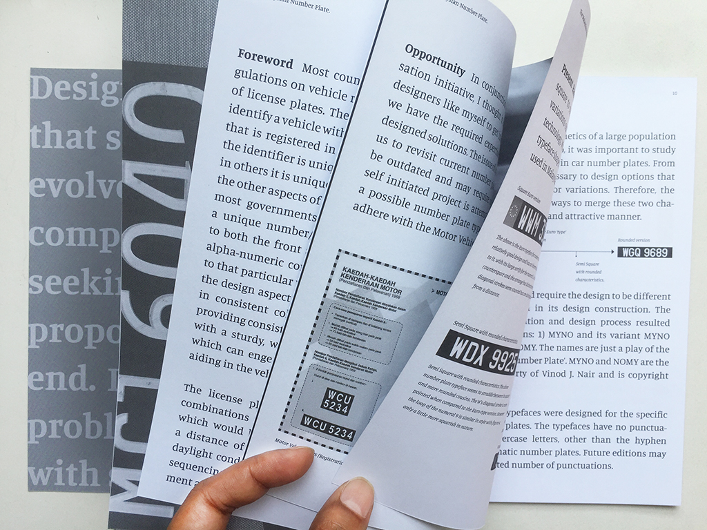
An Update: Since this article was published on Kreatif Beats, Taylor’s Press has published a monograph by the author on the topic called: The Malaysian Number Plate: Typefaces Designed By Vinod J. Nair (ISBN 978-967-0173-63-4). The book has a limited print run and is available for RM20/- contact vinod.nair@taylors.edu.my to obtain a copy.
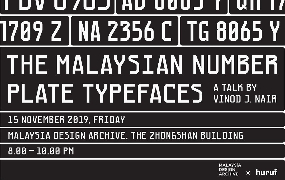
A further update: On the 15th of November 2019, Vinod was invited by Huruf to talk about his number plate typefaces at the Malaysia Design Archive, which co-hosted the event. The following are images from the talk.