
As part of the curriculum at the design institution that I’m studying in, I am required to take the Advanced Typography module in my second semester. Before the commencement of the module, I couldn’t contain my curiosity and thus I looked up what my seniors had done in the last semester. In the Final Project of the module, students are to either develop a font intended to solve a problem, improve an existing one or experiment the use of font in their area of specialisation. Still, when the time came to begin my Final Project, I was clueless.
One day while walking around campus, an idea came to me. I noticed that there were a lot of activities that were associated with breast cancer awareness. Most of the time, their logos were displayed with a pink ribbon and a script-based font, so I thought of creating a gender neutral logo as men, too, could develop breast cancer albeit far less common compared to women. However, after discussing with lecturer, I took up his suggestion to design a typeface, instead of a logo, that could represent a breast cancer awareness brand.
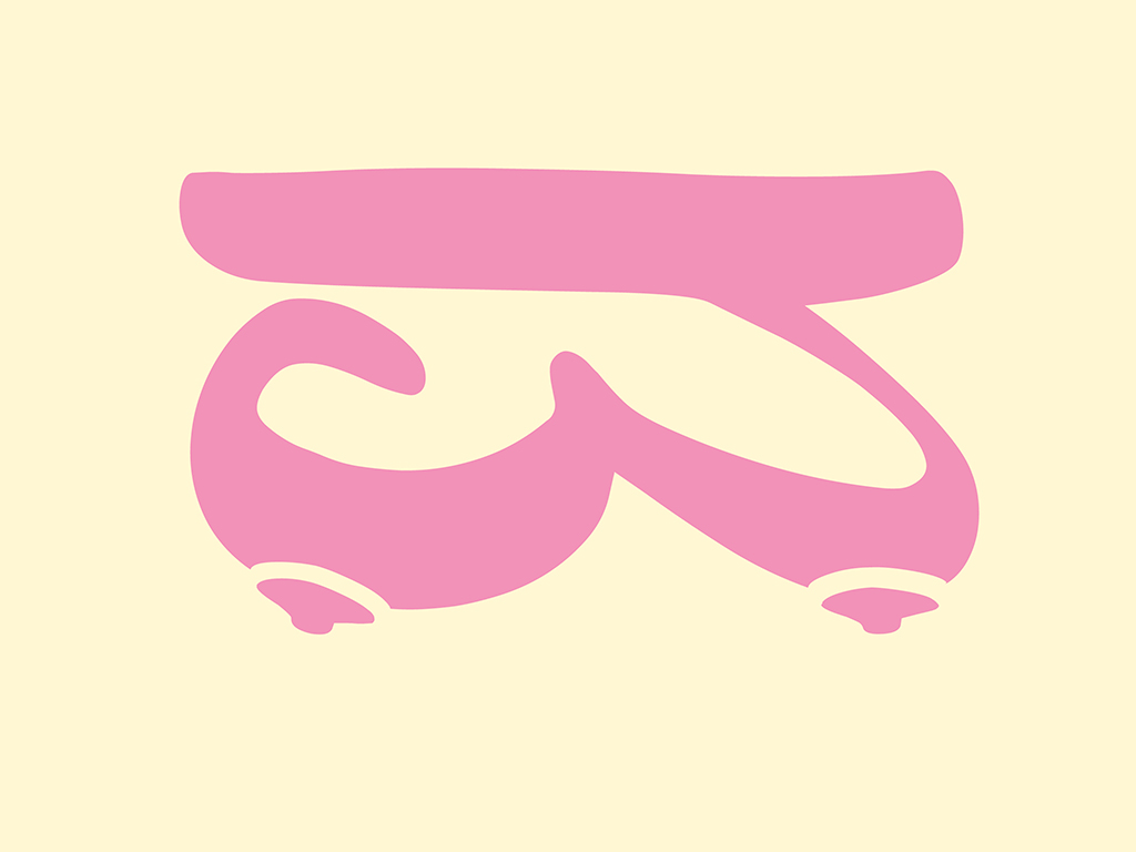
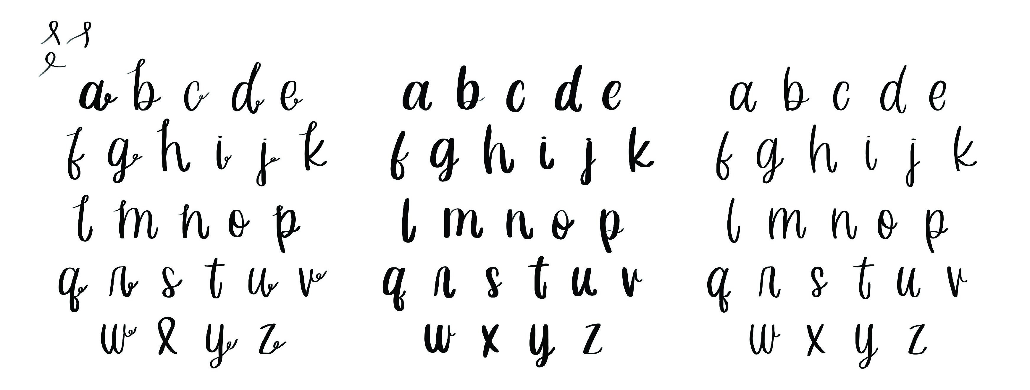
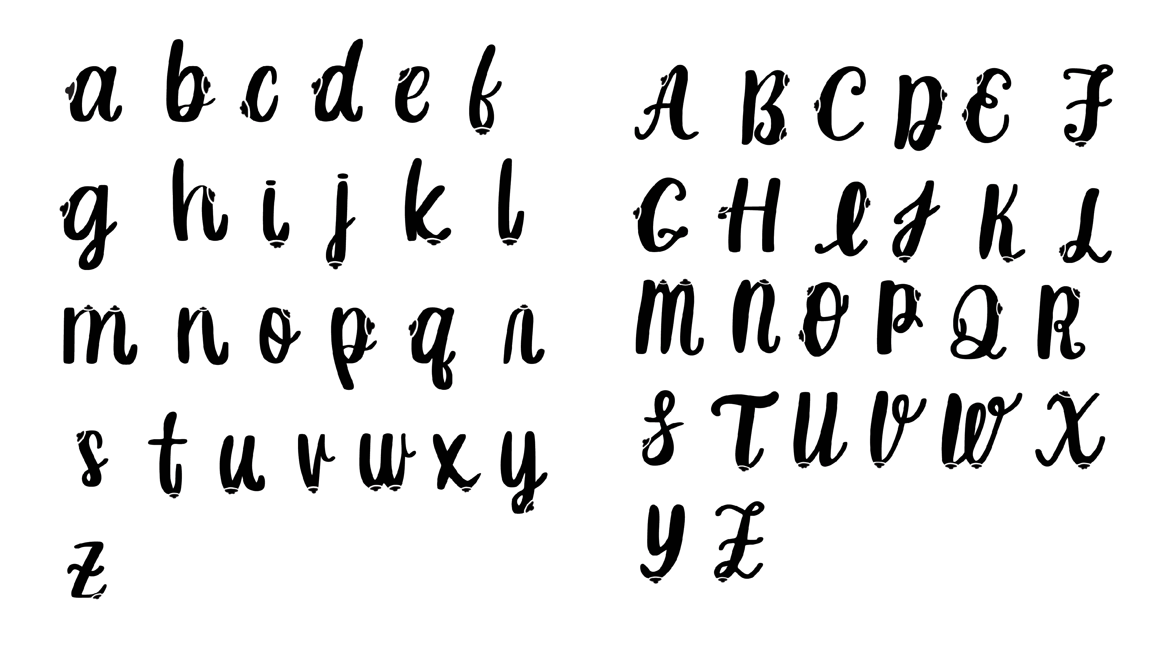
I started by doing some sketches pertaining to the typeface idea. The initial idea of wrapping a ribbon around the letters with a nipple looked very awkward and so I changed it into a script-based font where I combined the ribbon and nipple into one. More exploration of various types of script-based fonts mimicking the loops of the ribbon were conducted. At the end, I found that a more simplified version was better suited. This was achieved by creating lowercase letters first to ascertain the weight of the strokes before deciding on a heavier stroke. Contours of a nipple were added as part of the stroke, with a heavier stroke being more accommodating. I later realised that letter forms should be focused on before combining the various elements. I eventually created the uppercase letters with the same heavy strokes I used for my lowercase letters.
I found it difficult to create nipple shapes so I turned to the Internet. After browsing through many images, I came across something useful – I learned that women actually have three different types of nipples: a normal nipple, a flat nipple or an inverted nipple. I then began making the different forms of the nipples.
As part of the creative process, I explored a version where the nipple form on the font that was pink in colour. The reason for this was because when the nipple was black, the letter looked like it had a pimple as opposed to a nipple. Sometimes it even looked like a spaceship. I was then advised to keep the strokes simple. Looking back, the pink nipples also looked like flowers. And so, I’m glad I didn’t move forward with that line of inquiry.


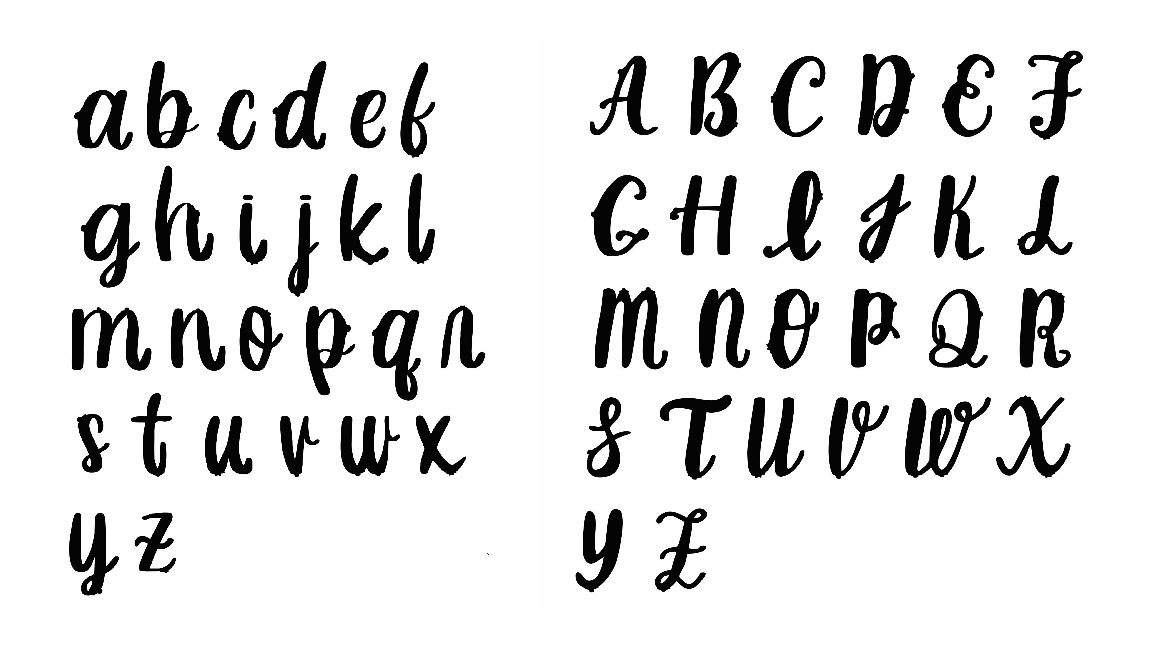
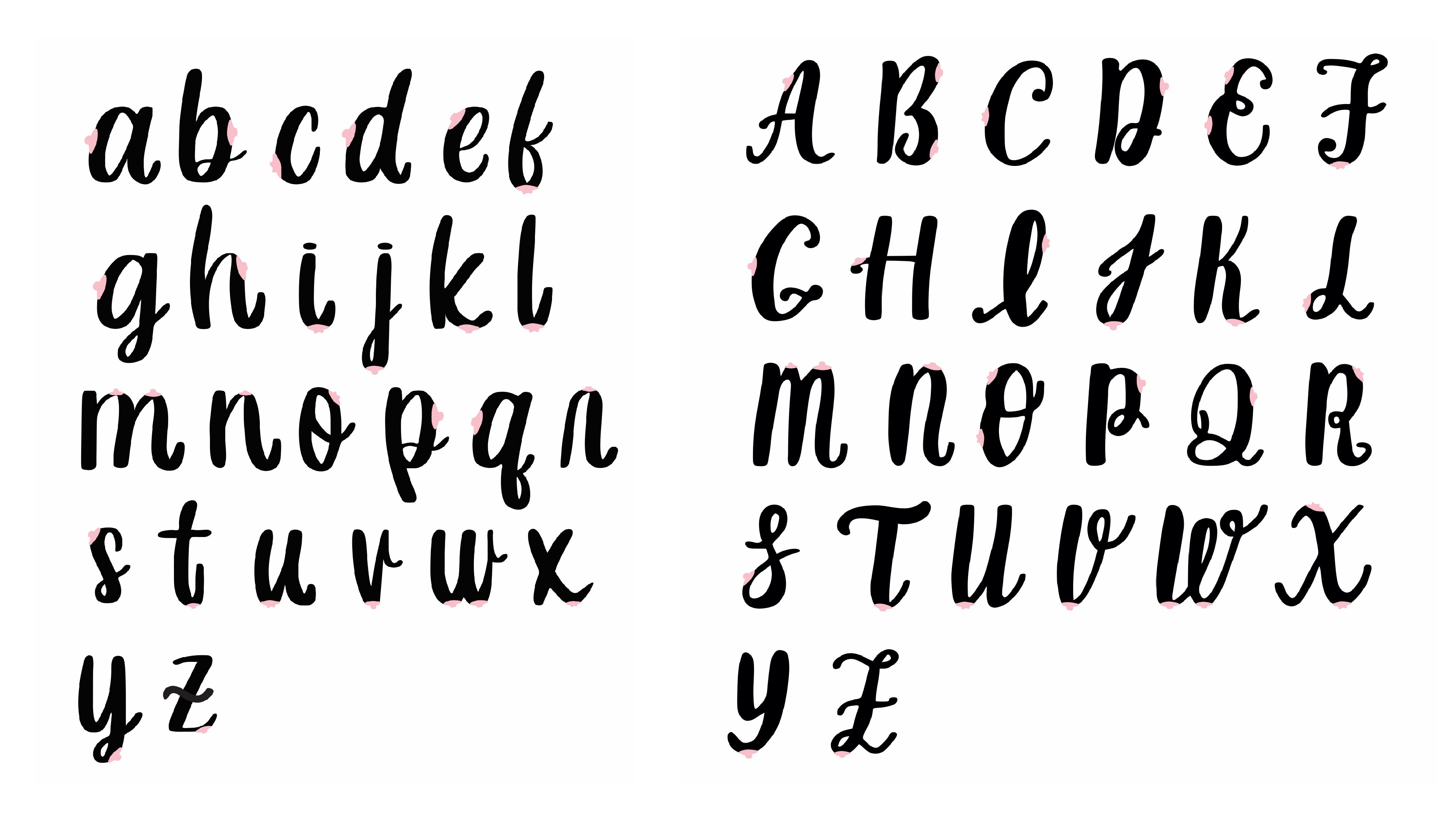
I returned to the drawing board and made yet another attempt. This time white lines were use to separate the nipple from the letters. The outcome looked much better but it was still not that noticeable, thus the white lines were made thicker so that they would be more apparent even in smaller sizes. This was a challenging process for me as I had to figure out how to separate the letters from the nipples without drastically changing the forms of the letter. Thereafter, I put all 52 letter forms into Fontlab.
Finally, after many attempts, I was satisfied with the outcome of my letters as the nipples were now more obvious. I chose the name “Breast Stroke”, a pun suggested by my lecturer, as I felt it was suitable for the typeface.
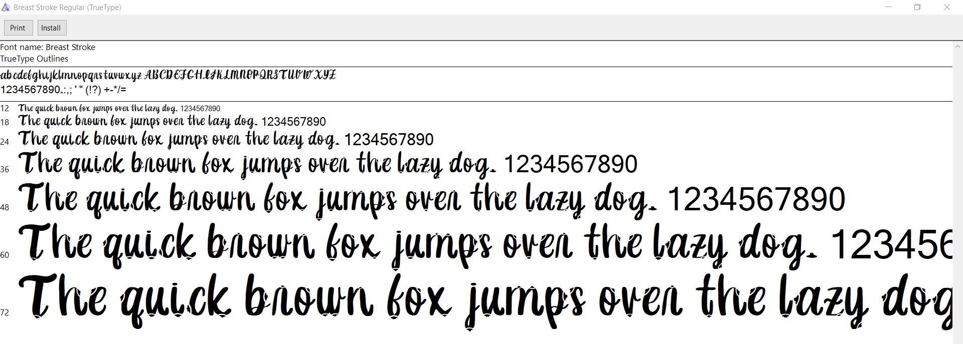


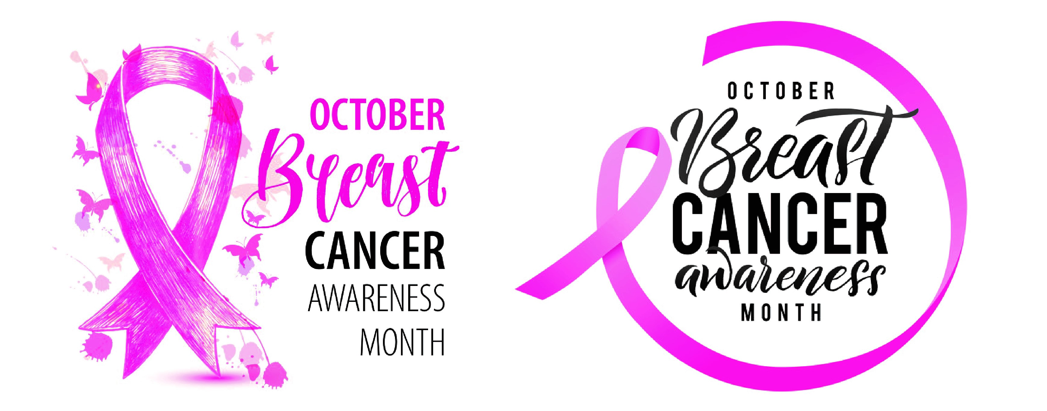
(Above) Applications using the “Breats Stroke” typeface. Artwork © Abigail Chong, Malaysia, 2019.