
As a student in Advanced Typography at Taylor’s University, I prepared myself for our final project — partly dreading it, yet also filled with a sense of excitement. The assignment was to design a typeface that would solve a problem. At the time, I had with me many photos of product labels adorned with terrible typefaces that I found on the streets of Maldives. I was then struck with a rather interesting idea. What if I took the Maldives’ most popular brand of fish products, Fasmeeru, and redesigned them completely? Maldives, where I’m from, is not a developed nation. Our approach to advertising and design for the many local products mirrors this under-development in design sensibility.
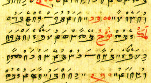
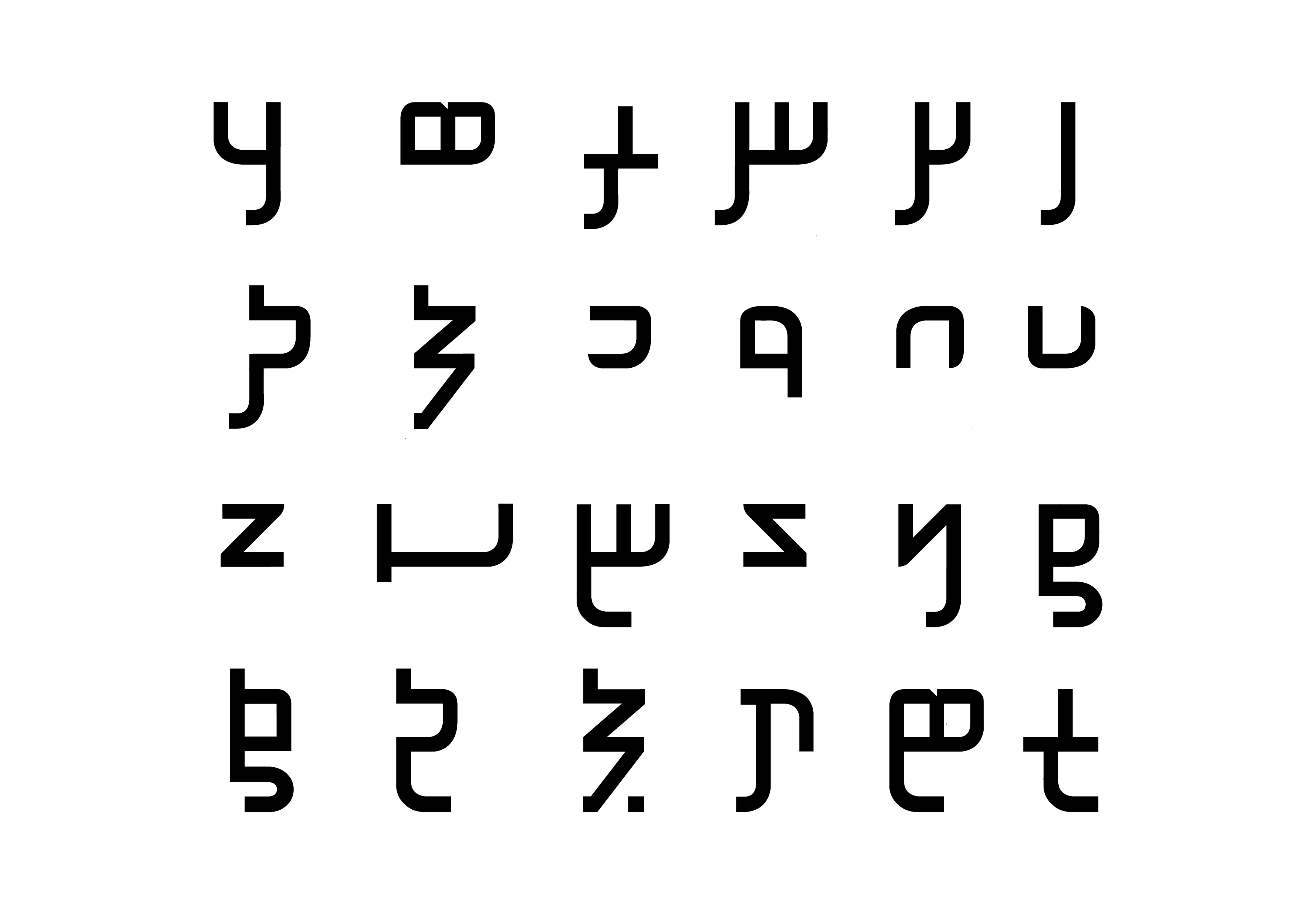
In the Maldives, we speak Dhivehi and our script is called Thaana. Dhivehi is the official spoken language in the Maldives, however there are different dialects which all differ depending on the island you come from. Thaana is what we call our written language. It is influenced heavily by Arabic script which is read right to left. It was previously used to write magical incantations before being adopted into daily use! I originally planned to create my typeface inspired by the past script which is very decorative due to its long intersectional tails, especially when compared to our current script where the tails now end at the same length. The reason for the development of our current script was to shorten the extremely long tails on many letters that made it difficult to read and not practical to use.
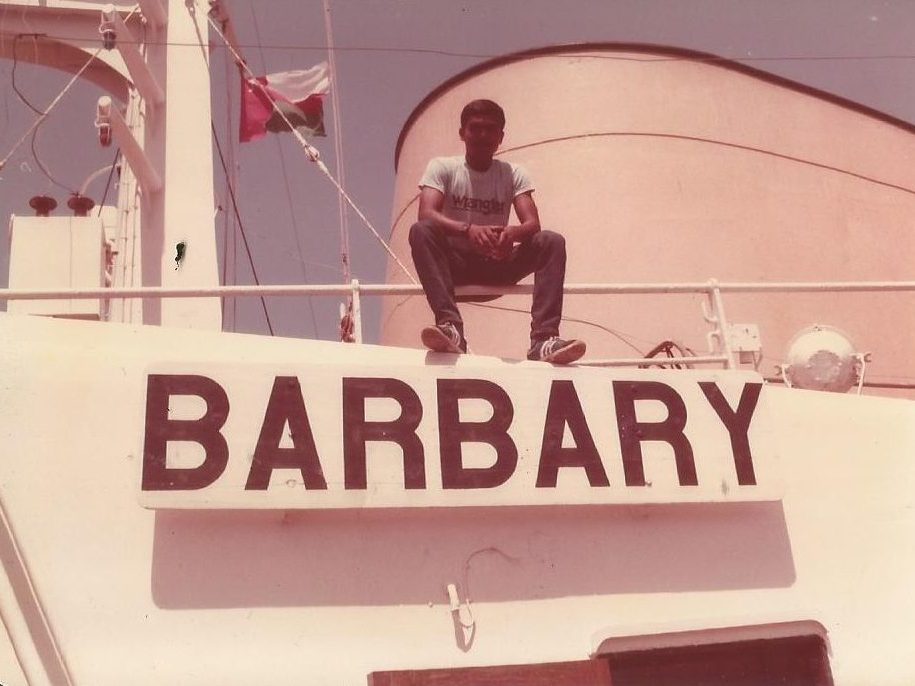
While I was staring into space, daydreaming, or as I like to call it, “thinking really hard”, an idea struck me. My father used to work at sea, eventually making his way up to ship’s captain. I remembered when I was younger, he had showed me a few old photos of a typeface on a ship. He told me that he had hand-painted the letters on the ship during his time as a cadet officer. After giving it some thought, it occurred to me that the typeface on a sea-going vessel would make an ideal typeface for the Fasmeeru seafood brand.
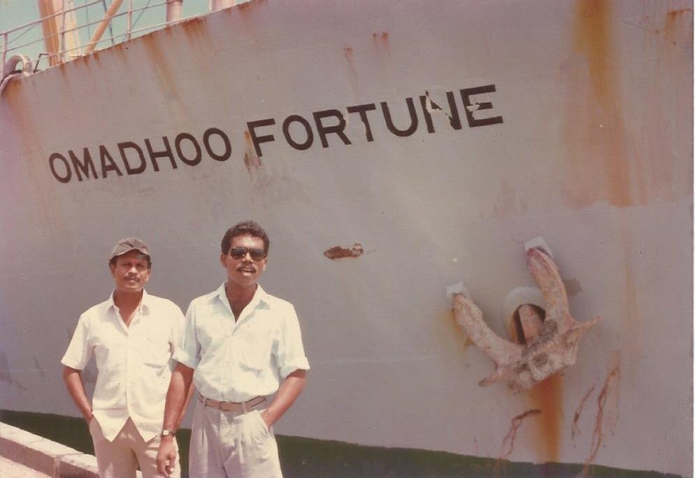
I asked him about the process he used to complete these letters, along with how he had even gotten the experience for this. He said that he had taken Technical Drawing when doing his O-Level exam and that he had also learned calligraphy. He would choose the simplest typeface he knew when painting letters on the starboard bow and port bow of the ship. He would generally consider the number of letters and area size to calculate the correct letter size. The letters would be marked using guide stencils and then painted by hand, all while hanging off the side of the ship. The “Omadhoo Fortune” (Figure 1.2) was hand-lettered by my father when he was a chief officer — normally, the task is delegated to cadet officers — however, he did it himself simply because he enjoyed the task.
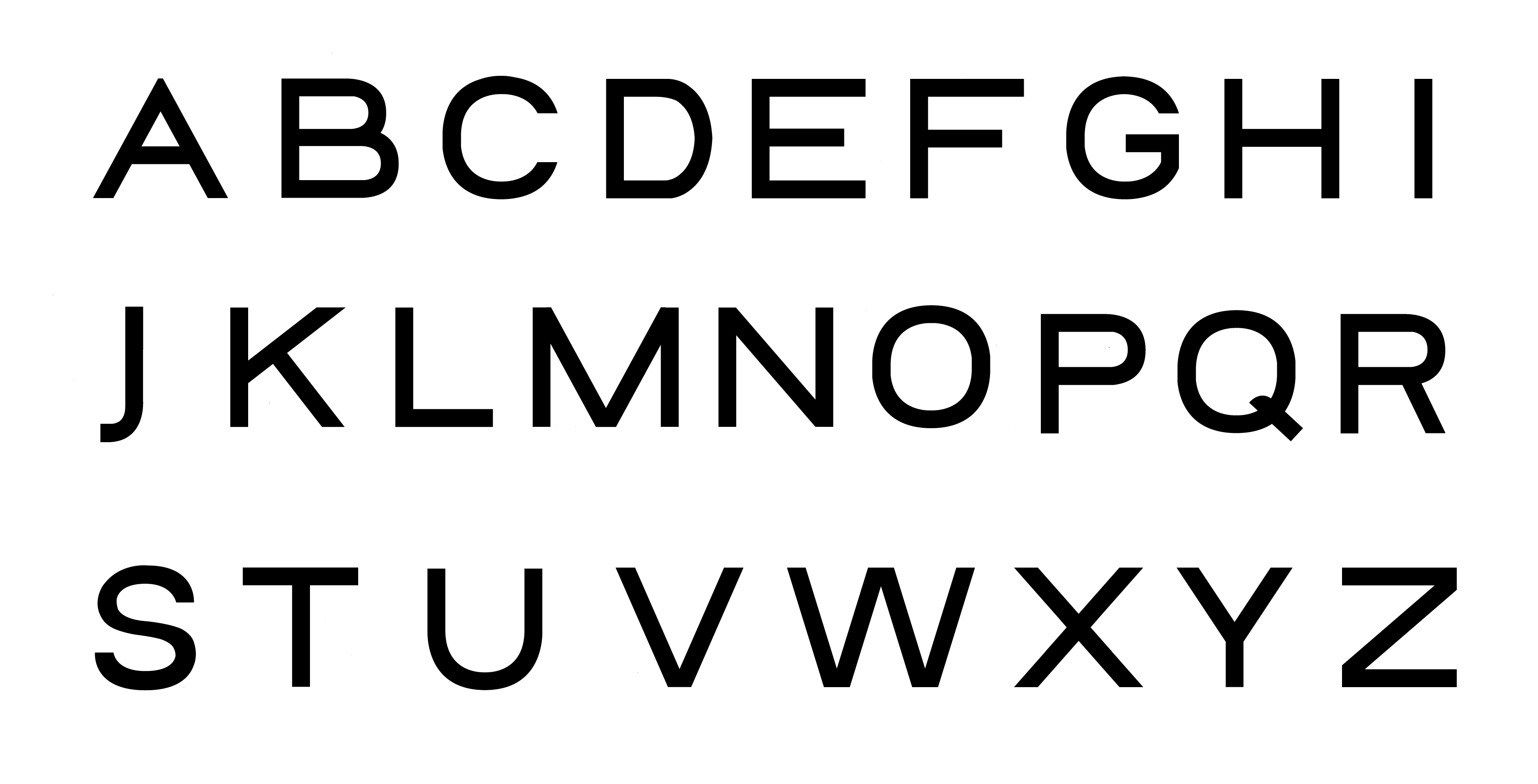
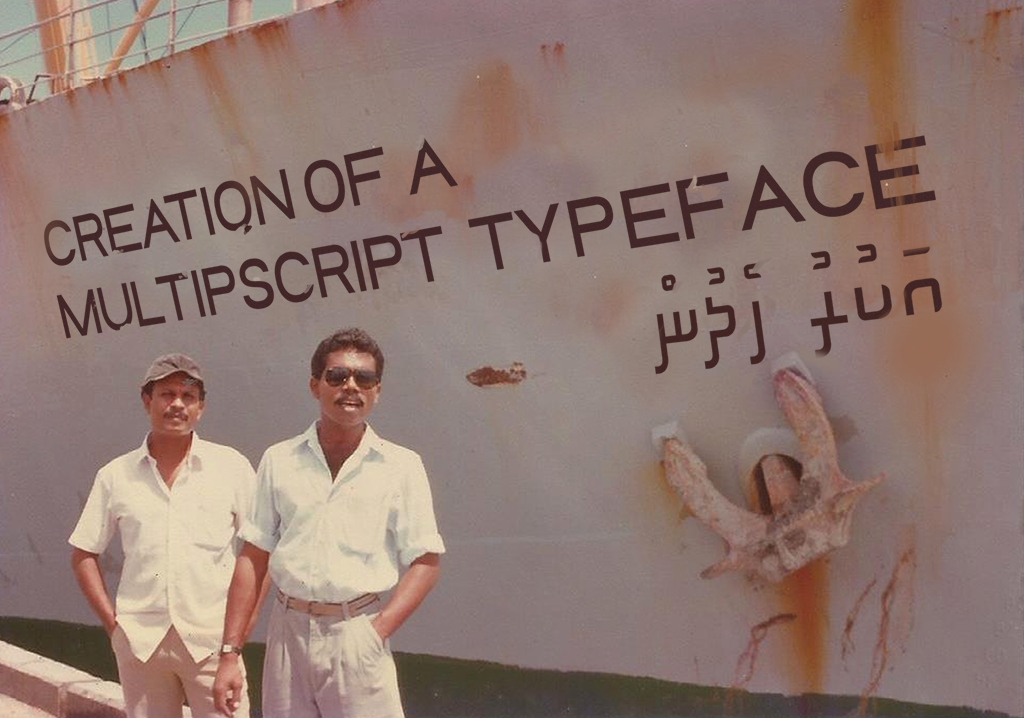
Once the direction was clear, I resolved to create a ‘multiscript’ typeface consisting of Latin and Thaana scripts which would be used on the packaging of the Fasmeeru seafood brand. Initially I sketched it out in Adobe Photoshop and then imported it to Adobe Illustrator where I constructed sketch options using Adobe Illustrator’s pen tool. I started with the letters O, H, and D, because these letters can easily be used to create the rest of the letters in the Latin alphabet.
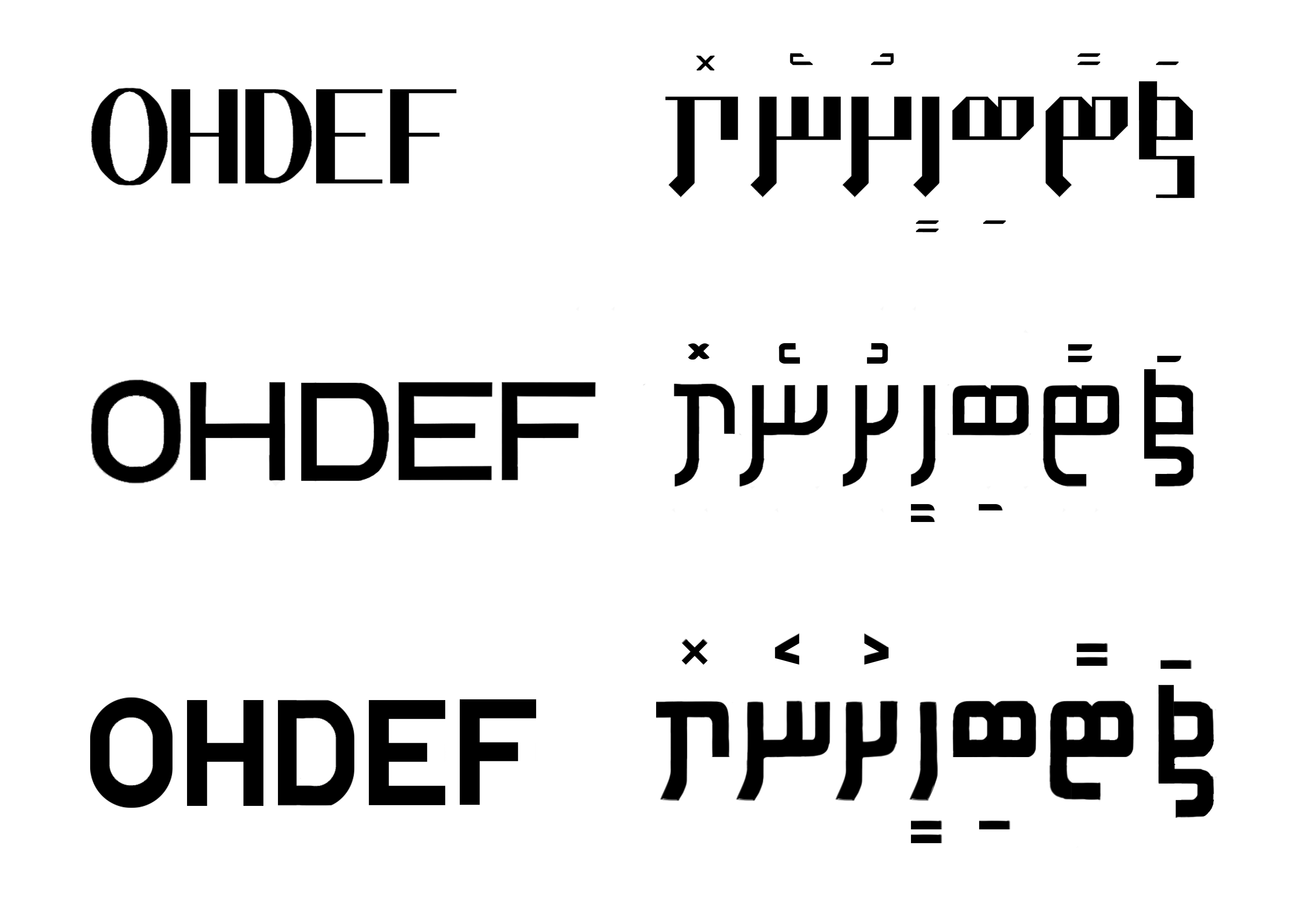
I eventually chose the second option, inspired by my father’s lettering of the “Omadhoo Fortune”. There were a few inconsistencies in the lettering but these were ironed out over the course of a few weeks and many painstaking hours staring at my laptop’s screen — I was seeing letters in my sleep. To my surprise, the Latin script was more challenging than the Thaana script. When studying Latin letterforms, I noticed subtle differences. Take for instance the diagonal strokes of the letters V and A. Their appearances can be deceptively similar but I can assure you that they are not. The Thaana script on the other hand, has more similarities among its letters, evidenced by many of my peers saying, “Wow… they all look the same!”. It was particularly difficult for me as I actually cannot write in Thaana properly. During the weeks working on this multi-script typeface, I had to learn how to write the Thaana script out properly to understand its nuances. I also had to ensure that the two scripts were in harmony by using the same width when constructing the letters. The Thaana and Latin script were also the same size, though the Latin script was in all capital letters while in Thaana we do not have capitals. Consistency is key when creating a typeface, however, it is even more important during the creation of a multi-script typeface.
To turn this into a functional typeface, I used FontLab 7. And let me tell you this, it is not easy —this is the furthest you could get from easy. I spent many sleepless nights, completing the task and overcoming challenges. As students in Advanced Typography, we were taught how to create a functional Latin typeface in FontLab during our first semester in Typography. However, I was creating a typeface in a completely different language. This was not taught and I had to learn this by myself.
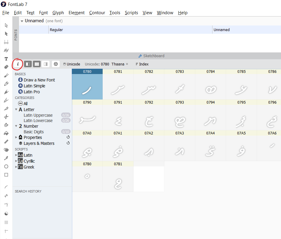
In FontLab, upon creation of a file, you will see a small “I” icon around the left of your screen. Click on it and go to the Unicode ranges and select Thaana. After this, save and close your file and it should hopefully show up. If the Unicode doesn’t immediately show up, don’t panic, it may take a simple restart to solve your problems. I have to be honest here, there isn’t exactly a step-by-step process I followed doing this. I had to play around with my given tools. It took a lot of time and effort. If you’re intending to create a typeface for a script other than Latin, buckle up.
Now you’ve (hopefully) got the Unicode loaded, great! Time to insert every character, including the fili. Fili are the characters above or below the letter itself, giving the letter its vowel sound. Once all are inserted, you must individually check how each letter corresponds with the fili itself since my letterspacing was absolutely atrocious at the time. This is the hardest part, doing individual letterspacing for every single letter and fili. I eventually realised that many of the letters fit into roughly the same shape, so I centred the fili based upon the letter “alif”. This saved me a lot of time. That said, you would still have to make some adjustments to individual letters. This process was extremely time consuming and exhausting, but after exporting the font and seeing it function, I was over the moon. There were many errors, such as the letters typing from left to right (we read right to left) along with wonky spacing every once in a while. But I had actually managed to create a relatively functional typeface in both English and Thaana.
Do I recommend that you, as a student, who might be reading this to try this as well? Well, if you want to take that risk go for it. Was it gruelingly difficult? Yes. Was it worth it? Also, yes. I didn’t know if I wanted to do this but I did, and I’d say it turned out rather well. However, you need some good time management skills and patience for all this. Doing a design course is about standing out. What makes you different? And to do that, you have to take risks — not blindly, of course. You need to be aware of your own skills and whether you yourself really believe that this is possible. If you do, go ahead! And to any fellow Dhivehi students who will take on this challenge, good luck.
Download the Omadho Fortune Thana multi-script typeface here.
To view more of Fazal Ibrahim’s work, click here.
Well done!