
I have now been an educator in art and design for nearly two decades. During this period, I have taught many subjects: photography, promotional design, final year project, advertising, typography, brand identity, and publishing design. I have taught all of these subjects at different times, however, the one subject that I have taught for the longest period, approximately 16 years, has been publishing design.
I first started teaching publishing design at the Malaysian Institute of Art (MIA) in 2002. The subject was taught in two semesters in the Diploma in Graphic Design programme. Publishing Design I, was taught by Encik Norlisham, it introduced students to the different types of publishing mediums; magazine, newspaper, and handouts among others. Thus, I decided that in Publishing Design II I would tackle the oldest format in publishing, book design.
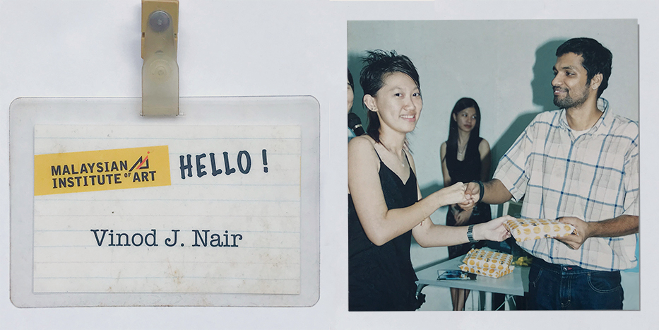
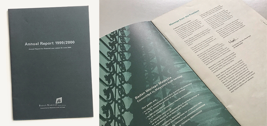
As a designer at Grandmother India Design Pvt. Ltd. in the late 90s, there was a minimal number of jobs dealing with publishing design. However, this would change at William Harald-Wong & Associates (WHW). I remember my first assignment in publishing design was to design the Badan Warisan Annual Report 1999/2000. I felt like a deer caught in the headlights of an on-coming car. I was not sure how to start, how to deal with the information provided, and what to do for visuals. You see, during my time as a student at the esteemed J.J. Institute of Applied Arts, this was not an area of focus in the advertising skewed curriculum, and thus, my knowledge in the subject was quite basic.
So I began by analysing existing designs in order to figure out how they were constructed and how I should approach this task. Thankfully, by that time, I had had somewhat of a crash-course in QuarkXPress, which was a publishing software that everyone used before Adobe InDesign. This experience of not knowing how to manage the process or how to ‘see’ was traumatic, but in time I learned, and with some guidance from my colleagues who were far more fluent in the discipline of publishing design, I managed to produce a simple but rigid design that William, the principal designer at WHW, found to be of acceptable standard—something I was most concerned with.
Teaching Publishing Design
When I began teaching the publishing design subject for the first time, I found it incredibly difficult to impart design sensibilities. This was partly due to the students’ lack of mastery of the fundamental knowledge in the understanding and use of grid systems, typography, and composition. However, one thing they all could do was visual making.
In my first semester of teaching the subject, I learned that I needed to provide students with exercises that would prepare them to take on the task of designing a book. So, I turned to books on typography and publishing design. While I managed to develop some exercises to address the typographic deficit, I could not find any book that taught or broke down the process of designing a book, like what do you do first, and what are the subsequent steps thereafter. After much reflecting and introspection, and thinking about my first experience in publishing design I finally figured it out, which merits an article by itself. My time and the trauma (or experience) of designing my first annual report played a major role in the way I crafted the process.
Once that was sorted, the standard of books being designed in the Publishing Design II class began to show a marked improvement. I then introduced mock-up making as an exercise for students to explore a variety of different formats in class, and this would ultimately influence the chosen format of their books. As these activities were conducted in the studio, peer to peer learning was important — students learned a lot more from each other than they did from me. Many times they would teach me a better way of doing something or introduce me to an issue in my instructions, and together with their help, the exercises got better, and a lot more effective.
The Hurdle
The biggest difficulty I faced (and sometimes still face today) was in imparting a design sensibility that would lead to creating layouts that were exciting and that surprised the reader at every turn of the page. Developing a layout that seamlessly transitioned from page to page and used non-objective elements to aid in the composition was frustratingly difficult to teach. I would have to intervene in students’ works to demonstrate how to place their information in a way that not only brought cohesion but also a healthy level of variation.
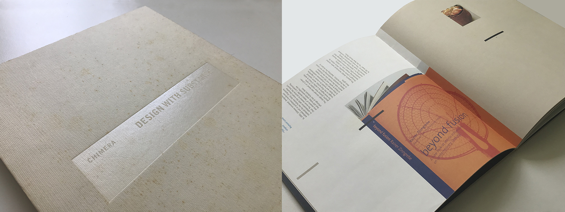
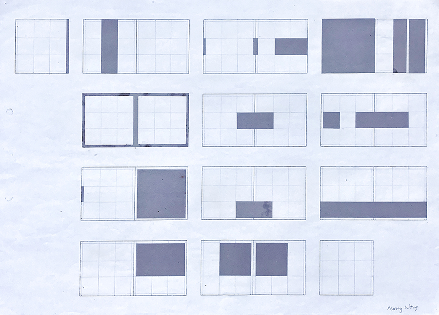
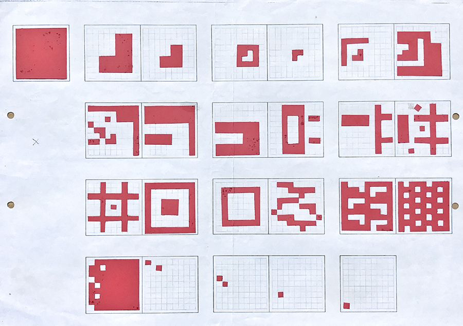
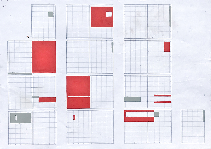
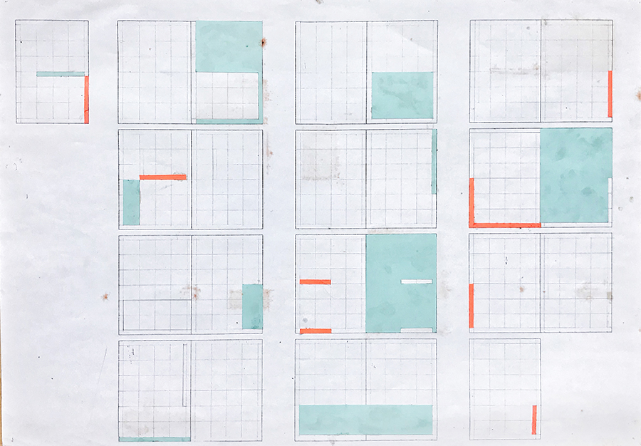
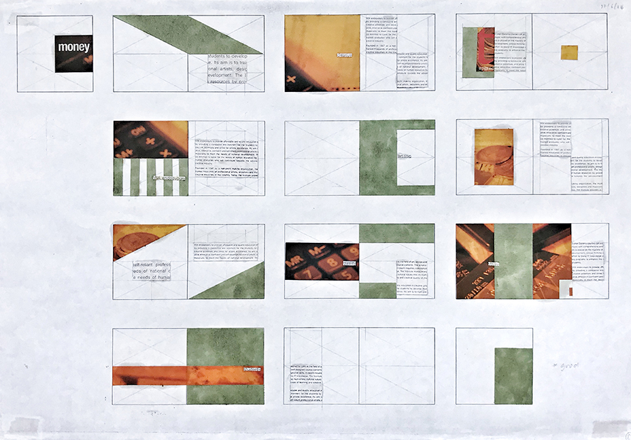
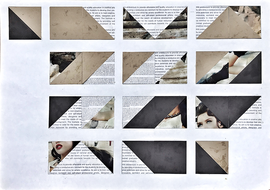
After a few frustrating semesters, somewhere in 2004, two things happened: firstly Imaya Wong — a colleague from WHW who was now working for Chimera gave me a book that she had designed and that I admired. Secondly, I was browsing through a generic book where diagrams of thumbnail pages included rectangular patches that indicated visuals or text. A standard way to show thumbnails of book layouts. This time, however, while staring at it, I had a eureka moment! I thought that if I were to introduce an exercise that allowed students to dissociate with the content — the meaning of the written text, and or visuals — and instead only focus on the form, and its movement across pages within a predefined grid, I could get students to start ‘playing’ in an uninhibited manner. This I hoped would get them in touch with their design intuition, and eventually help them to see the content as something that they can manipulate, instead of it manipulating them.
I thought that if I were to introduce an exercise that allowed students to dissociate with the content — the meaning of the written text, and or visuals — and instead only focus on the form, and its movement across pages within a predefined grid, I could get students to start ‘playing’ in an uninhibited manner.
I didn’t know what to call this exercise at the time, I didn’t even understand it properly, but what I did know, or so I felt, was that this could help students ‘see’ through the content: text, visuals, colour, and white space, as just forms on a page that need to flow in a manner — from page to page — to allow for a subtle narrative of form though movement. I would eventually come to call it the “Form & Movement Exercise” — an exercise of my own making to aid in developing design sensibilities in publishing design, specifically book design. (During the editing of this article, Assoc. Professor Sherry replaced the term “movement” in this paragraph with “flow”, and it occurred to me that “Form and Flow” sounds good too—maybe a change is in order?)
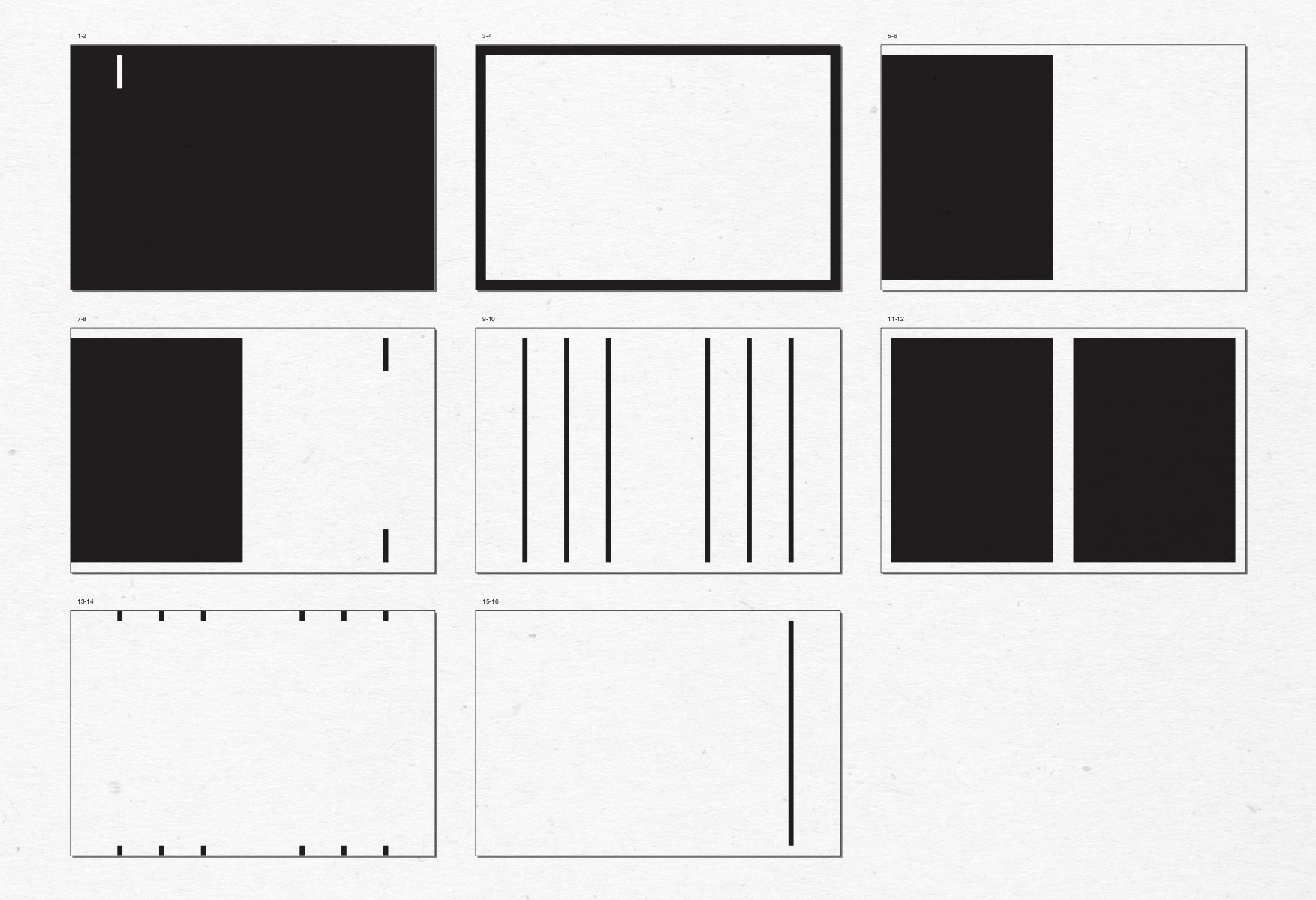
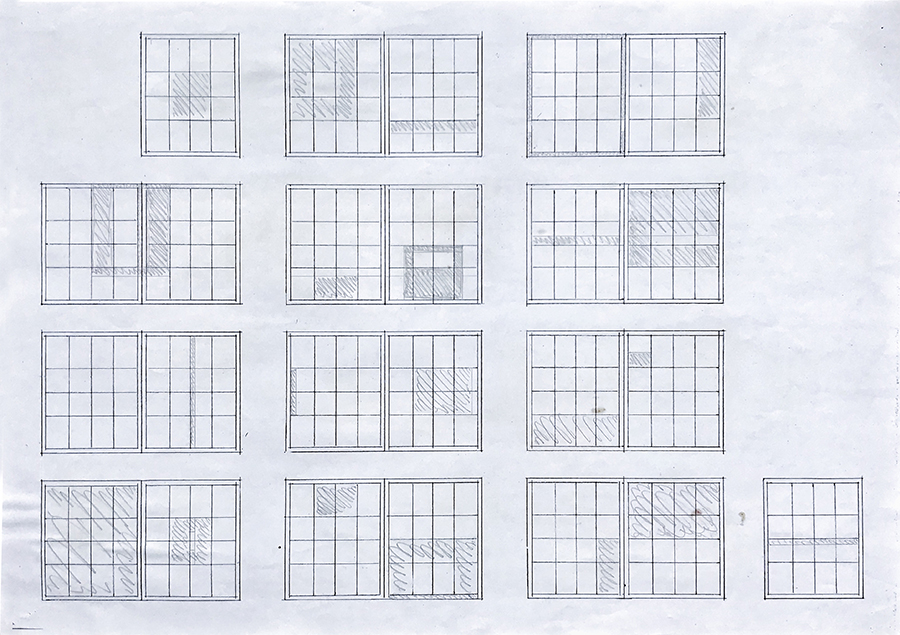
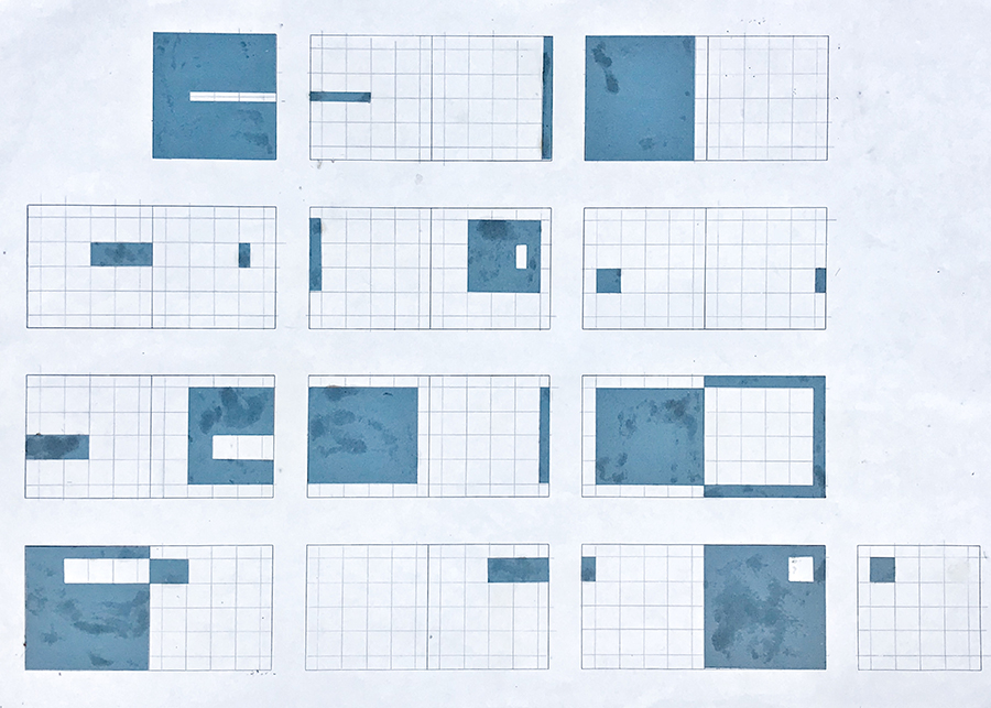
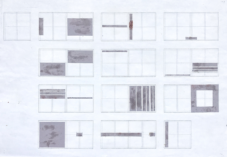
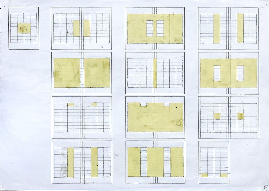
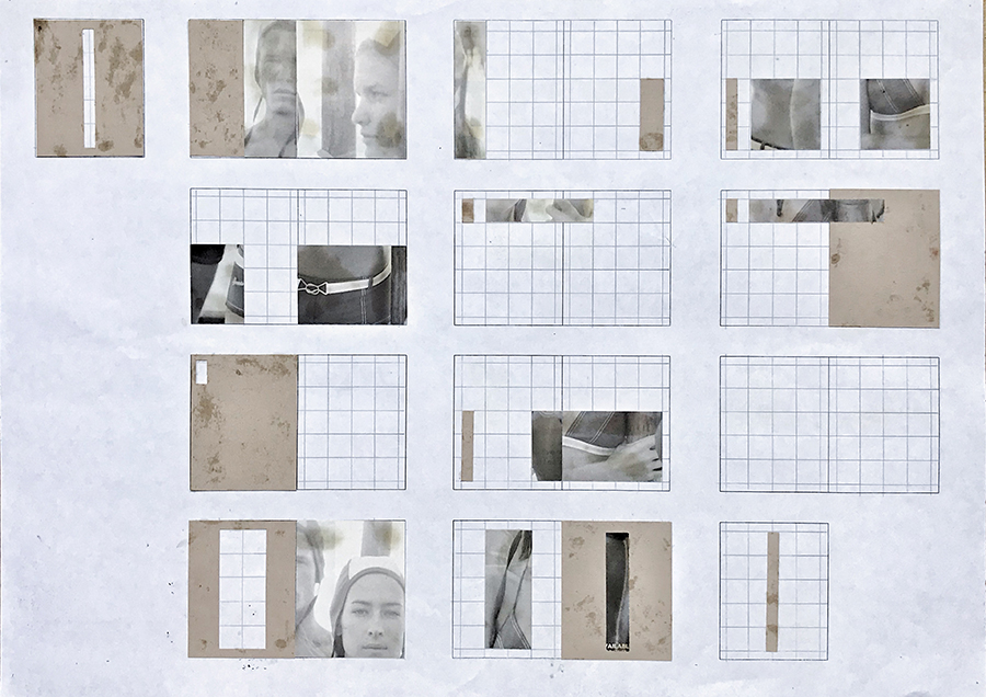
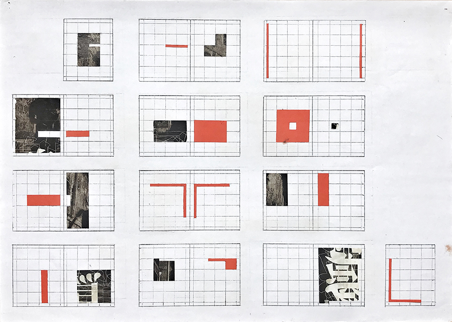
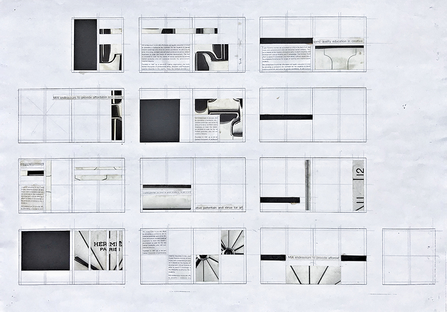
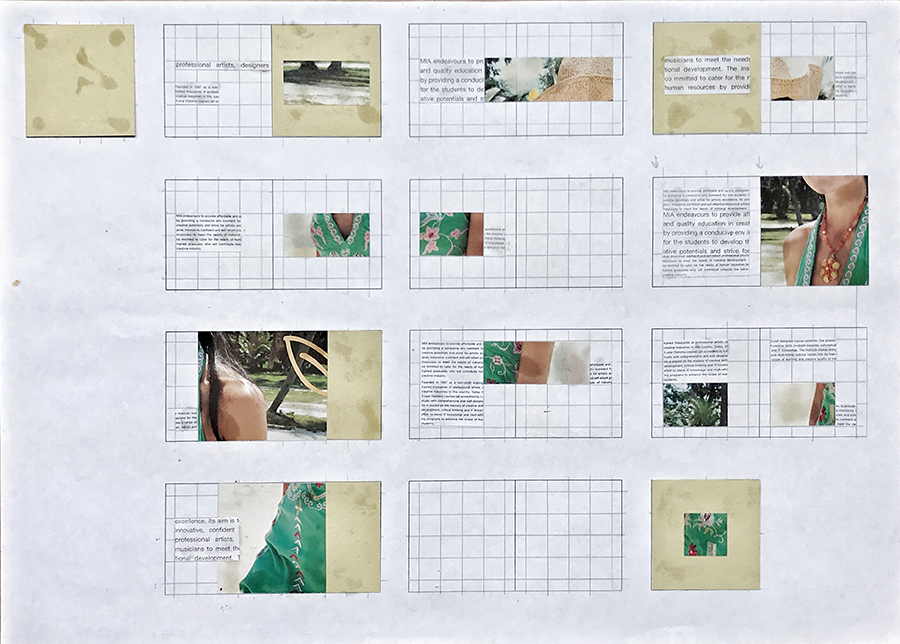
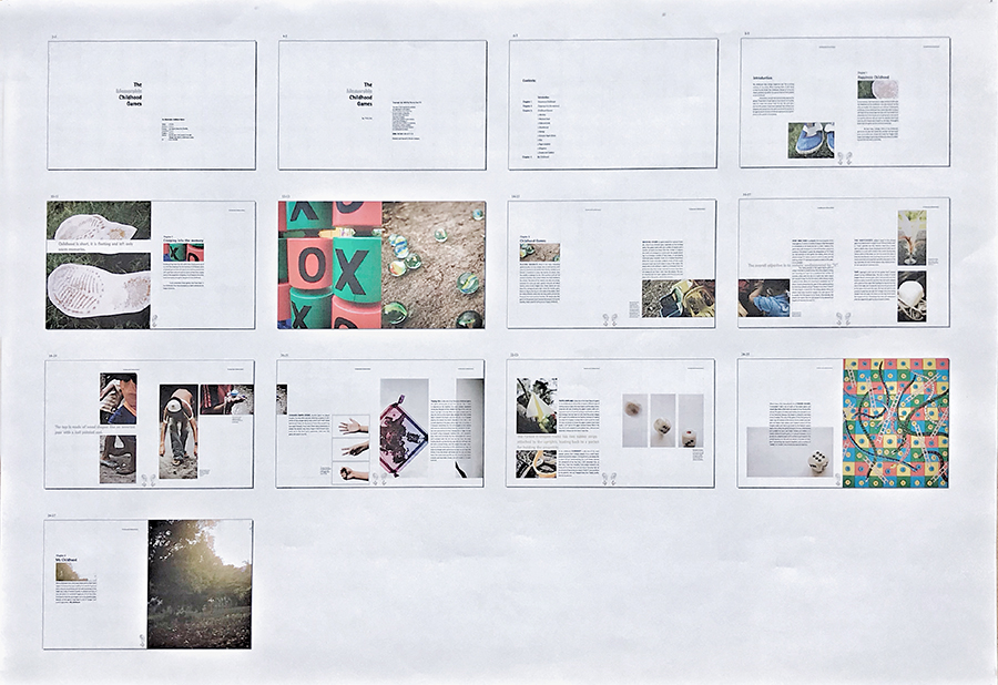
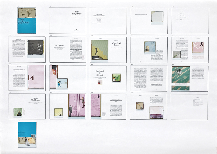
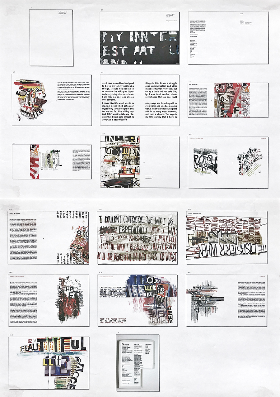
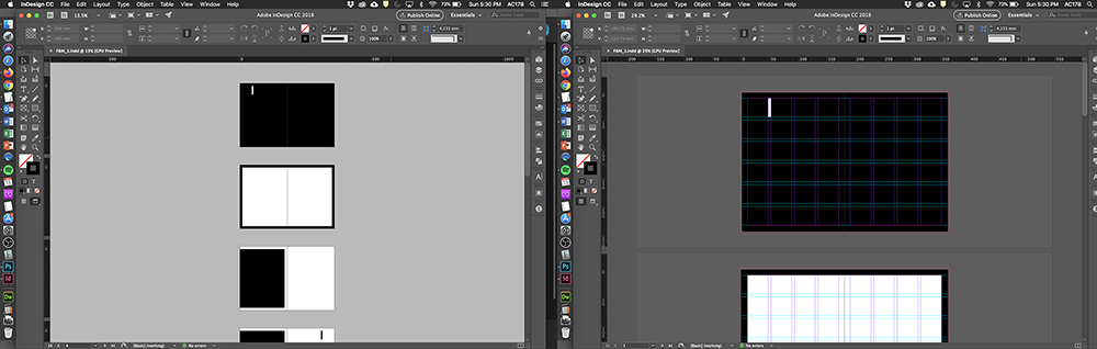
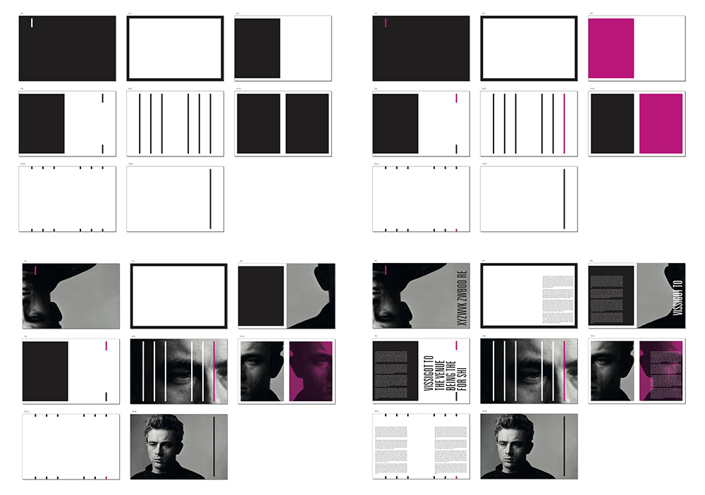
The first time I introduced this exercise, it was rather labour-intensive. I made students draw rectangular thumbnails using a pencil and ruler, draw grids in the thumbnails, and instructed them to use cut pieces of coloured paper to fit within the grid. Each rectangular thumbnail represented a spread of two facing pages and each cut-out form represented text, visuals and/or colour on white space but students were not to bother about what those coloured cut-outs represented. Instead they were to just focus on organising and composing them in the spreads. I would simplify the task and expand on it over time, eventually digitising the entire process. The following showcases the various stages and phases of the exercise over a period of 16 years:

I am glad that I have finally managed to put pen-to-paper (so-to-speak). I have felt the need to share my strategies so that other lecturers, facing similar challenges in teaching publishing design may wish to utilise it, or even build upon it.
While I can’t scientifically conclude that these exercises have played a major role in my students’ development in publishing design. However, I can empirically say, based on my observation, the Form & Movement exercises have allowed students to embrace intuition and to limit inhibition in layout design with resulting layouts that have healthier levels of variation that engages and surprises readers in their reading experience.