
In our world today, brands are continuously displayed all around us. Therefore, these brands are always competing, and companies work to influence consumers’ choices to buy their products over others. Due to this, it is important for brands to establish a recognizable and unique identity in order for consumers to distinguish their brand and products.
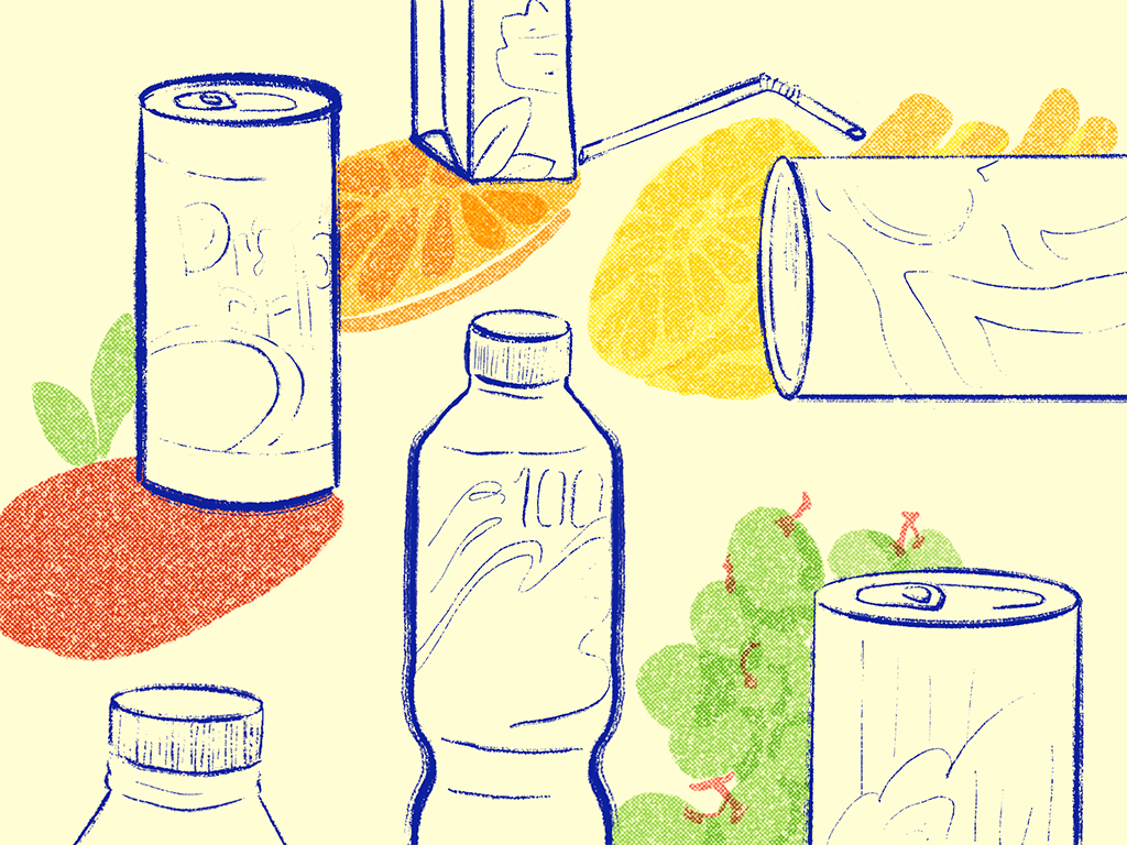
In order to create a successful brand identity, the visual elements on all of the brands’ products and packaging must effectively reflect the brand’s identity. These visual elements include logos, colours, symbols, typography, etc. Visual elements on the primary packaging also create associations that allow the products to be unique which help the consumers to familiarize themselves with the brand and relate the products to their brand identity.
Brand association relies on this semiotic theory.
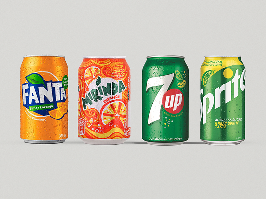
When you think of an orange fruit, the colour that comes to mind is logically the colour orange. This is due to the semiotic theory based on semiosis that claims that humans are interpreters of signs and that they tend to connect visual signs with other objects or meanings. Brand association relies on this semiotic theory. For instance, people associate the colour orange on the packaging of Fanta soda with the orange fruit flavor while the circle and ring symbols on the packaging of a Sprite soda relate to its bubbles and fizziness.
Association is important in brand identity since the visual elements on the packaging of the products are used to remind consumers about the product brand. The associations consumers make between the visual elements and the product help to make the product unique when designed well. Therefore, although both Fanta Orange and Miranda use orange as the main colour on their packaging to symbolize their drink’s orange flavor, the shade of orange that they use is unique.
In the same way, when symbols are chosen and well-applied, they can create unique associations which will allow consumers to relate the symbols to the brand. Both Sprite and 7-Up included lemon and lime symbols in their packaging to reflect their drink’s lemon-lime flavor. However, 7-Up’s lime looks stylized while Sprite’s lime appears more realistic as if the lime has been stamped onto the packaging. Despite utilizing similar symbols, consumers are still able to associate the symbols, packaging, and products to their brand due to the uniqueness of the colour and stylization of the symbols.
Due to living in a consumer society, we are continually exposed to brands and the visual elements used to reflect brands’ identities. As a result, consumers become familiar with the unique visual elements to help them easily remember and associate these visual elements with a specific brand. Therefore, products utilize these visual elements associated with the brand in order to help consumers to relate and recall the brand, such as associating the colour red with Coca Cola.
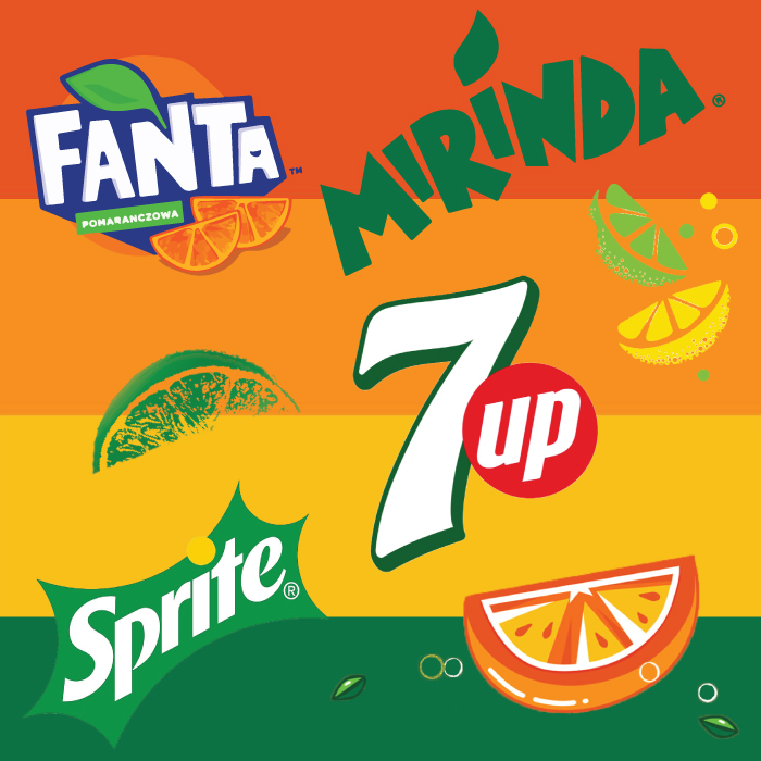
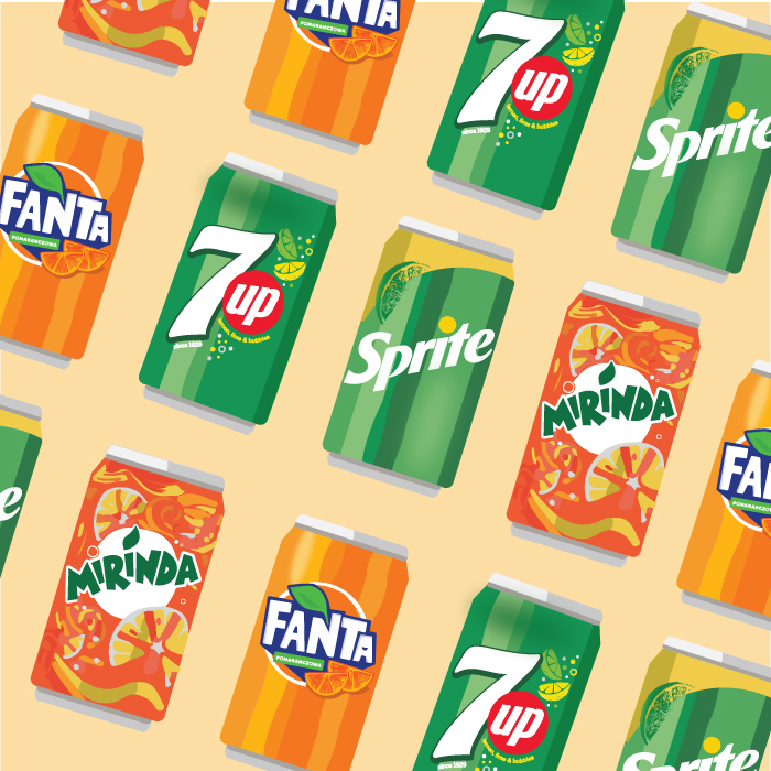
This information is a result of the research that I have done as part of my dissertation, in which I studied the role of visual elements in primary packaging in helping to relate a product to its brand identity. It was achieved by conducting a survey and observing the use of visual elements (colors, logos, typography, and symbols) in the primary packaging of four different soda brands. The findings of the research suggest that the visual elements on the primary packaging of the studied soda brands (Sprite, 7-Up, Fanta, and Miranda) create associations that allow the sodas to be unique which helps the consumers to familiarize themselves with the brand and relate the products to their brand identity.
Congratulations Gaby?
So you’re saying that if the producer plans to make any changes or modification in the packaging, they need to always pay close attention to what the consumers already associated with the identity of the product. If not, they might just loose the connection, right?