
Designers use whitespace as a design element to create visual aesthetics and enhance layouts. However, most designers fail to consider the importance of whitespace in readability and navigation control. This article investigates the beneficial aspects of using whitespace in layouts. Although a significant number of people prefer access to more information, the majority of viewers find that the less they see the more they can focus thereby finding the layouts offered improved readability and navigation.
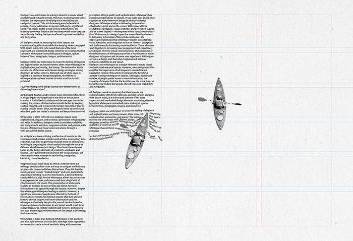
All designers work on ensuring that their layouts are communicating effectively while also keeping viewers engaged. With this in mind, it is to be noted that one of the most important and overlooked design elements to creating effective layouts is whitespace (unmarked space in designs, spaces between lines, paragraphs, images, and elements).
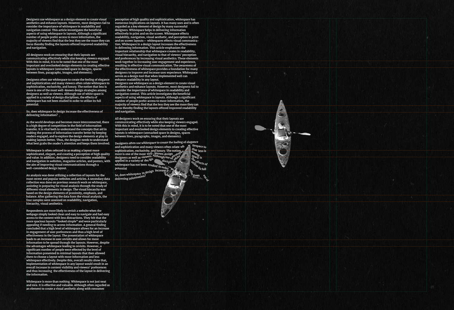
Designers often use whitespace to create the feeling of elegance and sophistication and many viewers often relate whitespace to sophistication, exclusivity, and luxury. The notion that less is more is one of the most well-known design strategies among designers as well as viewers. Although use of white space is applied in a variety of design disciplines, the effects of whitespace has not been studied in order to utilize its full potential.
So, does whitespace in design increase the effectiveness of delivering information?
As the world develops and becomes more interconnected, there is a high degree of competition in the field of information transfer. It is vital both to understand the concepts that aid in making the process of information transfer better by keeping readers engaged, and to explore the design elements at play in making layouts better. Thus, the designer needs to understand what best grabs the reader’s attention and keeps them involved.
Whitespace is often referred to as making a layout more elegant, and creating a perception of high quality and value. In addition, designers need to consider readability and navigation in websites, magazine articles, and posters, with the aim of improving visual communications through a well-considered design layout.
An analysis was done utilizing a collection of layouts for the most recent and popular websites and articles. A secondary data collection was done on previous research work on whitespace, assisting in preparing for visual analysis through the study of different visual elements in design. The visual hierarchy was based on the design elements of proximity, emphasis, and balance. After gathering the data from the visual analysis, the four samples were assessed on readability, navigation, hierarchy, visual aesthetics.
Respondents are more likely to revisit a website when the webpage simply looked clean and easy to navigate and had easy access to the content with less distractions. They felt that the more spacious layouts “looked simple” and were particularly appealing if needing to access information. A general finding concluded that a high level of whitespace allows for an increase in engagement of user preferences and thus a high level of effectiveness in the layout. The presentation of whitespace leads to an increase in user revisits and allows for more information to be spread through the layouts. However, despite the advantages whitespace leading to revisits. However, a significant number of people were effected by the level of information presented in minimal layouts that then allowed them to choose a layout with more information and less whitespace effectively. Despite this, overall results show that, implementation of whitespace in any layout would result in an overall increase in content visibility and viewers’ preferences and thus increasing the effectiveness of the layout in delivering the information.
Whitespace is more than nothing. Whitespace is not just neat and nice. It is effective and valuable. Although often regarded as an element to create a visual aesthetic along with consumer perception of high quality and sophistication, whitespace has numerous implications on layouts. It has many uses and is often regarded as a key element of design by many successful designers. Whitespace helps in delivering information effectively in print and on the screen. Whitespace effects readability, navigation, visual aesthetic, and perception in print and on screen layouts— whitespaces effects visual communication. Whitespace in a design layout increases the effectiveness in delivering information. This article emphasizes the important relationship that whitespace creates in readability, visual hierarchy, and navigation to that of viewers’ perception and preferences by increasing visual aesthetics. These elements work together in increasing user engagement and experience, resulting in effective visual communication. The awareness of the effectiveness of whitespace provides a foundation for many designers to improve and increase user experience. Whitespace serves as a design tool that when implemented well can enhance readability in any layout.
The actual journal article was published on KREATE (A Regional Design & Education Journal on Culture, Future Making & Social Design). For more of an in-depth read click here.