The final project for the Advanced Typography module was one of the most challenging tasks I have ever faced within the module. The typeface I designed had to either:
- expand an existing letterform into a font
- solve a real-life design problem
- or be an experimental endeavour that is novel and unique
Brainstorming Ideas
I had three possible ideas: my first idea was to improve one of the most despised fonts in the fontosphere, either Papyrus or Curlz. The second was to create a new typeface to help people with dyslexia to increase their reading proficiency. The last idea involved creating a typeface to make prescription labels more clearer to the elderly.
I chose the second idea due to the fact I am dyslexic myself and so I can relate to the topic.
Battling with dyslexia has been one of the most challenging aspects of my life. I struggle to learn and it causes me to feel excluded from my friends and family. I find it challenging to read large bodies of text since I always loose track of where I was reading. I also struggle with written assignments. By creating a font that helps me to understand what I read, it might also help me understand myself better. Despite the fact that there are already many dyslexic typefaces out there, dyslexic people still experience varying levels of the disorder. Perhaps there is never going to be one single typeface that would serve all dyslexic dispositions. With that in mind, perhaps my contribution to the pool of available typefaces would address the need for a variety of possible solutions.
Font Development, Draft 1 & 2
After studying characteristics of a dyslexic typefaces, I decided to create a monospaced typeface with the look of Century Gothic, however this ended up looking too tight for someone with dyslexia to read. In my second draft, I used the typeface Verdana and Century Gothic as inspiration for my typeface. I made the bottom part of the letterform thicker to prevent it from flipping — the reversing or mirroring of letters. Unfortunately, I had to discard the idea because it looked exactly like OpenDyslexic typeface. With the strict rules in mind, it was challenging to achieve my goals while also making it original.

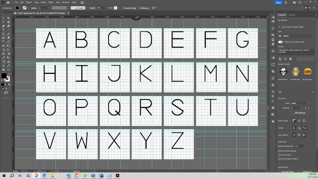
Font Creation Development of Draft 3
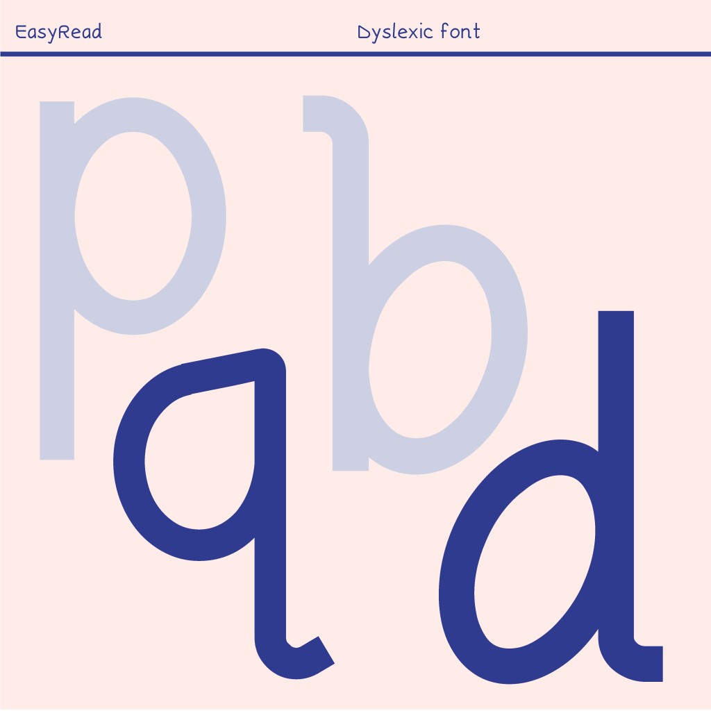
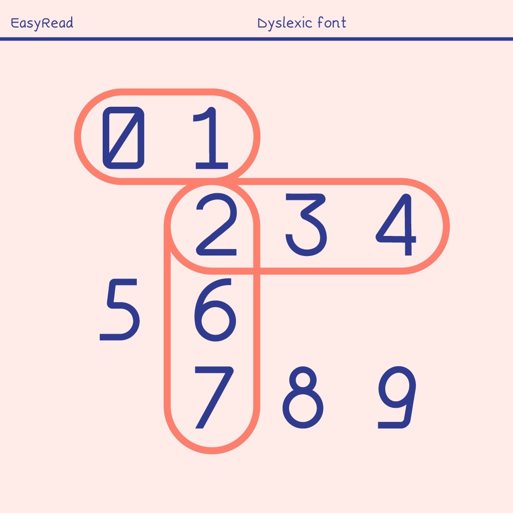
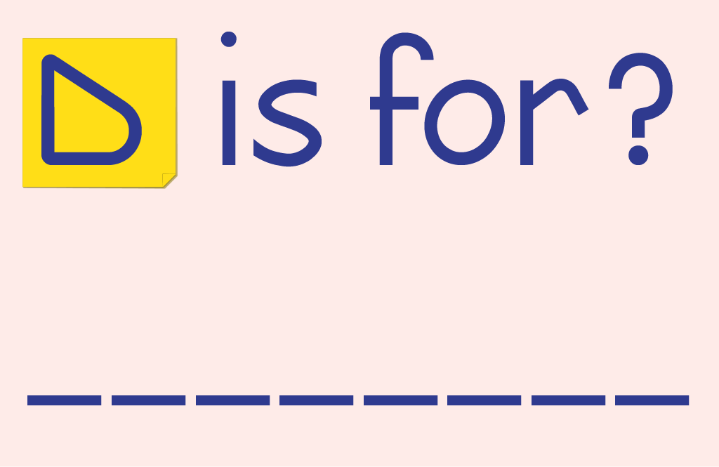
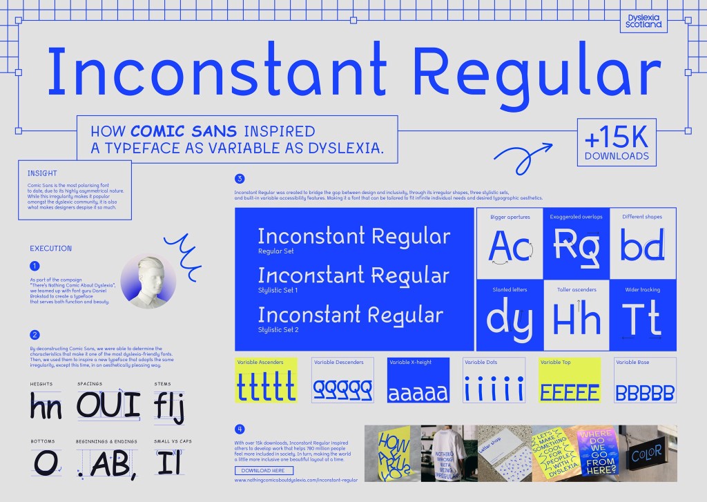
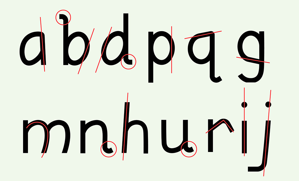
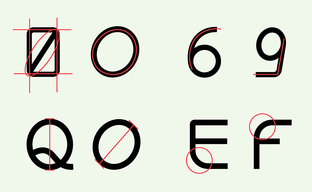
I soon discovered a font called Inconstant Regular created by Norwegian graphic designer, Daniel Bronsted. His font took a unique approach in that it embraces the nature of being irregular. From my research, dyslexics tend to get confused with certain letters that are either flipped or mirrored. Examples of such Letters are (b,p,q,d), (w,v, ) and (u,n,h). From the inspiration of Inconstant Regular, I decided to make these identified letterforms more unique to lessen confusion.

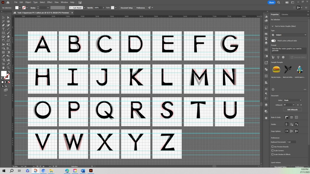
Since emphasizing the unique characteristic of each letterform is crucial for a dyslexic typeface, I found the overall process complicated and in conflict with the usual practice of typeface design which seeks to ensure that letters are unified and consistent. In draft 3 (below), first stage, I analysed the Sylexiad typeface designed by Dr. Robert Hillier to make my typeface in draft 3 more organized. I inspected each of my letterforms carefully and made a adjustments. In FontLab — a font design software — I spaced and then generated my typeface only to find that when I used the typeface in sentences the letters ended up blending together and so I had to go back to the drawing board.

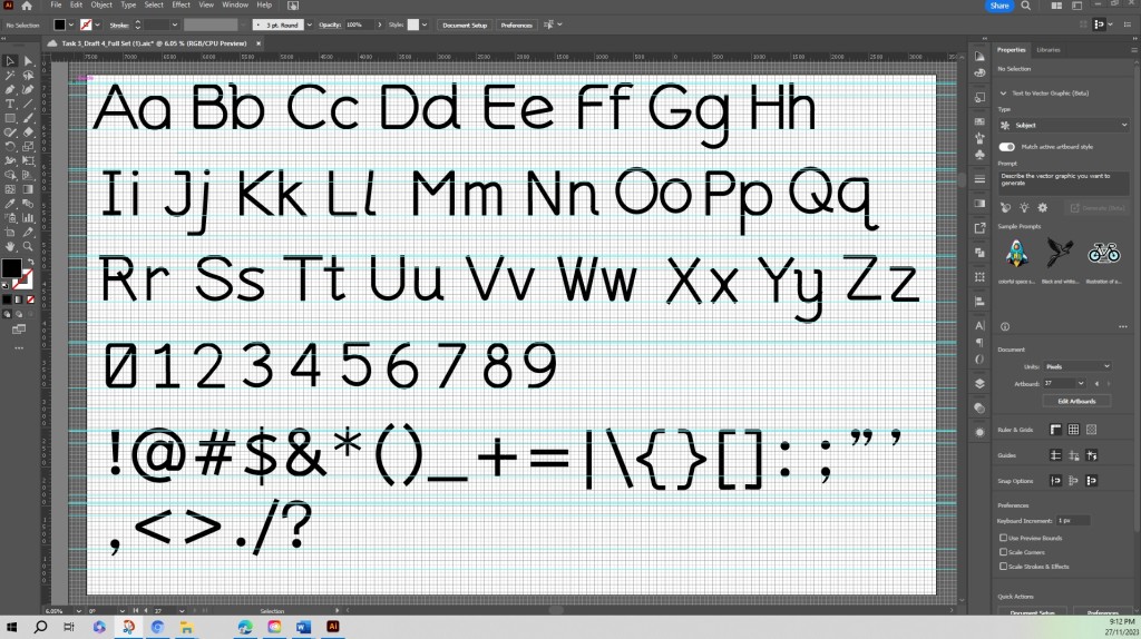
Creating the Final typeface
I found a research article online, called Good Font for Dyslexia by Luz Rello & Ricardo Baeza-Yates. Their research used 48 participants diagnosed with dyslexia to read twelve texts with twelve different typefaces. The typefaces were OpenDyslexic, Courier, Helvetica, Arial, Verdana, Myriad, Times, CMU, and Garamond. Surprisingly, despite OpenDyslexic being labeled as a dyslexic typeface, it did not increase readability among those afflicted with the disorder. Based on the research results, the recommended typeface for dyslexics was Verdana by British type designer Mathew Carter. I then studied the cap-height, x-height, ascender and descender of the typeface Verdana and incorporated these values into my typeface.


Font Measurements for Easyread
After on my study of Verdana, I incorporated similar proportions for Easyread:
- Ascender: 624px
- Cap Height: 524px
- X-Height: 400px
- Descender: –225px
Feature to Identify Similar Letters
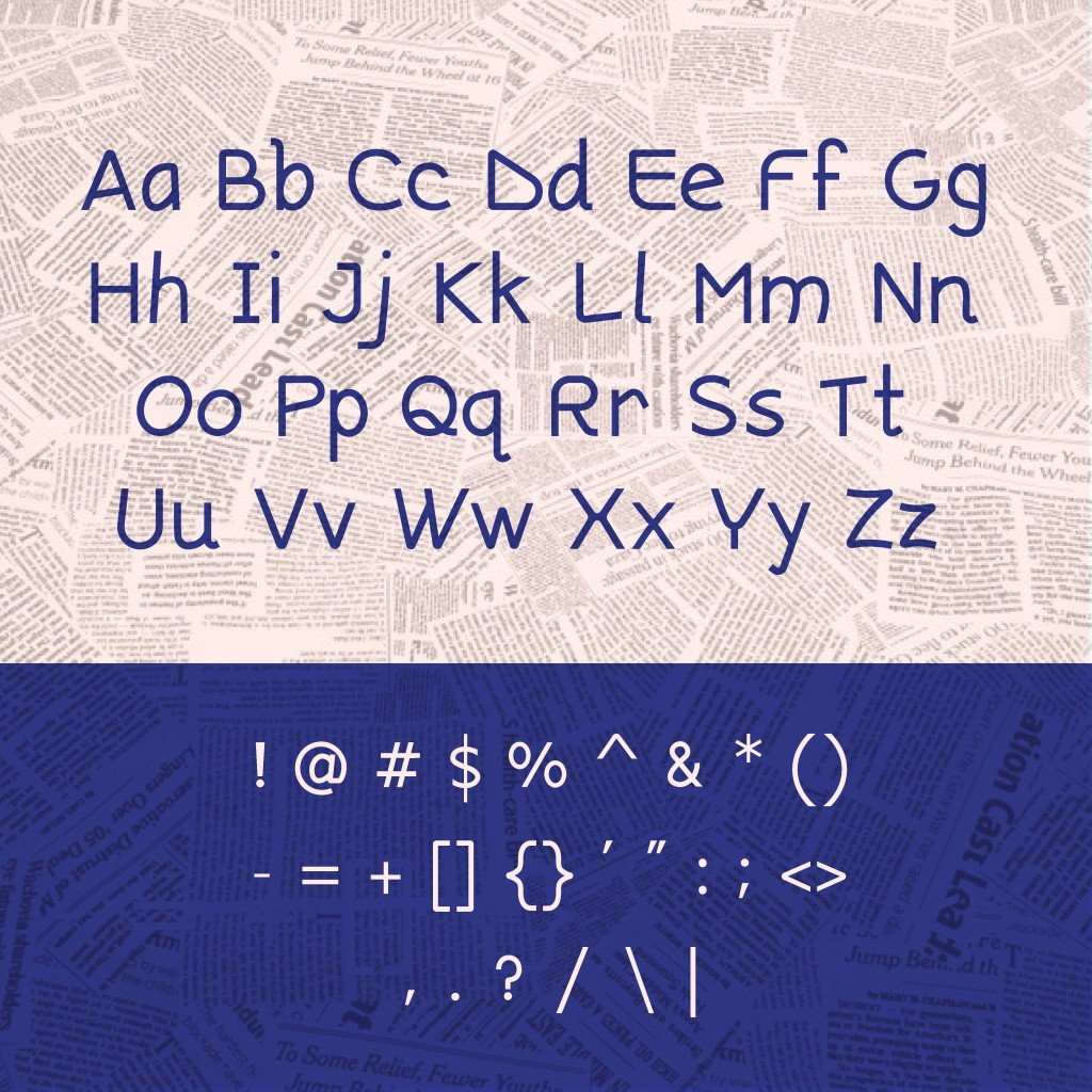
After studying how these three typefaces Sylexiad, Inconstant Regular and OpenDyslexic made similar letters distinctive, I set about altering the letterforms of Easyread with the knowledge gained. The next obstacle involved adjusting the side-bearings of the letterforms in FontLab and upon generating the typeface, to figure out how to present the features within the given size.


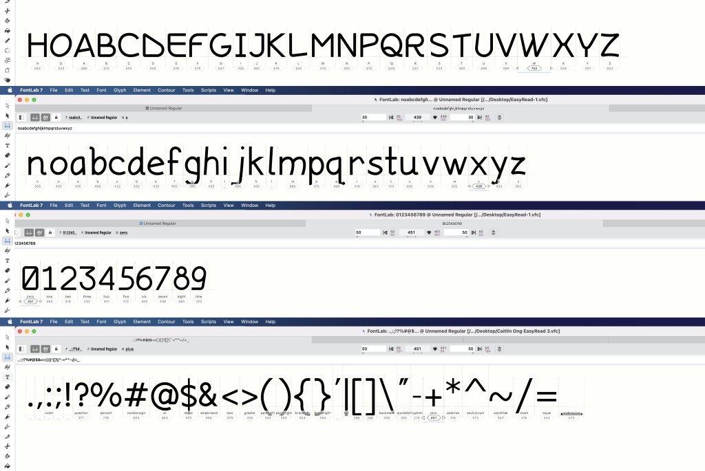
FontLab
I finally uploaded my font into Fontlab where I used the side bearing guide provided by Mr. Vinod. It is a very tedious task to adjust the side bearings of every single letter, punctuation, and numeral. Sadly, I did not get time to kern certain pairs due to the limited time remaining to finish work on the presentation and application.
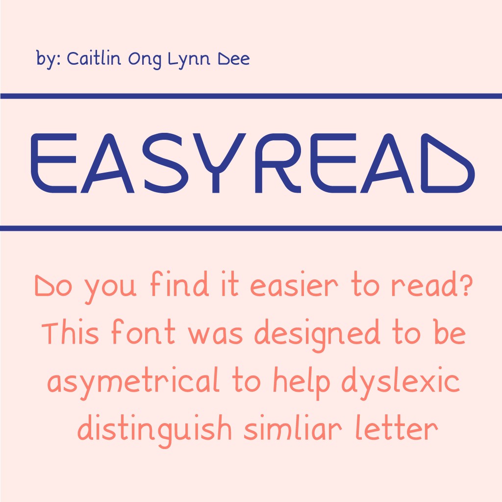
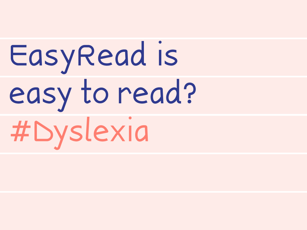
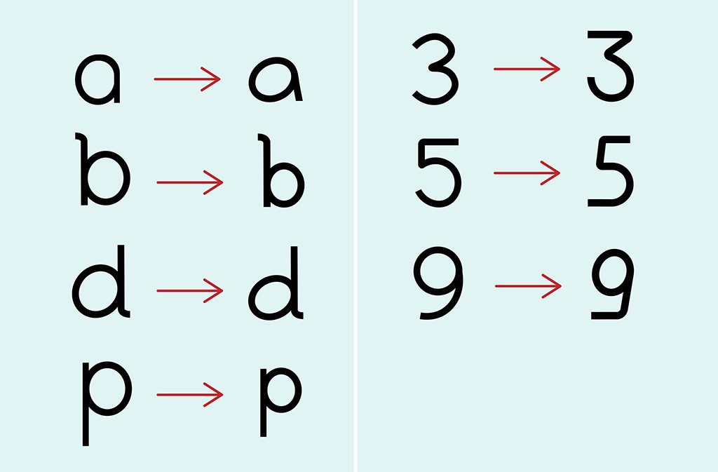
I named my font EasyRead simply because it is designed to be asymmetrical to prevent confusion of similar looking words and thus, easy to read.

Font Presentation & Font Application
I observed my friend’s work to get an idea of how to compose the layout for the presentation of the typeface. From there I went back to the drawing board, I picked a color scheme that is brightly lit and complete with pastel colors. The reason for the choice of colors is that dyslexics tend to be overwhelmed by tasks that involve texts, and a pastel color will help to ease their nerves. The concepts I produced for the font presentation are either based on my own life experiences or research information on dyslexia.
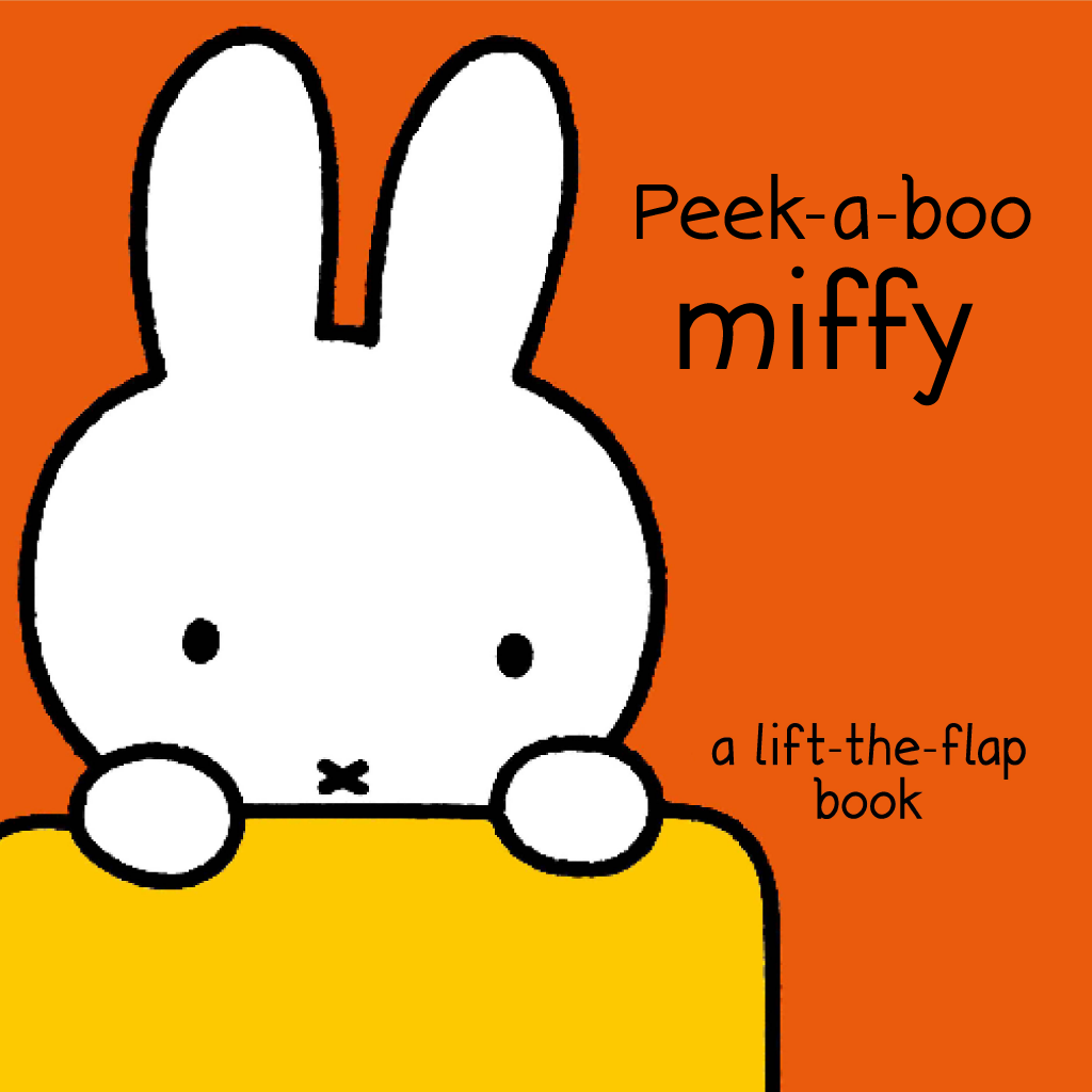
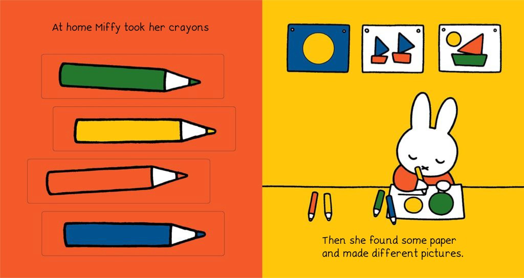
Mr. Vinod recommended I do a children’s book using my font. He suggested a book called Miffy. I followed his advice, replacing the existing font with my font.
Conclusion
It was a fulfilling experience since I was able create a mundane object that explored my inner turmoil. To me, I find it interesting to see others’ work that challenges principles that are considered the norm. The entire process took a lot of trial and error and I sometimes question myself to embrace the irregularity even for reasonable purposes.