

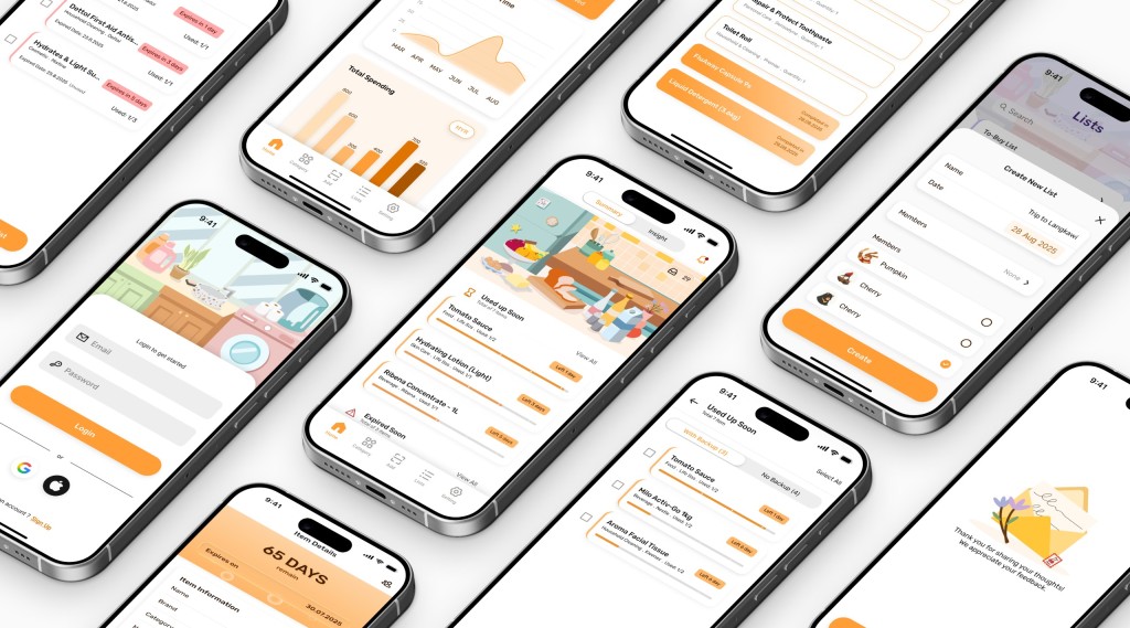

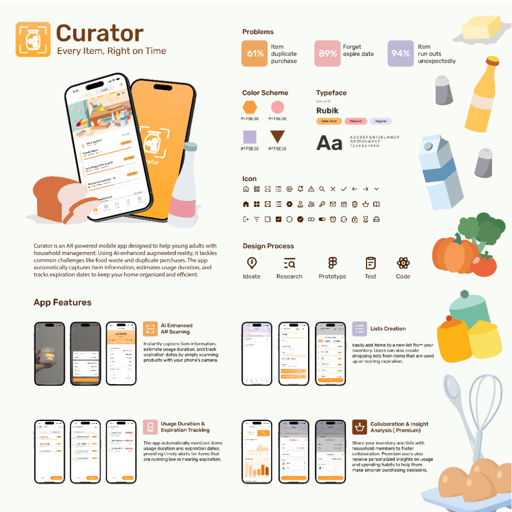
In my final year project, I developed an app called Curator, which uses AI-powered augmented reality (AR) to help people manage their inventory. The app estimates item usage duration and tracks expiration dates, with features for categorization, organization, and list creation. We’ve included premium features like collaborative tools and data analysis to create the revenue streams necessary to cover development costs.
When we start learning about UI/UX, we inevitably encounter the fundamental laws of user experience. But how do we effectively apply these principles in a mobile application? Through my experience developing Curator, I want to explore how I leveraged information hierarchy and visual design to build an engaging and intuitive user experience.
Information Hierarchy
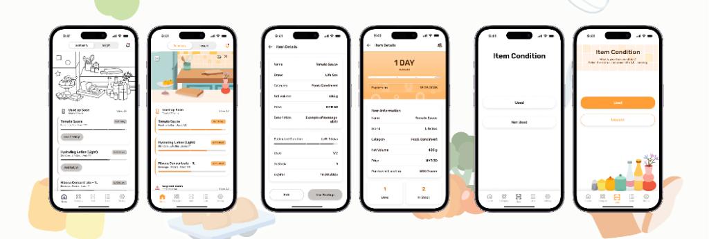
Management apps face a significant challenge: displaying a large amount of information without overwhelming the user. This is exactly where hierarchy comes in. I tackled this by organizing all the information into three distinct levels:
- Primary: The most important stuff—think expiration alerts and key actions that demand immediate attention.
- Secondary: The supporting details, like item categories and specifications, that provide context.
- Tertiary: The background information, such as timestamps and descriptions, that offer extra depth.
By assigning consistent font sizes, weights, and positions, I was able to guide users through the interface and help them instantly focus on what’s most important. A well-planned color scheme also reinforced this structure, making it easier for users to process information while reinforcing the app’s brand.

Visual Design and Animations
Visual design in UI/UX is about blending aesthetics with functionality to improve cognitive efficiency. Since the human brain processes visual information much faster than text, visual communication is incredibly powerful. The Aesthetic-Usability Effect demonstrates that users perceive well-designed interfaces as more usable.
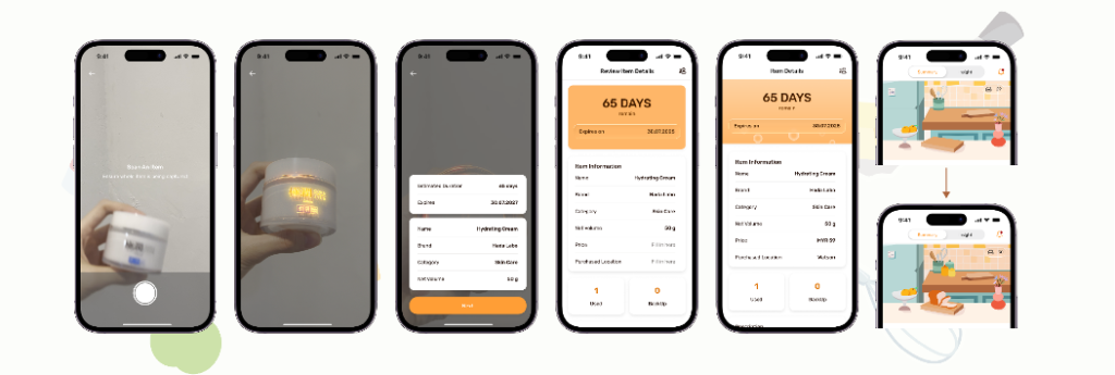
In Curator, every visual element is a cognitive shortcut. Icons instantly communicate categories, color-coding signals urgency, and the placement of items shows their relationships. This visual language reduces the mental effort needed to understand and navigate the app.
I also made sure to use thoughtful animations and micro-interactions to transform a functional app into a delightful experience. These small details serve three key purposes:
- Purpose-Driven Messaging: Every animation has a reason for being there, whether it’s confirming a loading state, a successful action. For example, animations on the onboarding screen engage new users and highlight key features.
- Visual Language: Subtle animations often convey messages more effectively than text. In the app, after a user adds 10 items, the homepage illustration performs a small pop-up animation. This visual cue helps the user understand that their inventory is growing and needs to be managed.
- Contextual Feedback: They give the user the right feedback at the perfect moment. When someone adds an item to their list, a smooth transition with subtle feedback “Added to List” confirms the action and keeps the user in flow.
The most important takeaway is that UX laws are not rigid rules. They’re flexible principles you can adapt to solve unique problems. By focusing on a strong hierarchy, clear visual communication, and purposeful animations, we can transform a complex chore like inventory management into an engaging and efficient experience that users will actually want to come back to and enjoyable to use.
Developing with React Native
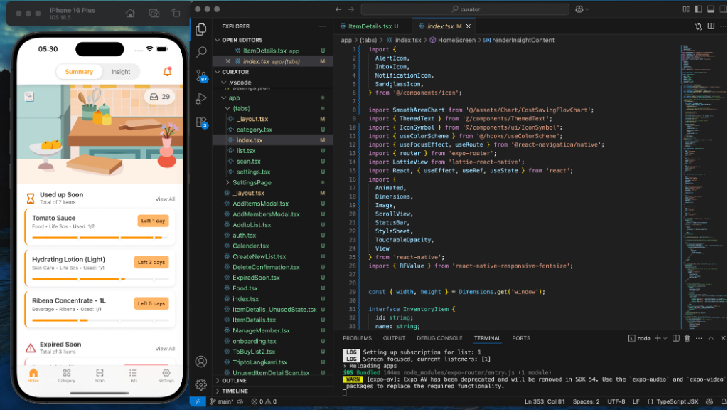
By transforming the prototype into a functional app (front-end), I chose to use React Native. This is kind of innovative as in the previous semester no one had try this before. While I initially considered using a no-code tool like FlutterFlow, my desire to create a truly mobile app that perfectly matched my prototype led me to a more flexible solution. In the journey of research and experimenting through several platforms, I finally found React Native with Expo Go recommended by AI as a beginner-friendly option. Expo Go allowed me to run the project on both Android and iOS, aligning perfectly with the goal of developing collaborative features across different devices.
First, you will need visual studio code and open the terminal. Write a prompt to AI to show the step for installing required tools. By setting up the environment, it started with a project that the file is fully created properly. With the basic knowledge of html and css, I’m able to navigate the project files and find the display of the context on screen. All the assets and components are being stored in the project files accordingly, and being called out in tsx files when the assets are being used. For a responsive UI, SVG files were preferred for icons because they are vector-based and can be resized without losing quality. I even used AI to convert downloaded PNGs to SVG format and stored them into the tsx files. This allows the icon to change color and size easily without pixelatex. Similarly, I created dedicated files for custom typefaces to ensure brand consistency across the app.
Example:
const styles = StyleSheet.create({
default: {
fontSize: 16,
lineHeight: 24,
fontFamily: ‘Rubik-Regular’, // Primary typeface
},
});
Container:
HTML: <div></div>
React Native: <View></View>.
React Native shares a similar syntax to HTML and CSS, but their outcomes differ—HTML is for web pages while React Native is for native mobile UIs. I also used JavaScript to perform key functions like page navigation and animations.

For anyone starting with React Native, I have some advice: Don’t hesitate to start over if your code is full of errors. Sometimes there is a conflict between the “const” that couldn’t be found by AI and yourself. So to save your time, start over and give a more detailed prompt to AI to build a better framework. The prompt given can be simple but must be detailed. I recommend using different AI platforms for different tasks, like writing code from scratch with Claude and debugging with Gemini, can also improve efficiency. As long as you review all the code given by AI, you will be more familiar with the framework and easily find the errors by yourself.
Since React Native is a mature language, any specific demands—like responsive font sizes (using RFValue) or linear gradients—can be found in the community on sites like GitHub and Quora.
Remember to test all existing functions whenever you add a new one, and always back up your project at the end of the day.
My gratitude is immense for having the belief in myself to pursue this project, to trust my research and execution skills, and to take the leap into something new. I’m also deeply grateful to everyone who contributed to this app, making the journey a smooth one. Receiving positive feedback at exhibitions and knowing that the app genuinely solves real-world problems has been incredibly rewarding.
Figma prototype: here