


The book focuses on bipolar disorder, but I did not want it to feel like a medical textbook. Bipolar disorder is often described through symptoms, definitions, and clinical explanations. While these are important, I wanted my book to focus more on the emotional experience behind the condition. I wanted to ask: what does it feel like when emotions become too intense to control? What happens when confidence turns into collapse? What remains when a person is not only their highs or their lows?
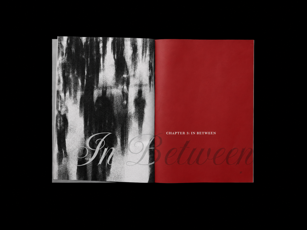
The title *Between Highs and Lows* became the foundation of the whole project. It suggests movement between two emotional extremes, but it also points to the uncertain space in between. The book is divided into three chapters: *The High*, *The Fall*, and *In Between*. Each chapter represents a different emotional stage. *The High* explores mania, where everything feels possible and energy feels endless. *The Fall* presents the sudden collapse into depression, where motivation disappears and even simple tasks can feel impossible. *In Between* focuses on stability, uncertainty, and identity.

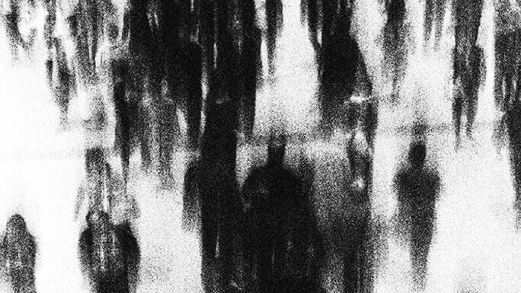
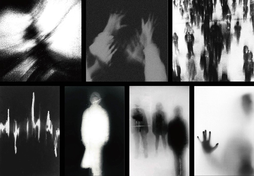
One of the most important parts of this project was building a visual language that could express these ideas without becoming too literal. I chose black-and-white grainy imagery, blurred figures, shadowed faces, and distorted human forms. I did not want to illustrate bipolar disorder in an obvious way. Instead, I wanted the images to feel abstract, uncomfortable, and emotional. For me, a blurred figure can sometimes say more than a clear portrait. It suggests instability, disappearance, pressure, and the feeling of not fully knowing where the self begins or ends.

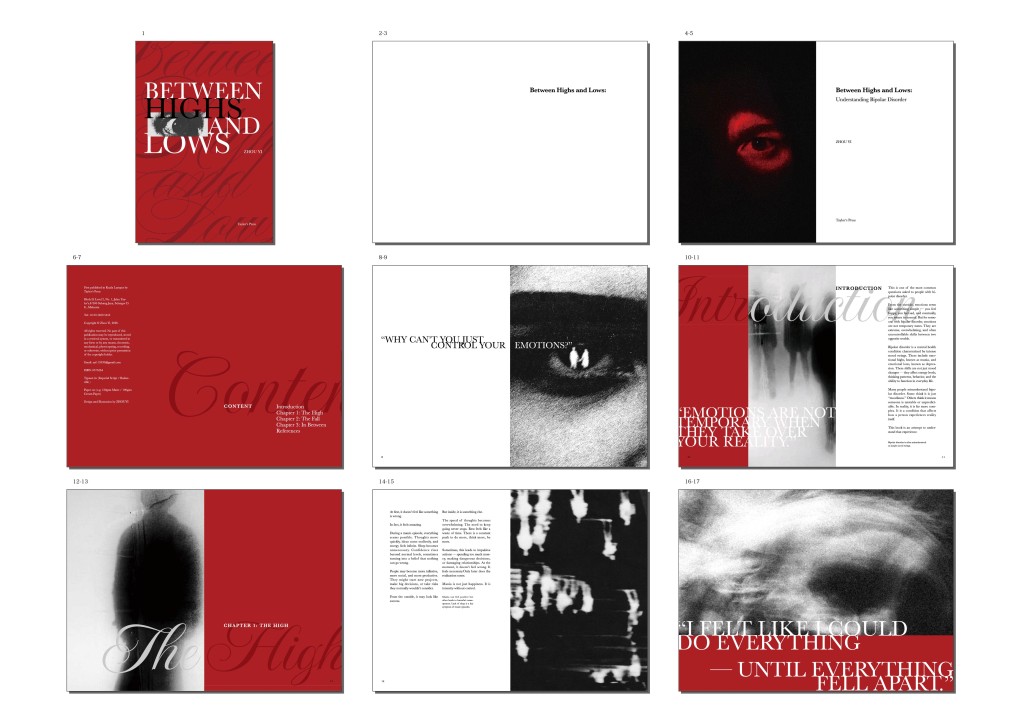
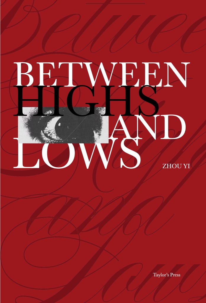
The cover was the first place where I needed to bring the whole visual system together. I used a strong red background, large serif typography, a black-and-white eye image, and script typography as texture. Red was chosen because it carries emotional intensity. It can feel powerful, dangerous, passionate, and unstable at the same time. The title *Between Highs and Lows* is arranged with strong black-and-white contrast, showing the conflict between the two emotional states. The eye in the centre adds a sense of being watched and misunderstood. It suggests that bipolar disorder is not only about what a person feels inside, but also about how they are seen by others. The large script typography in the background becomes a visual texture, creating a feeling of repetition and emotional movement.

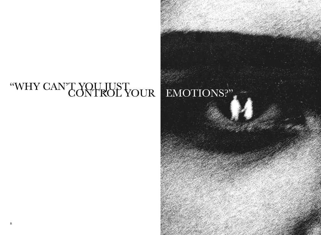
One of the spreads that best introduces the tone of the book is the page with the question: “Why can’t you just control your emotions?” This question is direct and uncomfortable. It represents a common misunderstanding towards people with bipolar disorder, as if emotions are something that can simply be switched on or off. In the spread, I placed a large amount of white space on the left and a grainy black-and-white eye image on the right. The sentence stretches across both pages, forcing the reader to move visually from silence into pressure. The white space creates emptiness and discomfort, while the eye creates tension and judgement. I wanted this spread to feel like being questioned, watched, and misunderstood at the same time.

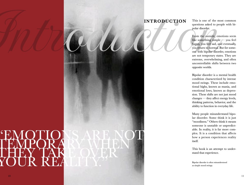
Typography played a major role in creating this emotional tension. For the body text, I used Baskerville because it is readable, calm, and suitable for long-form reading. For expressive titles and visual type, I used large serif typography and Imperial Script. The serif type gives the book a strong editorial voice, while the script type adds movement and emotional softness. Together, they create a contrast between structure and instability. This contrast became important because the book itself moves between explanation and emotion.
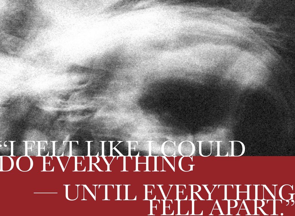
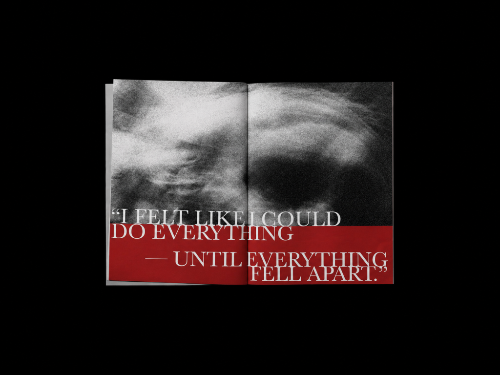
Another key spread is the one with the quote: “I felt like I could do everything — until everything fell apart.” This spread belongs to *The High*, but it also hints at the collapse that follows. The upper part uses a blurred black-and-white face, creating a sense of motion, speed, and mental overwhelm. The face is not clear because mania in the book is not shown as simple happiness. It is shown as intensity without control. The lower part of the spread uses a heavy red block, making the page feel visually weighted. The typography is oversized and partially cropped, almost too large for the page. This was intentional. I wanted the words to feel as if they were taking over the space, just like the emotional high takes over reality. The spread starts with confidence, but the red weight underneath suggests that something is already beginning to break.
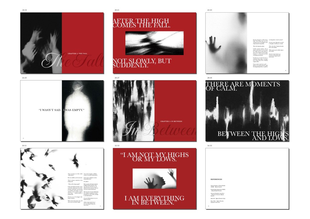
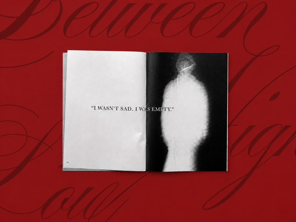
In contrast, the spread “I wasn’t sad. I was empty.” uses a quieter composition. This page is one of my personal favourites because it shows that emotional intensity does not always need to be loud. The left side of the spread is mostly empty white space, while the right side shows a ghost-like blurred figure. The quote sits across the centre, simple and direct. I wanted the emptiness to be felt through the layout itself. Instead of filling the page with many elements, I allowed the white space to speak. The figure on the right looks almost erased, representing numbness, disconnection, and loss of identity. This spread is about depression, but I did not want to show sadness through tears or dramatic facial expressions. I wanted to show absence.
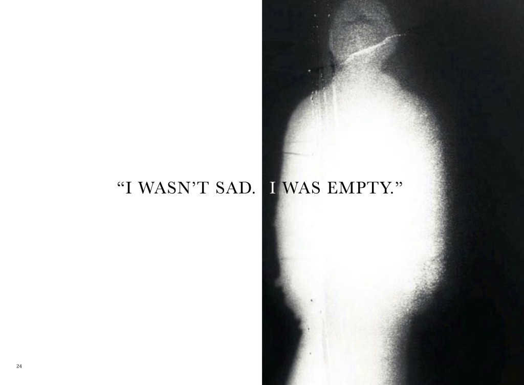
The book also presents selected moments from the written content through expressive spreads.

After completing the printed book, I extended the project into a short promotional motion graphic. The video uses the same visual language as the book: red and black contrast, grainy images, large typography, glitch sounds, typing sounds, and page-turn effects. It begins with the question “Why can’t you just control your emotions?”, moves into *The High*, then shifts into *The Fall*, and ends with the book cover. Creating the video helped me see how a printed publication can continue into a digital space while maintaining the same identity.

Throughout this project, I learned that publication design is not just about arranging text and images. It is about controlling rhythm, hierarchy, emotion, and material. It is about deciding when a page should feel loud, when it should feel quiet, and when it should leave space for the reader to feel something.
*Between Highs and Lows* became a project about emotional contrast, but also about identity. I did not want the book to define a person by their condition. I wanted it to show that there is still a person living between the extremes. In the end, this book is not only about the highs or the lows. It is about everything in between.