


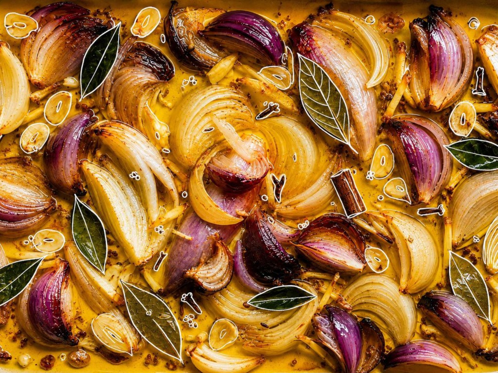
Mine began with a sentence I had heard growing up:
“Indians smell like curry.”
It was a phrase people often said without much thought. While it may have sounded harmless to some, it always made me wonder why an entire culture, its people, and its rich culinary heritage could be reduced to a single sentence. Curry became a label rather than a celebration of diversity. That question stayed with me for years, and when it came time to develop my publication design project, it became the inspiration behind the title of my book: Not Just Curry.
Despite the title, the publication was never intended to argue against that stereotype alone. Instead, it became an opportunity to tell a much bigger story, one about family, tradition, identity, and the memories attached to every meal. Rather than focusing on the misconception itself, I wanted to shift the conversation toward what Indian food truly represents: love, culture, history, and togetherness.
As a Creative Media student, I wanted to create a publication that combined editorial design, photography, and storytelling in a meaningful way. Many food books focus on recipes, measurements, and cooking techniques, but I wanted to take a different approach. I was more interested in the stories behind the dishes than the instructions for making them. Instead of asking readers to recreate a meal, I wanted them to understand why those meals mattered in the first place.
Growing up, food was never simply something to eat. Every meal represented time spent with family. Dinner was when everyone gathered after a long day, sharing stories while passing dishes around the table.
A typical meal at home wasn’t centred around one “main” dish. Rice would sit in the middle, surrounded by a variety of dishes such as rasam, dhal, vegetables, curries, and fried snacks, each bringing its own flavour, colour, and texture. Individually they were simple, but together they created a complete dining experience.
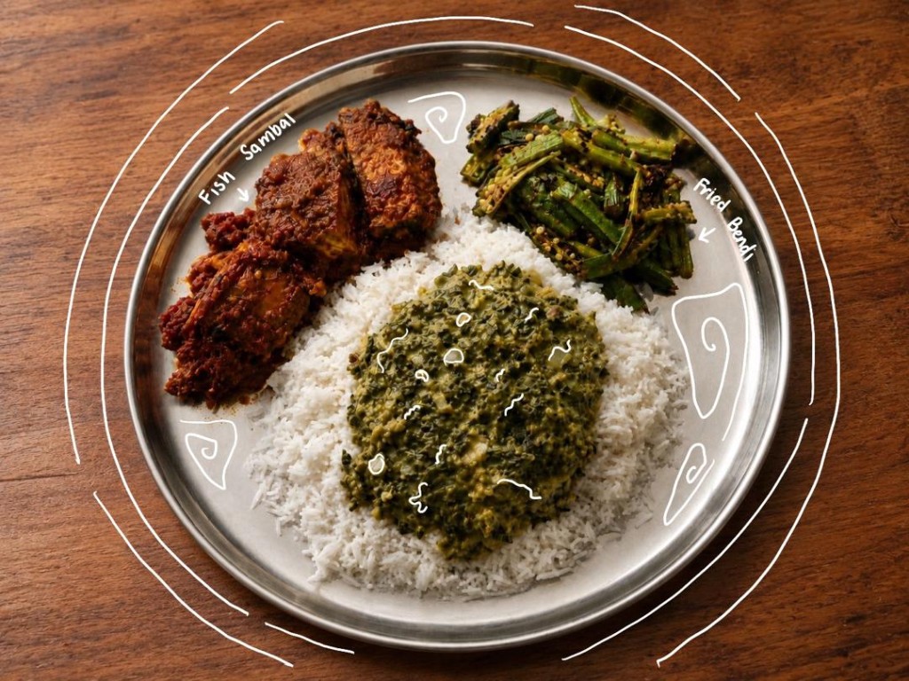
Those everyday moments became the foundation of my publication.
As I began writing, I realised this project was becoming far more personal than I had originally expected. I wasn’t simply describing food; I was documenting memories that had shaped my childhood. Every chapter reminded me of conversations with my family, especially the stories my father shared about growing up in a farming family. He often spoke about appreciating whatever food was available and how every meal was prepared with care rather than convenience. Listening to those stories made me appreciate how closely food is connected to gratitude, hard work, and family values.
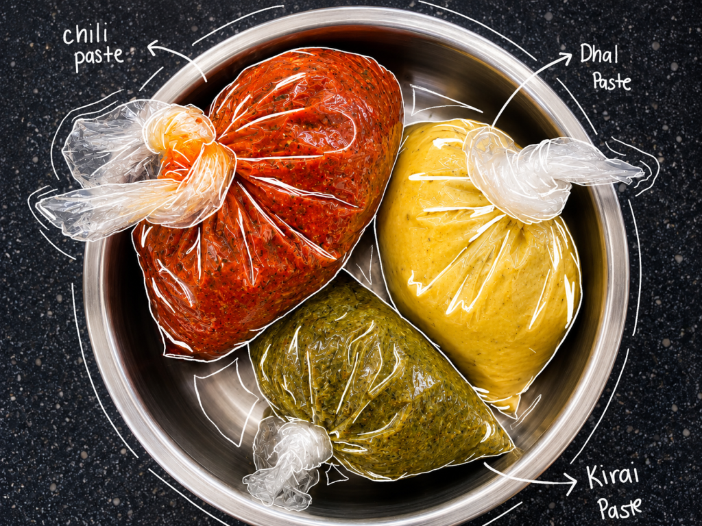
Simple dishes such as rasam, keerai kadayal, dhal, and vadai transformed into symbols of something much larger. They were no longer just recipes or traditional Indian meals, they represented generations of family traditions that had quietly been passed down over time. They reminded me that culture is often preserved in the smallest everyday routines, whether it’s preparing a favourite dish, eating together, or sharing stories across the dinner table.
One of the creative decisions I made early in the writing process was to write entirely in my own voice. Instead of producing formal descriptions similar to those found in cookbooks or history books, I wanted the publication to feel personal and approachable. I imagined readers sitting across from me while I introduced them to the meals I grew up with. That meant allowing humour, personal observations, and even small childhood memories to become part of the narrative. This conversational style became one of the strongest aspects of the book. Rather than presenting Indian cuisine as something distant or educational, it invited readers into my family’s home. Whether they were already familiar with Indian food or discovering these dishes for the first time, I wanted them to feel welcomed instead of overwhelmed by unfamiliar names or ingredients.

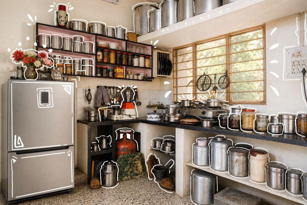
Photography became just as important as the writing. Every image featured in the publication was photographed by me, allowing complete creative control over how each dish was presented. Instead of relying on stock images or heavily styled commercial photography, I wanted every photograph to feel authentic. I carefully arranged each dish, experimented with lighting, and focused on highlighting the natural colours, textures, and details that make Indian food visually distinctive.
Food photography taught me that presentation is not simply about making something look attractive. Every decision, from camera angle and composition to props and lighting, changes how readers emotionally respond to an image. Warm lighting created a welcoming atmosphere, while carefully chosen backgrounds helped reinforce the feeling of home rather than a professional studio. I wanted readers to look at the photographs and imagine sitting down to share the meal themselves. Alongside photography, editorial design played a significant role in shaping the reader’s experience. Throughout the project, I carefully considered typography, page layouts, spacing, image placement, and visual hierarchy. These decisions may seem small individually, but together they determine how comfortably readers move through a publication.

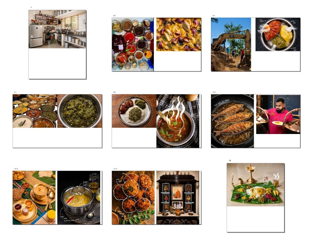
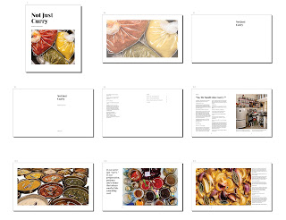
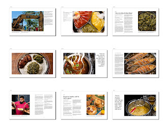
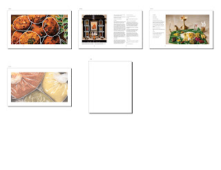
I quickly realised that designing a book involves much more than arranging text and images on a page. Every design decision contributes to storytelling. The pacing of each chapter, the balance between photographs and written content, and even the amount of white space all influence how readers absorb information and connect with the narrative. Sometimes the most effective design choice was not adding more elements but allowing the content room to breathe. Working through multiple drafts also taught me the importance of revision. Some layouts looked visually impressive but distracted from the writing. Others contained beautiful photographs but interrupted the flow of the story. Refining these details required patience, experimentation, and constant feedback. Each revision strengthened not only the publication itself but also my understanding of editorial design as both a creative and problem-solving process.
Throughout the project, I discovered that publication design is about creating an experience rather than simply presenting information. Readers don’t only see a book, they interact with it. They notice how pages flow, how images support the narrative, and how typography guides their attention. Every design choice influences how they feel while reading. More importantly, this project showed me that design has the power to preserve culture. A publication does not have to teach recipes to celebrate food. It can capture conversations, traditions, family values, and everyday moments that might otherwise disappear with time. Stories shared around the dining table deserve to be documented just as much as historical events because they form part of our personal and cultural identity.


Looking back, Not Just Curry became much more than a university assignment. It challenged me to think differently about storytelling, strengthened my skills in editorial design and photography, and encouraged me to see familiar experiences through a new perspective. It reminded me that some of the most meaningful stories are often the ones we experience every day but rarely stop to appreciate.
Creating this publication also changed the way I think about design itself. Before beginning the project, I viewed design primarily as a visual discipline focused on aesthetics and communication. By the end, I understood that design can also preserve memories, challenge stereotypes, and create meaningful emotional connections between people and stories even if it means getting a B+. Good designs does not simply make information look attractive, it gives that information purpose, context, and lasting impact.
If readers finish Not Just Curry with one lasting thought, I hope it is this: behind every meal is a story, behind every family recipe is a memory, and behind every culture is far more than a stereotype. Food is not simply something we eat. It is a language of love, identity, and belonging that deserves to be shared, understood, and celebrated.