
“Solve a real-world typographic problem?!” The task sounded very intimidating.
Usually, we would be assigned projects that work directly with our creativity, however, this time we were to pay close attention to our surroundings in order to find a creative solution that solved an issue we had identified.
Doubts and confusion surrounded me during the first week. My ideation process lasted several days without much visible progress. Tired of replaying the same thoughts, I realized I needed to change. By detaching my mind from the busy surroundings, I explored my past experiences and finally recalled the problems I have encountered during my early times of my internship in Laos.
At that time, I’ noticed lots of people, including myself, struggling to find brush script typefaces in the Laotian language. I discovered a disappointing truth, there weren’t any well designed Laotian brush script typefaces available on the internet. The inconvenience has caused a degree of sacrifice in terms of the aesthetics of graphic design in Laos. This problem offered me a challenge.
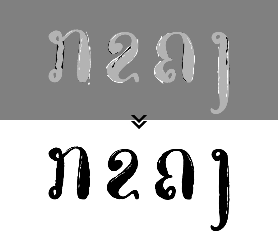
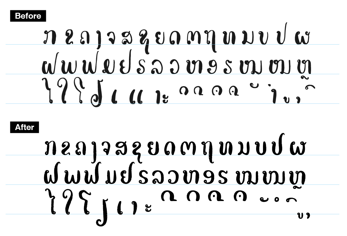
During the early stages of the idea implementation process, I prepared all the letters on paper with pen and ink. The first few attempts didn’t succeed as the strokes of the letters were lacking contrast. It was challenging to create a huge letter stroke contrast with the pen I was using. On the other hand, while trying to use a more reliable tool, the brush, I found it was difficult to control the round strokes that were present in each of the Laotian consonants. However, after several rounds of practice, I rewrote all the consonants again with a small brush and produced better than expected results. Despite the lack of letter contrast that the small brush offered, I proceeded to digitally modify the strokes in Adobe Illustrator.
The digital refinement process for individual letters was broken down into a few steps. To obtain a desired appearance of a letterform, a manual refinement had to be made with the direct selection tool along with support from the smooth tool. To match the letter contrast of the vertical strokes, I extracted certain shapes from different letters to join them to others with similar characteristics. The same techniques were repeated for each letter in order to achieve a consistency in letter width throughout all the consonants and symbols.
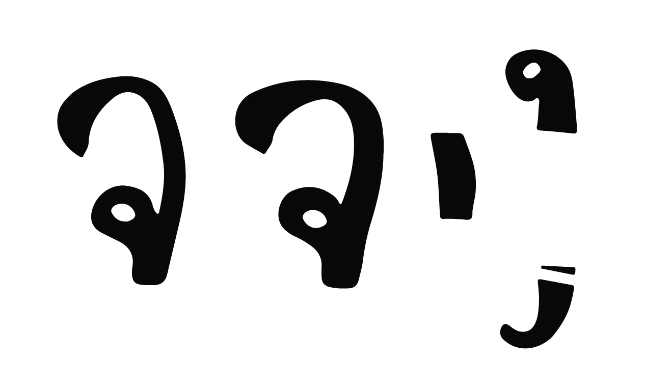
The puppet tool was mainly utilized to shape and refine letters due to its flexibility in bending shapes and creating curves that were mostly present in Laotian consonants. Again, to make sure that the letter width of all letters was consistent, blocks of the same size were used.
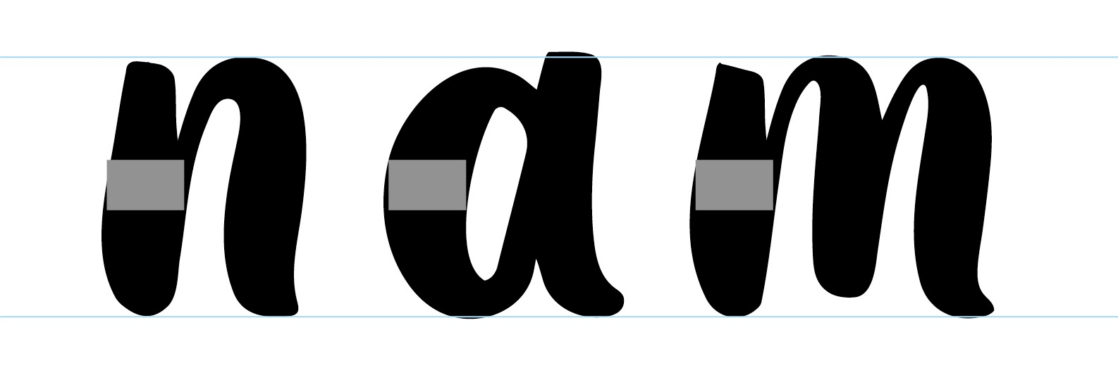
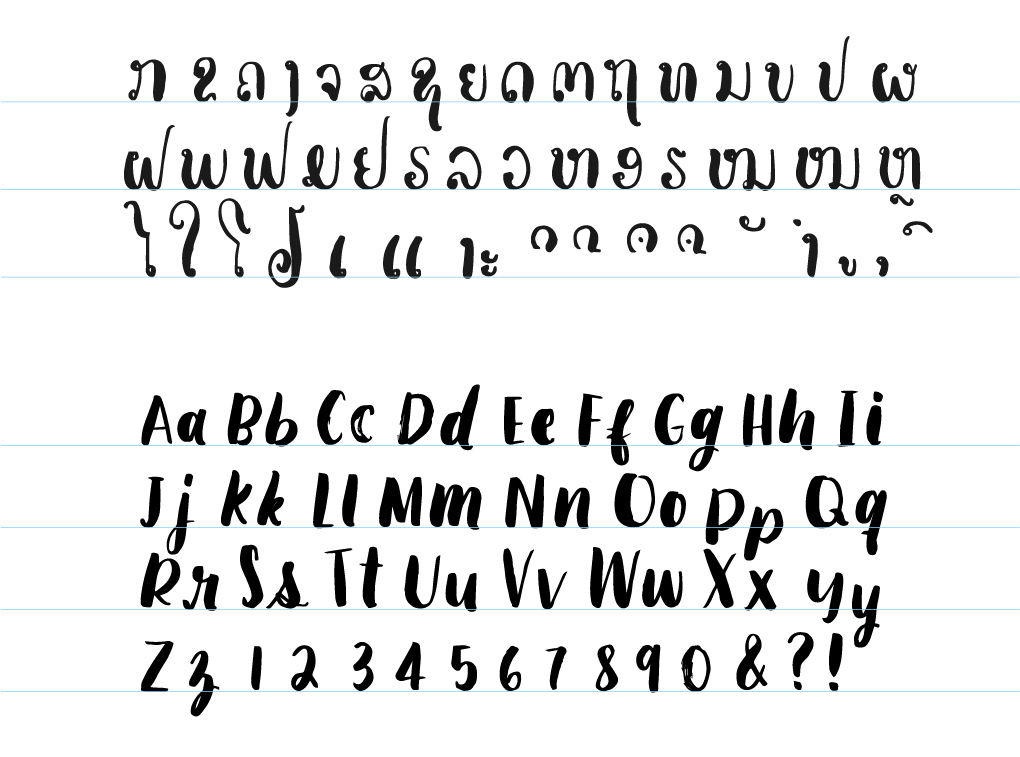
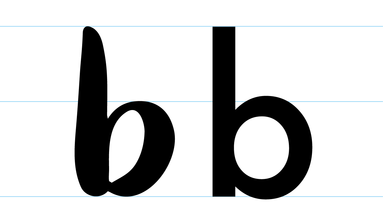
Once all of the alphabets were ready, I started aligning them to the baseline and its x-height, ascender and descender. To get the proportion and shapes right, I used the typeface Futura Std as a benchmark for the letters. I chose Futura due to its extended ascender that is higher than standard typefaces.
The final step in completing the letter digitization in Adobe Illustrator was to texturize the type. The process of texturization first starts with a “base” layer of texture, this was achieved by using Illustrator’s brush preset to create a minimal and rough texture all around the letters.
The main layer of texture was then added manually by the “traced shapes” I had prepared with the pen tool.
With the shape builder tool, I closed all unnecessary vector gaps. This is a preparation for the final letter generation in Fontlab.
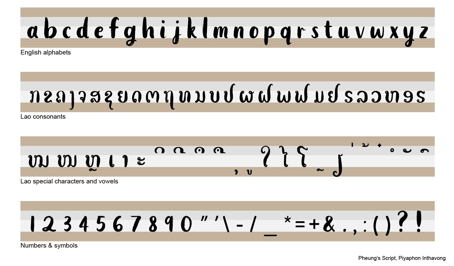
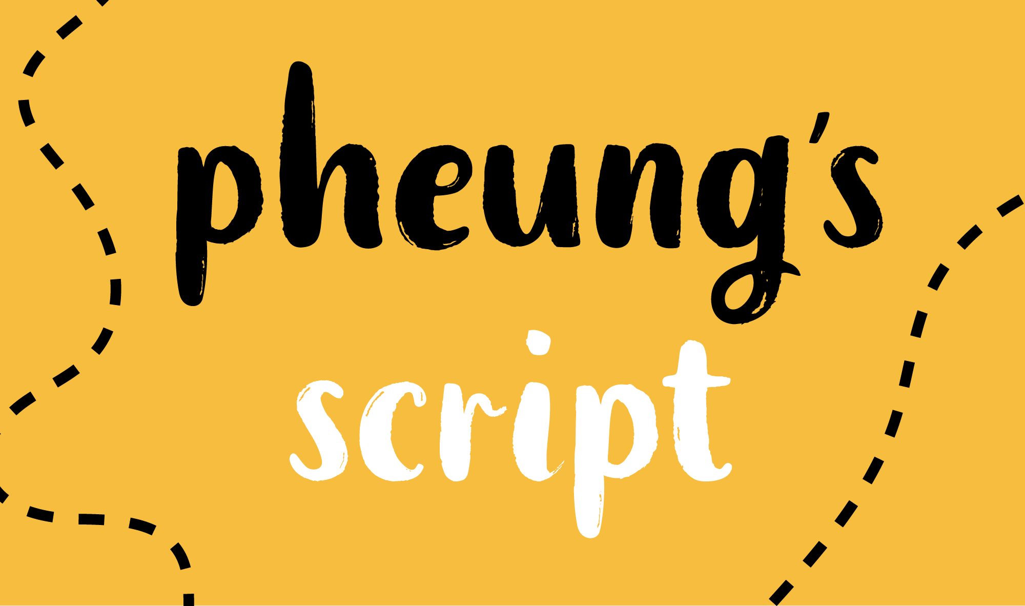
Pheung’s Script is a brush script typeface inspired by one of my respected relative’s informal calligraphic style. The word “pheung” means bee, and so the theme follows. This typeface is ideal for title purposes such as name tag, handwritten quotes, product packaging, merchandise, social media, greeting cards, etc. The script can be downloaded here.


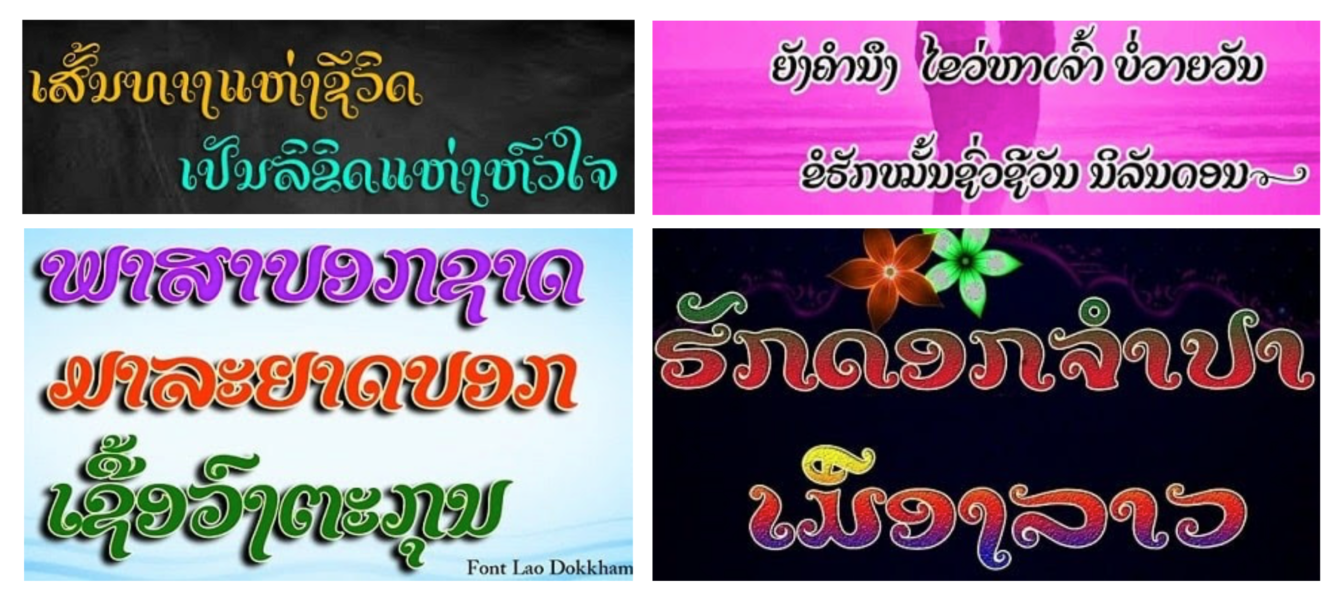
(Above) The Pheung’s (brush) Script typeface used as informational guide for travelers in Laos. ?? Design applications by © Piyaphon Inthavong, 2020.
Dope homie