

The Origin of Inspiration: A Childhood Fascination
This early interest was rekindled during the advanced typography class, this year when one of the lecturers introduced various historical scripts. Although the lecture did not mention the Mayan civilisation, it reminded me about my curiosity of this ancient culture. I then decided to channel this interest into creating a Mayan-inspired experimental typeface for my final assignment where we were required to create a complete font set. The task allowed us to either design a font that solved a larger problem, improve or expand existing letterforms, or create an experimental typeface with a unique approach.

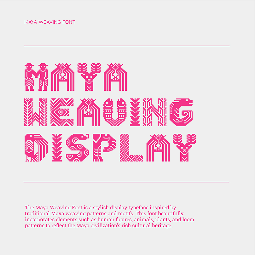
The Mayan civilisation had a complete writing system, but the glyphs are very different in shape, usage, and pronunciation from Latin scripts, making them challenging for this project. Instead, I approached the project from an aesthetic direction by taking inspiration from the weaving patterns found in Mayan textiles. The challenge was to combine these traditional motifs and patterns into the structure of Latin letters to create a visually engaging and culturally rich typeface.
Visual Research
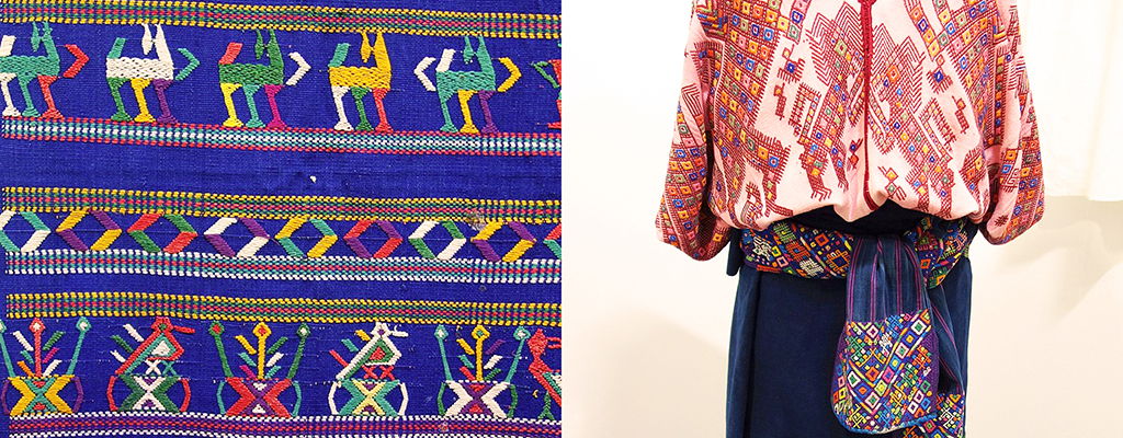
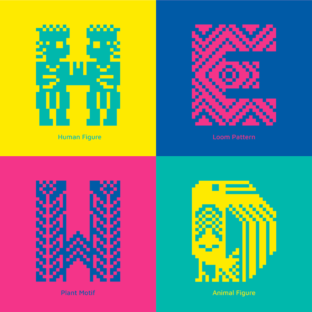
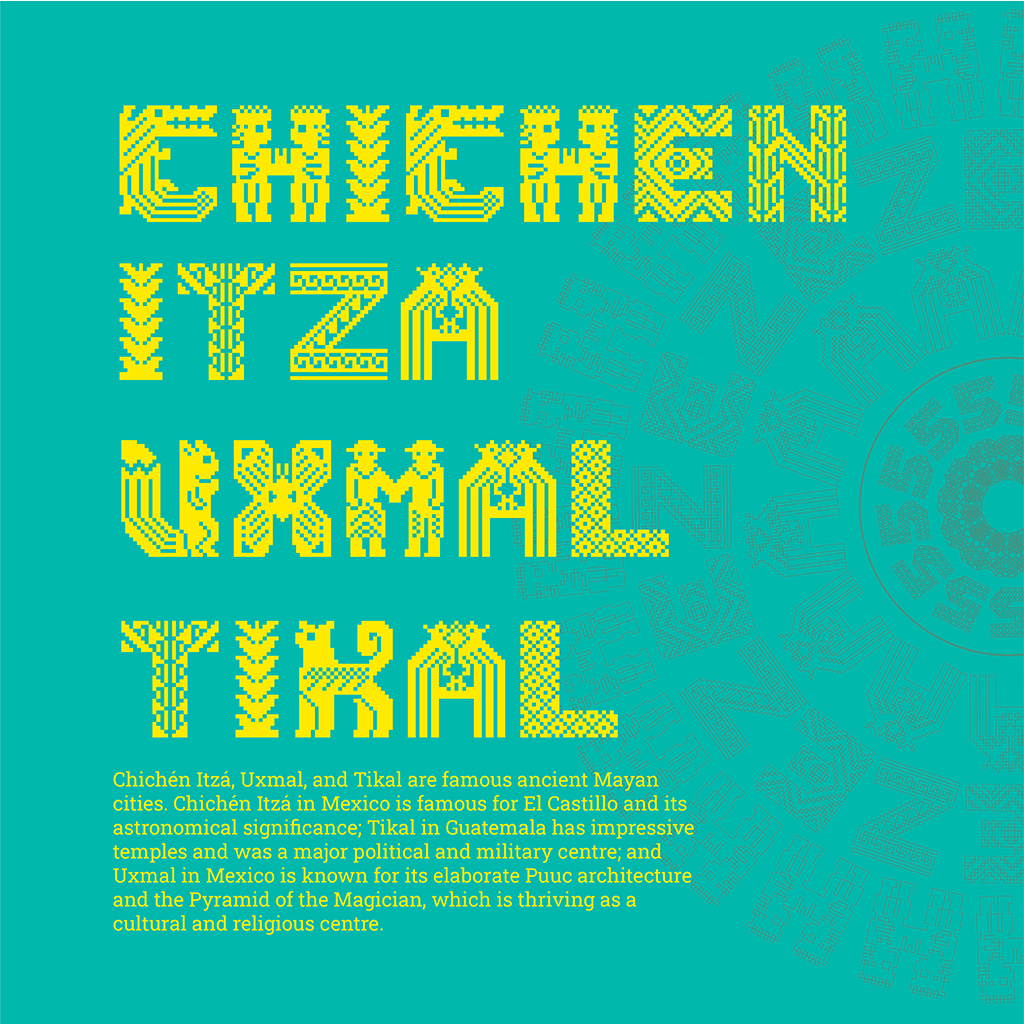
I began my design process by conducting plenty of visual research. Fortunately, a wide range of information about Mayan art and culture is available online. I discovered that Mayan textiles have a variety of motifs where birds were the most common. Other motifs included plants such as corn and trees as well as animals that included crocodiles, snakes, and bats. Human figures, deities, and ancestral spirits are also found. These motifs were designed along with a variety of totems and symbols such as zigzag patterns and star- or diamond-shaped designs.
Textile patterns from various cultures can be difficult to distinguish from one another because of similar weaving techniques and motifs. This can be seen in the cases of Maya and Aztec designs since they are both Mesoamerican. As I looked further, I noticed that diagonal shapes are frequently used in Mayan designs, even their animal figures.

From Sketch to Digital Design
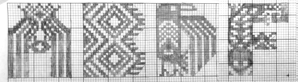
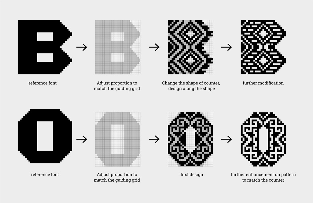
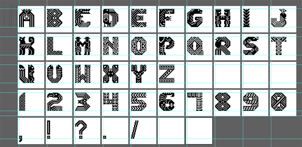
I started the design process by drawing alphabets on graph paper, giving each letter a 25 to 30 relationship. I had to create the patterns inside the letter shapes which was a true test to my creativity and imagination. Some of the classic Mayan patterns did not resemble real animals so I created designs that ensured the figures were recognisable to the audience without losing the characteristic Mayan motifs. I hard-linked the similar, overall shape of possible figures with the shapes in the Latin alphabet that I built it in my mind, and then sketched it out. As I grew more comfortable with the design process, I worked directly in Adobe Illustrator where I could refine and explore my ideas more efficiently. I first focused on animal and human figures which required precise and thoughtful design due to their complexity compared to loom patterns and plant motifs. The limited space within the grid required careful management of positive and negative space to maintain clarity and detail.

Solving Creative Block
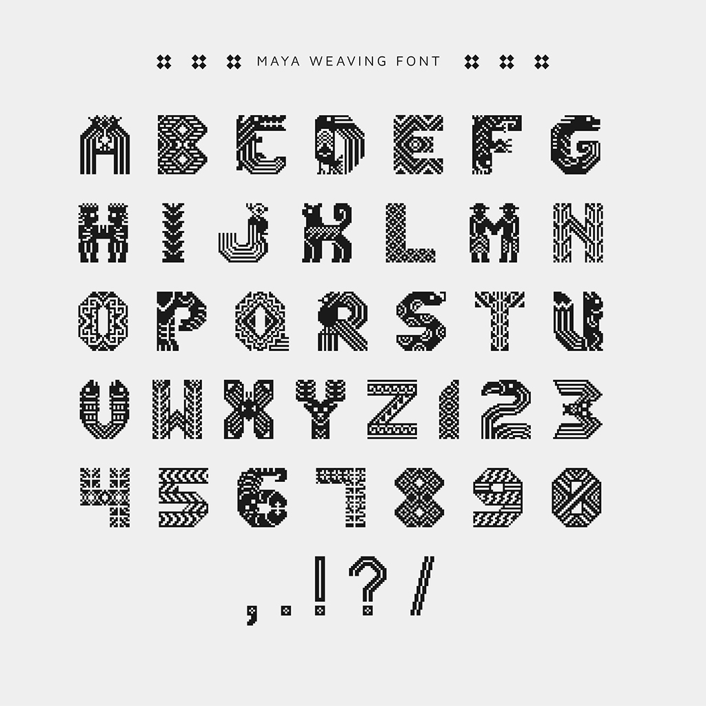
The design process became slower when I hit a creative block. My early ideas had mostly been used, and I found myself struggling for new ideas on the remaining letters. To overcome this, I looked for additional inspiration online. There were more nature figures that might not appear on textiles but can be found in Mayan zodiacs and ceramics, allowing me to infuse my typeface with more authentic cultural elements. The final letterforms are based on four main elements: animals, human figures, plant motifs, and loom patterns. Each letter went through multiple revisions to achieve a balanced, concise, and harmonious look. The process required continuous trial and error, with several variations and failed attempts throughout the way.

Tiny details significantly affect the design. A letter’s counters affects the negative space and overall shape of the letter. Due to this constraint, I designed some of the letters based on their counter. Another concern is that an odd number of columns made the design asymmetrical, so I had to modify my design accordingly to achieve symmetry.

Finalising the Font
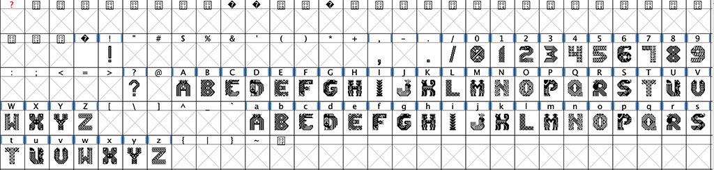
After all designs were done, they were transferred into FontForge, a free type construction application. This was my first time using such a tool, I followed TechRuzz Tutorial to learn the process. This tutorial provided detailed guide from exporting files from Illustrator, importing and then adjustments in the kerning process and exporting file. The process began by placing each letter on a 1000 pt x 1000 pt art board in Illustrator and exporting them as SVG files.

FontForge has default descender and ascender heights of 200 pt and 800 pt respectively. Each letter was imported into FontForge, ensuring the “scale to fit” option was unchecked to preserve original proportions.
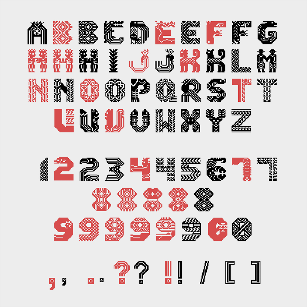
Once imported, adjustments were made to align each letter on the baseline. Auto-width was activated and 40 pt side bearings were added for balanced spacing. The last task involved pair kerning, this process took a lot of time. I wish there were a quicker way to do it, though it is what designers do. Finally, I exported the typeface as a TTF file. There are a total of 26 uppercase letters, 10 numbers from 0 to 9, and 5 punctuation marks included in Maya Weaving Font, each with unique designs.

Font Presentation and Application
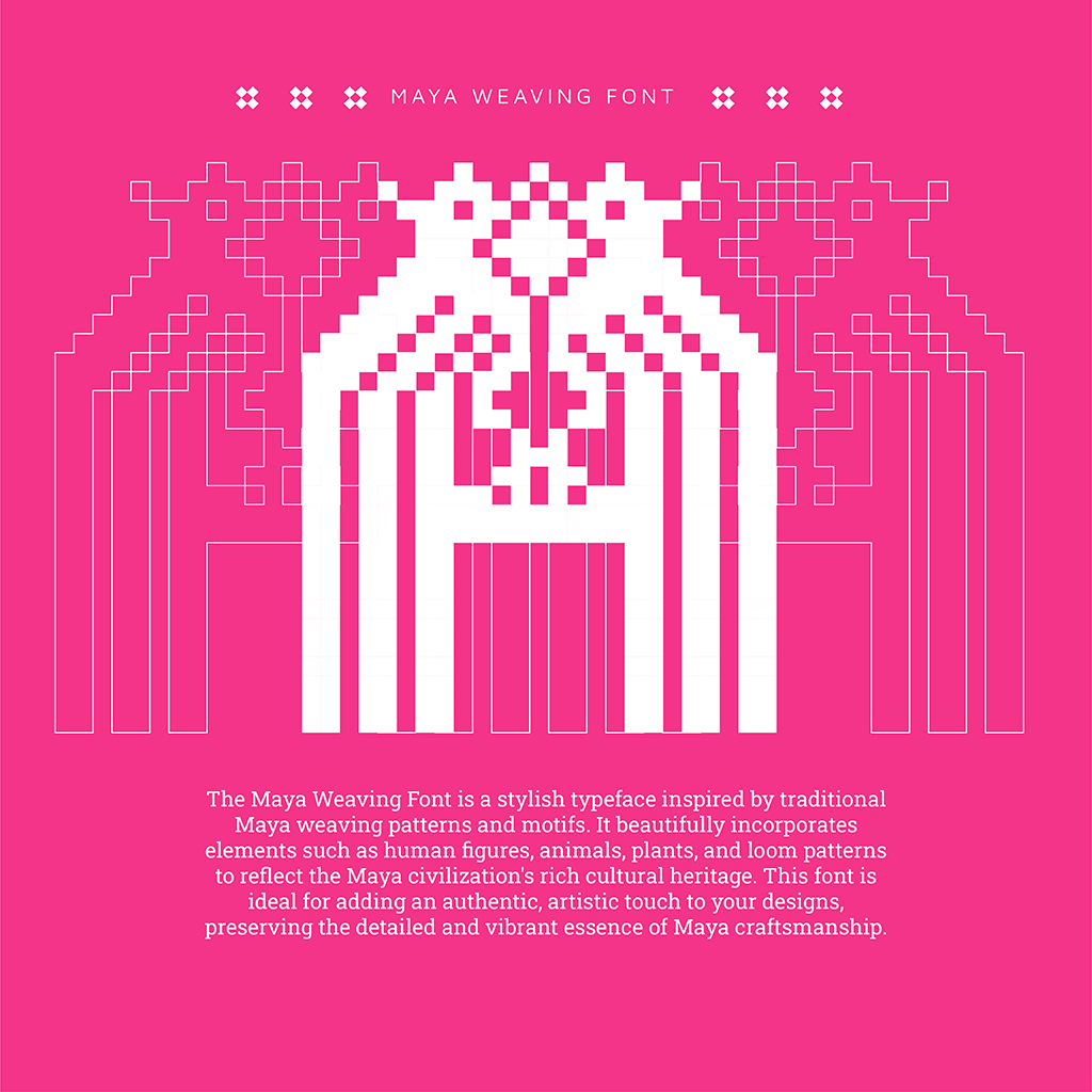
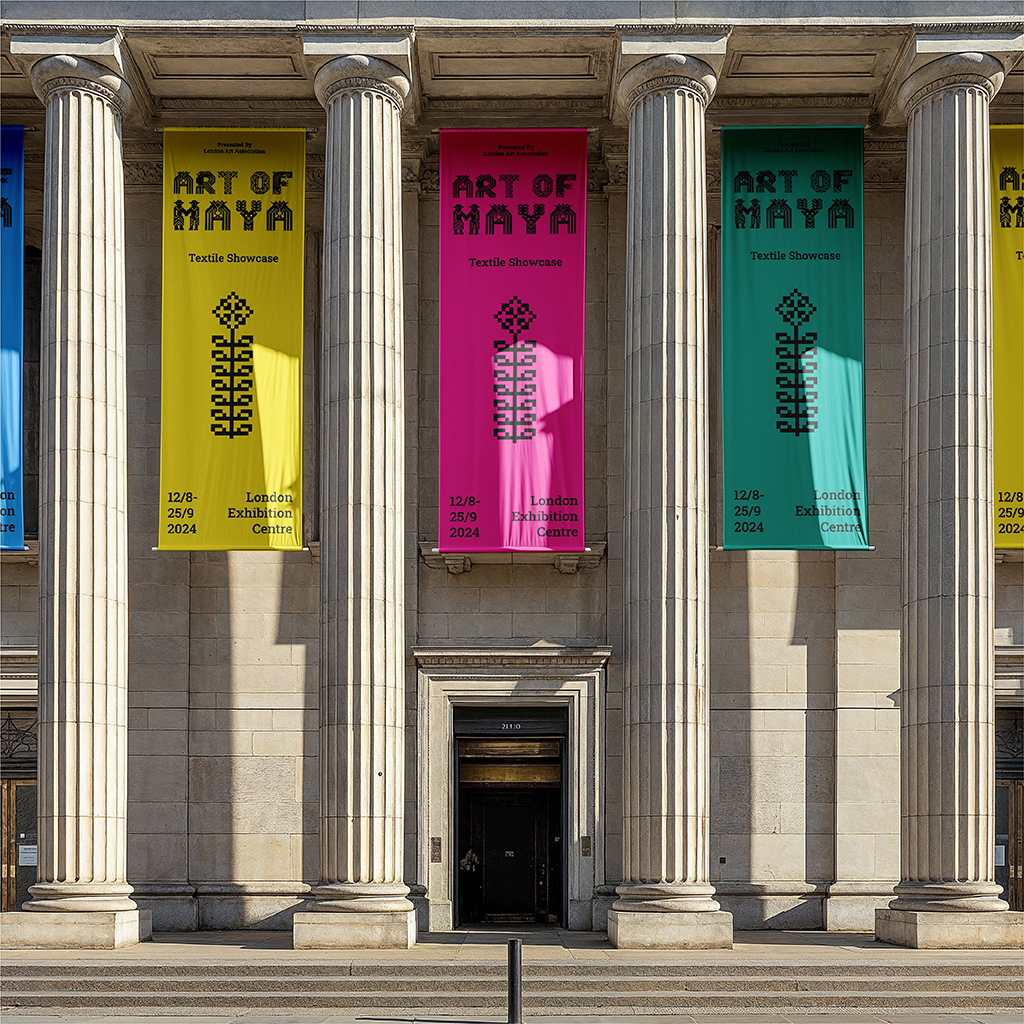
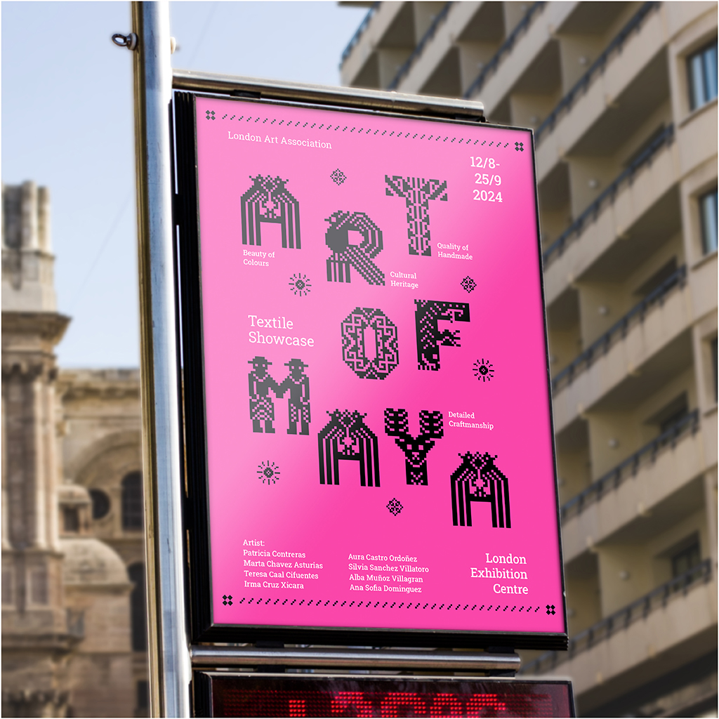
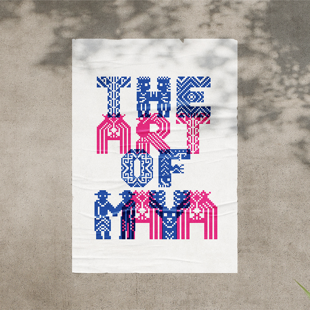
Mayan textiles are known for their vibrant colours, so I reflected this in my typeface by presenting it in four different colours, giving a young and modern vibe. The font is primarily intended for use in title or display and is paired with a slab serif body text.

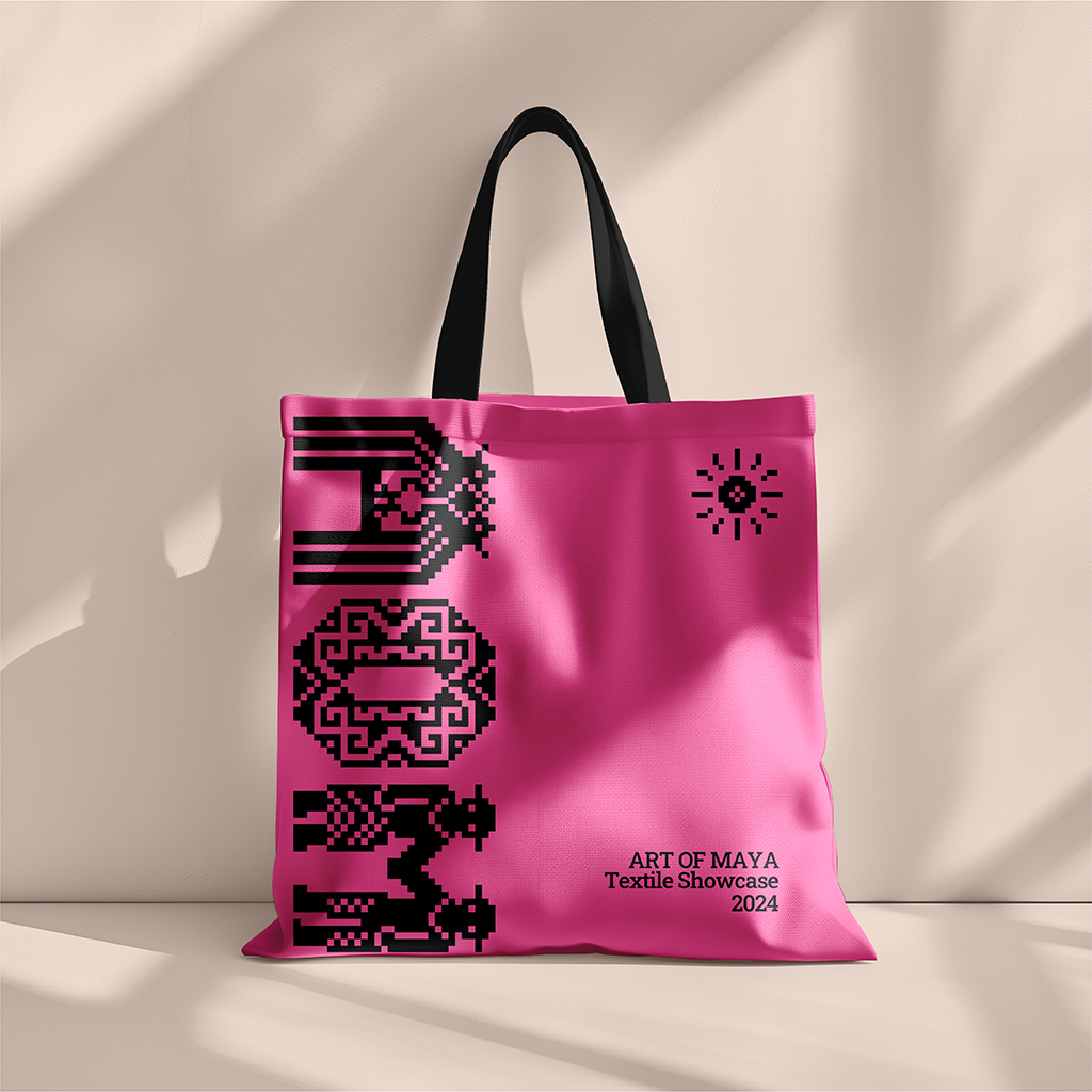
The initial idea was to use the font on a Mayan-themed board game cover that required extra effort to illustrate the background for it. This idea was abandoned due to time constraints. The second idea was to apply the font on graphic tees or merchandise such as pins, buttons, and tote bags. After a round of attempts, Mr. Vinod, my instructor, found that the outcome was relatively flat and lacked excitement—one of the reasons might have been the ineffective proportion in the mockup and the overall selection not enhancing the design. He suggested modifying the mockup.
Realising the potential for improvement, I decided to change my approach. I experimented with various materials, such as postcards and framed posters, to find a more engaging way to emphasise the typeface design. Through this process, I discovered that the typeface performed well in black text and looked particularly striking at a large scale, with the maximum of four characters per line.
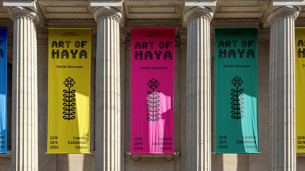
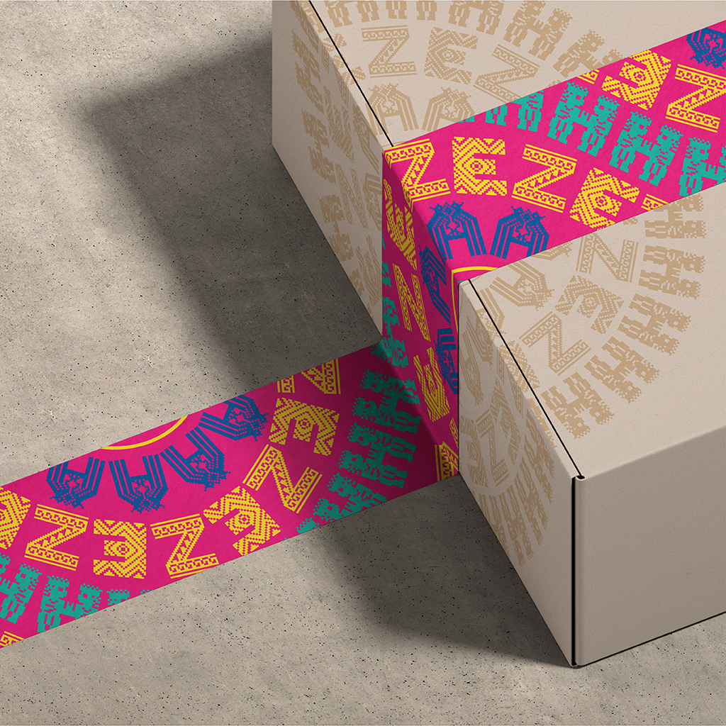
I wanted to give my font application a thematic direction. Since the typeface was inspired by textile patterns, the idea was to use it in a textile exhibition showcase. The font would be featured as a title on posters or banners. Another application, suggested by Mr. Vinod after he noticed some of my interesting experiments, was to create pattern-like designs and apply them to duct tape. Given their decorative nature, each letter appears to stand out on its own, therefore I only added minimal icons as visual aids. The end result was more appealing and satisfying.
This was the most challenging task of the semester. This project not only challenged me to push the boundaries of my creativity and design capabilities, but also deepened my knowledge of how to merge traditional cultural elements with modern design. The process was somehow torturous, and I nearly gave up. I kept pushing myself, searching for inspiration, and collecting advice from friends and lecturers. I am glad that I created a thorough process since I learned a lot and discovered a new potential within myself.
Try our the font below: