For the final project in Advanced Typography, we were given three options:
- Create a font that addresses a larger problem within an area of personal interest.
- Explore existing letterforms.
- Develop a font with an experimental design.
I chose to create a font that addresses a problem close to my heart, combining cultural heritage with contemporary typography.
Concept Idea
As a fully Javanese Indonesian, I have always felt a deep connection to my roots—the stories, traditions, and beauty interwoven in batik. Growing up surrounded by the richness of our culture, I have long wanted to reinterpret a part of this heritage into something new, something that could speak in a modern design language.
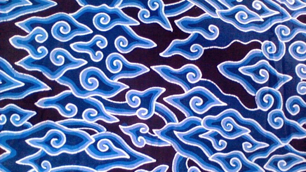
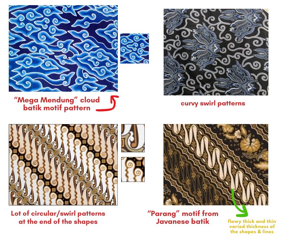
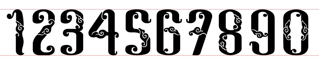
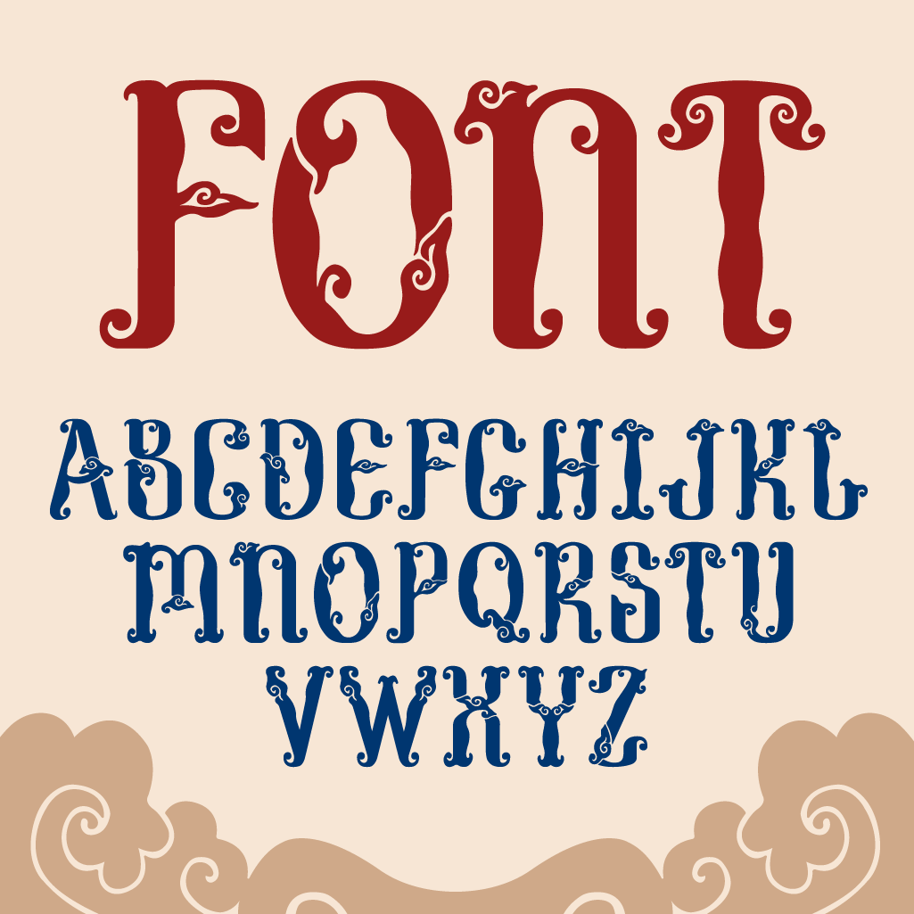
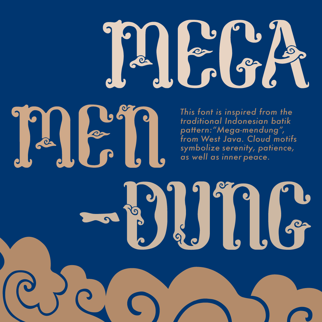
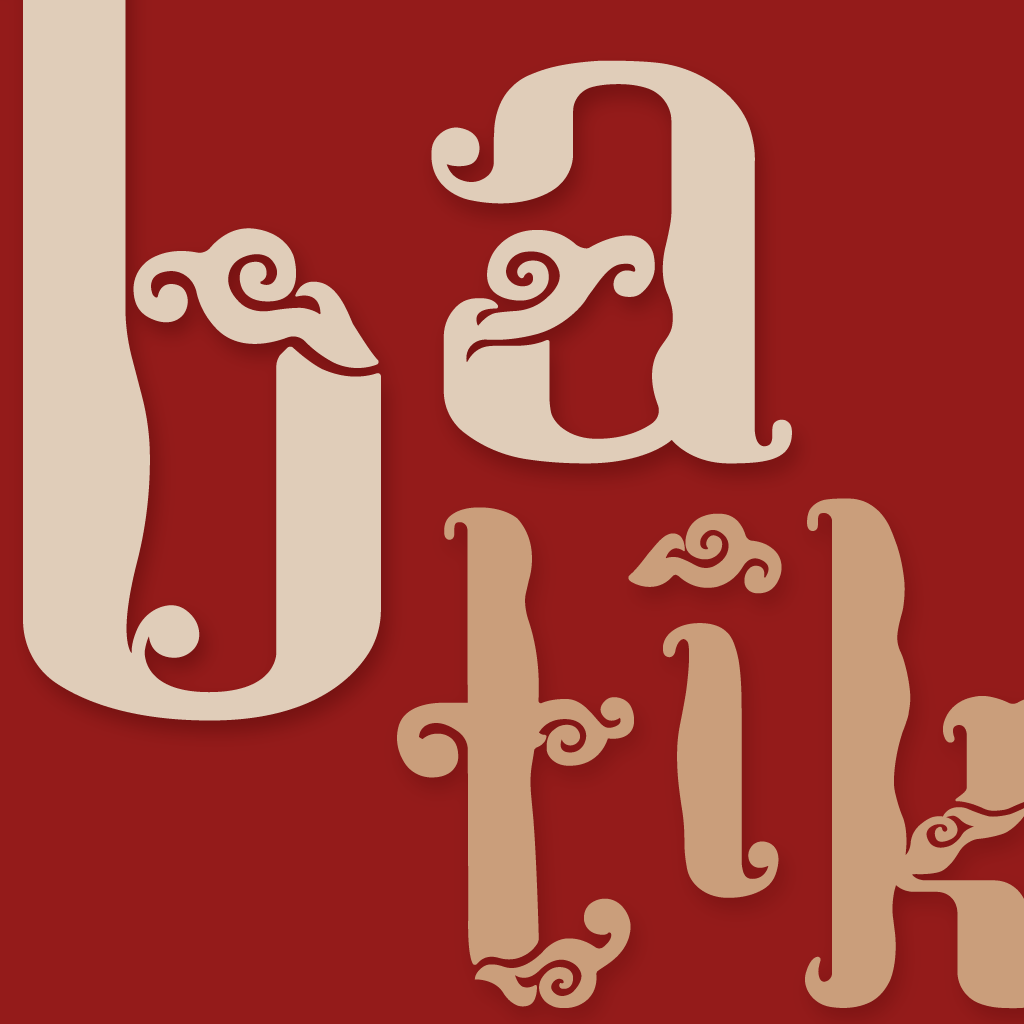
For my final project, I designed a Batik-inspired font based on the Megamendung motif, which originated in Cirebon, West Java. The pattern symbolises clouds in Javanese culture, conveying peace, patience, and blessing. In Javanese, mega means “cloud” and mendung means “cloudy sky.” Traditionally used in batik textiles, it also represents a spiritual connection to nature and the heavens, reminding us to remain grounded and calm even during emotional storms.
While batik is a cornerstone of Indonesia’s cultural identity—especially in Java—it is rarely expressed in typography.
Many cultural festivals, museum banners, brochures, and traditional event materials use generic or mismatched fonts that fail to reflect our heritage. My aim was to change this by creating a typeface that is visually engaging, culturally resonant, and rooted in tradition.

Visual Research & References
Before beginning any sketches, I conducted extensive visual research to collect inspiration and references. I examined different batik patterns, paying special attention to recurring elements such as curved decorations, swirls, spirals, and variations in stroke thickness. This research formed the foundation for my design decisions later on.

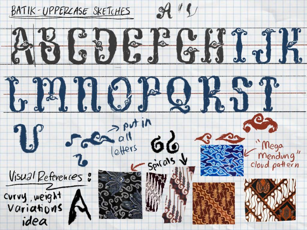
Sketches & Drafts
I began by extracting common motifs from batik patterns, particularly the Megamendung cloud form. My plan was to integrate this motif into every letter and numeral. Using both rough paper and graph paper, I explored ways to merge these patterns with letterforms.
Initially, my sketches felt plain and lacked elegance. Through repeated refinement and experimentation, I developed more intricate and balanced designs. This iterative process continued until my ideas reached a level of refinement that aligned with my vision.


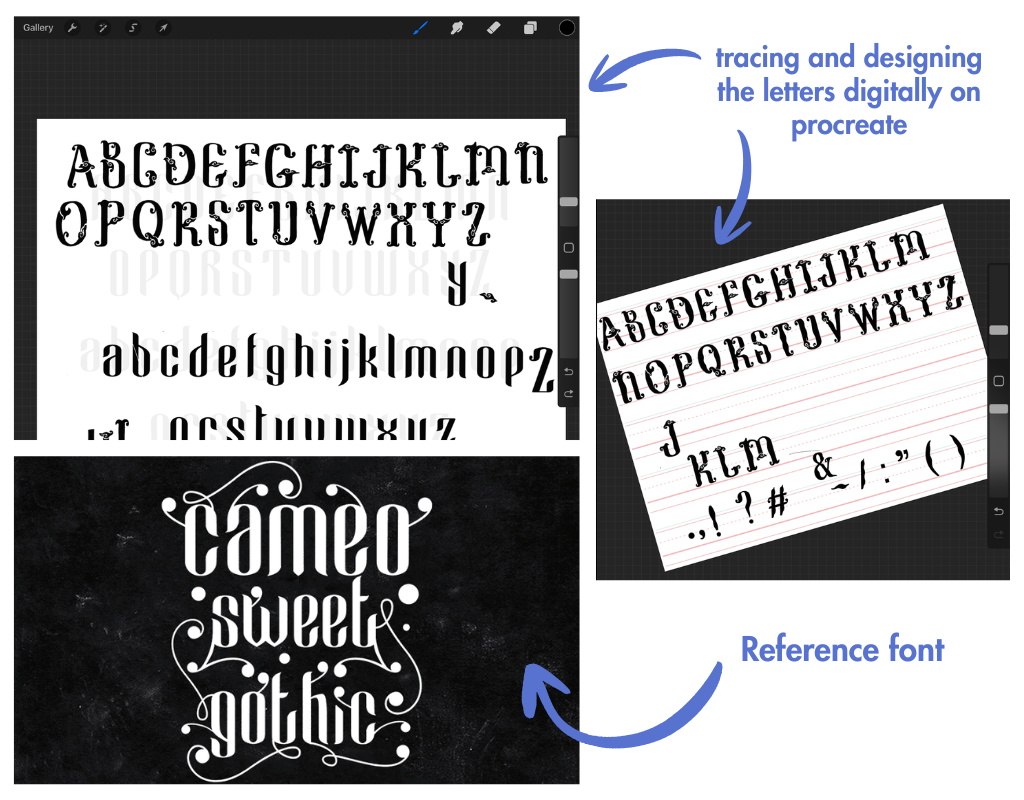
Transferring and Refining Sketches in Procreate
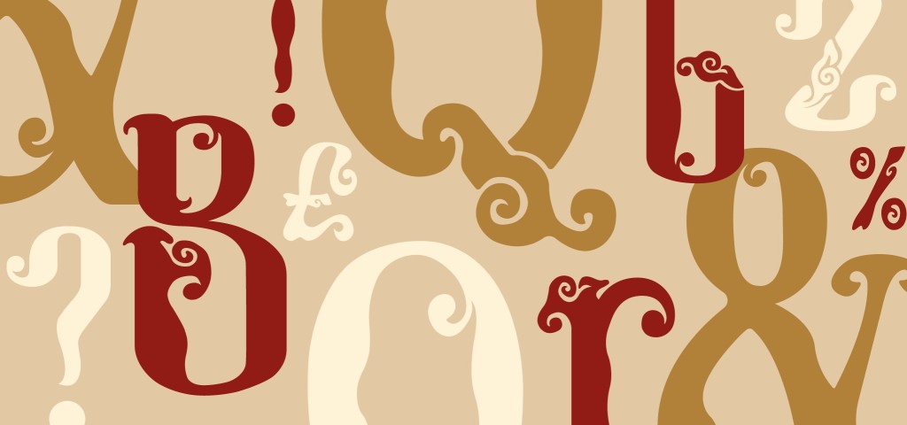
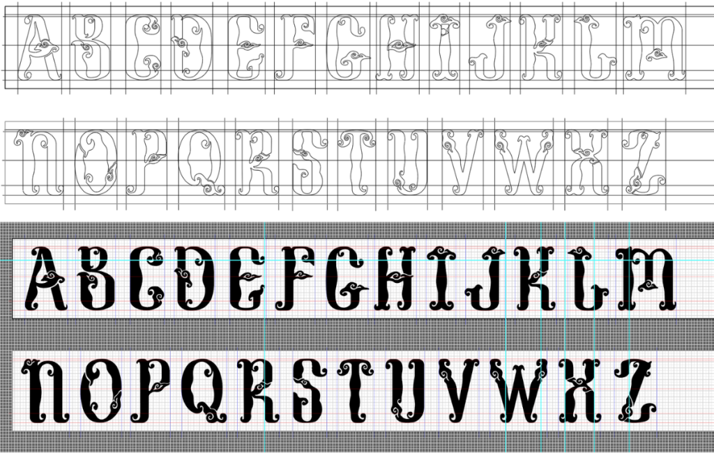
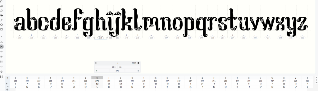
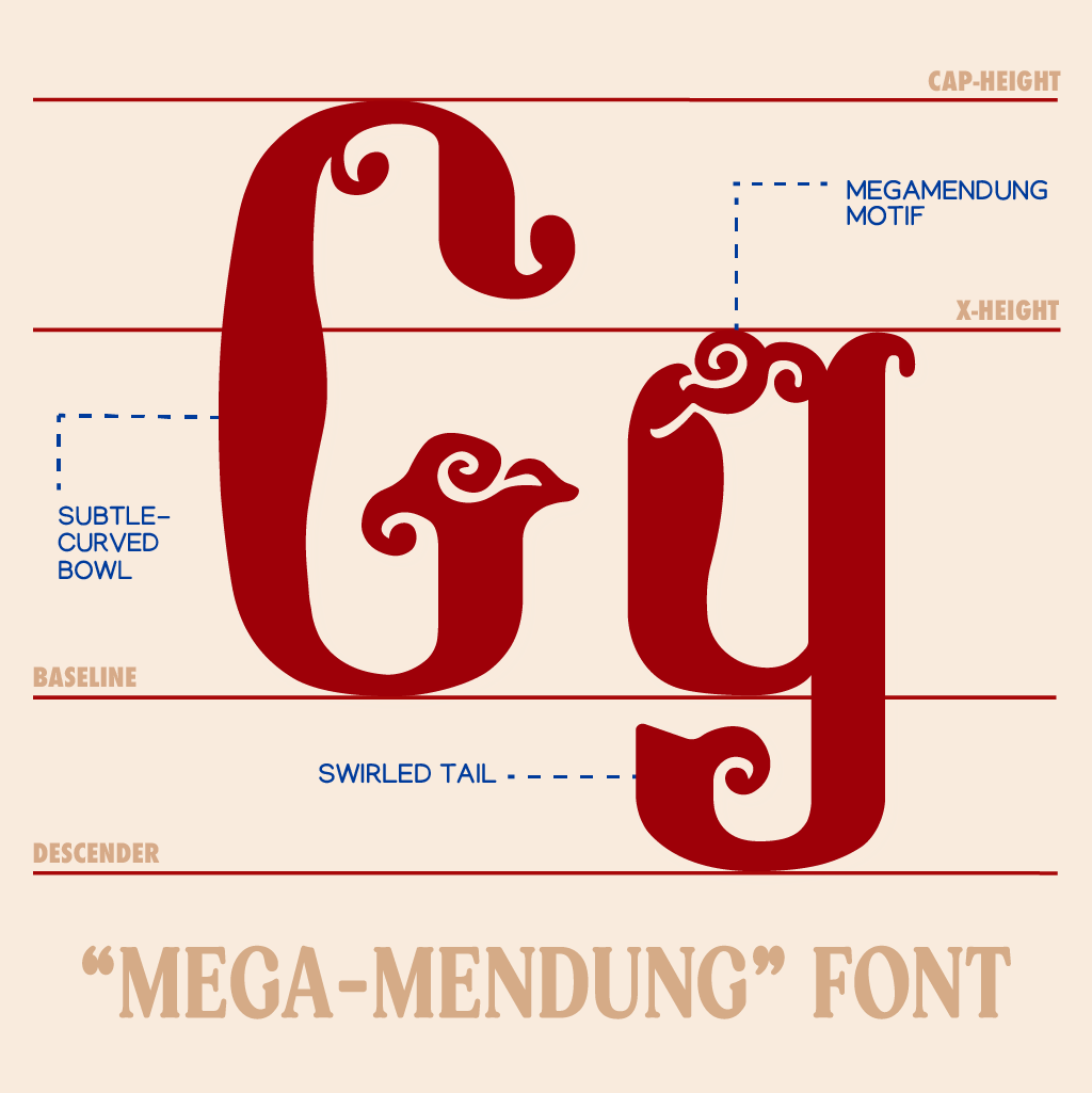
To further refine the designs, I moved my sketches into Procreate on the iPad. The digital environment allowed me to work on fine details more efficiently and to quickly undo or adjust elements. I started with uppercase letters, using a reference typeface to maintain proportional balance—not to replicate, but to guide structure.
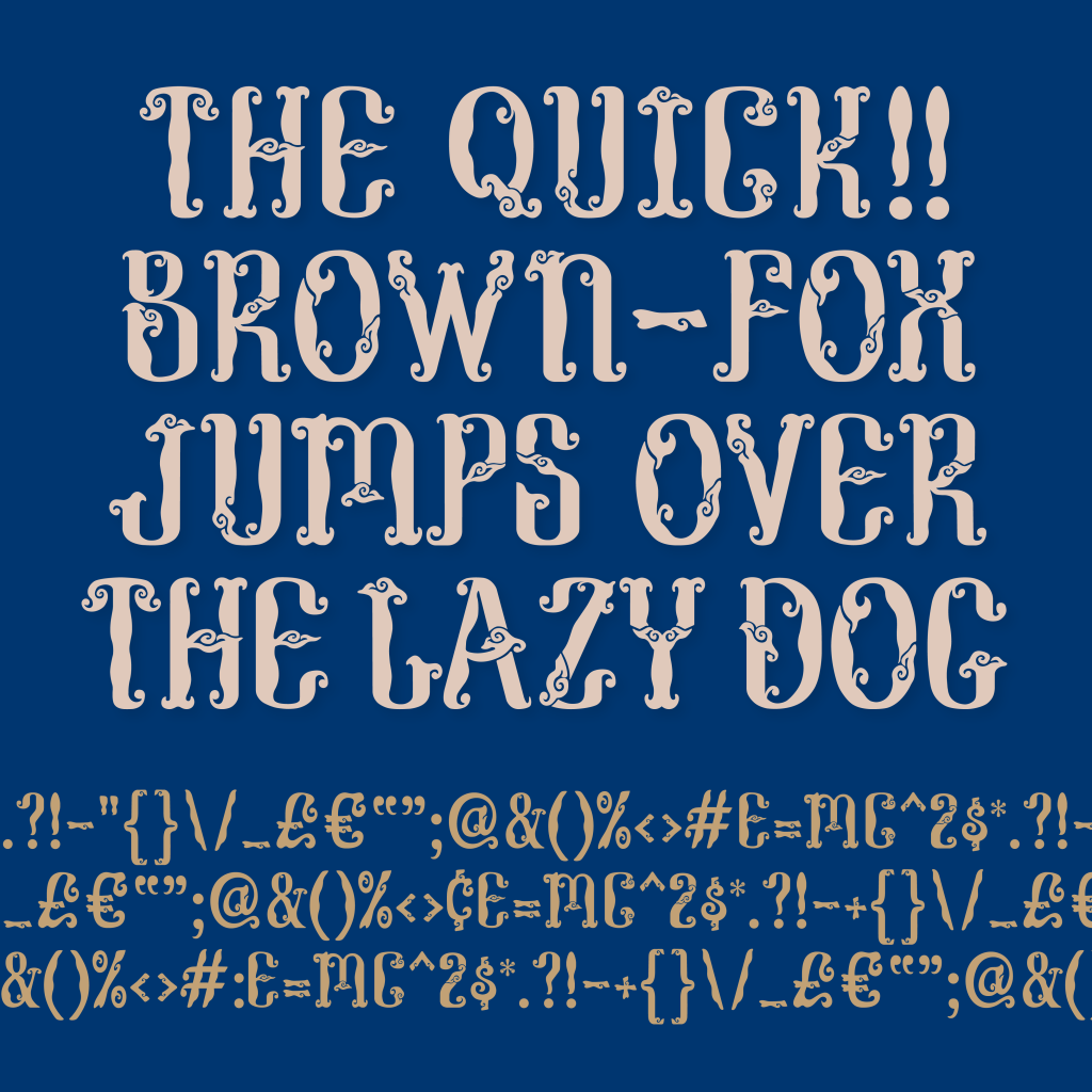
From this base, I introduced curved structures, Megamendung patterns, and swirling details, using varying stroke thicknesses to mimic the movement found in traditional batik. Once the uppercase set was complete, I progressed to lowercase letters, numerals, and symbols. Each underwent several rounds of refinement, with trial and error shaping the final harmonious set.

Digitising in Illustrator
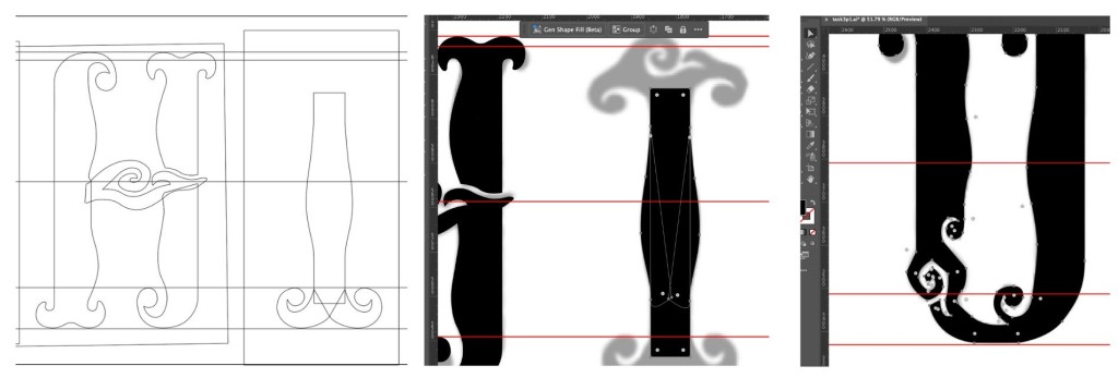
After finalising the designs in Procreate, I imported them into Adobe Illustrator for vectorisation. Using the Pen and Curve tools, I carefully traced each form. This was the most time-consuming stage, given the intricate motifs and flowing curves. Frequent zooming in and out ensured smooth paths and precise anchor points.
While reviewing the vector letters, I noticed inconsistencies in stroke thickness. Placing uppercase and lowercase characters side by side helped me refine proportions and maintain uniformity. As my lecturer, Mr Vinod, reminded us, even a display font must remain readable. Following his advice, I used grids and guides to ensure consistent heights, proportions, and stroke widths while preserving the vintage aesthetic.


Constructing the Symbols
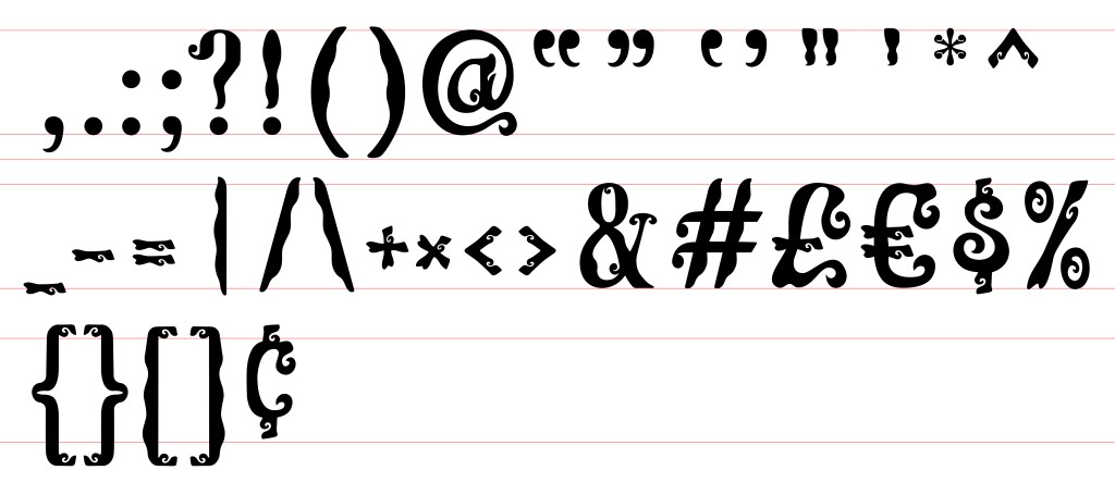
Designing symbols, especially brackets, proved challenging. Each had to align seamlessly with both uppercase and lowercase letters. To maintain accuracy, I used sample references from a default font to gauge the correct height for punctuation and symbols.
During this stage, I noticed subtle typographic conventions I had never paid attention to before—such as the small gap often left below uppercase letters when enclosed in brackets, and the slightly shorter height of numerals next to uppercase letters. These observations deepened my appreciation for the precision required in type design.


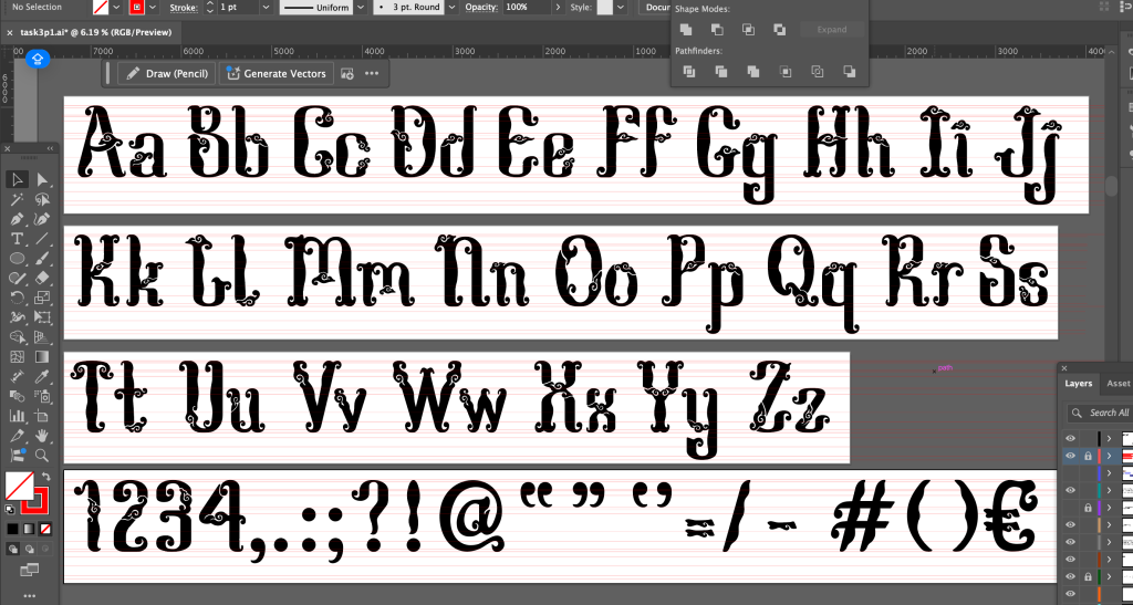
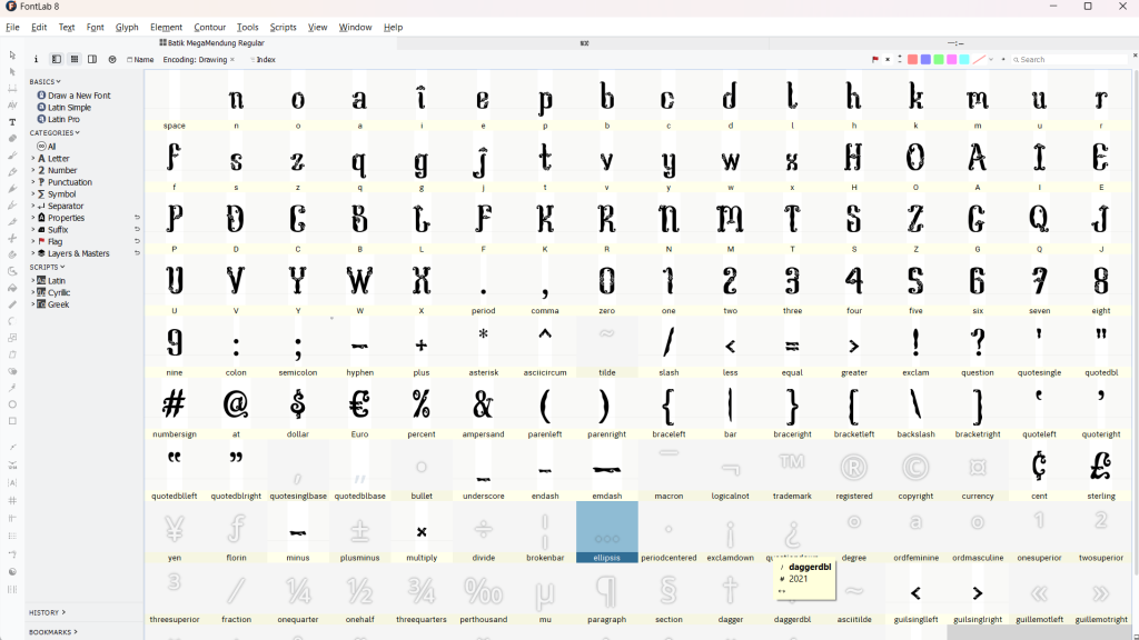
Generating the Font in FontLab7
Once the letterforms were complete, I imported them into FontLab7. Before importing, I measured the cap height, x-height, and descender values in Illustrator, ensuring each artboard was 1000 px tall.
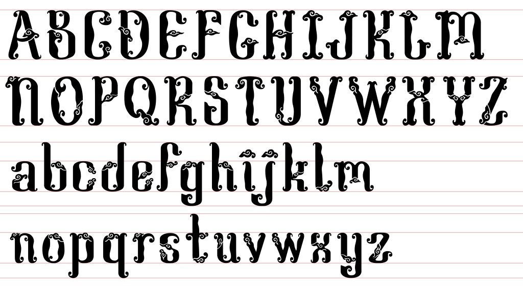
In FontLab7, I fine-tuned kerning and side bearings, repeatedly testing the spacing until it felt balanced and consistent. After these adjustments, I exported the font as OTF and TTF files, then installed it for review.


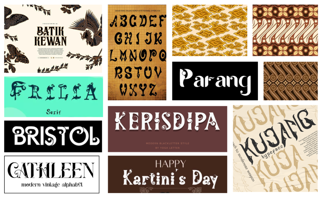
Font Presentations
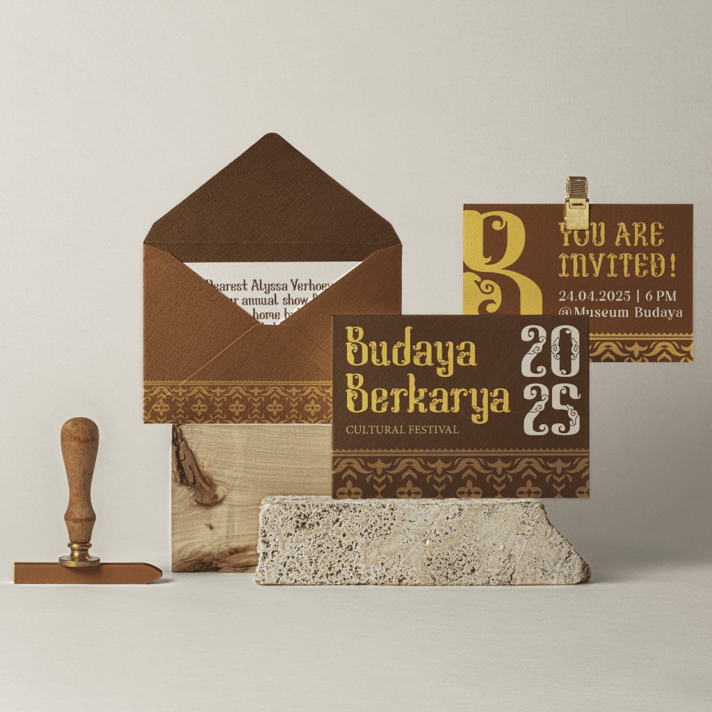
Before preparing the font presentation layouts, I selected a colour palette. Initially, I chose brown, but based on feedback from Mr Vinod, I added red, blue, and beige/brown for greater visual variety. Blue and red are colours often found in traditional Indonesian batik fabrics, adding a cultural layer to the presentation.


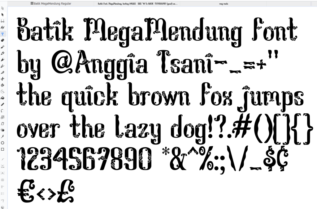
You can try typing using the Mega Mendung font below:
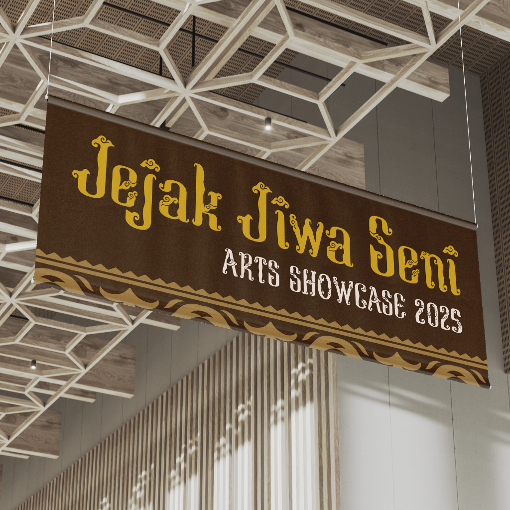
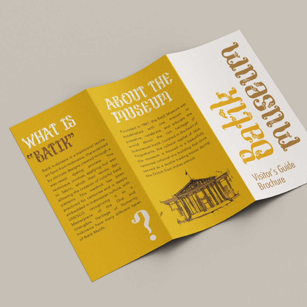
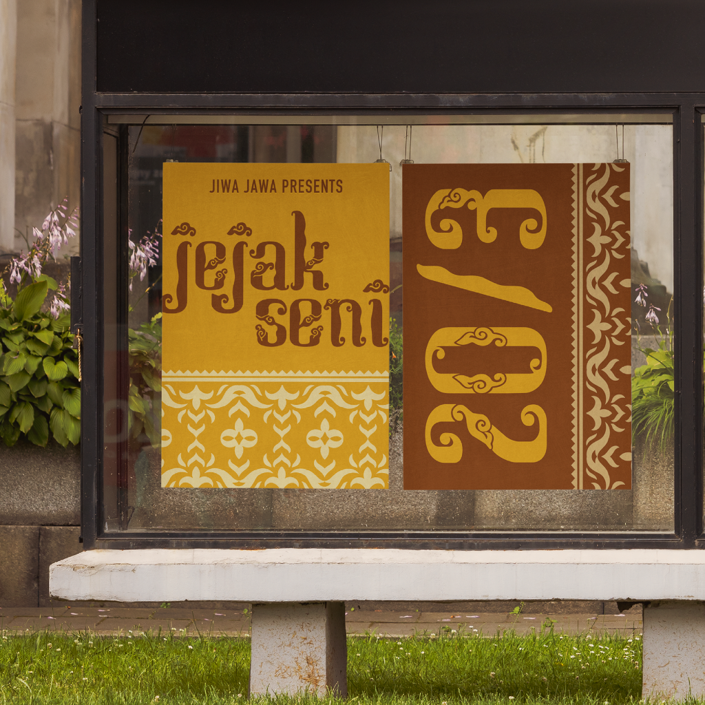
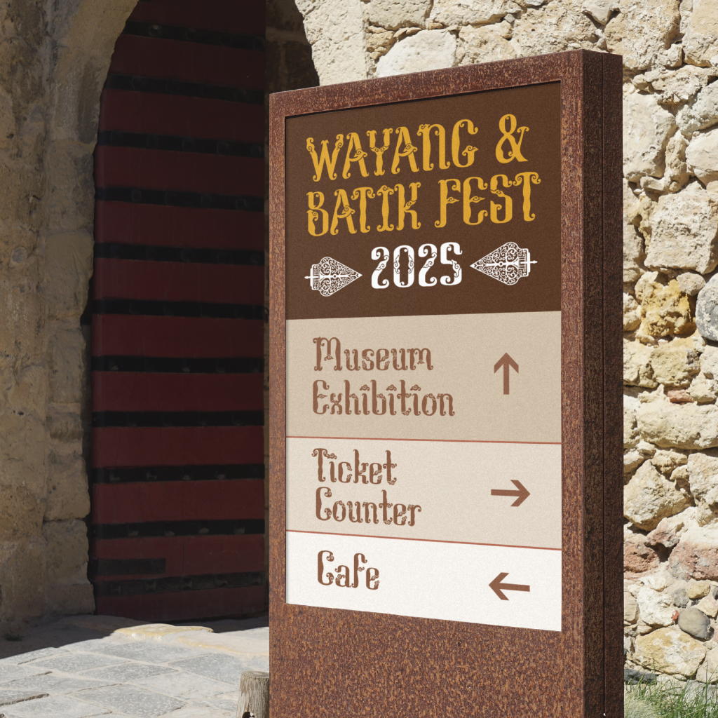
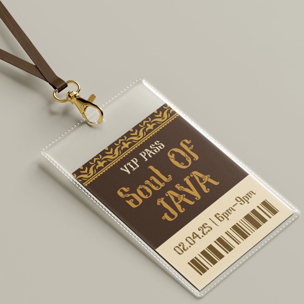
Font Applications
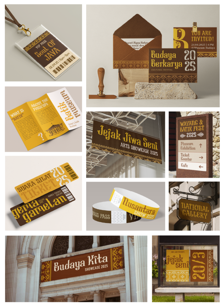
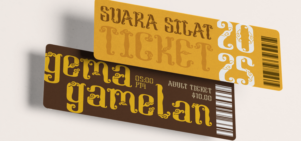
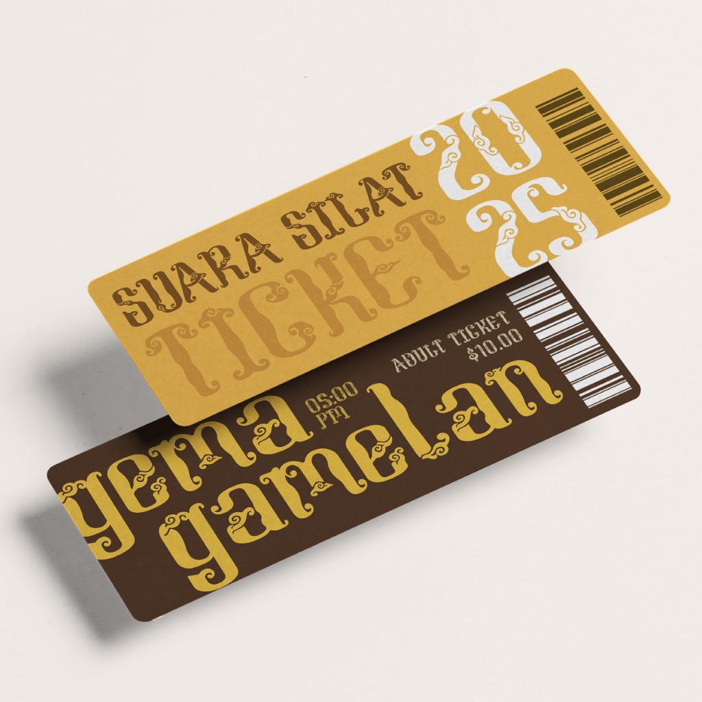
We were tasked with creating square-format font applications (1024 × 1024 px) in Photoshop using free online mock-ups. My applications showcased the typeface in contexts such as banners, signage, tickets, brochures, and festival materials.
I focused on heritage-related settings like museum branding and cultural event posters. More than decorative, the font was designed to unify the visual identity of such events and invite both local and international audiences to engage with Indonesian culture. Its decorative, vintage nature gave each letter strong visual presence, so I kept additional design elements minimal, allowing the typeface itself to be the focal point.
Conclusion
This project was challenging, sometimes overwhelming, yet deeply rewarding. It pushed me beyond my creative comfort zone and tested my ability to merge traditional cultural motifs with modern typography. Along the way, I developed a deeper appreciation for type design and the subtle decisions that shape readability, balance, and personality.
Design is more than aesthetics—it is storytelling. By integrating traditional batik motifs into letterforms, this project became not only the creation of a typeface but also a reimagining of cultural identity.
I hope it inspires others to embrace their roots and use design as a medium for telling stories that matter.