
Let me give you a little introduction about what feminism is and what feminists are fighting for until this day. Feminism is the belief in social, economic, and political equality of the sexes. feminist all around the world had fought for these basic rights and they had to use art and design as a way to shape public opinion and fight for oppressed women’s rights. However, it was not always that effective for example the “Votes for women” banners and badges that were in the 19th century, the design was clear and simple with three colors white, green and purple.
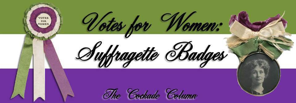
Which was effective in addressing the vote for women movement, but these simple designs were not effective when it came to a more complex issues like sexual harassment, domestic violence and reproductive rights which were hard for graphic designs to encapsulate the movements in a few easy-to-digest images or slogans.
Therefore, I questioned how we can make graphic design more effective when it comes to social movements, how we can give a poster the power to encourage people to take action on these movements.
So, to understand what makes a design effective in social movement we have to analyze its key design elements and study how they affect the way people react to it emotionally.
Before I explain the importance of the emotional aspect, let’s start by studying the key design elements that make graphic design effective, as we all know graphic design is shaped by its principles, utilizing its key elements can help transform any design to an effective one. To illustrate that strong typography, clear layouts and a strategic use of color and shape can make a huge impact on the effectiveness of a design.
To give an example I’m going to analyze the design “Woman Freedom Now, 1971” by Faith Ringgold.
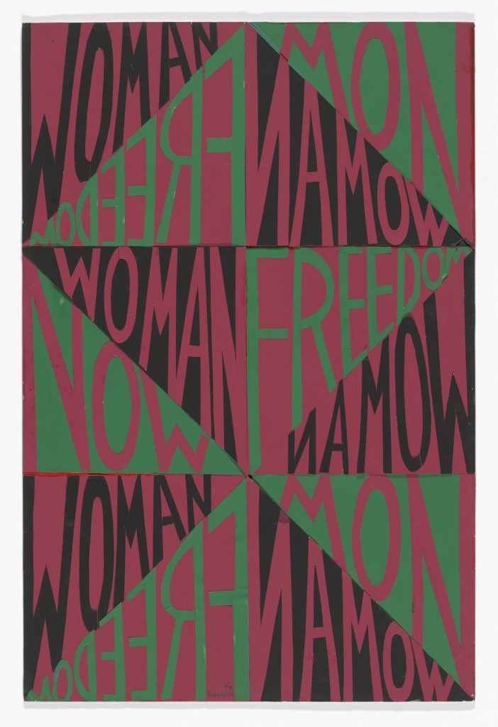
Starting with typography whether it is on signs or posters, typography has always been a crucial tool for communicating a message and inspiring action, Therefore, choosing the right typeface, size, and spacing can make a design stand out and grab attention.
The typography in this design is strong and bold which makes it effective in conveying a message and grabbing attention to women’s freedom.
Moving on to the geometric, asymmetry layout, where we can notice how the words “Woman” and “Freedom Now” are repeated and arranged in a way that creates a dynamic and visually engaging pattern. What makes this layout even a more effective design choice will be the geometric, asymmetry layout that brings a continuous dynamism, as if “Woman Freedom Now” was a shout ad infinitum.
This design was also a great example when it comes to the strategic use of color, as you can see the designer used bold, contrasting colors (red, black, and green) that enhances the visual impact, not just that but she strategically used the color as a symbolic of black rights and the Pan-African flag.
To sum up, this design utilized the key design elements effectively because it combines text and visual elements to create a powerful statement. The way the words are arranged, the use of color, and the overall composition all contribute to the message of women’s rights and equality, particularly for Black women.
Now that we covered the key design elements part, let’s return to why the emotional aspect is so important in feminist design, maybe we can take a look to what the author Posher (2019) thought , he considered posters to be an ideal tool to challenge the system, because of the way posters connect instantly with people regardless of their surroundings, giving that it’s visible to everyone.
In addition, since the emotional aspect is crucial when it comes to motivating people to take action and make a difference, that can be either by manipulating colors, typography or even visuals to convey a message that can connect with viewers emotionally, which create effective designs that can raise awareness about the feminist cause.
Starting with colors, we should all recognize that colors are not just for decorating a design or for appearance and aesthetics, colors have an undeniable effect on people’s emotions, thoughts and opinion, influencing emotions and perceptions, guiding attention and empowering viewers to take action, which is crucial for activist designs.
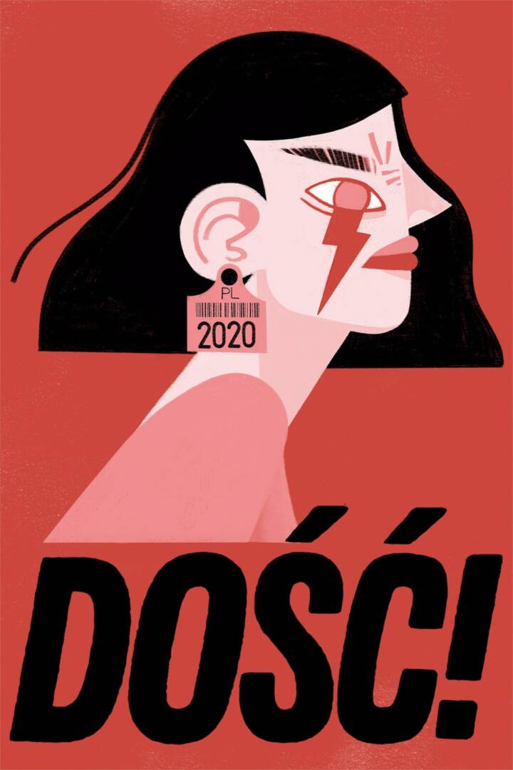
Therefore, the choice of colors in design could change the whole way a message is received. Here in the design “Enough!” by Folie Annee Graphique, the designer used the color red, a color that has been associated with violence, anger, and it frequently indicates danger, in this design the color was used in a feminist protest against Poland’s abortion law, where feminist activists began wearing the eye-catching red lightning bolt as a symbol of protest after Poland’s constitutional tribunal declared that abortions performed for fetal defects were unconstitutional.
After understanding the background of the design, we could see that with the use of the color red in the design is meant to symbolize a warning, a message that the protester won’t accept that women are being deprived of their basic rights.
Now, when talking about the emotional impact that typography has, we can point out how it is a tool for social change, it can affect viewers’ emotions and shape their perspective, especially in activist design. It’s an important factor that designers must use effectively to impact how messages are presented and perceived.
For example, choosing the right fonts and styles may have an influence on activist movements, evoke emotions from viewers, highlight important information and make complex issues accessible to a wider audience.
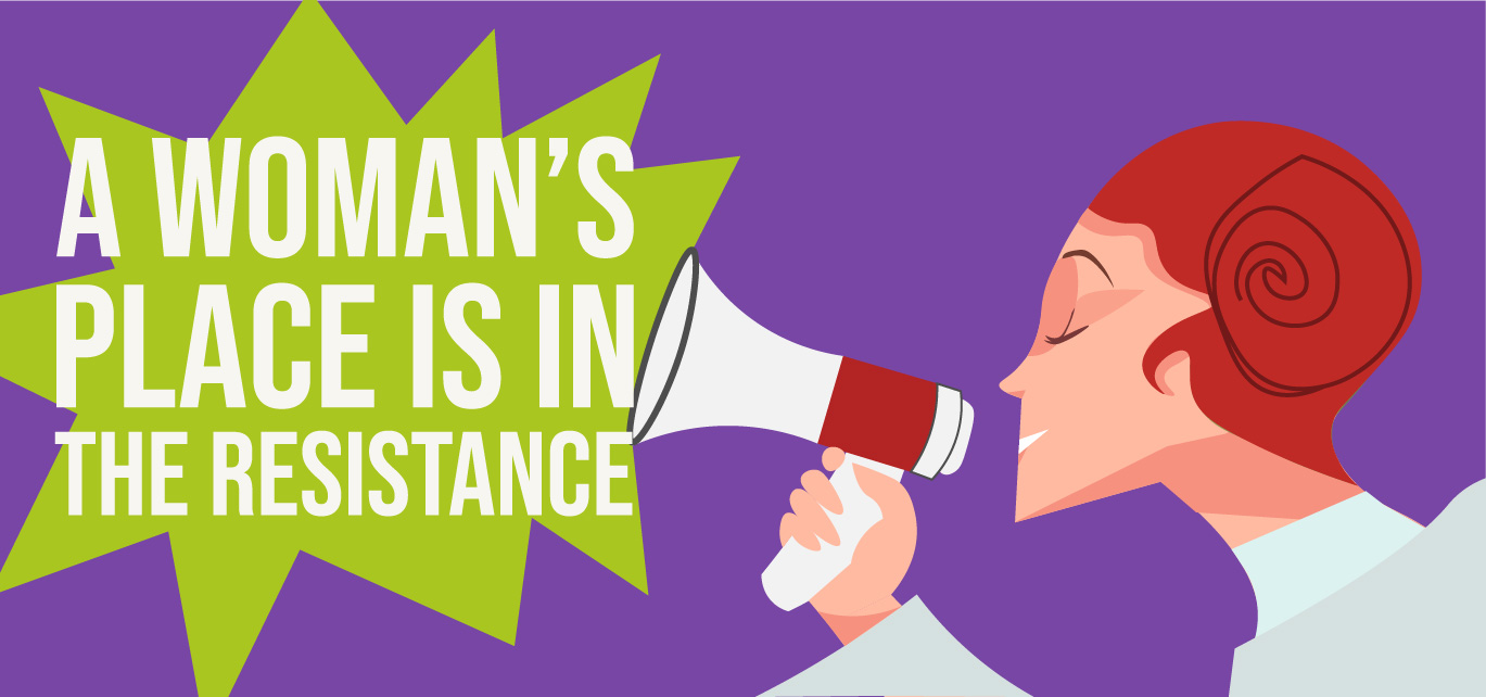
To illustrate that, we should analyze the design “A woman’s place is in the resistance,” by Hayley Gilmore
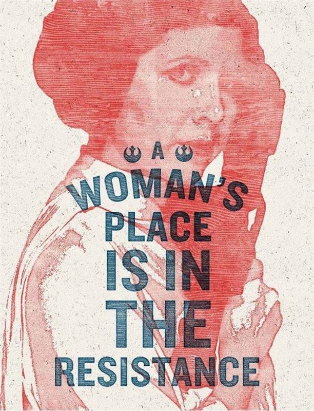
This design used bold typeface to move people’s emotions in the women’s march movement. The text “a woman’s place is in the resistance” advocating for women’s involvement in resistance and social change, in addition to how the design employs bold typography making it visually striking and easily readable. The layout of the text in a stacked format with the words “a”, “woman’s”, “place”, “is in”, “the” and “resistance” centered on separate lines, resulting in a visually appealing statement.
So, we can say that the use of bold typography can evoke powerful emotions in viewers, like a sense of strength, confidence, and urgency. Which made the typography in that design give a powerful visual statement on the importance of women’s roles in activism and resistance, leaving the design the potential to inspire action by making the message more impactful and attention-grabbing.
Lastly, imagery and symbolism can also affect people emotionally, as they play a huge role in driving action by visually communicating complex issues and sparking emotional responses.
To give a visual example, let’s continue analyzing the design “A woman’s place is in the resistance,” by Hayley Gilmore
First, if we dive deeper into the history behind this design, we will find that it was designed in the women’s march movement to fight for women’s rights after the candidate Donald J. Trump -who has openly stated his opposition to laws protecting women’s rights- be elected president, resulting in a protest where people lifted Hayley Gilmore design as a symbol of resistance.
What made people lift her design, was its impact on people emotionally, as the designer used a pop culture reference image to princess Leia from Star Wars, a fictional character known for her strength and leadership in the rebellion in the Star Wars saga. Hayley’s choice of this historical image reinforced the theme of female strength and rebellion with the text “A WOMAN’S PLACE IS IN THE RESISTANCE”, The design conveys a strong message of female empowerment and resistance. And since the image is using a famous impactful rebellion character in the movement, it gives the potential to inspire and motivate women to take action and challenge the status quo, creating an emotional connection by using the emotional bond with the character to call for action.
In summary, graphic design has been a means of expression and an act of protest throughout the history of feminists. Moreover, activist designers must make effective use of colors, typography, and visuals to convey a message that connects with viewers emotionally to motivate them to take action. Utilizing bold contrasting colors to convey urgency and bold strong typography to grab viewer’s attention to the intended cause, as well as including historical figures and images into the design, creates an emotional connection with the viewer, resulting in more people supporting the movement.
I cited a lot in this article from this research “Posher, Andréa (2019): Design and Activism A Relationship that needs Reflection” that you can check here
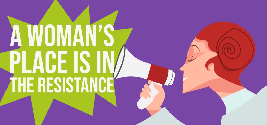
In line with this article, I designed a cover illustration to represent the aspect of feminist design. I used a pop culture reference to princess Leia from Star Wars, Knowing the emotional impact this character holds on strength and rebellion. Moreover, the colors used are bold and contracting to grab viewer’s attention, while I used strong typography and layout. In addition, the phrase “a woman’s place is in the resistance” embodies the strength, courage, and determination of women who have stood up against oppression and injustice.