


The Concept
I have always been drawn to swimming and the outdoors from a young age. Growing up Maldivian and being surrounded by the ocean, much of my childhood was spent in the sea, swimming and snorkeling. I love the warmth of the sun on my skin and the moment of looking up from deep underwater, where blue surrounds me, colorful reefs sit below, and sunlight ripples across the surface above. That feeling is more exhilarating than most things I have experienced.
Development Process
When designing this font and brand, I wanted the work to resonate with who I am and where I come from. The typeface became an extension of my identity, shaped by personal interests and experiences. It represents countless memories with childhood friends, including moments of skipping classes in higher secondary just to swim, all of which informed the spirit and character of the design.

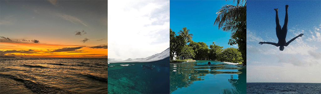
Before beginning work on the typeface, I created a moodboard to reflect my personality and who I am at my core. To better visualize this, I created the moodboard using photographs from my own camera roll, allowing the imagery to guide the overall mood, tone, and creative direction of the font.

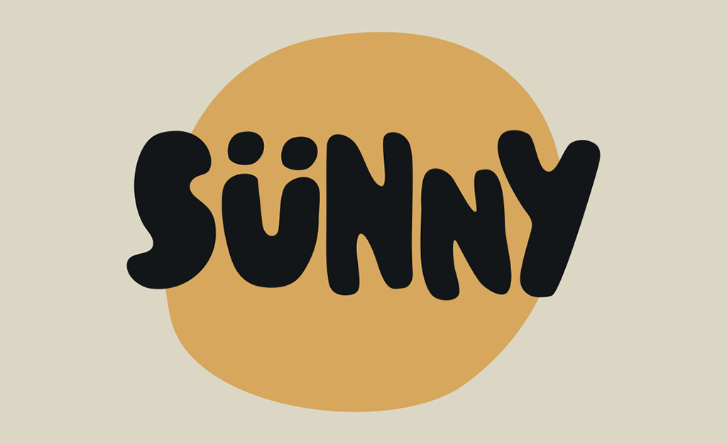

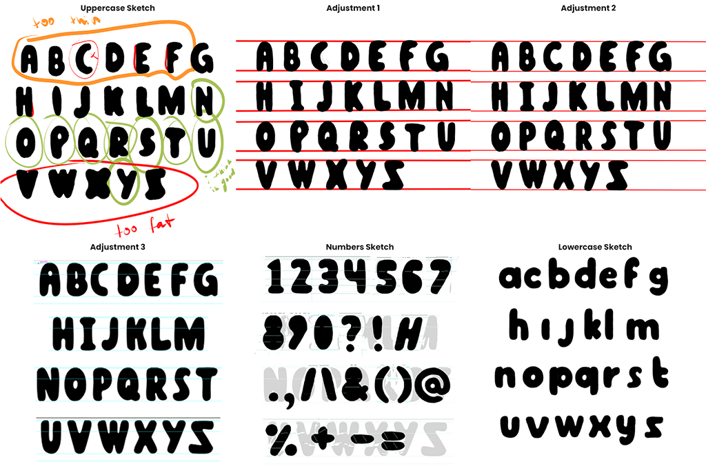
I began by sketching the basic concept of the letterforms. Since the letters spelling “Sünny” had already been developed in the previous task, the remaining characters were designed to follow the same stylistic approach. I paid close attention to stroke thickness and overall consistency, completing the initial sketches and drafts in Procreate before moving on to the digitization stage of the typeface.

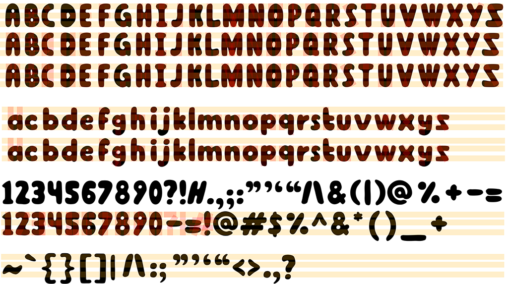
I used red guide bars to maintain consistent stroke thickness, while three horizontal guides helped ensure structural consistency across the letterforms. After refining countless small details that were quite subtle but extremely important to me, I reached a point where I was satisfied with the final outcome.

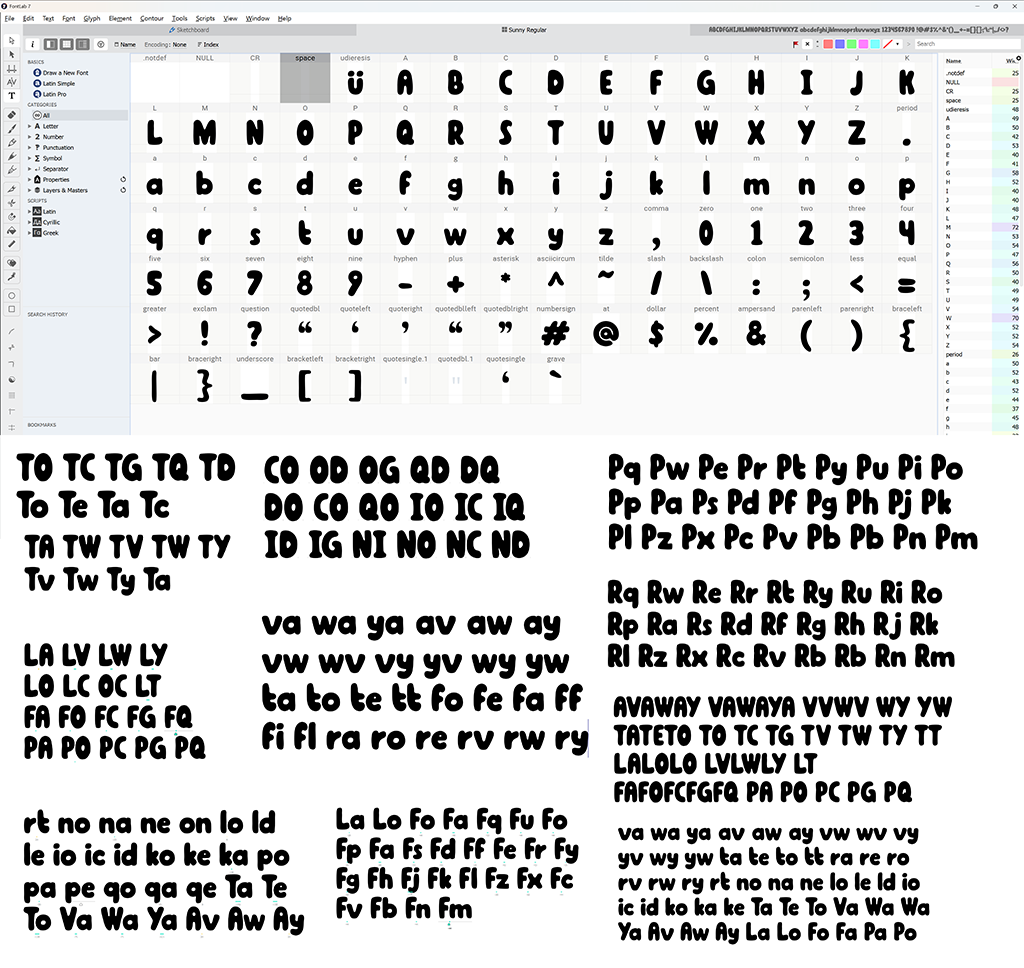
I then imported the letterforms into FontLab 7, where I focused on final refinements and kerning adjustments. My goal was to achieve the tightest possible spacing while maintaining legibility, which led me to test numerous letter pairs and word combinations. Each time I typed new, random strings of text, additional kerning issues became apparent, reinforcing how iterative and meticulous this stage needed to be.
While working on this project, I realized that the level of perfection I aimed to achieve required countless hours, days, and nights of careful refinements, many of which may appear insignificant at first glance. This process also helped me overcome a bad habit I previously had of ignoring imperfections under the assumption that “nobody will notice.”
I learned that without making these subtle adjustments, the final outcome would not have been nearly as refined or visually compelling.
Font Presentation

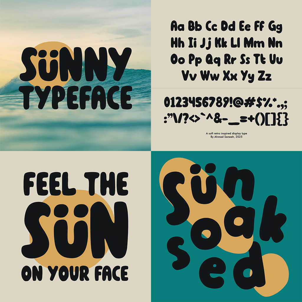
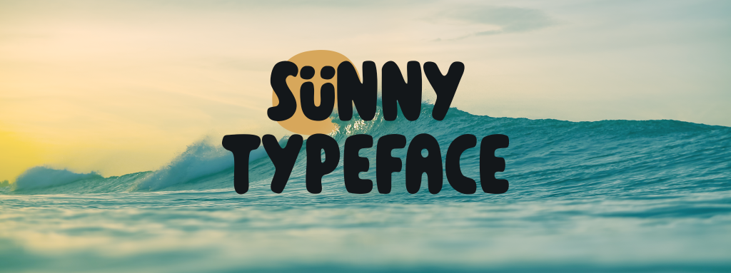
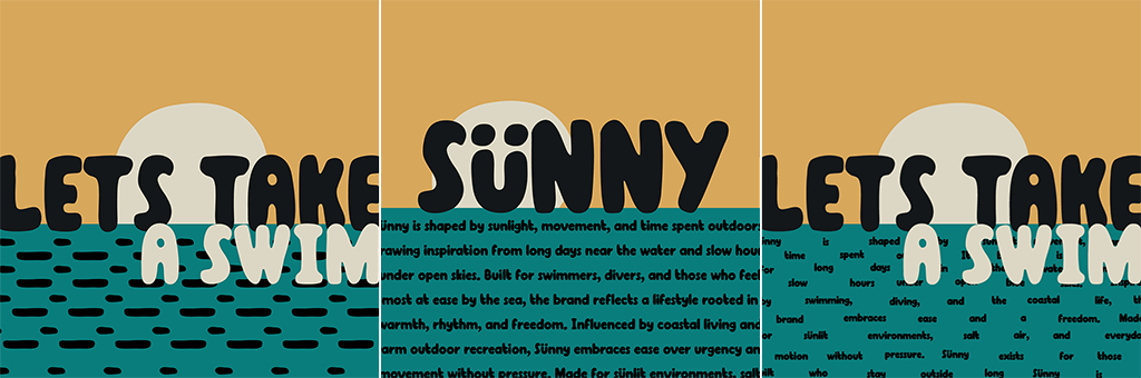
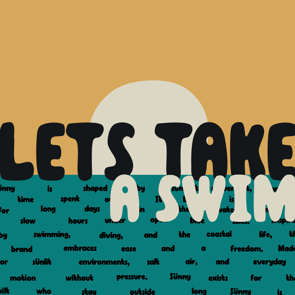
Sünny is intended to be a bold and playful typeface. When creating the font presentations, I aimed to produce visuals that were strong enough to function both as showcases and as usable applications of the font. Each presentation was carefully considered. Presentation 1 incorporates elements of water and sunlight alongside the text, while Presentation 4 depicts the letterforms floating in water.

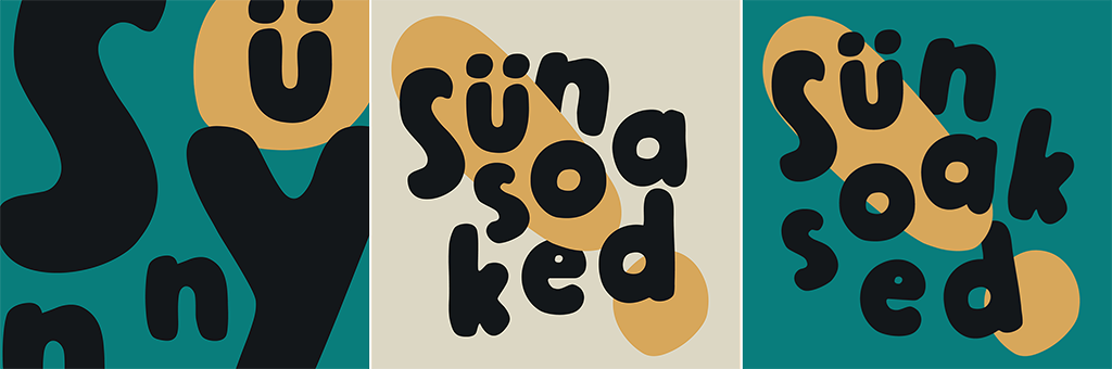
When designing Presentation 4, after exploring different approaches to expressive typographic composition, I arrived at the idea of using an exclamation mark together with the word “Sünsoaked.” I envisioned the exclamation mark as a surfboard, with the letters appearing to hold onto it while drifting in water.
Despite it not reflecting this exact image, I still rather like the composition. When viewed with this intention in mind, the concept remains present and adds a playful layer of deeper meaning to the piece, which aligns well with the overall tone of the brand.
Designing this artwork was one of the most challenging parts of the project, but it ultimately became one of the most rewarding outcomes. Initially, I experimented with repeating the symbols -_-_- to create an abstract ocean-like texture.
I wanted to rework the artwork in a way that allowed my letterforms to take center stage, while also avoiding the need to introduce an additional artwork solely to present my letters. My intention was to make the composition feel less illustrative and more typographic. I first attempted to arrange the text neatly to resemble an ocean surface, but this approach removed too much of the energy and visual interest from the piece.
Eventually, I combined both ideas by using the text itself to form the wave patterns, arranging the letterforms in the same way I placed the -_-_- pattern and made the wave lines using the text, allowing me to showcase both my letters and the artwork with its full intended beauty. It is also important to note that despite it being an illustrative presentation, even the sun is just an enlarged version of the period “.” used in my typeface.
Font Application


When designing the applications, I considered the overall personality of the Sünny brand and what types of applications would feel most relevant. As the brand is strongly associated with outdoor settings, summer, and sunlight, I focused on applications that reflected this energy. These included items such as surfboards, posters, beach chairs, and soda bottles.
I also thought about what kind of artworks people would like to have especially when designing the poster. I approached it as something made for the audience rather than for promotion or profit, aiming to create a design that surfers would find visually appealing and valuable enough to display as a poster.

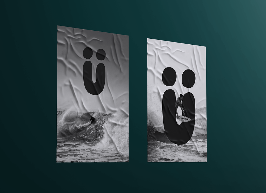
I explored a grayscale direction to maintain a restrained and timeless aesthetic. No brand colors were introduced to the Ü element as it made the composition feel too distracting and visually overpowering. This took away from the simplicity of the design, so I chose to remove the color and keep the poster minimal and cohesive.
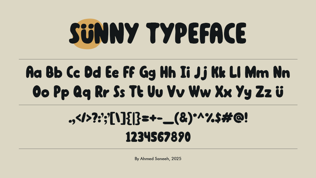
Type using the Sünny font below:
This project deepened my understanding of typography not only as a technical craft but as a personal and expressive medium. Developing Sünny allowed me to translate memories, emotions, and lived experiences into a functional typeface that reflects who I am and where I come from. Beyond the technical growth, the project reinforced the idea that type can carry atmosphere, identity, and feeling. In that sense,
Sünny is not just a font, but a visual extension of moments shaped by sun, water, and movement.