

Developed as an expansion of my previous semester’s type project, Blocky reflects both continuity and growth in my design practice, allowing me to further explore bold structure, consistency, and versatility within type design.

This project began with the intention of revisiting and strengthening an earlier typographic idea. Rather than starting from scratch, I wanted to challenge myself to improve upon my previous work by refining my process, sharpening my design decisions, and exploring new methods of execution. By building on an existing foundation, Blocky became not only a typeface, but also a record of my progression as a designer.
Inspiration and Research![]()

The primary inspiration for Blocky came from marker pens and handwritten lettering. I was particularly drawn to the expressive quality of marker strokes and the balance they offer between control and imperfection. To explore this, I experimented with three different types of marker pen brushes: round, flat, and brush-tip. Using each marker, I manually wrote out letterforms to observe how the tool influenced shape, stroke weight, and overall character.
After reviewing these sketches, the flat marker pen stood out as the most visually compelling. Its consistent stroke width and defined edges produced a bold, structured appearance while still retaining a handmade quality. This combination aligned closely with the direction I wanted the typeface to take, leading me to focus my development around this tool.
Before formalizing the design, I also conducted visual research by exploring typefaces and lettering styles online. This research helped me better understand how bold and block-like fonts are constructed, particularly in terms of proportions, spacing, and visual rhythm. Rather than replicating existing designs, this phase allowed me to identify effective typographic strategies and consider how they could be reinterpreted through my own approach.
Hand Lettering and Concept Development

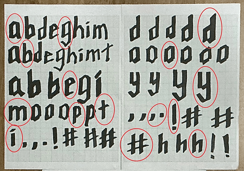
Following the research stage, I continued developing the letterforms through extensive hand lettering using the flat marker pen. A key realization during this process was the importance of consistency in technique. By holding the marker pen at the same angle while writing each letter, I was able to achieve uniform stroke direction and weight throughout the alphabet. This consistency became a defining feature of Blocky, contributing to its cohesive and intentional appearance.
Working by hand allowed me to experiment freely with form, proportion, and rhythm.
I created multiple variations of certain letters, adjusting widths, corners, and internal spaces to explore how small changes could influence the overall feel of the typeface. This analogue phase played a crucial role in shaping the personality of Blocky, as it encouraged exploration without the constraints of digital precision.
Digitisation and Structural Refinement

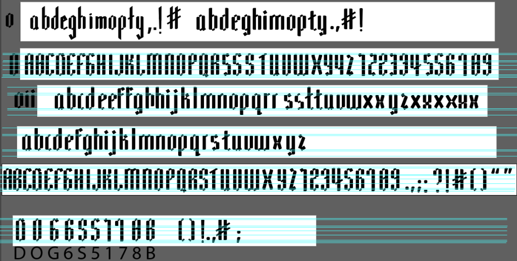
Once I was satisfied with the hand-drawn sketches, I moved on to digitising the letterforms using Adobe Illustrator. Each letter was carefully traced and refined, with close attention paid to maintaining consistent heights, baseline alignment, and proportions. At this stage, my primary focus was on building the basic structure of the typeface while preserving the character of the original marker strokes.
During the digitisation process, I experimented with the shapes and details of specific letters to improve consistency across the typeface. Small adjustments to stroke thickness, corner angles, and spacing revealed how subtle refinements could significantly affect visual balance and readability. This stage helped me better understand the relationship between individual letterforms and the typeface as a complete system.
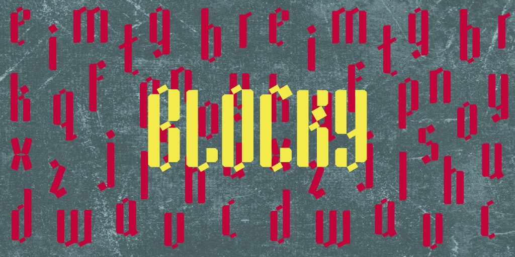
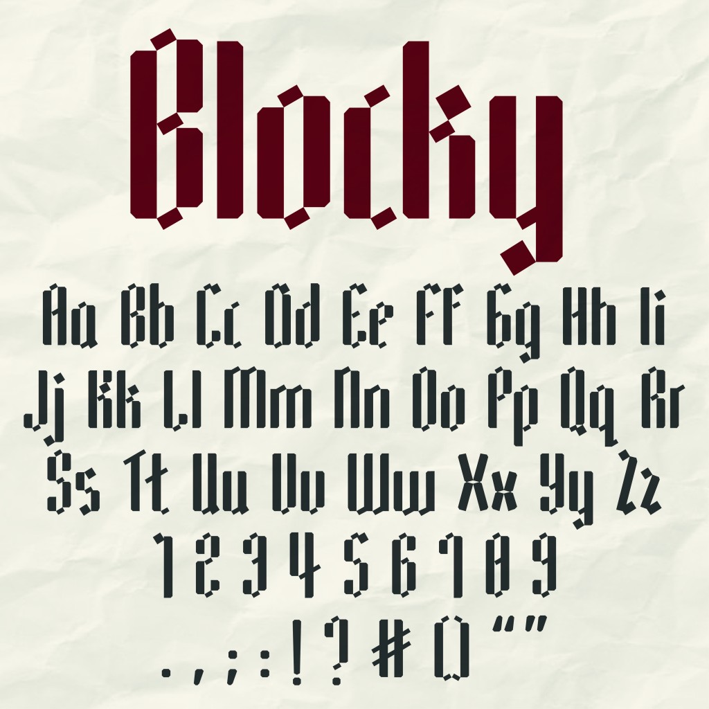
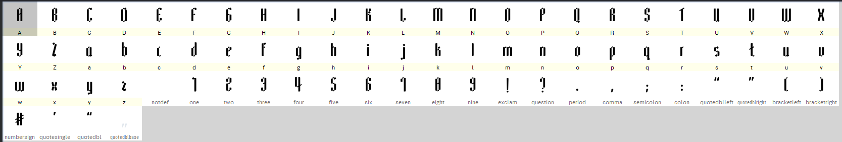
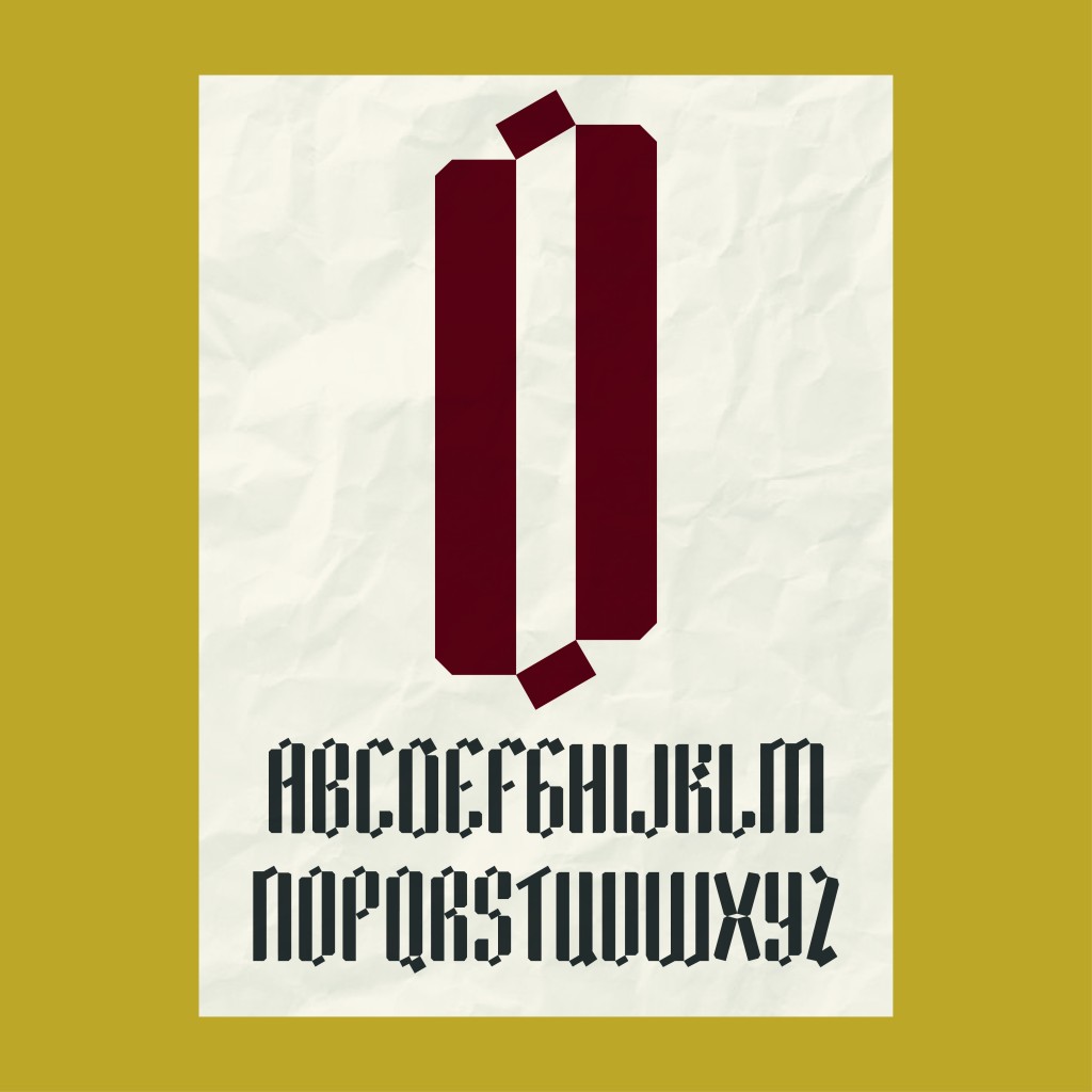
After finalising the full set of letterforms, I named the typeface Blocky. The name reflects the font’s bold, structured, and confident visual style, while also hinting at its geometric and modular qualities.
Technical Development in FontLab

Following the design stage in Illustrator, the font was imported into FontLab for technical refinement. This phase introduced me to the functional aspects of type design, including spacing, alignment, and kerning. Each character was carefully adjusted to ensure consistency across the typeface, while kerning pairs were refined to improve readability and visual flow when letters are used together.

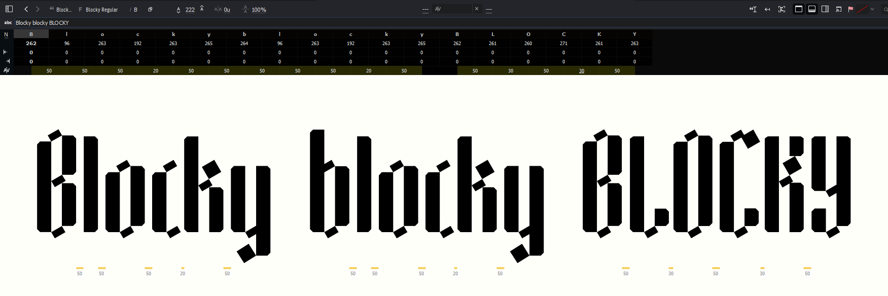
This process highlighted the importance of viewing a typeface not as isolated letters, but as an interconnected system. Even well-designed letterforms can appear unbalanced if spacing and kerning are not properly considered. Through repeated testing and adjustment, I was able to improve the overall harmony and professionalism of Blocky. Although this stage was time-consuming, it significantly enhanced the usability and quality of the final font.
Colour Exploration and Presentation Design

With the technical aspects completed, I began exploring colour palettes that would complement the personality of Blocky. The goal was to identify colours that enhanced the font’s bold character while maintaining strong contrast and readability. The selected palette was later applied consistently across the presentation and applications to reinforce the visual identity of the typeface.
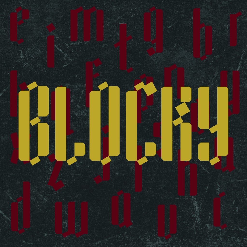
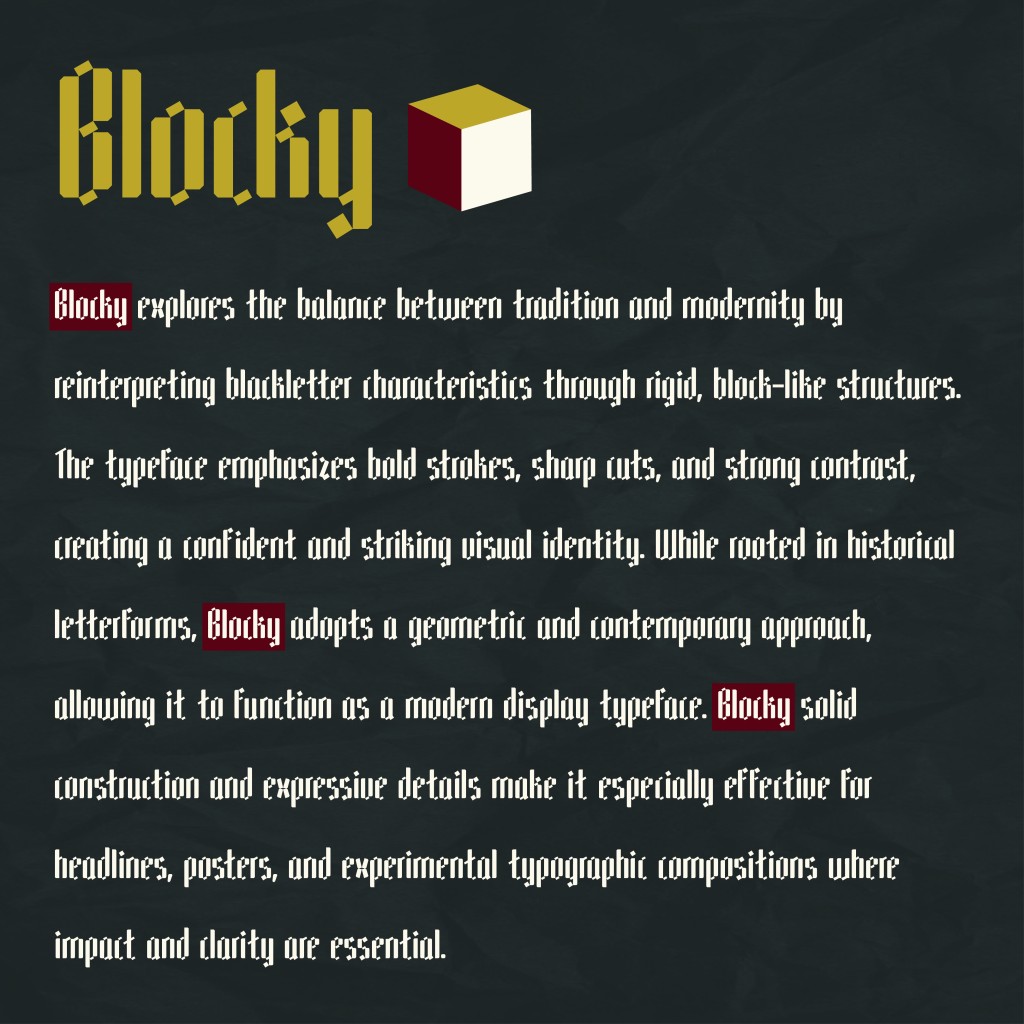
I then moved on to designing the font presentation. Various layout compositions were explored to showcase the letterforms in engaging and visually clear ways. Emphasis was placed on highlighting the shapes, proportions, and distinctive features of the font. To prevent the designs from appearing flat or overly minimal, paper textures were incorporated into some layouts. These textures added depth and visual interest while subtly referencing the handmade origins of the typeface.
Font Applications

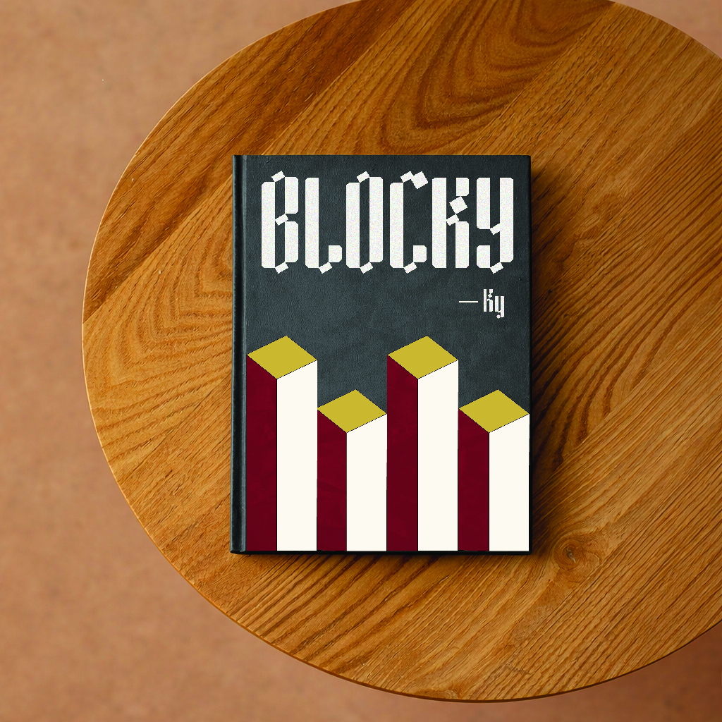
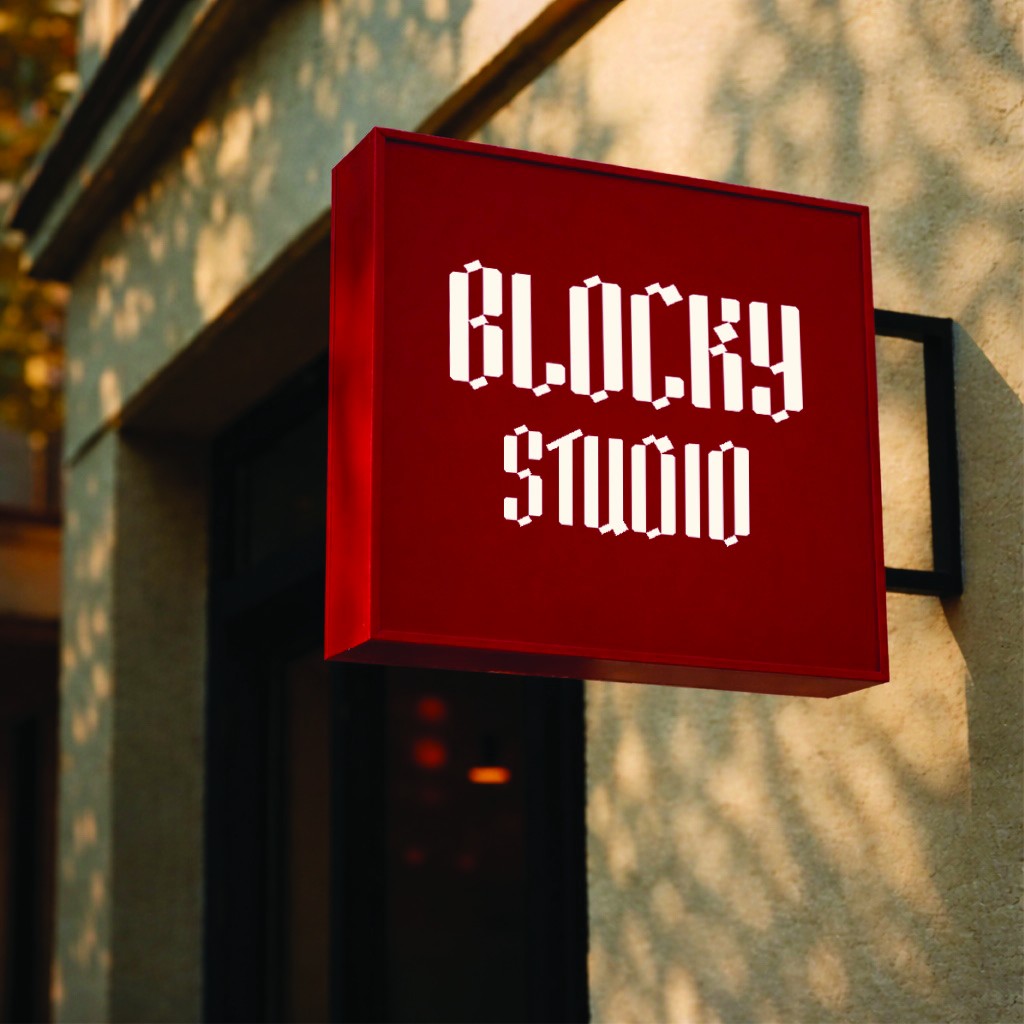
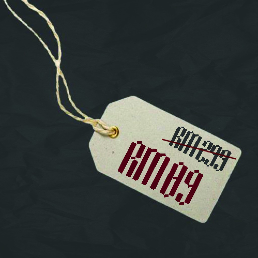
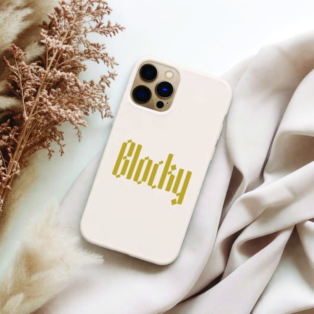
To demonstrate the versatility of Blocky, I developed a series of real-world applications. Using Photoshop, I created perspective text and prepared visual elements by cropping and refining objects. These elements were then imported into Illustrator for further layout refinement and final adjustments.
In total, four font applications were created: a book cover, a signboard banner, a price tag, and a phone case. Each application was designed to highlight a different aspect of the typeface’s functionality, showing how Blocky can adapt across print, signage, and product-based designs. These applications helped validate the flexibility of the font and demonstrated its potential beyond static typographic specimens.
Reflection and Learning Outcomes
Reflecting on the development of Blocky, this project provided valuable insight into the importance of process-driven design. Expanding on a previous semester’s work allowed me to approach the project with greater confidence while remaining open to experimentation. I learned that strong outcomes often emerge through iteration and careful refinement rather than immediate solutions.
One of the most significant lessons from this project was the impact of consistency, particularly during the hand-lettering stage. Maintaining a fixed marker angle influenced the cohesion of the entire typeface, reinforcing how early design decisions can shape the final result. Additionally, transitioning from analogue sketches to digital letterforms taught me how to balance organic qualities with technical precision without losing the original character of the design.
Working with FontLab deepened my understanding of typography as a system. Adjusting spacing and kerning required patience, but it strengthened my appreciation for the technical craftsmanship behind professional typefaces. The application phase further reinforced the importance of testing designs in practical contexts, ensuring both visual appeal and functionality.
Overall, Blocky represents both a creative and technical milestone in my design journey. It strengthened my typographic skills, sharpened my attention to detail, and helped me develop a clearer design voice grounded in thoughtful process and experimentation.
Type using Blocky:
Conclusion
The creation of Blocky demonstrates how handcrafted exploration and digital refinement can work together to produce a cohesive and expressive typeface. From initial marker pen experiments to technical development and final applications, this project reflects my ongoing interest in bold structure, consistency, and practical versatility. Blocky not only showcases my typographic abilities, but also represents my growth as a designer who values experimentation, iteration, and purposeful design decisions.