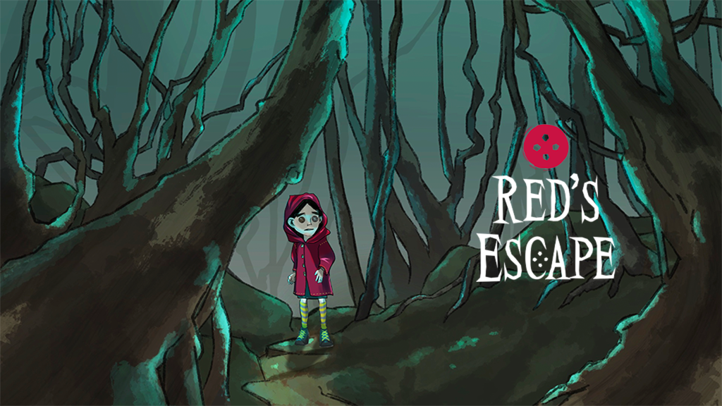
Red’s Escape is a 2D horror game concept that reimagines the familiar fairy tale of Little Red Riding Hood as a dark fantasy horror experience. Playing as Red, the player explores an unsettling forest and a decaying house, collecting clues while trying to escape this transformed world.
When I first started this project, I did not simply want to turn this fairy tale into a scary game. Because the story is so familiar, I wanted to distort its world just enough to make players feel that something was wrong with a story they thought they knew.

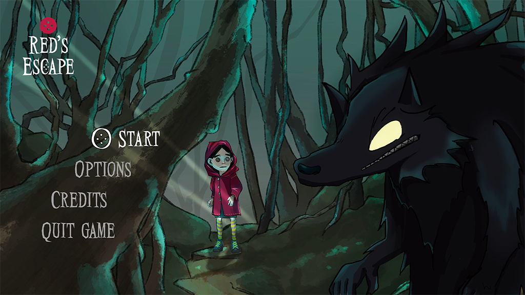
The reason I chose Little Red Riding Hood was quite simple: it is a story that almost everyone knows. A girl in a red hood, a path through the forest, her grandmother’s house, and a wolf. Anyone familiar with the story can immediately picture these elements.
That was exactly why I wanted to look at this familiar tale from a different perspective rather than simply retelling it.
What if the world Red thought she knew had already changed?
I wanted to keep the recognizable elements of Little Red Riding Hood while creating a world that felt completely different. What interested me most was the uneasiness between the feeling of “knowing” something and the feeling that something is no longer quite right.
I wanted players to recognize, This is Little Red Riding Hood, while simultaneously thinking, But this is not the Little Red Riding Hood I remember.
One of the most important things I wanted to achieve with Red’s Escape was to make the story something that players could experience rather than simply watch.
In the game, the player takes on the role of Red and explores a forest and her grandmother’s house. I structured the gameplay experience around four main stages: Explore, Research, Encounter, and Escape.
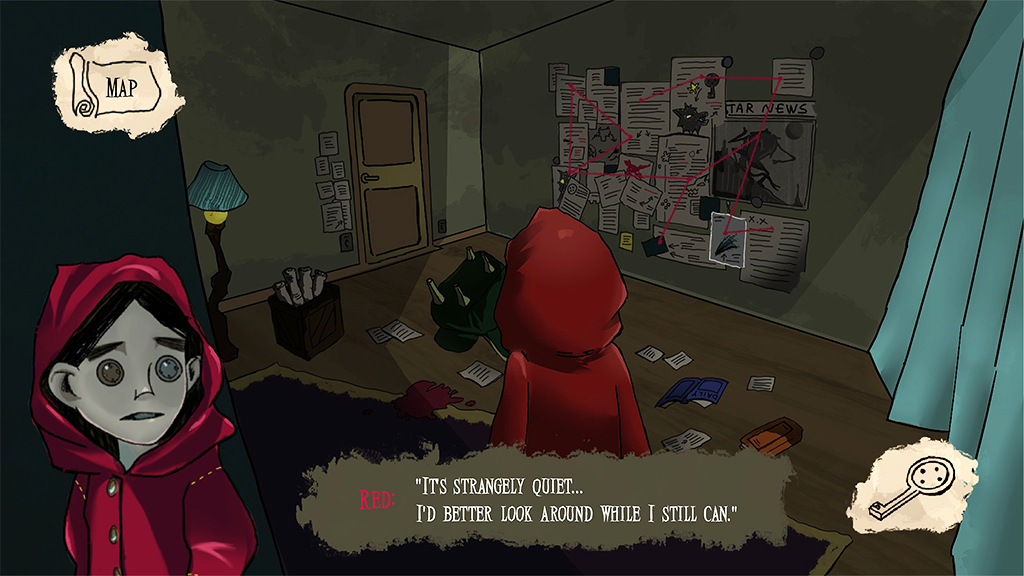
Rather than simply reading the story, the player walks through the world, discovers its secrets, and sometimes has to run from them. I wanted Red’s uncertainty to become the player’s own experience.
When designing Red, I did not want her to feel like a heroic character with special abilities. Instead, I wanted her to be an ordinary girl who, just like the player, does not understand what is happening and experiences the same feelings of surprise and fear.
The story begins on what should be Red’s usual journey home from her grandmother’s house. But the familiar forest begins to look different. I wanted Red and the player to experience surprise and fear.
Visually, I tried Red to remain easy to recognize within the dark world around her. Most of the environments and elements other than Red, use darker tones, allowing the player character to naturally become the main visual focus.
To create a distinctive silhouette, I designed Red with a larger head and thin limbs, creating a simple and recognizable shape even from a distance. I also took inspiration from Coraline and the Secret Door and gave her button-like eyes, adding a unique element without distracting from the story.
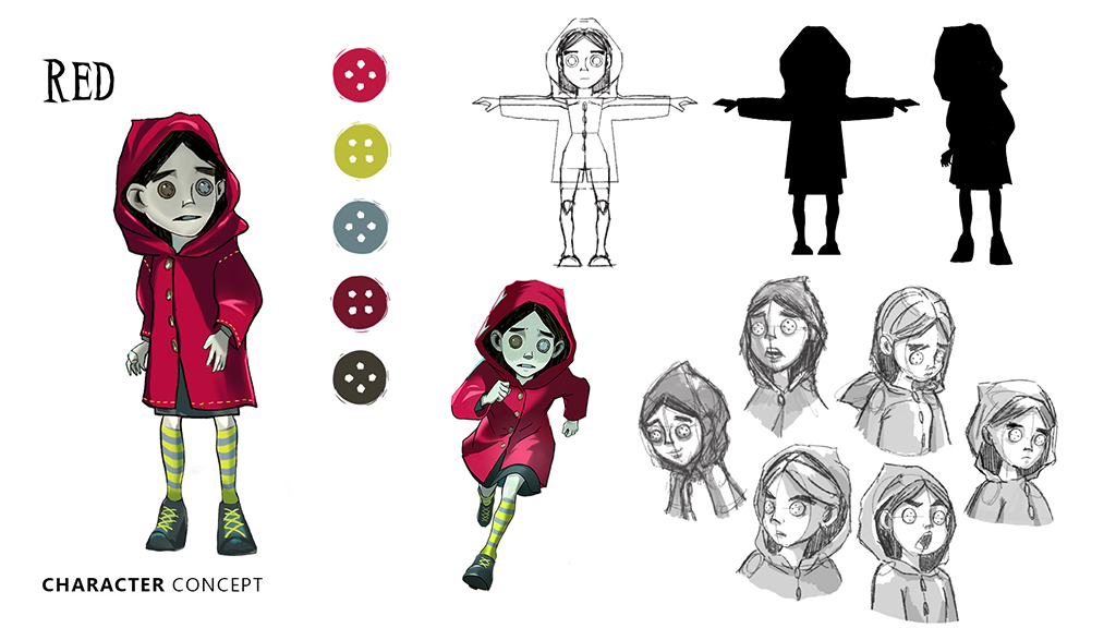
The colour red also became an important part of her identity. It maintains her connection to Little Red Riding Hood while making her easy to remember and immediately recognizable. At the same time, it creates a strong contrast against the Wolf.
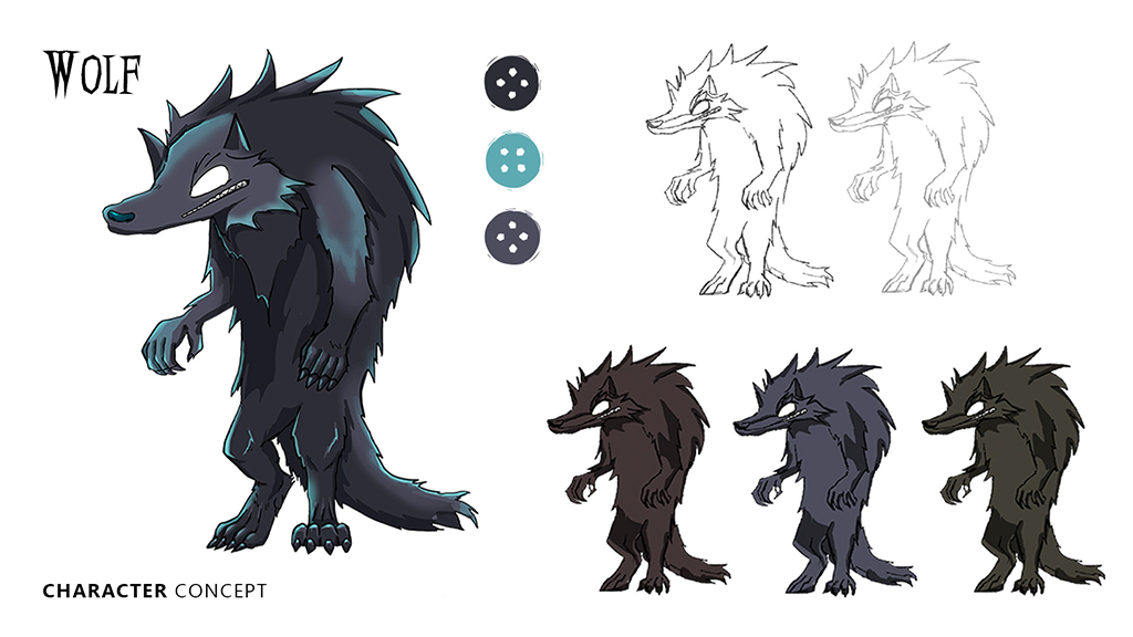
Red is small, while the Wolf is large. Red stands out in bright red, while the Wolf blends into the darkness. This visual contrast is one of the key elements in creating the tension of Red’s Escape.
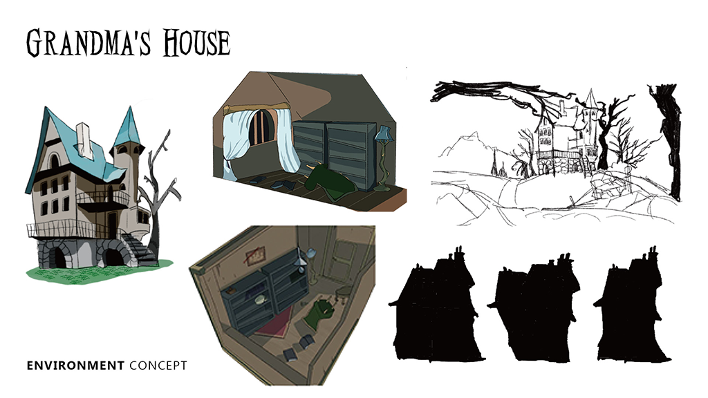
In Red’s Escape, the environment is more than just a background for the characters. I wanted it to create anxiety and tension while revealing what has happened in this world.
When designing the forest, I focused on creating the feeling that the Wolf could be hiding somewhere nearby. Rather than constantly showing the Red, I used gaps between trees, deep shadows, fog, and limited lighting to suggest that something might be lurking just beyond the player’s view.
I did not want players to simply feel “scared.” I wanted them to wonder, What is happening?
The grandmother’s house becomes another unsettling environment. Scattered furniture, a fallen cup, a disturbed carpet, and newspaper articles containing information about the Wolf provide clues about what may have happened. Instead of directly explaining the story, these details encourage players to investigate and create their own understanding of the events.
One challenge during production was finding the balance of darkness. At first, I made the environments too dark, which made the details difficult to see. So, I reduced the darkness and introduced cyan- and green-tinted lighting. This allowed me to maintain visibility while creating an unnatural and unsettling atmosphere.
Another key element in designing Red’s Escape was contrast: light and darkness, what is visible and what is hidden, and the familiarity of a fairy tale against an unsettling world.
One of the most important contrasts was Visible × Hidden.
Red is designed to remain easy to recognize even within the dark environment, while the Wolf blends into the darkness environment. Red remains at the centre of the player’s attention, while the Wolf becomes a presence that could be anywhere.
Another major contrast was Fairy Tale × Horror.
Little Red Riding Hood is often associated with childhood and familiarity. I wanted to challenge that feeling by placing these familiar elements within a dark and unsettling horror world.
I wanted players to recognize the fairy tale while feeling that something had changed. The world should feel familiar enough to understand, but strange enough to make players uncomfortable.
This project began with a simple question: What would happen if Little Red Riding Hood were reimagined as a dark fantasy game?
From that idea, I developed the world through sketches, character designs, environments, and game scenes.
I began with Red and the Wolf, exploring their silhouettes, colours. I then developed the forest, the grandmother’s house, and their interiors, considering how each environment could contribute to the story.
Throughout the process, I learned that making something darker does not necessarily make it scarier. I experimented with lighting, colour, and composition until I found a balance between visibility and atmosphere.
Eventually, the project expanded beyond the game scenes themselves. Character designs, environment designs, sketches, posters, and gameplays were brought together as one visual identity. The final showcase allowed me to present not only the finished concept, but also how the idea developed throughout the design process.

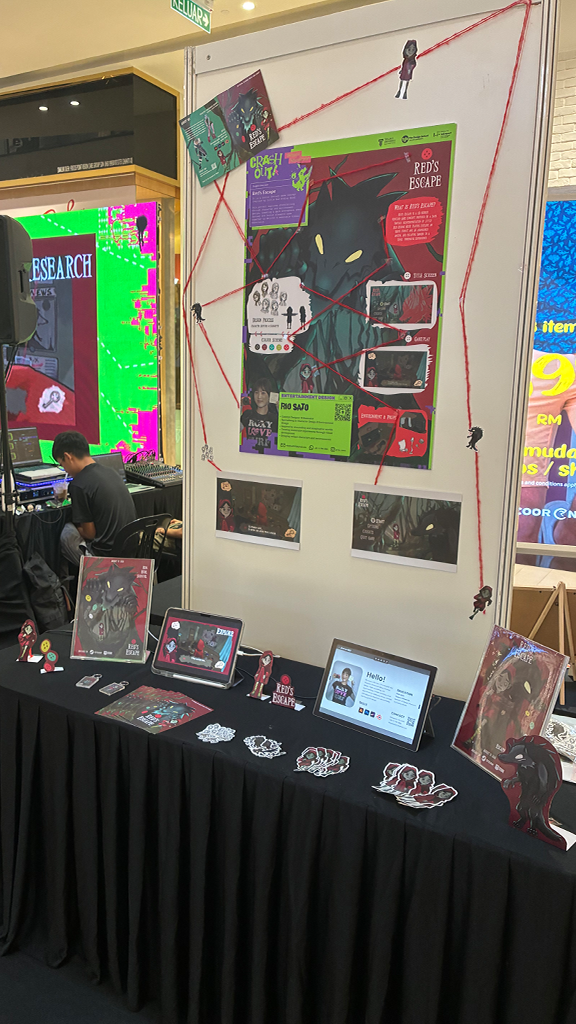
While working on Red’s Escape, I learned that completing a single visual and designing an entire world are two very different things.
Red’s colour and silhouette guide the player’s attention. The forest and house create feelings of uncertainty and curiosity. The hidden Wolf creates tension even before it is seen.
These small design decisions showed me that visual design can also shape emotion.
For me, Red’s Escape became more than a game concept. It was an opportunity to connect characters, environments, colour, storytelling, and player emotion into one cohesive world.