


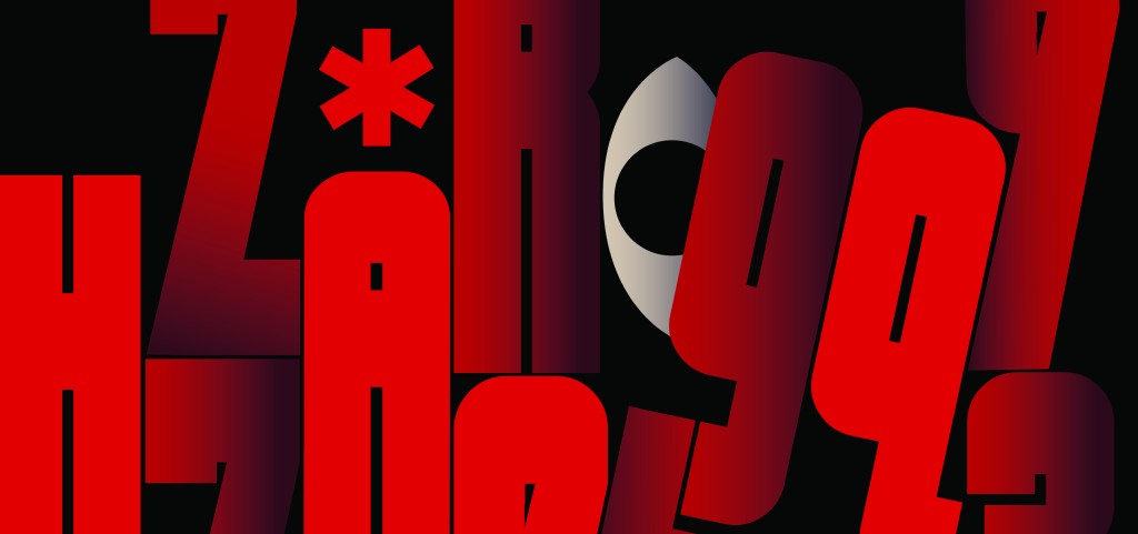
The visual language of power and authority can be found everywhere—from influential figures and political ideologies to monumental architecture and visual propaganda. There are countless forms of communication and cultural expression capable of making us perceive power and greatness; they can make us admire, feel small, feel intimidated, and ultimately become inclined to obey. But what is it about these forms that enables them to convey such power?

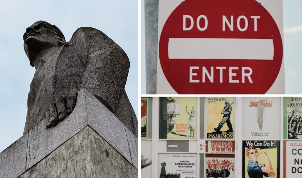
To answer that question, there isn’t one single definition of what makes something appear powerful or authoritative, as these ideas are shaped by individual experiences and cultural perspectives. However, from an objective point of view, observations of historical depictions of power and authority reveal recurring visual characteristics, such as an emphasis on size (big proportions/high elevation), compositional hierarchy featuring symmetry and a central focal point, and expensive / quality materials & colour depictions. (Mittman, 2019)
The Inspiration
My curiosity about visually expressing power grew through my interest in dystopian literature, particularly George Orwell’s 1984, where the whole idea and expression of totalitarianism in this book was something so unnerving and uncanny, and had such a great and jarring impact on me that I was in awe with how the story made me feel, discomforted and disquieted, and began to reflect on parallels between the story and our modern society – disturbing.
But when I looked back at the design of the book, it had seemed like a whole other story: something far more tame than what I had just read and experienced, and felt that the design didn’t do justice to the dystopian and oppressive nature of the story. That brought me back to the question, “what about certain forms that are able to convey such power?”.
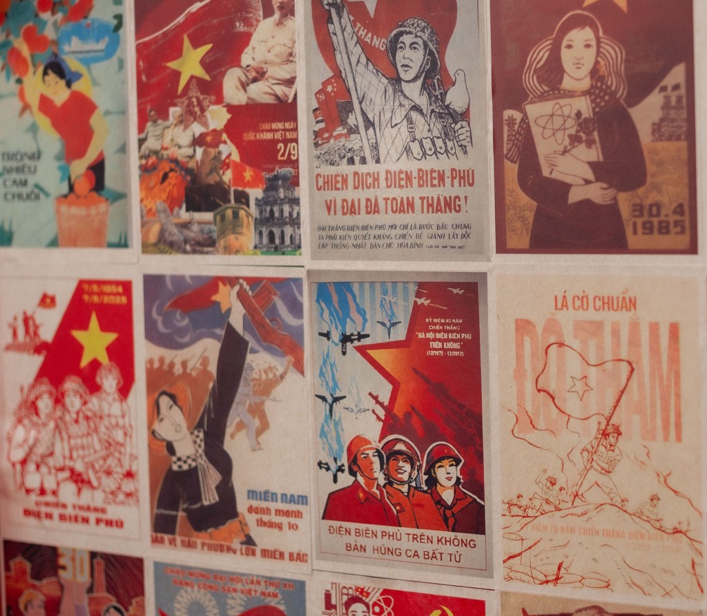
The novel expressed the ability to control a nation unequivocally, and depicted a constructivist, totalitarian society that created an eerie, hopeless environment. To me, that is absolutely frightening, and the feeling the novel gave me was similar to looking at a communist propaganda poster; intimidated, uncomfortable, brutal, and built on false hope. This became the visual definition of power and authority for my project that I wanted to convey for my typeface, and drew inspiration from communist and constructivist design.

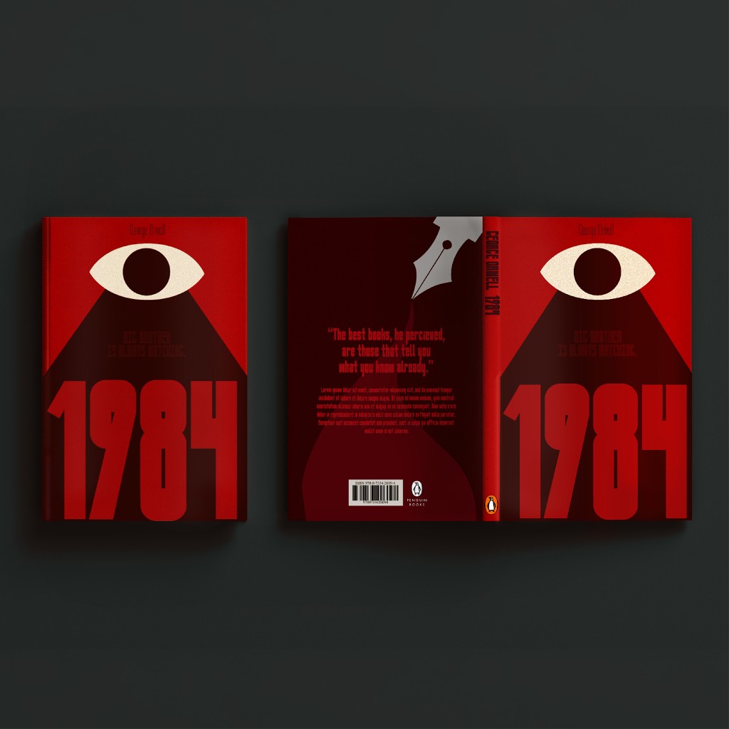
The edition I read featured a bright-red cover with a large eye in the middle, and a handwritten-like typeface used for the typography. To me, the most underwhelming and least-evocative design element on that cover was the text, and thus inspired me to design a typeface that visually communicates those same feelings of dominance and control that the story conveys, to ultimately redesign 1984’s book covers with the intention of building a stronger, more intimidating identity that reflects the very unsettling story within.
Designing ‘Newspeak’
After defining the direction of the design and expression, I decided to explore sans-serif and grotesque typeface styles to better capture the feelings of intimidation and power, influenced from communist propaganda designs and constructivism.
The design trials remained fairly simple and followed the same grid and construction. However, the real exploration lay in the weight and counter thickness, which I found to be the determining factors in whether the typeface would evoke the intended feeling. This was something I initially struggled to decide on my own, so with the help of Mr. Vinod, I moved towards a thin letterform with narrow counters.

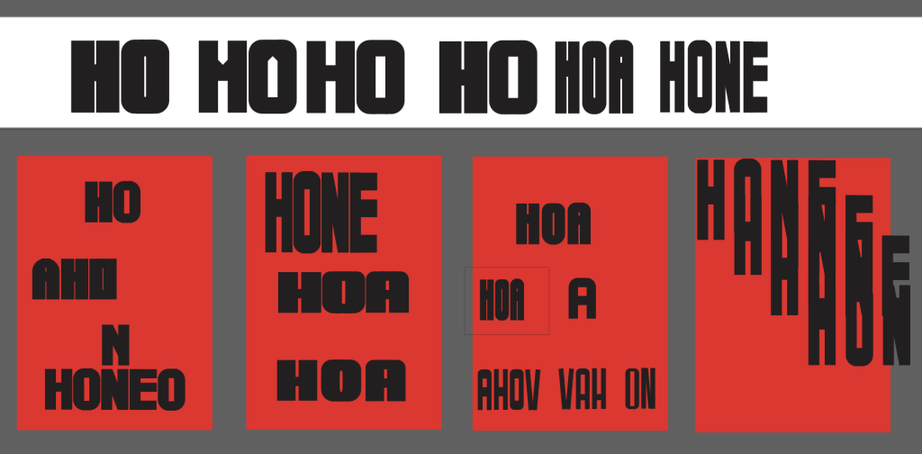
Once I settled on the overall construction and weight, I completed the initial character set (only uppercase/unicase). One of the decisions I struggled with later on, was whether the typeface needed lowercase characters at all.
My initial intention was to create a typeface that would be used primarily in uppercase, as large-scale typography felt more appropriate for communicating authority. This was influenced by my earlier research into power, where size and scale repeatedly appeared as characteristics associated with dominance. However, since the typeface could technically support lowercase characters, I decided to develop them as well – why not.
As development progressed, the first lowercase forms did not feel as successful as the uppercase characters and began to move away from the visual language I had established. I therefore made several adjustments influenced by Mr.Vinod’s feedback to bring them back into the same style.

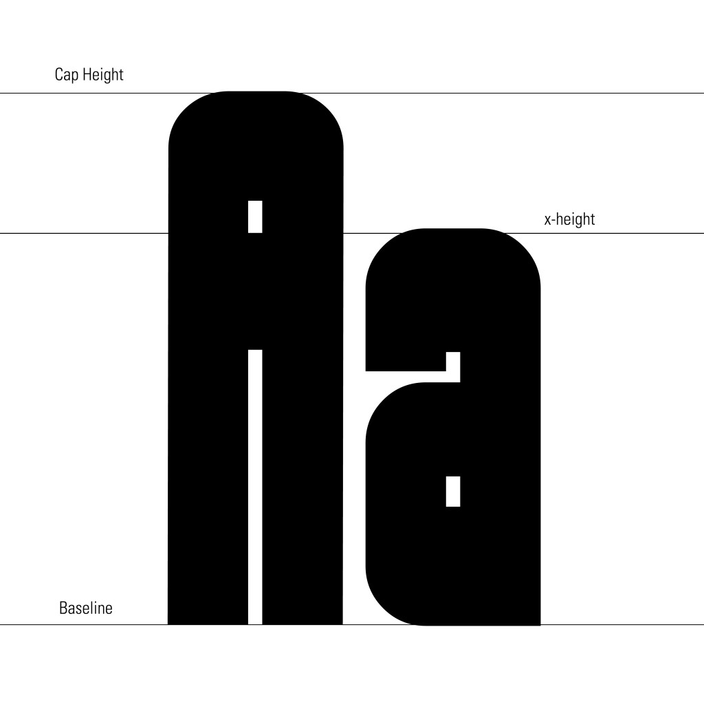
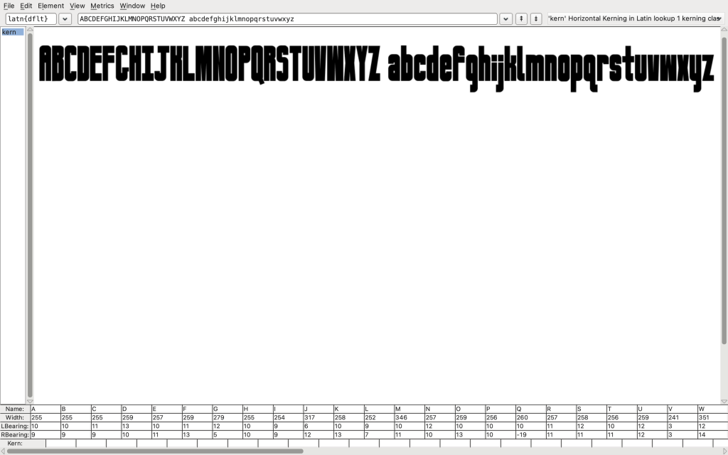
After completing the character set, I moved the typeface into FontForge, where I refined the technical aspects of the typeface. I adjusted the sidebearings and kerning to control the relationships between individual characters, deliberately keeping the spacing relatively compact, creating a dense and compressed rhythm. Rather than allowing the letters to feel open, relaxed and comfortable, I wanted the close spacing to create a sense of tension and visual pressure.

The final result became “Newspeak”, named after the controlled language developed by the Party in the novel 1984. The name is, of course, a direct reference to the novel, and my interpretation of a typeface that could exist within its universe. It also reflects one of the story’s central ideas: that controlling language can become a means of controlling thought, reinforcing the relationship between language, power, and authority.
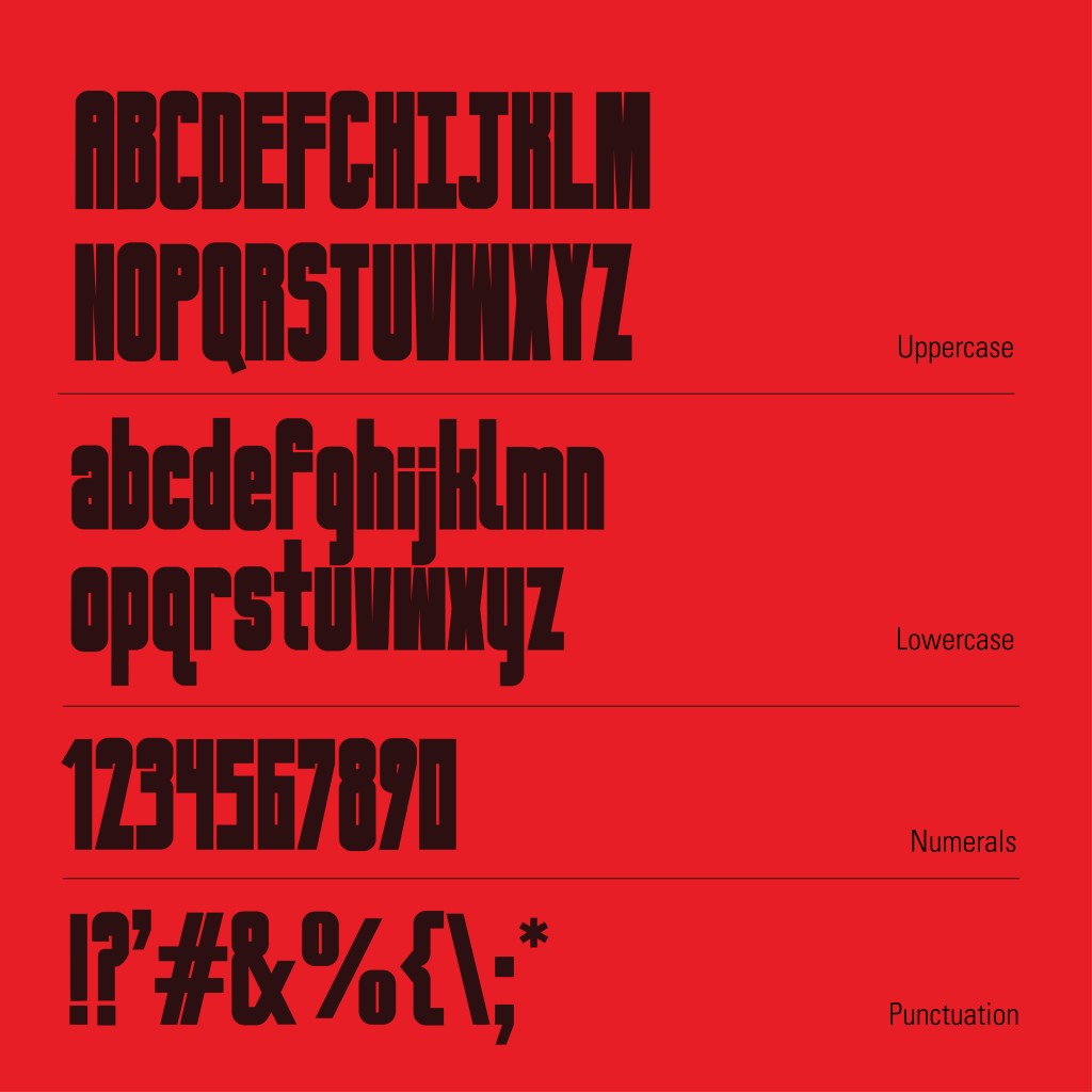
Imagining ‘Newspeak’ in the Real World
Newspeak is designed as an attempt to translate the oppressive experience of 1984 into typography, to be then used in the real world for headlines, titles, and bold statements made to capture attention.
For the type presentation, I presented Newspeak in a way that showcased all of its features and how it can be used to intimidate and be used to make a statement. Using bright red, black, and a hint of blue for contrast, Newspeak is depicted as bold, oppressive, and commanding.
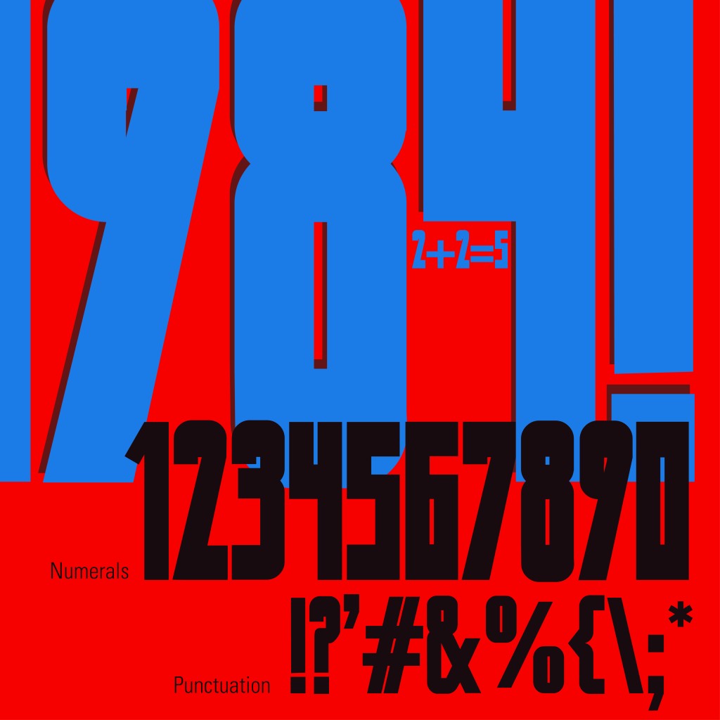
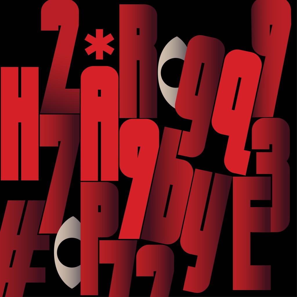
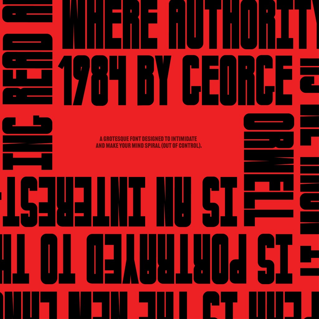
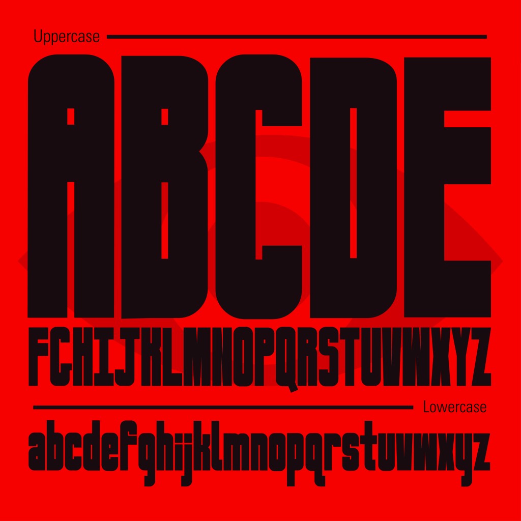
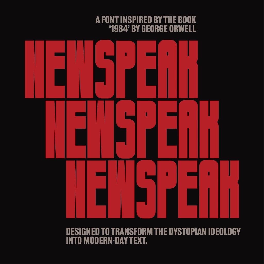
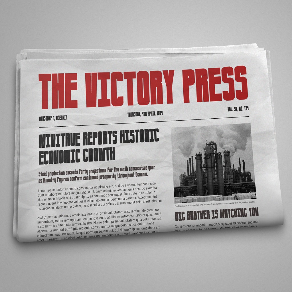
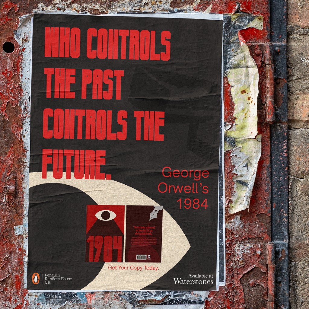
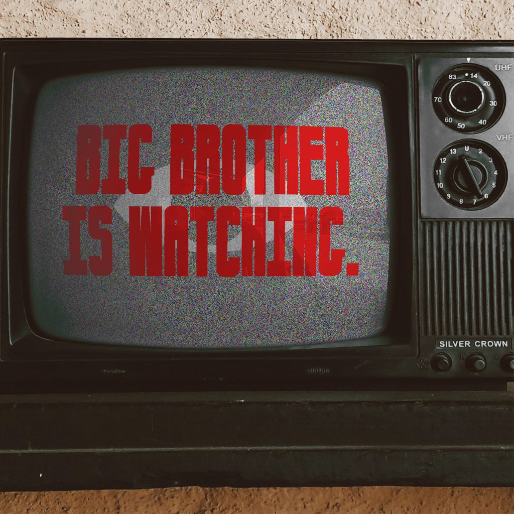
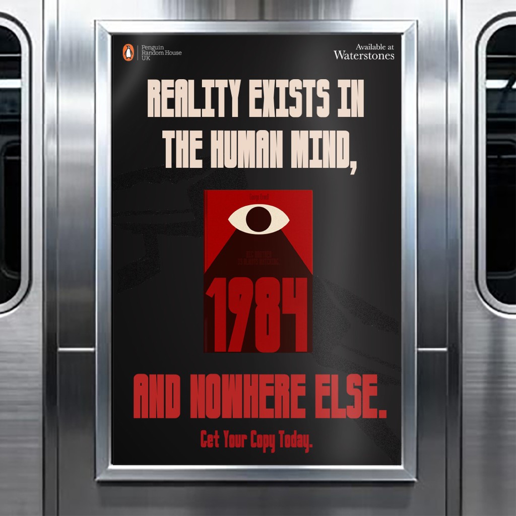
Moving on to real applications, I chose to showcase Newspeak in the context of a book cover (1984 book cover reimagined), the masthead of a newspaper, a poster, an urban poster / screen, and a dated TV screen (in reference to telescreens from the novel). The reason why these items were chosen was that they all communicate a message to viewers, and heavily involve typography in their effectiveness to communicate. I wanted the vibe to be unsettling and heavy, to accurately depict Orwell’s story and ideology into the real world.
Sample Newspeak here:
The End Goal
All in all, Newspeak, inspired by George Orwell’s 1984 and originally conceived as a response to book covers that, to me, lacked strong visual communication, is an interpretation of how power and authority can be visually expressed through typography, translating the feelings of intimidation, oppression, and discomfort that the novel evoked in me into a functional typeface. Ultimately, it should remind people of how daunting visual communication can really be, and to instill a sense of fear within oneself as they read and witness this typeface.