



The Idea
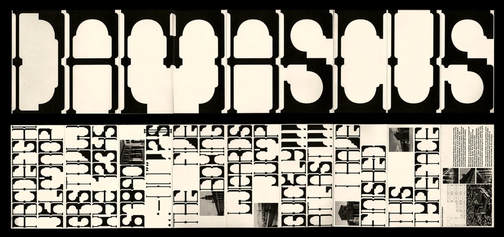
Before the semester had even begun, I stumbled upon the font Damascus Modular while casually scrolling on Pinterest. The unique shapes and overall appearance of the font intrigued me immediately. I knew then that I wanted to create something with a similar modular approach for this project when the time actually came.

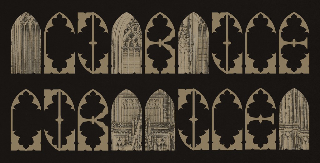
While architecture is not an area I am particularly familiar with, the look and aesthetics of Gothic architecture have always piqued my interest, so I decided to combine the two. Additionally, something I noticed when searching for “Gothic architecture fonts” was that most of the results were simply blackletter-esque fonts. Since I had already explored blackletter in Semester 1 Typography, I wanted to take a different approach rather than creating another font that directly followed the usual visual style associated with the word “Gothic”.
When I proposed the idea to Mr. Vinod, I still did not have a clear vision of how I wanted the font to look, as I did not have time to plan out sketches beforehand. My main concerns were whether I would really be able to create something from the complex forms found in Gothic architecture and whether the final result would turn out too similar to my inspiration font. Despite that, I decided to proceed anyway, because why play it so safe when so much freedom was given?
Creating the Grid
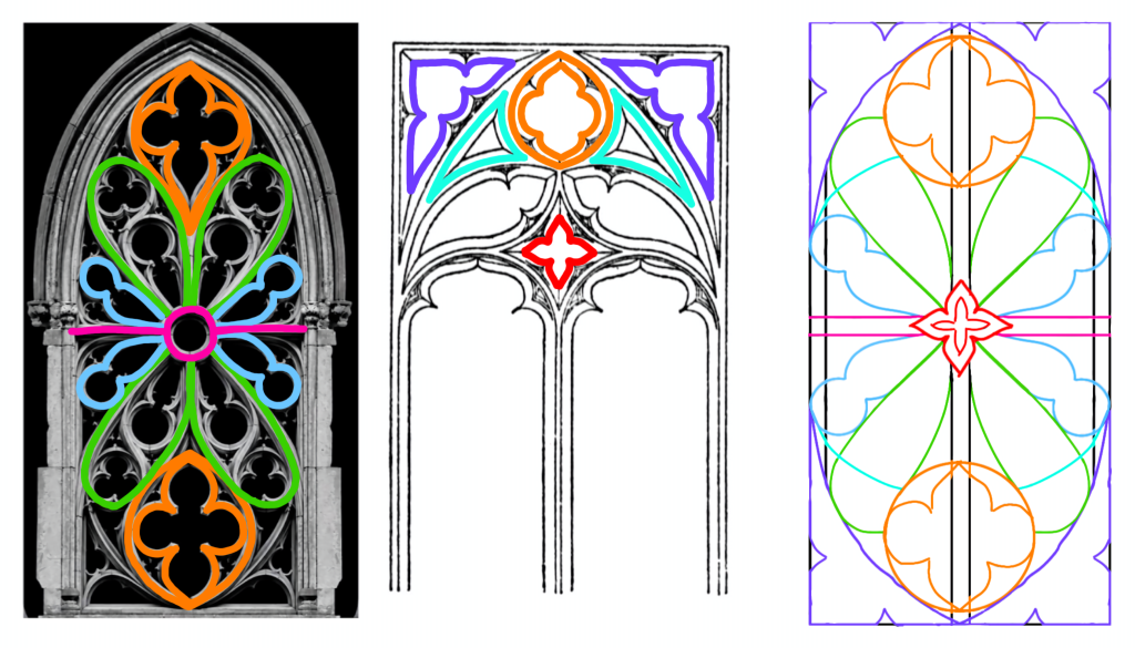
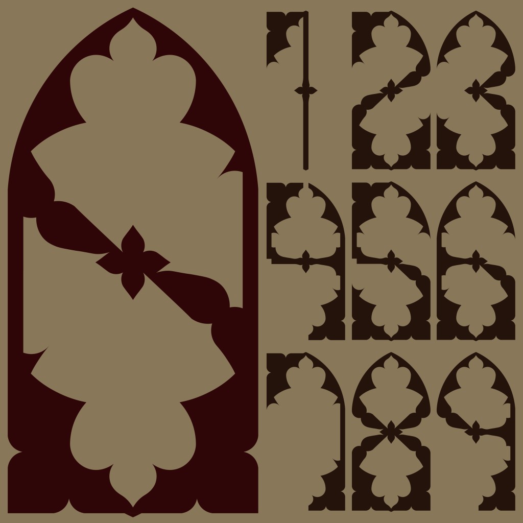
For the grid, I selected an image as well as a sketch of an arch, and then started with the extraction process. I took out some of the most prominent features from each image and combined them together to form the basis of the grid. This took a few attempts, as I had to experiment with which parts were worth keeping and how they could work together. I also tried extracting a few letters during the process to get an idea of what the grid could potentially produce.

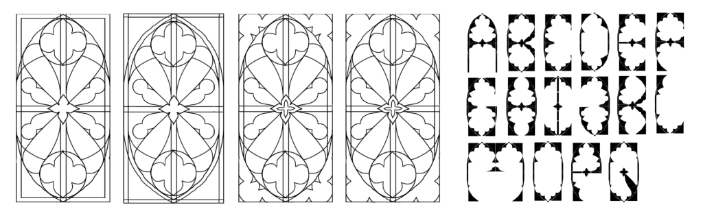
I felt the extracted letters could be better, so I made some changes to the grid again, making sure it would be able to form curves for letters like S, Z, X, and more. The image below shows a quick colour-coded overview of the extracted parts and how they were incorporated into the final grid.

Digitisation
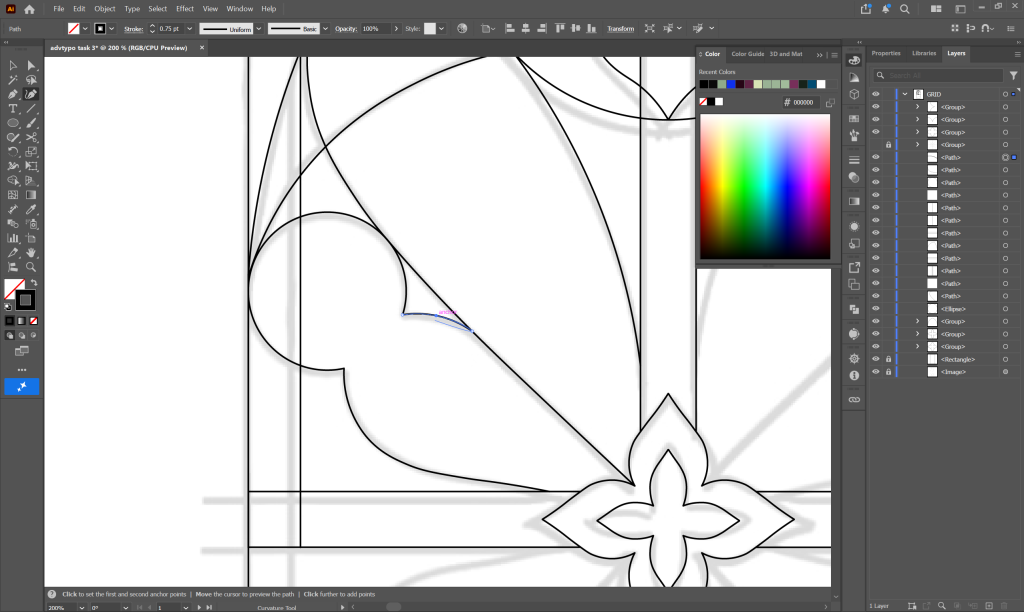
I digitised the grid in Illustrator using the Pen and Shape tools by tracing out parts of the grid and using the Reflect tool to maintain consistency and symmetry throughout the structure while also making the process more efficient.

As for the letters, I used the Live Paint tool to colour in different parts of the grid and experiment with possible letterforms. This part was generally quite simple, but some letters required much more experimentation than others. Certain characters were easier to identify within the grid, while others took several attempts before they started looking like actual letters without losing the overall style.
I eventually ended up with three different variations: one that was more rectangular like the inspiration picture, one with one top corner cut, and one with both top corners cut to resemble an actual arch. When I showed them to Mr. Vinod for feedback, he suggested proceeding with the third variation as it had a more elegant look compared to the other two.

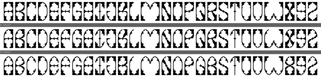
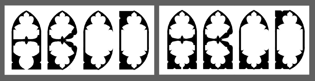
Looking back at what I had, I was still unsatisfied with certain letters, especially the I, N, and X. I also thought that I could fill in both bottom corners of each letter (where applicable) to make them further resemble an arch, so I went back with the Live Paint tool to make these changes and fix any mistakes.

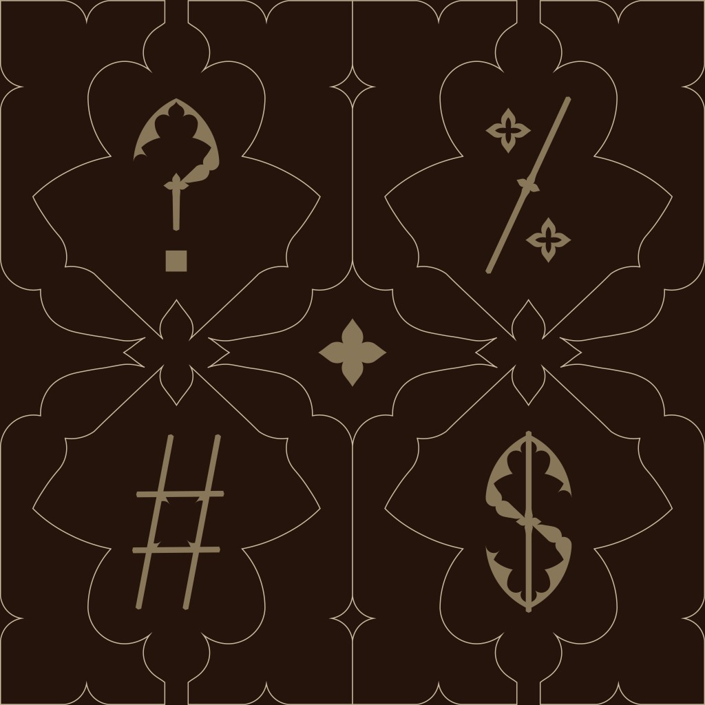
I then started creating the punctuation mostly using the same approach as the letters, though certain symbols had to be made without using the grid. The main feedback I received was that some of my punctuation, specifically the exclamation mark and question mark, should not be so stylised. The period was also too small and needed to be enlarged, so a few other symbols needed to be fixed as well. These were relatively small changes, but they made me realise how much even the smallest details could affect the overall appearance and usability of a typeface.


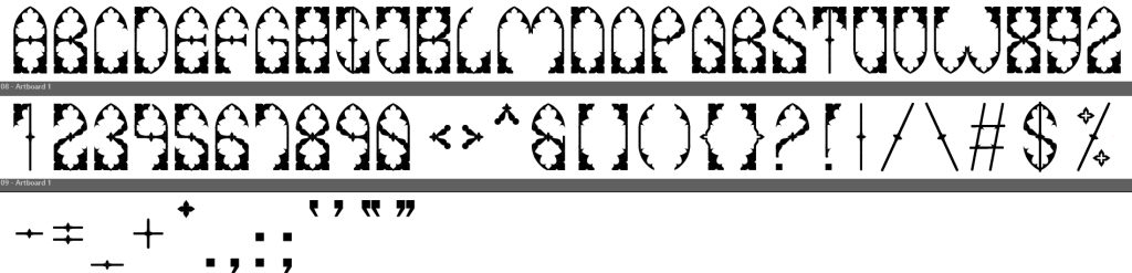
Importing to FontLab
I first used Object > Live Paint > Expand, then united the shapes using the Pathfinder tool to turn each letter into a single shape in Illustrator before importing them into FontLab 8. I set the side bearings for each letter to 30 and 45 for all the punctuation to create some separation.

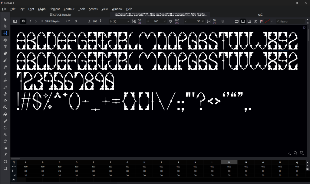
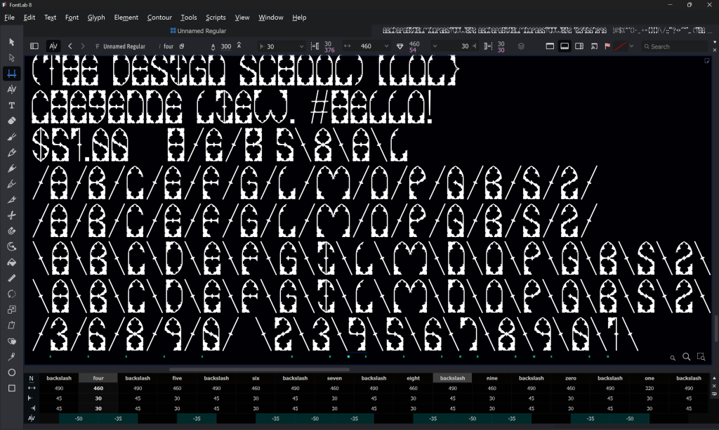
While playing around with different character combinations, I noticed that most of the characters, especially those with curved top edges, created very wide spaces when paired with a forward slash or backslash. This was something I would not have noticed if I had only looked at each character separately. To fix it, I adjusted the kerning to -35 for some combinations and -45 for others.

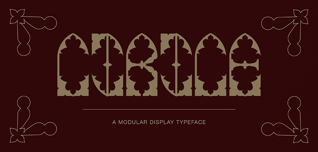
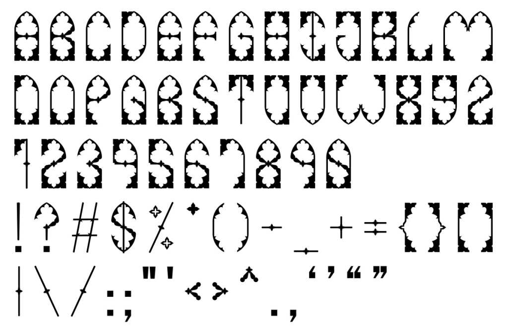
Once everything was done, I named the font Cirice after the song by Ghost. Since Gothic architecture is commonly associated with old churches, I wanted the name to reflect that connection. The word itself is also the Old English word for “church”, which I thought was fitting for the overall concept.
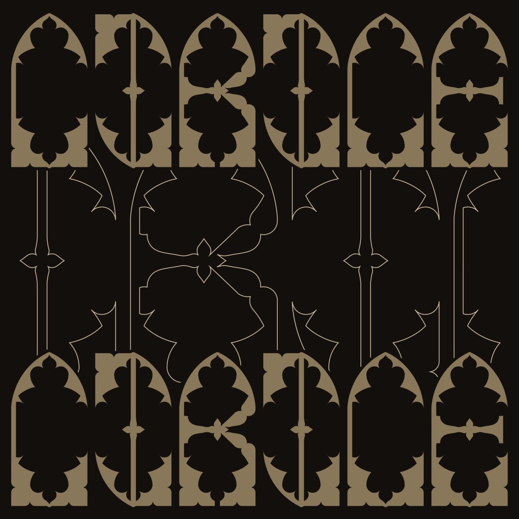
Here is the final outcome of my font, typed out in Illustrator after exporting:

Font Presentation
I started by selecting a dark, muted colour palette with enough variation to fit the overall Gothic-inspired concept without making everything look too dark or monochromatic.


Since Cirice is a display typeface, I used large-sized characters across the artboards to make the forms more visible. I also played around quite a bit with the outlined version of the font to further emphasise the details.

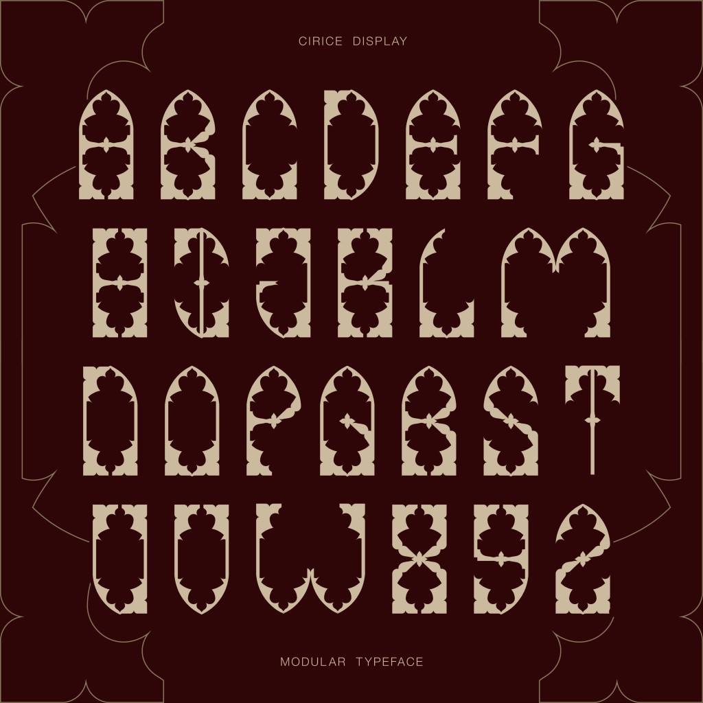
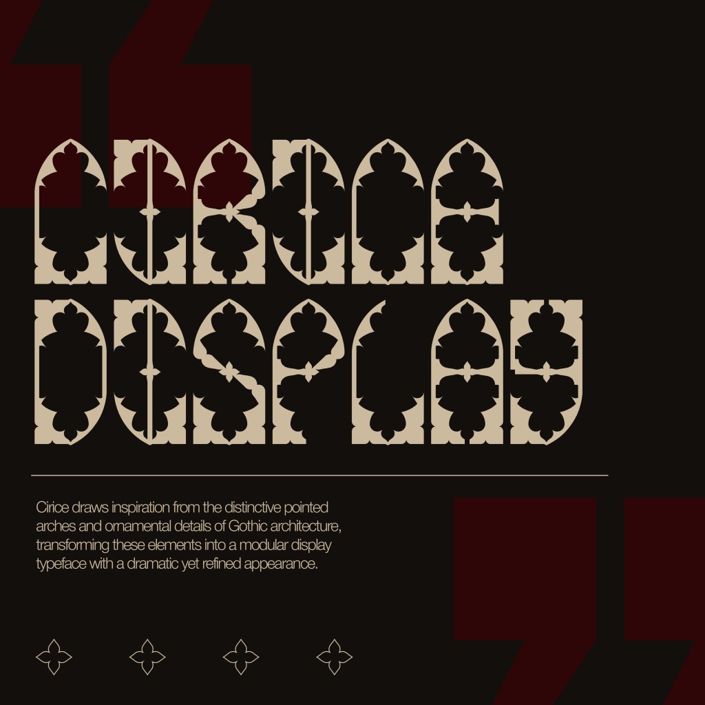
Try typing in Cirice below:
Font Application
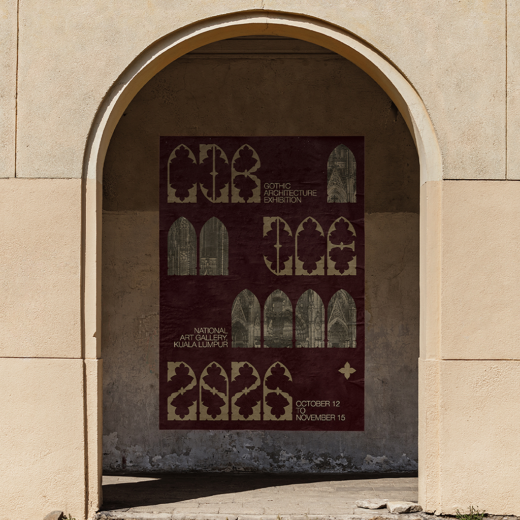
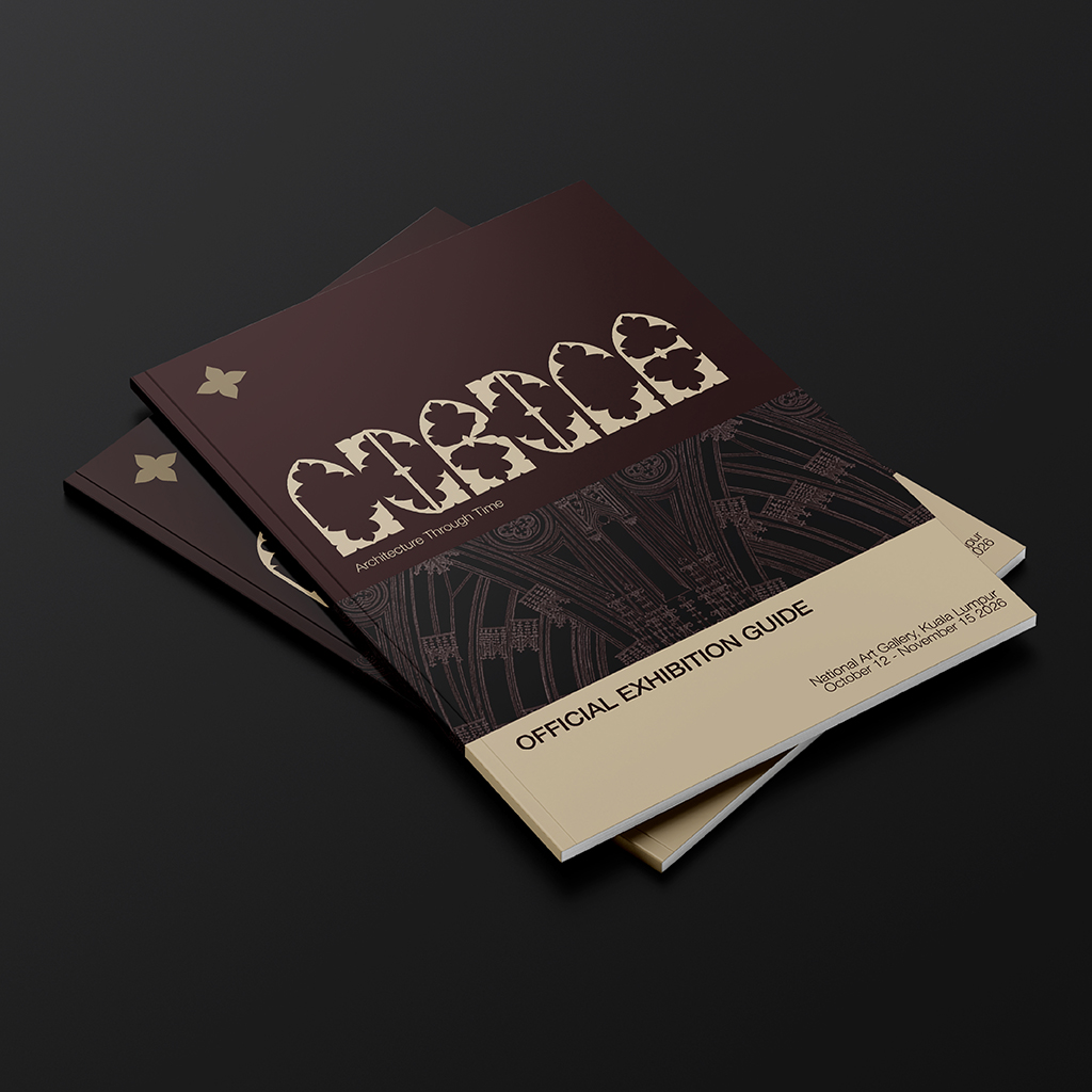
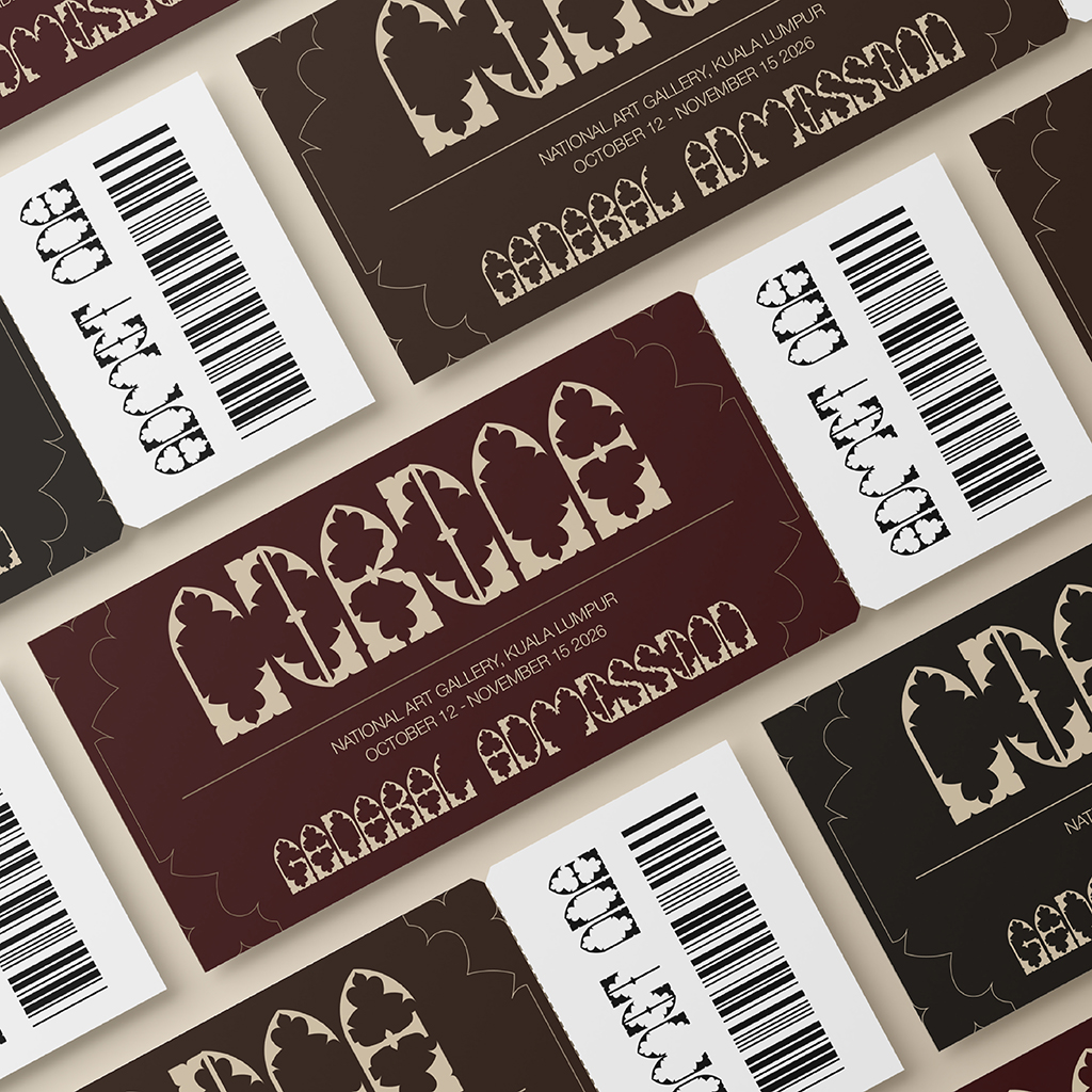
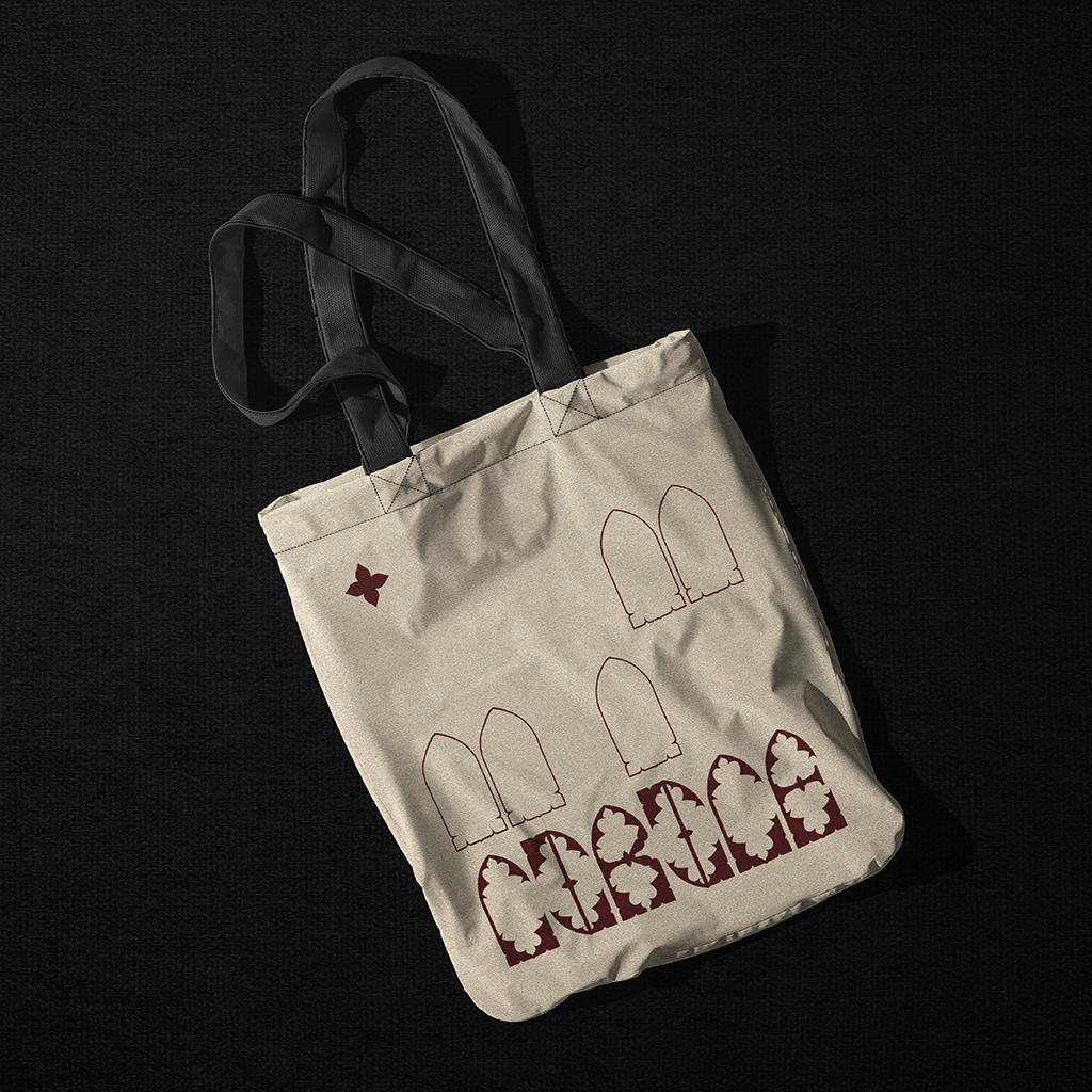
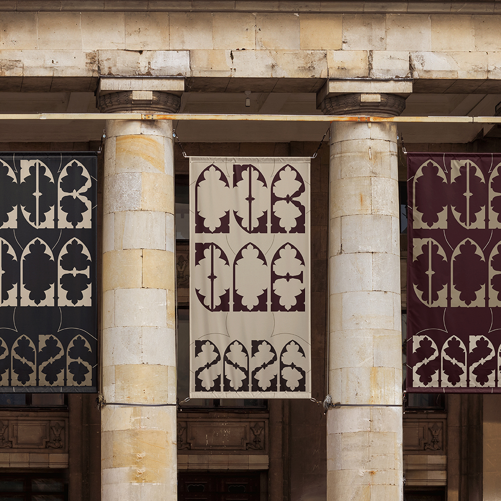
Mr. Vinod had previously mentioned in class that our fonts had to have a purpose, so I came up with a concept for a Gothic architecture exhibition named “CIRICE 2026”, where the typeface could be used as part of the event’s visual identity.
I created mockups for a poster, banners, tote bag, entry tickets, and a brochure/booklet for the exhibition.

Final Thoughts
I had a lot of fun during the process, although I found myself second-guessing my decisions quite often. I realised early on during the process that my font was not going to be very legible, which is why it became a display typeface. That was not my original intention, but I think it was better to work with what I had rather than force it to become something it was not. If I were to change anything now, I would definitely try to make the font more legible while still keeping its overall style. Throughout the entire process, one thing I took away is just how much actually goes into making a complete typeface, from developing the grid and constructing the letters to refining the punctuation and kerning. Despite everything, I am proud of the final outcome and I am glad I was able to overcome my initial concerns and see the idea through.