
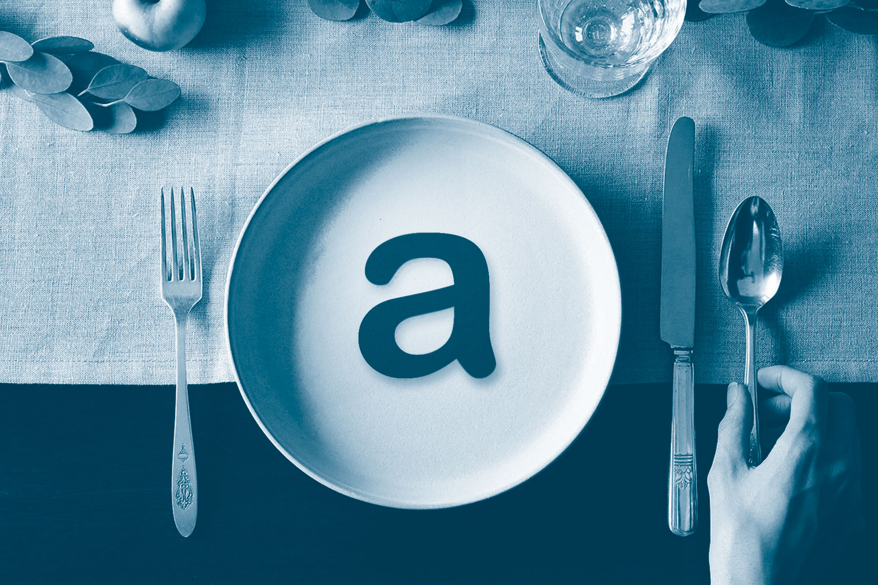
An exploration of how typefaces affect taste
Typefaces and foods are paired more often than we may notice. As a hungry designer and type enthusiast, a peculiar question arose in my mind: Do typefaces affect the way we taste foods? What started out as a small question has led me to a modest exploration of scripts, experiments, and of course, food. Years of consuming both type and food have nurtured a healthy appetite for both is reflected in this small, tasty exploration.
A walk down the supermarket aisle is a cacophony of voices, each screaming the song of their brands and products. With enough window shopping, you might notice something curious happening with the typefaces. A harsh stencil typeface seems to growl barbecue sauce while the ornate script typeface in the other corner seems to whisper dark chocolate. How is it that we’ve been conditioned to perceive these typefaces to have such attributes? Is this attitude towards typefaces nurtured or is it the nature of the typeface itself?
A walk down the supermarket aisle is a cacophony of voices, each screaming the song of their brands and products.
Typefaces
The design of typeface extend beyond mere aesthetics and is closely linked to the applications as well as the methods and material used in its creation. This leads to several distinct qualities such as serifs, a steady remnant from the Roman stone carvings still deeply rooted in modern typography. Ink traps, for example, are little grooves at the junctions of letterforms, help retain legibility when printed in extremely small sizes, such as in a phonebook. An interview with Malaysian type designer Tan Sueh Li provides insight into a more emotive approach of type design, suggesting that the typeface can also carry the emotion of the designer during the designing stage.
With the buffet of typeface designs available, many efforts have been made to categorise them into neat categories for everyone’s sanity. Debates of ideal type classification systems are something we’ll not dip our toes into here, but what is interesting are the attempts at more subjective categorisations of typefaces, e.g., how a typeface is perceived subjectively.
In a study by Doyle and Bottomley (2009), typefaces were found to help accentuate a product’s connotative meaning by helping enhance the meaning if it were congruent with the content. A model of measurement of connotative meaning was used in the study, dividing connotative meaning into three bipolar dimensions—Evaluation, Potency, and Activity. This allowed researchers Doyle and Bottomley to quantify the connotative meanings of a handful of typefaces, effectively outlining an alternative framework for categorising typefaces through the connotative meanings evoked.
Taste
Taste can be defined as the sensation of flavour perceived in the mouth and throat on contact with a substance (Oxford Living Dictionary, 2017). This sensory function has proved particularly useful for the development of our species and has evolved to serve our needs better. Leaving the enclosed tropical forest environments for the savannah, early hominids unlocked a greater repository of new and unknown food sources. Exploring these new dietary dimensions made it crucial for the use of taste to serve as a primary function in identifying food sources of both nutrition and non-toxic value (Breslin, 2013). Efforts to categorise the dimensions of taste have led to a common categorisation of sweet, sour, salty, savoury (or umami), and bitter tastes, commonly used even today.
However, an extrinsic nature exists in the process of tasting, where it can be influenced by external factors. There exists a substantial amount of research that highlights this multimodality, such as stress levels being linked to sucrose preference (Pepino and Manella, 2005), prior knowledge of food products (Nevid, 1981), or perception of different textures in food (Szczesniak, 2002). Focusing on the cross-modality between sight and taste, visual cues can create a priming effect, be it from the menu design, presentation of foods, or even the figurativeness of the image presented. Perhaps it wouldn’t be too far-fetched to claim typefaces having the potential to prime, and subsequently alter our perception of taste.
Typefaces and Taste
I stumbled upon Sarah Hyndman’s fantastic work in Type Tasting (which I highly recommend checking out), where she explores the various influences of typefaces on perception. Similarly, a study by Velasco et al (2016) showcases the use of Sarah Hyndman’s typefaces and ideology through an online survey. Participants were required to rate the taste of the given typeface shown, arranging cups based on the order of their taste intensity through a digital interface. These two instances of examining both typefaces and taste together are a rare find, highlighting the literary opportunity in the examination of typefaces’ effects, specifically on taste.
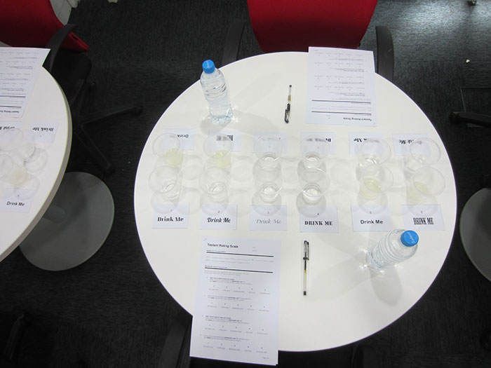
To put this claim under fire, I decided to conduct a small, controlled experiment. Instead of an online survey as in Velasco et al’s 2016 study, this experiment would have the participants actually sampling the tastants in real life. Three different colourless solutions (salt water, sugar water, and diluted lemon juice extract) were placed in two cups each. It was important to note that the two solutions were identical in intensity, as to allow the typefaces to do all the talking.
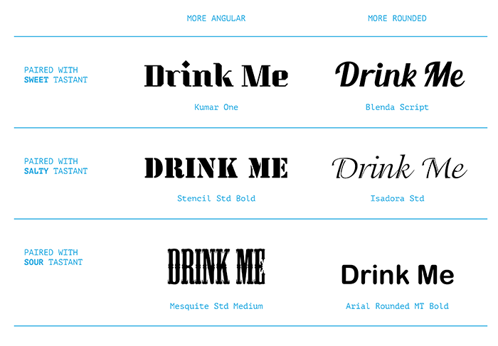
?For each of these tastants, a card was placed in front of the cups, with the words Drink Me printed on it set in different typefaces. Six volunteer student participants of varying educational backgrounds were asked to rate the expected taste of the tastant upon sight and then requested to drink and rate the actual taste of the tastant, taking sips of clear water in between trials.
It was found that the angular typefaces led participants to expect the tastant to be less sweet, but sourer and saltier; the rounded typefaces leading participants to expect sweeter tastes but less sour and less salty. Upon tasting the tastants, the sweet and sour tastant paired with the angular typeface were perceived as less sweet and sourer respectively. The actual taste of the salty tastant, however, was rated the same average value for both rounded and angular typefaces. This discrepancy could be attributed to the order of presentation, because sweet tastants have been shown to have a suppressive effect on other taste dimensions when presented in a mixture (Green et al, 2010), or simply due to a small sample size.
So how does this work? An evolutionary standpoint may suggest the results to be cross-referenced with Breslin’s 2013 study on the development and function of the human sense of taste and Bar and Neta’s 2009 study of preference of rounded shapes due to its apparent promotion of safety. Rounded or curved shapes are perceived to be ‘safer’, and therefore possibly linked to the safety of nourishment and survival from the consumption of sweet-natured foods. This could be due to our evolutionary roles as foragers in searching for energy-rich food sources, and through the evolution of mankind, remnants of the instinct to associate sweet foods with the safety and subsequently rounded visual shapes may remain part of the minds of the modern man.
Typographic Appetisers
This research by no means represents a definitive proof of typefaces’ influence on taste, but rather a modest exploration into the research claim. The current realm of research on typefaces frequently relies on hearsay and unfounded suppositions (as claimed in Lemon, 2017), and mostly focuses on its relation to marketing and advertising. I hope that this study would broaden typeface research beyond logotypes and legibility.
This short study has significant implications to both design and culinary fields. The ability of typefaces to alter taste perception without changing the food structure provides a possible foundation towards reducing sugar contents of foods while maintaining the same taste perception simply by setting an appropriate typeface. Knowing the capabilities of typefaces in altering taste intensity, designers now have a greater responsibility to harbor awareness towards typeface choices, not just in the role of legibility and aesthetics, but also in their roles in elevating or diminishing the culinary experience.
So don’t be too surprised if Arial Rounded (or god forbid, Comic Sans) would soon replace sugar in your next cup of coffee. May you enjoy the typographic appetisers with your meals!
Note: This is a summarised version of the dissertation titled ?Eye Candy: A study on the effect of typefaces and taste?, conducted for the Design Research Methodology and Design Research Dissertation modules of the second year of the BA (Hons) Graphic Communication Design course in Taylor’s University. The full dissertation may be obtained in the Taylor’s Library, or by contacting the author directly through homingdavid@gmail.com.
References:
Bar, M. and Neta, M. (2006). Humans Prefer Curved Visual Objects. Psychological Science, 17(8), pp.645-648.
Breslin, P. (2013). An Evolutionary Perspective on Food and Human Taste. Current Biology, 23(9), pp.R409-R418.
Doyle, J. and Bottomley, P. (2009). The massage in the medium: Transfer of connotative meaning from typeface to names and products. Applied Cognitive Psychology, 23(3), pp.396-409.
Green, B., Lim, J., Osterhoff, F., Blacher, K. and Nachtigal, D. (2010). Taste mixture interactions: Suppression, additivity, and the predominance of sweetness. Physiology & Behavior, 101(5), pp.731-737.
Lemon, M. (2017). Towards a Typology of Typographic Signification. Masters. University of Tartu.
Pepino, M. and Mennella, J. (2005). Factors Contributing to Individual Differences in Sucrose Preference. Chemical Senses, 30(Supplement 1), pp.i319-i320.
Szczesniak, A. (2002). Texture is a sensory property. Food Quality and Preference, 13(4), pp.215-225.
Taste. (2017). In: Oxford Living Dictionary. [online] Available at: https://en.oxforddictionaries.com/definition/taste [Accessed 29 Oct. 2017].
Velasco, C., Woods, A., Marks, L., Cheok, A. and Spence, C. (2016). The semantic basis of taste-shape associations. PeerJ, 4, p.e1644.
Velasco, C., Woods, A., Hyndman, S. and Spence, C. (2015). The Taste of Typeface. i-Perception, [online] 6(4), p.204166951559304. Available at: http://journals.sagepub.com/doi/full/10.1177/2041669515593040 [Accessed 7 Apr. 2017].