
My name is Piyaphon Inthavong and I am a first year, first semester student enrolled in the Creative Media programme at the The Design School, Taylor’s University.
I must admit that I was a little taken aback when I was asked by my typography lecturer, to write about the process of designing my font for an article for Kreatif Beats. That said, I was also elated with the opportunity.
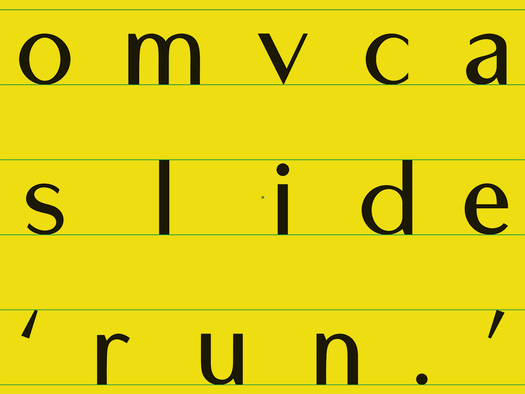
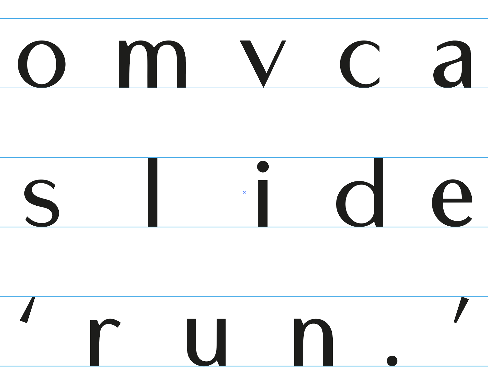
Project two in my typography class entailed the design and creation of the letters: o, m, v, c, a, s, l, i, d, e, and three punctuation marks — the comma (,), the period (.), and the apostrophe (’). We were given approximately two weeks for this project.
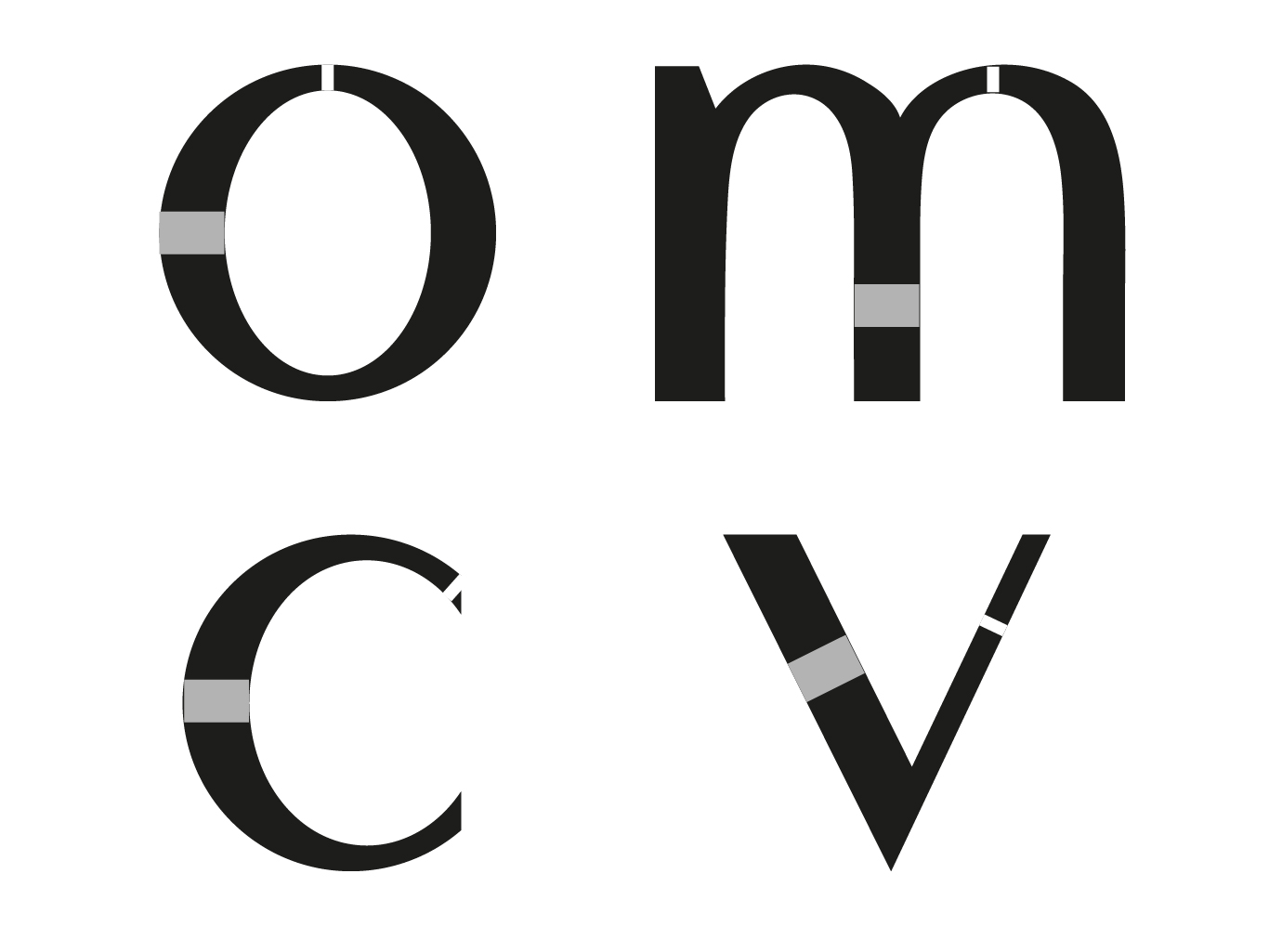
The process would begin with the examination of one of nine type families provided to us by our lecturers. From the nine type families, I chose Futura Std for my analysis, specifically Futura Book Std. The analysis entails the dissection of the letter forms to better understand the nuances of each letter.
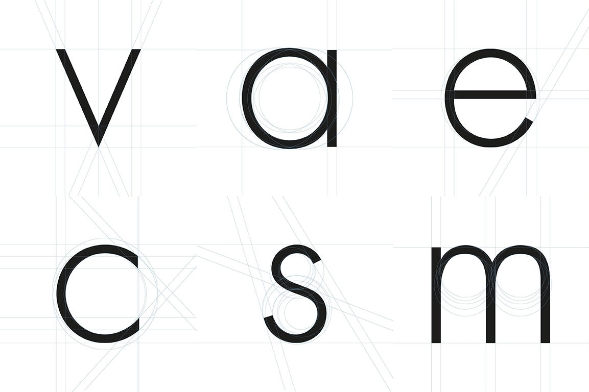
Futura Book Std, is a sans-serif geometric typeface, which was designed by Paul Renner and released in 1927. The construction of the letters inspired me to design a font loosely based on this typeface. The type family Futura is not new to me. It has been a personal favorite of mine for a few years now.
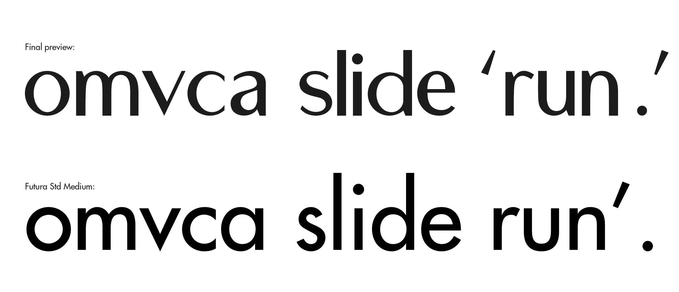
When I began, I knew exactly the kind of typeface I wanted to create. I wanted to create a variation of Futura but with an increased contrast. While sketching out the letters, I abided by a few of the conventions I observed during the letter construction analysis task.
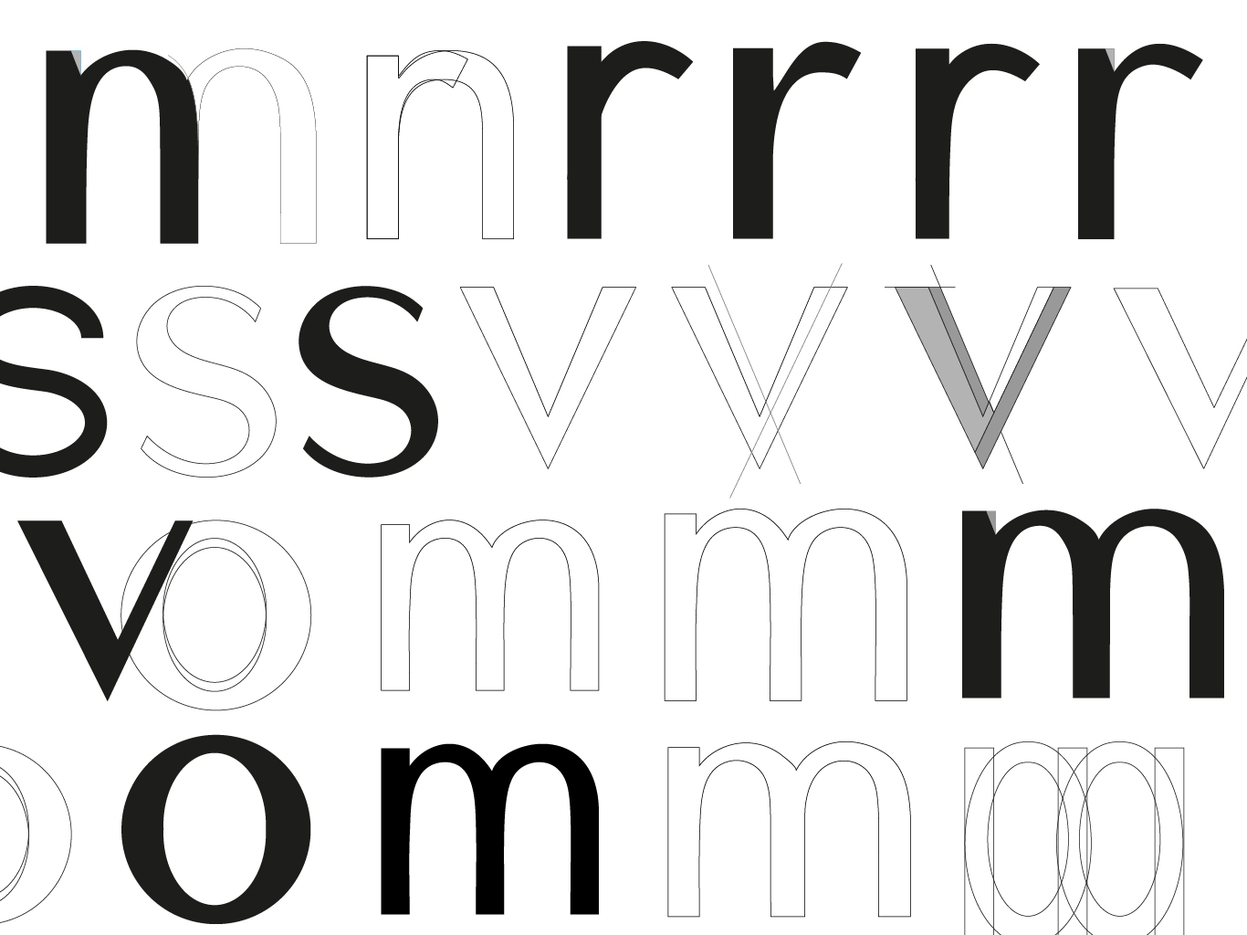
In reaching the end of the sketching process I began my first attempts at digitizing the sketched out letter forms. This phase was the most time consuming of all. Despite the apparent simplicity of the sketch, it was surprisingly difficult to replicate the design digitally. The most difficult part of the process was maintaining the consistency of the strokes and contrast for all the letter forms. I relied heavily on the pen tool, shape tool, shape builder tool, and the smooth tool when constructing the digital forms.
For me, the letter “a” was the most challenging part of the digitization process. I made numerous attempts at introducing contrast without losing too much of Futura’s identity. Despite the numerous attempts the results did not satisfy me. Irritated, I kept at it without much success until I finally made the decision to change my single story “a” to a double story “a”.
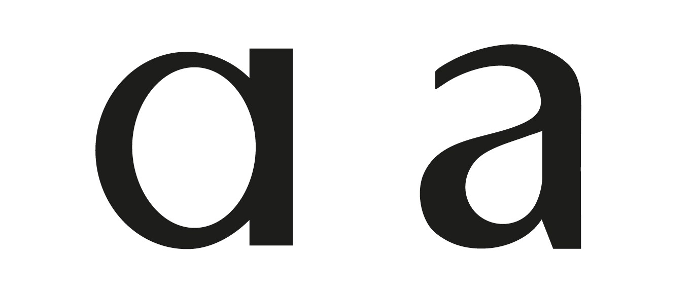
Even with the progress things were not going all that well. During one of his rounds in the class, I showed Mr. Vinod the results of my effort. He noticed that I was struggling and suggested that I refer to the type family Optima. Looking up the typeface I immediately recognized that Optima encompassed what I was trying to achieve; A sans serif typeface with an increased contrast.
To help me ensure consistency in the letter forms, I used a rectangle shape to maintain the weight of the various strokes of my letter forms. The final step in the process was to adjust the anchor points to address the rough edges. This inadvertently increased the elegance of the letter forms.
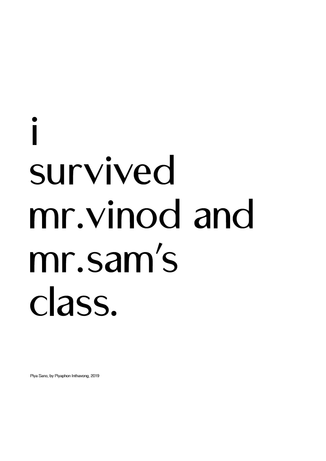
In the end, the final result looked different from my original inspiration. The process had resulted in some unexpected characteristic which gave the font a certain distinctiveness. I was satisfied with the final result and decided that I will complete the rest of the characters when time permits. I have named the font Piya Sans. Piya means beloved and is also part of my name.
You must be logged in to post a comment.