
Since the beginning of the current outbreak of COVID-19, I decided to develop a series of sketches with an abstract motif — a personal interpretation of the astral elements represented in the Inca culture, (which expanded from the North of Colombia to South of Argentina and from East of Brazil to West on the Pacific Ocean); among them, the sun, moon, mountains, rivers, sky, and the vast Peruvian landscape. The title for this series of sketches was suggested by the great Latin American writer Gabriel Garcia Marquez, winner of the Nobel Prize in Literature in 1982 for his novel Love in the Time of Cholera
I wanted to develop this sketch series using a full black cartridge paper surface where I would be able to play down and manipulate metallic pens with metallic colour mixed with other media in order to create a superior contrast between the shinning liquid media and the black surface.
This intention to explore the use of full black paper surface with metallic pen had been spinning in my head for some time. The objective came about when first finding the proper dark or black coloured paper surface to work with, followed by obtaining the proper colours that would offer a high contrast to each other. After much contemplation, metallic pens were chosen, since they would offer a powerful visual impact when combined, placed, or mixed together. Other types of materials such as watercolor or coloured pencils, normal pens, or colour marker pens were not suitable on the black paper surface due to the nature of the black color or paper exterior that absorbed the inks making it impossible to render any sketch or idea.
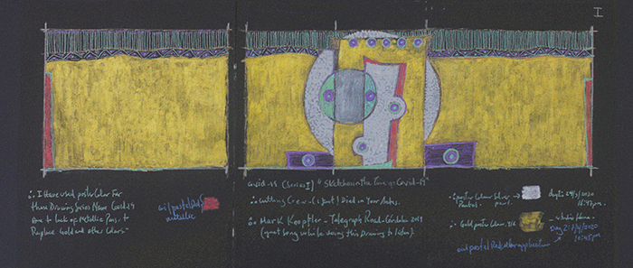
I did not have to prepare the paper surface. The first step to follow was to plan and decide the paper size and format before starting work on the drawing itself. I started to sketch simple single page drawings using these metallic colors then proceeded to chose two pages together to create a more dynamic composition as the drawing above. Finally I decided to place three pieces of A4 sized paper together horizontally, creating a long horizontal rectangle format (This format originated with the Greeks, triptykhos meaning “three-layered) — a piece of art made of three paintings or panels connected to each other in a way that allows the two outer ones to fold in toward the large central one. This type of art format has been used by different artists, such as Hieronymus Bosch in 1515 for his The Garden of Earthly Delights and by Francis Bacon in 1969 for Three Studies of Lucien Freud, and Triptych Bleu, I, II, II by Joan Miro in 1961. Artists use the triptych for any number of reasons such as to give the art a narrative, or the sense of a story, to examine a subject from the multiple perspective or to showcase three separate elements that are related and complement each other in a painting. These panels may be displayed together in a single unit or hung separately.
Some artists would prefer to have panels made of the same size, square, or vertical rectangle with the height a uniform size. There are no fixed rules on how to read a triptych painting or a way to achieve continuity such as a constant horizon line or background, a unified colour palette, or consistent subject matter. Some may read the triptych from left to right as the entire scene or individually as when the scenes on the left and right are different from the central one.
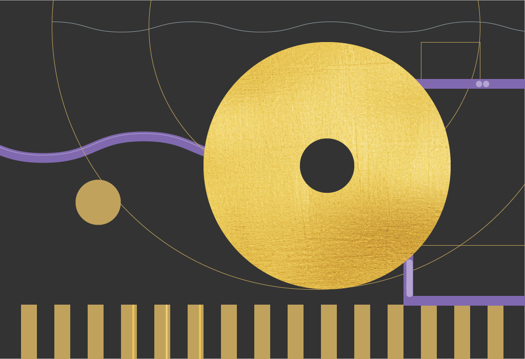
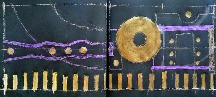
On the sketch below I did the preliminary outline using metallic pens that maintain a consistent line across the two pieces of paper. This outline drawing is to be read from the left to right as the focus point remains on the right side of the paper.
It depicts a round shape representing the sun complemented by other abstract elements such as waving lines or water and a structure stand on the right boundary of the page edge, along with the single bars at the bottom of the page. This composition is completed with the final set of gold poster colours describing a unity.
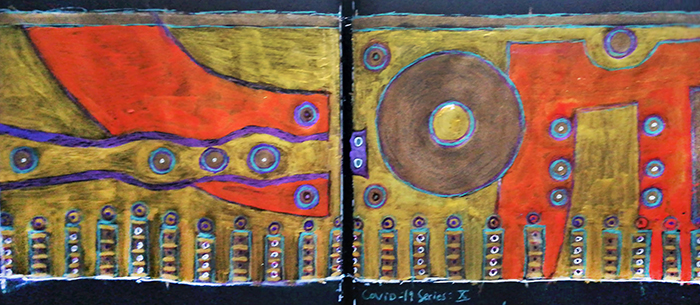
I aimed to express through this COVID-19 series the creation of the world, life, mankind, rivers, mountains; relying on South American syncretism and astral beliefs whereby the utilization of metallic colors and paint materials help to represent these ideas.