
Contrast is simply a conflict. The word originated from Medieval Latin that combines contra (meaning “against”) and stare (meaning “to place”). It is one of the elements of graphic design that you can see in almost every work, making it all the more crucial to understand it well. It is also an element that is deeply linked to our perception and survival instincts.
It is easier if we categorize the different types of contrasts, so I’ve divided them into 3 groups: visual / stylistic contrast, conceptual contrast, and contextual contrast. Let’s look at them one by one!
Visual Contrast / Stylistic Contrast
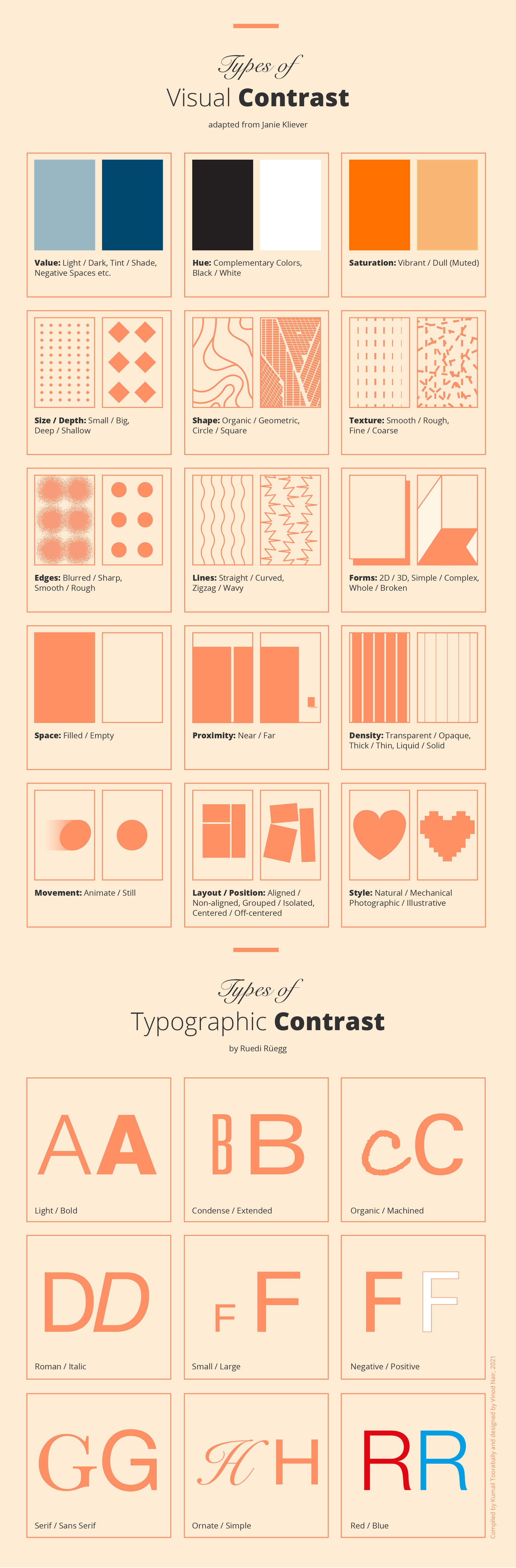
Visual contrast is what you would usually imagine when you hear the word “contrast” in design. Below is an extensive list showing the types of visual contrast.
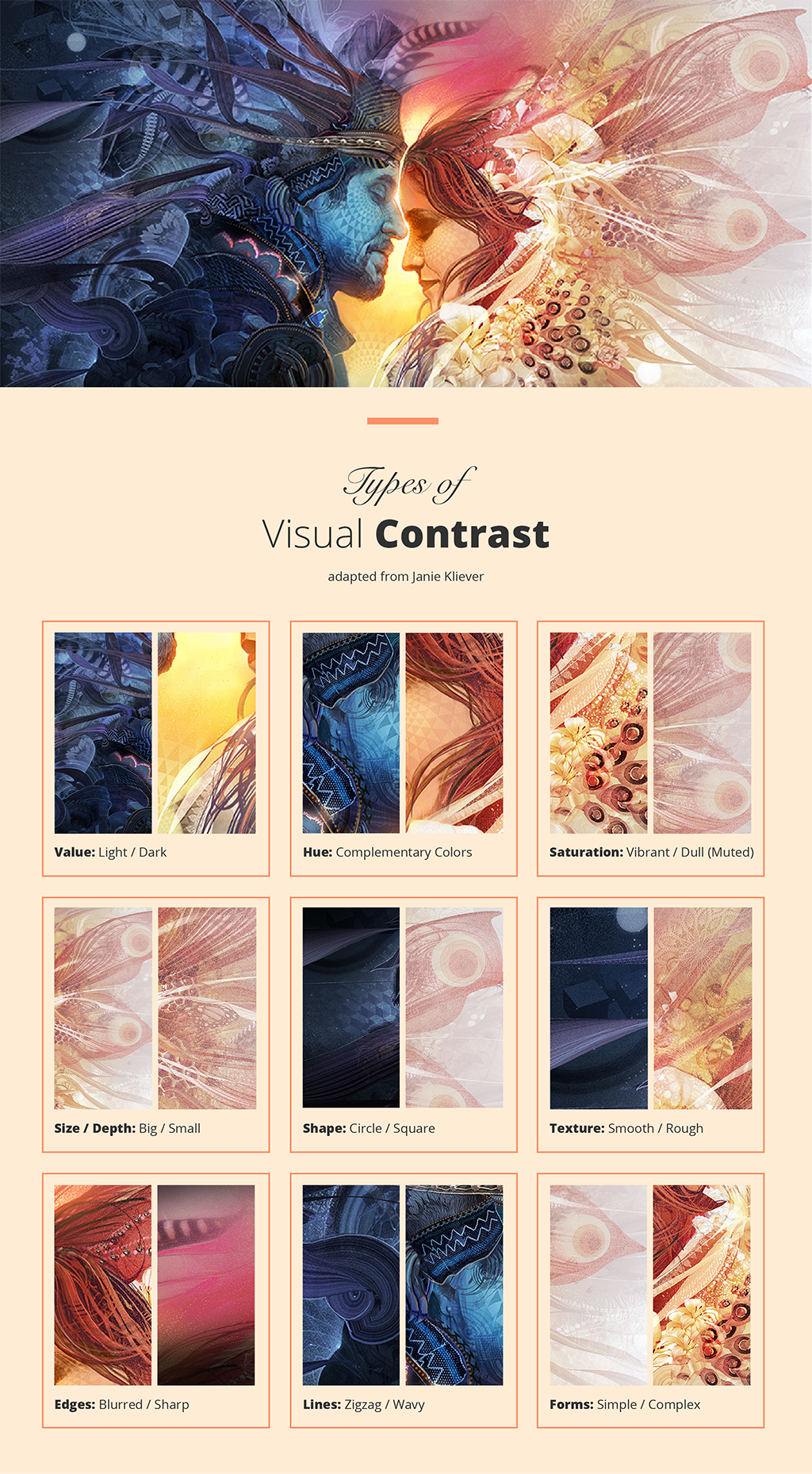
Let us take the following image titled “Union” by Android Jones (Figure 2—give it a few seconds to load) as an example and break it down using the guideline on visual contrasts. How many kinds of contrasts can you spot in this image?
There is more to contrast than just “light and dark”. When they are used in graphic design, they can create conflict, and human eyes are instinctively attracted to conflicting things. Visual contrast is deeply linked to our survival instincts. We unconsciously lookout for elements of contrast, things that stand out, as part of our instinctive threat-detection process, such as poisonous colorful spider in a leafy green forest.
The exact principle is used in graphic design, and that is why contrast is an extremely powerful tool to guide the viewer’s eyes; whether it’s a big “Add to Cart” button on a website that stands out from the rest of the page, or a subtle contrast in element positioning to create a visual hierarchy.
Conceptual Contrast
Conceptual contrast focuses more on what is being communicated in design. Instead of using visual elements, conceptual contrast creates conflict using the subject being portrayed. Some quick examples would be: Sun / Moon, Fire / Ice, Living / Non-living. They can also be characteristics, i.e. Light / Heavy (gravity), Stable / Unstable. Above in the work of Android Jones (Figure 2), the biggest conceptual contrast drawn is Man / Woman. This type of contrast is also often used in photography to create interesting shots.
When you incorporate conceptual contrast into your design, it can add depth to the meaning that you intend to communicate, which makes the design more interesting for the viewers. The conflict created by contrast commands attention, and becomes a powerful eye-catcher.
Contextual Contrast
Contrast is also created by the relationship between the visual elements. Their context defines how we perceive the objects.
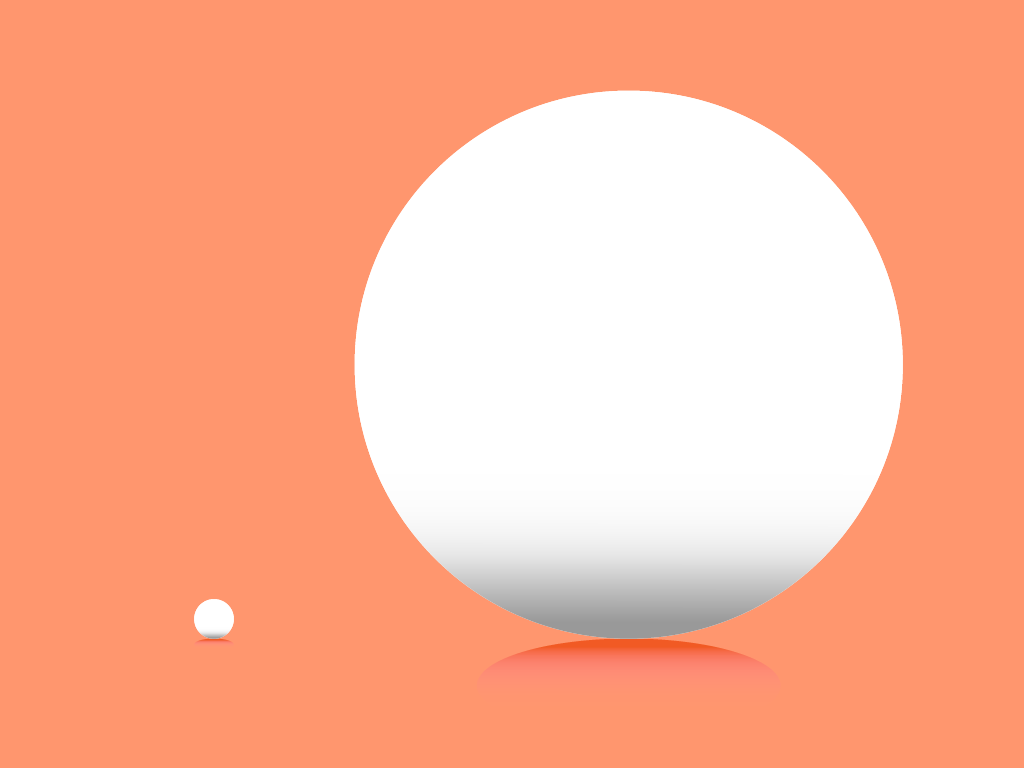
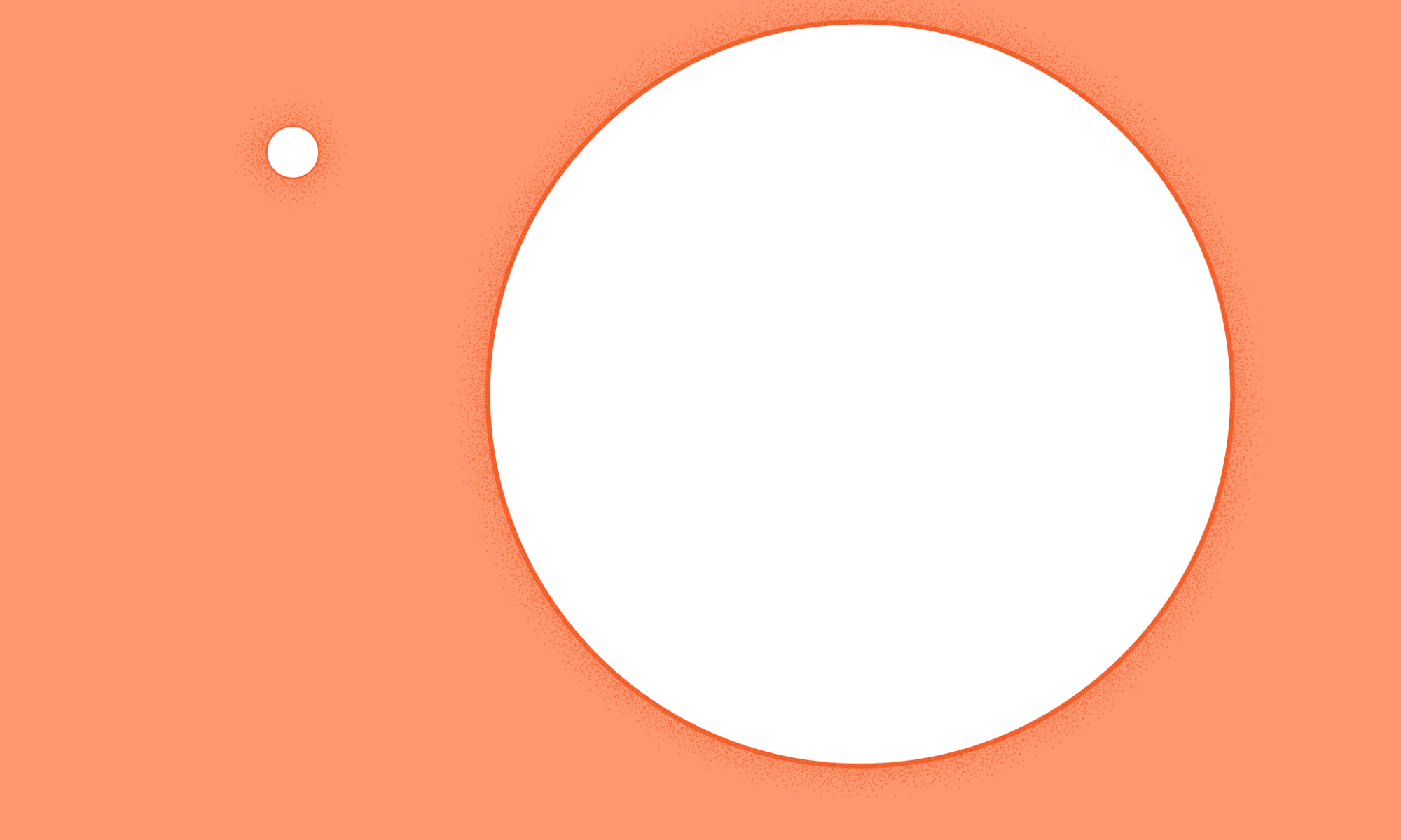
Figure 4. Different object sizes add a contextual contrast.For instance, the large circle makes the small circle appear smaller and the smaller one makes the larger one appear larger (Figure 4). Their size sets a context. Contrast is important because the essence of any element is defined by its value, properties, or quality relative to something else.
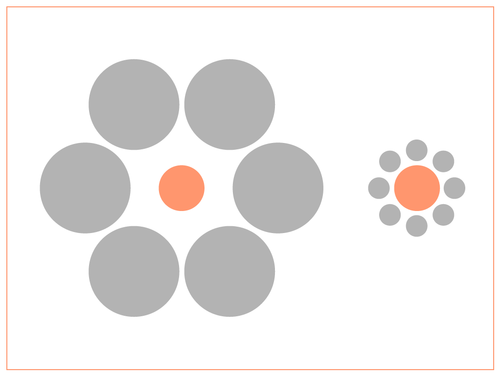
The Ebbinghaus Illusion (Figure 5) makes this concept much easier to grasp. Both the orange circles are surrounded by grey circles, but the grey circles on the left are larger relative to the size of the orange circle. This makes the orange circle, or the main subject, appear smaller in its context. And the exact opposite happens to the orange circle on the right.
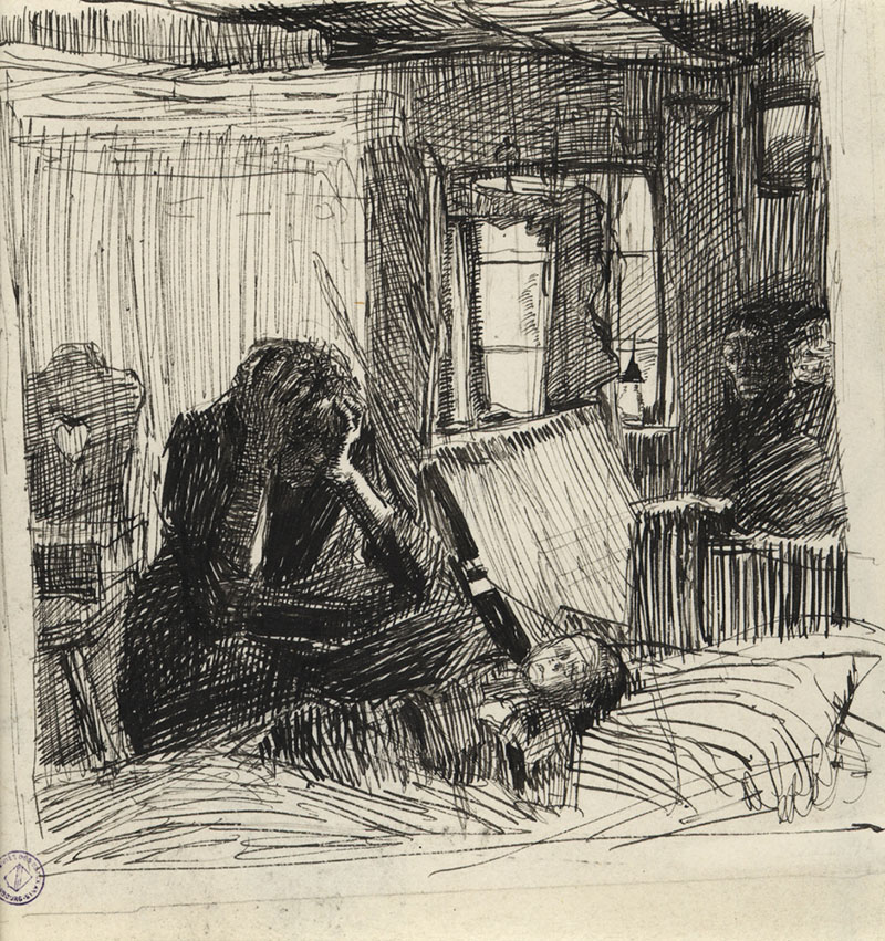
Käthe Kollwitz, a German artist, adds contrast in her work (Figure 6) using the elements of art line, value, and shape, but she also adds contrast of emotion, showing the despair of the mother in dark values and lighter sweeter elements like the heart on the chair in the background. In this case, the chair sets the context to amplify the despair of the mother.
Using Contrast to Create a Visual Hierarchy
“Design is largely an exercise in creating or suggesting contrasts, which are used to define a hierarchy, manipulate certain widely understood relationships, and exploit context to enhance or redefine those relationships, all in an effort to convey meaning.”
To sum it up
Contrast can be used to create variety, visual interest, and drama in your work. Taking your designs to the next level isn’t all about using rounded corners and drop shadows to make everything more attractive. It’s about finding better and more efficient ways of communicating the message using design. Exploring contrast in detail and using it to its full potential is arguably one of the best ways to do this.