The self has been an intriguing topic ever since man existed. Babies are drawn to their own hands and feet, notice how often they curiously examine their digits. As we grow up, the concept of self becomes more concrete and so we behave, think and/or dress in a certain way to express ourselves. The concept of self has been explored by artists and designers throughout time. The most common and conventional understanding is that self-portraits literally feature the artist themselves looking directly at the viewer. However, in many instances, there have been expressions of the self in forms that break away from the norm, such as Indonesian artist FX Harsono’s portraiture, Open Your Mouth (2002).

In Design Principles, a year one, semester one module, one of the projects is self-portrait. As the lecturer of this module, I have seen captivating and engaging self-portraits created not only by design students but also students from other programmes who take the module as an elective or a minor subject. This article is therefore dedicated to a selection of outstanding self-portraits by Design Principles students. Each portrait is accompanied by the student’s rationale for their design decisions.
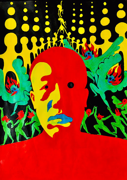
“In this project, I adopted the principle of contrast where the two strongly contrasted colours imply that I’m the combination of outward quiet and inward excitement. The 1960s psychedelic style is used in the picture that represents the highest level of human imagination; it was the perfect style for me to express my rich creativity and imagination. For the small figures in the background, I used the principles of repetition and movement.” ~ Fu Rao.
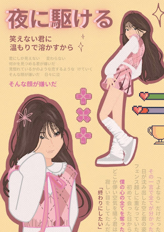
“With the ‘old school’ Japanese magazine concept, it represents how I am a nostalgic person and I love reminiscing the past. I also included graphics of pixelated game elements as my favourite style of video games that have pixelated art styles. The Japanese captions are all just lyrics of my favourite Japanese song “Yoru ni Kakeru” by Yoasobi. Overall, I’ve attempted to incorporate asymmetrical balance in this design and to focus on harmony. I’ve made the main colour of my design pink to make most of the graphics and texts. I have used pink or pink in varying shades. I wanted this design to have a cheerful and bright feeling, hence I settled on a yellow background. I added dark pink borders to my figures in order that they stand out as much as I wanted. if I hadn’t, the skin tone would almost blend in with the background.” ~ Joey Ho Chu Yie.
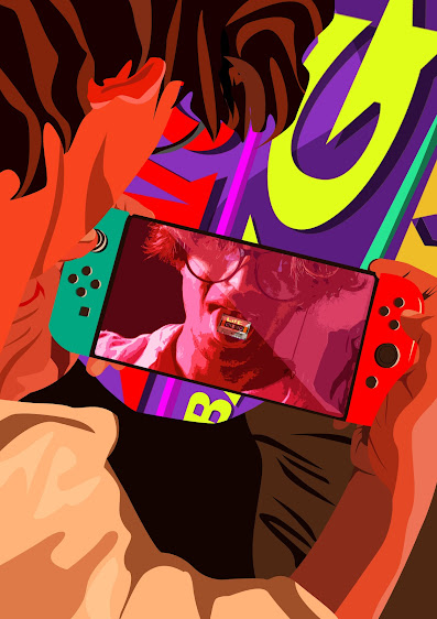
“My design portrays my interest in gaming. I am the character and I play, I control my life. The cassette tape on my tongue shows how much I like music and how it relates to my life. I use contrasting colours because I visualize these colours when I play these games.” ~ Hisham Rasheed.
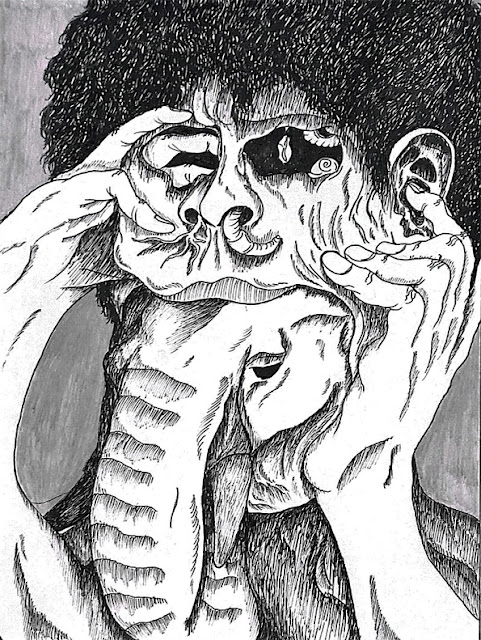
“The face is nothing but a skin that covers my true nature. The day will come when the skin gets corrupted with “bad things” hurting my body. Only then will the “fake” personality be removed and the true nature of myself will appear as a gentle-looking disaster. I showed a human with the head of an elephant that lifts the dirty corrupted human head and forces it to break apart from the body. The elephant shows the more introverted side where I am being silent and gentle but can be very disastrous. The design principles that can be identified in this idea are contrast, asymmetrical balance, and repetition.” ~ Lau Zhen Lin.
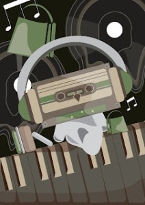
“I wanted to convey a grounded yet-whimsical look for myself in this self-portrait. Considering the colours, details, art style, and vibe, I decided to highlight my main interests thus choosing to position them at the forefront as the first thing that others would learn about me. My inner thoughts are portrayed more in the foreground (the slow loss of motivation and urge to avoid all ongoing responsibilities) by distorting the vinyls and blending them in with the black background as a reflection of my mind. This showcased the side of me that people find out about after a prolonged period, hence the lack of extra focus on the overall self-portrait. My hope is to convey the different sides of me through the use of layering and colours that allow others to get a glimpse of me but not the full picture.” ~ Wong Shu Xun, Gladys.
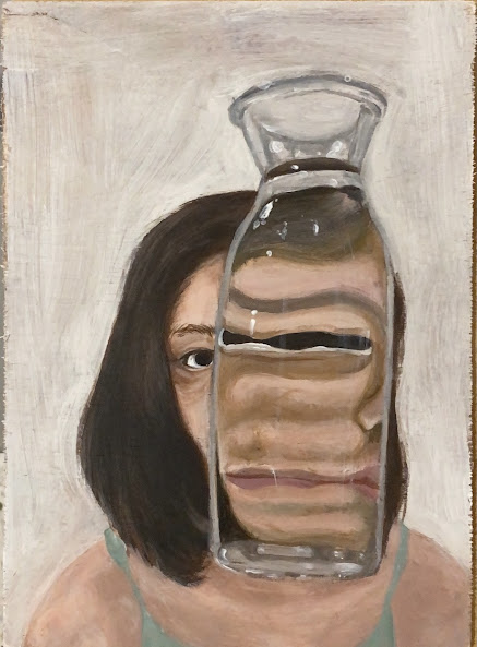
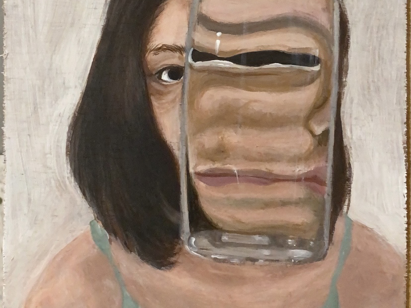
“I wanted to convey those tiny bodily and facial imperfections of myself as something that is in fact perfect and something that should be celebrated and that impeccably reflects what I strive for through my art. In this self-portrait, as you can see, on one end of the glass, I look normal like everyone else, and on the other side I look very much distorted, and my features are elongated. The warps and cracks as well as the torn pieces of the wooden panel also symbolise my imperfections. I’d say the bottle magnifies how I really am which is perceived differently by everyone—accepting me as someone with internal conflicts but also seeing me for my unique and positive side as well. Or they can just view me negatively entirely. It’s a matter of looking past one’s grey areas of someone/oneself and accepting it as something that makes me, me.” ~ Jodiann Yeoh Chooi Kit.
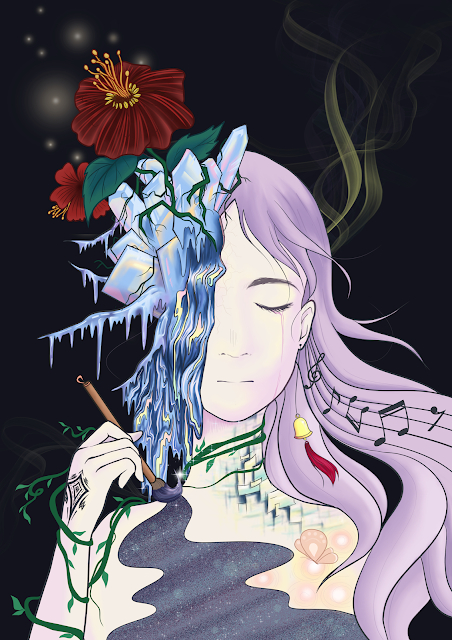
“I expressed my feelings, my thoughts, my preferences, my past experience and even my current struggles in this artwork. Holding a Chinese calligraphy brush, I am painting myself. I forgot the last time I smiled. The veins are slowly wrapped around me. Where is the end? I couldn’t find yet. The unknown fragments, the smoke, the glowing bubbles, they are the past, but they are here now. The flowers are blooming. It is difficult, or impossible, to grow on ice. Is this a resemblance of growing in an adverse and hard situation? No matter what, the ice will melt one day. Humans are full of contradictions, so am I.” ~ Tan Yi Yun.

