
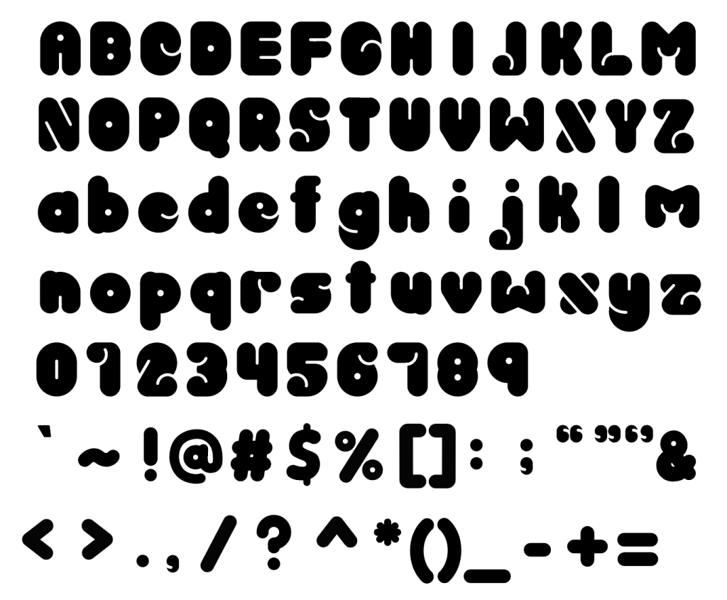
In our final project, the goal was to create our own typeface, complete with both capital and lowercase letters, numerals, and punctuation, using all the knowledge we had gained from this module and our previous typography course.
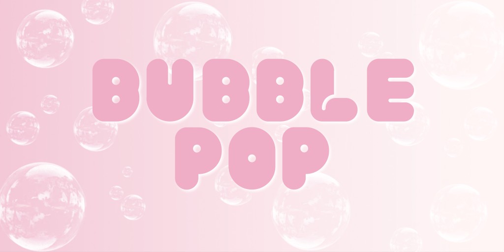
For this project, I decided to expand on the typeface I started with in Task 2 where we created word marks to represent our identities. My word mark was inspired by the concept of simplicity, reflecting my desire to embrace straightforwardness in a world where I often overthink. In this article, I’ll share the process of designing Bubble Pop, showcasing how it conveys the essence of simplicity and fun in typography.


The Inspiration Behind Bubble Pop
Bubble Pop was inspired by a combination of factors, including my current skill level and the limited time available for the project. I realised that designing a typeface from scratch would be a useful learning experience as I considered how to proceed with this project. I was focused on building the letters in an easy-to-understand manner so that I would better comprehend the basic steps involved in creating letterforms.
Starting with basic shapes was key to this process for me. By breaking down the design into simple shapes, I was able to more clearly interpret how each letter was constructed. This method not only helped me to complete the task within the time frame provided, but it also gave me the opportunity to fully explore the basic concepts of typography. I discovered that by putting these shapes together, I could make a letterform that reflected the minimalist design I was going for.
Exploring Simplicity Through Shape
My experience with creating Bubble Pop was basically formed by working with basic shapes. Understanding these simple forms allowed me to use them as building blocks to create each letter. This strategy allowed me to keep my design process simple and focused which was ideal given the minimalism concept of the font.
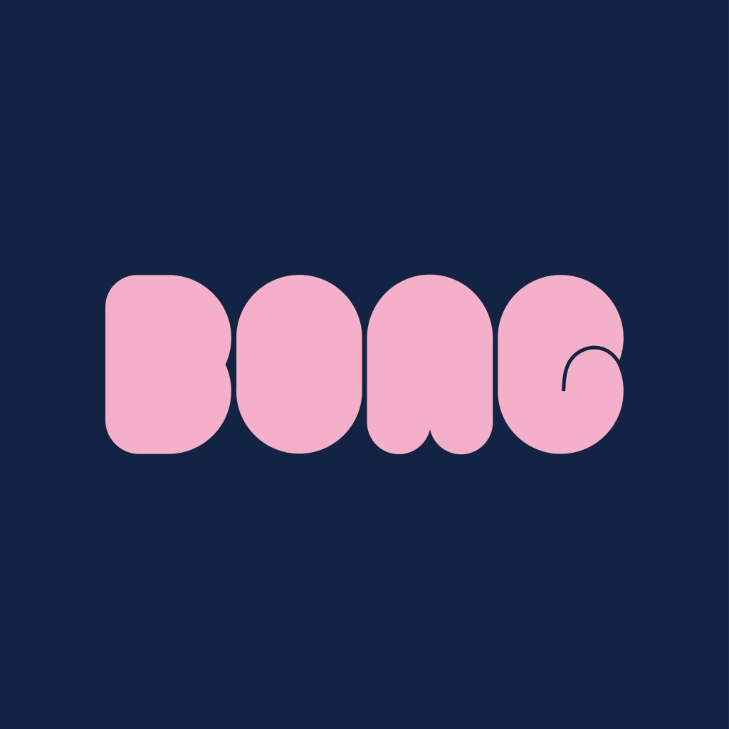
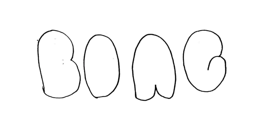
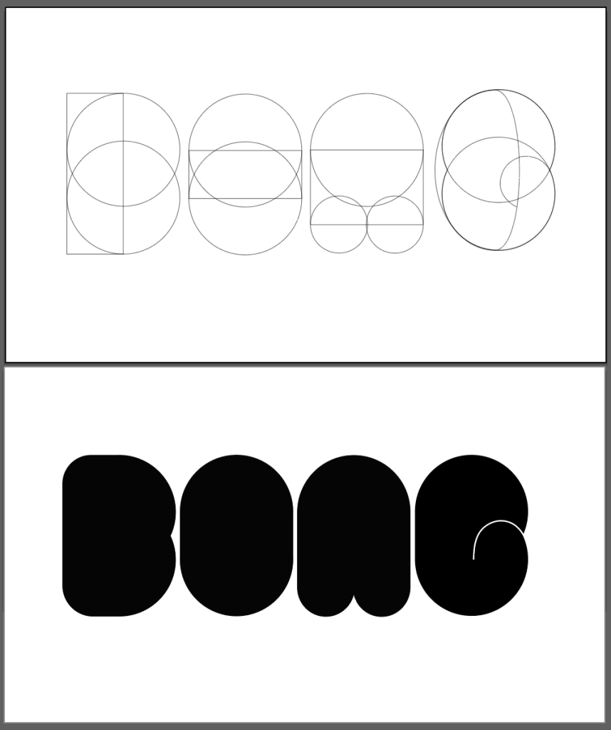
I started by drawing the letters “B,” “O,” “N,” and “G,” making sure the designs were simple and free of unnecessary features. In this initial phase, I was focused on gathering the basic shapes required to build each character. This rough sketch from Task 2 helped me visualise a typeface that would capture the simplicity I was going for, while also remaining playful and minimalist.

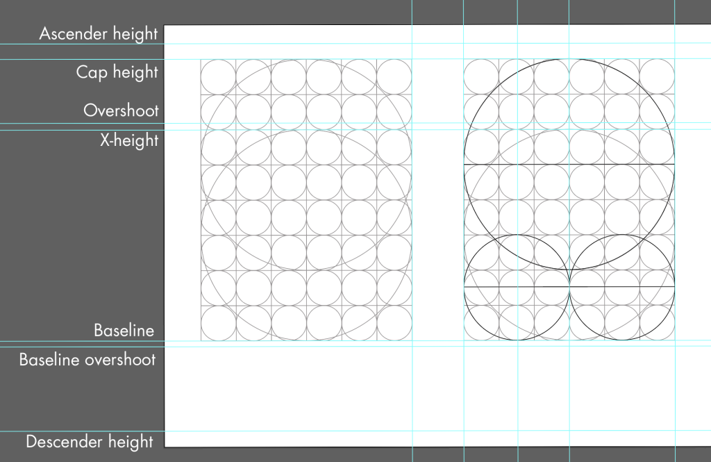
Using a Grid to Maintain Consistency
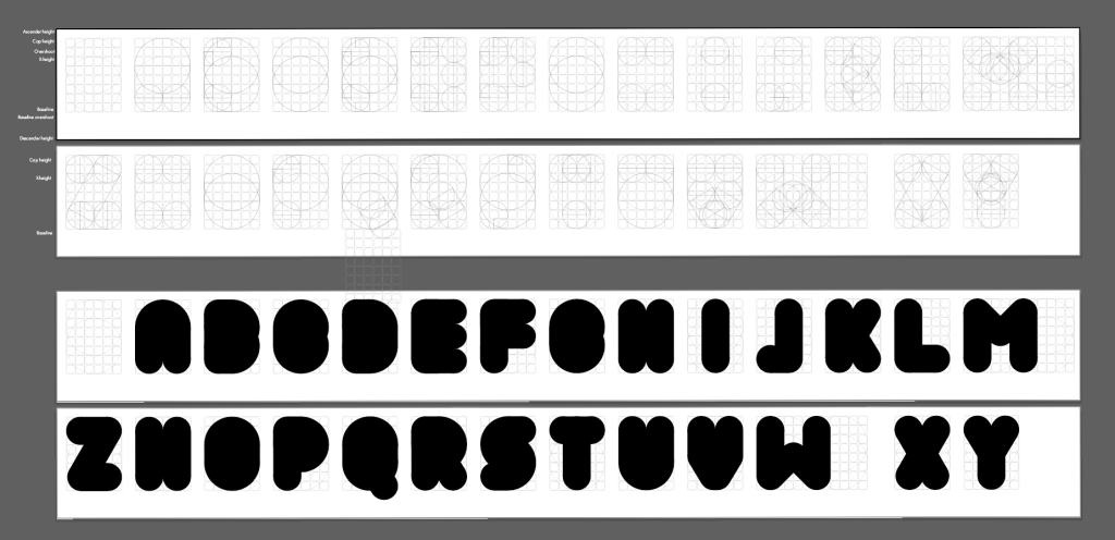
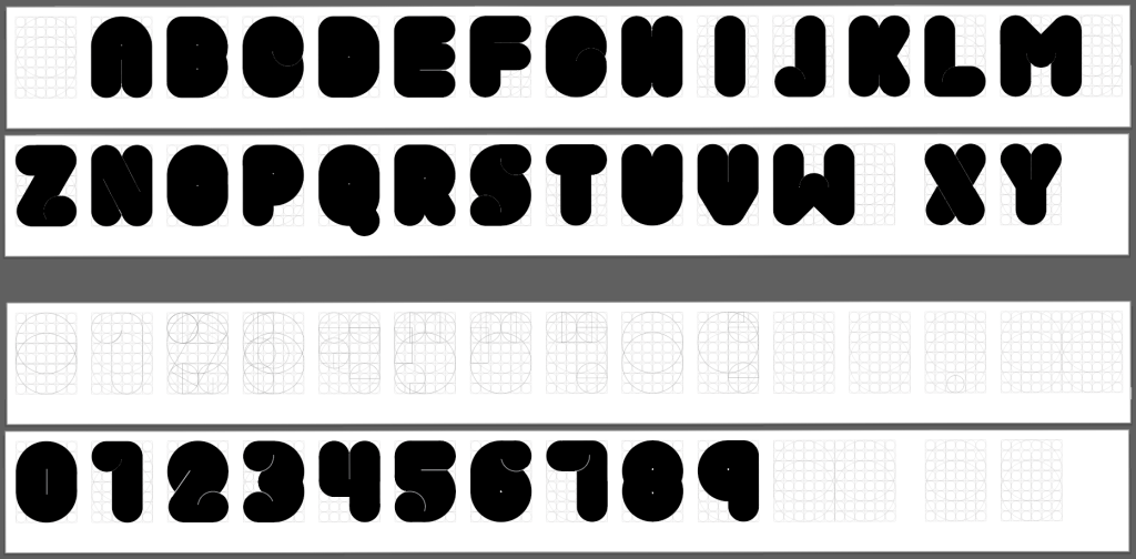
The grid structure was important in bringing Bubble Pop to life. As I started digitising the font, I used the grid provided to guide the positioning and proportions of the shapes. The grid ensured that all letters had the same height, width, and spacing, which is essential for creating a cohesive typeface.
By sticking to the grid, I was able to achieve a balance between the letters’ fun, rounded outlines and the minimalist concept. This consistency gives Bubble Pop its unique appearance — it is simple and clean, with a lively, bouncy personality that distinguishes it from other minimalist fonts.
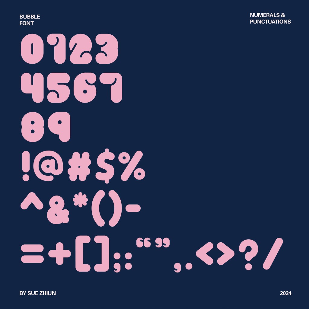
Font Measurements:
- Ascender: 705 pt
- Cap height: 666 pt
- X-height overshoot: 516 pt
- X-height: 500 pt
- Baseline: 0 pt
- Baseline overshoot: -13 pt
- Descender: -213 pt

Progress
When I first started digitising Bubble Pop, I aimed to proceed with a minimalist style that I had used in my wordmark for the letters ‘B’, ‘O’, ‘N’, and ‘G’. My initial goal was to keep the design simple and aligned with my concept of simplicity. However, as I began working on the other letters, I realized that sticking strictly to this minimalist style had made some of the letterforms harder to identify and read.


To address this issue, I decided to introduce some additional elements — thin lines and small circles to enhance readability while still maintaining the minimalist feel. I carefully added these elements to ensure that the design remained clean and simple, avoiding anything too bold or distracting.

After receiving feedback from Mr. Vinod, I revisited my design approach. He pointed out that the thin lines and small circles, while consistent with the minimalist concept, made the letterforms difficult to see and read when viewed from a distance or when made smaller. To improve readability, he suggested using thicker lines and larger counters.

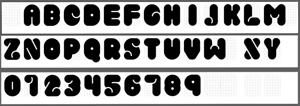
Taking his advice, I refined all the uppercase letters and numbers, opting for thicker lines and larger circles to ensure the characters were clear and legible in various sizes and contexts. Once the uppercase letters and numbers were complete, I moved on to digitizing the lowercase letters and punctuation, following the same style to maintain consistency throughout the typeface.

Developing the Final Font in FontLab 7
After completing and refining all the letterforms for Bubble Pop, the next step was to import them into Fontlab 7, which is a software designed for professional font creation. This stage was crucial for turning my designs into a fully functional typeface.

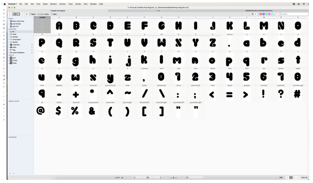
Once I had all the characters imported into Fontlab 7, I focused on adjusting the left and right-side bearings for each letterform. Side bearings are the spaces on either side of a letter, and they play a critical role in how the letters interact with each other when typed out. Proper adjustment ensures that the spacing between letters is consistent and visually pleasing, which is key for readability and overall aesthetics.
Using the references and guidance provided by Mr. Vinod, I carefully fine-tuned these side bearings to ensure that Bubble Pop maintained a balanced and harmonious look. This involved testing the font in various contexts to see how the letters aligned and interacted, making further adjustments as needed to achieve the desired result.
Conclusion
Creating Bubble Pop was an intense and challenging experience, especially with the limited time we were given to complete the project. As someone who struggles to work without a clear direction, the pressure to produce a full typeface from scratch was extremely daunting. Despite feeling rushed, I’m very satisfied with the final results. The process of designing Bubble Pop taught me a lot of valuable skills and gave me a deeper understanding of how to construct a font from the bottom up. Through the ups and downs of this project, I’ve learned not only the technical aspects of font design but also how to push through creative blocks and time constraints. In the end, seeing Bubble Pop come to life made all the hard work worth it, and I’m proud of what I was able to accomplish.
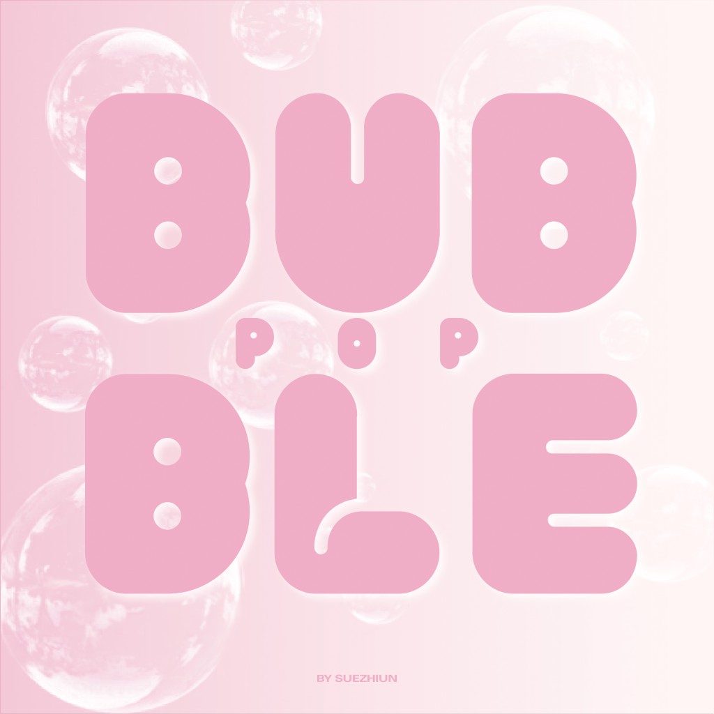
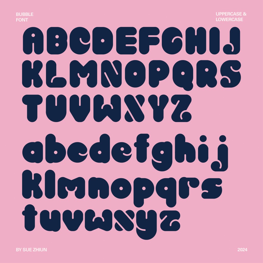
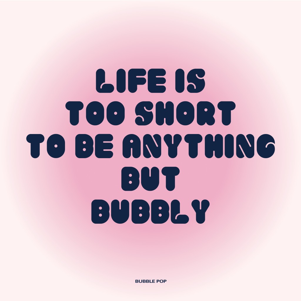
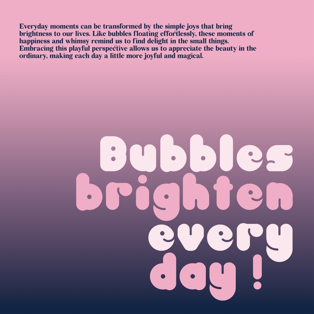
Font presentation
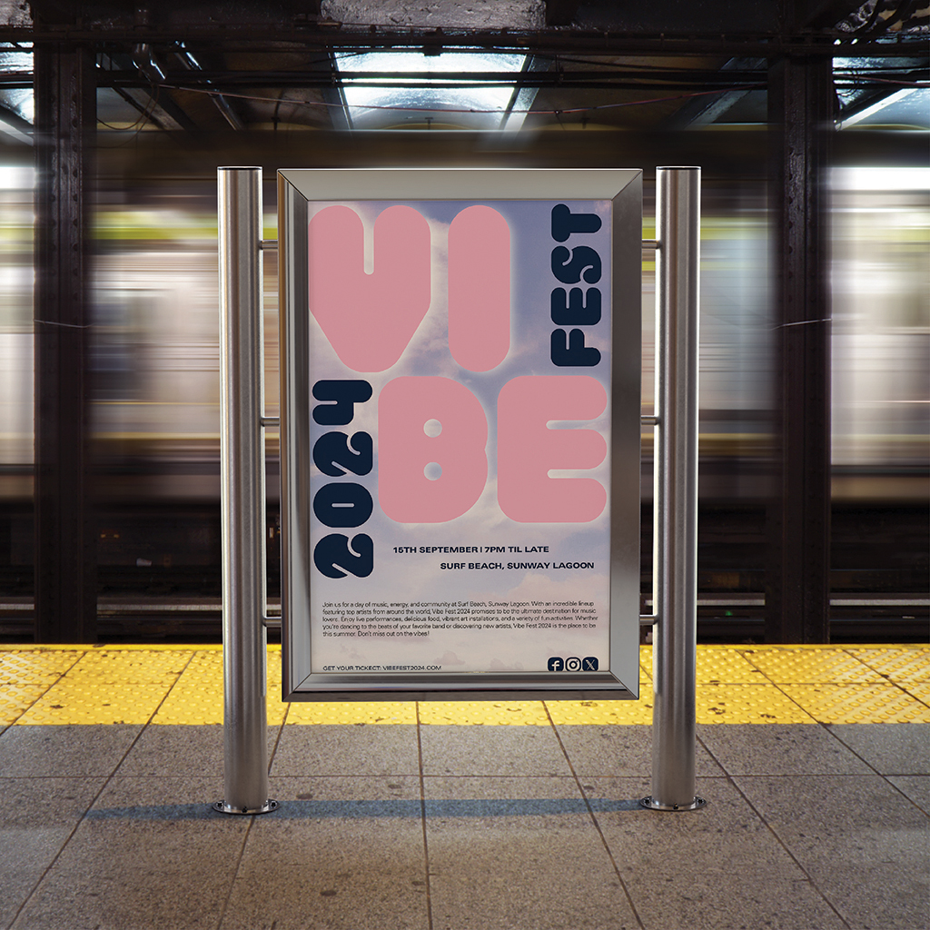
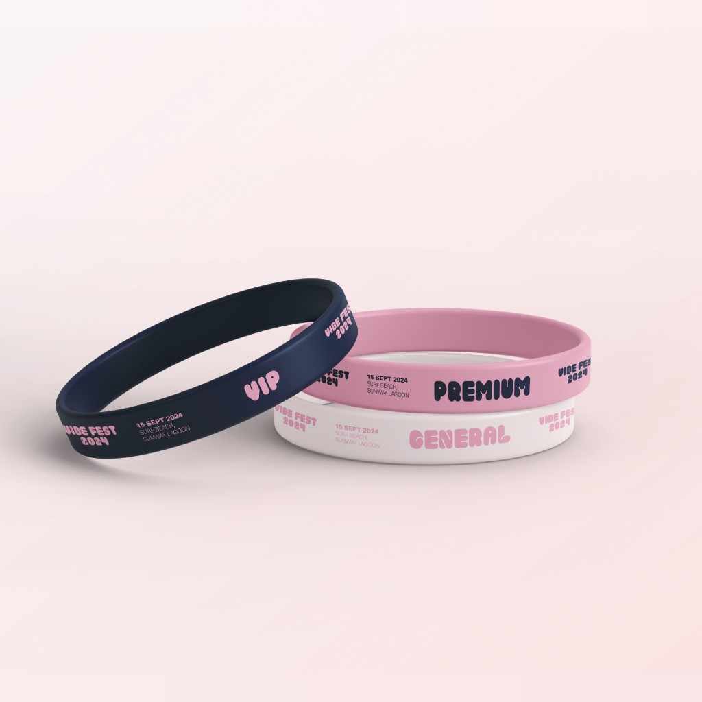
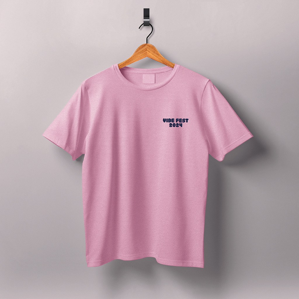
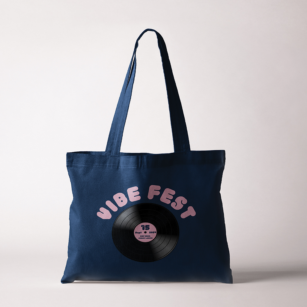
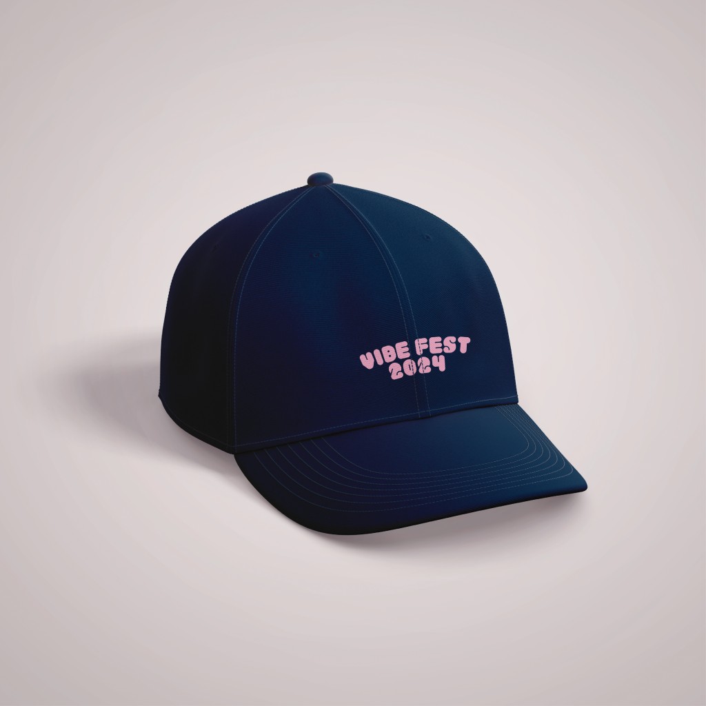
Font application
Try out the font here: