
Inspiration
The font was created in response to my final project of the Advanced Typography module. Initially the task gave me a lot of trouble in the ideation process. One of the major factors that directed me towards creating a font based on the Ben 10 alien ‘Upgrade’, was by looking at Pinterest posts on alien inspired fonts as well as previous students’ works for this task.
One person in particular, Janaan Ahmed, created a font based on the title font of the Netflix cartoon ‘Hilda’, which inspired me to create a font inspired by Ben 10 aliens. My initial idea was to make each letter inspired by a particular alien which I was advised against by Mr. Vinod, as it could lead to inconsistencies in the fonts. Which is when I decided on sticking to one alien ‘Upgrade’ as he was one of my childhood favourites.
Development Process
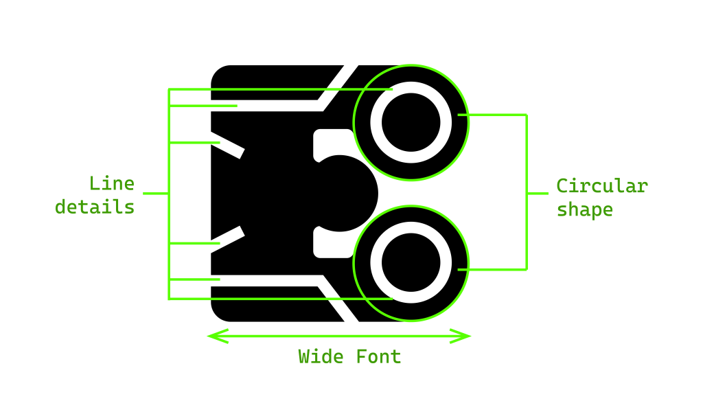
To make a font inspired by Upgrade, I must study and understand him. After watching through the episodes of Ben 10, as well as looking at screen captures of Upgrade, I noted important aspects of his design: – the mouldable round body shape and the green lines that span across him. This helped me note the important elements I would want in my final design.
To help me out with the sketching process, I also collected relevant reference material that were similar to elements I wanted in my design. Before the digitization process, it was necessary for me to sketch out the uppercase letters traditionally. To make the construction geometrically correct and consistent, I chose to use graph paper to help me out. Considering the decorative aspect and boldness of the design, I figured the design wouldn’t translate as well in lowercase, hence deciding it to be a Unicase font. Needless to say, sketching on paper was one of the easiest steps in the whole process of bringing this to life.
Digitising was done on Adobe Illustrator. I must say, it shocked me how much time has gone into just digitising the characters. Starting with the letters, the digitisation process went through these following steps which can be divided into two sections: 1. Making the letterform shape 2. Adding the line details: –
- Making the letterform shape:
- Importing the picture I took of the sketch into illustrator
- Creating a grid on top of the said letter
- Placing the raw shapes (here it is circles and rectangles)
- Merging the shapes
- Cropping the excess that overflows from the grid
- Rounding the corners of the edges
- Adding the line details inspired by the one in Upgrade
- Using outlines to make the details
- Turning outlines into fill shape
- Subtracting lines from the letterform shape and turning them into negative space within the design
I followed a similar process with the numbers and punctuation. I found myself having difficulty incorporating the Upgrade design into the numbers as the shapes were more rigid and thinner, which prompted me to soften the shapes and make them bolder. With punctuation, I was forced to omit the line details from some of the symbols as they were too thin in line weight. After creating all the letterforms on Illustrator, I brought the letters onto Font lab 8 for adjusting the letter spacing and converting them into a OpenType font.
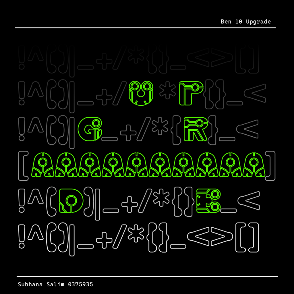
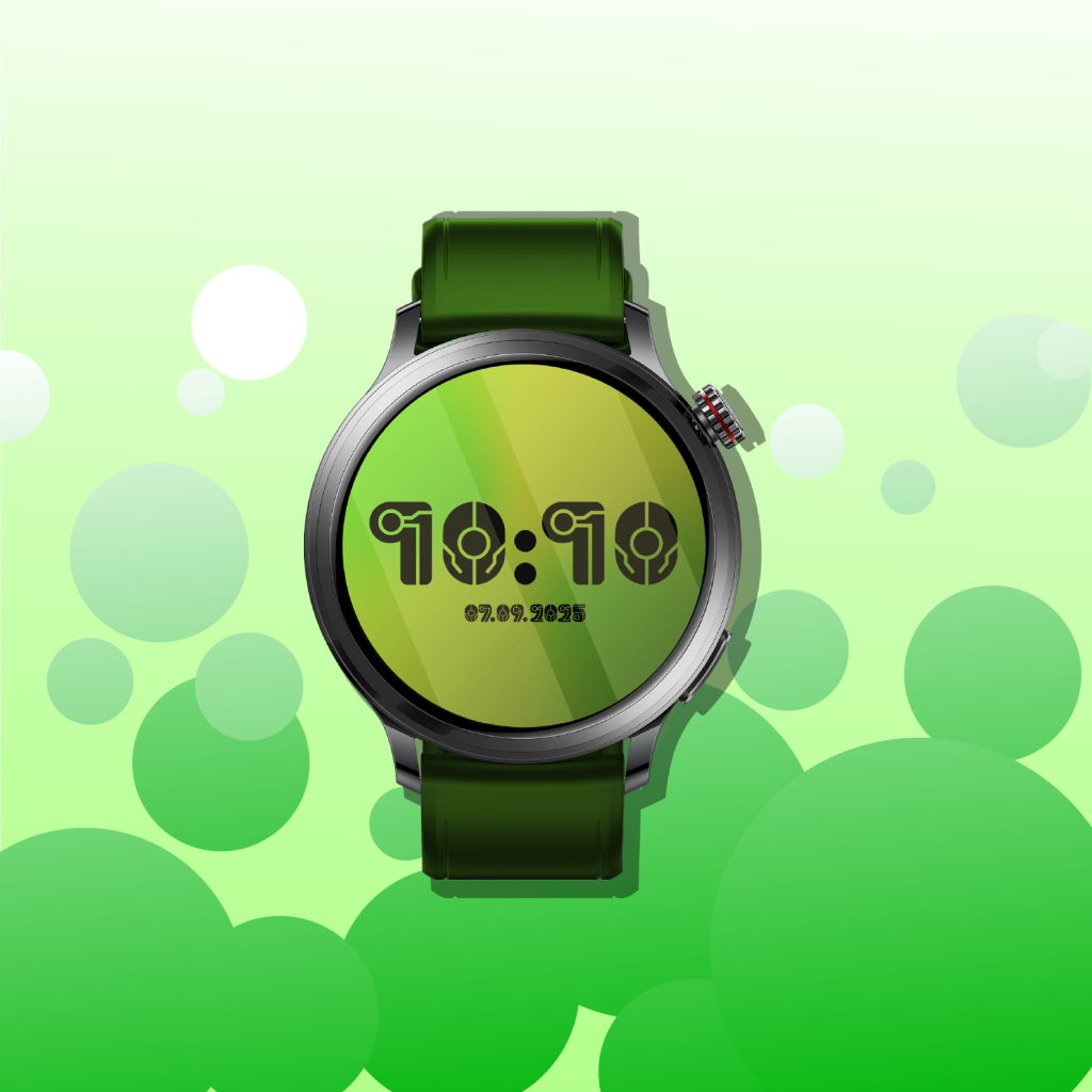
Along with creating the font, we must provide 5 font presentations and font applications, in order to show how the font can be used and displayed. The font presentations and applications utilized the same colour palette as the ones used in Upgrade and Ben 10.
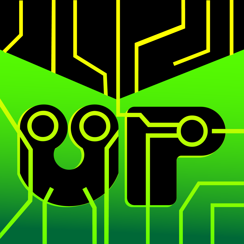
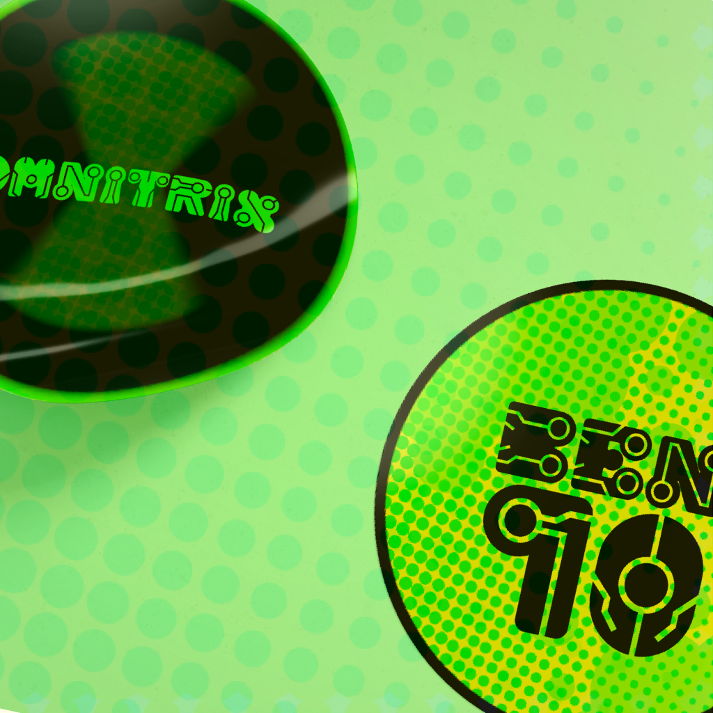
My main focus with the font presentation was to display the characters in an aesthetically pleasing way that also fully encapsulates Upgrade. My favourite is font presentation 4, which has the lines that extend from the letter resembling a circuit board pattern, as a visual representation of Upgrade charging up as he absorbs into any object.
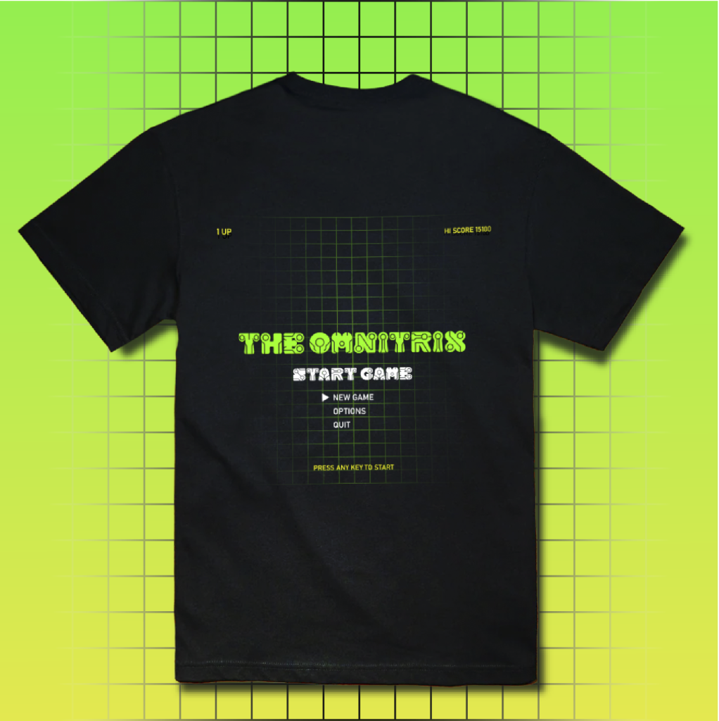
With my font application, I had to not only think of designs but also elements or promotional material that would suit this font. To help me, I thought about the target audience of Ben10 and what types of items they would be interested in buying. I tried to maintain the electric, robotic, sci-fi design consistent with the font application as well.
Characteristics of the font
The follwoing are important characteristics in my final font:
- Round & soft shapes
- Heavy weight
- Wide in width
- Circular shapes resembling his head shape
- Line designs inspired by one present on his body surface
Achievement of the font
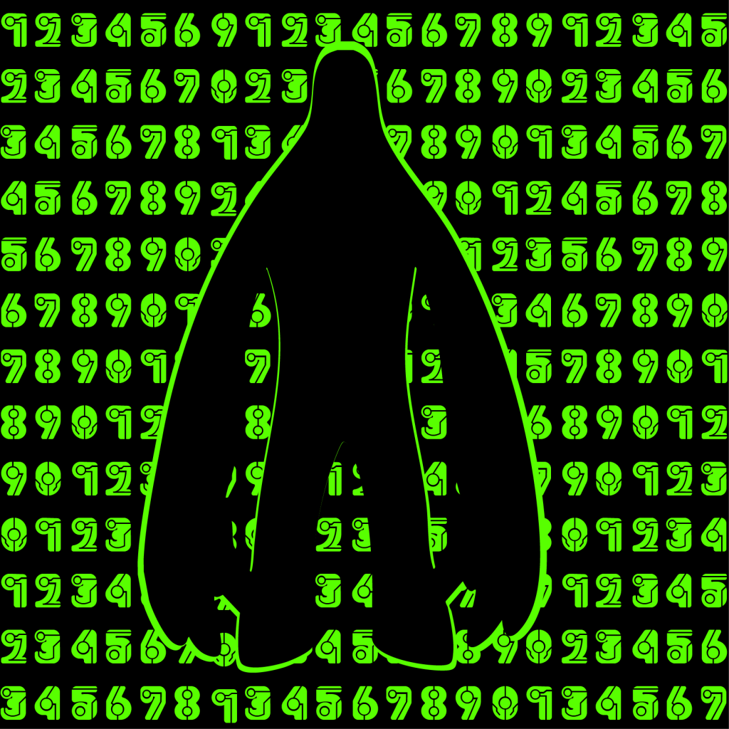
- The negative space in the font: My favourite feature of the font is the white space carved into the font, which allows me to recreate the green lines details present on Upgrade by simply overlaying the font on a green background. This white space gives me flexibility to play around with the colours, allowing me to change the colour of the font, and place it over different coloured backgrounds to get different effects.
- Decorative font: This font being highly decorative allows it be used for large title designs that can stand on its own without the use of other decorative elements to support it.
- Represents Upgrade: By studying Upgrade and adding the most prominent element of his design into the font, I manage to create a font that represents his visual aesthetics. His simple colour palette of green, white and black made this process easier.
- Can be used for Ben 10 promotional material: It is without doubt that the font can be used for the promotional material for Upgrade. However, it can also be used for Ben 10’s promotional material as a result of sharing similar aesthetics of electric, alien-like and sci-fi.
Improvements to the font
Despite the several factors that make this font a successful design, I still feel there are areas of improvement.
- Lacks consistency: Some of the letters lack consistency with each other, for example I maintained the curved structure for the curved letters such as U, C, G, J. However, this does not translate to the letter S.
- Does not fully represent Upgrade: The line details present in the letterforms could’ve been more consistent with each other. Also, some of the line details do not fully encapsulate the design present on the Upgrade alien.
- Lacks readability at small sizes: Due to its highly decorative nature and boldness of the font, it loses its readability when reduced to smaller sizes.
You can type using the Ben 10 font below:
Ben 10 Font © Subhana Salim, 2025.
Final thoughts
The process of creating the font was a nostalgic experience as the source material had ties to my childhood. Although the deadline and workload were difficult for me to manage, it ultimately pushed me into creating one of my best works. This font provides me with both practical as well as personal value as it allows me to create fan work for the cartoon as well as leaving the opportunity for this font to be used for official promotional material. Making this font provided me with a valuable learning experience in the area of font making, making me more attentive to consistency and accuracy in construction.