
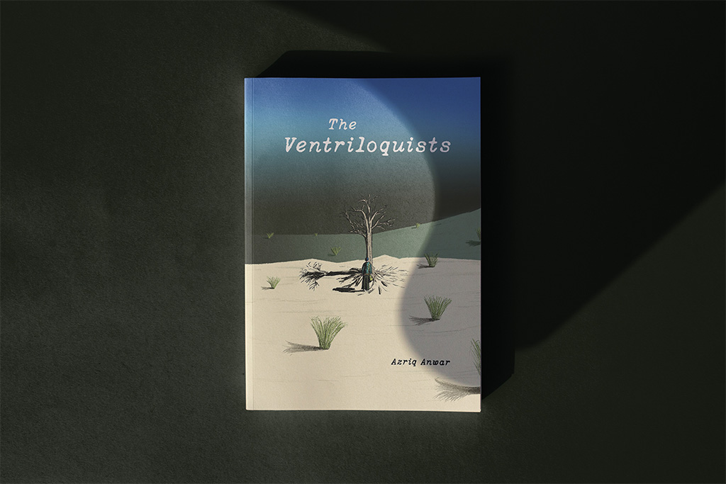
What I portrayed in this publication, The Ventriloquists, was to show human commentary acting upon the gruesome, and hilariously ridiculous characteristics. From waging wars to crybabies on television, there are just countless things that can be voiced out about. Therefore, this publication was my attempt in showing what some of those are like.

This project started with a list of ideas that revolved around experimental animations, multimedia comic books, art direction for a band, and blunt mockery of public figures in the form of an infographic. The tone of what I was going for wasn’t quite there. After some consultations with Ms. Anis, she suggested morphing my idea of the mockery of public figures into a satirical direction, with an angle of it being subtle. She also spawned some ideas that benefited the project by mentioning the works of George Orwell’s Animal Farm and Yasmin Ahmad’s unconventional way of writing and filming. From there, I looked into the respective works and expanded more references into the mix. The core references I chose were Courage of the Cowardly Dog, George Orwell’s 1984, Coldplay’s Mylo Xyloto, Radiohead, and the whimsical music of Cat Stevens (Yusuf). These carefully chosen references helped bloom a specific angle that I intended to capture which I think weaves through each other.
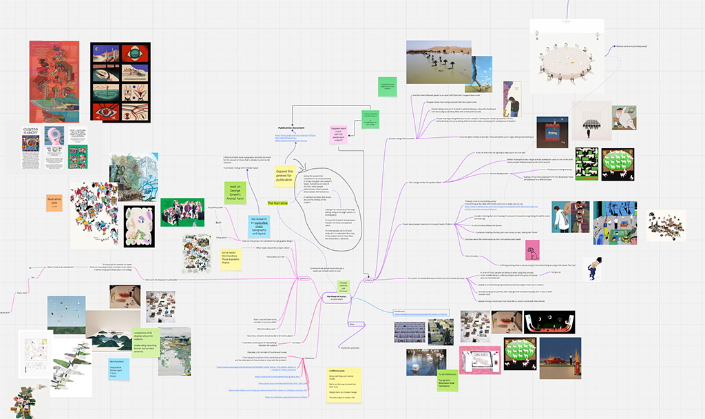
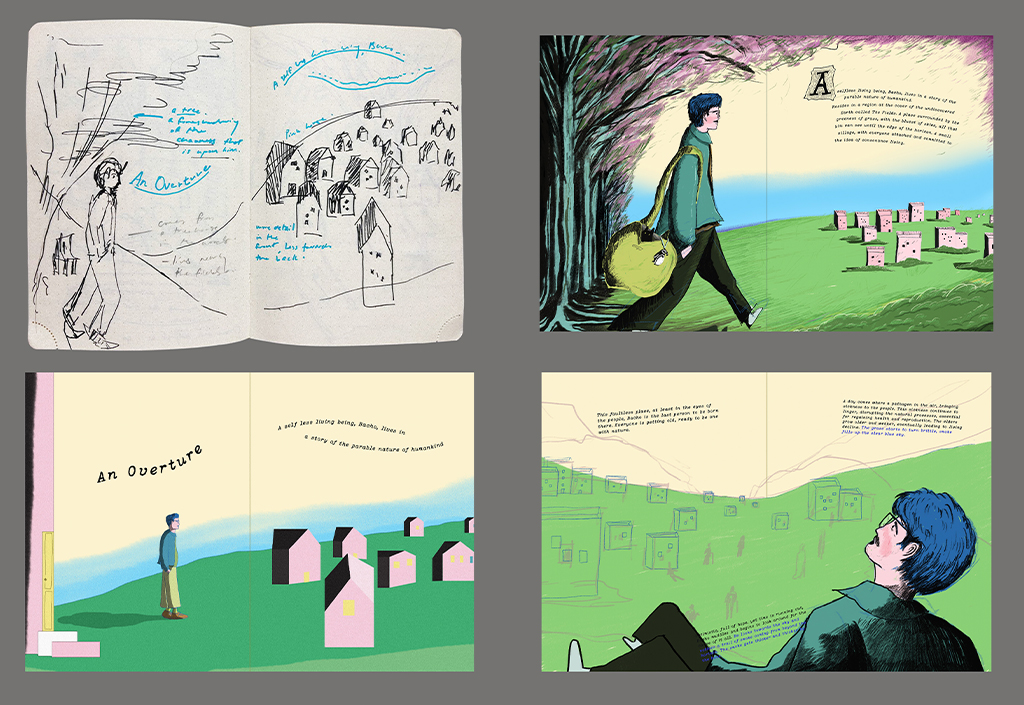
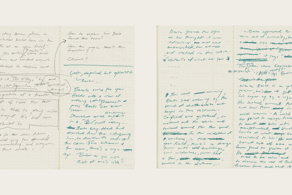
Moreover, I placed and laid out all these ideas on Miro board to have a clear view on what I have already and will jot down. They were laid out in a form of a mind map; with the main points being, the main narrative, questions for myself to consider, subjects to talk about and visual mood board. Like all things, rules need to exist and balance is needed between all the elements. But in the case of this project, unconventionality needs to play a role, so the proposition is to break those rules. Each reference that I chose drives and translates the feeling that imposes into the core of the story. With the references that I gathered, I then started to draft my first sketch/drawing, which resulted in it being quite underwhelming.


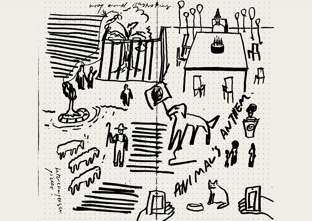
Then on, I went back into deciding the many fonts, compositions and mood boards that I had picked. Subsequently, I drove and mashed the ideas to form a composition that I had finally figured out after a few days of pushing the puzzles of drawings together. From there, I needed to decide which topics I wanted to portray the world like.
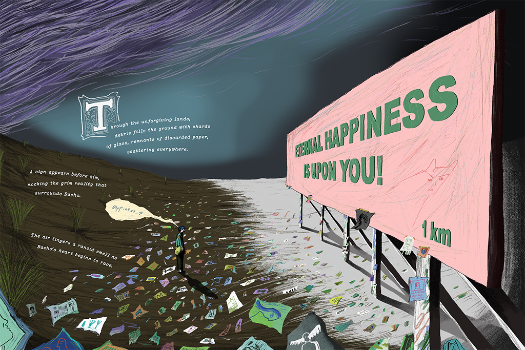
Though I have to compromise the topics that I had written down to take into account that the story needs to flow in a cohesive direction. As I went along, the flow and aesthetic came into the form of a children’s book with the story being about someone seeking refuge from a place that had been reduced to lifeless-ness. I expanded the compositions of the story, while breaking the rules of typography, taking advantage of the unconventional element that I imposed into this project. This element allowed me to interlace the usage of colours deteriorating towards the end of the story. The intention of this being the colours represents what the main character’s belief, contentment, and honour that he carries upon.
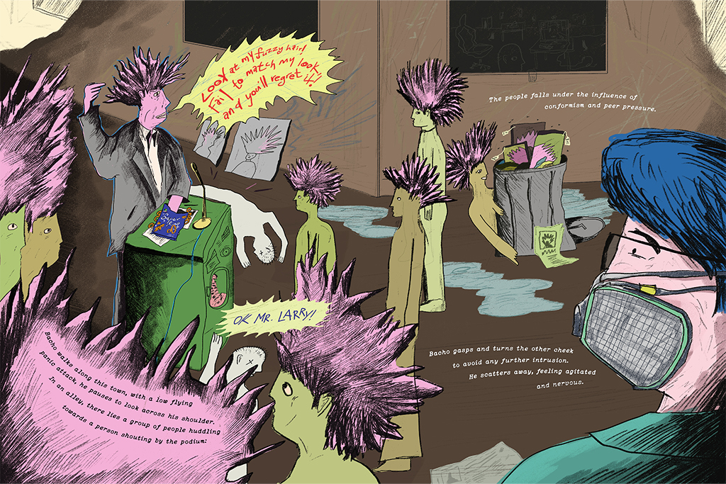
How I decided to place a certain tone to the publication was by integrating counterparts of my core references. With George Orwell’s Animal Farm and 1984, these stories described political allegories, propaganda, surveillance, and the maintaining absolute power over its citizens. Yasmin Ahmad’s unconventionality of film making and writing paved a way for me to break some rules of applying elements onto places that had boundaries. The cartoon, Courage The Cowardly Dog, inspired the different variations of how bad and evil people can take shape. This converged with Coldplay’s Mylo Xyloto’s comic book that tells a tale of shedding a light of hope in the midst of the chaos. Moreover, Radiohead’s musical themes paint a picture by using their haunting melodies with an experimental landscape which reflects on alienation, consumerism and the unsettling impact on technology. To tie it all together was Cat Steven (Yusuf)’s whimsical music that I think balances everything.
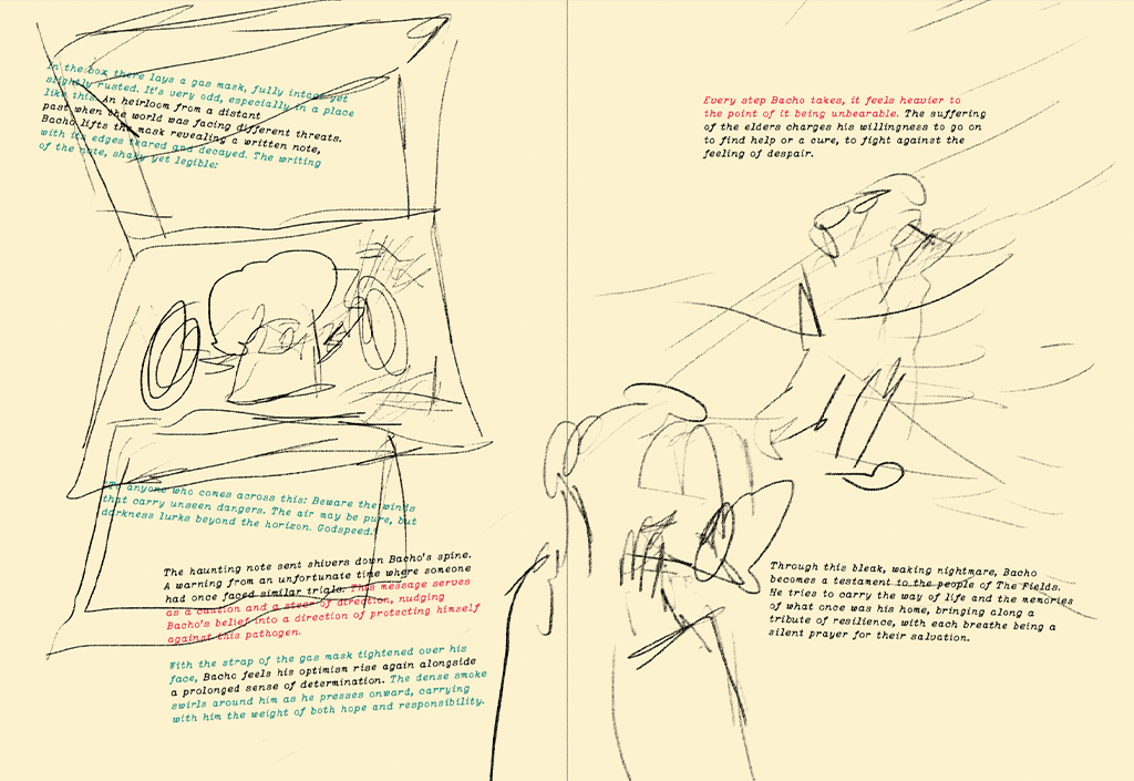
Originally, I wrote this story that has an ending, a slightly happy ending to be frank. But my lecturer suggested it to be a cliffhanger instead. I too agree with this direction as it can let the audience perceive the ending that they think would work best. No one can really draw a picture of what the future would be like, due to our nature’s unsureness. Also, it shows how the world can influence people into making choices and becoming someone that they are destined to be. Either good or bad.
The things that I had chosen to converse in the story are: refugees, displacement, capitalism, digital addiction, indoctrination, ecological brutality and how synthetic the world is progressively becoming.
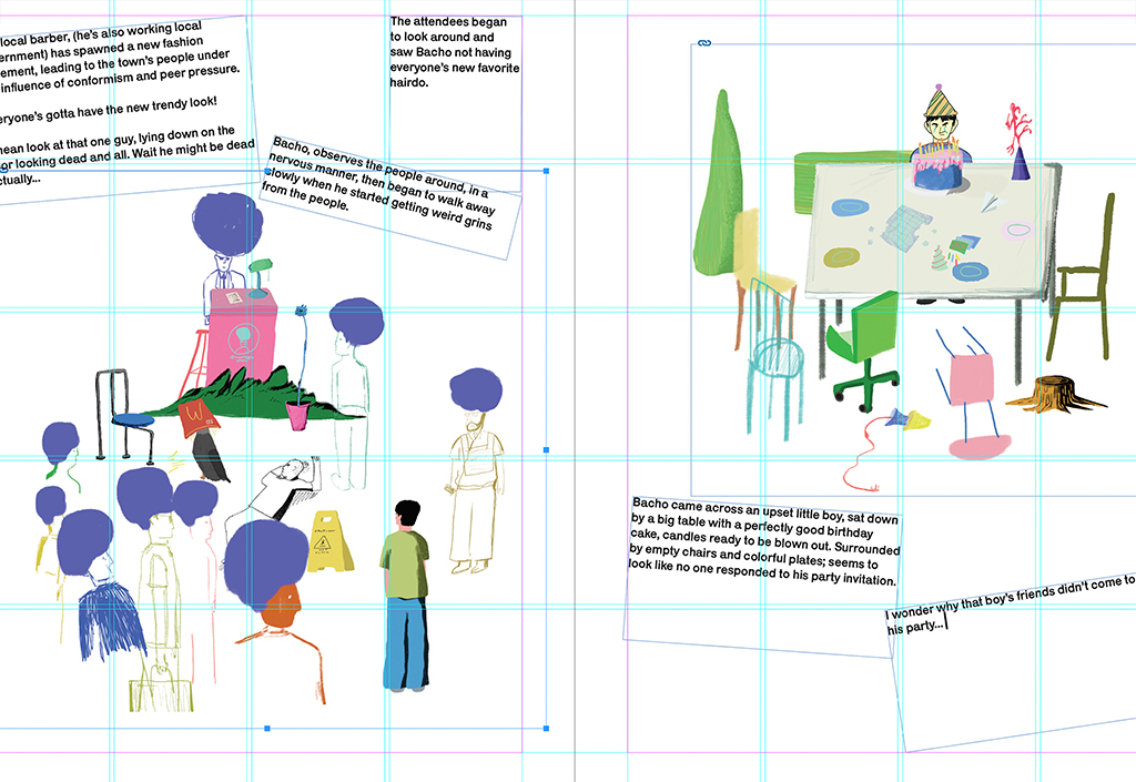
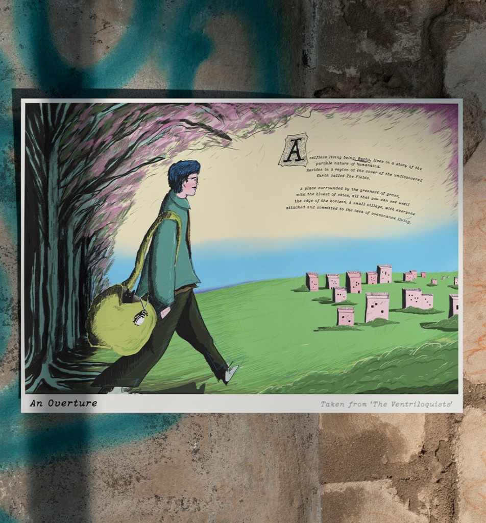
The name that I went with for the main character was Bacho, my late father’s name: as a tribute to him who himself went through an exceptional journey during his lifetime.
On a side note, the story was way longer than it ended up to be as I then broke it down into visuals to make it more clearer for me to arrange the story.
From the start, the grounds had been set on turning this publication into a physical format. It would have beaten the purpose of a part of the message in this publication if I made this book in a digital format since the addiction to digitalisation of things was voiced out. Since it was weighted more on the visual aspect, I thought of having the size of the publication as big as what a children’s book would be like. The intention was to broaden and enlarge the view of the visuals while showing the details that were placed upon.
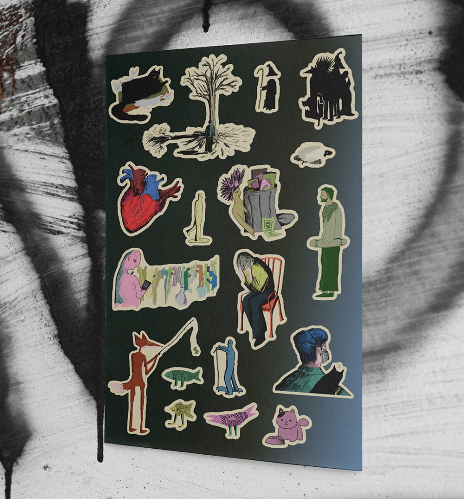
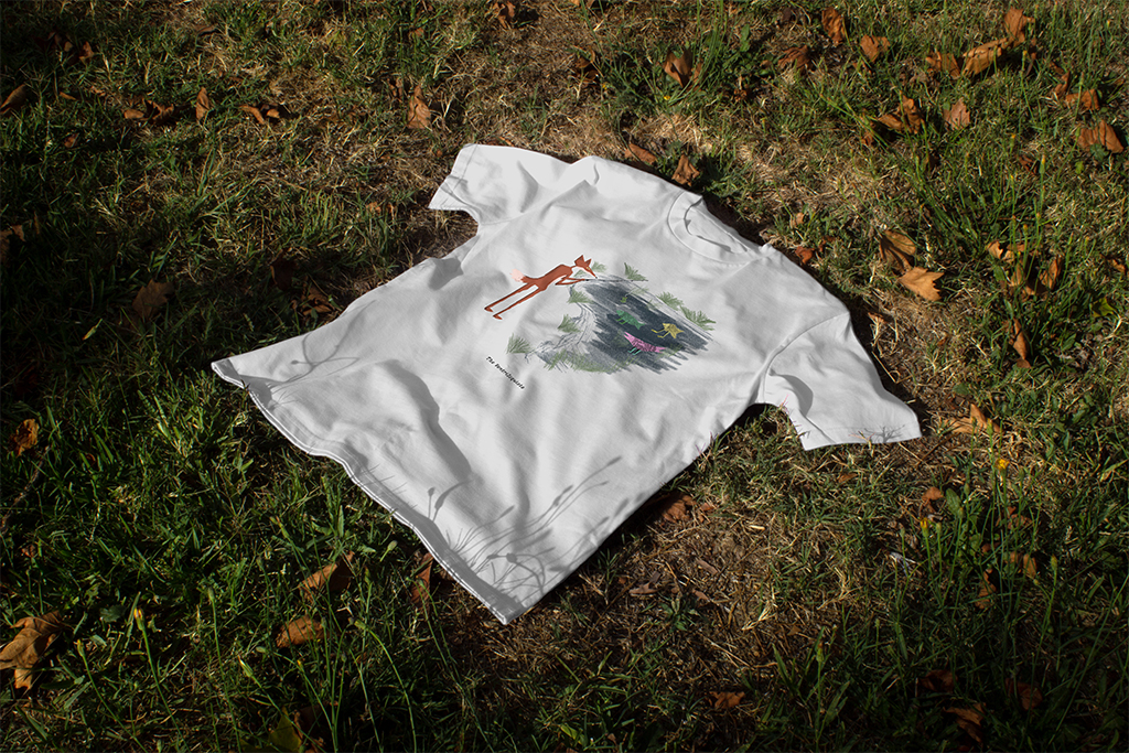
The merchandising was initially going to be an infographic that includes an explanation of each part of the story. Then, I thought that would also beat the purpose due to the whole thing needing to be as subtle as possible. I moved into doing stickers, prints, and a t- shirt: which the visuals I took directly from the publication itself. In addition, I had put together a compilation of my early drafts and sketches into a book, showing a peek of how the idea came to be along with the ideas that did not make the final cut.


Ultimately, the purpose of the whole publication is to create a recollection by serving the hard bargaining truth of the world. I initiated this publication with its fate to eventually dissolve into piles of negligence. It is a way of a story for it to be buried and unheard. Just like in real life, heart wrenching truths and criticism are always shut down by the media.