


Cell was developed as part of my Advanced Typography module in the Bachelor of Design in Creative Media (Animation). What began as an academic assignment gradually evolved into a deeply exploratory design process that combined illustration, experimentation, and technical problem-solving. The project challenged me to rethink what a font could be—not just as a communication tool, but as an expressive visual language.
Why Cells?
At the idea proposal stage, I explored three possible design directions: a problem-solving font inspired by jellyfish, an experimental typeface based on cellular forms, and a font derived from Melaka heritage tiles. Each concept had its own strengths, but after discussions and critical feedback, the cell-based concept stood out as the most promising and conceptually rich.
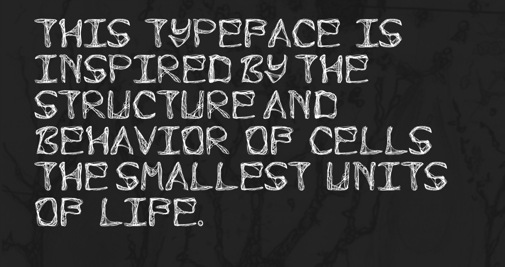
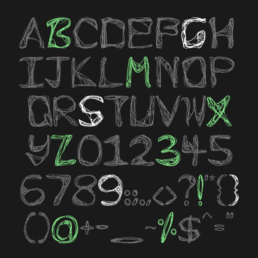
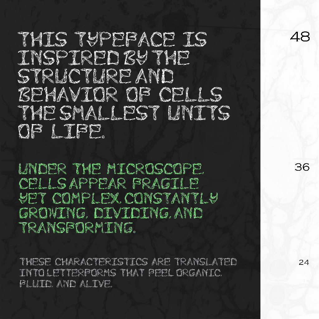
Cells are the smallest units of life. They are irregular, soft, and constantly changing—qualities that sharply contrast with the structured and systematic nature of traditional typography. This contrast became the core conceptual tension of Cell: the balance between organic randomness and typographic order.
I was particularly drawn to the idea of translating something microscopic and alive into letterforms that could still function within graphic design, animation, and experimental media. Unlike purely decorative lettering, Cell needed to operate as a usable font system. This meant balancing expressive freedom with consistency, readability, and technical constraints. The challenge was not just to create visually interesting letters, but to ensure that they could work together cohesively as a complete typeface.
From Observation to Sketch: Drawing Living Letterforms
The design process began with observation and research. I studied visual references of cells under microscopes, paying close attention to their uneven outlines, soft curves, and irregular edges. Cells rarely repeat themselves exactly, yet they still feel visually unified. Capturing this sense of variation within cohesion became a key goal of the typeface.
All letterforms were initially drawn by hand in Procreate. Instead of starting with strict typographic grids, I allowed myself to work intuitively, letting each letter evolve naturally through sketching. Each character was treated as an individual “organism,” but with shared visual DNA—rounded structures, varying thickness, and organic protrusions that referenced cellular membranes and internal forms.
Cell Type Drawing Progress: https://youtube.com/shorts/I3nvjvmJ3t8?feature=share
Small details played an essential role in shaping the character of the font. Slight distortions, asymmetry, and uneven curves helped the letters feel less mechanical and more alive. At the same time, I remained conscious of overall proportions so the font would not feel chaotic or overly decorative when used in layouts or longer compositions.

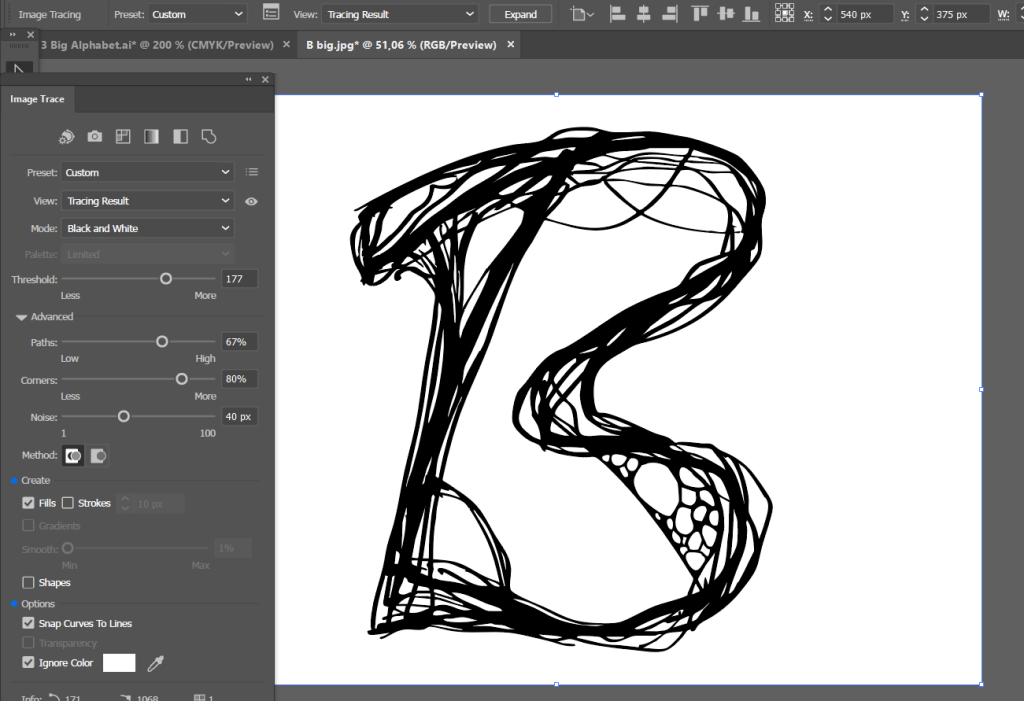

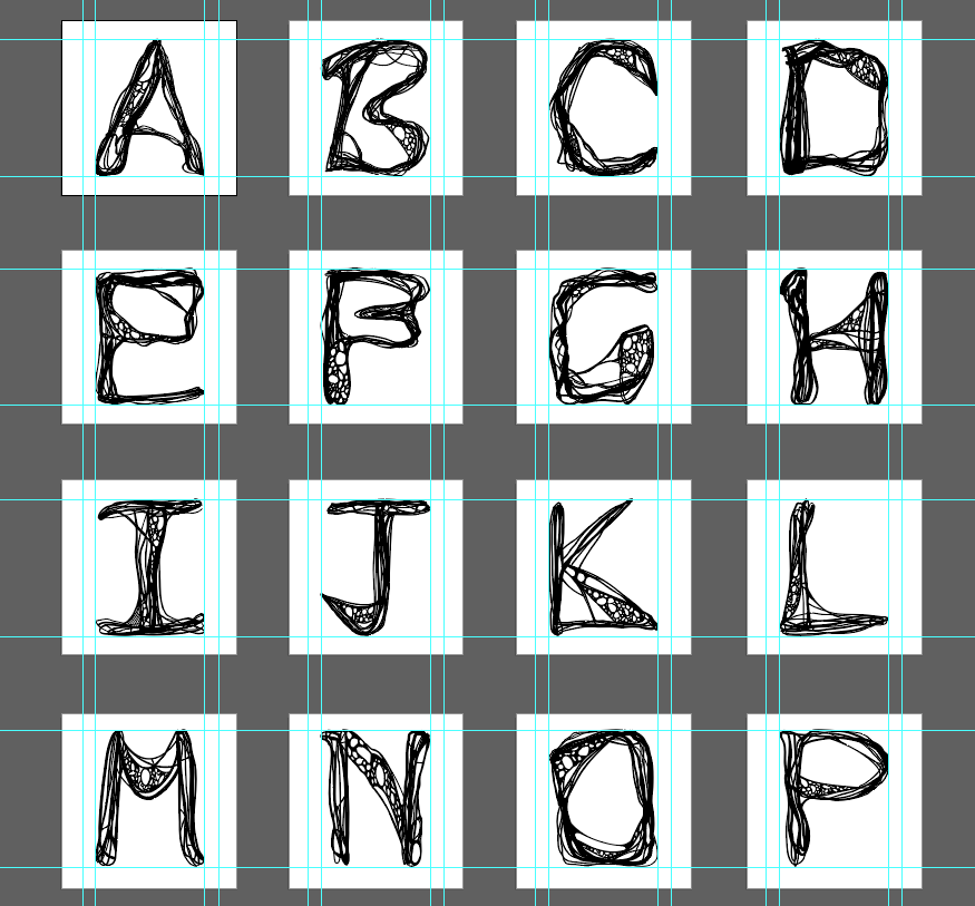
Once the hand-drawn letters were completed, they were exported as images and imported into Adobe Illustrator. Using the Image Trace function, I converted the drawings into vector shapes, allowing the letterforms to be scaled, edited, and refined without losing quality.
This stage marked a significant shift in the design process—from expressive exploration to technical discipline. I introduced guideline systems to control letter height, baseline alignment, and stroke balance. While the font retained its organic appearance, these invisible structures ensured consistency across the entire character set.
This process highlighted one of the most important lessons in type design: even the most experimental fonts require strong underlying systems. Without structural control, a typeface risks becoming visually inconsistent or difficult to read. By carefully balancing freedom and constraint, Cell was able to maintain its organic identity while functioning as a cohesive typographic system.
A Unicase Decision
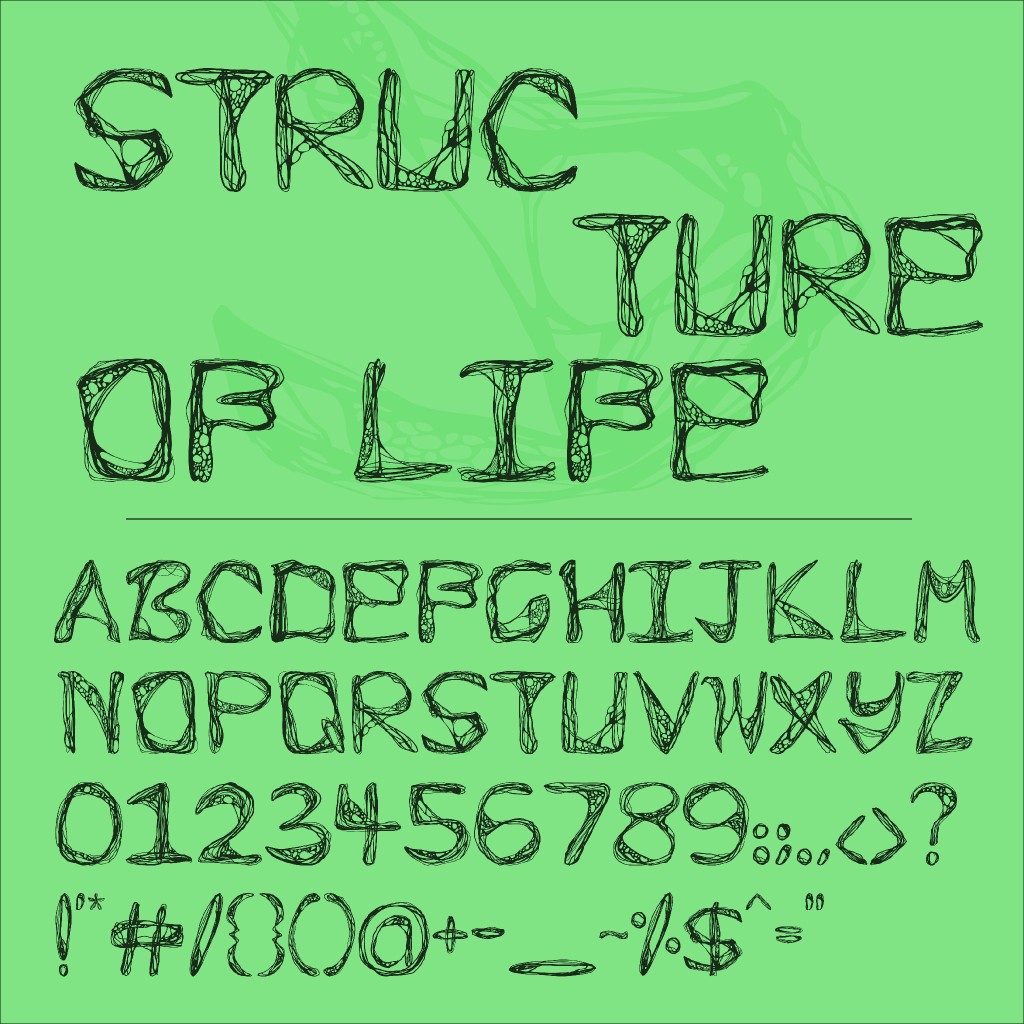
Cell was designed as a unicase typeface, meaning it uses a single-case system rather than separate uppercase and lowercase letters. This decision supported the experimental nature of the project and simplified the visual rhythm of the typeface.
After completing the alphabet, I moved on to designing numbers and punctuation marks using the same organic logic. Each character needed to feel like it belonged to the same cellular “family” while remaining recognizable and functional. This stage reinforced the importance of consistency—not just in form, but in character and personality.
Once all characters were completed, they were exported individually as SVG files to preserve vector accuracy for font design software.
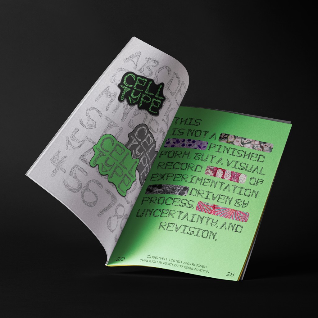
Presentation: Letting the Typeface Speak
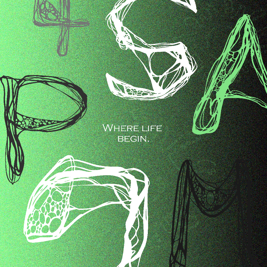
For the final presentation, I adopted a minimal visual approach. Since the letterforms themselves are intricate and expressive, excessive decoration would have distracted from their qualities. The focus was placed on form, texture, and structure.
The color palette was intentionally restrained, consisting mainly of multiple shades of grey paired with a vivid green accent. This combination enhanced the biological and experimental tone of the typeface while maintaining clarity and visual hierarchy. Negative space played a key role, allowing viewers to focus on the details of each glyph.
Studying professional font presentations helped me understand how layout, spacing, and hierarchy elevate a typeface beyond its raw glyphs, transforming it into a polished design


Application: Testing Cell in Real Contexts
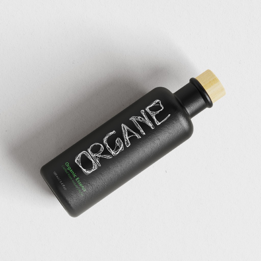
To demonstrate versatility, Cell was applied across five different mock-ups, featured below are two of them: a ceramic bottle and s magazine layout.
Each application explored how the typeface interacts with scale, material, and context. On packaging, the organic shapes suggested scientific experimentation and biological products. In editorial and large-format settings, the font-maintained impact while revealing intricate details.
These applications reinforced that Cell works best as a display typeface—ideal for branding, experimental media, animation titles, and conceptual design projects.
Reflection: What This Typeface Taught Me
Designing Cell deepened my understanding of both creative exploration and technical precision. I learned that type design is not solely about aesthetics—it requires patience, problem-solving, and strategic decision-making.
The project also highlighted the importance of time management. Spending too long attempting to fix one technical workflow delayed progress elsewhere. Knowing when to adapt is just as important as persistence.
Most importantly, Cell changed how I view typography. Letters are no longer static symbols to me; they are forms capable of emotion, movement, and storytelling. This project strengthened my confidence in experimental design and reaffirmed my interest in typography as a bridge between art, science, and visual communication.
Try out the typeface below: