

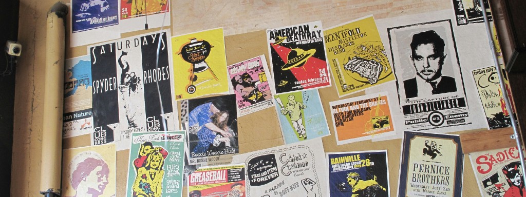
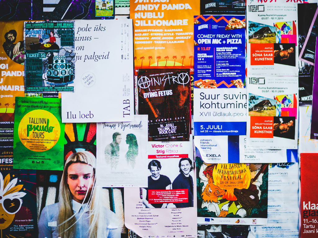
It was found on the walls of cities, railway stations, school passages, building fences, shop windows. It announced revolutions, concerts, elections, protests, films, sales, ideologies, identities. The poster has always been more than a decorated sheet of information. At its best, it is a public instrument: a designed surface that interrupts space and asks to be read.
Posters possess the unique potential to distill and deliver complex information rapidly.
However, creating a layout that effortlessly communicates in a short window of time is one of the most difficult challenges in graphic design. Often, in an attempt to share as much information as possible, designs can inadvertently work against the mechanical realities of how the human brain processes information.

The Politics of Arrangement
Layout is often treated as a technical stage of design, something that happens after the “real idea” has been decided. But in practice, layout is where meaning begins to take form. A poster does not present information neutrally. It structures access to that information. It dictates the point at which the eye is resting, what is emphasized, what is pushed aside and the way in which the viewer is travelling through the page. Before any conscious interpretation takes place, the layout has already begun shaping understanding.
From this perspective, layout is not just formal, it is cognitive too. It reflects an assumption about the viewer: how much effort they are willing to expend, how quickly they need to understand, and what deserves immediate attention. Every composition quietly proposes a reading experience, one that can either support comprehension or obstruct it.
And this is where the idea of cognitive load comes in, the amount of mental work needed for comprehension. A layout that works against the natural workings of the brain presents a kind of friction, one which exhausts the viewer. To investigate this dynamic, I set out to provide empirical evidence for what many designers have long practiced: thoughtful layout does not merely elevate aesthetic appeal; it actively conserves a viewer’s cognitive resources.
Testing a Simple Idea
The main focus of my research was measuring the extent to which layout determines understanding. I gathered 80 people who had design background. The participants were presented at two posters that had identical content (the same text, the same information) but totally different layouts. Poster A (first poster) was clean and organized, while Poster B (the next poster) was less structured and much more visually scattered.
The results were surprisingly decisive. The majority (more than 85 percent) of the participants preferred Poster A, and they considered it to be more readable, clearer, and overall more effective. What was also striking was not only the preference but how people experienced the two designs which were distinctly different. The conclusion is not merely that one design is “better.” It was that organisation reduced the cognitive effort.
When the hierarchy is apparent and the relations among elements are clear, the viewer does not have to search for meaning. Perception takes place shortly and in a way, spontaneously. When the structure is weak or inconsistent, the viewer has to figure out the layout first before taking the message. That extra effort, even if it is slight, is enough to fully withdraw attention.
Attention Is a Limited Resource
This matters because contemporary visual culture is not defined by scarcity, but by excess. Screens, interfaces, and public spaces are saturated with competing signals. Information is encountered rapidly and selectively. In such an environment, a poster is not competing to be seen; it is competing to be processed.
If understanding requires effort, it is unlikely to happen. This is where poorly organised posters fail. Not because they lack creativity, but because they mismanage attention. They present everything at once, without distinction. Headline, detail, decoration, and background compete on equal terms. Without hierarchy, there is no entry point. Without an entry point, there is no engagement. The result is not complexity, but noise.
Clarity, however, should not be mistaken for simplicity in the reductive sense. Effective posters are not necessarily minimal or restrained. Many are expressive, dynamic, even visually dense. What distinguishes them is not the absence of elements, but the presence of order. Strong layouts establish relationships. They create contrast with intention. They control pacing, for what is seen first, what follows, and what remains secondary. Even in highly experimental compositions, there is often an underlying system that governs how the eye navigates the design. Apparent chaos, in successful posters, is rarely accidental.
This distinction is particularly relevant in contemporary design practice, where visual experimentation is often valued. While ambiguity and disruption can be powerful, they require control to be meaningful. Without that control, complexity becomes confusion, and confusion rarely holds attention.
Memory Begins with Structure
From the data, what becomes clear is that visual organisation shapes how deeply information is taken in. Hence, the impact of layout extends far beyond immediate understanding. When visual elements are grouped logically and guided by hierarchy, they form patterns that the brain can store and retrieve more easily. In contrast, disorganised layouts produce fragmented impressions that are difficult to recall. This suggests that layout is not only about access, but about retention. A poster that cannot be remembered cannot continue to communicate.
Seen this way, layout also carries an implicit responsibility. Every compositional decision reflects a choice about how the viewer’s attention will be used. A well-structured poster respects that attention, guiding it efficiently and purposefully. A poorly structured one consumes it without reward. In an environment where attention is constantly fragmented, this distinction becomes increasingly significant. Design is no longer only about expression. It is also about managing effort.
Despite the rise of digital media, the poster remains a relevant and revealing format. It condenses design into a single, static surface. There is no interaction, no animation, no extended engagement to rely on. Meaning must be established through composition alone, often within seconds. This makes the poster an exacting test of visual thinking. Its success depends not on how much it shows, but on how well it organises what is shown. It requires precision, not just in style, but in structure.
Some posters remain in memory long after they are seen. Others disappear almost immediately. The difference is rarely accidental. It lies in how effectively attention has been shaped: how clearly the design establishes entry, direction, and emphasis. Because seeing is never passive.
To look is to process, to prioritise, to interpret. And a poster succeeds when it understands that process, not by overwhelming it, but by working with it.