
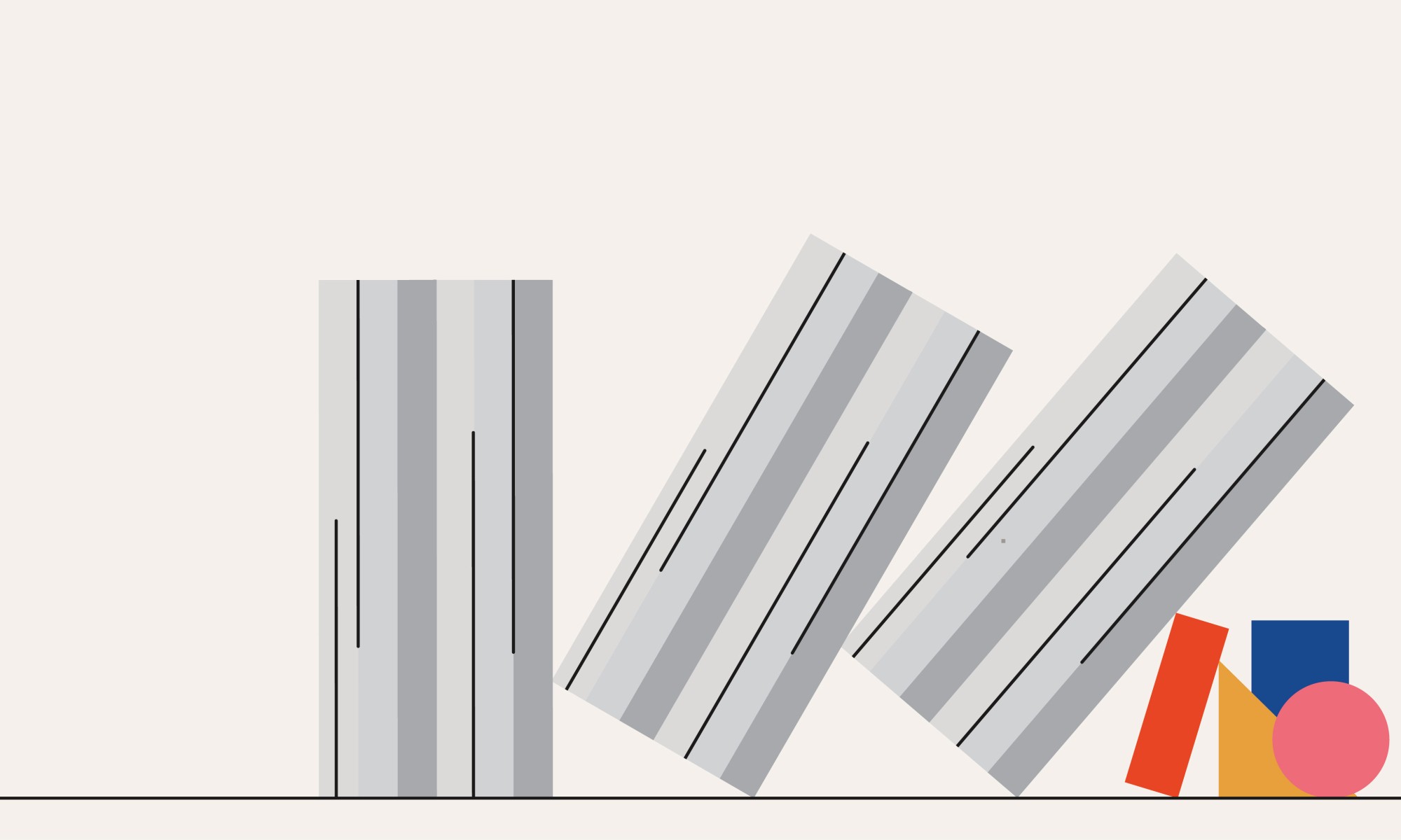

When we actually get there, we know that adulthood is not some magical journey. Instead, it is filled with responsibilities, deadlines, and the constant blue-light glow of our smartphones or laptops. Somewhere between school exams, career pressure, and complicated social relationships, the bright colors of our childhood slowly begin to fade into the depths of our minds.
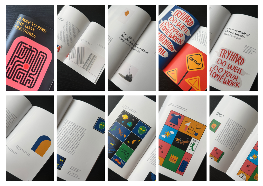
My newly designed book, A Map to Find the Lost Treasures was created from a desire to pause and look back at the things we often leave behind as we grow up. Written as a reflective journey across four chapters, the book explores how childhood memories—from building towers with toy blocks on the living room floor to being afraid of the iconic Malaysian rotan—continue to shape the people we become.
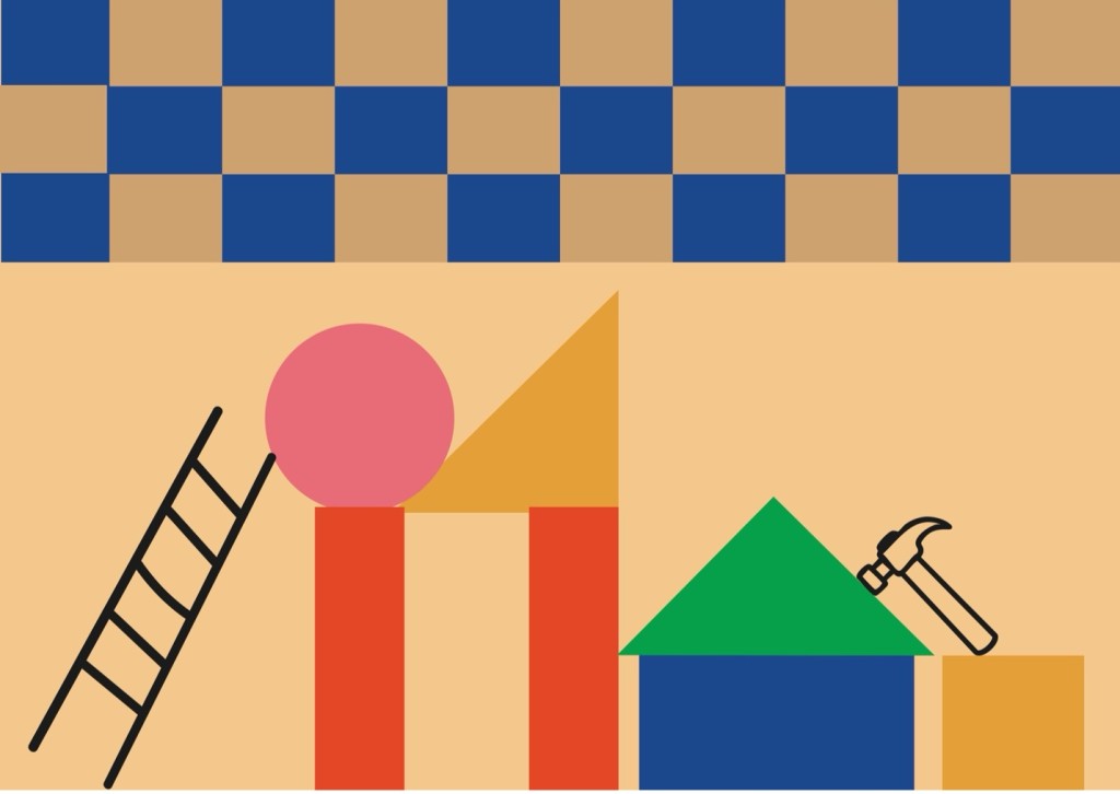

When I started to illustrate my book, I knew the visuals included must do more than simply decorate the pages. They needed to feel like a portal back to those familiar childhood moments. The book explores the subtle emotional changes that come with growing up—how we slowly trade curiosity for predictability and forget the simple joy of playing and discovering things.
For me, an illustration should never simply repeat what the text is saying. It should add another layer to the story and help bring out the feelings that may not be directly expressed through words. My process began by going through the raw manuscript carefully and highlighting the specific sentences that I felt could be translated into visual moments.
From there, I planned a total of sixteen illustrations across the manuscript, with around four visuals for each section, including the Introduction. Each illustration was designed to work as an indirect reflection of a particular sentence, turning abstract ideas such as nostalgia, academic pressure, and the loss of imagination into something more tangible and visually engaging. For example, rather than literally illustrating a child sitting on a carpet surrounded by toys, I explored the feeling of childhood play through simple symbolism, using geometric building blocks as a visual reference to the toys we grew up with.
Once I had identified the key sentences, I began collecting visual references and exploring different ways to represent each idea. I maintained a steady workflow by developing around three to five visual concepts each week, which allowed me to build a growing library of references and ideas before moving into the final production stage. During Weeks 1 and 2, I focused mainly on analyzing the manuscript, selecting the key sentences, gathering references, and developing my initial concepts. In Week 3, I reached an important turning point in the project as I experimented with two different visual directions: photographic collage and minimalist vector illustration. After discussing the options with my lecturer, I decided to move forward with the minimalist vector approach as it better suited the reflective and nostalgic tone of the book. From another two weeks, I focused on producing the illustrations manually in Adobe Illustrator, using clean geometric shapes while gradually refining the composition, arrangement, and overall visual consistency across the book.
When I was brainstorming the visual concept, I hit a wall of creative confusion. I was unsure which visual direction would best carry the emotional weight of the book. There were two ideas in my mind at the beginning. The first was a photographic collage approach, using real photographic elements, cutouts, and vintage textures to create a fragmented feeling, almost like pieces of old memories coming together. The second was a minimalist illustration approach, using clean vector-based forms inspired by classic children’s book illustrations. This style focused on simplicity, clear shapes, and a sense of playfulness.
Feeling uncertain about which direction to pursue, I discussed my ideas with my lecturer, Mr. Vinod. He encouraged me to step back from the immediate design process and explore more historical visual references to help me develop a stronger visual voice. In particular, he recommended studying the work of the legendary graphic designer Alan Fletcher, including his work with Pentagram, as well as classic children’s books illustrated by Paul Rand. These references gave me a new perspective on how simple forms, visual wit, and playful compositions could communicate meaningful ideas while still feeling personal and nostalgic.
When I was studying the work of Alan Fletcher and Paul Rand, I completely changed my visual direction of my book. Fletcher’s clever visuals showed me that simple shapes could communicate complex, humorous, or emotional ideas without needing a lot of visual elements. At the same time, looking through Paul Rand’s children’s books helped me understand the expressive power of basic geometric forms. He was able to simplify familiar objects and ideas into circles, squares, and bold blocks of color while keeping his illustrations warm and playful.
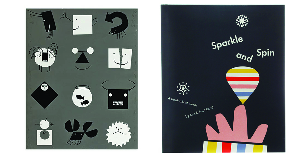
These references encouraged me to experiment with simpler but more meaningful compositions. Paul Rand’s approach especially connected with the main visual motif of my book: plastic building blocks. Just as children use simple blocks to build castles, houses, and imaginary worlds on the living room floor, I realized that I could also use basic geometric forms to build visual stories around more complex emotions. With this clearer direction, I decided to fully commit to a minimalist illustration style.
Once I had settled on the visual direction, I moved into the production stage using Adobe Illustrator. My main idea was to create illustrations using clean geometric shapes and simple line elements while keeping the overall style playful, warm, and engaging. Since building blocks became the central visual motif throughout the book, I started exploring how these familiar shapes could also work as metaphors for different experiences of growing up.
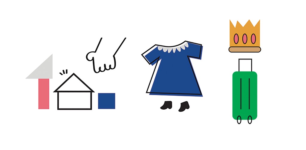
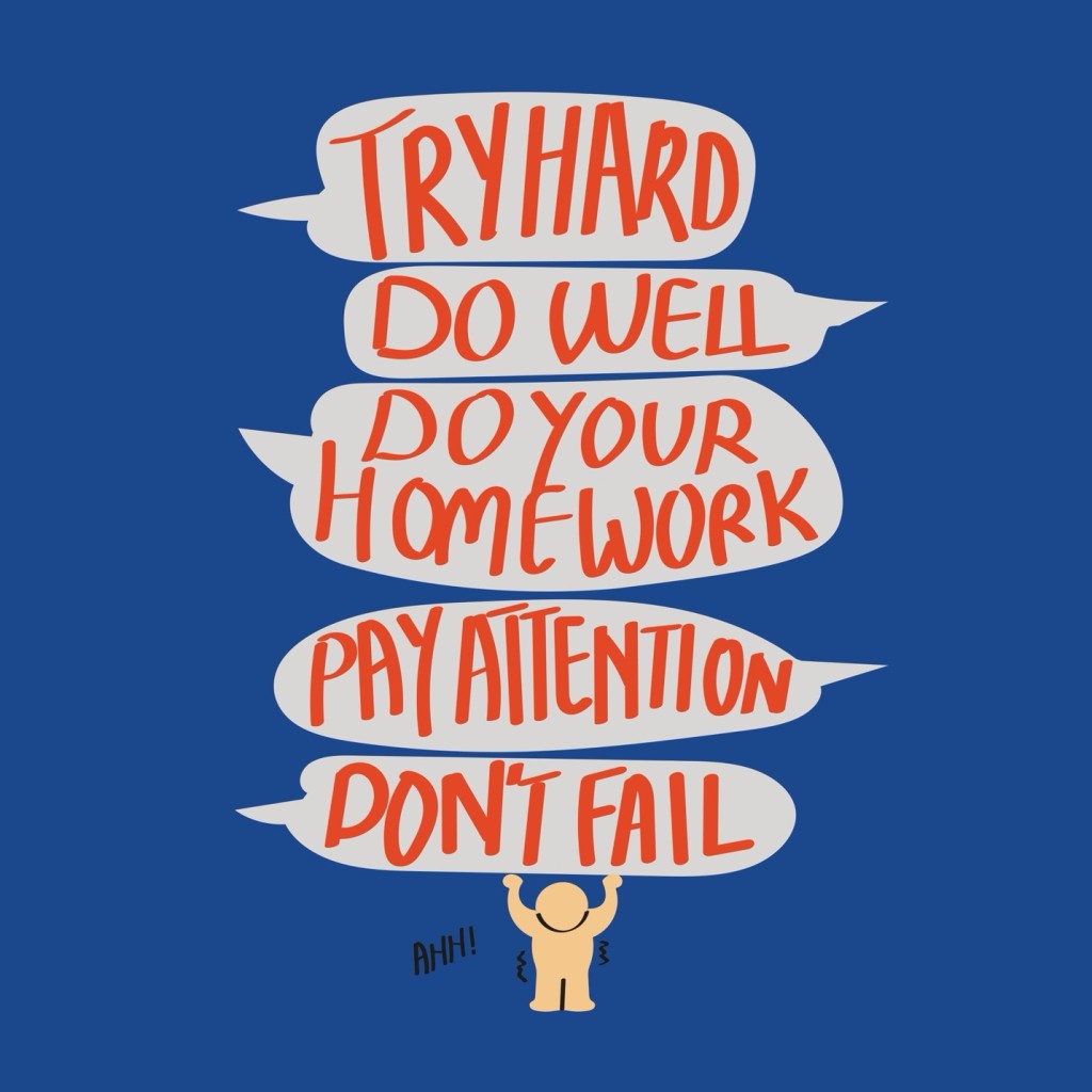
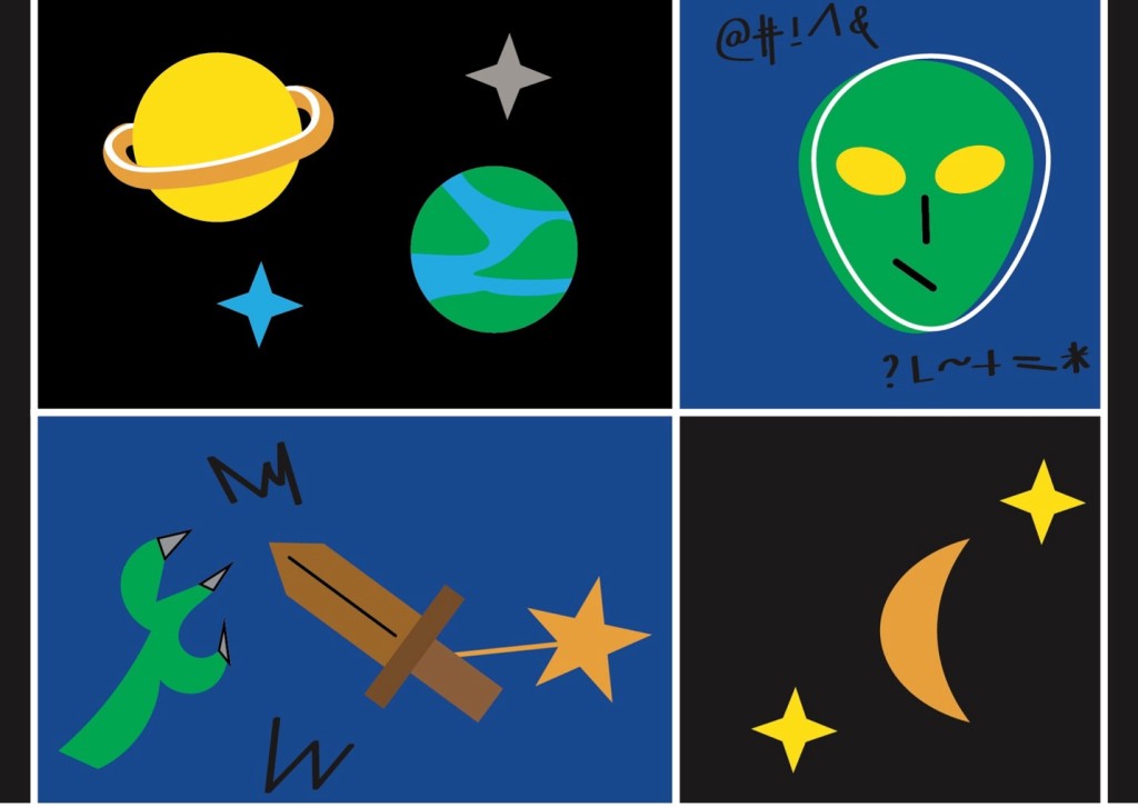
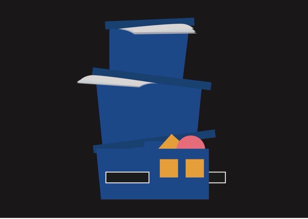
For example, I used unevenly stacked blocks to represent the architecture of support, showing how parental guidance provides the foundation we rely on during childhood. For example, I used unevenly stacked blocks to represent the architecture of support, showing how parental guidance provides the foundation we rely on during childhood. For the burden of expectation, I arranged dense speech bubble shape into more overwhelming compositions to reflect academic pressure and the fear associated with the rotan. In another illustrations, I transformed minimalist style visuals and simple line elements into childhood imaginations like spaceship, aliens, princess or warrior. For example, I made illustrations inspired by how a simple cardboard box could become a cockpit or spaceship in a child’s imagination.
This stage took a lot of time because all the illustrations were drawn and constructed manually by me. I had to carefully consider the composition, arrangement of shapes, color balance, and consistency across all sixteen visuals. I spent many hours adjusting anchor points, refining line weights, and experimenting with color palettes. I wanted the illustrations to retain the bright, nostalgic colors associated with childhood toys while using more dark and calm background tones to reflect the perspective of adulthood. Through this process, I gradually found a balance between childhood simplicity and the more reflective tone of the book.
Illustrating A Map to Find the Lost Treasures taught me that design is about much more than creating something visually appealing. It is also a way of understanding emotions, telling stories, and connecting with people through shared experiences. As a designer, I believe the goal is not only to make something that looks good, but to create something that people can connect with. This book is my tribute to anyone who has ever built an imaginary world out of toy blocks, felt nervous about seeing a red mark on a paper, or dreamed of flying to the edge of the world. Through simple vector lines, playful block forms and illustrations with nostalgic colors, I hope these illustrations can give readers a quiet moment to look back at the childhood treasures they thought they had outgrown—and perhaps remind them that those treasures are still a part of who they are today.