
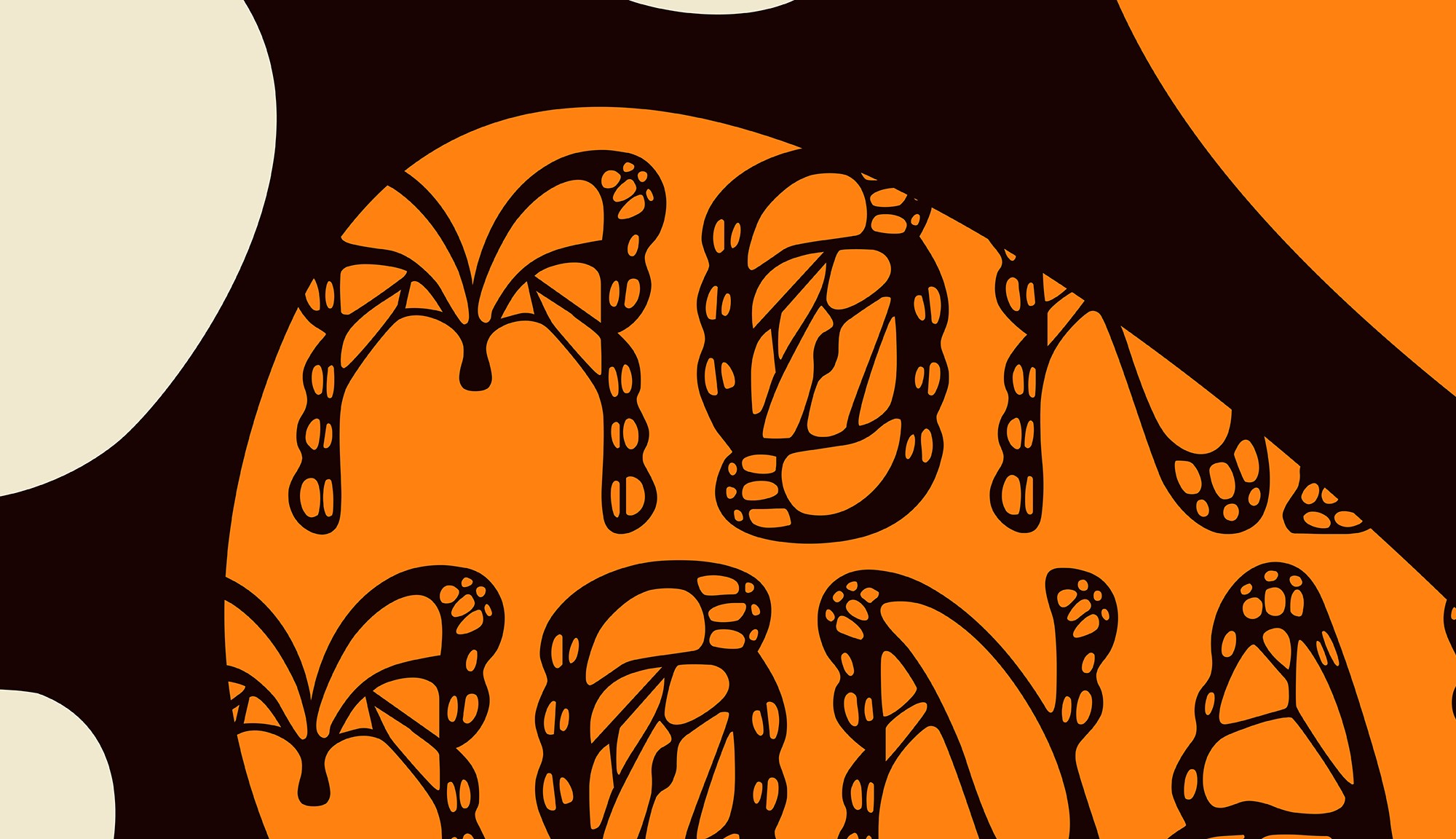

Inspiration
The inspiration behind this font can be trace back to earlier this year (2026) in which I had started to admire and become curious about butterflies. I began learning more about the insect and discovered that the iconic Monarch butterflies are at the risk of extinction.
When researching butterfly-related fonts to gauge the common look of that font type, I found that most of them were quite simple and did not resemble butterflies enough. Instead, I was hoping to see the intricate mosaic beauty of the wing pattern incorporated into the letterforms.
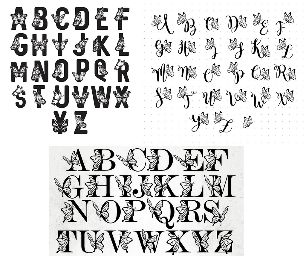
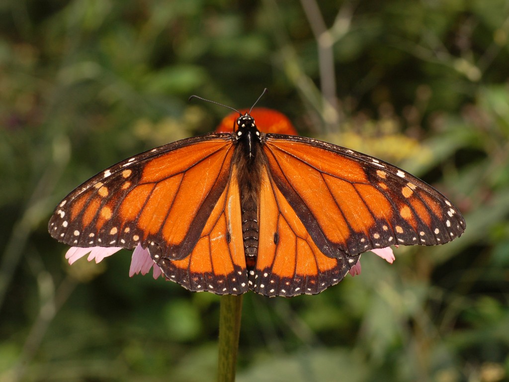
The combination of these two incentives provided me with a solid idea. I aimed to create a font that incorporated the Monarch butterfly’s wing pattern and, in turn, help bring awareness to its endangered status.
Sketch Developments
The main aspects of the Monarch butterfly wing pattern I wanted to include in the letterforms design were the black veins, white spots, and the two black spots (the scent glands on the males). While keeping this theme in mind, I also knew that interpreting these wing patterns into letterforms would be difficult and would require more than one alteration. Therefore, my main goal at this stage was to conjure up what I could and fix the details later when needed. The sketches shown in Figure 4 to Figure 10 were done digitally in Procreate.
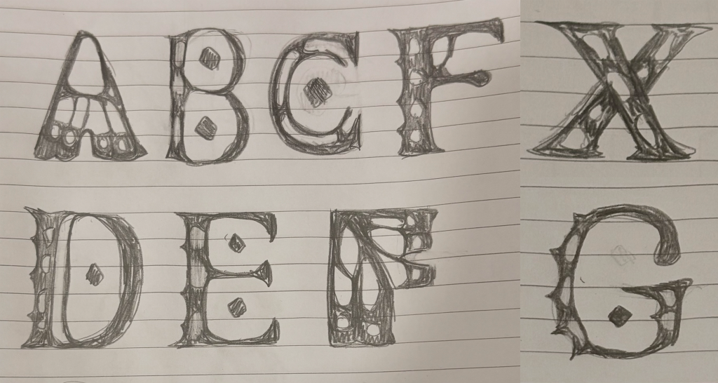
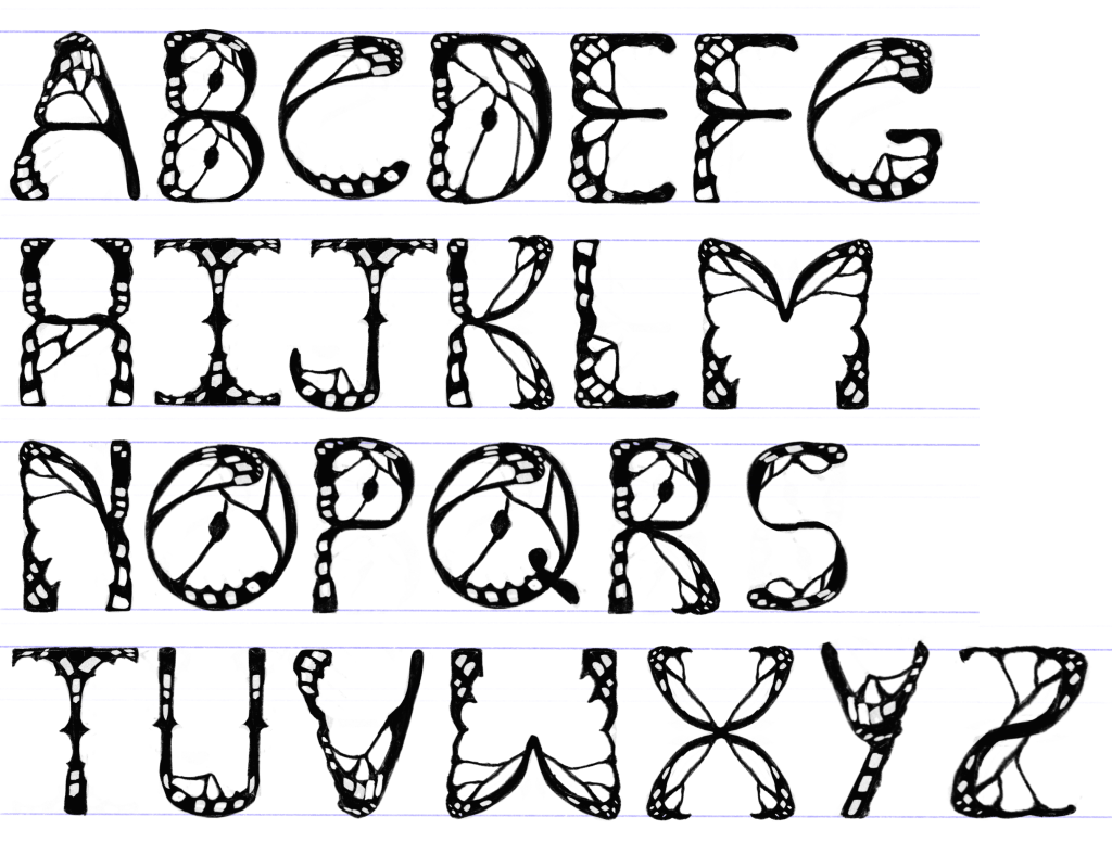
As I finished the first sketch, I was left with mixed feelings. Although I was getting a clearer vision of what the letterforms should look like aesthetically, I acknowledged that they lacked inconsistency in its structure. With that, I refined the sketch by making a better effort at reusing shapes throughout each letterform.
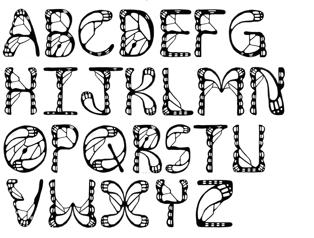
After an attempt to digitize this sketch into Adobe Illustrator, I came to another realization that the letterform measurements were not ideal and were not consistent with one another. To solve this issue, I used the Univers LT Std Condense typeface as a loose reference guide, as it maintains good letterform measurements and has a similar stroke width to my developing font.
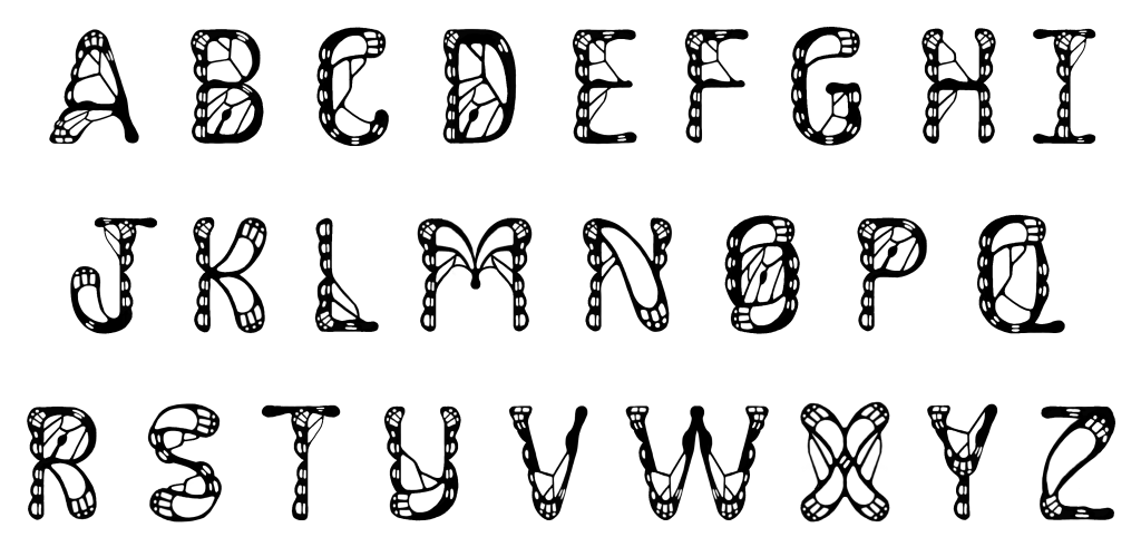
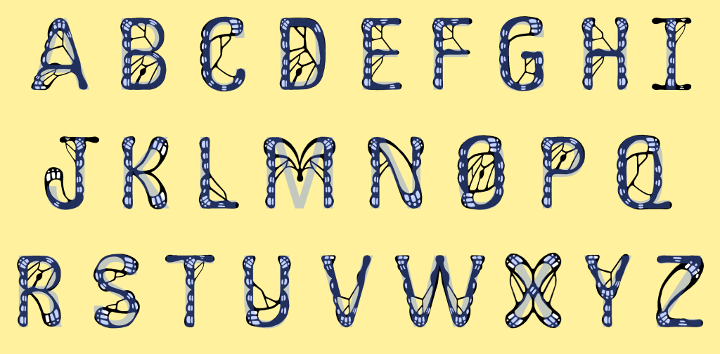
During this second and final refinement of the sketch, the letters S, U, Y and Q went through notable changes. I felt these changes were necessary and significant, as everything now looked harmonious and even more consistent than before.
Throughout this entire sketching process, I developed a specific guide when constructing these uppercase letterforms to ensure consistency. The breakdown of this guide can be seen in the list below, referencing the shapes seen in Figure 8.
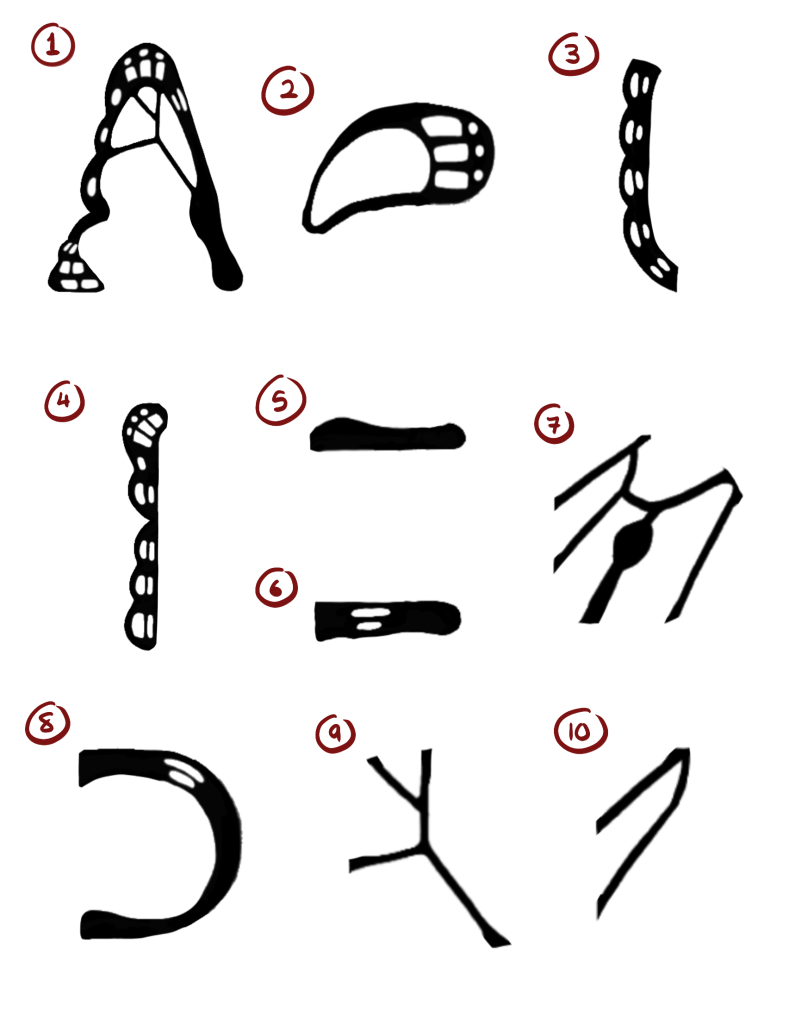
- Shape 1: For sharp points used in A, V, W, Y
- Shape 2: For top and bottom curves used in C, G, O, Q, S, and U; and diagonal lines in K, M, N, R, X and Z.
- Shape 3: For slight side curves used in C, G, O, Q and S.
- Shape 4: For straight vertical lines used in B, D, E, F, H, I, J, K, L, M, N, P, R, T, U and Y.
- Shape 5: For straight horizontal lines in the middle of the letterform used in A, B, E, F, and H.
- Shape 6: For top and bottom straight horizontal lines used in E, F, I, J, L, Q, T and Z.
- Shape 7: For the inside of letterforms used in B, D, O, P and R. However, it was not used in Q to better differentiate it from O.
- Shape 8: For bowls and a second curve alternative used in B, D, P, and R.
- Shape 9: Design used in A, B, C, D, E, F, G, H, Q, S, U, V, W and Y. However, it was not used in K and Z, as it felt the letterform designs were strong enough without it.
- Shape 10: Second design alternative used in E, H, I, J, L, M, N, and T. However, it was not used in K and Z, as it felt the letterform designs were strong enough without it.
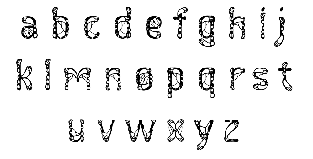
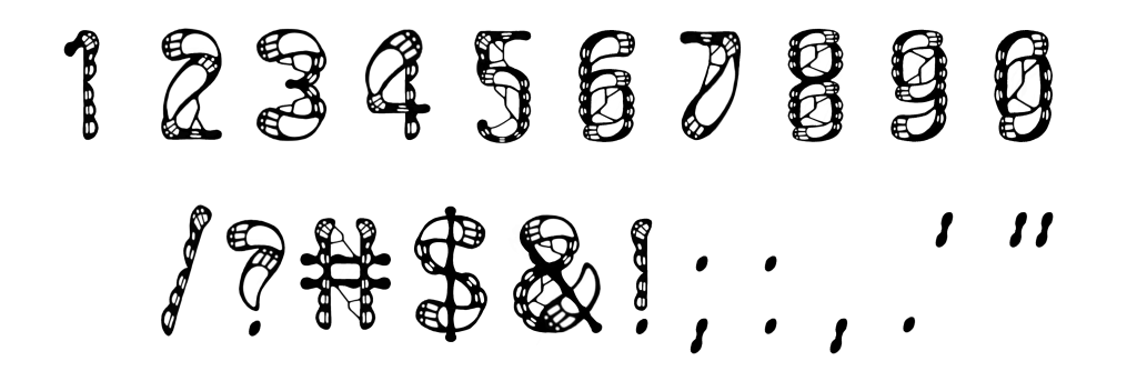
Establishing these main repeated shapes and undergoing the numerous refinements for the uppercase letterforms helped make the construction of the rest of the characters much smoother. Continuing to use Univers LT Std Condense as a reference guide, I proceeded to develop the lowercase letterforms, numbers and punctuation marks for my font.
Digitization and FontLab Development
In Adobe Illustrator, I digitized these sketches by using the Image Trace tool. I found this tool to be highly useful, as it allowed me to turn my sketches into vectors quickly and efficiently. Despite this, I still made slight adjustments to the characters to ensure they aligned with the established baseline, cap height and x-height. I also fixed the edges and circles within the letterform designs that were slightly jagged.
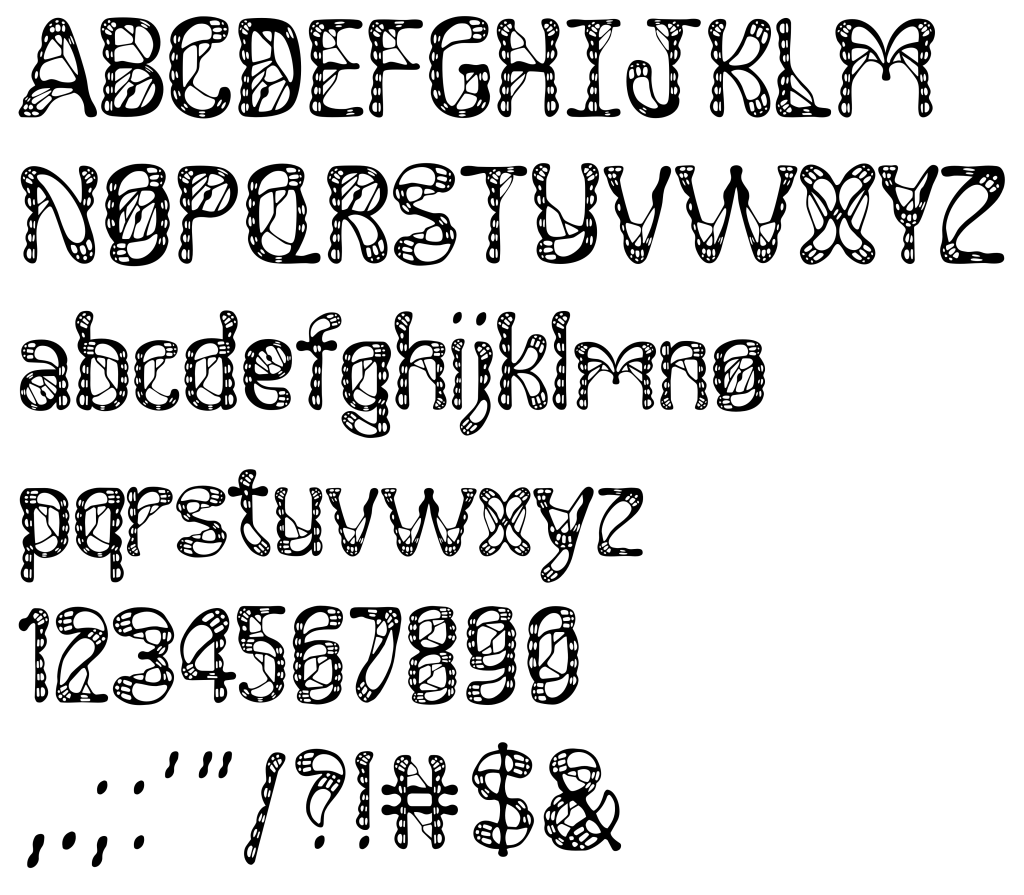
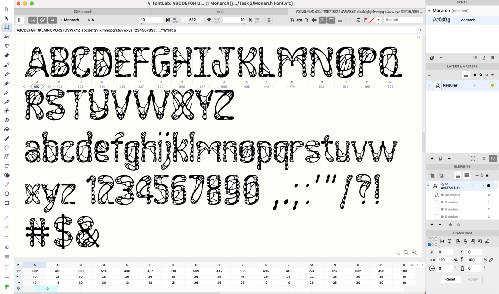
Following the complete digitization, I began the technical process of my font development in FontLab 7. Before importing the characters, I measured the x-height, ascender and descender in Adobe Illustrator and placed these measurements into FontLab 7. Afterwards, I adjusted the side bearings and kerning accordingly to ensure proper legibility of the font.
Presentation
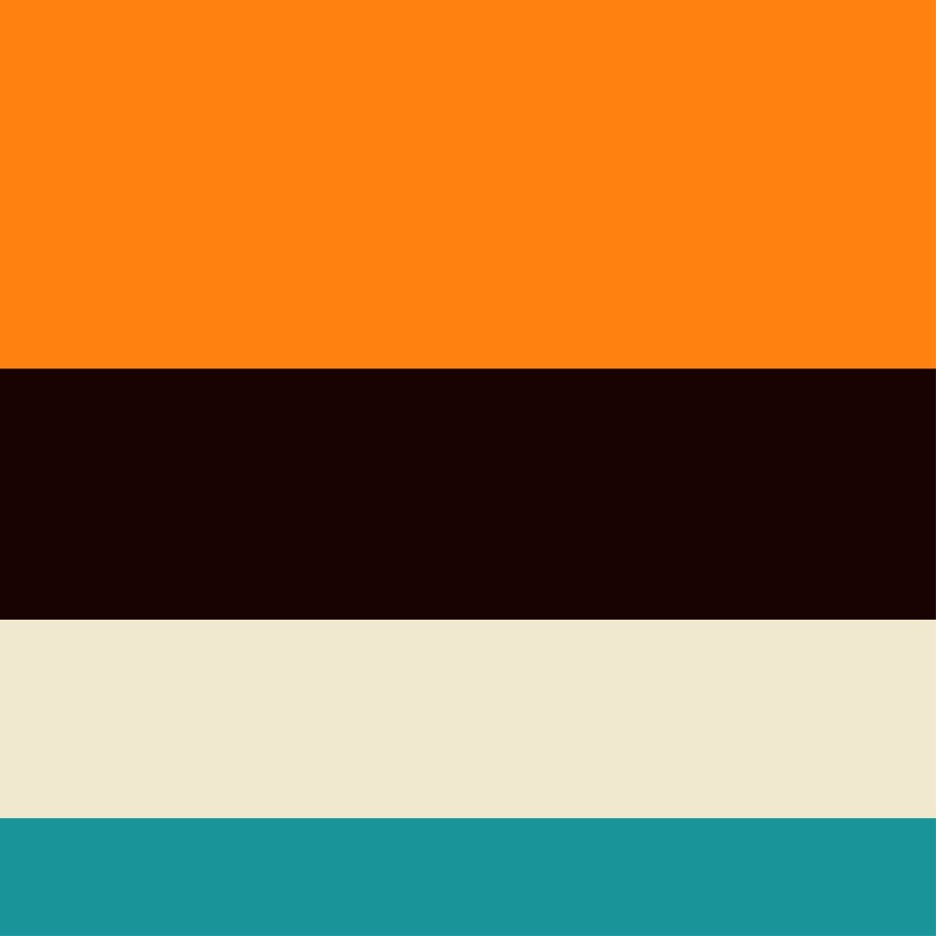
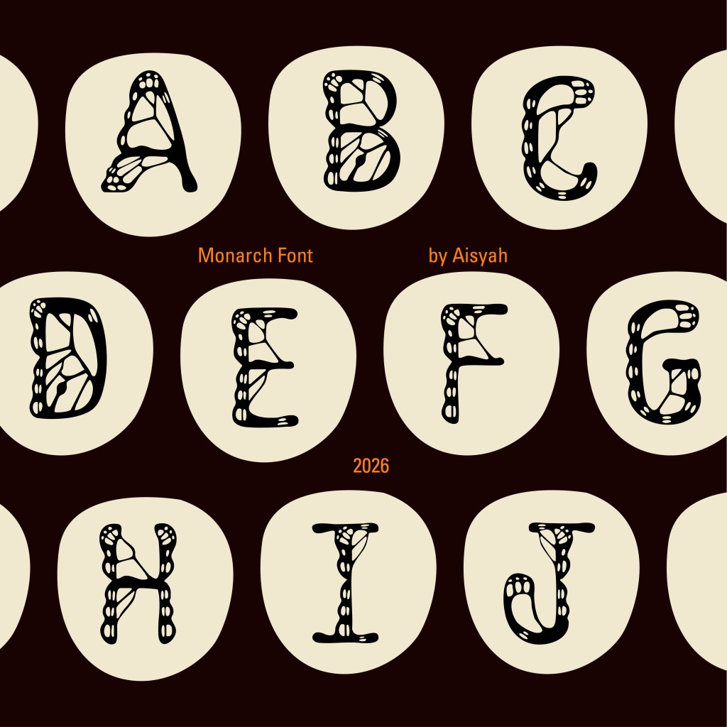
Before creating the font presentations, I developed a color palette derived from the Monarch butterfly itself, as seen in Figure 13. This color palette was strictly used throughout each presentation to ensure a strong association with the butterfly.
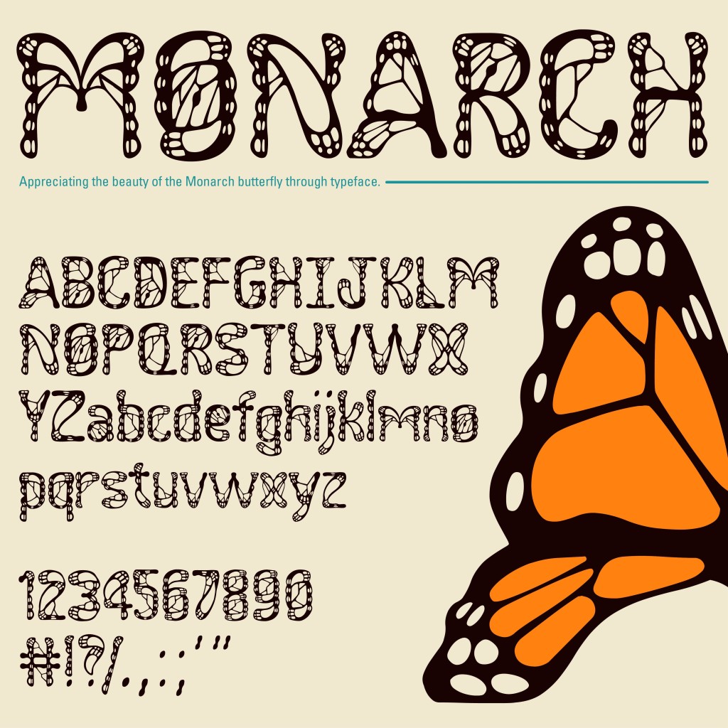
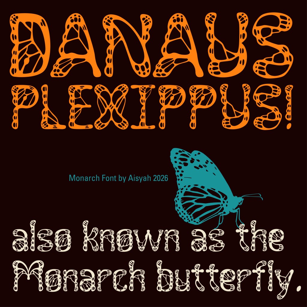
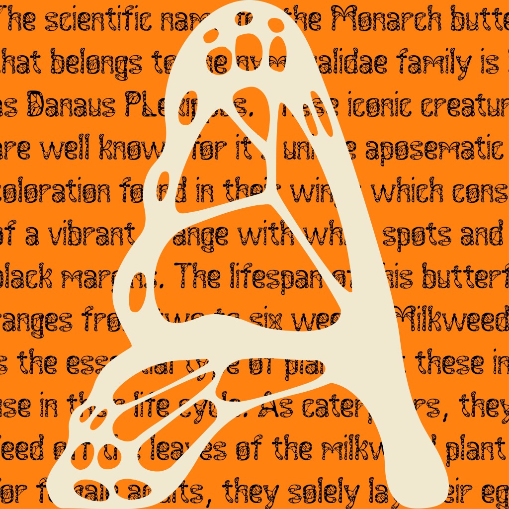
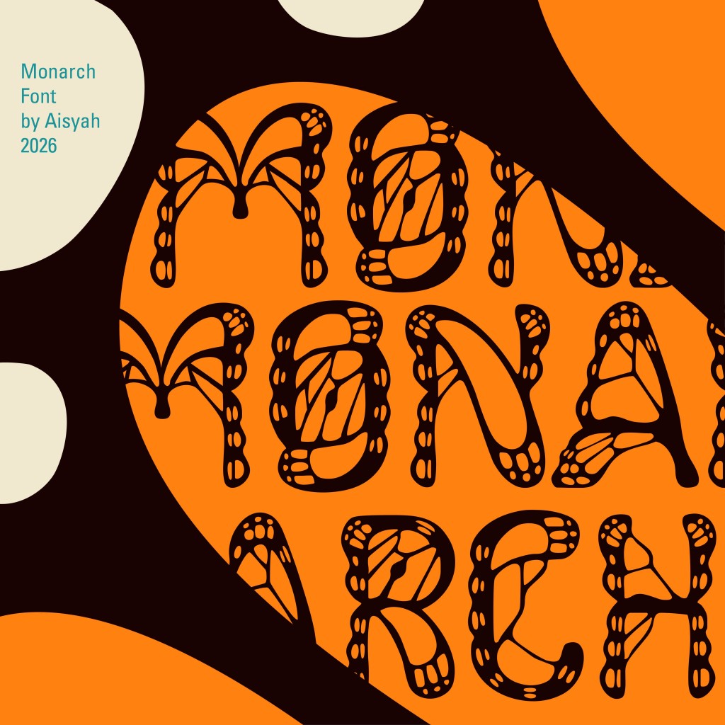
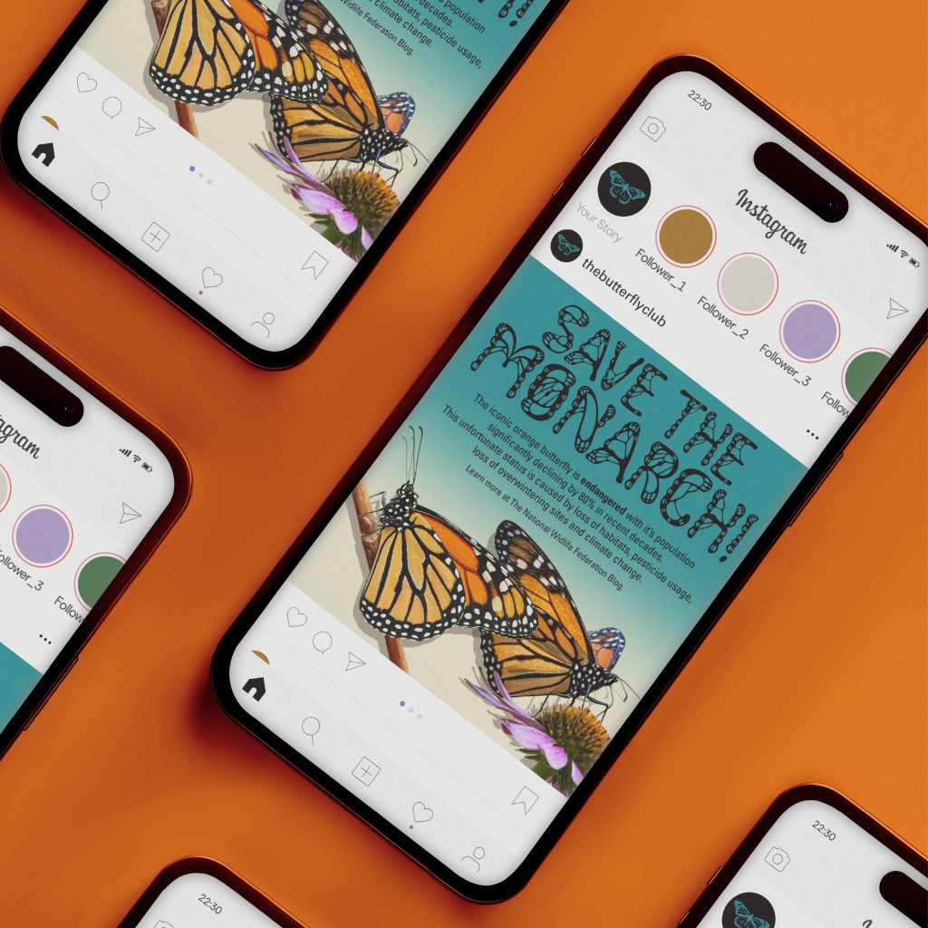
As the font itself was highly detailed and intricate, I felt that a minimal and simple style of font presentation was the best option to avoid excess visual clutter and bring better focus to the font. To include more nods to the Monarch butterfly, I included facts and statements about the insect which were typed out using the font. I also lightly incorporated the design of the butterfly’s wing by using basic shapes and letting the text interplay with it.
Application
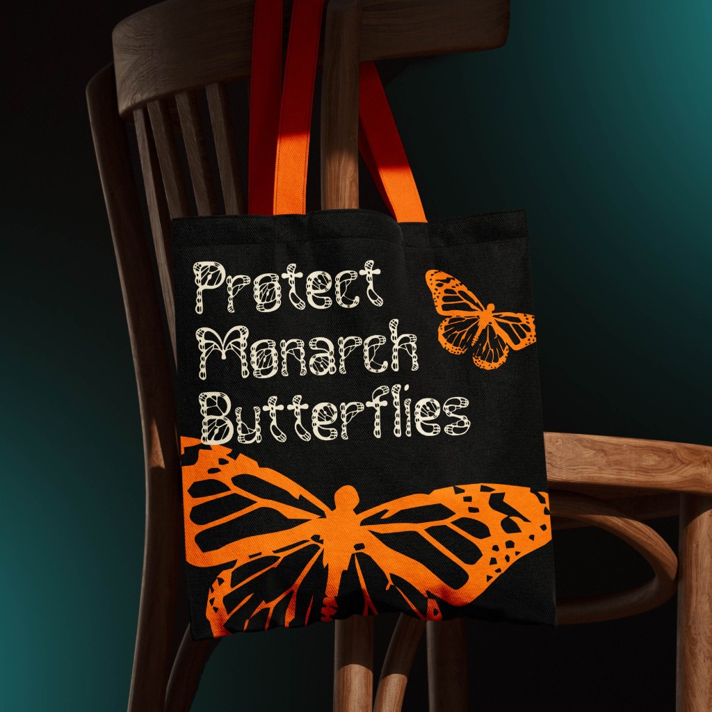
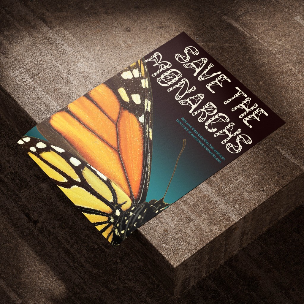
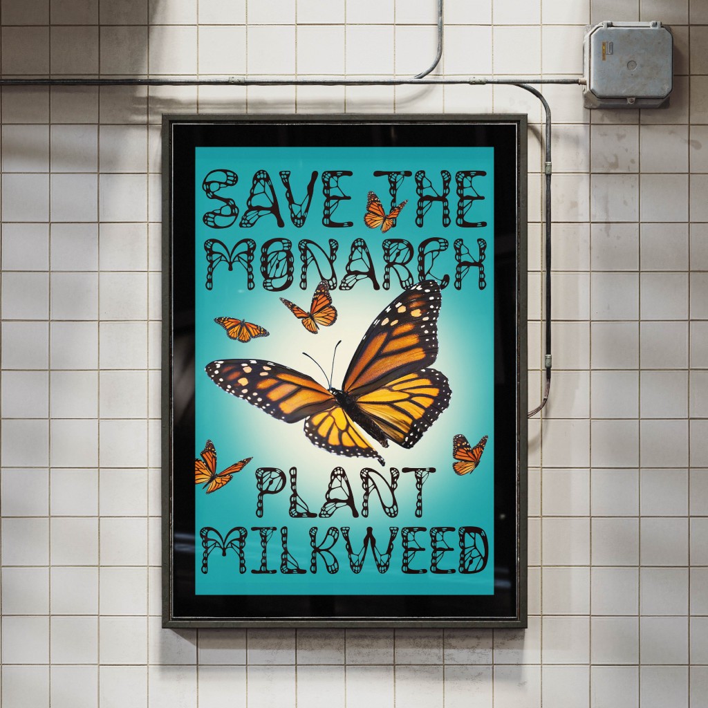
As for applying the font in a real-life context, it is important to reflect on the main purpose of the font: to spread awareness of the Monarch butterfly’s endangered status. Therefore, my font applications were strongly based on this concept, emphasized by using mockups of posters, billboards and merchandise.

Final Thoughts
The creation of ‘Monarch’ served as an outlet and expression of my adoration for butterflies. The ability to turn my interest and technical skill into a meaningful project resulted in a typeface I am immensely proud of. The completion of this typeface provides me with further motivation to enhance my skills as a designer, undertake more creative projects and continue to strengthen the balance of creativity and discipline.
Test the Monarch font below: