When I was in high school in the United States, I felt very comfortable in expressing my emotions and thoughts through form since the International Baccalaureate (IB) curriculum that I was part of had a Visual Arts class that provided me an opportunity to express my creativity. The classes required us to question what we do as artists through research and investigation that helped cultivate ourselves through reading and writing. I was taught by my art teacher, Mr. Ryan Bill, to analyse every artistic creation. These classes provided me with a foundation for the pursuit of my minor in my undergraduate studies in Malaysia.
Between March and August of 2021, I sat for an elective module called Typography as part of my minor in Creative Media. My undergraduate degree was in mass communication with a specialization in advertising. One of the tasks in this module required us to design a limited number of Latin alphabets. As this was the first time many of us were designing a font, we were required to choose an existing font as a point of reference in order to analyse its anatomical parts to inform us in the creation of our own fonts. Through this analysis I observed that some of the hallmarks of a font were subtlety, character presence, legibility, and readability. During this assignment, my passion for typography began to grow.
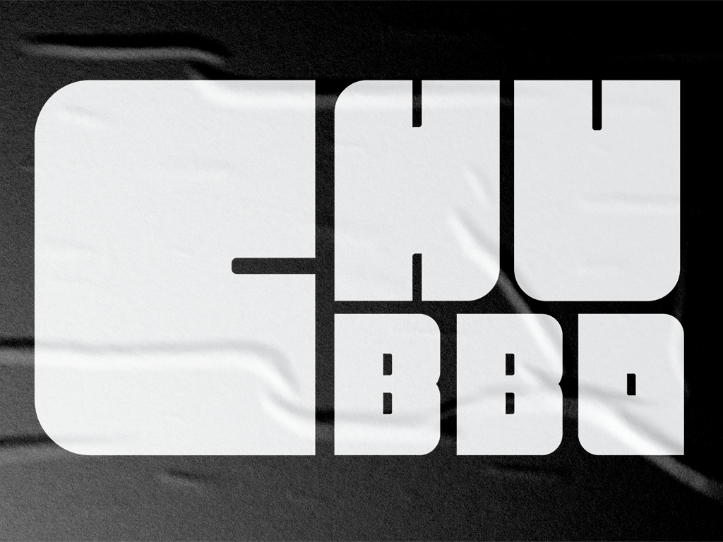
As a result, I promised myself to complete the entire alphabet for the font during my semester break. I named the font Chubbo.
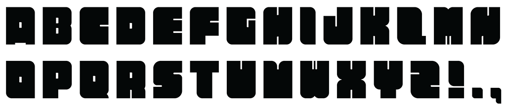
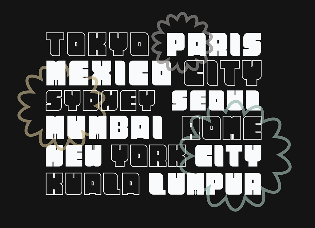
Chubbo is a bold, all-capital, sans-serif display font that is based on a rounded rectangular geometric shape. Chubbo can be used as a headline font or logotype or for any occasion when impact is required. It is a chubby looking font with a friendly and inviting demeanor. It is minimal in construction and contemporary in its aesthetic.
That said, designing Chubbo was not easy. While the font was based on an elementary shape, the deliberation in the creation of the individual letters was akin to piecing a jigsaw puzzle—you’re essentially trying to find the best match for each piece, and putting them together in the most presentable manner. It sounds effortlessly simple, but trust me, simplicity sometimes can be a lot more complex than we imagine. For example, the letter Q seemed deceptively simple, but it was the most complicated shape that I struggled with.
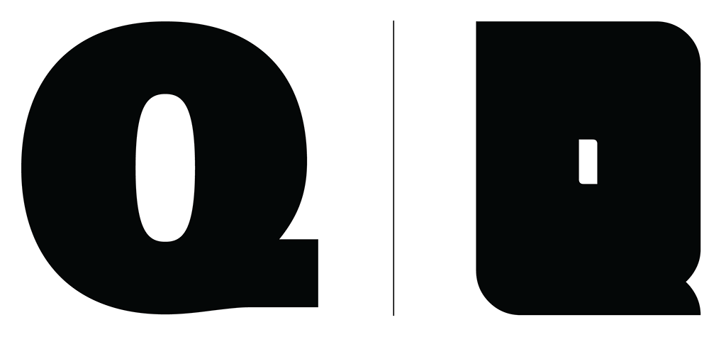
When I analysed and broke down the shape into individual parts, I saw that Q was the combination of the letter O with a signature tail located at the bottom of the glyph. The problem for me was in trying to combine these two seemingly simple shapes into one form while maintaining consistency with the other letterforms. I spent half a day exploring outcomes until I finally found one that satisfied me. I know it sounds insane, but creating a font required a lot of patience.
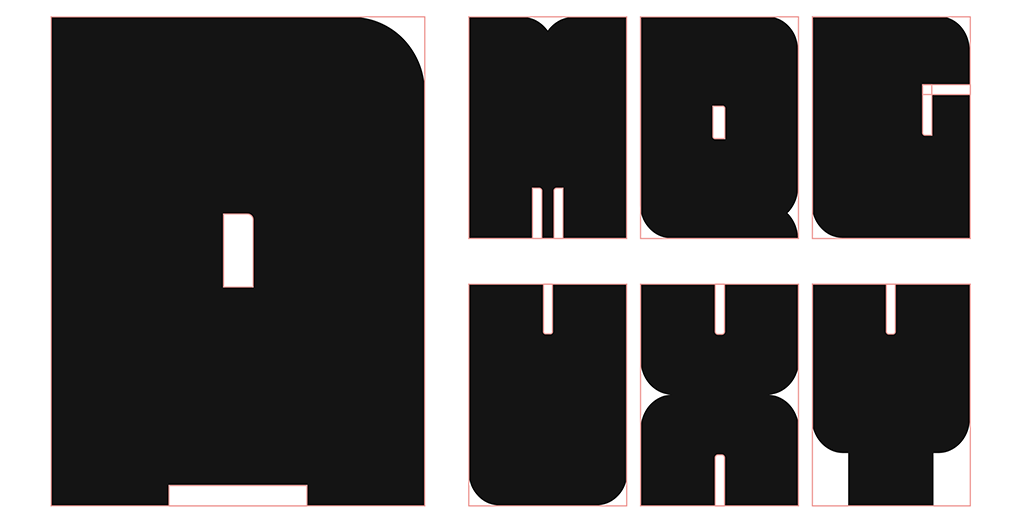
I did my best to limit the features of my letterforms in order to maintain their identity. I quickly learned that ‘more is more’ does not apply to font design. Many of the thin counters in Chubbo were reused in a modular fashion, with each letter including similar features of other letterforms.
I quickly realised how important it is to analyse and understand the design decisions made by type designers before beginning my font design.
The deconstruction and analysis of the font Univers LT Std 85 Extra Black, which was my point of reference, was an eye-opening experience. I realised that some fonts were designed with a specific purpose in mind and could either be a display font (ornamental/decorative) or a text-based font. Instead, I was only pushing myself to create a font that was mostly readable, this freed me to be creative and innovative.
Unlike my visual arts class in high school where I was able to express myself freely, the typography module required me to be well informed in the conventions of type design which is much harder due to its constraints in the use of limited geometric shapes that make up a legible and readable letter. Communication is central in the process. The “A” needs to be read as such and sometimes the reader may not see it as such. Your ability to critically and objectively assess the clarity of the letterform is crucial in the design process. And so, I have fought many battles in my mind to the point of exhaustion—the process can be a torturous one albeit worth it at the end.
My experiences and learning from the various tasks in the typography module played a significant role in the creation and completion of the Chubbo typeface. It has become one of my proudest creations. As such, I would like to share my creation of the Chubbo font with all of you. You can download Chubbo here.
Be chunky!