Skip to content
Search for:
Search
Close
Close Menu
+
Your Regional Creative Source
Design
Visual Culture
Opinion
Arts
Education
Issues
About
Menu
Search
Menu
Back to Top
Tag:
Featured
Uncategorized
Sound Symbols: How to See Sounds
Uncategorized
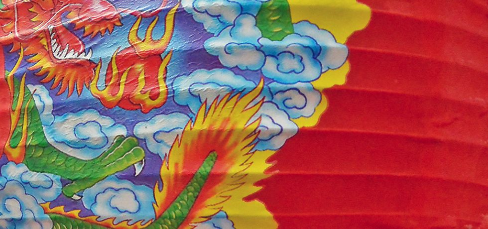
Enter the Dragon!
Opinion
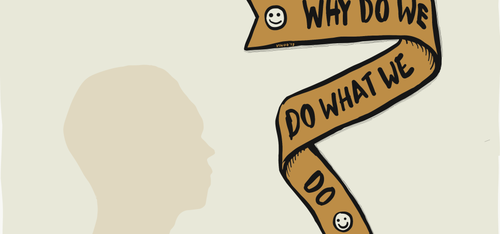
Demystifying Imagination
Graphic
Type
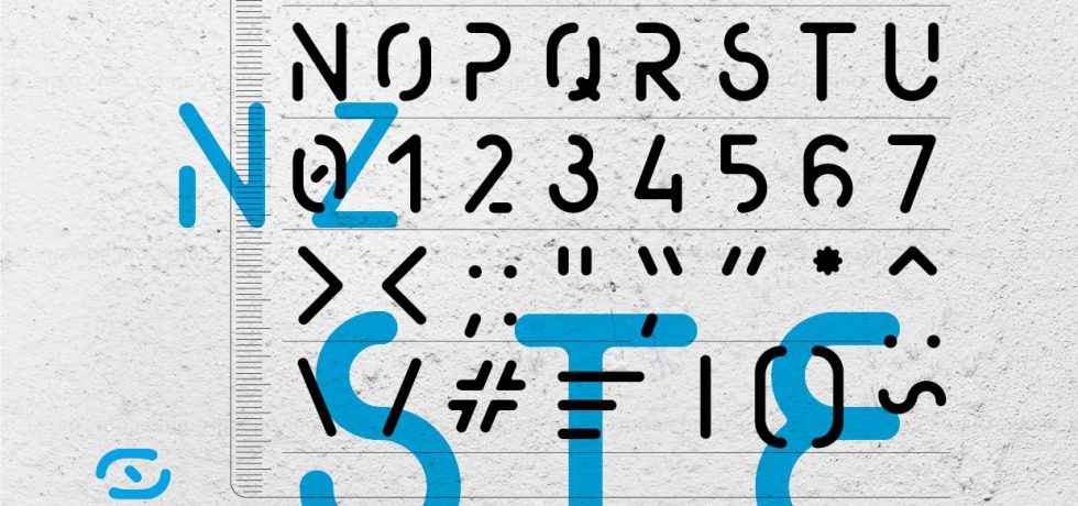
The Forgotten Stencil Typeface
Opinion
Should Not The Aim Of Life, Be An Aim In Education?
Opinion
Book Review: Square Circle Triangle by Bruno Munari
Uncategorized
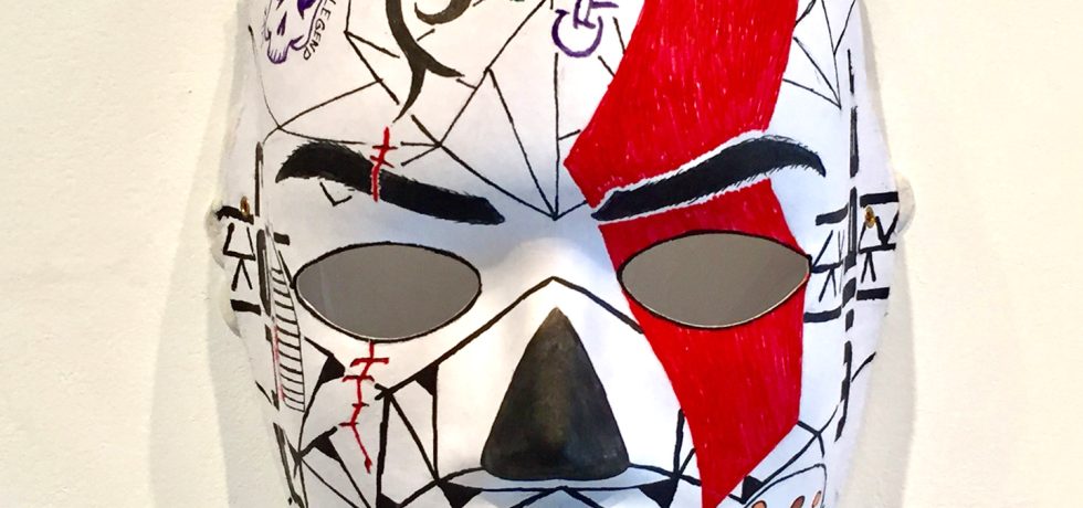
Immersive Oddities / When Will It All End? Exhibitions At Coda
Opinion
Should Creative Disciplines Be Evaluated Differently in Universities?
Uncategorized
Eye Candy
Uncategorized
Perception of Minimalism in Graphic Design and Fine Art
Posts navigation
Older posts
Newer posts