
Coinciding with the release of Oculus Quest 2 last October 2020, the VR rhythm game favorite Beat Saber released its most anticipated multiplayer support major update. Now players can compete in tracks with four other players as a customized character avatar with the aim to finish a song with the highest score. After Beat Saber’s initial release back in 2018, on top of new DLC song packs, the multiplayer game play is one of the most requested support by avid Beat Saber players, but the update also came with a surprise.
The massive User Interface (UI) design overhaul was received with conflicted interest by the game’s player base. While the majority of players are not particularly concerned by it, there are players who were alarmed by the new slick, atmospheric transparent design that totally replaced the bold clean UI that they are accustomed to. The move is deemed ugly, unorganized, and it has affected the players’ experience and familiarity with the game itself. But of course, after a few weeks, there are fewer and fewer complaints about the UI design as people start to acclimate themselves to the new environment and spend more time playing the game rather than nit-picking the design flaws.
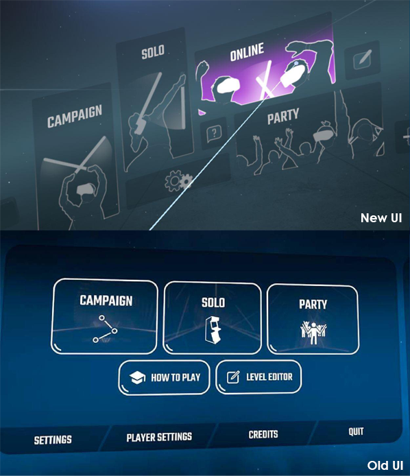
This is just another example of the challenges faced by any design team in their effort to come up with a new UI design to freshen up the User Experience (UX). The fact is, when it comes to visual communication for screen-based design, users hate change and for most people, their approach is more often “if it’s not broken, don’t fix it” rather than “surprise me with something different”. That is why, when new UI is aggressively re-designed, it is usually met with horrified reactions by the users, simply because it diverges from their expectations as well as their familiarity with the applications.
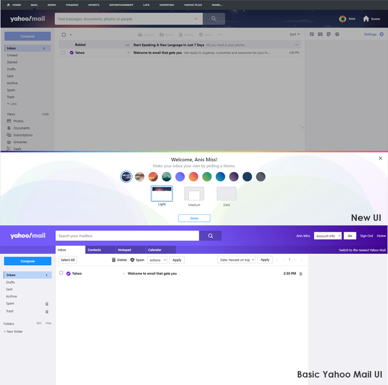
When Yahoo! Mail re-vamped it’s UI design in 2013 to provide a fully updated service experience such as their competitor at Gmail, the request and demand for the original version immediately came flooding in. They had no choice but to allow their users to switch to the Old Version Classic View instead of maintaining the new one. One of the reasons that this happened was because Gmail caters to the younger users while Yahoo! Mail had catered to the older demographic. Learning a new interface was not popular to senior users since they had adapted an automated routine around the design they knew. They found the new UI disruptive which then affected their UX because they were unfamiliar with the design, and also because many of their favorite features such as print and sorting mail had been removed from the main screen to make way for the new minimalist design.
So here lies the dilemma, how does a design team re-design the UI without disrupting the UX? The key here could lie in the manner of how a design team approaches the matter. As designers, we tend to get lost in the process as we look at the design, function, and aesthetics, and sometimes neglect the actual usability of the UI in the eyes of the users. Users on the other hand seldom care for design, but when they are accustomed to the same features repeatedly, they build a mental routine around the design patterns and get used to it. Hence designers may need to work around this instead, and to discover how to retain some design familiarity for the users.
Takuma Kakehi wrote about this and highlighted the three significant benefits to utilizing familiar design attributes for ease of usability. Though the points here are written with general product and technology in mind, these are also applicable for UI/UX design with concern for the transition experiences by users.
- Hint and trigger users: When a technology is new and alien to users, familiar attributes could hint at its function and trigger these users to take an action.
- Manage expectations: People tend to over anticipate the capabilities of a new technology, because it is often communicated abstractly. By introducing familiar attributes, people can begin to relate to former references and thus lower their expectations to those that are more in line with the reality of the technology’s capabilities.
- Connect emotionally: A solely functional product can isolate users, especially when the technology is new, because users cannot relate to their past experience. Referencing something in the past could bridge this gap.
The idea here is for designers to include empathy in the design process in order to be able to relate to the users. By using existing UI visual cues and design, designers may be able to ease in the new fresh look and introduce changes with less controversy. Before the social media Facebook migrated toward the new current UI, users were given the option to view the new design and experiment with it, thus creating the bridge between users and designers. This demonstrates that utilization of Takuma Kakehi’s to include familiar design attributes instead of forcing the users to accept and deal with totally new ones. The design was gradually introduced with the aim to help users navigate, learn, and familiarize themselves with the imminent changes, thus improving the current UX to the new UI. So the lesson here is that in this current age of fast-paced changes, it’s best to avoid the temptation of a totally novel UI design without testing the volatile waters of the UX.