
Ideation
As the semester moved into its final phases, I had to prepare for our final assignment in typography, the creation of an entire typeface. This daunting task had been looming for a while over the advanced typography students at Taylor’s University. I felt excited and ready for the challenge.
For this project, I had three ideas in mind. My ideas involved creating fonts that are in line with UI/UX, psychedelic type, or blackletter. Out of these three, I chose to pursue my first idea, the creation of my own geometric sans serif to be used in my future endeavors in UI/UX Design.
I’ve always been fascinated by the clean, minimalist, modern craft of geometric sans serifs. The applications of geometric sans serif in modern UI/UX designs are widespread. However, most “display” geometric sans serifs are too boring, in my opinion. Fonts such as Futura Standard, Helvetica, and Montserrat lack the zing that excites viewers. My vision for this project is to create an exciting yet professional typeface that I can use in my UI/UX designs.
Digital Exploration
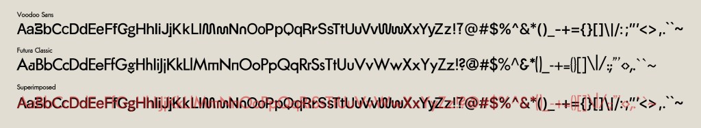
The distinct letterforms of Futura Classic were: a, g, j, m, n, and r. These letters differentiate Futura Classic from all the other geometric sans serifs. These forms clearly show the heavy influence of the Bauhaus on the craft of letterforms.
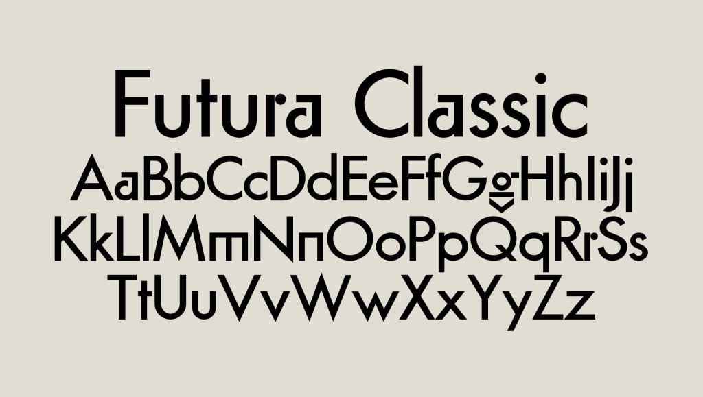
I used their experiments on some of the letterforms to incorporate that uniqueness and identity in my own font. Illustrated below are my digital explorations compared to Futura Classic (reference font) and Helvetica. I skipped manual sketches because I felt that it was easier to create a geometric font digitally instead of manually.
Further progress
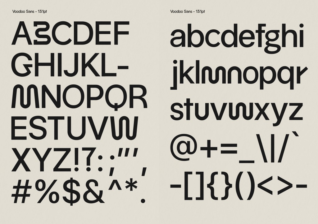
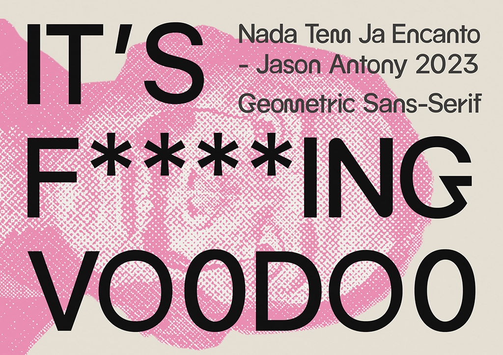
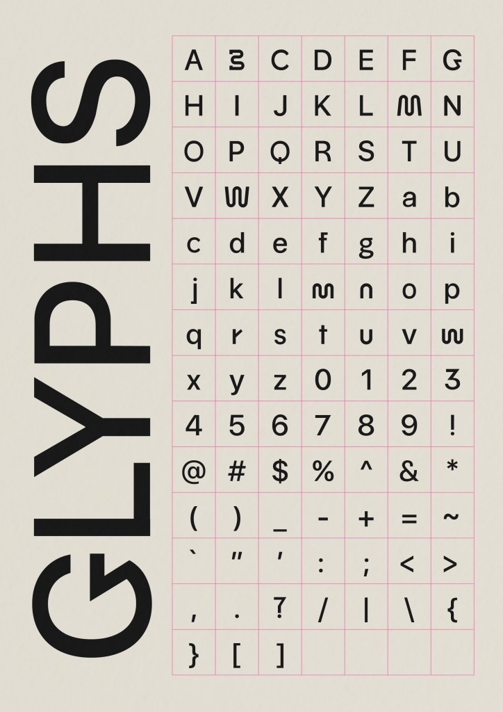
Figure 4 (above) shows the completed font that I named Voodoo Sans. I decided to have alternatives to some letters so that I could choose which one matched best with the rest of the font. There were several variations of different letter forms that were adapted from different styles and identities.
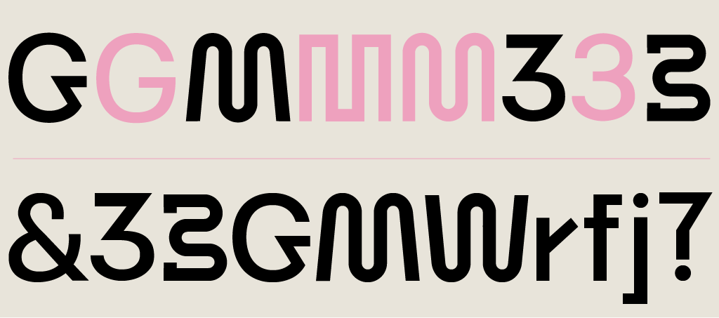
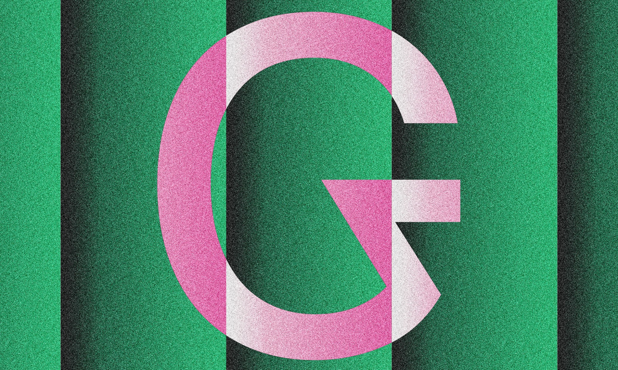
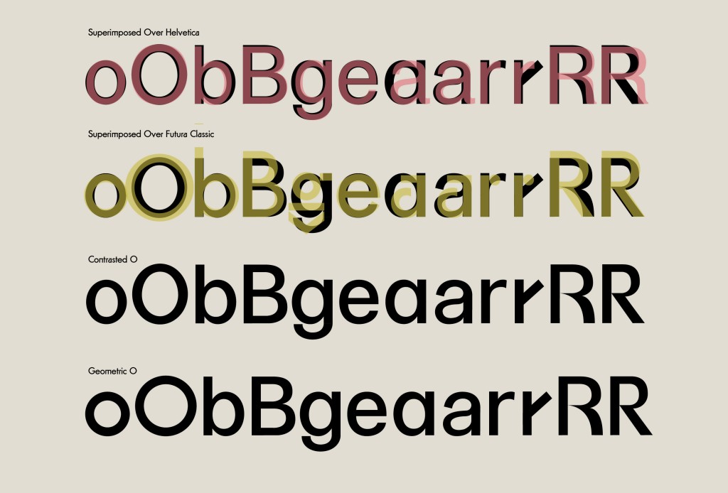
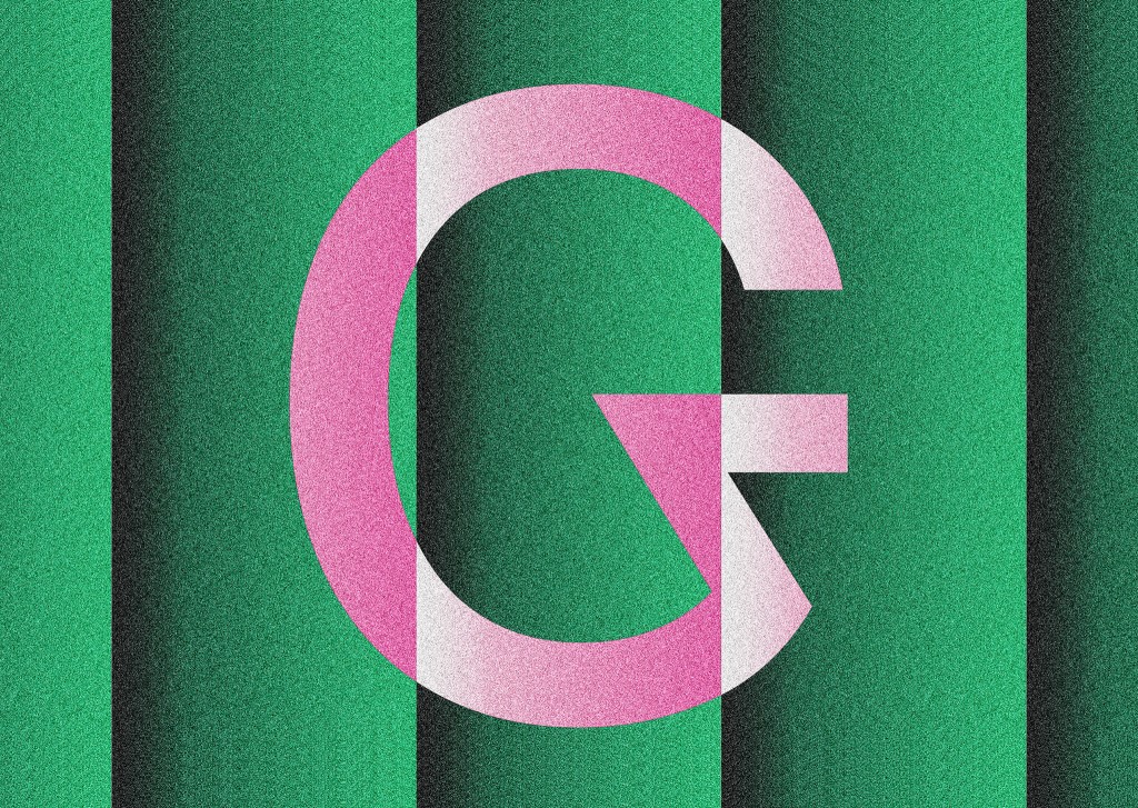
Since geometric sans serifs are meant to be extremely legible, not many changes can be made to the letterforms themselves. Thus, it was a great challenge for me as a designer to construct unique variations of letters to differentiate my font from other similarly based geometric fonts. Voodoo Sans features some differences in style that make it unique. It has fluid geometric strokes, as seen in the characters M, W, and &. It has sharp angular edges, as seen in characters 3, G, and “?”. It also features squared-off edges in the characters r, f, and j.
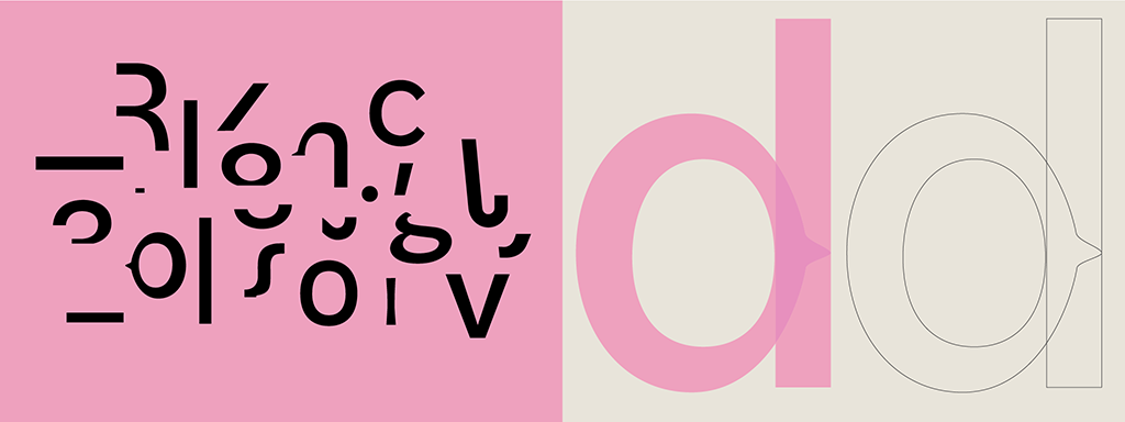
All the characters in the font could be abstracted into these essential components. The process of creating letters involves arranging and manipulating those components into the final letterforms. I also used tracing, direct selection editing, and transformation methods to forge all the characters.
This font has shorter ascenders than Futura. Personally, I like it when the ascender and cap height meet. It looks cleaner and more intentional. The dimensions for the descenders are the same as for Futura Classic. Some character widths are similar, and some are completely different. Futura has more rounded letters, such as O, G, and Q. Voodoo Sans, on the other hand, does not have a purely geometric measurement for those letters; rather, it is squished from the sides, making it look slimmer. Voodoo Sans has a shorter x-height, which complements the shorter ascender height.
Measurements of Voodoo Sans (from baseline)
- Ascender: 670 pt
- Capital height: 670 pt
- X-height: 488pt
- Baseline: 0
- Descender: 178 pt
- Overshoot: 10 pt
- Stroke: 100pt
- Crossbar stroke: 80 pt (for f & t only)
The name Voodoo Sans came to me after I had finished crafting the font. Since my aim was to create a unique and functional typeface, I figured it might be magical to combine both worlds of display and decoration into one. Then the thought of Voodoo popped into my head. It then just clicked and fit right into the identity of the font.
FontLab
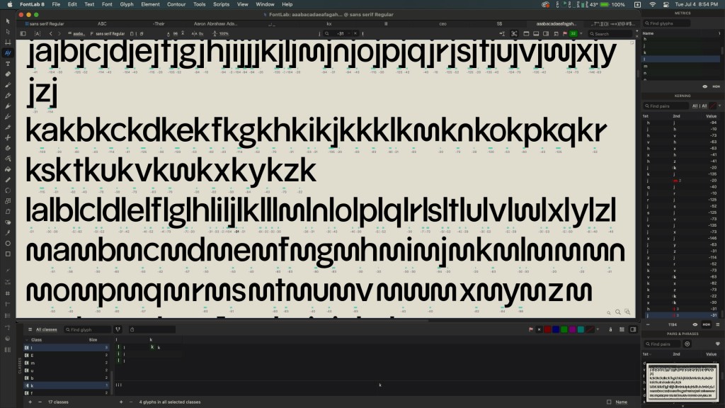
After the crafting process, I started to add my letterforms to FontLab for kerning and exporting. Kerning is a monstrously difficult task. The scrutiny required to achieve the perfect spaces in each letterform in relation to another is a skill that takes experience, time, and talent. I spent two whole days kerning the font, and it still has a lot of aspects that could be improved. My professor once said that type foundries kern their fonts for months. They also have a person who just kerns the font as the focus of his job. Despite the flaws, I am quite satisfied with what I did achieve by myself for my first experience kerning a whole font.
During the process, I realized that I didn’t kern the font as efficiently as I could. I used a lot of brute force in kerning all character combinations. I knew about kerning classes, which saved me some time, but I could have used that feature more efficiently if I had more experience with the software and the art of kerning. Even though this font is intended for reading and screen purposes, the short amount of time that was given to complete the task resulted in imperfect kerning.
Try out the Voodoo Sans here:
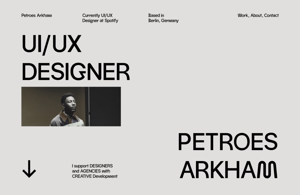
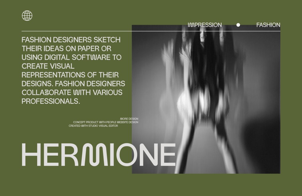
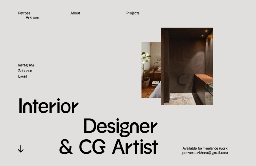
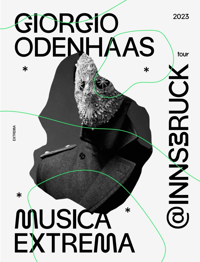
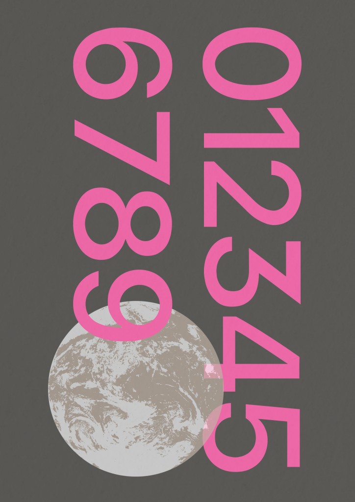
For applications of this type, I wanted to create website landing pages and posters. I feel that this font suits it well and also aligns with the purpose I had for its creation. I used Figma and Illustrator to create the mockups and posters.
In the end, after hours and hours of work, was it worth it? Absolutely.
At first, I did not expect that my font would turn out the way it did. However, with the guidance of my lecturer, peers, and my own judgment, this font became something that I am proud of. Throughout the process, I was determined and I gave it my all. In fact, I am writing this article about Voodoo Sans because I was personally asked to share my journey and thought processes on the creation of my font.
To all the current and future designers interested in developing a font, please give it a try. Regardless of the difficulty and duration, if you put your heart into it, I’m sure you will feel the same way I do!
If you would like to download this font, click here.
If you would like to follow me on Instagram: Personal, Design.
If you would like to contact me, don’t hesitate to drop me a message on Instagram.
You’ve reached the end of this article, a big thanks to you for reading!
Damnn broo this is legit cool af