On August of 2018, the Advanced Typography module was deployed for the first time in the newly launched Creative Media programme at The Design School, Taylor’s University. Students completing the Typography module in their first semester would go on and take the advanced module in the second semester of the 3-year undergraduate programme. However, this was not always the case.
Before the creation of the Creative Media programme, students were only exposed to one semester of Typography. This was deemed insufficient to inculcate strong fundamentals, not just in the discipline, but in important attributes like conceptual thinking, observation, experimentation, exploration, crafting, and more.
When I embarked on designing the curriculum for the Advanced Typography module, I realised that I needed to design tasks that cultivated transferable skills for the different specialisations that students would select in the future, be it UIUX, graphic design or animation. One of the tasks that I designed was “Finding Type”.
In my reading and research, I observed the increased use of novel typefaces in animation, movies and game designs — these are typefaces designed specifically for use in game interface, movie credits as well as for customised lettering designed for movie or game titles. The branding of movies or games are an important and relatively new focus in the creation of uniquely customised letterforms. Some of these eventual wordmarks would go on to develop cult-like status and inspire the development of quirky full-fledged fonts. These trends are not new, but in an age of increased content creation, differencing and customising typefaces has become critical.
This led me to research typographic exercises that could develop students’ ability to design custom letterforms that embedded in them the characteristics of the movie or game. To my surprise, I could not find such an exercise online or in the library of books I possess. This meant I had to design this task from scratch. In thinking about the challenge, I remembered an exercise I use to prescribe when I used to teach a visual identity related module. The exercise involved the extraction of colours from an image to develop a colour palette. I wondered whether I could use a similar method to extract letterforms from an image.
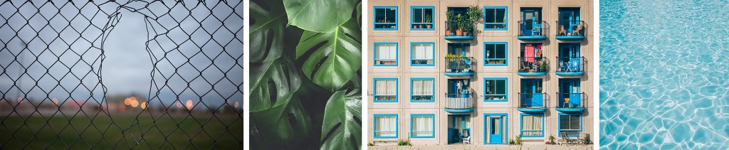
For this to work, the image needs to have strong characteristics, preferably of a repetitive nature. The object or subject can be natural or manmade. I began to think through the steps the process might entail in order to produce letterforms that contained in them the properties of the subject. I eventually broke down the steps into the following:
- Finding an image.
- Deconstructing an image.
- Identifying letterforms.
- Extracting letterforms.
- Identify a reference.
- Refining letterforms.
- Introduce consistency in height, width and contrast.
- Deliberate on retaining or removing characteristics.
- Decide what areas require simplification.
*Note: Step 5 was only added after reflecting on the results of the first round of deployment.
1. Finding an image
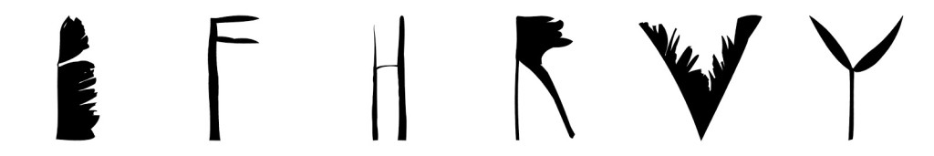
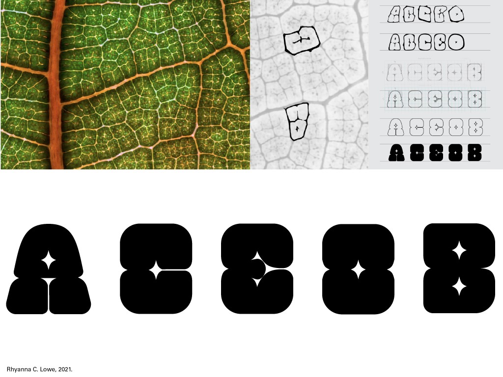
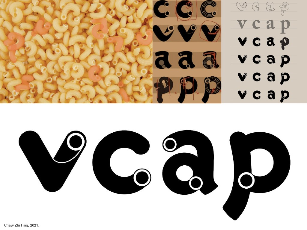
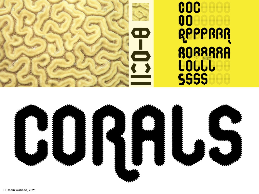
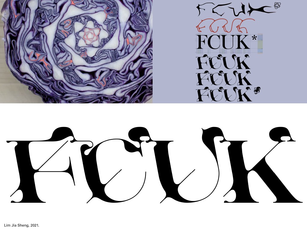
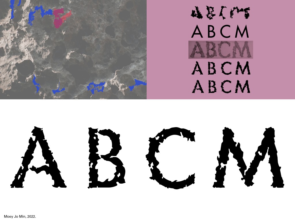
The image selected must have a strong and consistent character, preferably a subject matter that is similar or repetitive in nature. If an image has too many different elements, the extraction would have attributes that are inconsistent and varied and would make the process a lot more time-consuming. That said, I have seen students choose subjects that have variation, despite this they were able to produce a set of letterforms that were relatively consistent but also representative of that variation.
2. Deconstructing an image
The student may choose to outline the image or simply outline the identified shapes. Either way, what is important is the observation of the constituent shapes and forms of the object in the image being studied. The nature of the lines, textures and overall form.
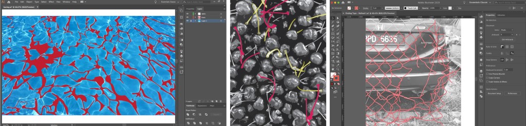
3. Identifying letterforms
After faithfully deconstructing the image — outlining the image — the student would proceed to identify letterforms within the outlined areas. The shapes may not look exactly like the desired letter but as long as it resembles its basic shape, it is acceptable.
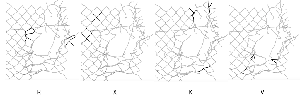
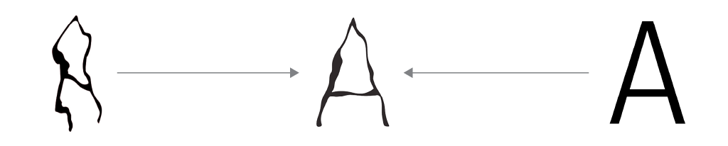
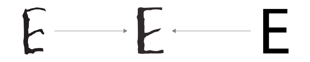
4. Extracting letterforms
The letterforms are then extracted from the deconstructed image and placed on a baseline to be studied as a whole and in comparison to each other. Core characteristics are identified, and a potential direction is determined.
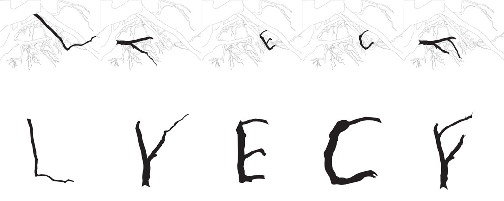
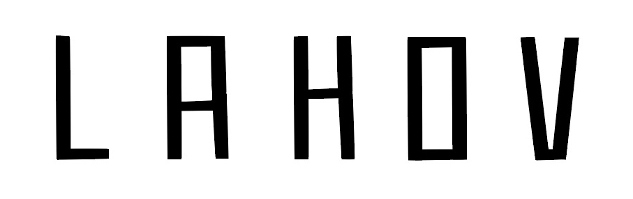
5. Identify a reference typeface
A typeface that suits the type of art direction being pursued is identified as a reference. The reference serves to guide the student toward an overall aesthetic, but also serves as a point of reference when determining the shape or form of a letter according to convention; What strokes are thick and thin in a serif letterform? How low should the vertex of the letter M be? How thick is the cross stroke for the letter A? How small is the lowercase letter a in comparison to its uppercase cousin? Essentially a reference when dealing with the complexities of letterforms.
6. Refining letterforms
At this stage the design evolves through an iterative process. Imagine the original extraction on one side of a continuum, and the reference typeface at the other end. The objective here is to refine the letterform to a point where it is consistent, uniform and stylistically similar to the other extracted letterforms. All this while retaining the inherent quality and core characteristic of the original object/subject of the selected image. One could also refine one letterform to an acceptable point and then refine the rest accordingly. The characteristic need not be faithful to the original extraction and can evolve as long as it retains the essence of its structure and form. The objective is not to reach the end of the continuum but rather to end somewhere between the two points.
In an ideal world, I would have tried this novel exercise out myself prior to introducing it to my students in 2018. However, this unit curriculum was being written at a time when I was managing a programme and playing a key role in designing a new one, all while teaching and fulfilling my administrative duties — safe to say I was busy. Despite this, I felt confident that the design of the task was sound and workable, this was especially so after I broke it down into a step-by-step process.
When the time came and the unit was deployed, the results were promising but it did not achieve the levels I had hoped for. The refinement was rudimentary, and the final results looked almost like the initial extraction or in some cases lacked character because they were overly refined. In an online exchange with one of the students, I realised the need for an existing typeface as a reference point or as direction. This would necessitate the students to create more steps between the original extraction and the final outcome. Thus, the fifth step, “Identify Reference Type”, was introduced and the total number of steps now stood at 6.
In subsequent batches, I felt strongly that the students should record the various steps in the evolution of their letterforms. This would allow student and facilitator to record and understand the design decisions made at every step of the process.
With the inclusion of step five “Identify Reference Type”, the output of the subsequent batches were successful and met my expectations. The codification of this novel exercise is my contribution to the process of creating unique letterforms in typography and type design.
It is definitely possible for more seasoned designers to produce the same result by simply using their intuition and without going through the prescribed steps. However, for students who have yet to develop strong intuition, confidence and powers of observation, they would benefit from the step-by-step procedure.
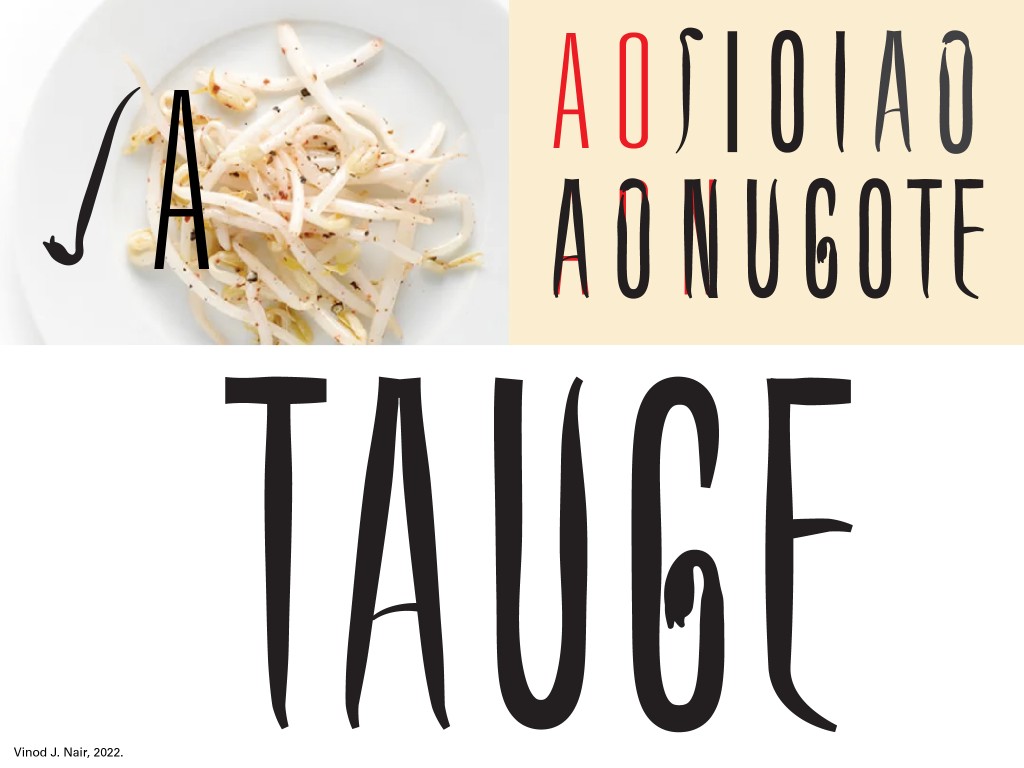
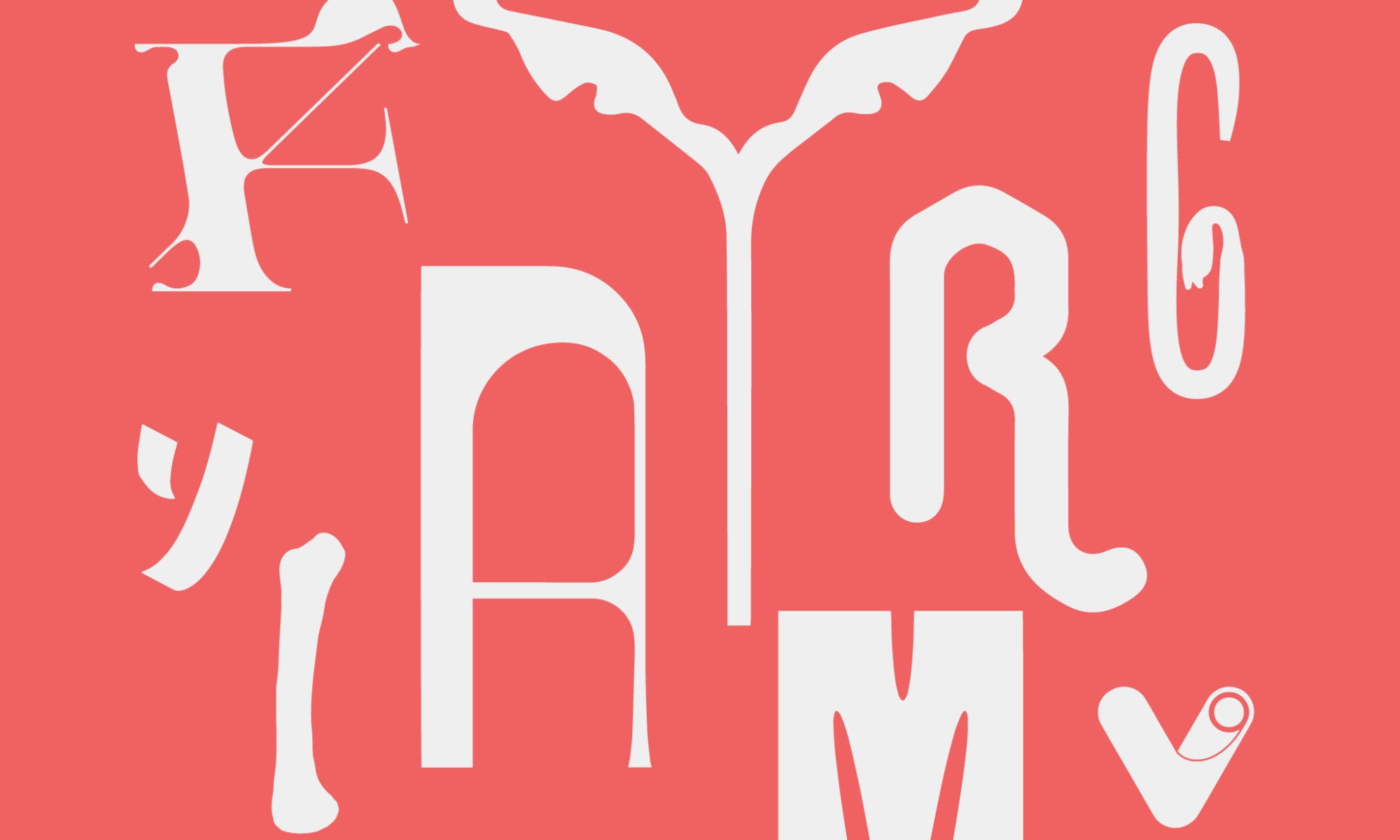
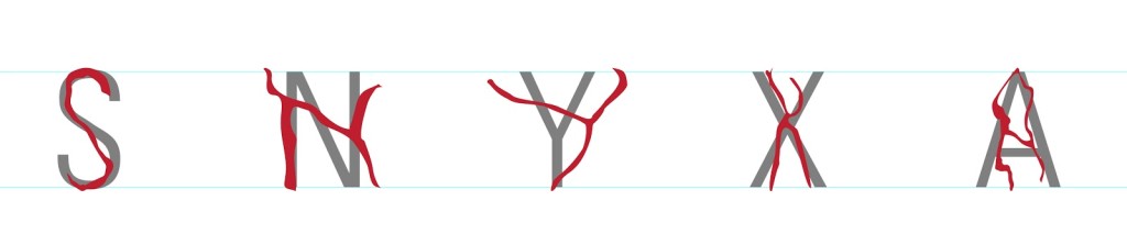
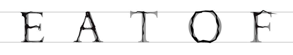
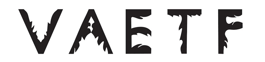
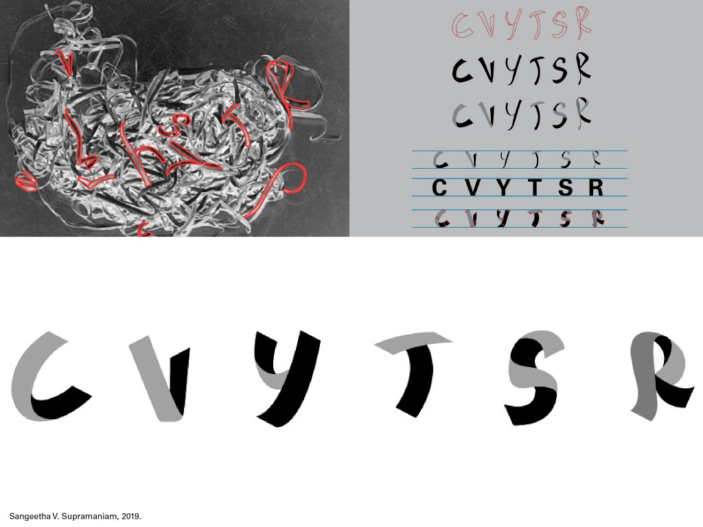
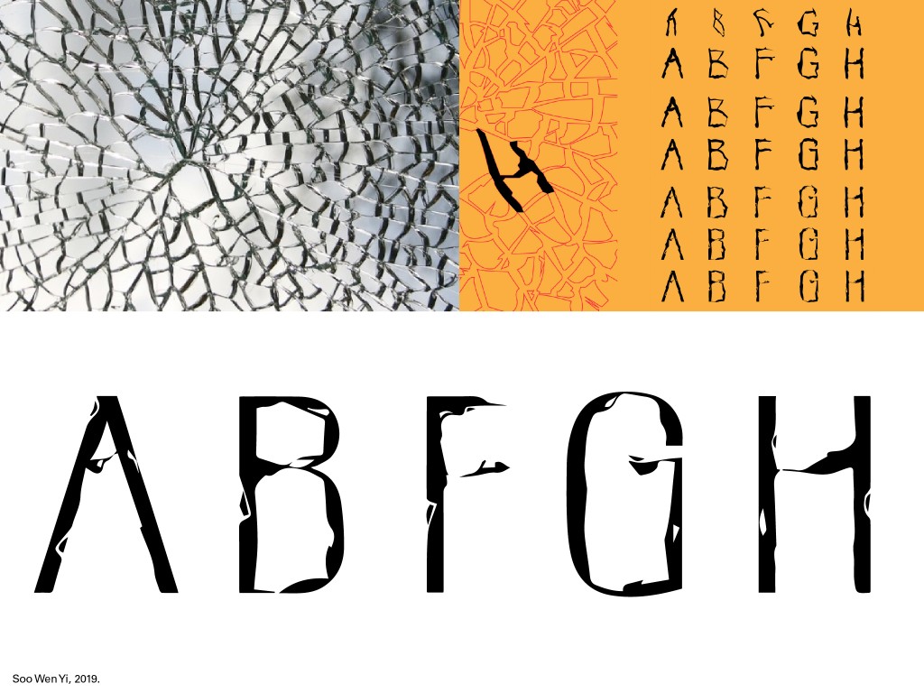
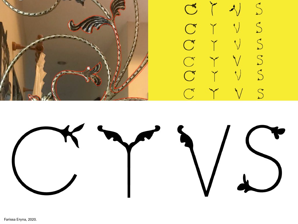
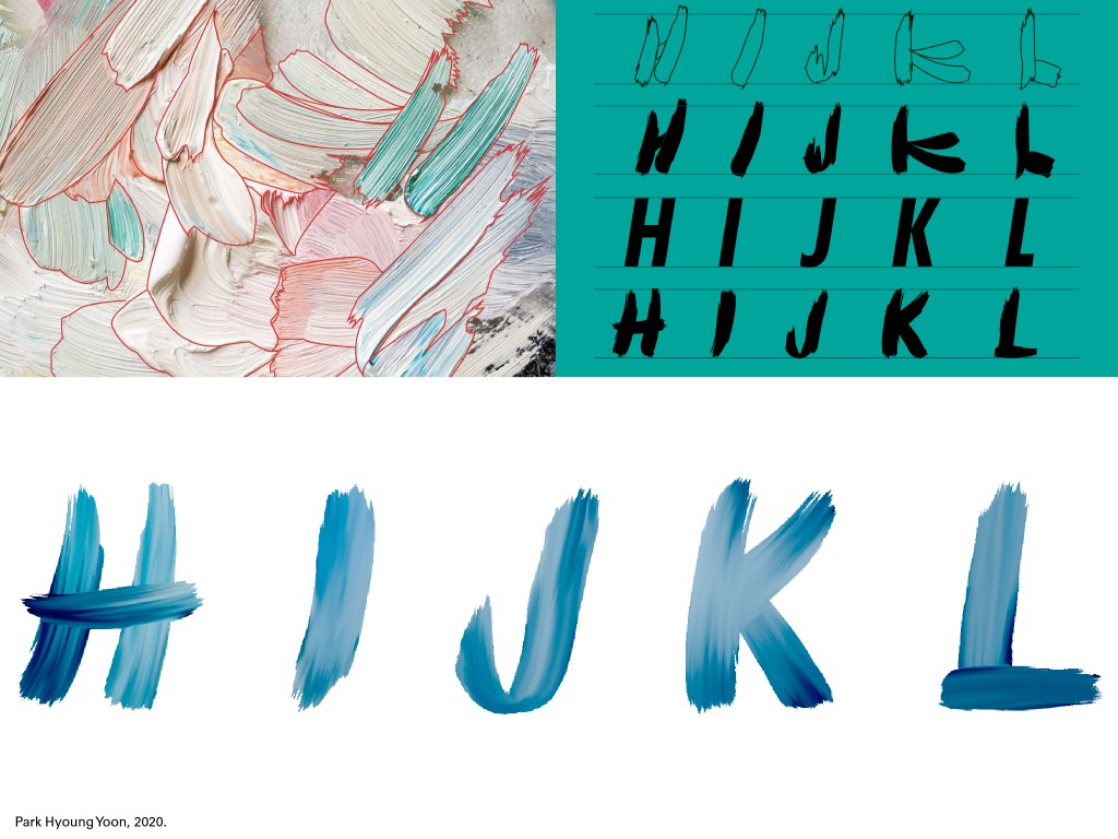
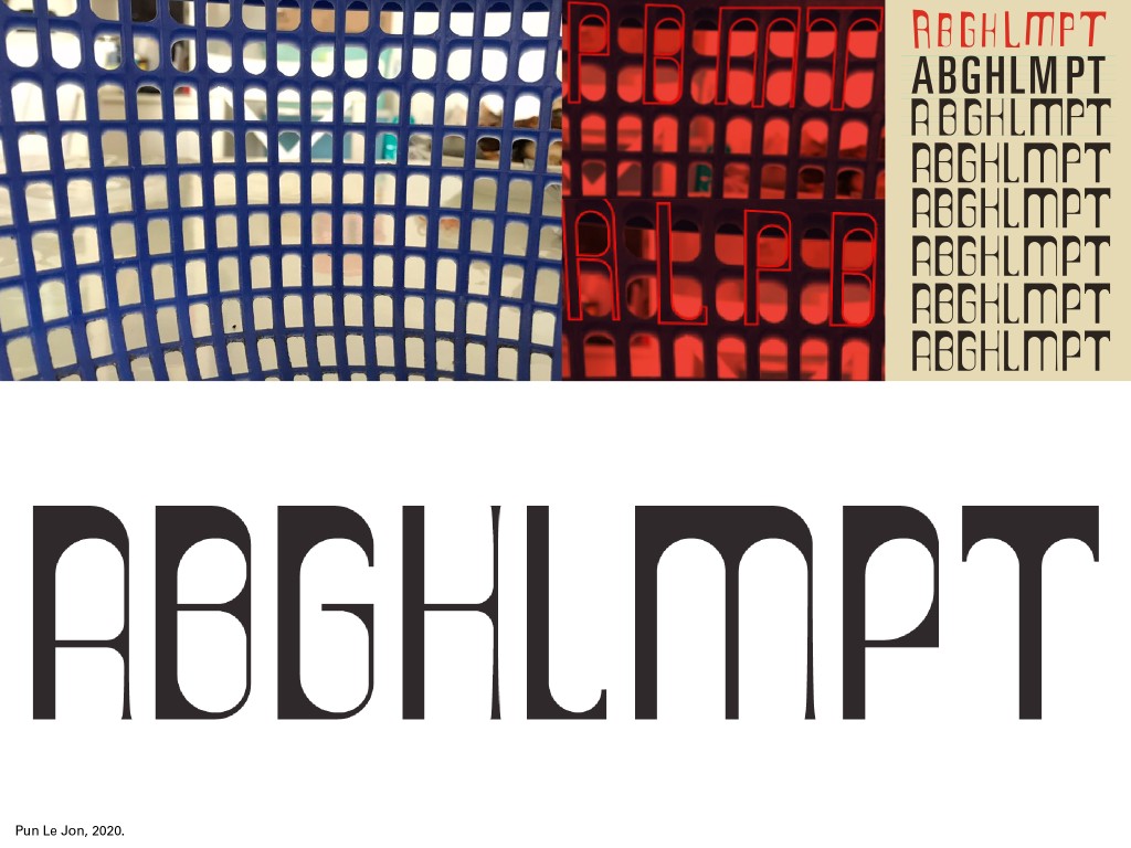
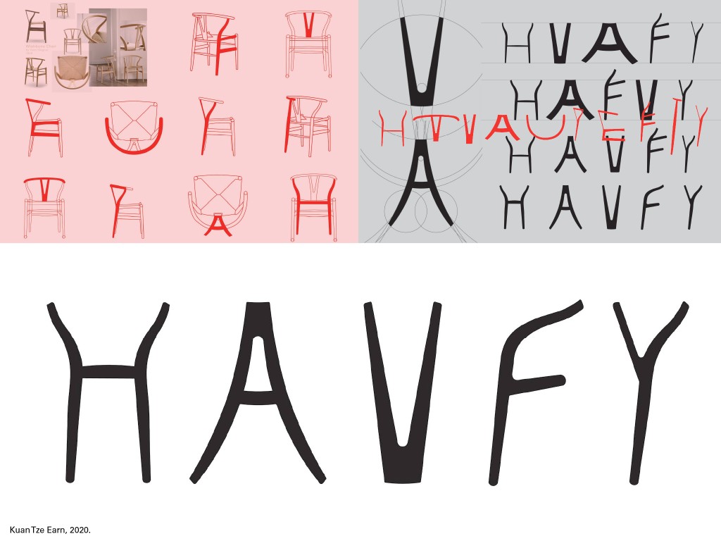
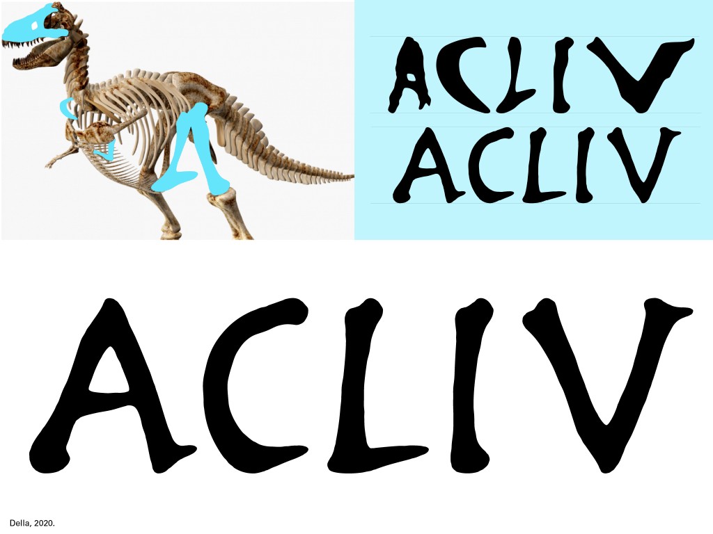
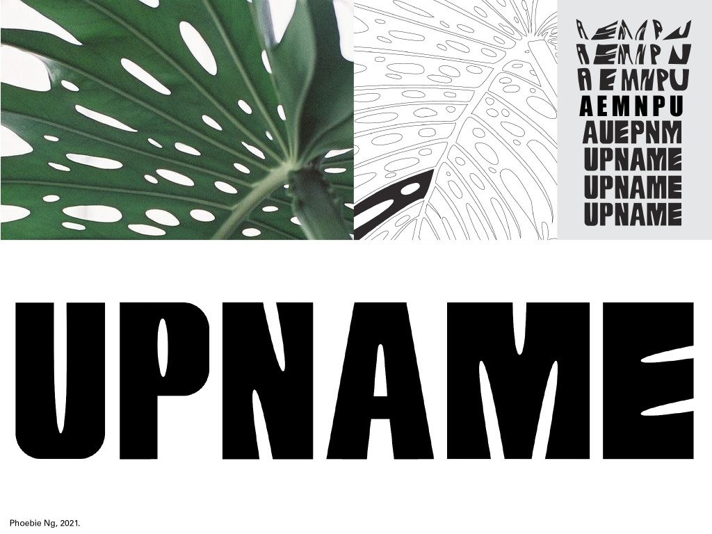
The following are some interesting results of the exercise over the years:
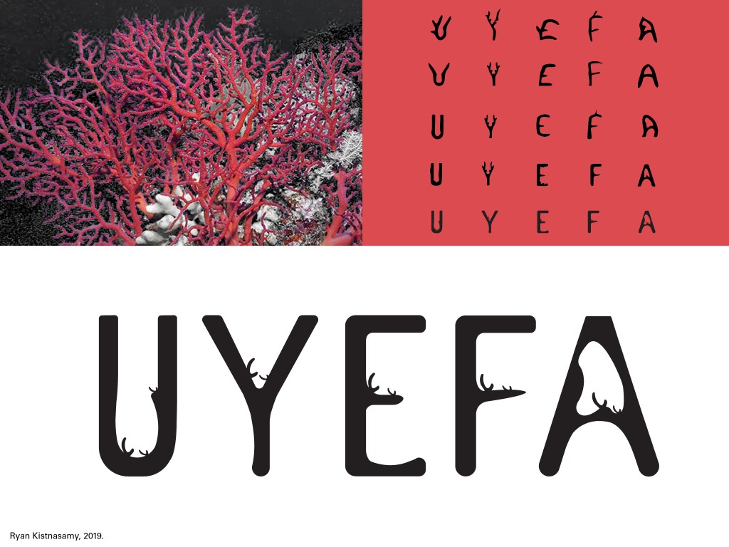
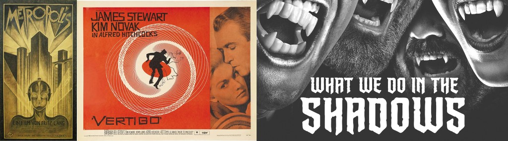
This year, 2023, I asked students to utilise the refined letterforms and create a mock movie poster. The titles don’t mean anything as they were randomly extracted. The images however are the subject/object chosen to extract the letter from. The following are the results:
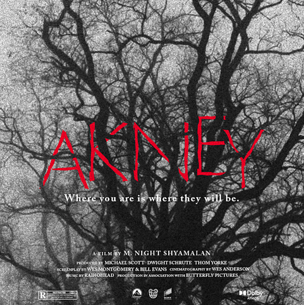
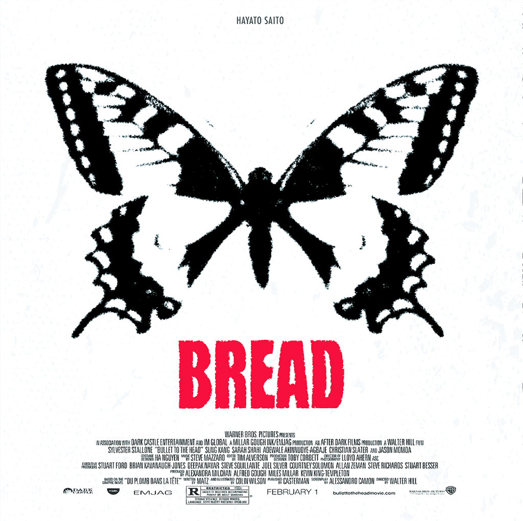
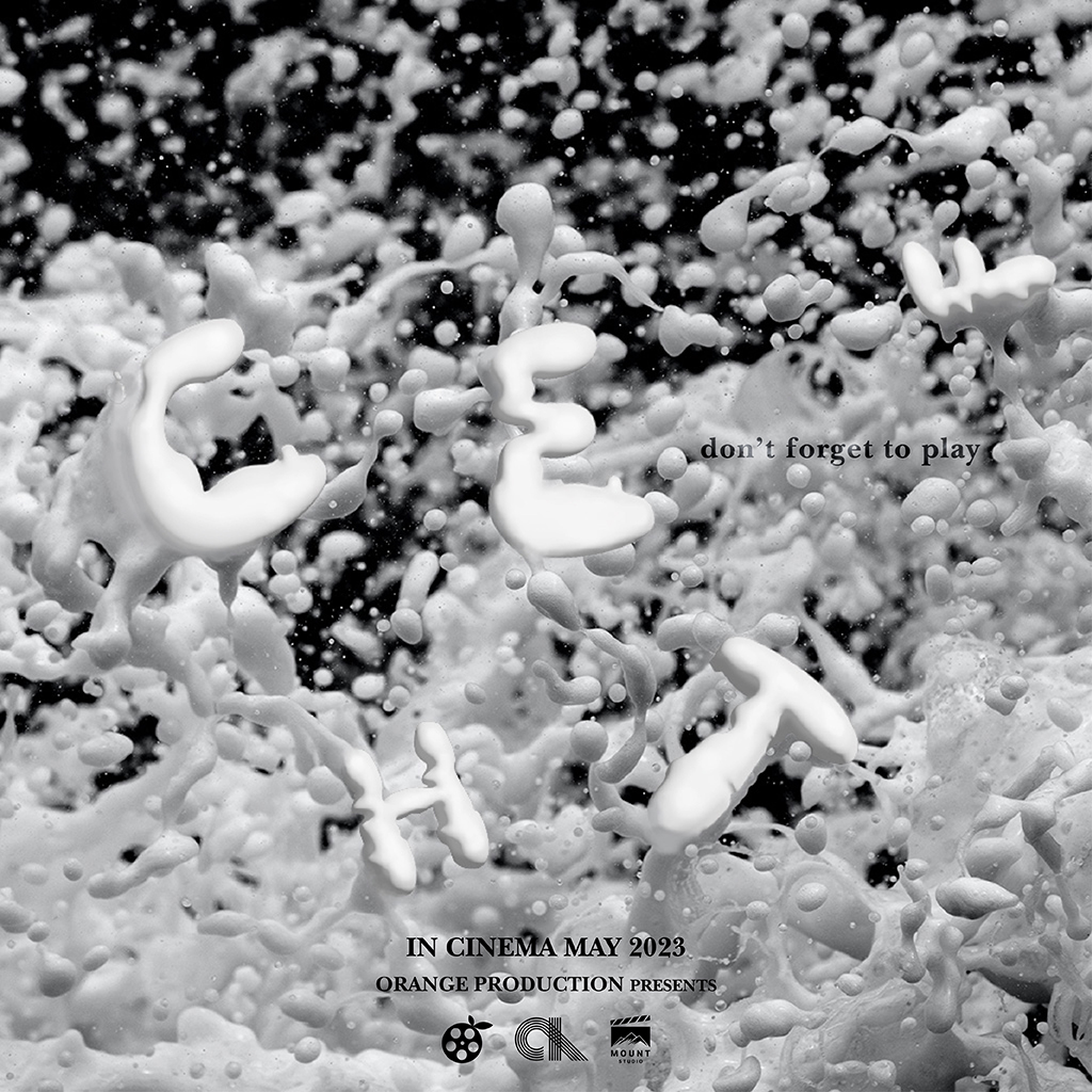
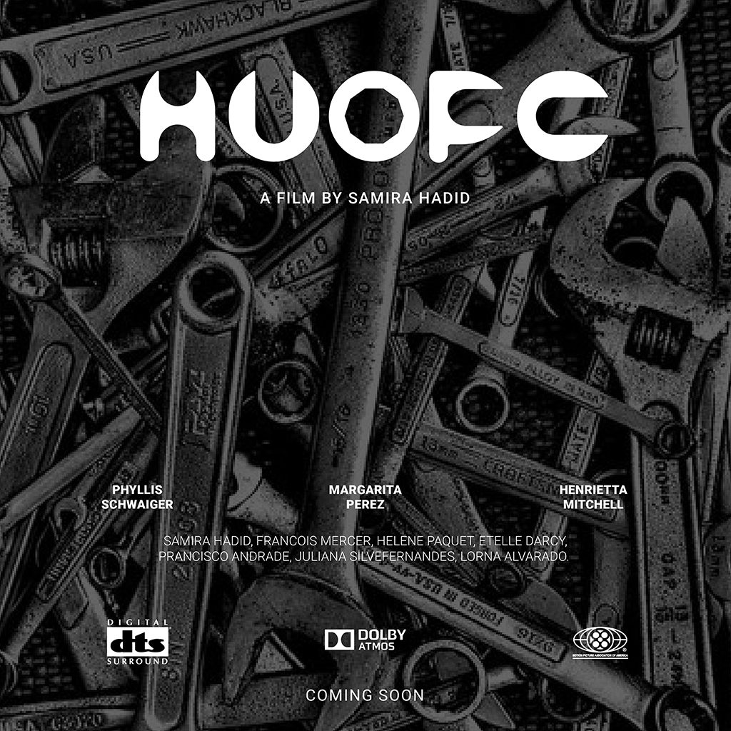
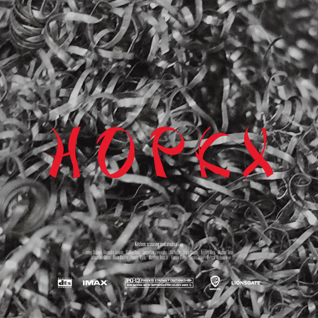
I was not able to include many pieces of good work, nevertheless, I hope the above suffices in giving readers a sufficient understanding of the range of outcomes possible in the Finding Type task.
Oh! I did eventually get around to doing the exercise myself, in case you’re wondering. Hope you like bean sprouts.