In the final project of Advanced Typography, we were instructed to create a font based on the three options: create a font that is intended to solve a larger problem or part of a solution in the area of my interest, or to explore existing letterforms, or develop a font with an experimental design.
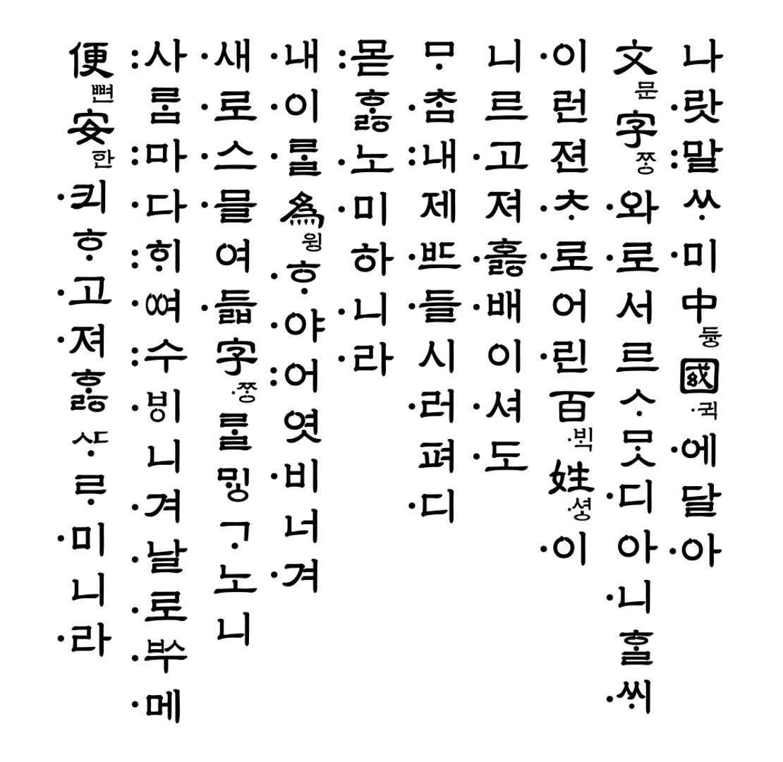
From these options given, I proposed three ideas related to the topic which were to create a Latin typeface of the Korean 15th century manuscript Hunminjeongeum (refer to the sample below), an ink trap-inspired typeface, or an expansion of typeface from a previous project (Key Artwork & Collateral).
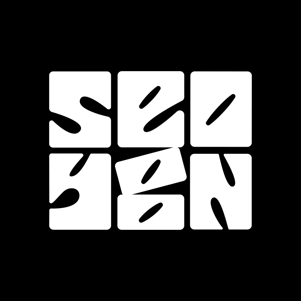
As for my final project, I decided to go with the third idea: a font expansion from my previous task (Key Artwork & Collateral) where the wordmark below would be the base design for the expansion.
I believed that this would also be a great chance for me to further explore my existing design related to identity.
Research/collecting references
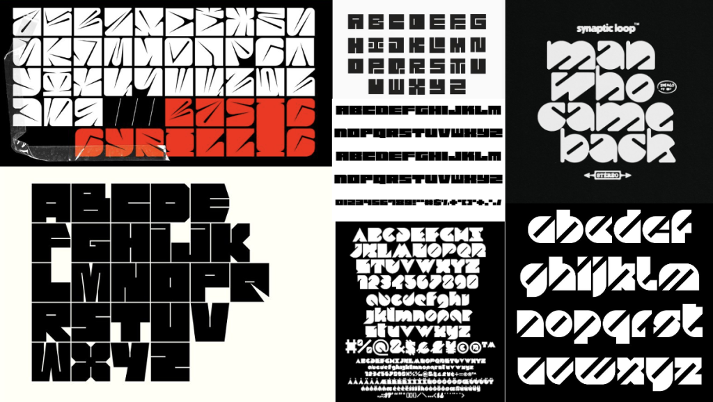
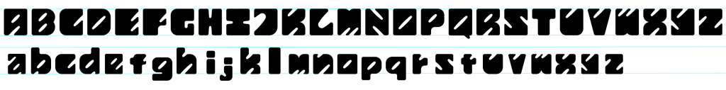
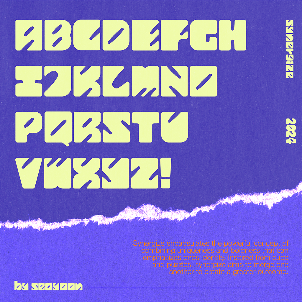
Before beginning to expand the letterforms, I looked for some visual references that would be helpful and guide me through each stage of the project. Looking at the initial design that I created in the previous project, the overall shape of each letterform has a base form of a rectangular shape. I had decided to gather several references following the characteristics of blocky, heavy, and bold fonts.
Rough Digitization
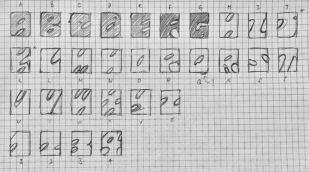
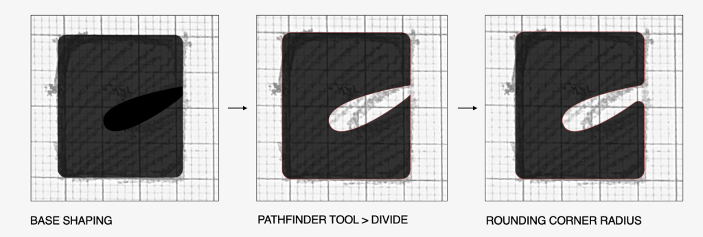
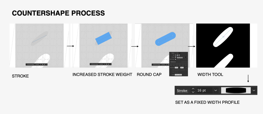
After sketching was done, I imported them into Adobe Illustrator for digitization. First, I set a fixed-sized rectangular shape and used a pen tool to create a counter shape which was then divided using the Pathfinder tool.
Feedback and Adjustments
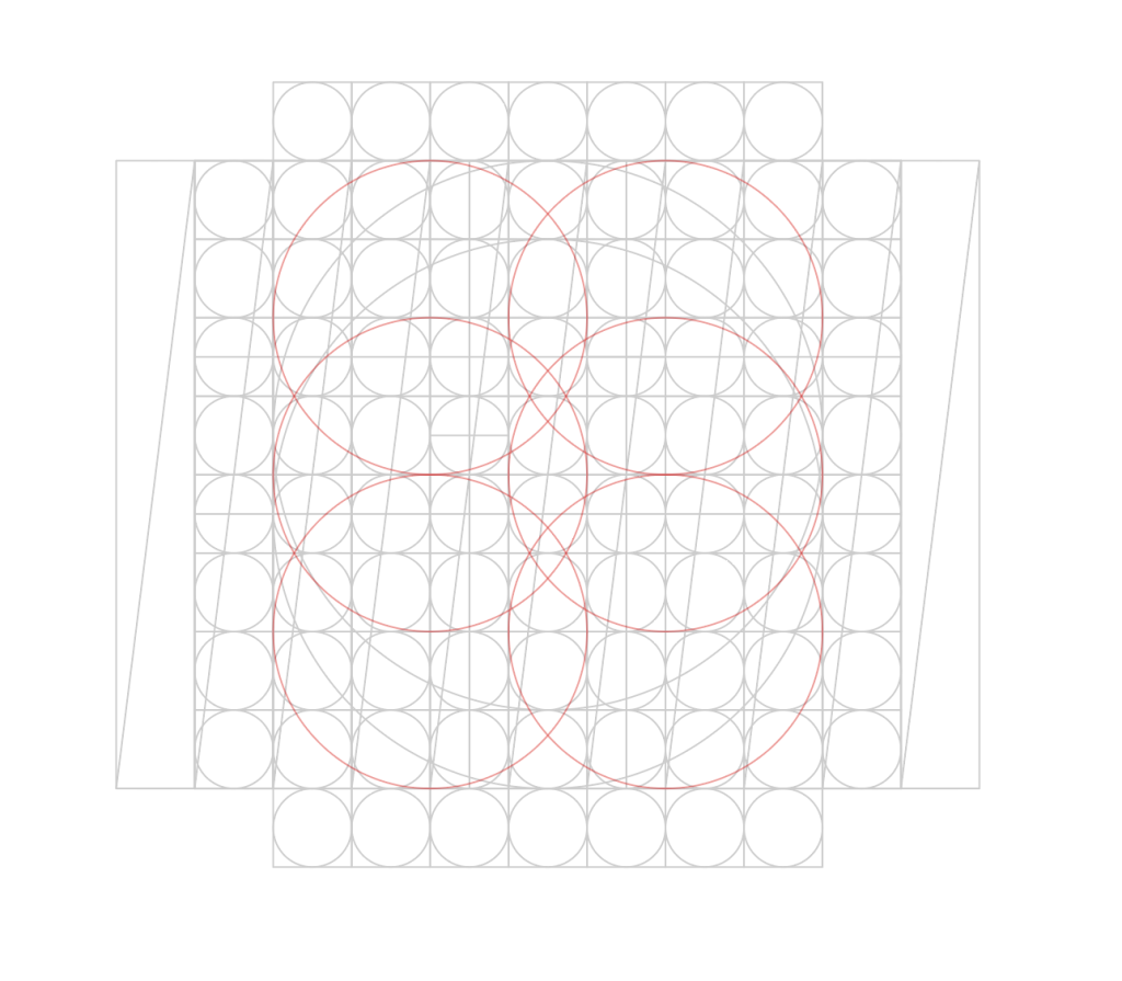
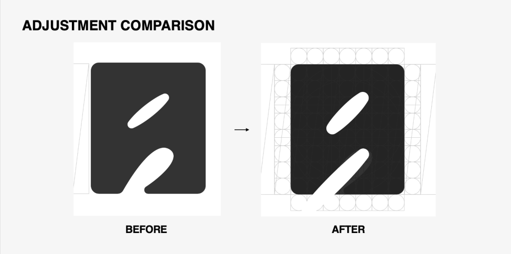
During the feedback session with my lecturer, Mr Vinod, he commented that the diagonal axis in the counter shapes of each letterform was not at a consistent angle. Some letters also needed to be improved for their readability. I was advised to create a grid structure when building the letterforms so that I could create each letterform in a consistent way. Below is the grid structure that I created for both the upper and lower cases. In addition, red circles were added as the guide for curved edges for some letterforms to improve readability.
To maintain the same diagonal angle of the counter shape, I used a stroke tool to set a fixed angle. Some modifications were made to the outline of the stroke where I rounded its corner and increased stroke weight in the central part so that it followed the initial design. After additional settings were made, I set the stroke to a fixed width profile which shortens the application process for the rest of the counter shapes in the letterforms.
Here is a side-by-side comparison of the adjustments:
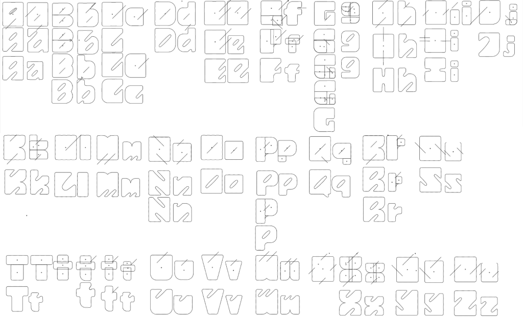
Despite the simple building structure, I struggled with the uppercase letters ‘G’, ‘H’, and ‘I’ as the readability was heavily reduced when I placed the counter space diagonally. For example, placing a diagonal counter onto the letter ‘H’ made it similar to the letter ‘N’ which may cause difficulty in the reading when placed together. Eventually, I had to eliminate the diagonal counter for these specific letters and go with a horizontal/vertical axis instead.
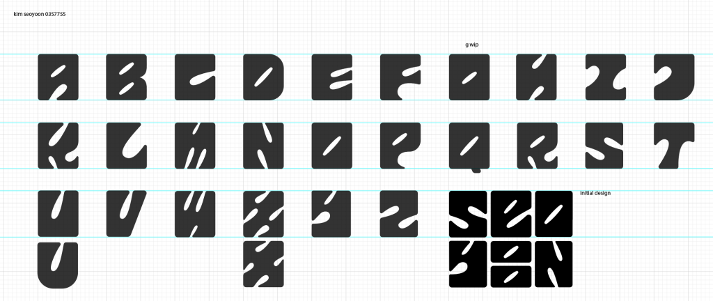
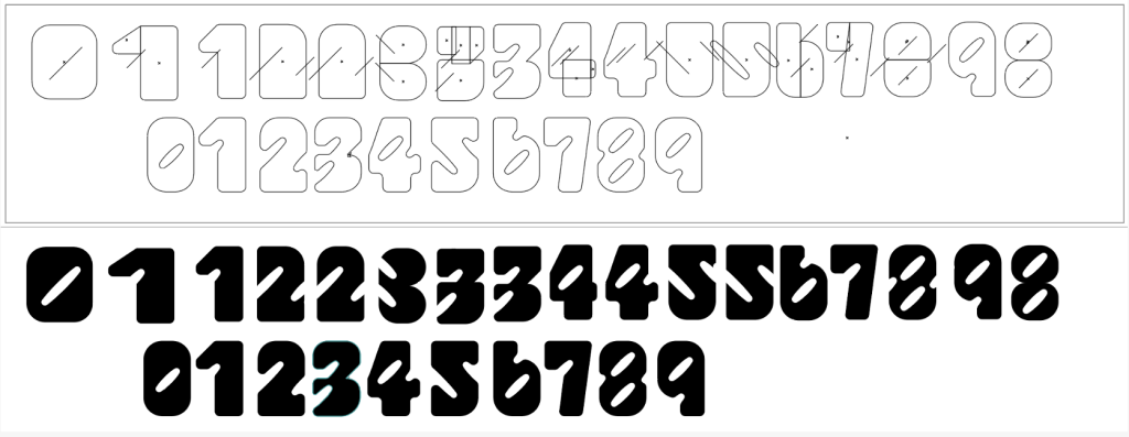
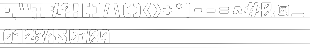
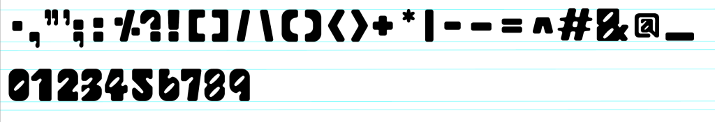
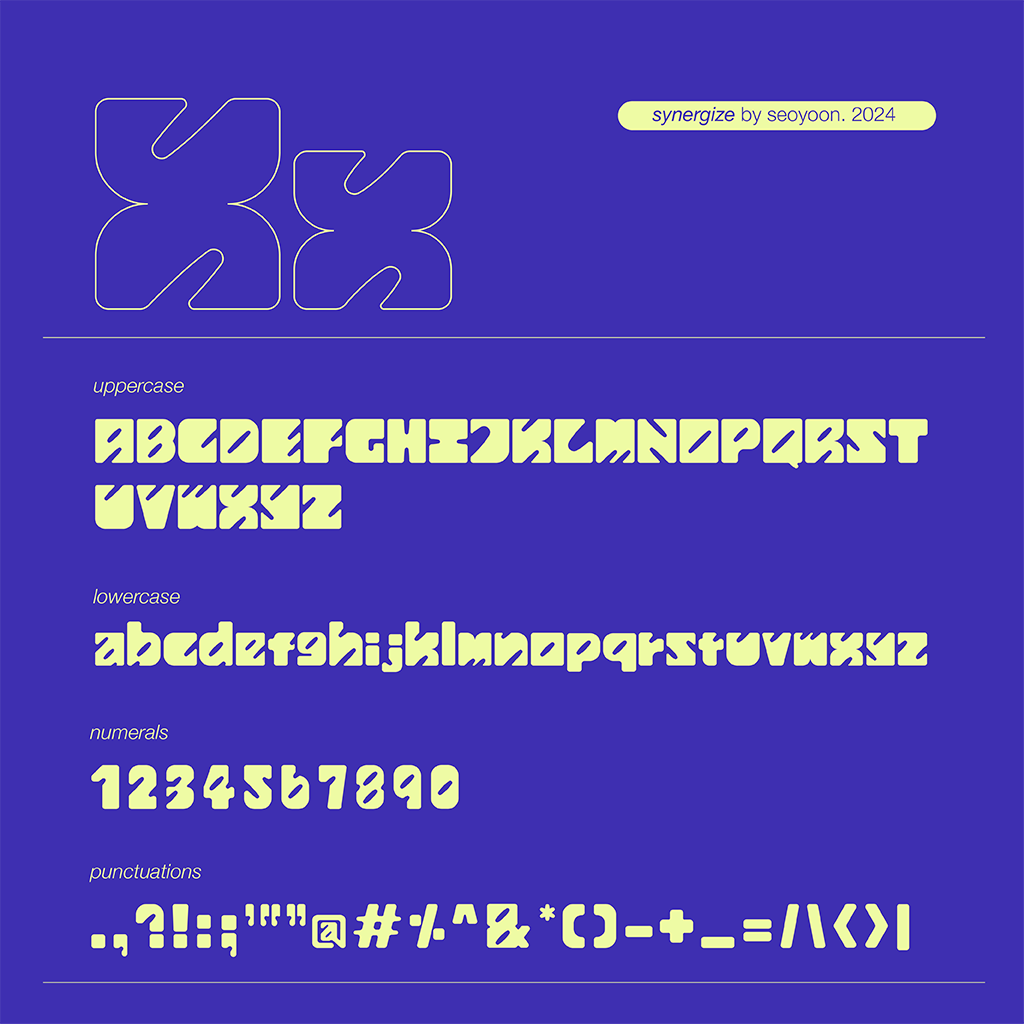
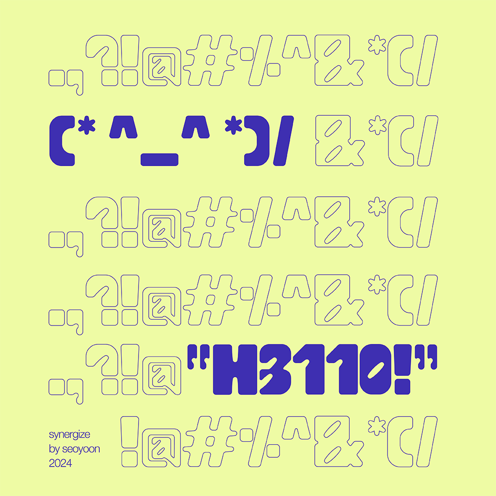
Numerals and punctuations: These were created using the same method as the above letterforms. Initially, I kept the base width the same as lowercase, but eventually, I decided to go with a more compressed version as some numbers tended to appear similar to some lowercase letters as in the numbers 0 and 6 and letters ‘o’ and ‘b’.
FontForge
To create the font, I used the software FontForge to import my letterform designs.
Importing letterforms onto FontForge from Illustrator. After finalizing all the cases, numerals, and punctuations, I went onto FontForge to import the letterforms using a post provided by Mr Vinod that explains how to utilize FontForge.
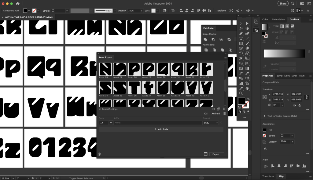
Firstly, I used the asset export tool to export each of my letterforms into the asset window and exported them in SVG format.
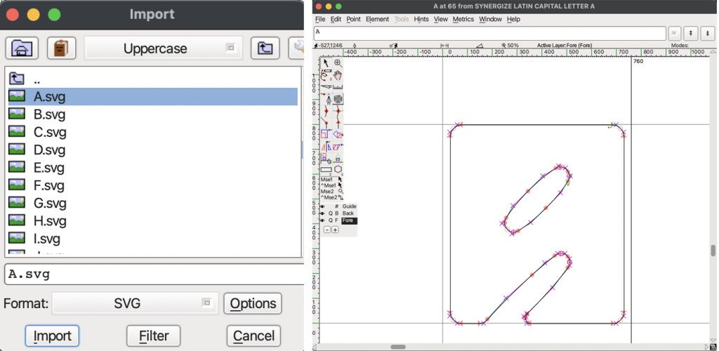
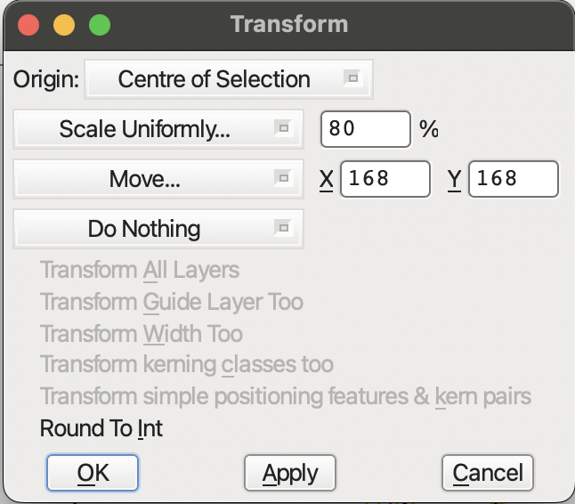
After categorizing each exported file into its folder, I imported each letter onto Font Forge accordingly. I used the Element > Transformation > Move & Scale tool to adjust the overall size and placement to the cap height and x-height.
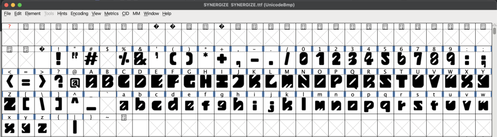
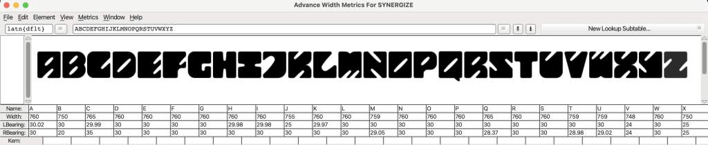
Kerning: Lastly, I made sure the kerning between the letters was relevant according to the side-bearing chart.
Font Presentation & Application
Before starting to design the layouts for the font presentation, I created a colour palette so that the overall presentation would have consistency.
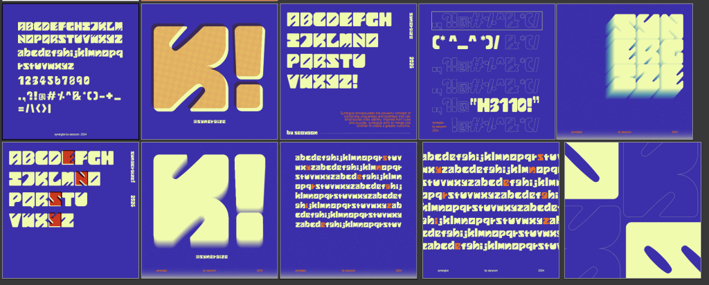
As shown above, I initially used the same background colour for all five presentations. Mr Vinod commented that using a different background colour for some of the artworks would make the overall harmony more diverse, therefore I tried utilizing more yellow as the background colour. Below is the improved version based on the feedback gained:
However, I thought that I needed more exploration in terms of the arrangement of the layouts, so I made some more attempts on the layouts:
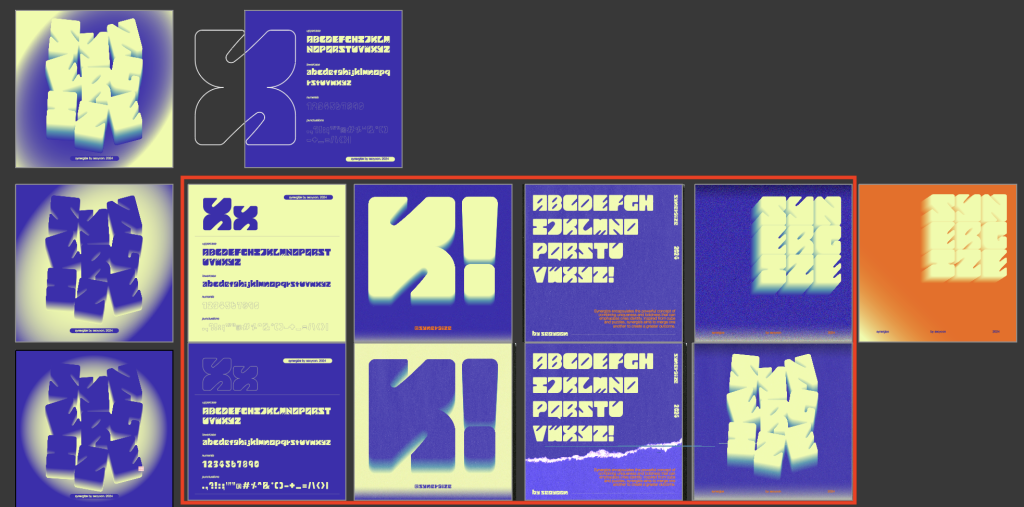
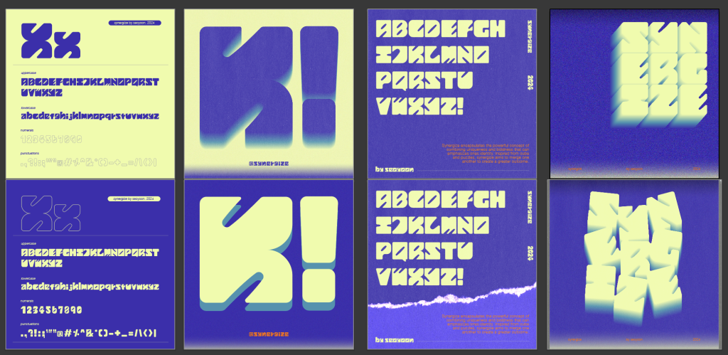
The red box indicates those that I selected for final choices. The first and second rows are the before and after modifications—for which I had to change the colour arrangement on some of the artwork.
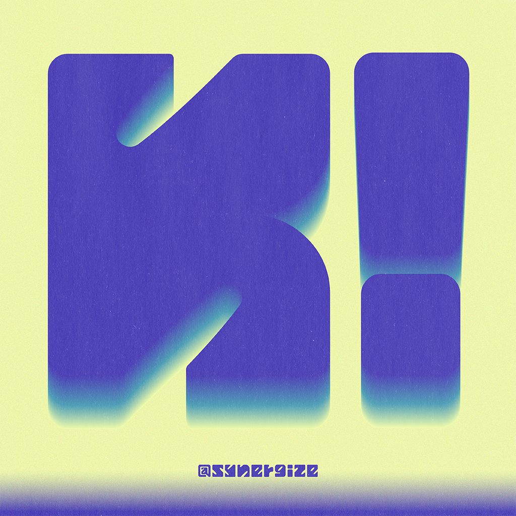
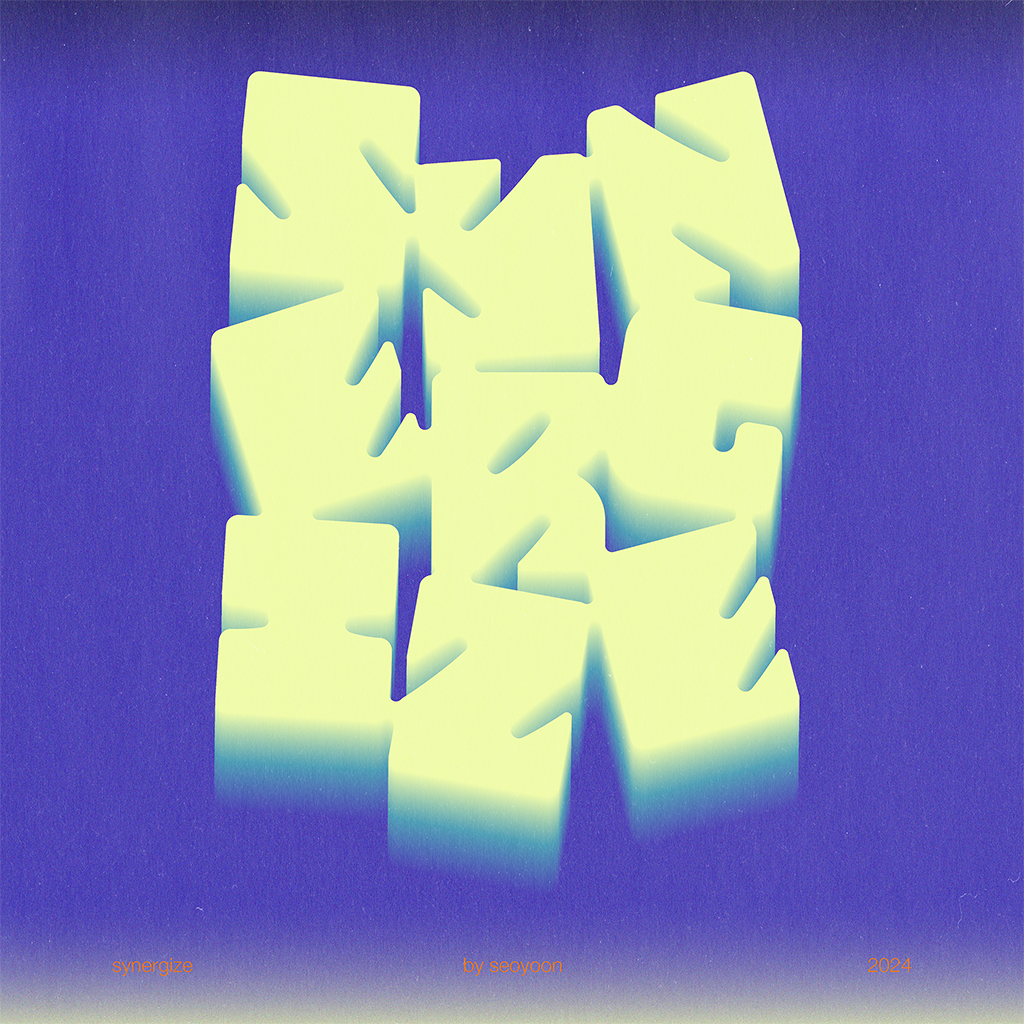
Additional Effects: I also made the letters appear more scattered to reduce the stiffness of the original arrangement. Compound shape tool & offset path tool were utilized to make each letter slightly stick to each other to match the idea of ‘synergize’ so that they appear to make a greater piece as a whole.
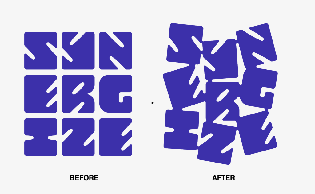
The name of my typeface ‘Synergize’ was inspired by the consonants of my name ‘Seoyoon’ which I extended with an existing verb ‘synergize’. As the overall concept of my typeface was meant to express my identity, this was a fun little detail to be added to enhance my identity.
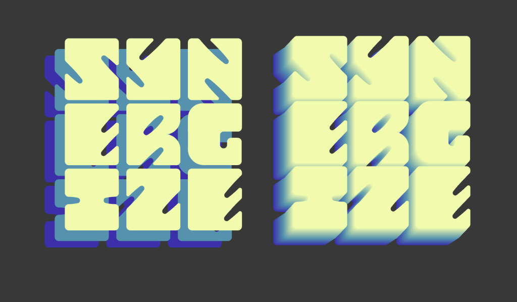
I then applied some additional 3D effects using the blend tool. While in the process of doing this, I also learned that text alignment is crucial as the direction of the 3d effect might be bent due to bad alignment.
Font Application
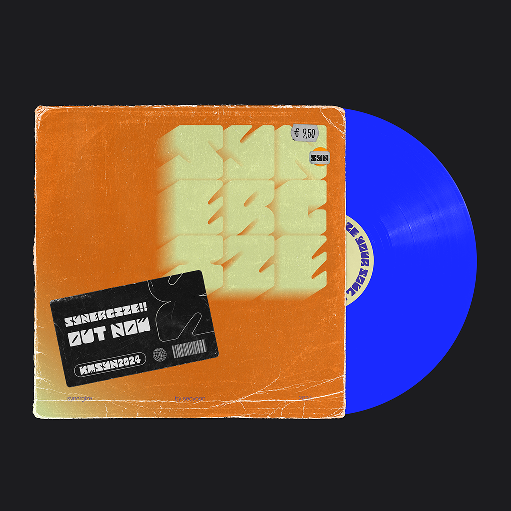
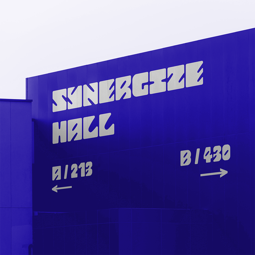
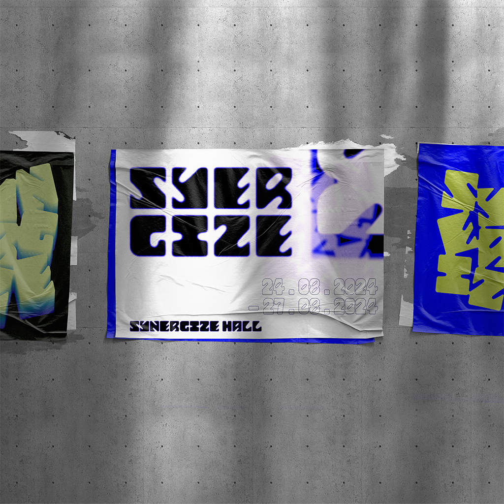
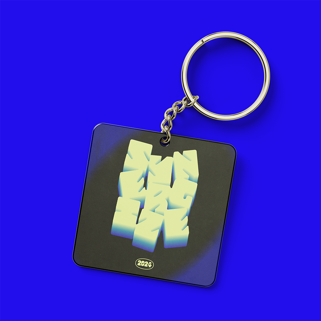
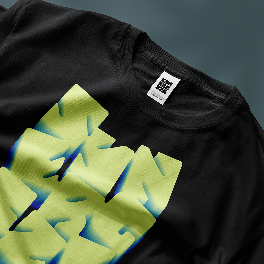
I wanted to explore creating font applications based on the concept of a concert/festival and its merchandise —I selected mock-up models such as a vinyl record sleeve, concert hall posters, and other merchandise such as keychains and t-shirts.