
Every good article must start with a little bit of history. Football as we know it today was introduced by the British during their colonial occupation of Malaya. Modern rules-based football in Britain started developing in the mid to late 19th century.
The English Football Association (FA) was established in 1863 with the “object of establishing a definite code of rules for the regulation of the game”. In contrast the Football Association of Malaya, today Malaysia (or FAM), was established 73 years later in 1936. However, football in Malaysia was already a central pillar of most sporting clubs at the end of the 19th century, leading to the establishment of the Selangor Amateur Football League in 1905.
The Malaya Cup (today Malaysia Cup), a national tournament, was established in 1921 as “HMS Malaya Cup, following the contribution of a trophy from the crew of British Royal Navy ship HMS Malaya”. The final between Selangor and Singapore would see Singapore winning 2–1. Singapore won the cup 43 times until its exit from the tournament in 1995 — the highest number of wins of any club at the time.
“Having topped their respective sections, Selangor and Singapore competed in the first Malaya Cup final on 1 October 1921 at the Selangor Club grounds (now Merdeka Square). The turnout of 3,000 spectators at the match was then the largest football crowd in the peninsula. Singapore won the match 2–1, and the Singapore players each received a gold badge for the victory.” — Source: National Library Board, Singapore.
Why is the above history lesson important? Well to understand the shape and form of our football badges today, we must understand the history and influences that underpinned it. And so it goes without saying that our football badges then and now are influenced by the heraldic based badges of football clubs in Britain then.
Heraldry is a visual communication system used in medieval Europe, initially for the purpose of identification. In England it is believed to have started in the later part of 1100s. The visual communication system uses a coat of arms (shield), symbolic devices (armorial bearings) and colours (tinctures) in a variety of combination to ensure distinction for the purpose of identification. One can say that these were the medieval forms of logos or trademarks.
At this point, I’d like to correct a common misnomer in the use of terminology. It is common to come across the use of the term crest when describing what is a badge or even a logo of a football club. So, why not a crest? Well, a crest is a device that features above a helmet on a heraldic achievement see figure 2.
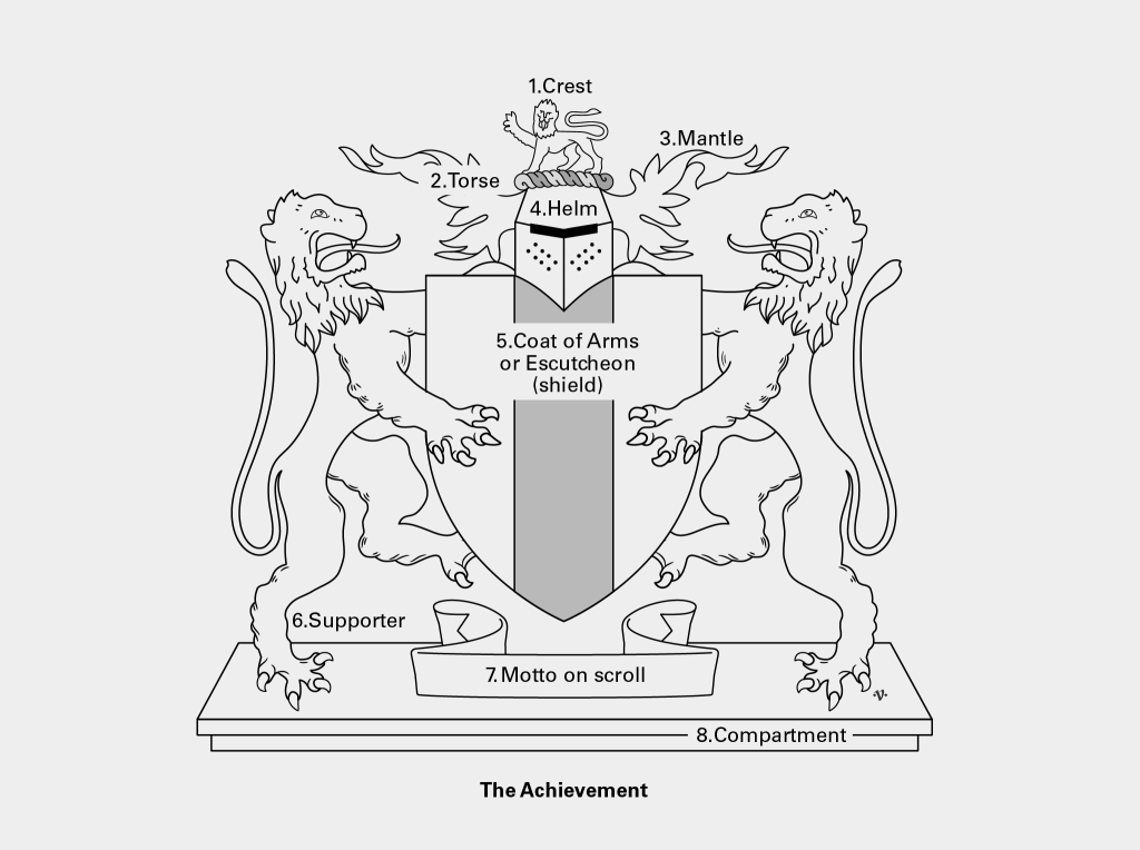
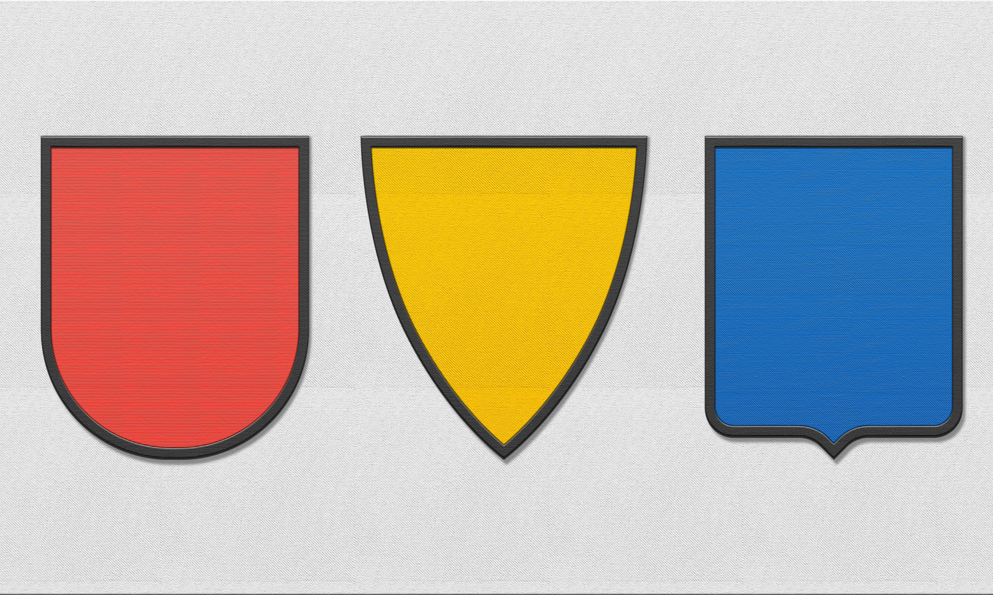
A football badge is closer in shape to a coat of arms than a crest, as per figure 2, which is a shield that sits below the helmet and is the central feature of an achievement. In the case of our football badges, considering the heraldic influence, I think the description ‘badge’ is the better option. A coat of arms as a description should only be used if the design is ‘granted’ by an authority like the College of Arms. Most of our modern football badges in Malaysia today are logos, as they do not conform to heraldic designs albeit influenced by the style. Even so — call me sentimental — I believe, considering our football history and its influence on the game in Malaysia, a badge rings truer and closer to the heart than the term logo does.
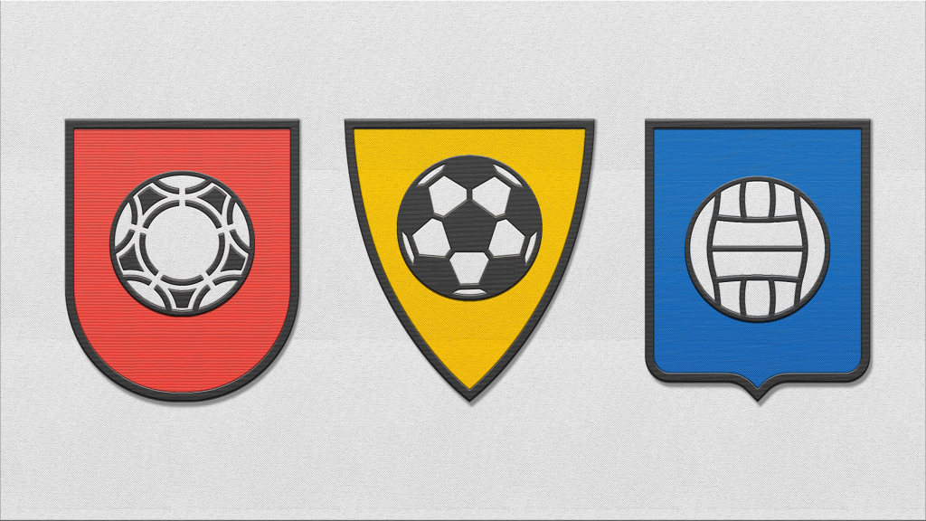
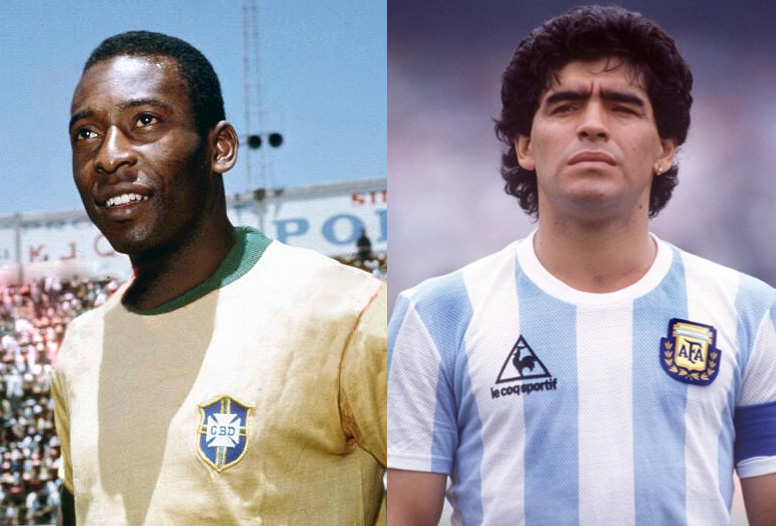
The term badge is used when it is worn on the person, in this case a football badge, to mark his/her allegiance to a club. This is why badges are worn just above the heart as can be seen on football jerseys (figure 3).
We can refer to it as an emblem when it does not adorn a person but rather a wall.
Football clubs then and now, in the UK and in Malaysia, continue to use similar heraldic forms although these days they tend to be mostly pseudo heraldic and logoesque. This is because they don’t comply to the conventions that govern heraldry such as the rules governing the use of colour: rule of tincture (RoT), or restrictions in the use of letterforms on the coat of arms (shield), or the conventions on probable display in legibility and simplicity.
So, when considering how to assess these badges I was faced with an insurmountable dilemma, should I assess these badges on their strict compliance to heraldic principles seeing that this is the basis of their origin, or should I assess these badges as modern-day logos? I spent days mulling this over and I’ve come to a decision that they are one and the same in principle.
You see, some of the principles that govern heraldry are similar to the principles that govern modern day logo design considerations, i.e. legibility, colour contrast, meaning, memorability, simplicity, and aesthetic considerations like, unity in design, crafting (in shape, form, or lines), balance and visual impact. This is not surprising because one can argue, especially in the West, that the practice of heraldry has had some influence on modern day logo/identity design. In the book “Marks of Excellence” by Per Mollerup, heraldry is covered as part of the history of modern day mark making (logo design), he states, “Heraldry offers a body of thought and terminology that is relevant to the creators of modern trademarks. Among the useful ideas is the concept of simplicity […] Good heraldry is simple heraldry; it omits the non-essential”. Replace the word heraldry with logo or mark and it still rings true.
The following were my considerations when assessing football badges in Malaysia:
1. My first consideration is whether the badge is simple (omission of non-essentials). What constitutes simple? A simple design has a strong point of focus, a single device that dominates, allowing unity in design, and is meaningful.
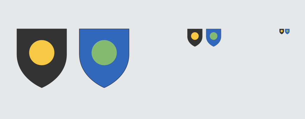
2. My second consideration is the use of colour, in particular whether it adheres to the rule of tincture (RoT), which is a heraldic rule. The rule simply states, “to never put a colour on colour or a metal on a metal”. Colours are: red, blue, green, black and purple. Metals are: yellow (gold) and white (silver). The purpose behind the rule is to ensure contrast. Contrast is important because it is legible at a great distance or in logo-speak, in smaller sizes. In football badges both size and distance are applicable considerations with regard to badges.
3. My third consideration is the use of textual information along or within the badge. As per heraldic convention, the use of letterforms as part of a coat of arms is frowned upon except on certain occasions when the device it appears on is a book, scroll, or the like. This was due to the levels of illiteracy in medieval times. This gave rise to a purely visual form of communication. Today marks or logo marks are purely visual in its elements and are still deemed as the most universal form of communication unlike logotypes or wordmarks. Thus, it is preferable if the football badges do not have any letterforms in them. In the case that it does, then it needs to be evaluated on how well it supports the the main visual device on the badge.
4. My fourth consideration is the level of crafting and composition. Are the shapes or forms used on the badge simple and legible or are they complex? Would it retain crucial information at a reduced size? Are the devices used on the badge balanced with clear hierarchy?
5. Lastly, my fifth consideration is impact. Does the overall effect of the badge leave a lasting impression, making it memorable? Impact is essential for staying power and connection. A design that has no point of focus or that has a point focus that is not emotionally charged, lacks in impact.
At this stage I should say, if you are not interested in the ranking exercise and would just like to see the reimgined badges, scroll down.
For this exercise I chose 14 Malaysian football clubs:
-
-
- ATM FC (Angkatan Tentera Malaysia)
- Kelantan FC
- DBKL FC
- Johor FC
- Kedah FC
- Negeri Sembilan FC
- Sri Pahang FC
- PDRM FC (Polis DiRaja Malaysia)
- Penang FC
- Perak FC
- Sabah FC
- Selangor FC
- Terengganu FC
- Kuching City FC
-
My criteria for evaluation (explained above in detail) and corresponding points are as follow:
-
-
- Simplicity (5 points)
- Colour Contrast (5 points)
- Letterforms (5 points)
- Crafting (5 points)
- Impact (5 points)
-
Total: 25 points.
Why was a criteria necessary? Having criteria allows for increased objectivity in the assessment of each badge in an otherwise wholly subjective exercise.
It keeps the assessor from straying and indulging in bias — to a degree — but it also ensures the consistent application of a set measure. Despite the precaution, some level of bias will exist, as no measure or assessor is completely free from it. Evaluating anything involves subjective interpretation (personal perspectives, experience and values) and so different individuals will have differing views or scores. As I often like to say, many minds result in many views and many truths. Establishing the set criteria created a framework for evaluation which allows for a level of fairness.
My evaluation yielded the following results:
Top of the table
-
-
- Johor FC (19 points)
- Kelantan FC (18 points)
-
Middle of the table
-
-
- Sri Pahang FC (15.5 points)
- Sabah FC (15.5 points)
- Negeri Sembilan FC (15 points)
- Perak FC (15 points)
- Penang FC (14.5 points)
- Kuching City FC (14.5 points)
- Selangor FC (14 points)
- Terengganu FC (14 points)
-
Bottom of the table
-
-
- PDRM FC (12 points)
- Kedah FC (11.5 points)
- ATM FC (8 points)
- DBKL FC (7 points)
-
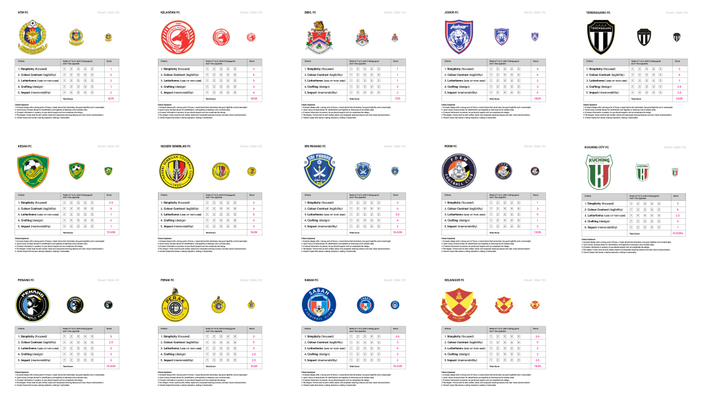
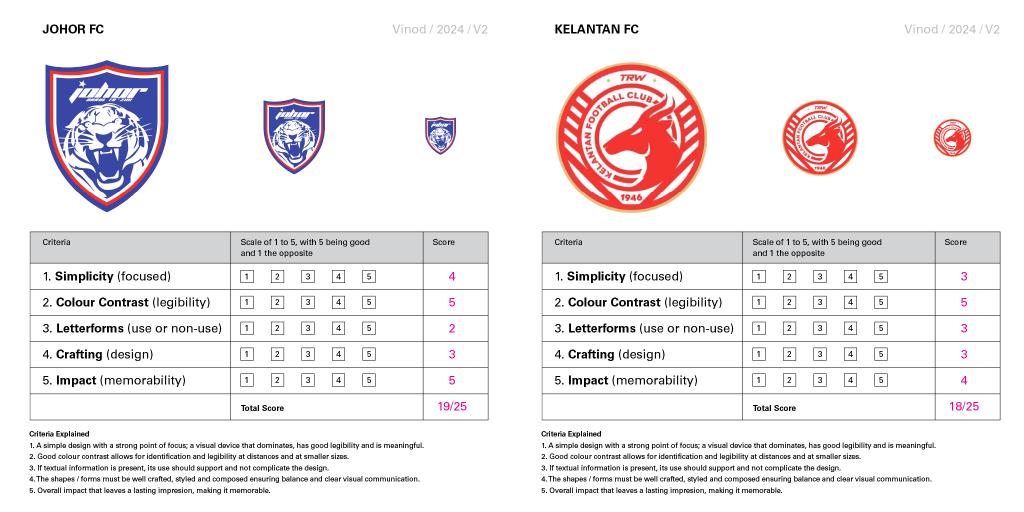
Now let me explain my evaluation for the top and bottom two football club badges. So how did Johor FC and Kelantan FC achieve these points? On Simplicity, the Johor club’s badge had a clear point of focus (roaring tiger) with minimal non-essentials and or distractions. Kelantan’s badge also has a clear point of focus (deer) however there are non-essentials that reduce the prominence of the deer, namely the diagonal lines and the small textual content that surround the point of focus. Both club badges have strong colour contrast and thus both achieved maximum points. Both clubs feature lettering in their badges, which is a pity as it reduces the impact or creates a distraction away from the point of focus. Here Kelantan faired slightly better as their letterforms were deemed more legible in comparison to Johor’s. Ideally both would have had better badges had they not included the textual content. In crafting, both club badges had complicated and or non-essential forms, which reduced legibility. Both achieved similar points here. Finally, Johor’s badge was deemed a little more impactful due to the emotionally charged tiger and its size within the badge. This would make it more memorable as a result. The deer in the Kelantan’s badge was a lot more regal with a different emotional appeal. However, its impact was reduced due to its smaller size and the inclusion of non-essential elements (diagonal lines and text) that surround the point of focus.
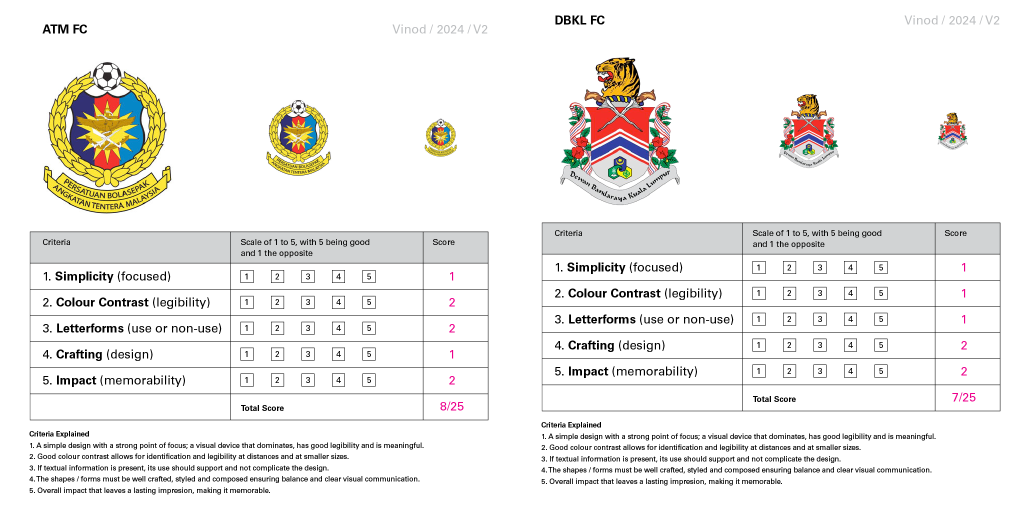
Now let me explain my evaluation for the bottom two clubs. On simplicity, both faired poorly. The badges are too complicated with too many colours and too many forms. Any point of focus is rendered mute due to the competing visual elements within the badge. The emblem in the ATM badge is clearly a focus but becomes illegible when placed against the 14-point star. It is further complicated when set against a tri-colour background. It is the same with the DBKL badge. On colour contrast both fared poorly due to the number of colours used. The DBKL badge has many smaller components in varying colours and proximity, in a reduced size or increased distance they no longer function. The ATM badge while not as colourful fares slightly better but not by much. On letterforms, the textual content for both are excessive. The ATM badge uses uppercase lettering which make it a little more legible, while the DBKL badge uses a tiled case lettering and a font not quite suited for use in smaller sizes making it appear smaller. The textual content for both is an additional distraction on a crowded field. On crafting both badges feature very intricate details not particularly suited for badges or logos. The design needs to be unified and simplified for it to stand out. The impact of each of the badges is not very memorable or easily decipherable. They lack a point of focus, they use too many colours, and have too many forms with too much detail, all of which in combination reduces its impact.
Each football badge has been evaluated against the set criteria explained earlier in detail. The explanation of the badges that received the highest and lowest points, provides insight into the thought process during the evaluation. This is repeated for every other badge on the list of 14.
With the evaluation done and the insights gained, I decided to reimagine the 14 Malaysian football club badges.
The process took longer than it should have, my illustrative skills are not what they use to be. Also, determining key elements (point of focus) for some of the clubs took a little research along with some trial and error. Many times, I had lost objectivity and could not determine good from bad in my own designs. Thanks to my experience, but also the lack of a deadline, I left the project in limbo only to return to it after some time had passed, lending a fresh pair of eyes on the design. Lastly my day-job got in the way, and I was unable to focus on this side project.
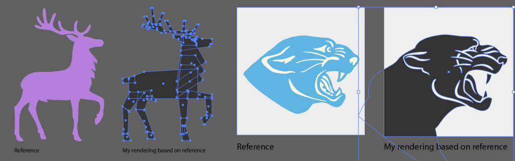
In any case, I did eventually complete the reimagination of these Malaysian football club badges to my satisfaction — some more than others. Along the way I did reference some graphic illustrations online to create the forms needed, namely the panther for the Penang football club badge and the stag (deer) for the Negeri Sembilan football club badge. I revised these to my liking of course but needed to declare them here lest I be lynched later.
In most of the cases in the reimagination, I tried to use elements from the original badge, in some of the cases these were probably not a good idea. The Kedah FC and the Sabah FC badges were my least favourite reimaginations. The point of focus in the Kedah FC badge, the leafed wreath and football, was not emotionally charged enough although easy to remember and legible at distance. The point of focus in the Sabah FC badge were also wreaths, a football and the Kinabalu mountain. While the mountain does have emotional quotient, I found it difficult to portray it in a manner that could play a central role. I fear I may have to revisit these two designs down the line.
Enough talk. Time for the reveal. I hope you like what follows, and I hope it sparks an interest to revisit your favourite club badges. And should any football club-boss find the design interesting or would like to adopt the design featured here or would like to commission me, you can reach me here. I can dream right?
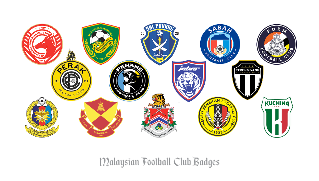
For context, featured below are the current Malaysian football club badges.
The following Malaysian football club badges were reimagined. My approach was to either use the existing devices in their badges or to introduce fan-favourite or historically related devices into the badges.
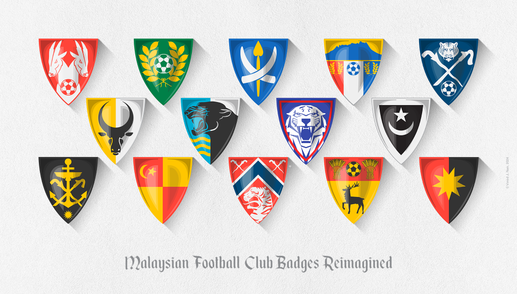
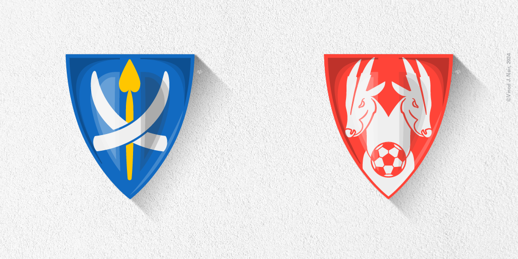
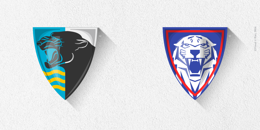
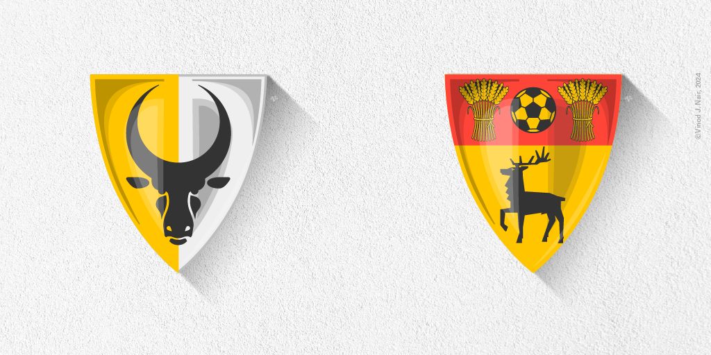
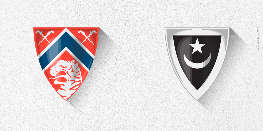
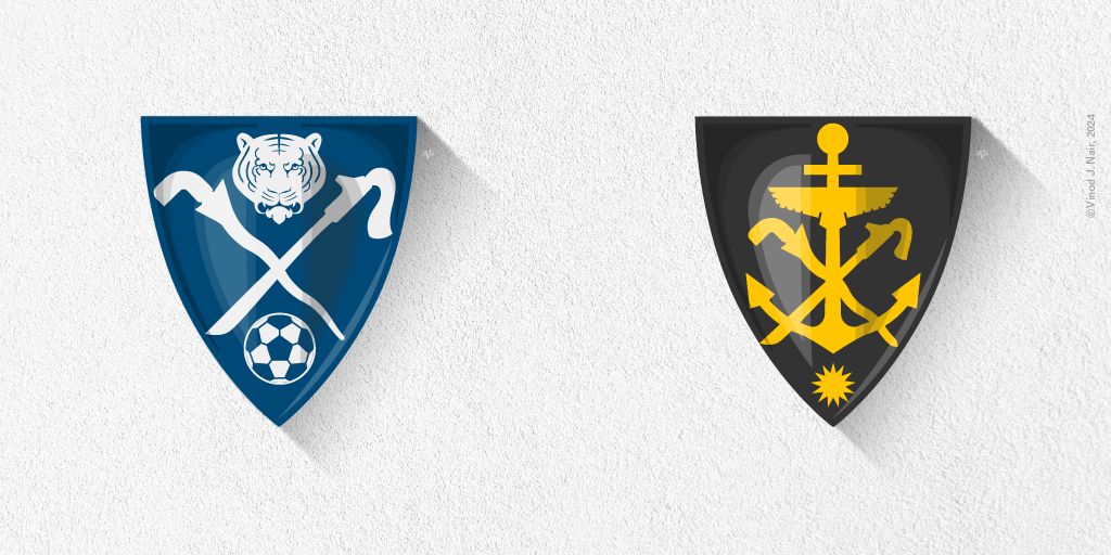
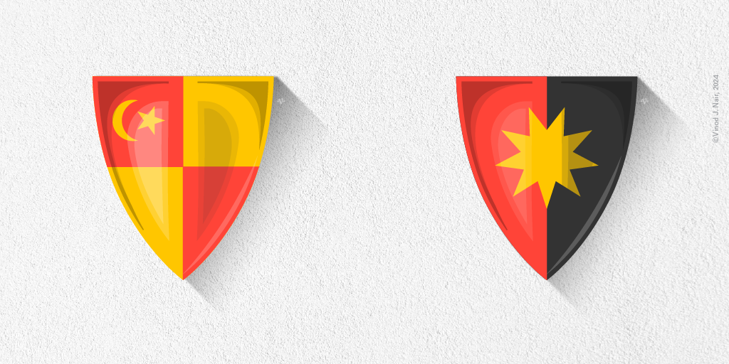
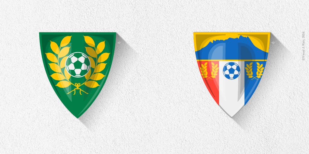
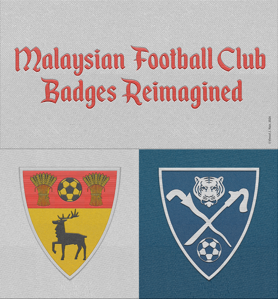
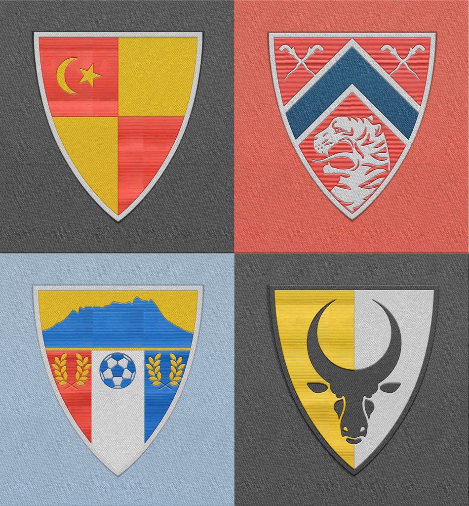
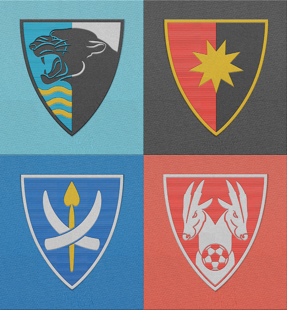
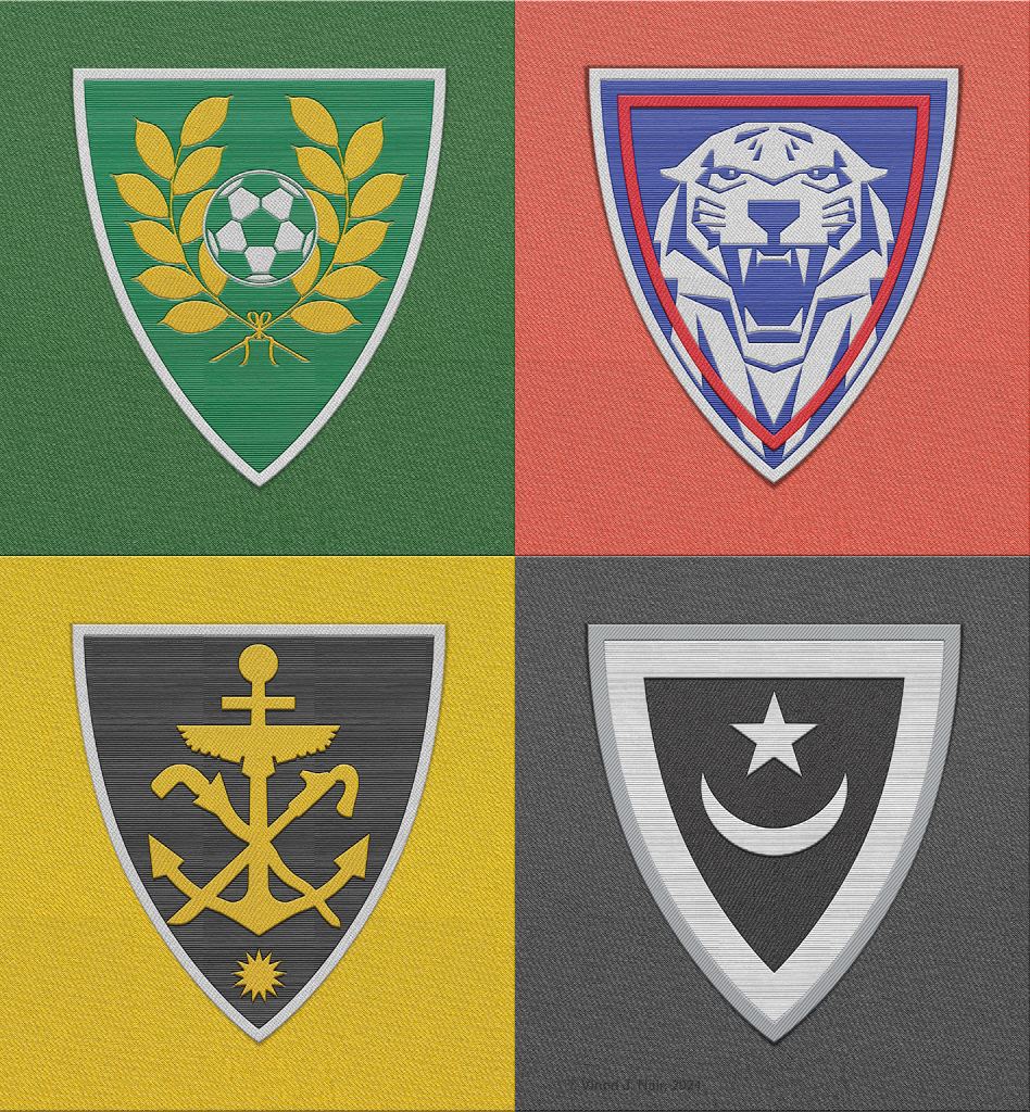
Figure 18. The reimagined badges simulated as woven badges that would be worn on football jerseys. © Vinod J. Nair, 2024.