
Dr. Julia was working on a research project, which was funded by the Ministry of Higher Education (Fundamental Research Grant Scheme). Her research project involved teaching children with dyslexia and pandemic-induced learning loss how to read in English using multi-sensory learning approaches.
Interestingly, Dr. Julia developed “a set of fonts” for her project. After I read this sentence, I paused. You see, I had never come across an individual, from a non-design background, who wanted to create a font for their project. Most people are generally convinced by designers to embark on such a path. Also, most people would merrily download (poor quality) fonts from the great expanse of the internet.
For most people, fonts and typefaces are simply ‘things’ that are free and preinstalled on a computer.
Dr. Julia on the other hand had the wherewithal and awareness to recognize that this is something that she needed to create specifically for her project and not something to compromise on.
Recently the JPJ or Jabatan Pengangkutan Jalan Raya (Road Transport Department) declared that all electric cars will mandatorily use a JPJePlate—a good step in the direction of standardising number plates in Malaysia. However, instead of developing their own font (like the Lembaga Lebuhraya Malaysia or Highway Transport Authority), the JPJ was quite content to adopt an archaic German font called FE-Schrift or Fälschungserschwerende Schrift (‘forgery-impeding typeface’) designed in 1978 instead of local options, like the one I myself designed called JPJ 1. The FE-Schrift option came with the manufacturing technology bought lock stock and barrel from Tonnjes via Handal Ceria in Cyberjaya who uses it to manufacture the JPJePlate. It is not that we lack the talent or the manufacturing technology, it is just easier to buy and thus we continue to empower western creativity over our own. This is the prevailing mentality, and that is why Dr. Julia’s decision above was surprising as it went against the prevailing trend.

Now the postgraduate student probably did not realise the complexity involved in creating a font and to be fair, neither did Dr. Julia at the time. For a font to work seamlessly, it takes a team of people with different capabilities. One of the individuals would be a font engineer, a person with some programming background to resolve the kinks in the codes to see how the font behaves on different software or operating systems. The crafting of an optimal working font requires experience that for a novice can be hard to find. Despite this, it is laudable that the postgraduate student was able to produce a font even though there were issues. It would have been a steep learning curve.
Even I am only able to design an optimally working font but to ensure seamlessness requires individuals with different specialities to collaborate in the making of a font or typeface. This can get expensive and is often the straw that breaks the camel’s back.
So, after receiving Dr. Julia’s email, I responded that I would be willing to help with the problem. However, after looking at the existing letterforms, I felt it would be easier to develop the ‘font’ from the ground-up again.
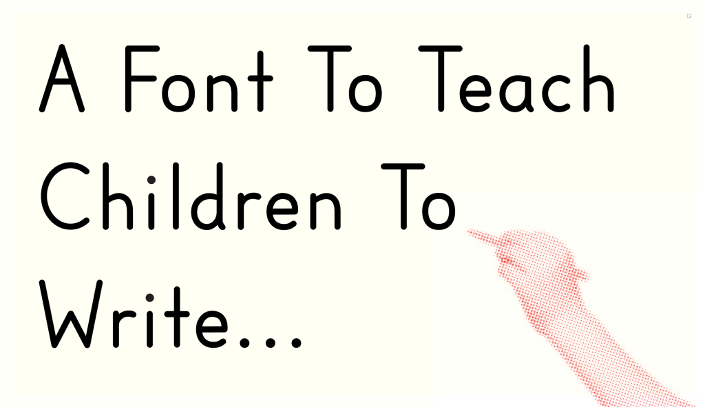
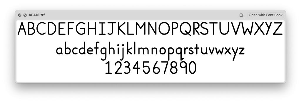
The objective in the creation of the font according to Dr. Julia was to create a font to teach children how “to write in the most natural manner possible…”. Essentially the letters of the ‘font’ would function as a demonstration on paper and a child would practice writing the letter in the same way.
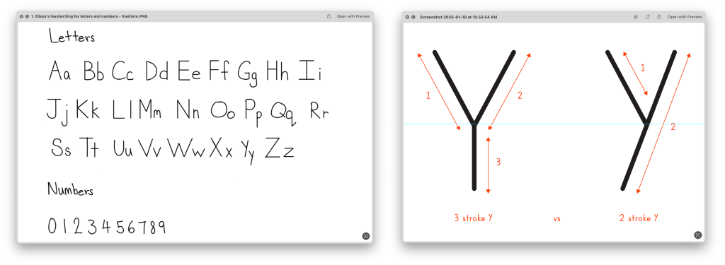
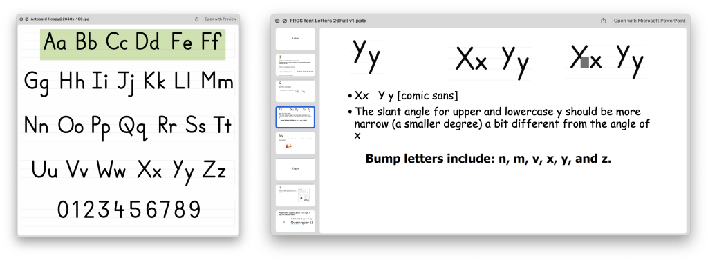
One important consideration was to reduce the level of complexity in the letter forms and one way of doing so was to reduce the number of strokes in the letter (figure 2). To this end Dr. Julia provided a sample of her graduate assistant Elisa Fay’s handwriting which emulates the stroke simplicity mentioned. She also provided a slew of other material some related to diacritics and others handwriting practice templates to showcase sample use of the font.

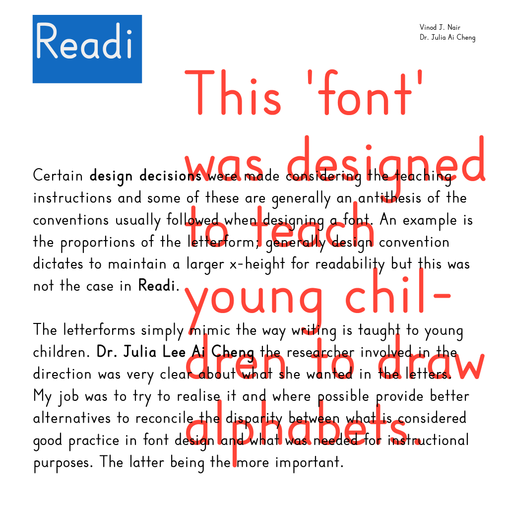
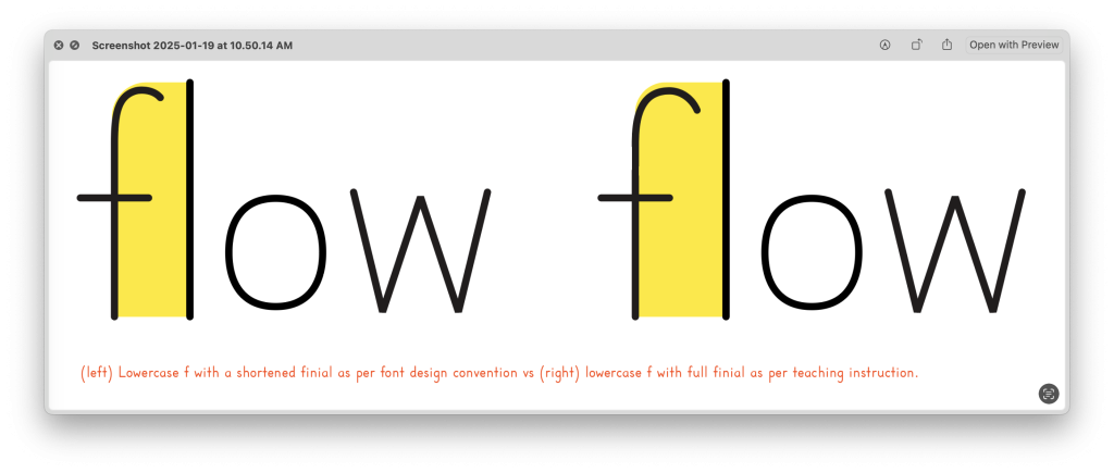
So, in a sense some of the considerations usually taken into font design may have to be reconsidered as that would add complexity in teaching and learning instruction. While this was the case most of the time, there were instances during the design process where such compromises would result in unusual letter spacing (figure 3). So, in cases like these Dr. Julia had to adhere to the norms in font design practice; in the case of the letter f, the blunting of the finial (upper curve) to avoid it creating large inter letter spaces.

Throughout the process, there was a lot of back and forth, long explanations, and detailed checks on the side of Dr. Julia and her graduate assistant Elisa. All this would eventually result in a very readable font — even though its intended use was not as a font but rather as a sample that appears in workbooks/sheets on how to write.
For my part, I needed to determine the stylistic direction of the font, and based on the previous designer’s attempt, I suspected that the design needed to mimic some level of naturalness while also embodying clarity in its strokes for the purpose of teaching and learning.
Ultimately, once the design direction became clear to me, the process of designing the ‘font’ began. The design was straightforward, unassuming, geometrical, and simple. Despite this, there were some challenges. More on this later.


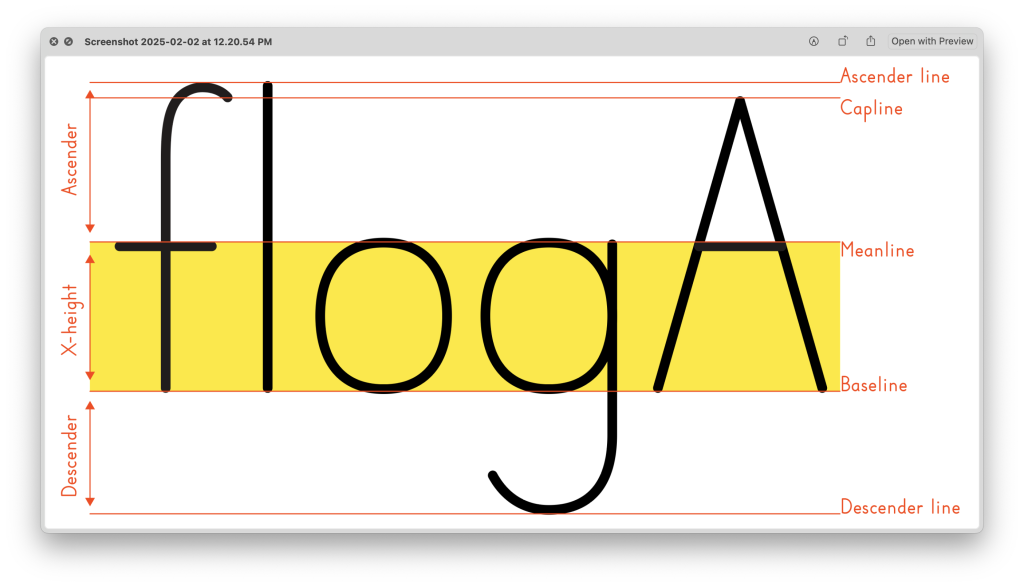
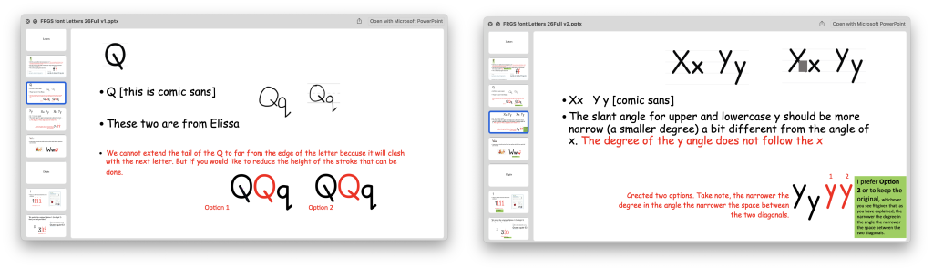
One of the challenges I faced were with the proportions of the letterform requested. The initial option 1 design (figure 4) had shorter ascenders and descenders — spaces above and below the x-height, see figure 5. However, Dr. Julia requested that the ascender and descender spaces be enlarged. The reasoning for this was that the larger spaces would allow children more room to draw letters with ascenders or descenders.
The reason for my initial consternation was that longer ascenders and descenders tend to reduce readability because our brain recognises and reads the shapes in the middle of the letterform (x-height) and thus the bigger it is, the more readable it becomes while conversely the opposite is true. These are common and successful strategies used for many text fonts i.e. Helvetica, Univers, Times New Roman, Caslon and so on. Since the primary objective of this font was not to function as a text font but rather as a means for instruction, Dr. Julia’s request made absolute sense.
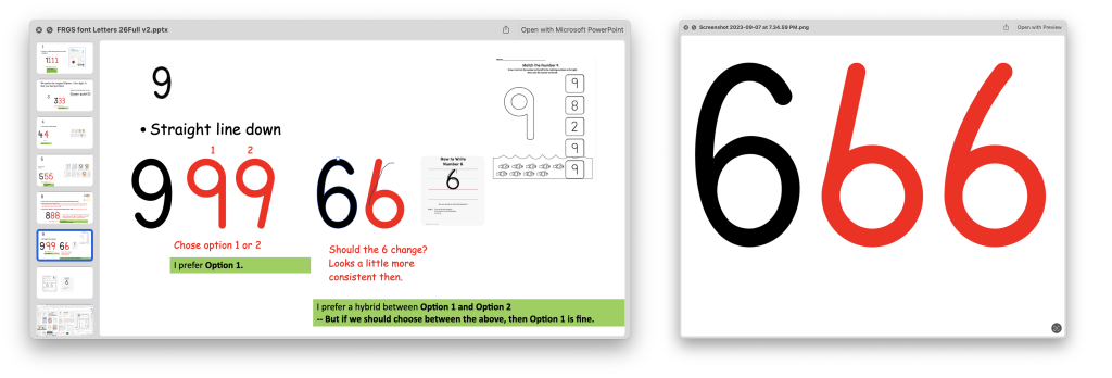
Once the stylistic direction was determined, I constructed the first basic shapes of the letterforms within the proportions agreed upon (figure 6). These were simplistic letterforms using basic lines and curves without the introduction of any contrast or nuances commonly practised in font design. I did refer to Elissa’s handwriting sample at times to understand the stroke mechanics when constructing the shapes. Dr. Julia’s comments — there were many — would necessitate some revision and some rethinking throughout the process.


Sometimes we were unable to find a common time to meet and so we fell into a pattern on commenting in the file (figure 7 and 8). Our comments, replies, and explanations were sent via email and as a result what would usually transpire over a conversation, and then later be lost, would be documented in detail.
This pattern of communication, I believe, gave both of us time to read and re-read each other’s explanations and suggestions and thereby understand our intentions and wants better.
Conversation often tends to be hurried, as we tend to be too quick to reply. The written replies slowed the process down and made it clearer as a result.
The next challenge in the process was the vowel letters and the diacritics. It was quite difficult to find the right Unicode for these individual letterforms. It took me a significant amount of time to first identify the Unicode for the diacritics and vowels and then later to find it in the software I was using (FontLab). Some of the diacritics were in the larger Latin letter set (Greek and Cyrillic), while 3 others did not feature at all.
Unicode: Every letter has a dedicated Unicode for your keyboard to type it out and for software to recognise it. A Unicode is, “an international encoding standard for use with different languages and scripts, by which each letter, digit, or symbol is assigned a unique numeric value that applies across different platforms and programs”.
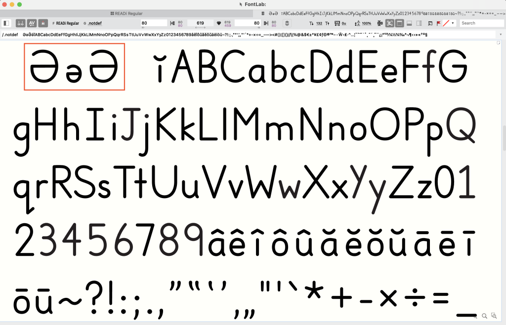


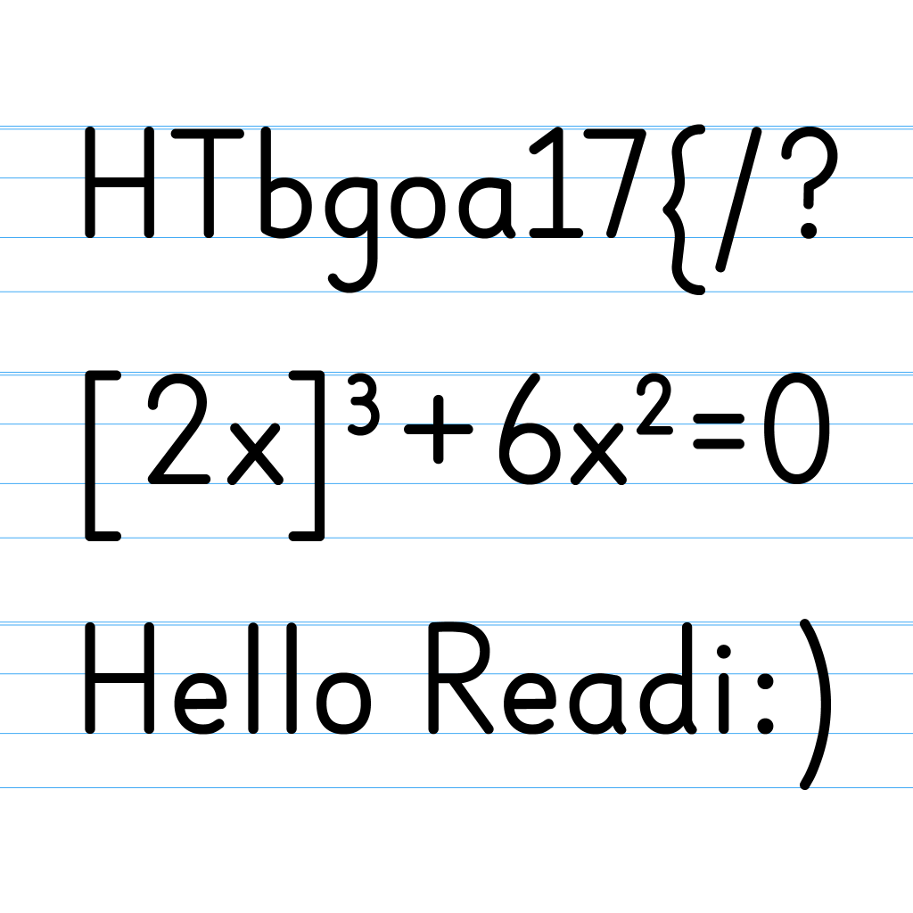
The upside down e (schwa), which is part of the Cyrillic character set was one of the more difficult vowels to find. Once I completed the uppercase, lowercase, numerals, diacritics, and vowels, I took it upon myself to create the punctuation and a few other character glyphs in addition to what was requested.
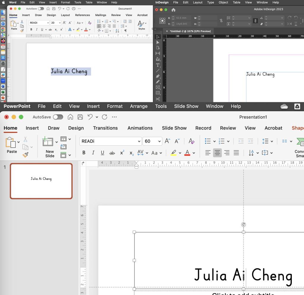
There were a few technical challenges with the font due to its proportions (ascender, x-height & descender). The line gap was one and the other was (as is always the case) the kerning. I spent a couple of nights redoing it from scratch and I tested it on MS Word and PowerPoint and it performed as expected. At this point the name that was used for the font was “Readie”, I pointed out to Dr. Julia that the letters “…die” at the end may not be a good choice and so we eventually settled with “Readi”. Finally, it came time to generate the first version of the font.

The real work on the font began at this point for Dr. Julia and Elissa. They put version 1 through an extensive battery of tests where they began to highlight a gamut of issues. One of the issues was an embarrassing rookie mistake. During the process of construction and design, I was testing out different weights for the strokes — the difference was marginal. Once I decided on the stroke weight I thought I had selected and updated all the letters. I did not. The worse part was that it was not apparent to me until it was pointed out!
Now, this is a classic example as to why designers need to step back from their designs for a short while or to get a fresh pair of eyes to look at the designs before handing it off. I was so close to it that I did not spot the difference in weight. In any case, once this was pointed out, I looked through every character to ensure the correct weight was applied.

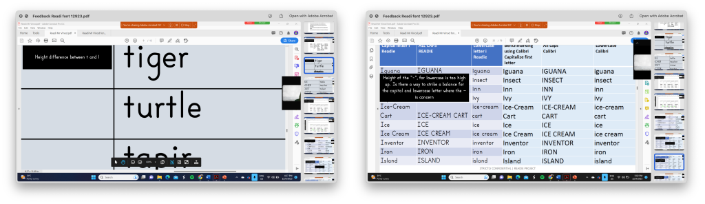

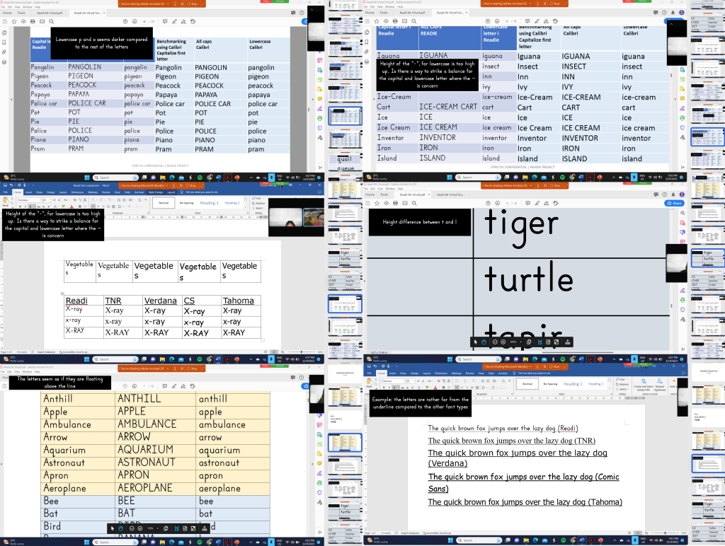
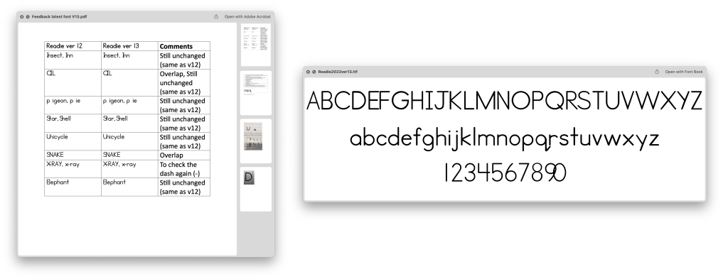
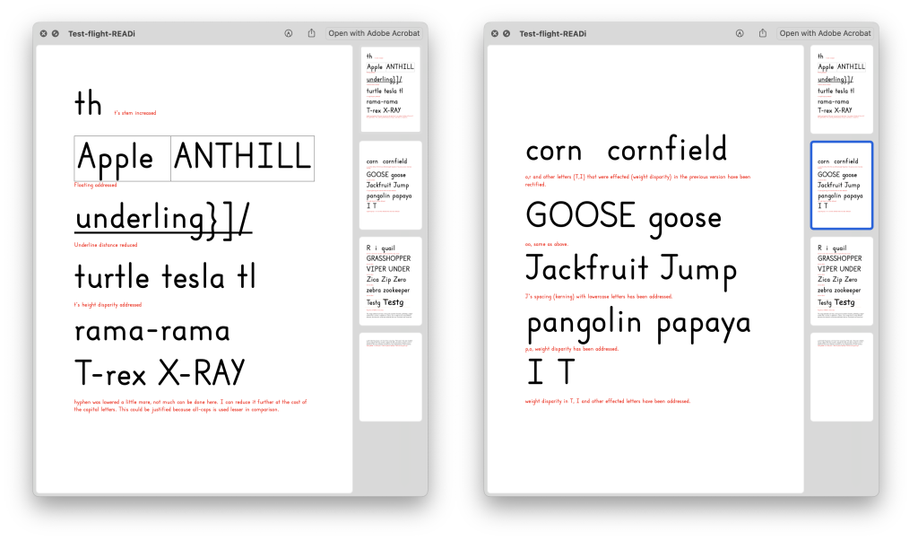
Many of the issues in the 25-page feedback document were easy to resolve; height of the vertical stroke for lowercase “t”, the distance of the underline from the baseline or the weight discrepancy in some of the letters. The more difficult challenges pertain to the kerning of certain letters like capital “J” or other letters like T, X A etc. The line gap was another difficult issue, it tended to make the sentence appear smaller in comparison to other fonts — this was largely due to the proportion of the letterforms, this took a lot more time to resolve.


The net result from these changes resulted in the font looking and performing a lot better than it did before. At this point, Readi was performing well. However, I would get the occasional email off and on from Dr. Julia regarding an issue here or there to resolve. One issue that continues to perplex us is how the font sometimes behaves differently in certain software i.e. the letter J would appear properly kerned in Microsoft Word, Adobe InDesign, Text Edit, Pages but not in Microsoft PowerPoint or Excel. I assume this is something only a font engineer (or someone with more experience than myself) would be able to troubleshoot and resolve.

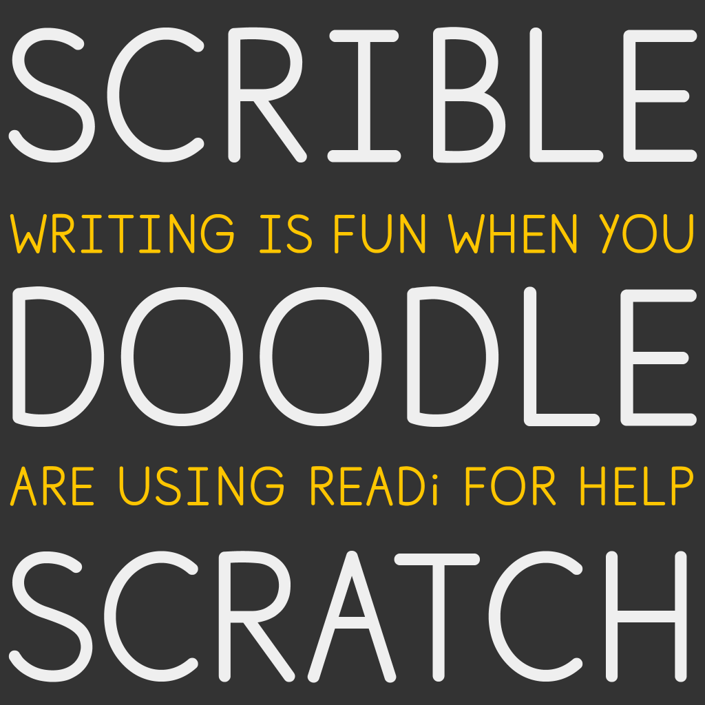
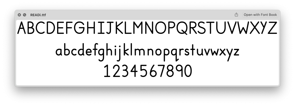
In any case I am glad that I was able to work with Dr. Julia and her graduate assistant Elissa. Readi performs as well as it does today only due to their tireless checks and tests. Try typing in Readi below:
.
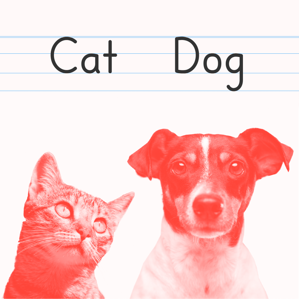
The following are some font presentations of Readi: