
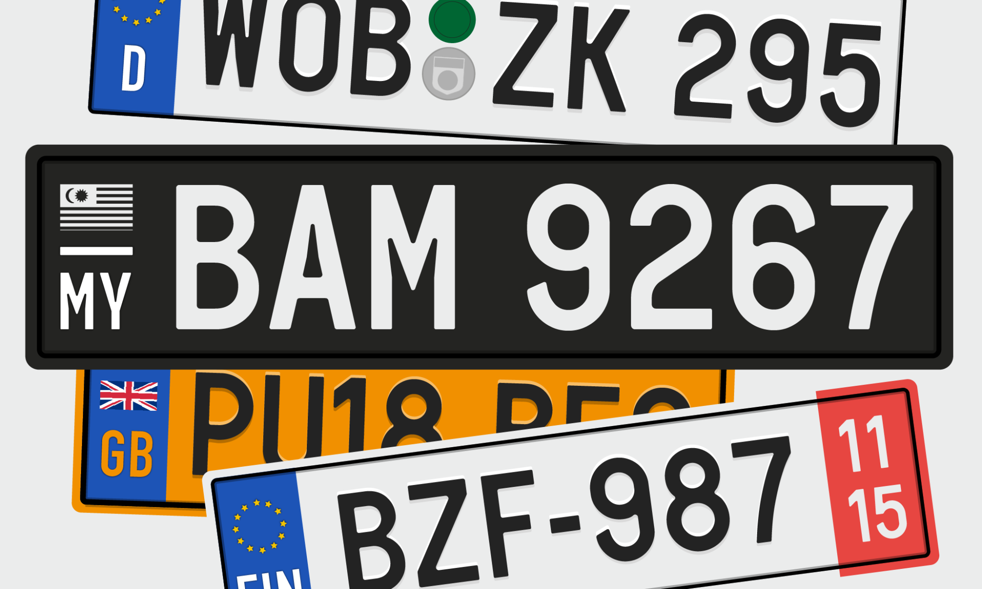
In 2018, peeved with the variation in number plate typefaces used by vehicles in Malaysia, I published an article (here previously) showcasing 3 typefaces that I designed as possible standardised options for car number plates in Malaysia (Figure 1, below). A monograph on the same topic was written and published in early 2019. Later that year I conducted a Twitter poll for feedback (read more here), the results led to the redesigning of the ubiquitous Factory Manufactured Typeface (FMT) used on number plates by most vehicles in Malaysia (Figure 2).
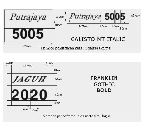
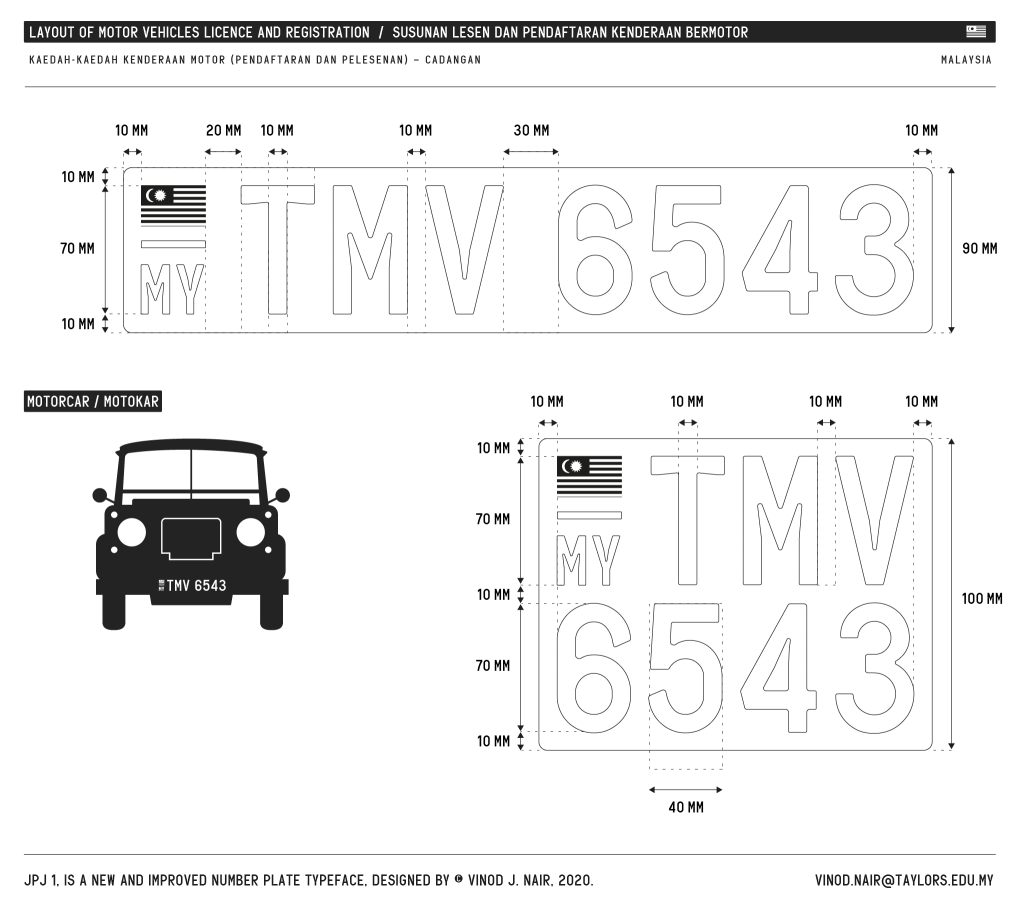
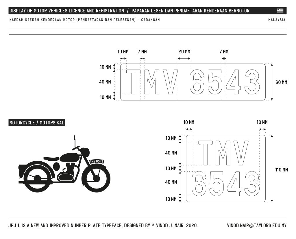
Before I begin, it is important to clarify that the terms ‘vehicle number plate’ or ‘vehicle license plate’ are one and the same. They both refer to the plate that houses the vehicle’s ‘license registration’, which is a combination of letters of the alphabet and numerals (alphanumeric), i.e. WNE 3314. The display of a vehicle’s license registration in Malaysia is governed by the Road Transport Act 333 (1987, p. 38), section 20 (Display of motor vehicle license). However, unlike Singapore, the precise particulars of this display have not been articulated in detail and elucidated in diagrams and therefore encoded in law via the act. That said, the Road Transport Department (RTD or known by its Malay name Jabatan Pengangkutan Jalan aka JPJ) has issued rules governing the display of vehicle registrations on license plates through its website (plate number specification). Here, the numeral sizes, colour, and even fonts are indicated in two brief diagrams. The fonts depicted in the diagrams are Calisto MT Italic and Franklin Gothic Bold (Figure 3). Whether this is a recommendation or rule is uncertain because in practice the typeface used by a majority of vehicles in Malaysia, is the FMT seen above in Figure 2. The FMT is a factory manufactured white plastic alphanumeric that is 70mm high and approximately 3mm in depth. It has been in use for decades and is not available digitally.
The fonts Calisto MT Italic and Franklin Gothic Bold are not fonts that were designed specifically for use as number plate typefaces. There is also the concern as to whether the RTD has obtained the license to use the said fonts. I suspect the choice not to feature the FMT, which has the widest usage, in the “Number Plate Specification” diagram (Figure 3) is due to the fact that the typeface does not exist in digital form. It would be unfair to fault the RTD in its choice, as knowledge on typeface selection or appropriateness isn’t within their area of expertise. In countries that have design awareness, these areas are governed by design policies and entrusted to national design councils to advise and or execute. Thus far, there are four countries in Asia that have design policies; Japan, South Korea, India and Singapore (International Council of Design, 2015). While Malaysia has a government funded design council known as MRM (Majlis Rekabentuk Malaysia) under the Ministry of International Trade and Industry (MITI) its voice or role in government, I suspect, is unclear to other government agencies. The lack of awareness amongst agencies in government on how and where design can assist in areas of governance, is still a major stumbling block.
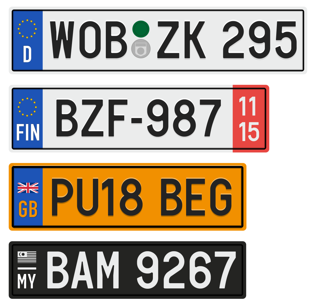
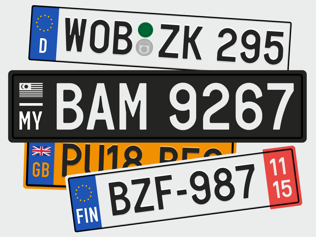
So why is there a need to have a standard typeface for vehicle number plates in Malaysia when abuse could still occur despite having standards? Well, the simple answer to that is that the lack of clear standards leaves room for a larger number of abuses i.e. “custom”, “fancy”, or “personalized” number plates. Standards are important for there to be coherence and clarity in the application of the rule of law. Countries like Germany, Italy, Singapore, UK and many more, all have standardised number plate typefaces and clear display guidelines. A standard number plate typeface will also allow for technologies like Automatic License Plate Recognition (ALPR) to be more effective for tracking and enforcement.
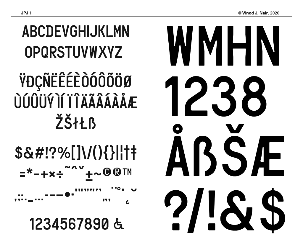
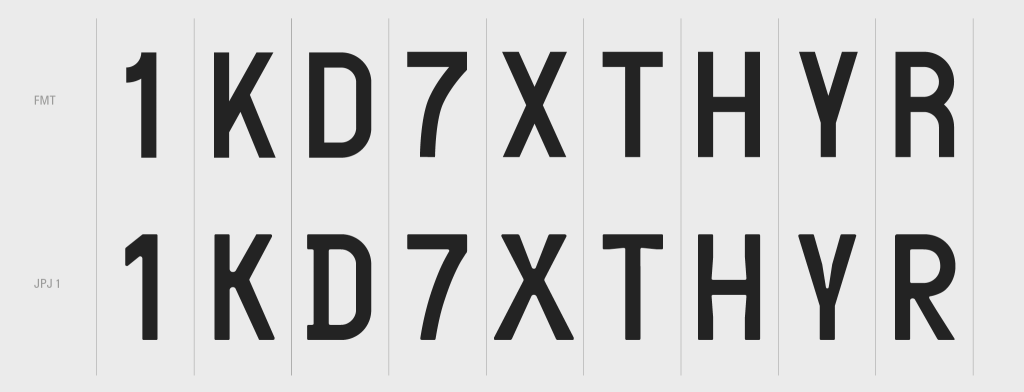
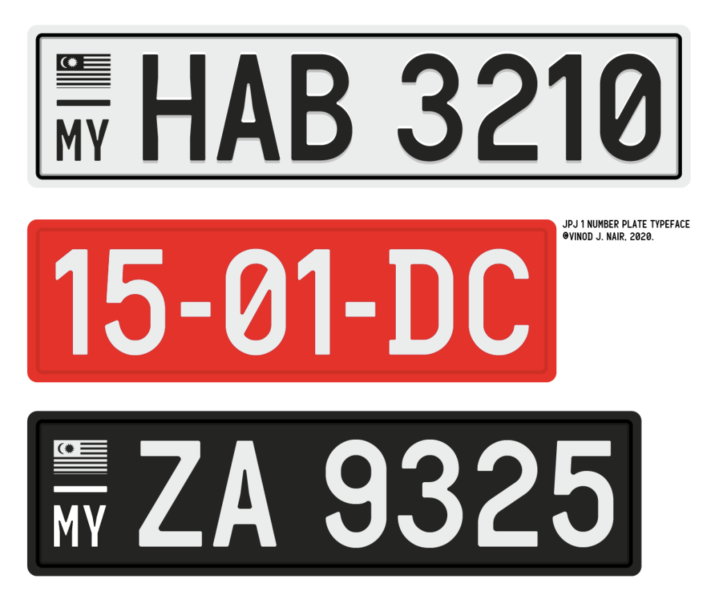
In Malaysia it is abundantly clear that the majority of vehicles use the FMT, and it is ‘RTD approved’ in practice albeit not featured in written law or in rules on number plate display. For a designer hoping to lend his expertise in this situation, it would have been a relatively easy task to replicate the FMT, as is. While the FMT has its merits, there is room for improvement. Therefore, this is what I set out to do with my revised and redesigned version (Figure 4) of the FMT, which I have named “JPJ 1”. To do so, I first began by analysing the FMT.
The FMT has a proportion that mirrors a ‘rustic capital’ in that it is condense in form but yet relatively open in face and heavily rounded. To its advantage it is legible and familiar to a great many Malaysians. It is my belief that familiarity and legibility in this case are phenomena that are interdependent or intertwined, the more familiar the typeface the more legible it may seem, and therefore easily recognisable and identifiable. There are studies on familiarity bias that so indicate. By and large the FMT conforms to the most important need, which is legibility.
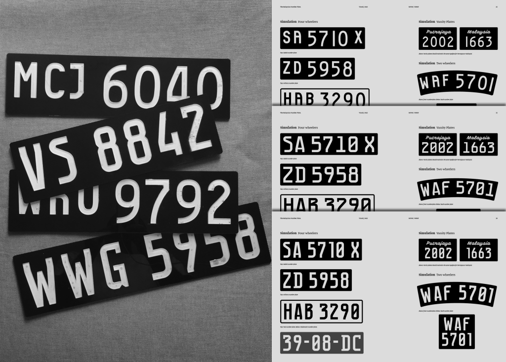
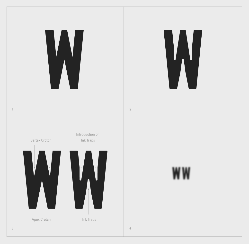
To improve on the FMT I first had to deconstruct the alphanumeric (figure 5). In analysing the FMT, it became clear that the artist based the forms on a 4 × 7 grid that reflected the thickness of the uniformed strokes. All the numbers and letters were derived from this discovered grid. Thus the FMT has a relatively consistent width and stroke thickness. This has resulted in some compromises seen in capital letters N, W and M, which under usual circumstances are wider.
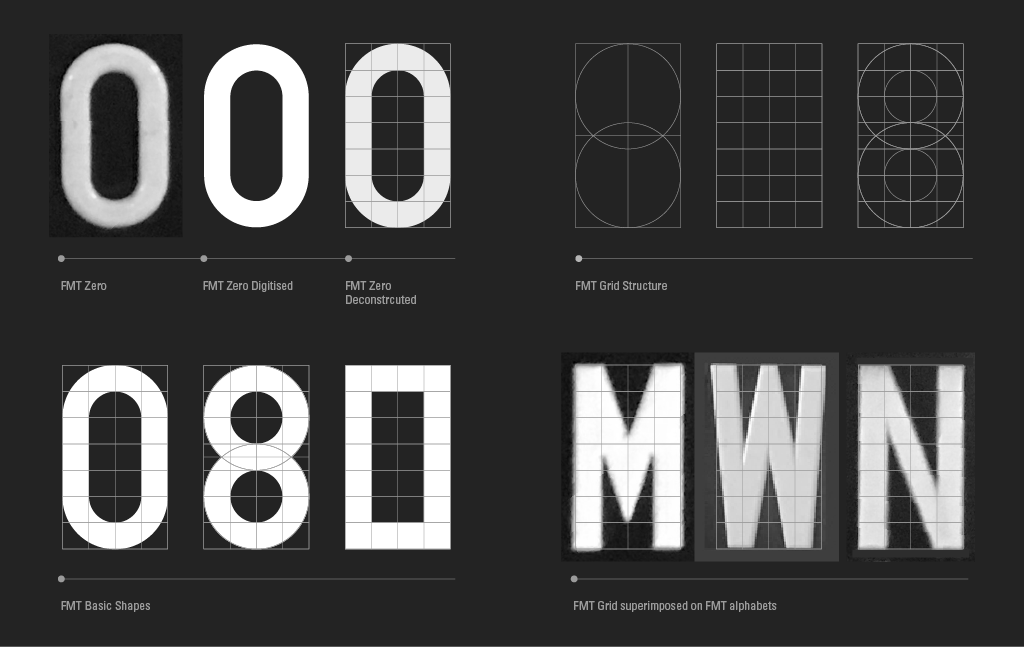
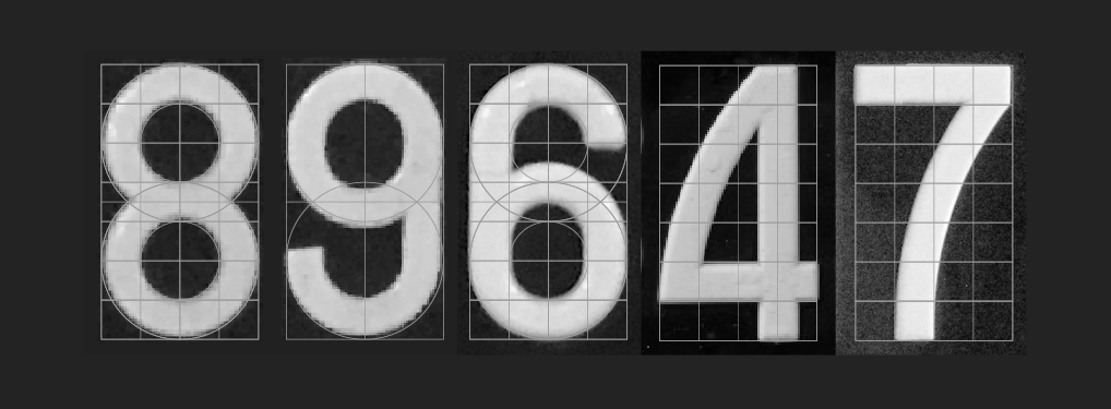
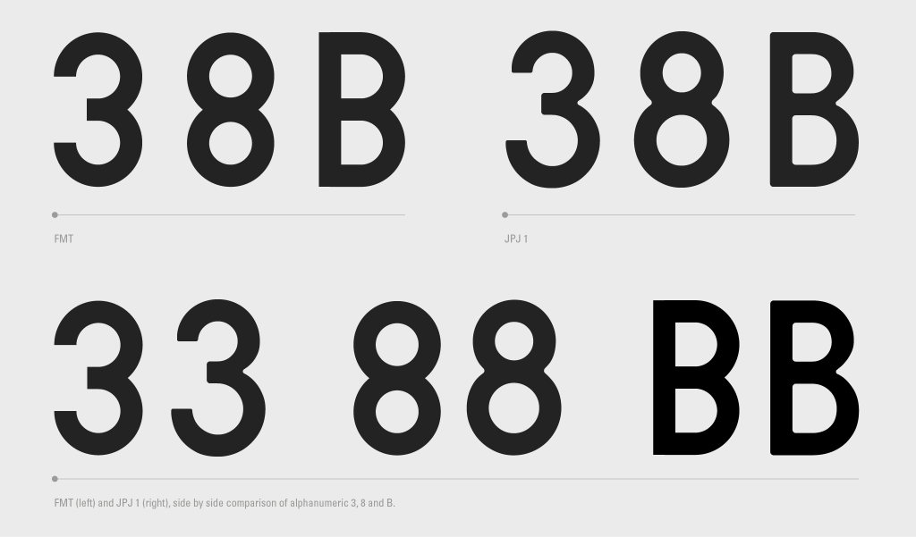
In its construction, the FMT’s numeral 8 is based on two equal sized circles while the number 9 and 6 counters are half a square larger in most instances (Figure 6). From this visual analysis of the FMT, the original artist did an acceptable job in its construction. However, the artist also ignored some time-tested conventions in typeface design. For example, the open and closed counters in the FMT 3, 8, and B (Figure 7) are equal in size, as a result the forms seem top-heavy. This visual dissonance occurs simply because of the way our brain deciphers visual information. As per convention, the solution is to reduce the size of the upper story open and closed counter to address this optical illusion (Figure 8).

In addition to the above, contrast and ink traps were introduced into JPJ 1 with the intention to boost readability and legibility. Ink traps were originally conceived by Mathew Carter when designing the typeface Bell Centennial, it “compensated for the amount of ink spread that occurs when printing on low quality paper at high speeds”. The ink trap would retain features of the letterform under adverse conditions. With this in mind, the same principle could be achieved with JPJ 1 so that it retains its core characteristics at distance when blurred (Figure 9). As objects are further away they tend to look blurry because of particles in the air that obscure the clarity of the object. Thus, contrast and ink traps were introduced for the alphabets M, W, V, N and more (Figure 11).


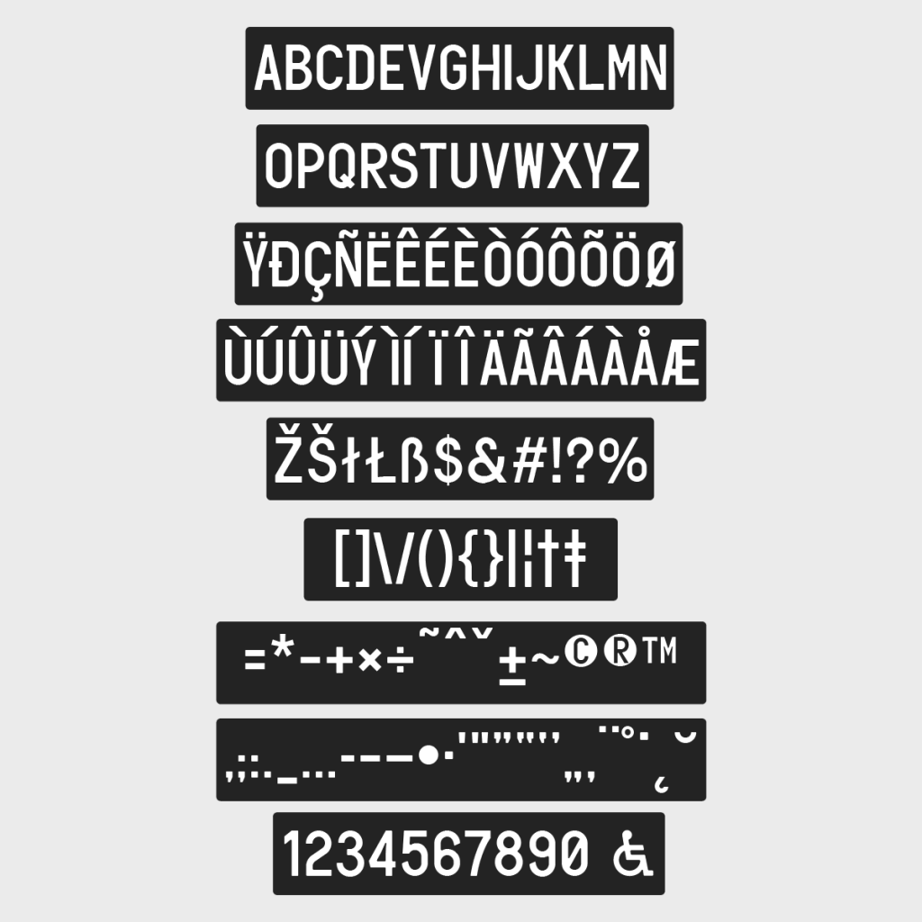
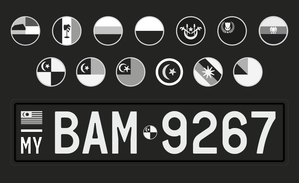
When JPJ 1 was conceived it was primarily aimed for use on number plates in Malaysia. However, I realised that there are other countries in the region and internationally that did not have a standard for their vehicle number plate typeface. Thus, an entire Latin character set that included international glyphs with punctuation was developed (Figure 13).
This year (May 2021) the issue of standardisation was raised (once again) by Bukit Aman criminal investigation department director Datuk Huzir Mohamed and this was reported by news portals. Having worked on this since 2017, I emailed my proposal to Datuk Huzir and The RTD Director Dato’ Zailani Hj. Hashim. In response the RTD Director informed me that he will raise the matter (again) with Putrajaya, the Malaysian government’s administrative capital. He went on to mention that this matter has been raised and deliberated since 2016 but was postponed due to unspecified reasons.
I suspect the reasons for the repeated delays, which may or may not be justified, is due to the complexity of the system being deliberated and the cost factors involved. The issue is much bigger than just a typeface. The typeface is one very small component of larger “Intelligent Transport System” (ITS) that is being worked out by the Ministry of Transport (MOT). The deliberations involve several enforcement and administrative agencies and many different technologies. RFID number plates, Automatic Number Plate Recognition (ANPR), vehicle On-board Unit Systems, Global Navigation Satellite System are all different types of “Vehicle Identification Systems” that are being considered. These involve infrastructure costs that are in the millions. The MOT is in favour of RFID (active and passive) number plates since 2017, used in combination with ANPR. So far, there has been no discernible action on the Malaysian ITS Blueprint 2019 with regard to the above, and in relation to vehicle license plate display format and the number plate typeface.
In closing, I believe the JPJ 1 number plate typeface that I designed has potential due to its familiarity and relatability, the innovative introduction of ink traps to improve legibility and readability at distance, the rounded corners to facilitate metal embossing, a wider range of Latin characters for international adaptability, a digital typeface for use to develop RTD diagrams, and a national vehicle number plate display format that improves upon the current format and considers cross-border identification. This offers JPJ 1 not just as a solution, but a designed solution.


I’d like to thank José Rodríguez from Texas (USA), for his technical insights on number plate designs. He can be contacted here.
Great honest article.
Love this. Learned so much about something we take for granted but in actual fact, has tentacles in governmental policies and legalities.
That’s a great insight! Love your typography works!
Onwards to design literacy in governance ?
Fantastic work, Encik Nair. Hope YB Loke notices this great article. Please expand further as to how this proposal would accommodate those lengthy “vanity” plates such as XIII NAM, PERFECT, MALAYSIA, BAMbee, etc.
Thank you for your much appreciated comment. I had actually looked into accommodating vanity plates, however to do so would require the use of another specifically designed typeface or adapting an existing typeface. I actually covered this in the monograph that I wrote, here are the some of the pages relating to it https://imgur.com/a/bbBgXFt . The pages in the links, I opted for the later although legibility would be an issue here. This is probably something I can look into if the project would go on to be accepted. Thank you again for your comment.
Thank you for your appreciation and suggestions. I shall take note of them.
Is this font available for use? ?
Thank you for your interest. At the moment is it a controlled font that is licensable (subject to type of use).
Fantastic article. A real eye opener. Kudos to you Vinod!
Thank you for your kind words.