
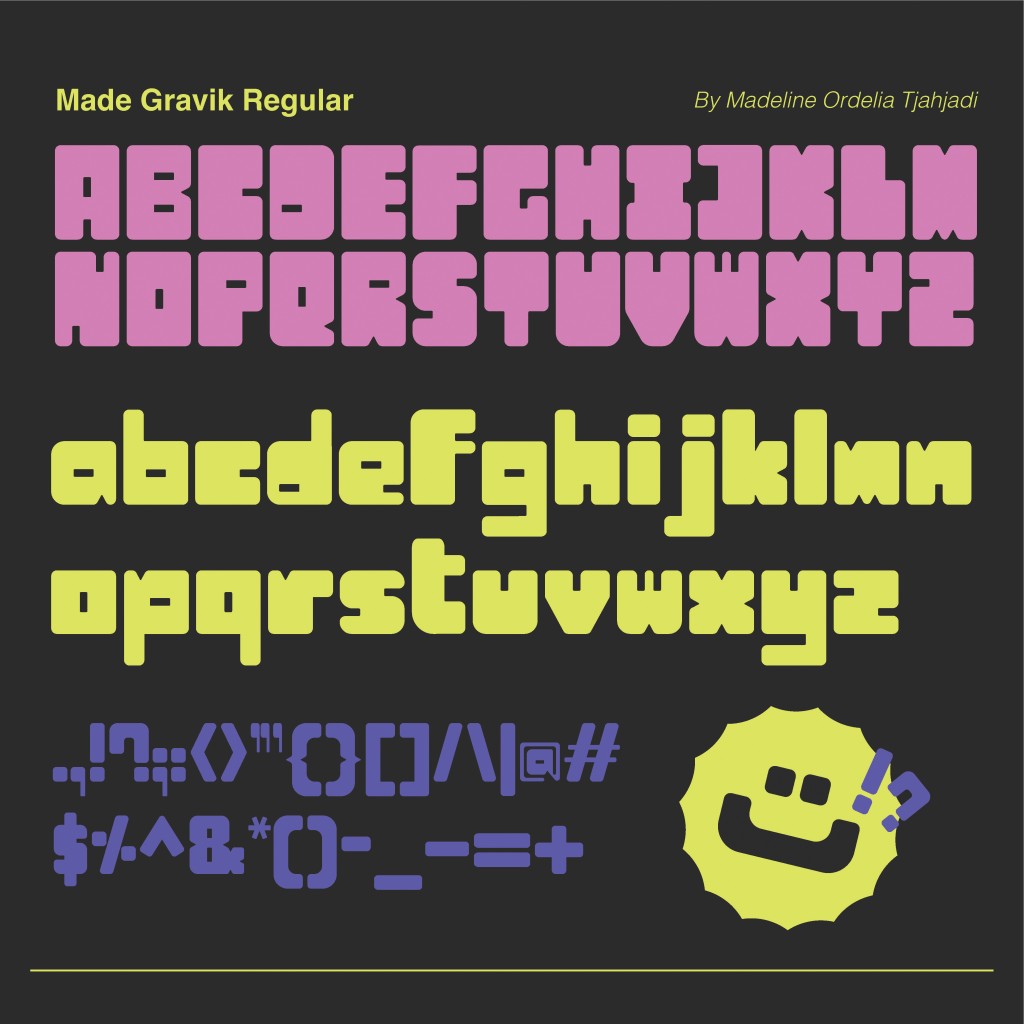
Made Gravik combines neatness, boldness, and a playful spirit. Designed especially for graphic designers, this typeface offers versatility for branding, posters, and more. The name itself is a fusion of my own name and my target audience—graphic designers—making it quite literally made for designers.
As a design student, I know I still have a long journey ahead to grow and refine my craft. Typography plays a vital role in design, and with countless typefaces already in existence, creating something new felt both daunting and exciting. By blending my personal style with the kind of type I’m naturally drawn to, Made Gravik came to life.
Concept and References
I’ve always admired how designers use type to shape posters, logos, and entire brand identities. That admiration led me to ask: What would my own typeface look like if it reflected my personal branding? That question became the foundation for this project.
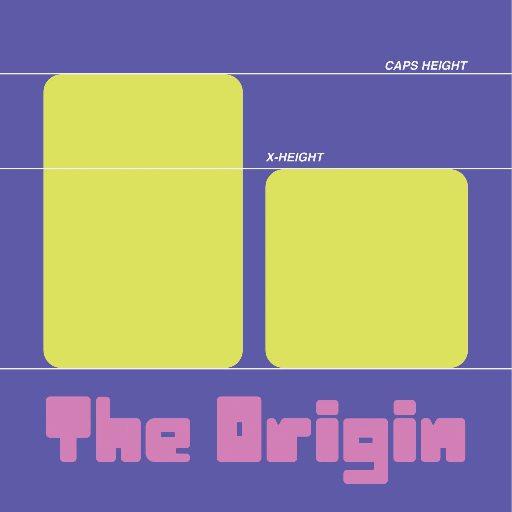
For my typeface, I designed each letterform with a bold, bulky, and blocky aesthetic. Using a consistent block shape as the foundation, I applied minimal spacing between characters. This tight spacing amplifies the typeface’s bold presence while preserving visual balance and legibility.
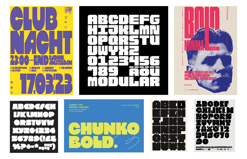
Before beginning the design process, I explored visual references to gather inspiration and support my ideation. I focused particularly on typefaces with minimal spacing, which aligned with the bold, compact aesthetic I envisioned.
Digitizing in Illustrator
Building on the foundation of my wordmark, I extended its key characteristics across the full typeface. By maintaining tight spacing between each letterform, I reinforced a bold and cohesive visual style.
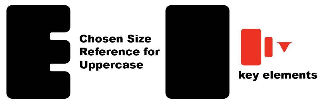
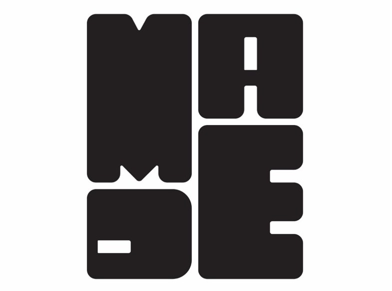
I used a large rectangle as the foundational shape for each letterform. The curved element was inspired by the ‘M’ in my original wordmark. A small rectangle, derived from the counter (or “hole”) of the letter ‘D’, was incorporated into the design, while the medium-sized rectangle was based on the width of the letter ‘E’.
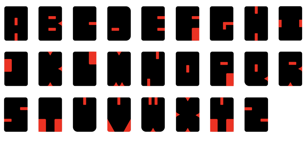
To create consistency in each letter, I used guides. This helped maintain uniformity and allowed me to easily compare each letter, especially the uppercase and lowercase forms.
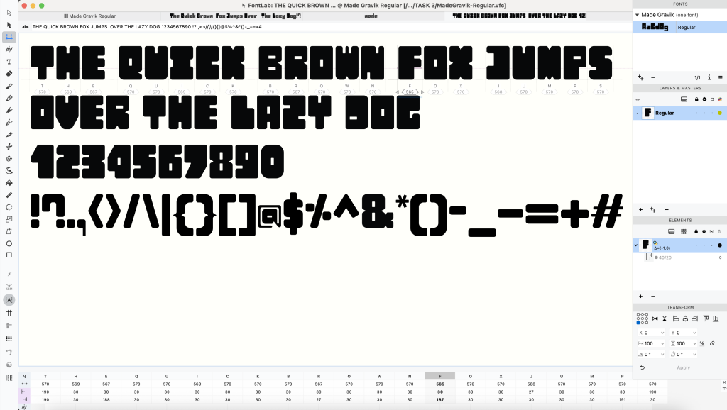
Importing the Letterforms into FontLab 8
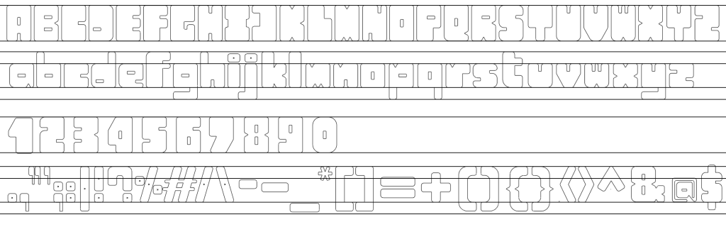
After completing the letterforms in Illustrator, I imported them into FontLab 8 for further refinement. There, I adjusted the kerning and side bearings to ensure consistent and balanced spacing throughout the typeface. Once finalized, I exported the font as a TTF file, making it ready for practical use.
After exporting the font and seeing it finally ready for use, I felt an immense sense of relief and accomplishment. I was genuinely excited to continue experimenting with it—testing the typeface in different contexts, exploring creative layouts, and sharing it with others, especially fellow designers. I’m curious and hopeful to see how Made Gravik will be used and interpreted in the future.
Font Presentation
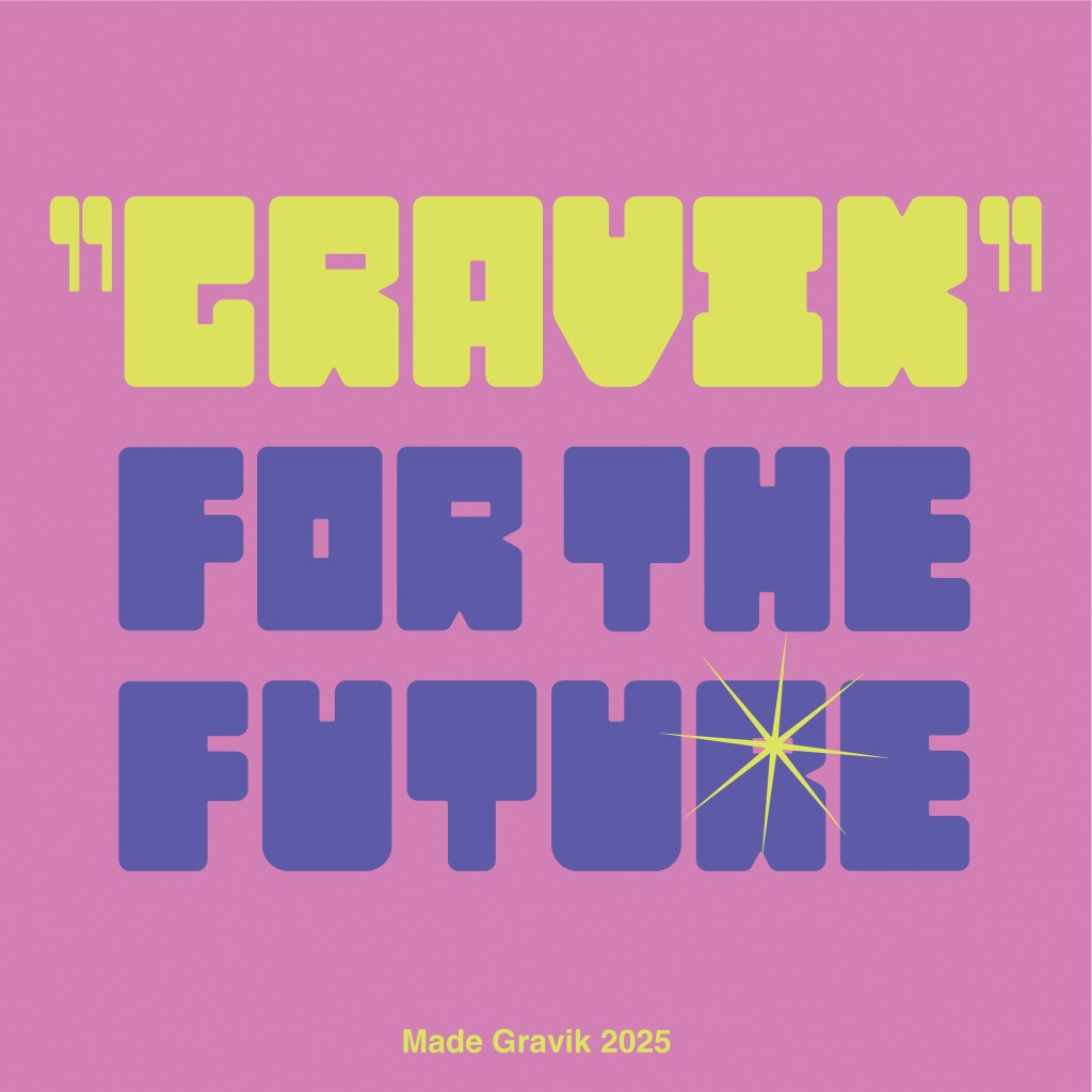
To introduce Made Gravik and showcase its potential applications, I designed a presentation using vibrant, eye-catching colors. The aim was to highlight the font’s bold personality and demonstrate how it can stand out across a variety of design contexts.
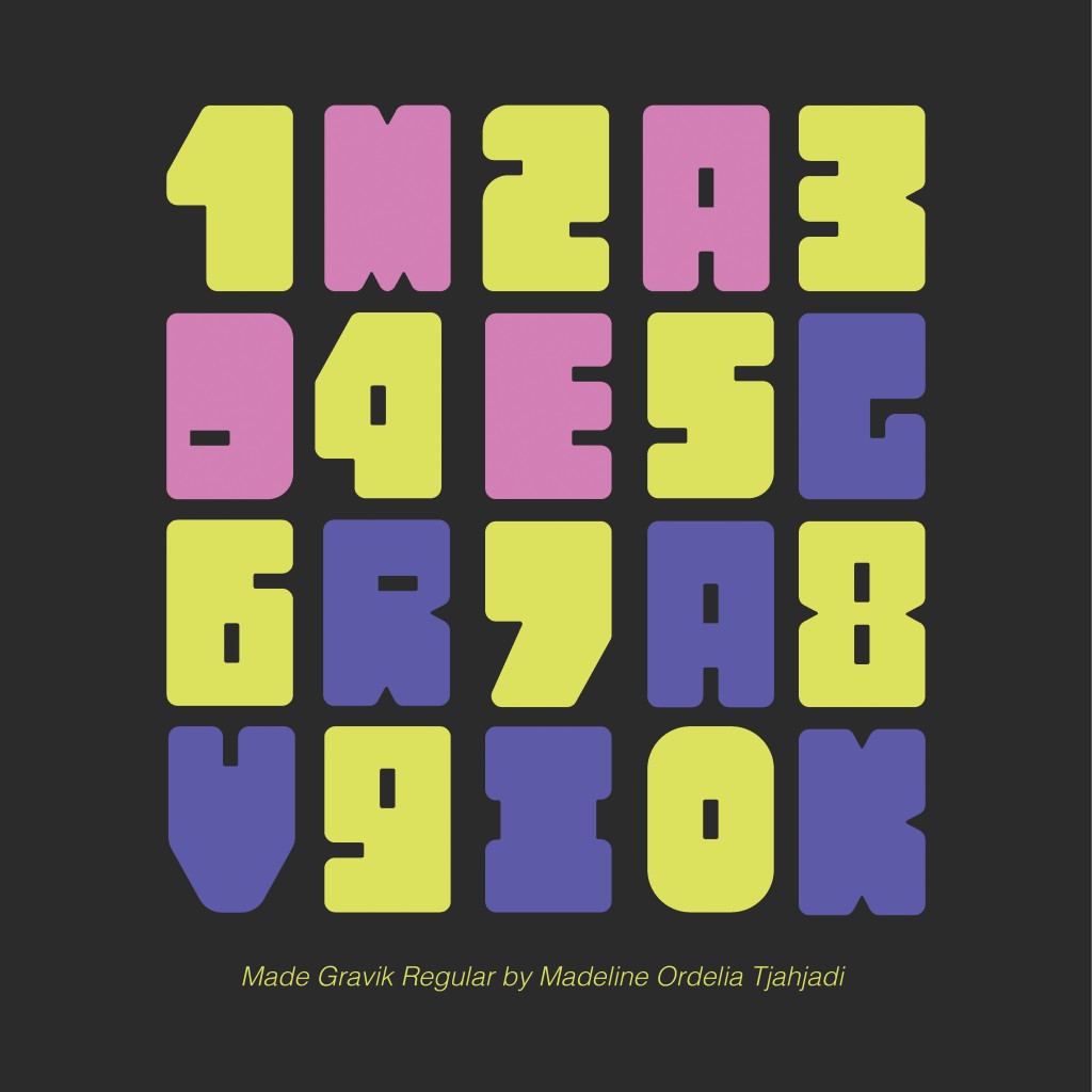
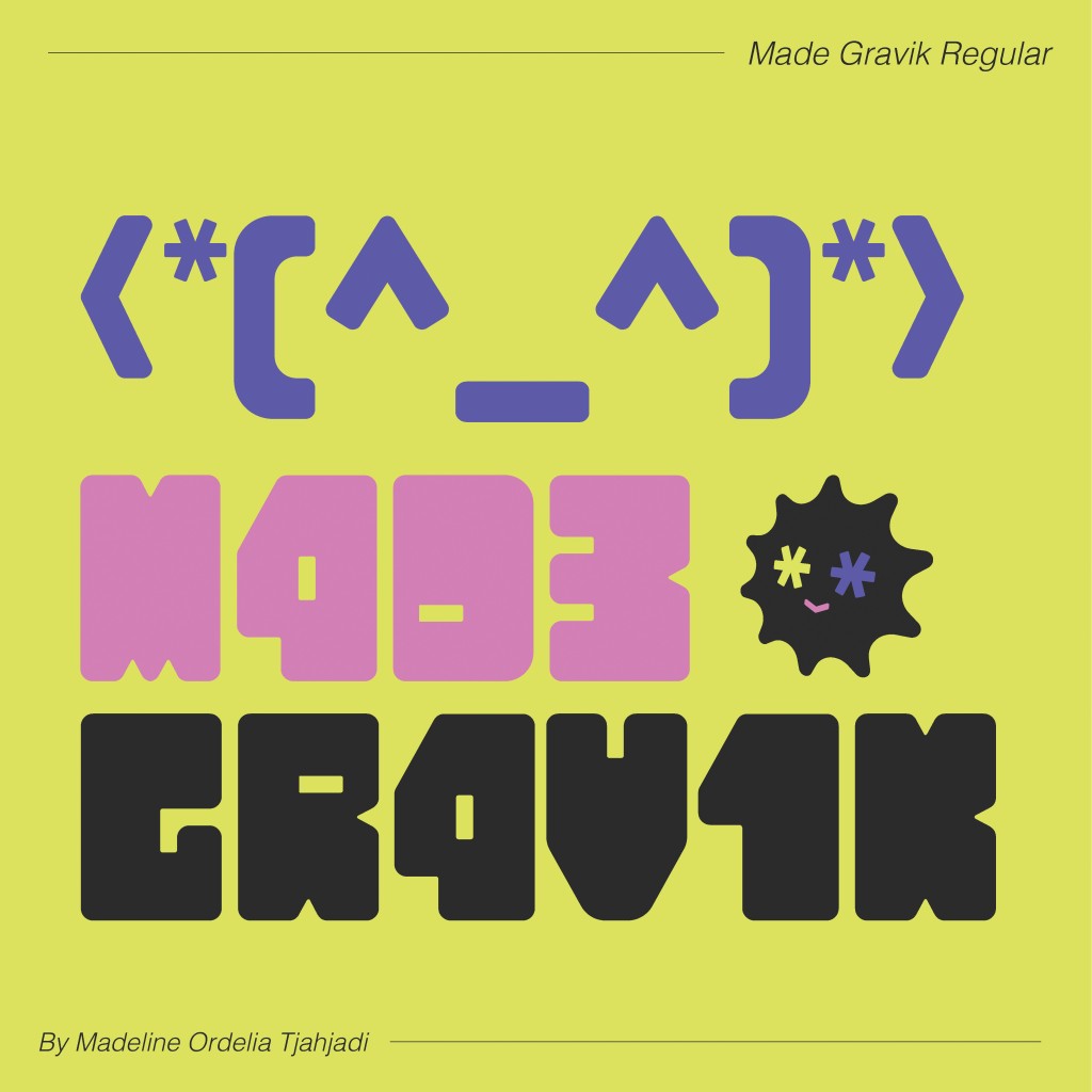
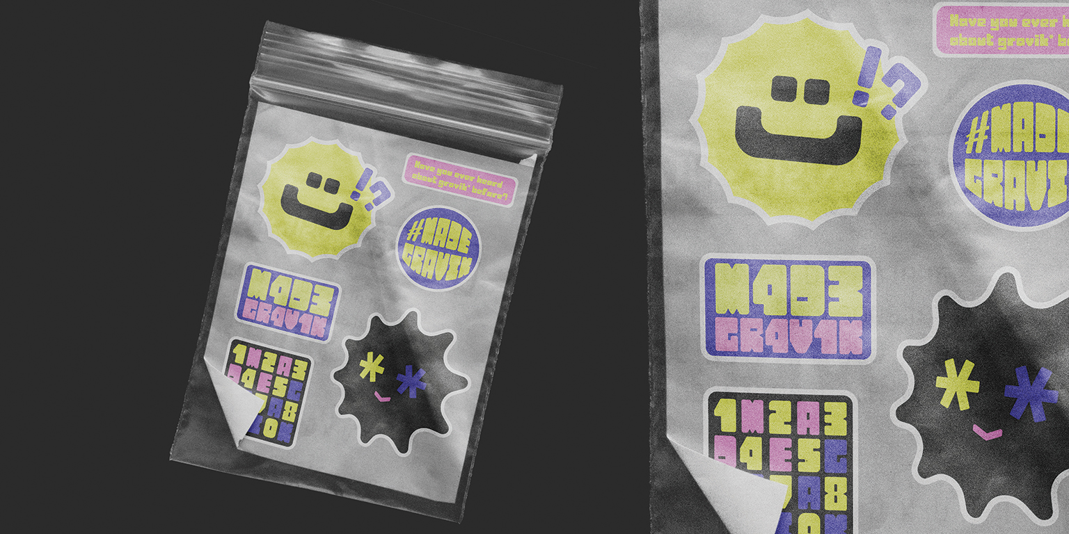
Font Application
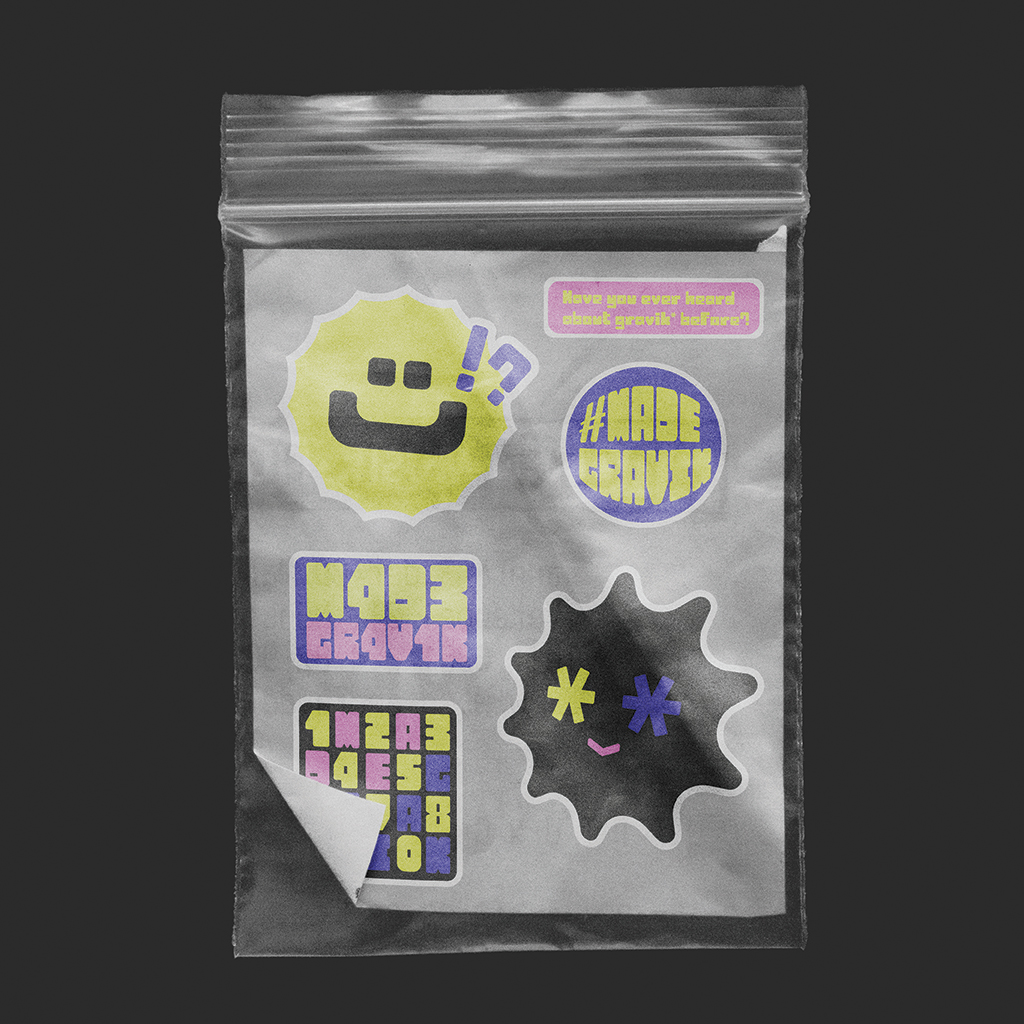
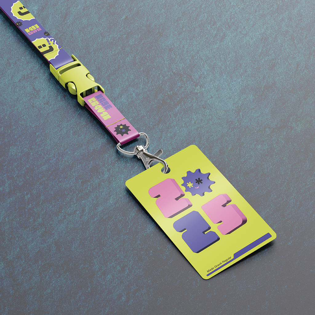
To visualize how Made Gravik could be used in real-world scenarios, I created a series of sample applications. Since the typeface was designed with creativity in mind, I showcased its versatility through examples such as posters, stickers, and other visually engaging designs. This approach highlights the font’s personality and demonstrates how it can enhance a wide range of creative projects.
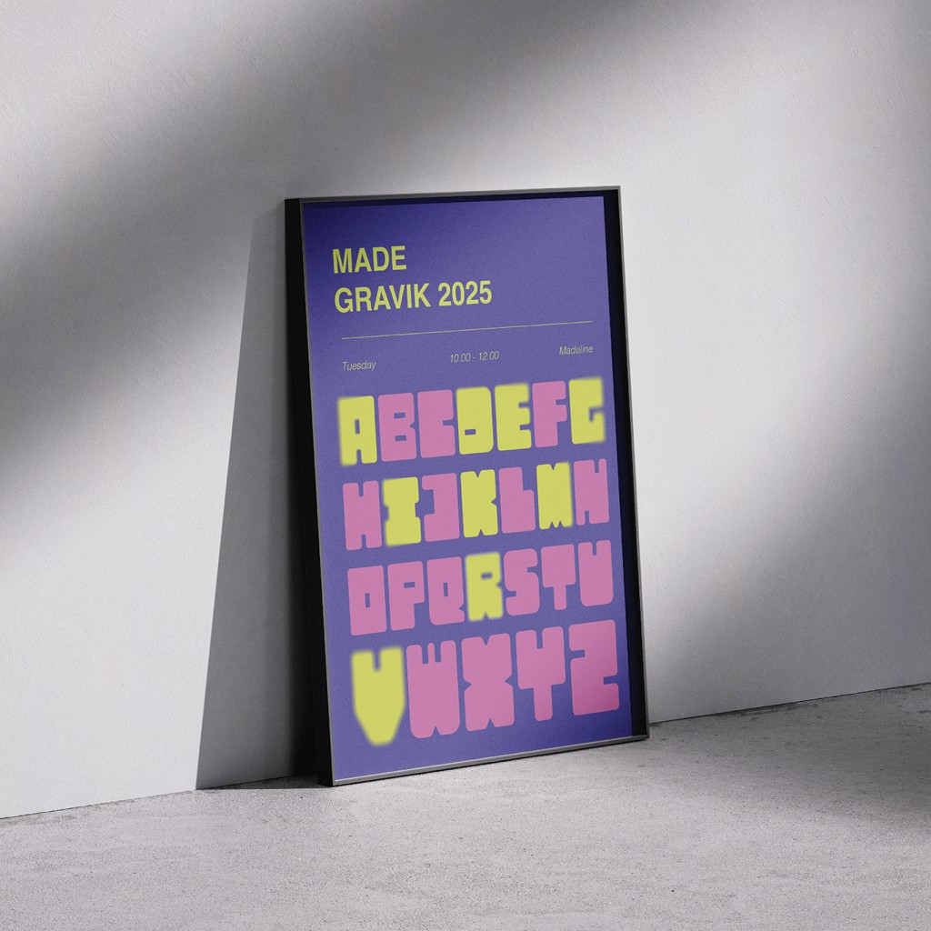
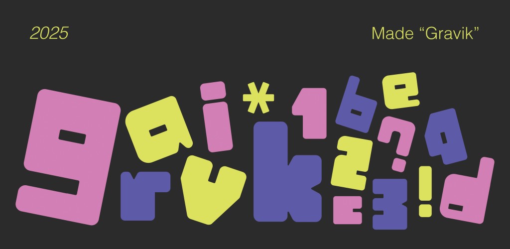
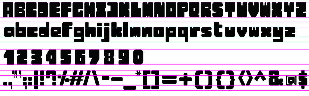
Type using Made Gravik below:
Made Gravik © Madeline Ordelia Tjahjadi, 2025.
Conclusion
Creating Made Gravik has been a journey of discovery—into typography, into design, and into myself. It challenged me in ways I never expected; I never imagined I would complete an entire typeface from scratch. But through every obstacle, I found the freedom to give form to my ideas and shape a typeface that reflects my identity as a designer.
This project has taught me the value of persistence, the importance of embracing critique, and the growth that comes from learning through mistakes. Most of all, it showed me that good work isn’t about perfection—it’s about progress, patience, and purpose.
I hope this journey inspires other designers to take creative risks, to welcome failure as part of the process, and to keep pushing their craft forward—one letter at a time.