
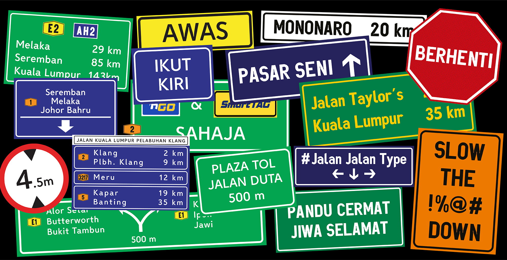
LLM lettering, developed by the Malaysian Highway Authority (Lembaga Lebuhraya Malaysia), is a sans-serif typeface specifically designed for use on Malaysia’s highway signages. The typeface consists of two styles: LLM Normal and LLM Narrow. LLM Normal is widely used for place names, directions, and general text, while LLM Narrow serves as a condensed alternative for situations where space is limited, e.g., long place names or smaller signboards. Although the typeface has long served as the standard across Malaysian highways, closer analysis reveals opportunities for improvement, particularly when it comes to readability at high speeds and from long viewing distances.
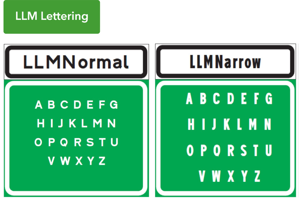
For this project, Wing and Daphne divided their focus to better understand the two variations of LLM lettering. Wing focuses specifically on LLM Normal, while LLM Narrow is examined in detail by Daphne. They assessed both the strengths and limitations of the current typeface, then merged their insights to propose two refined versions: Milky Way (Figure 2) and Mononaro (Figure 3), considering aspects such as legibility, spacing, and readability at various road viewing conditions.
LLM Normal – Analysis by Wing
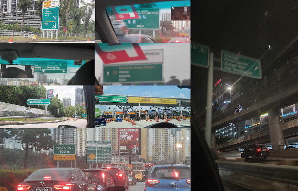
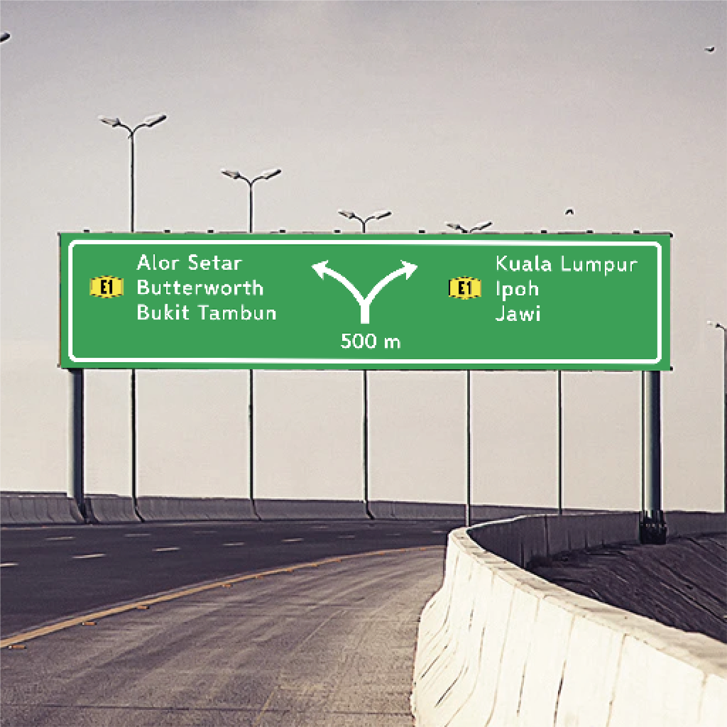
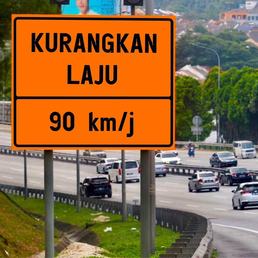
To experience the typeface firsthand and validate its practical usage, I observed the road signages along my soul-crushing daily commute to school on the well-known, heavily trafficked LDP Highway in Selangor. Most of the signs employed LLM lettering, including both LLM Narrow and LLM Normal styles.
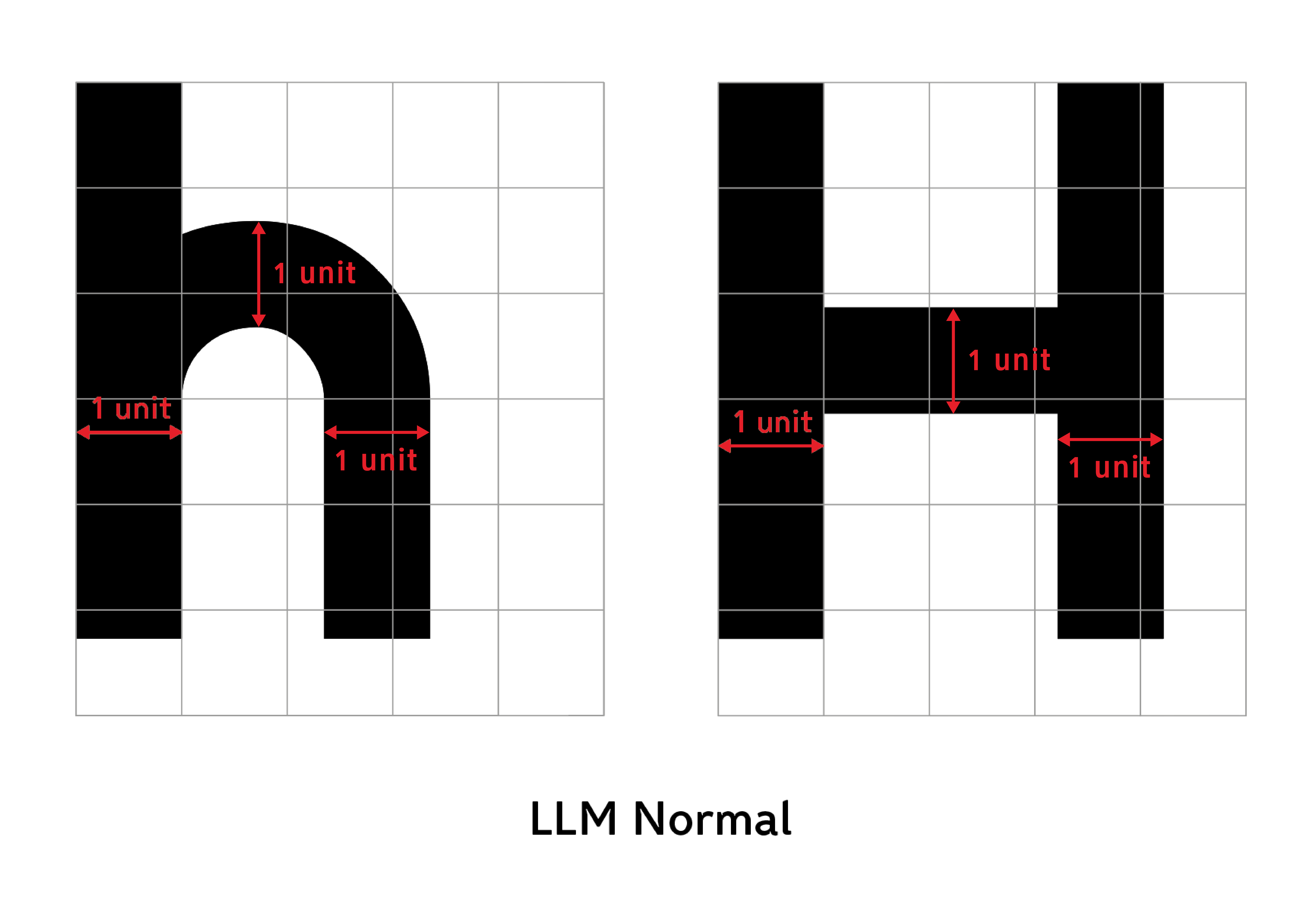
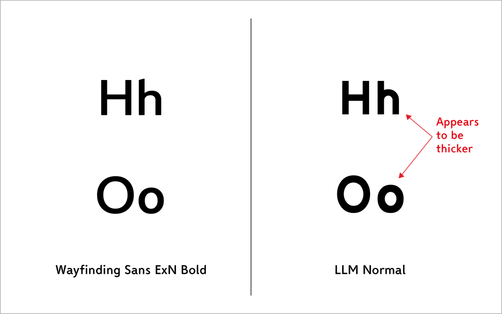
Under normal viewing conditions, the LLM Normal performed well at moderate driving speeds, but closer inspection revealed a few underlying issues. A digital deconstruction reveals that most uppercase and lowercase characters in LLM Normal share nearly identical stroke widths (Figure 5). This lack of differentiation results in inconsistent visual weight across cases, as demonstrated in Figure 6. In well-optimized typefaces, lowercase strokes are often made slightly thinner to account for optical differences, because when lowercase letters are drawn with the same stroke width as uppercase letters, they tend to appear visually heavier than the uppercase forms. For example, Wayfinding Sans ExN Bold, a typeface from the Wayfinding Sans Pro family by Ralf Herrmann, a typeface engineered for legibility under challenging driving conditions, demonstrates this refinement by applying subtle thinning to its lowercase strokes (Figure 6).
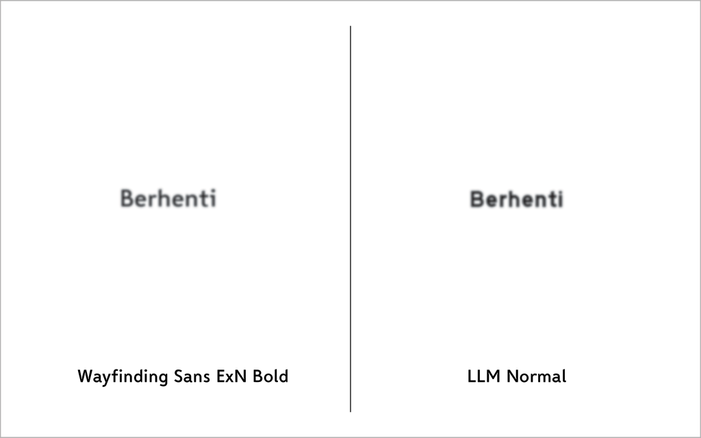
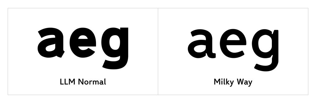
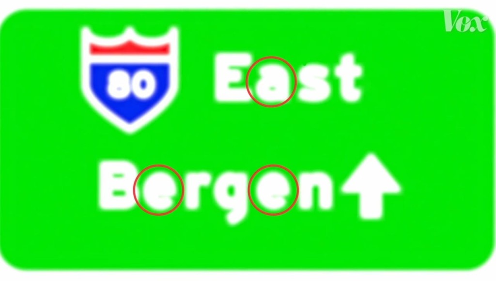
Another issue with maintaining identical stroke widths across both uppercase and lowercase letters is that the lowercase characters in LLM Normal are forced into tighter forms. Since lowercase letters are drawn at a smaller scale, applying the same stroke thickness as uppercase letters reduce the space available for their counters (the enclosed or partially enclosed spaces inside letters), leading to compressed letterforms and noticeably reduced readability. This is evident in LLM Normal, where the lowercase ‘e’ in particular features a small closed counter and a tight aperture that collapses when blurred, making it resemble a lowercase ‘o’ which may potentially lead to misreading at high speeds (Figure 7).
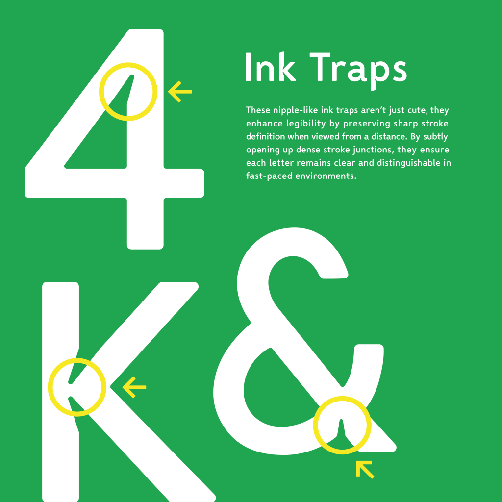
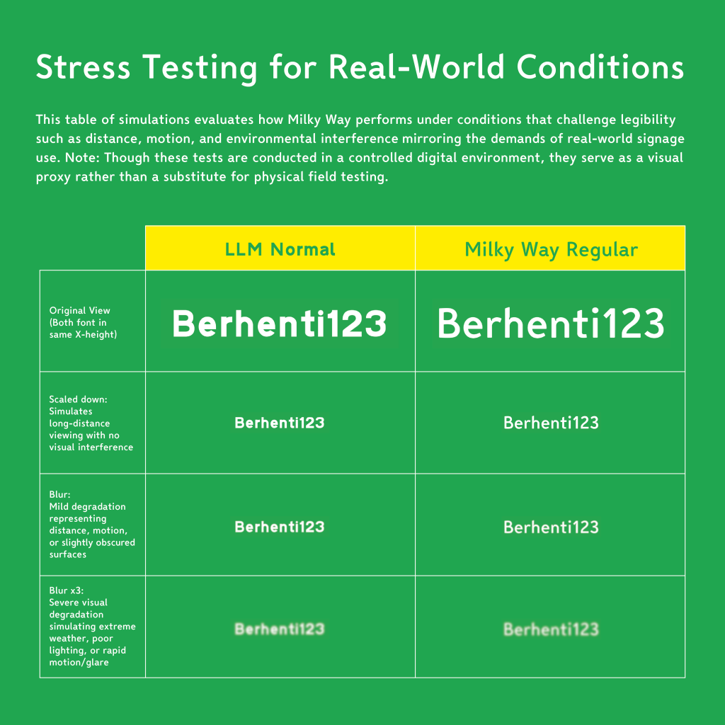
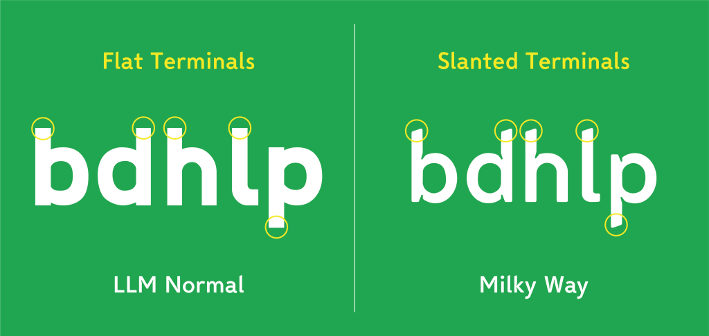
To address these issues and understand how letterforms are designed for road clarity, I studied established typefaces such as Wayfinding Sans Pro (Wayfinding Sans ExN Bold) and Clearview, the U.S. highway typeface granted Interim Approval (IA-5) by the FHWA in 2004 and reinstated in 2018 to optimize driver readability. Informed by these precedents and professional typographic knowledge, the letterforms of Milky Way were developed with larger counterforms, more open apertures, and ink traps (as applied in JPJ 1, a car number plate typeface designed by Vinod J. Nair, to retain letterform features under adverse conditions) (Figure 8 & 9) to address the compressed counters and diminished legibility observed in LLM Normal. While the effect of these modifications can be hard to notice by just looking at individual letters, a comparison table was created to simulate the improvements more clearly (Figure 10).
Source: Why the US has two different highway fonts.
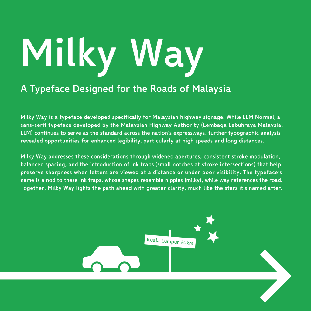
I named the new typeface ‘Milky Way’ as a playful nod to its ink traps, which resemble the shape of nipples (milky), while ‘way’ references roads. Together, Milky Way lights Malaysia’s road ahead with greater clarity, much like the stars it’s named after (Figure 14).
LLM Narrow – Analysis by Daphne
Similar to Wing’s approach, I carried out my own observations during my daily drive to campus and while being stuck in a traffic jam. While driving at speeds of approximately 50–60 km/h, I examined the readability of signages employing both LLM Normal and LLM Narrow typefaces. The findings showed that LLM Normal still remained fairly legible, whereas LLM Narrow proved slightly harder to read under these conditions. These observations helped me identify and understand the main problems that exist in the LLM Narrow typeface. Following this, I documented my observations in a notebook to further explore potential solutions to these issues (Figure 21).
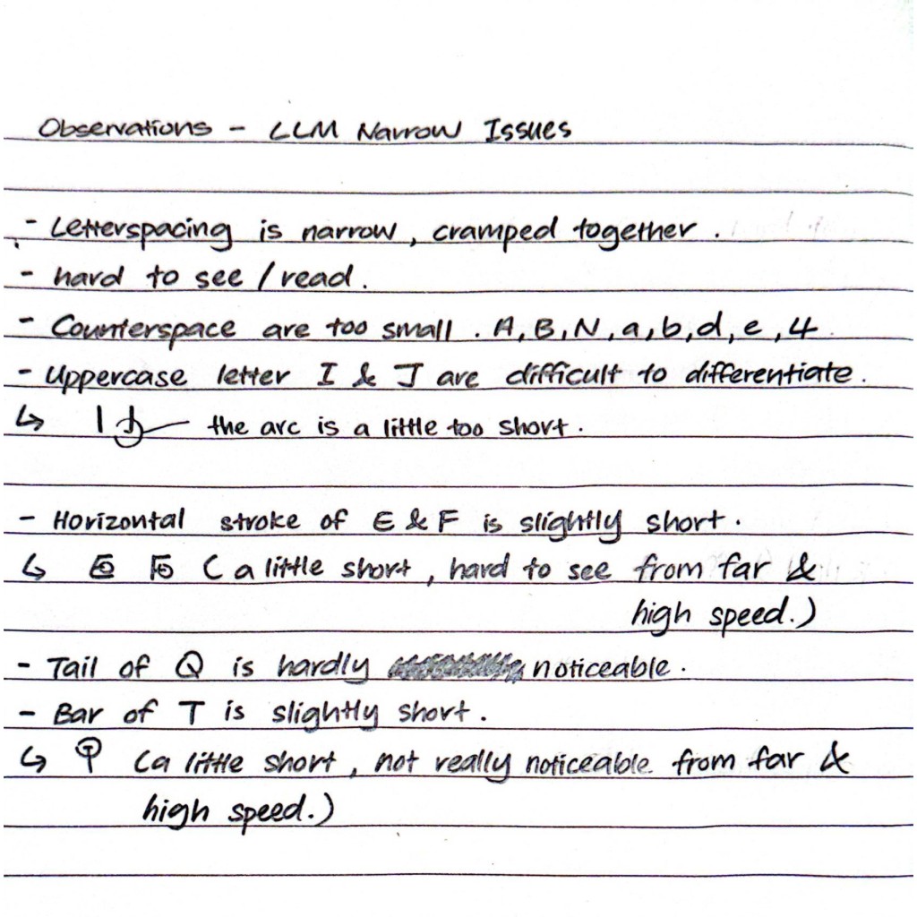
Main Issues Identified in LLM Narrow
Through the observations, several key issues were identified in the LLM Narrow:
- Cramped letterspacing – The letters are narrowly spaced which create a congested appearance that reduces the readability.
- Tight counterspaces – Limited counterspaces within the letterforms make characters harder to distinguish, which compromises legibility and readability on the road.
- Inconsistent stroke sizes – Uneven stroke thickness across the uppercase, lowercase, numerals, and punctuations result in a lack of consistency and visual balance.
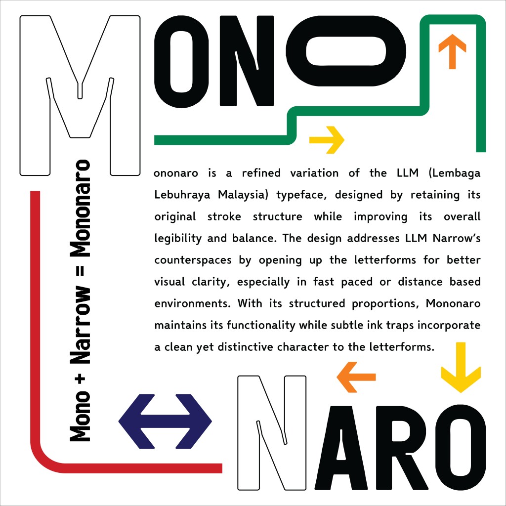
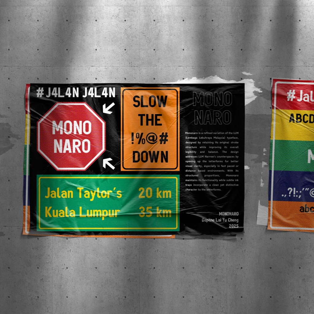
These issues limit the effectiveness of LLM Narrow as a typeface, where readability and legibility play an essential part in road signage. Mononaro was developed as a refinement of LLM Narrow, aiming to resolve the readability and legibility issues identified in the original typeface.
To understand how LLM Narrow could be improved, I studied road signage typefaces such as Wayfinding Sans Pro by Ralf Herrmann, along with JPJ 1: A Standardised Number Plate Typeface for Malaysia by Vinod J. Nair, which highlighted the use of ink traps for improved clarity. Insights from these studies contributed directly to Mononaro’s design. The typeface was developed with enlarged counterspaces while retaining the same stroke thickness and narrow form, and with the addition of ink traps in tight junctions of the letterforms. These refinements enhance readability and legibility in real life conditions such as halation and high speed driving to address the cramped counterspaces that decrease LLM Narrow’s performance.
Furthermore, established typefaces such as Univers LT Std were also referred to during the design process. Its variations, particularly the condensed versions, provided useful guidance for shaping Mononaro. The condensed letterforms in Univers LT Std appear more squared due to reduced width and tighter counterspaces. This idea influenced Mononaro’s design by using slightly squarer shapes that helped open up the counterspaces while still keeping it a condensed typeface.
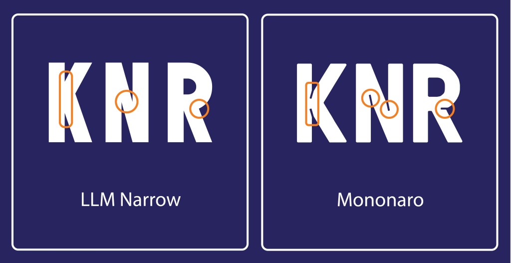
Ink traps are introduced in the Mononaro typeface, particularly in tight junctions such as the joints of letters like K, N, and R (Figure 22). When applied to road signage, they reduce the risk of strokes visually merging under conditions such as blur or halation. Instead of appearing as indistinct blobs, the letterforms retain clarity, which enhances both legibility and readability in real life conditions.
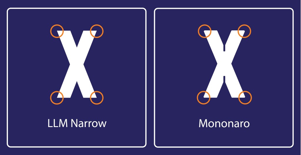
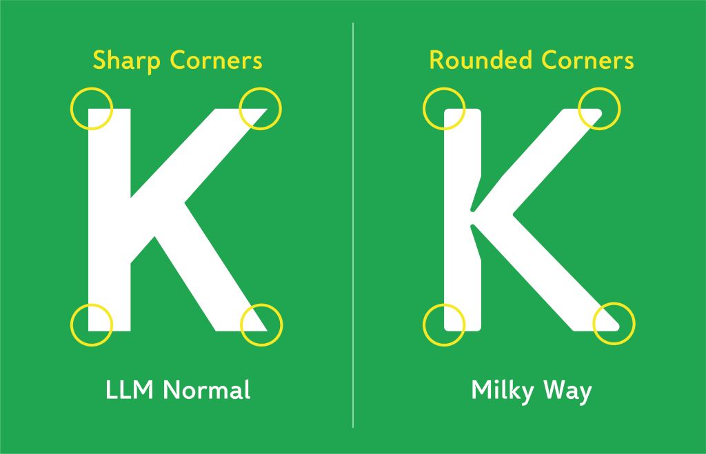
Rounded corners were also incorporated into Mononaro’s design. Sharp corners in letterforms can produce excessive contrast or glare under strong lighting, such as car headlights reflecting off road signs. The incorporation of rounded corners in the Mononaro typeface helps reduce optical distortion which make the letterforms easier to process at a glance, and also enhance the overall adaptability of the design when applied across different scales and environments.
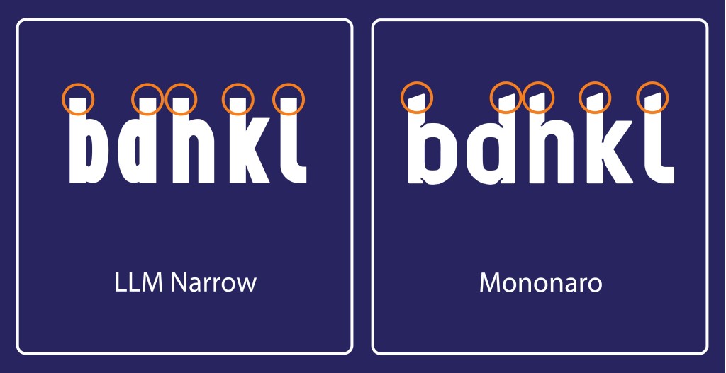
Another key design refinement in Mononaro was the redesign of ascenders with a slanted cut. This adjustment was created to improve the letterform differentiation, particularly between easily confusable letterforms such as the uppercase I and lowercase l. A comparison of letterforms b, d, h, and l were done to demonstrate the difference of the before and after of the font redesign (Figure 24). By modifying the ascenders with an angled cut, the letterforms gain a clearer identification and are less likely to blur together under challenging conditions. This contributes to faster recognition and enhances the legibility in road signage applications.
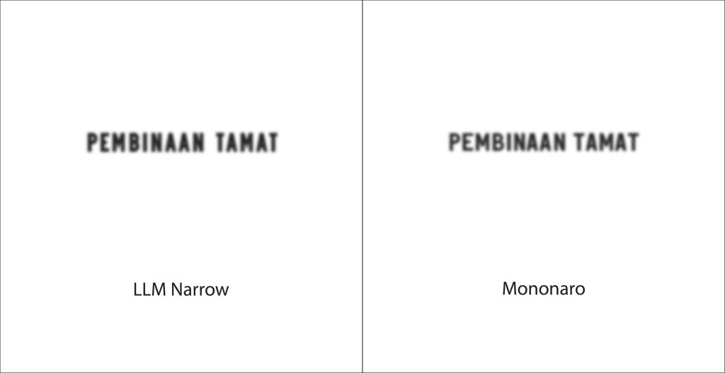
A real life condition of halation caused by car headlights shining onto the road signage was replicated to compare the differences and refinement in the Mononaro typeface (Figure 25). To replicate this effect, the scale of the word was reduced and blur effect was applied, with both LLM Narrow (Left) and Mononaro (Right) tested side by side. The results indicate that Mononaro demonstrates increased legibility due to its expanded counterspaces and the integration of ink traps.

A replication of high speed conditions is presented where motion blur was applied to simulate the challenges of legibility while driving (Figure 26). In this comparison, LLM Narrow (Left) and Mononaro (Right) are placed side by side. The results show that Mononaro achieves higher readability due to its more open counterspaces and the integration of ink traps.
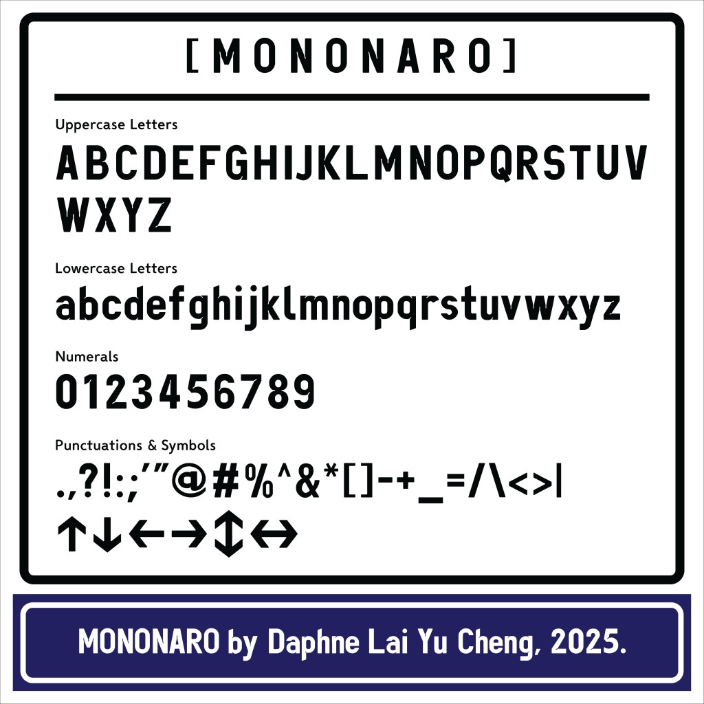
The name Mononaro combines ‘Mono,’ a reference to simplicity and consistency, and ‘Naro,’ short for ‘Narrow.’ The combination of ‘Mono’ and ‘Naro’ reflects its purpose as a redesign of LLM Narrow.

Designer’s Conclusion:
Deep down, there is an urge within us, as Malaysian designers, to see our own highway typeface properly studied and thoughtfully assessed. It is, in truth, somewhat saddening to acknowledge that to this day no open research papers by Malaysians exist on this subject. The act of identifying the flaws in LLM Lettering and proposing an improved version was never intended as a complete overthrow (though such a path is always possible), but rather as a higher calling: to ask the right questions, to challenge what has long been taken for granted, and to offer solutions that may guide the way forward. In doing so, this work does not close the conversation, but instead lays a foundation and a reference point upon which a better, more refined, and empirically tested typeface for Malaysia’s highways may be built. Beyond that, it is also a call to Malaysian designers and to the world, that our role is not merely to make a place more beautiful, but to make it safer, stronger, and more resilient through design. We warmly welcome collaboration in bringing this vision closer to reality!
– For the full breakdown of their process and findings, check out their blogs: Wing (Milky Way); Daphne (Mononaro)
You can also try typing in Mononaro and Milky Way below: