
For anyone who has lived through multiple waves of mobile design, from the slow days of Symbian to the speed of modern super apps, typography has never been a decorative option. It is the structure that holds a digital product together.
At the same time, the friction between Western minimalism and the information-dense ecosystems of Asia shows that many of our so-called universal UX principles are not universal
at all. They are shaped by language, culture, and expectation. If anything, this tension forces us to rethink how we teach and critique design, recognizing that typography is the essential tool we must master to make sense of our fractured, culturally-attuned digital world.
1. Typography Is Function, Not Ornament
One of the most persistent misconceptions in design is the idea that typography is about drawing letters. That work belongs to type designers. Typography, on the other hand, is the arrangement of text for clarity and usability.
In mobile UI and UX, typography is central to the experience because it controls how information is read, scanned, and understood.
The UX Designer vs. The Graphic Designer
Another related misconception is the belief that typography belongs solely to the Graphic Designer. In modern product teams, the responsibilities are cleanly divided:
- The Graphic Designer defines the visual brand (Which typeface to use, its stylistic personality).
- The UI/UX Designer defines the functional system (Which size to use for body copy, what the line height is, and how the hierarchy guides the user).
A system can be visually beautiful but functionally unusable if the hierarchy is broken or the line height is wrong. This is why typography must remain an essential skill for the UI/UX practitioner.
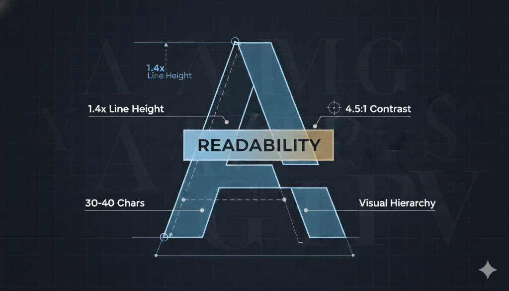
A. Readability and Legibility
A mobile screen leaves no room for careless decisions. Small text, weak contrast, and tight spacing place unnecessary strain on the user. Several basic rules help prevent this:
- Contrast: A strong difference between text and background allows effortless reading. In most cases, a contrast ratio of around 4.5:1 is a reasonable target.
- Line Height (Leading): Around 1.4x to 1.5x the font size usually supports smooth vertical movement of the eye.
- Line Length: On mobile, a range of about 30 to 40 characters per line keeps reading comfortable.
These rules seem simple, but they shape every moment of the reading experience.
B. Visual Hierarchy
Hierarchy helps users decide what to read first. Without hierarchy, a screen becomes a wall of text. Typography controls this through changes in size, weight, spacing, and placement. A designer who ignores hierarchy is asking users to work harder than they should.
2. Wireframes Are No Longer Rough Sketches
Before moving into cultural differences, it helps to recognise how modern tools have reshaped our baseline expectations. This shift in the early design phase also explains why typography continues to matter even before visual styling begins.
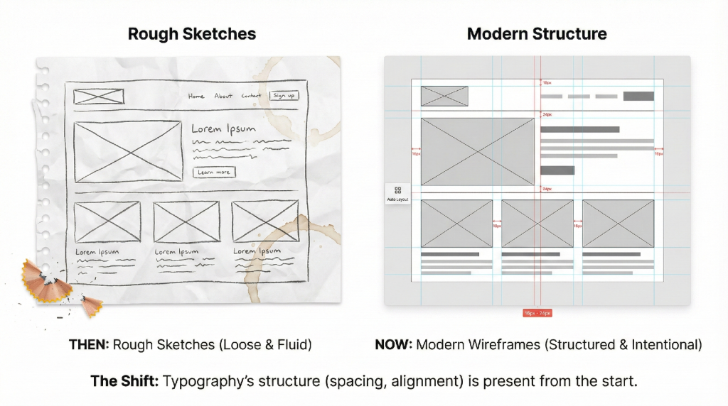
There was a time when low-fidelity wireframes were loose drawings. They were meant to capture flow and basic structure. Today, tools like Figma and Sketch have raised expectations. Auto Layout, Components, and defined grids have made precision easier. As a result, even early wireframes are expected to reflect a clear understanding of spacing, alignment, and grouping.
This shift does not mean students should design polished screens from the start. It simply means that structure should be intentional. Alignment and proximity are not decorative. They are the foundation of information architecture, and both rely heavily on typographic thinking.
When a designer moves from wireframe to high-fidelity prototype, typography is not being introduced. It is only being refined. The underlying structure should already be present.
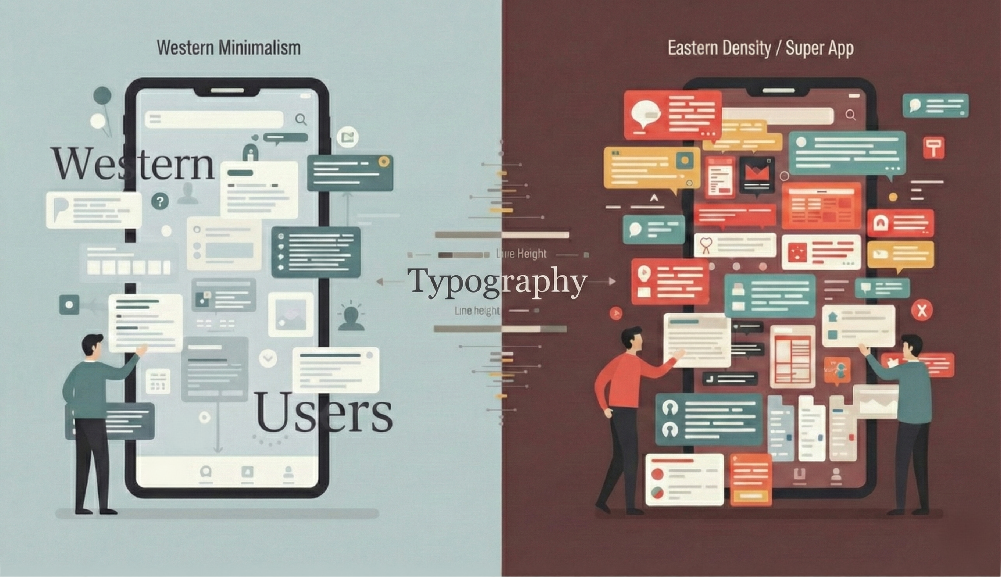
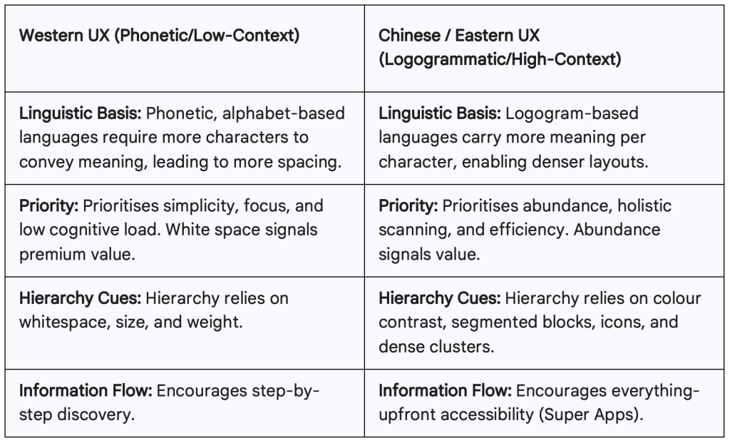
3. The UX Divide: Western Minimalism and Eastern Density
This evolution in wireframing sets the stage for a broader challenge. Even when structure is sound, not all regions interpret or value interfaces in the same way. Cultural expectations influence what users perceive as clear, efficient, or trustworthy.
The tension between Western minimalism and Asian information-dense interfaces becomes clearer when these differences are seen side by side.
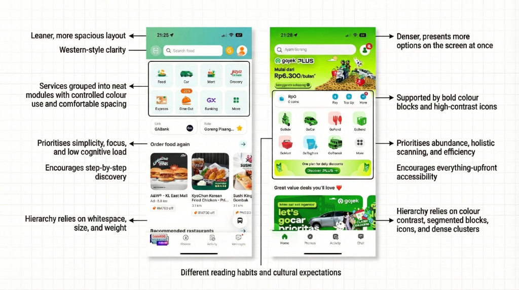
The Super App Challenge
A clear example of these differences can be seen in two apps that are familiar to many users in our region.
Grab vs. Gojek
Grab leans toward a cleaner, more spacious layout. Services are grouped into neat modules with controlled colour use and comfortable spacing. It feels closer to Western expectations of clarity. Gojek, by contrast, presents more options on the screen at once. The layout is denser, supported by bold colour blocks and high-contrast icons. For many Indonesian users, this density reduces navigation time because common actions are already visible without extra steps. Both approaches work, but they rely on different reading habits and cultural expectations.
Super apps combine payments, messages, services, deals, and everything else on one screen. Many high-priority actions exist side by side, which naturally reduces the use of traditional hierarchy. A crowded layout is not a failure. For many users, it is an advantage because it reduces the number of steps needed to reach the desired action.
4. Reframing How We Teach and Critique UX
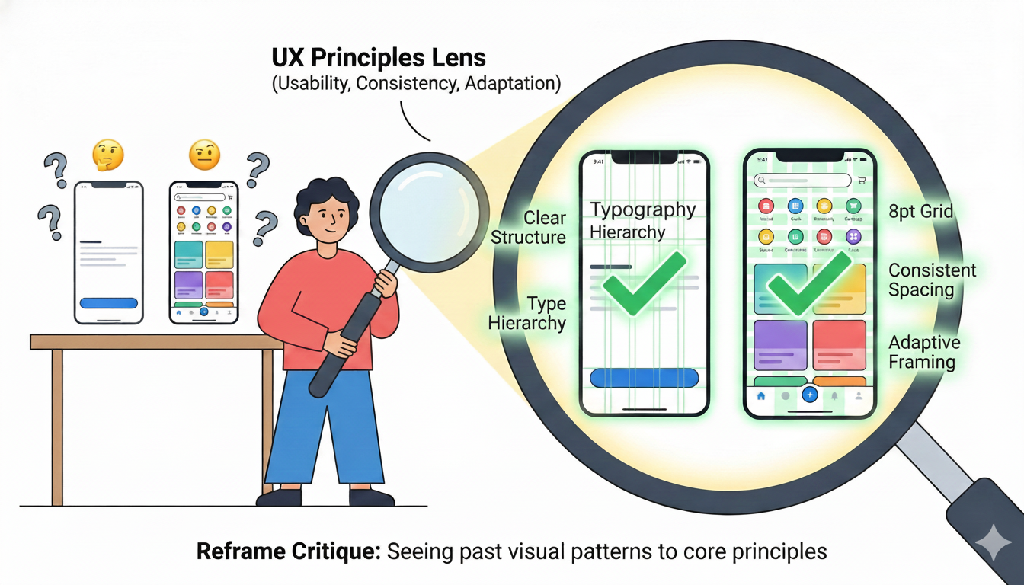
As educators and practitioners, the goal should not be to insist on a single visual approach. Instead, we should shift our critique away from patterns and toward principles.
A. Prioritise Functional Usability
A dense interface can still be efficient if it helps users achieve their goals quickly. A minimal interface can fail if it hides essential actions. The question should always be whether the structure supports the behaviour of real users.
B. Check for Structural Consistency
In busy layouts, consistency becomes the stabilising force. Regular spacing, aligned modules, and predictable patterns prevent chaos. Typography reinforces this rhythm by demanding strict adherence to measurement systems (e.g., 8pt grid, consistent line-heights) that stabilize even the busiest layouts.
C. Teach Adaptive Hierarchy
Hierarchy does not always depend on font size. In many Asian interfaces, hierarchy appears through colour, framing, or card-like segmentation. Designers must understand how different cultures read a screen and adapt accordingly, utilizing visual segmentation as their primary grouping tool.
Closing Thoughts
Typography is a constant across cultures, tools, and visual styles. Whether a design leans toward Western restraint or Eastern abundance, the structure of text determines how information is understood. It shapes the rhythm of scanning, guides the eye through content, and stabilises even the busiest layouts.
This is why reducing typography to the act of creating fonts misses its real purpose. Typography is the underlying structure that makes an interface readable and usable. When designers understand this, they gain the flexibility to design for different cultures, different reading habits, and different priorities without losing clarity.
By shifting the conversation from visual patterns to universal principles of usability, we can help students and young designers evaluate design choices through context, intent, and behaviour. This keeps their work grounded, adaptable, and relevant in a world where design systems continue to evolve across regions and cultures.