
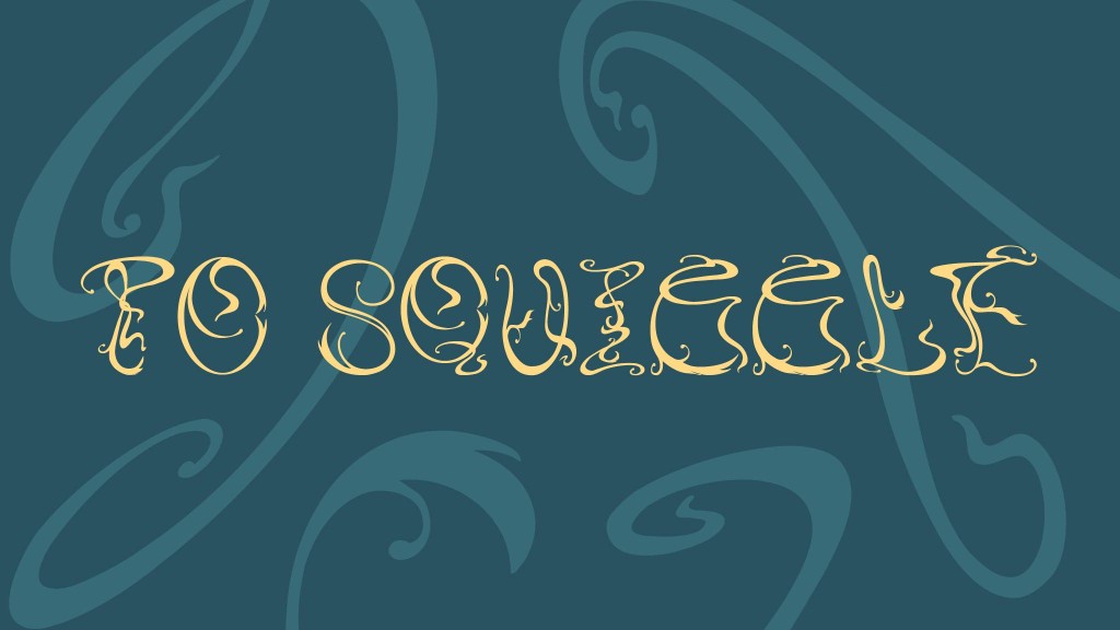
Among the options given, I proposed to explore the typeface of the film Fantastic Beasts: The Crimes of Grindelwald, experiment with tribal tattoos as letterforms, and experiment with the Art Nouveau movement as letterforms. I ultimately chose the Art Nouveau idea because I personally enjoy this style and tend to gravitate towards organic forms in design. I had always wanted to explore Art Nouveau as a more intricate and detailed letterform compared to what I had already seen online when searching for “Art Nouveau fonts,” and this project provided me with the opportunity to do so.
Research
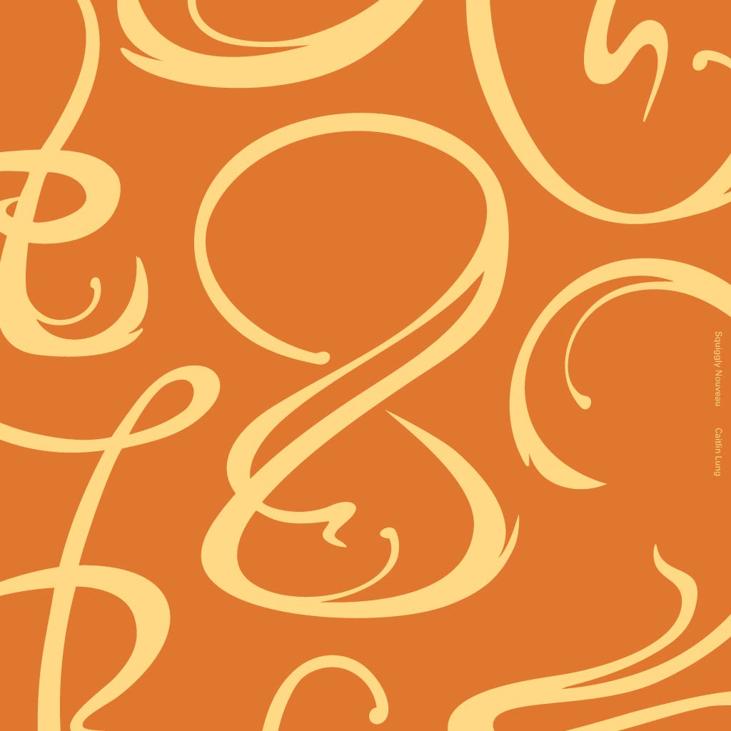
I began by researching the differences between the two art movements, Art Nouveau and Art Deco, considering how Art Deco came directly after Art Nouveau, seemingly as a response to it. The two styles are complete opposites: Art Nouveau uses smooth curves and plant motifs, while Art Deco relies on geometric and symmetrical lines. The recurring characteristics among modern Art Nouveau fonts are weighted organic strokes and small squiggles at the ends of strokes.
Ideation
To better understand the forms of Art Nouveau, I extracted shapes from images I found online and created my own forms that could potentially be manipulated into letterforms. When writing the proposal for this idea, I knew I wanted to explore multiple approaches.
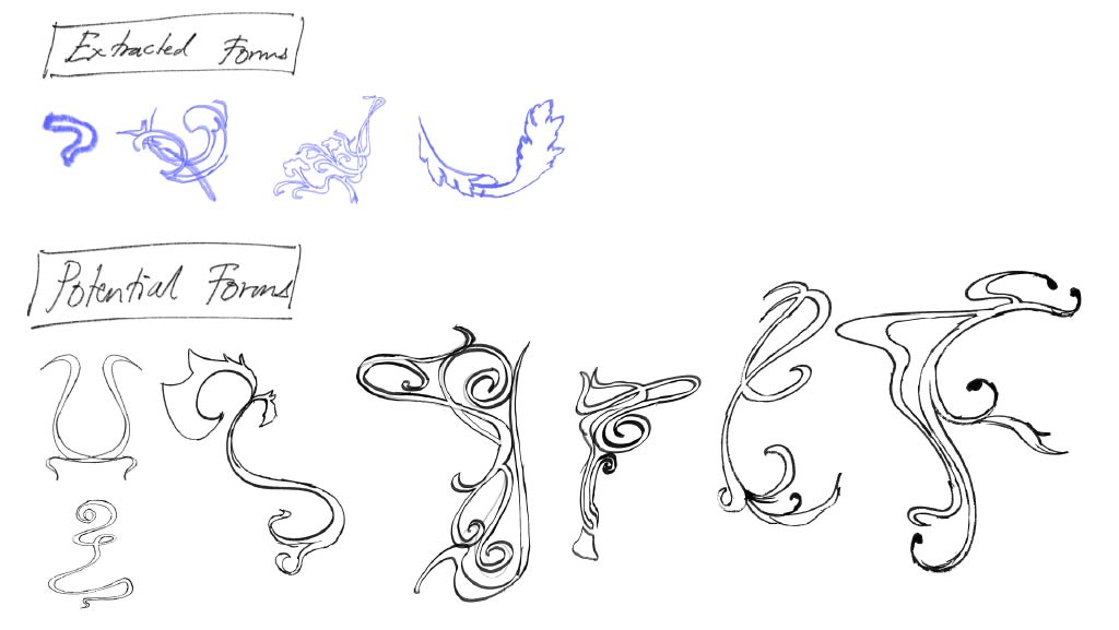
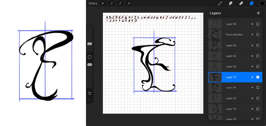
For Concept 1, I stumbled upon it haphazardly. When I first sketched the letter “F”, I did not intend for it to be the letter “F”; it was meant to be an exercise for my own reference. It was only when I found myself stuck trying to create letters that I realised the form I had previously sketched resembled an “F”.
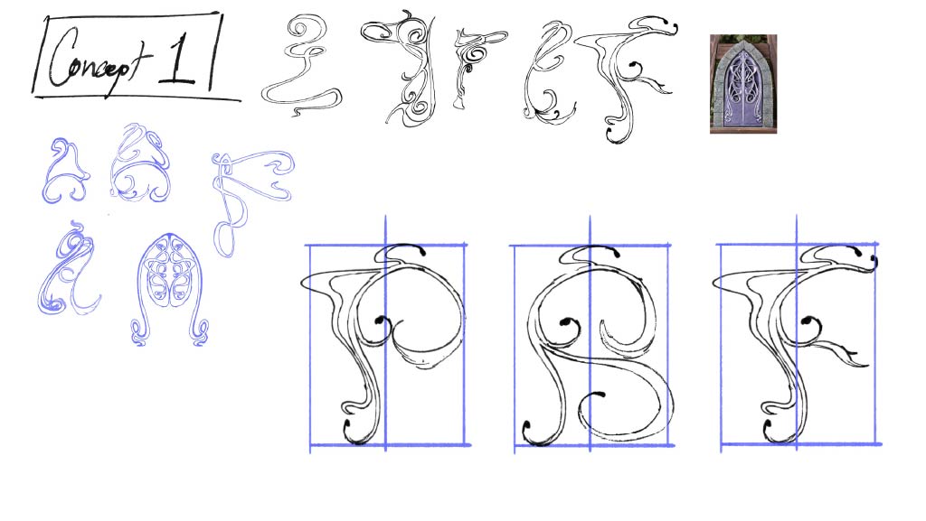
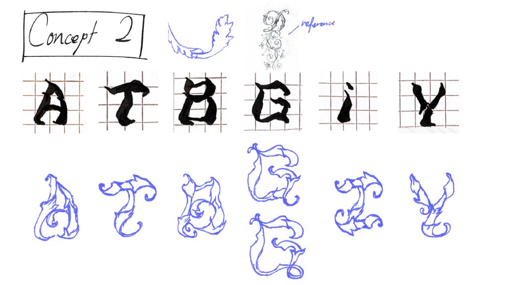
I was able to visualise Concept 2 quite clearly, with the main characteristic being leafy edges. For the base form of the letters, I wanted to bring forward an old idea from Semester 1 Typography that I had not ended up using. In the end, I chose to proceed with Concept 1, as it better represented the Art Nouveau movement.
Sketching
Before I began sketching the other letters, I brought the letter “F” into a new file and cleaned it up using a smoother brush in Procreate, then drew a grid using the letter as a reference.
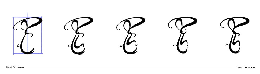
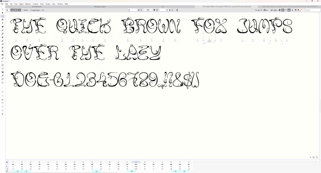
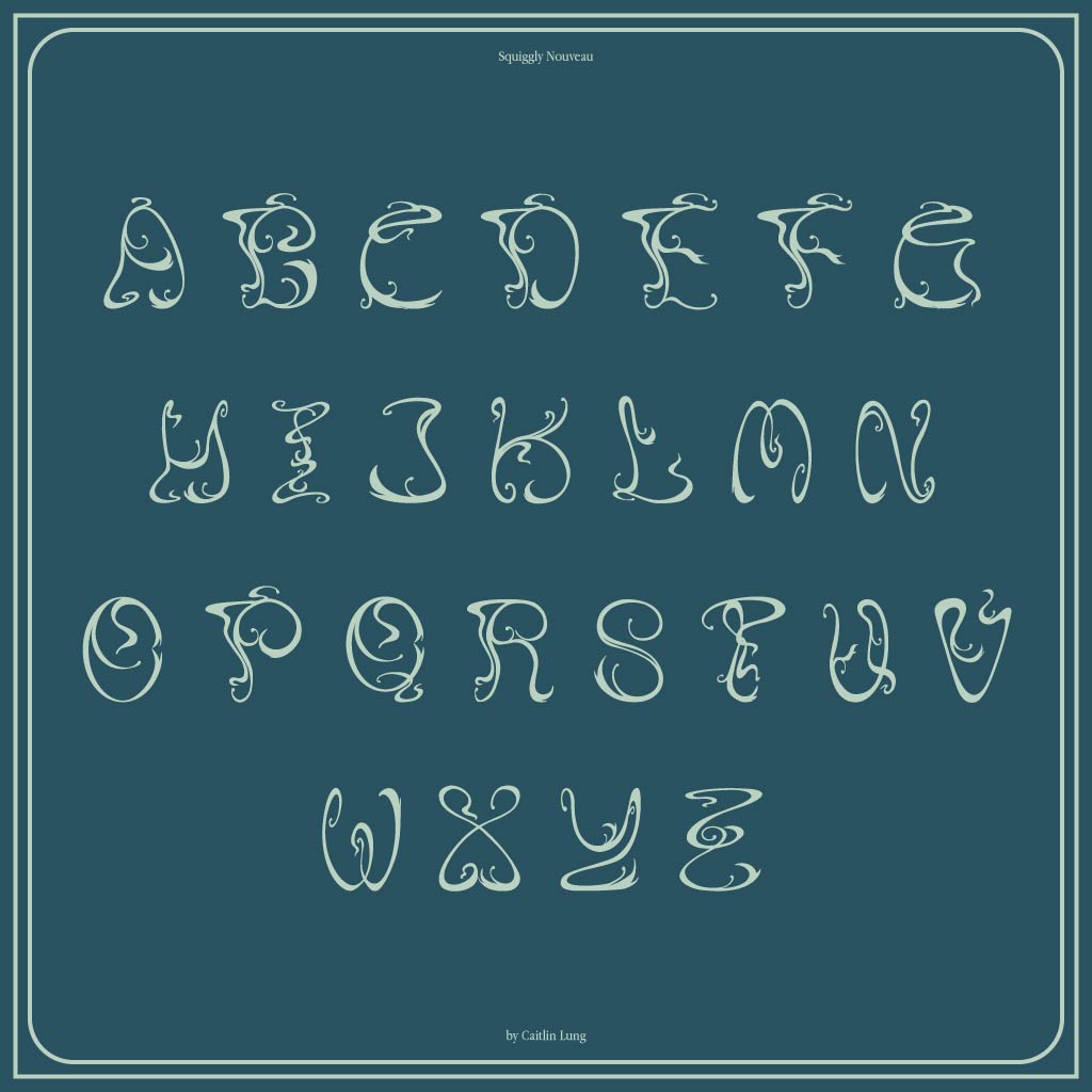
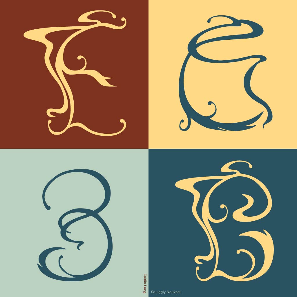
Letters that shared a similar structure to “F” were designed in a comparable manner, while letters such as “T” and “I” were created with a more decorative approach. Whenever I reached a creative block, I returned to the process that led to my first “F,” reminding myself to think in terms of overall form that suggested the letter instead of drawing individual strokes to assemble a letter.
While sketching, I actively sought feedback from friends to ensure that the letters were legible and harmonious with one another before finalising and moving on to the next letter. Some letters were easier to ideate, whereas others required multiple attempts before I arrived at a satisfactory sketch. Even then, feedback from friends left me feeling disillusioned at times.
One particular piece of feedback was repeated several times: “I thought it was another letter.” Stylistic ambiguity without sacrificing readability was the goal from the start, so I had to make adjustments based on the feedback I received to achieve that balance.
Digitisation
I had not fully considered how tedious this stage would be until I actually began working on it. I initially planned to manually trace over the sketches using the Pen Tool, but upon Mr Vinod’s suggestion to use Image Trace in Illustrator, I realised how much work that step could save. However, this also meant that I needed to have very clean sketches before importing them into Illustrator.
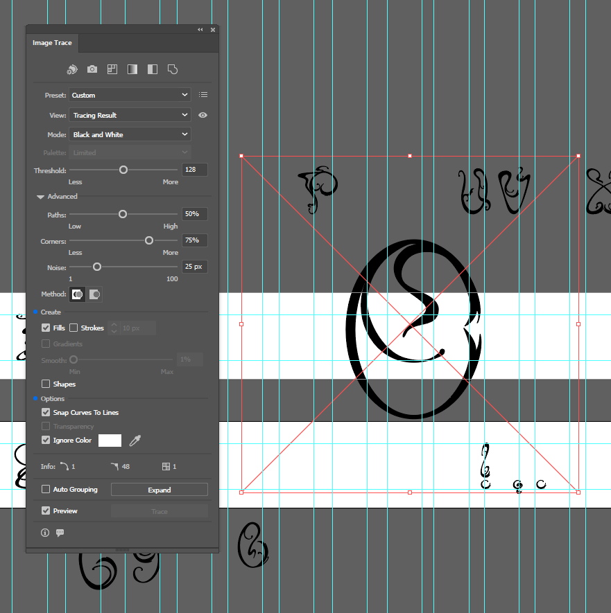
The main issue I encountered during this stage was proportion and sizing. After importing the sketches into Illustrator, some designs were no longer harmonious, and I had to return to Procreate to redesign them until I was satisfied. Furthermore, due to the varying stroke widths of the letterforms, it was important that the forms appeared visually consistent in size and balanced when placed next to each other.
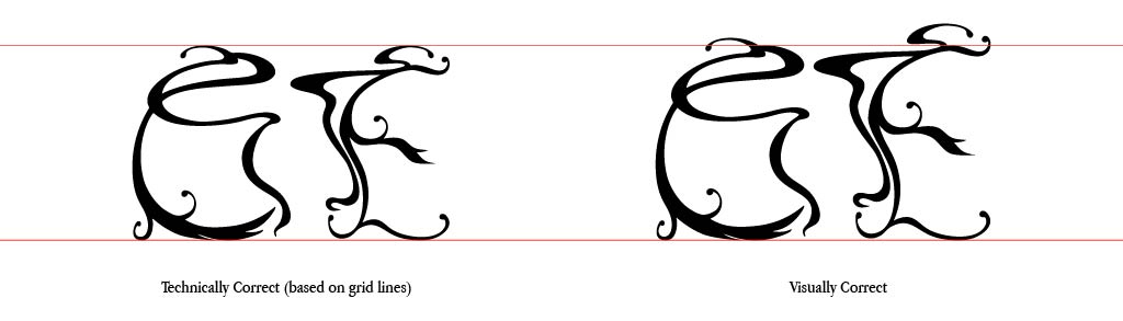
I used the rulers and guides in Illustrator to maintain visually balanced proportions while accounting for the decorative strokes. During the sketching process, I realised that for such an ornate letterform, it would be visually incorrect to adhere too rigidly to the grid and sizing. Therefore, some exceptions were made, as seen below:
FontLab
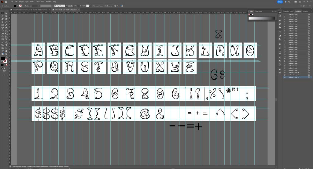
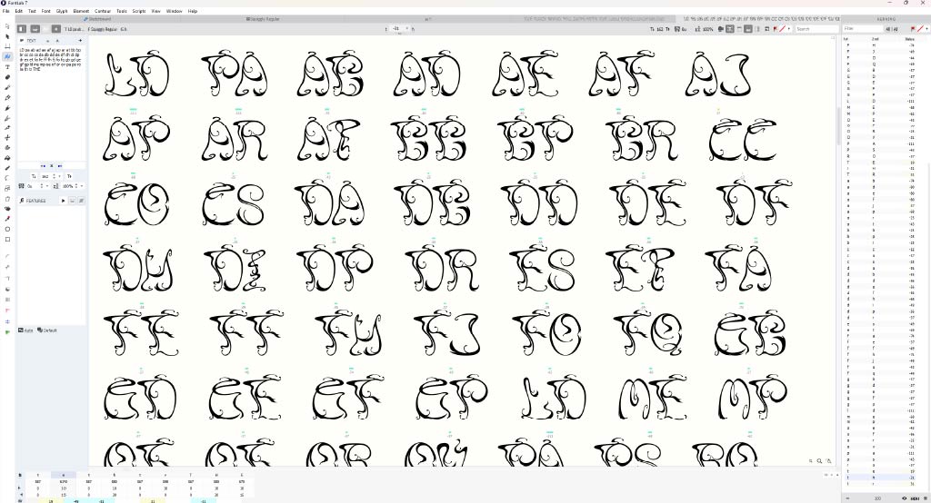
I used FontLab 7 to finalise the side bearings and kerning adjustments. From the start, I was aware that the decorative strokes would create kerning issues when paired with certain letters. The most effective way to identify these problems was to type out each letter with every possible pairing, which further emphasised how laborious this task was.
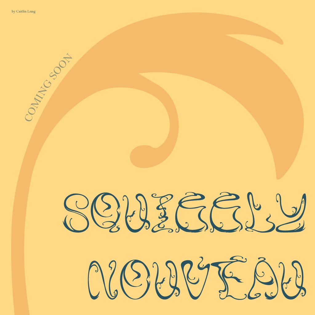
Font Presentation
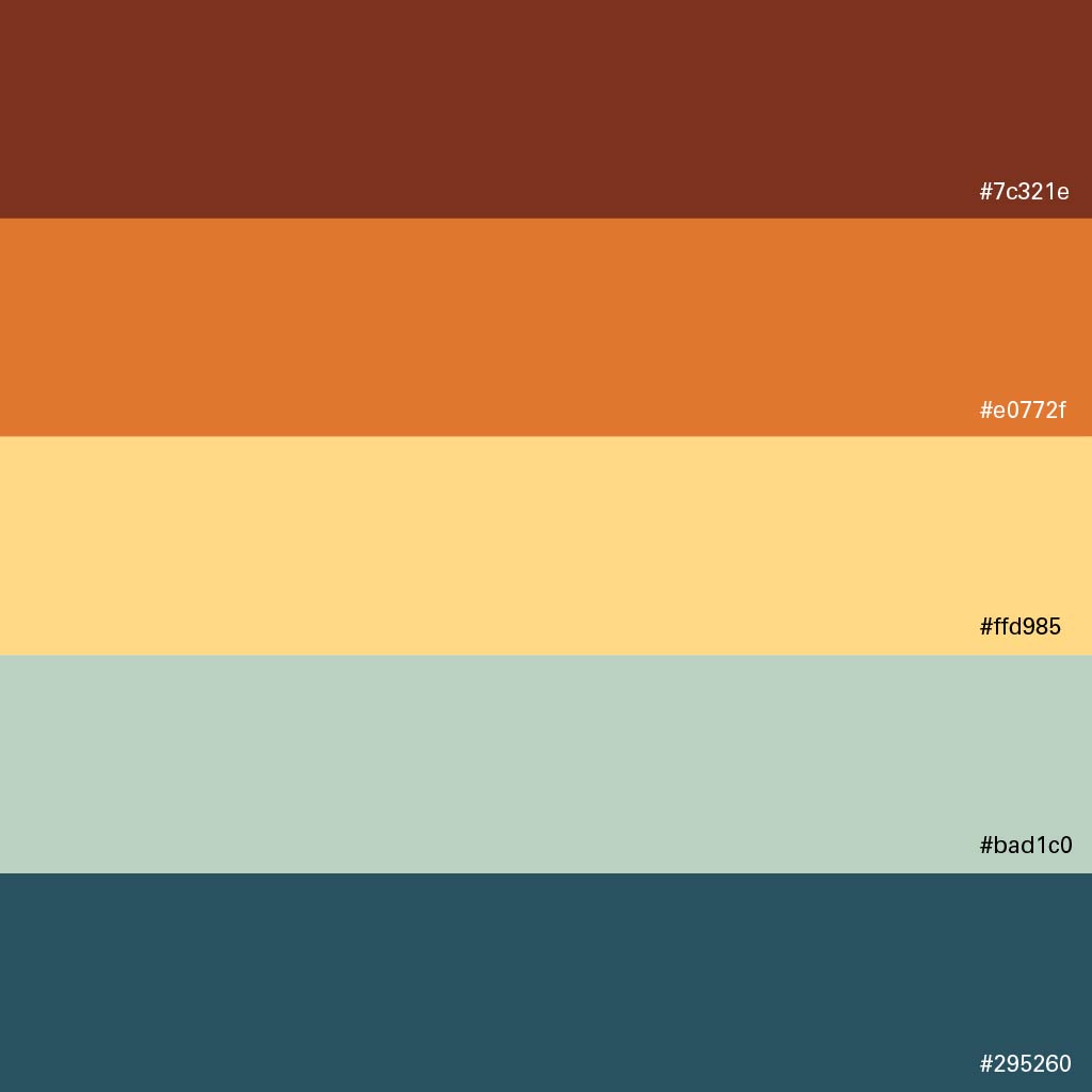
I began this stage by selecting a colour palette, and in keeping with the themes of Art Nouveau, I chose muted, warm, and jewel-toned colours. During this process, a thought occurred to me: this reminded me of medieval English flags often seen in fantasy or historical films such as Harry Potter and Game of Thrones. This led me to conduct a deeper exploration into the relationship between medieval England and the Art Nouveau movement, which ultimately influenced my approach to this stage.
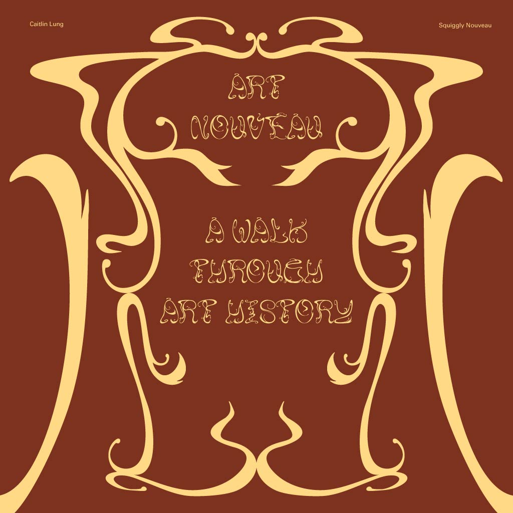
I mentioned in my proposal at the beginning of this task that I wanted to create a font that could also function as a graphical element. That was the intention for the first font presentation shown below.
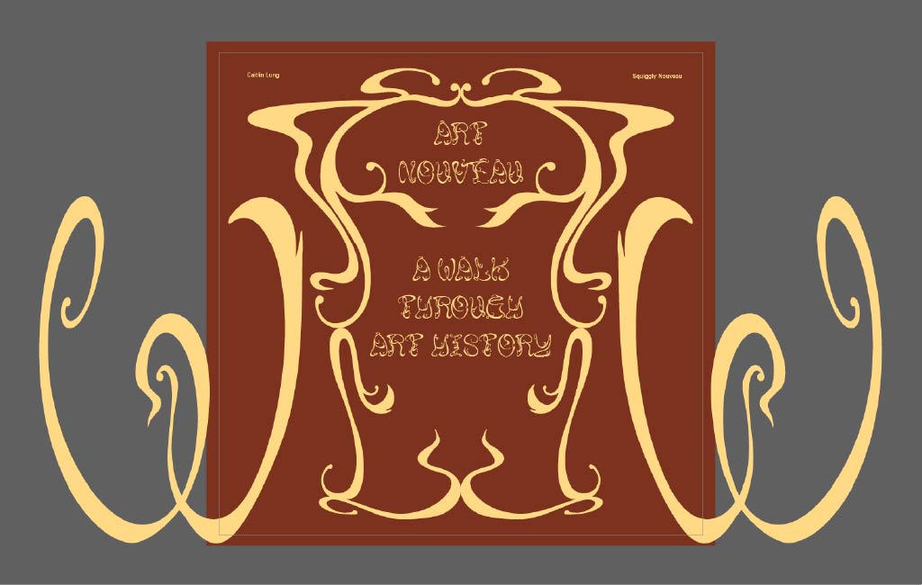
For the remaining presentations, I aimed to showcase the details and distinctive characteristics of each letter.
Font Application
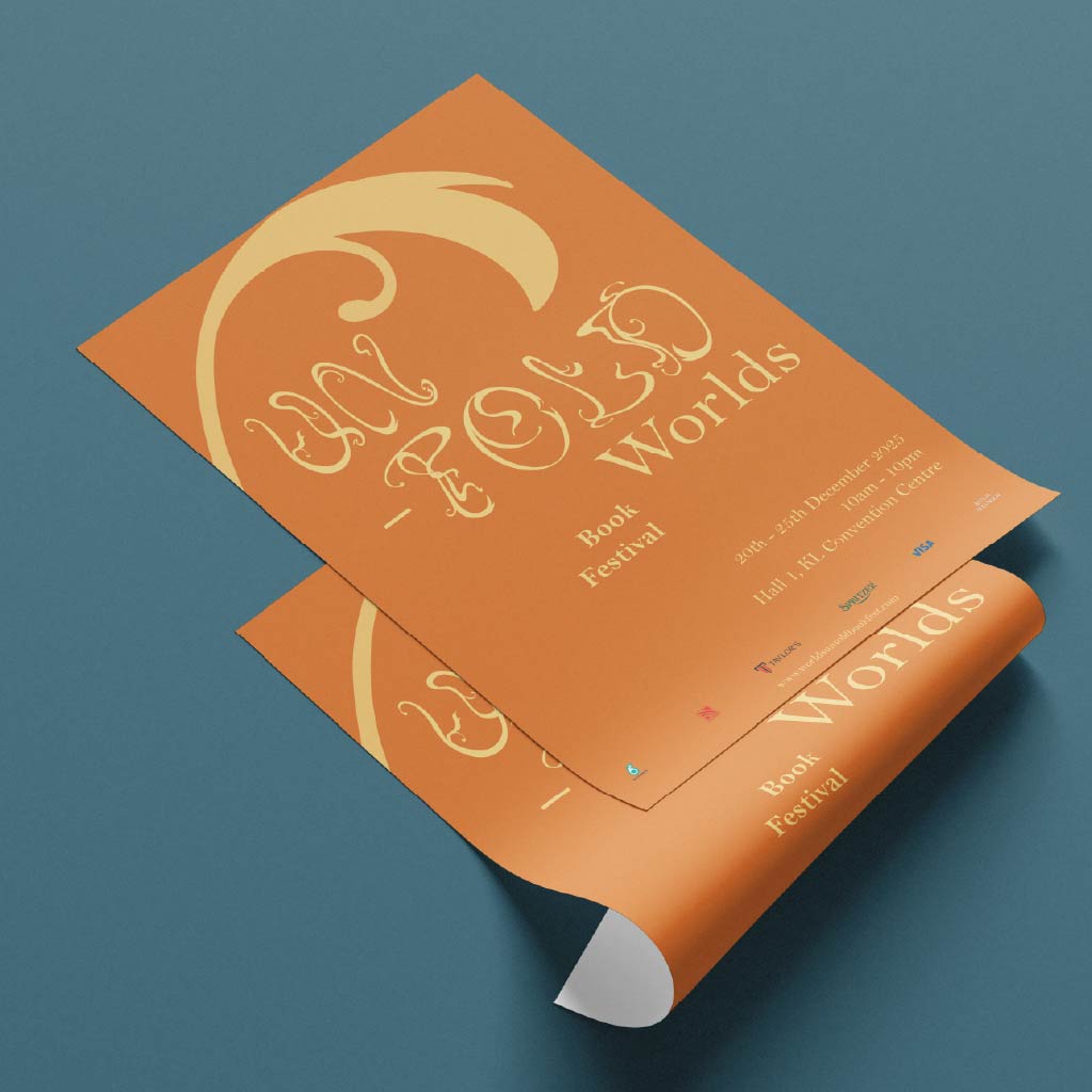
As an avid reader of fiction—particularly historical and fantasy novels—I am often exposed to elements of Art Nouveau in book covers, illustrations, and typography. I wanted to explore how Squiggly Nouveau could be used in the context of books.
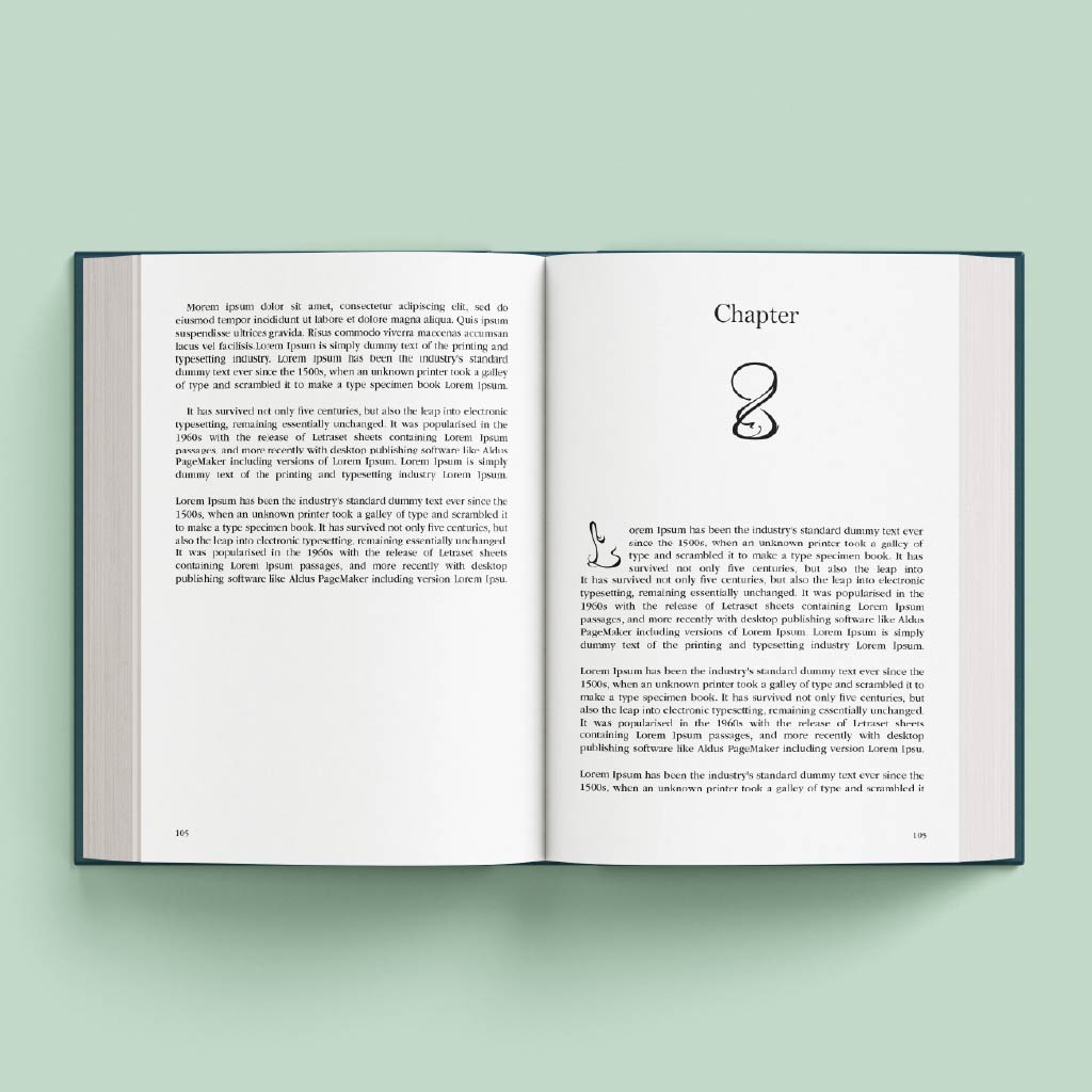
Within the book itself, I thought it would be interesting to use Squiggly Nouveau for chapter numbers or as a drop cap. Using both simultaneously can be distracting; however, I wanted to demonstrate both possibilities in my application.
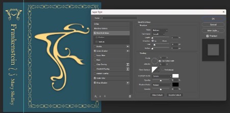
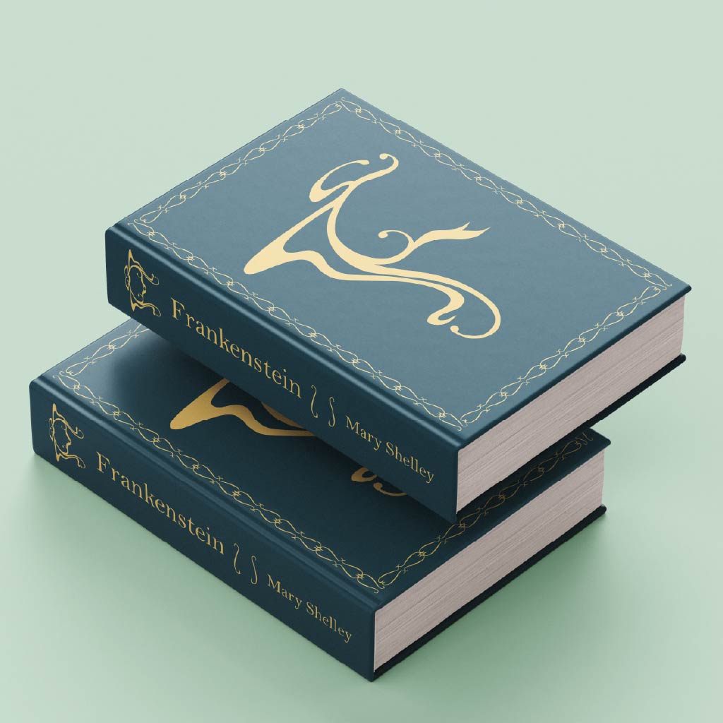
Font application two fulfilled one of my original goals for the task: using the typeface as a graphical element. I was strongly inspired by Guillermo Del Toro’s Frankenstein, in which butterfly and insect motifs were utilised. I also referenced fantasy novels I owned that featured similar symbols at the top of the spine. I duplicated the letter “F” and reflected it symmetrically to create a butterfly motif for the spine of the book. I then used the parentheses as a border by duplicating them and as a divider between the book title and the author’s name on the spine.
Many hardcover books, especially collector’s editions, feature debossing and gold leaf. I attempted to replicate this effect for the large “F” on the front cover using drop shadow, bevel and emboss, inner shadow, and outer glow. However, I was unable to achieve the desired result, so I decided to discard the idea.
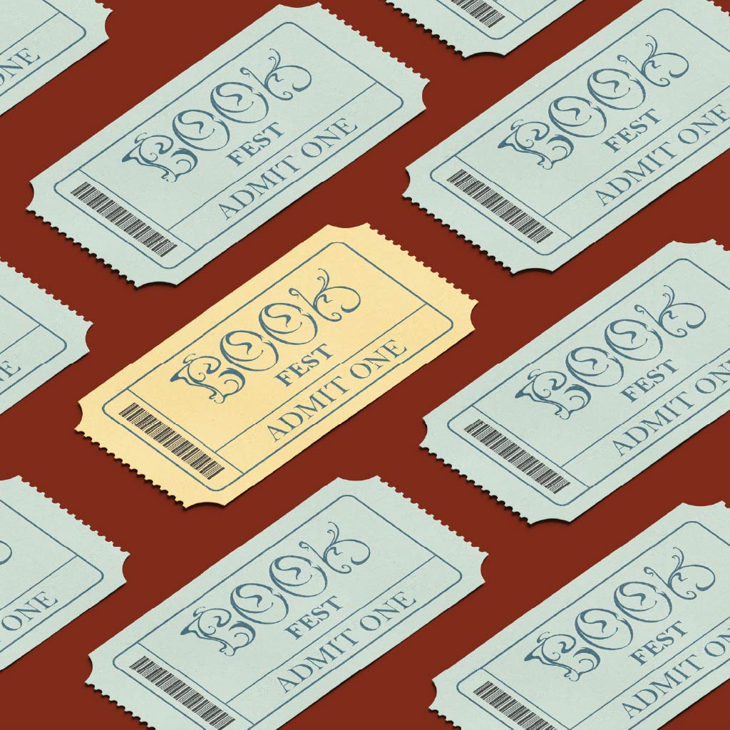
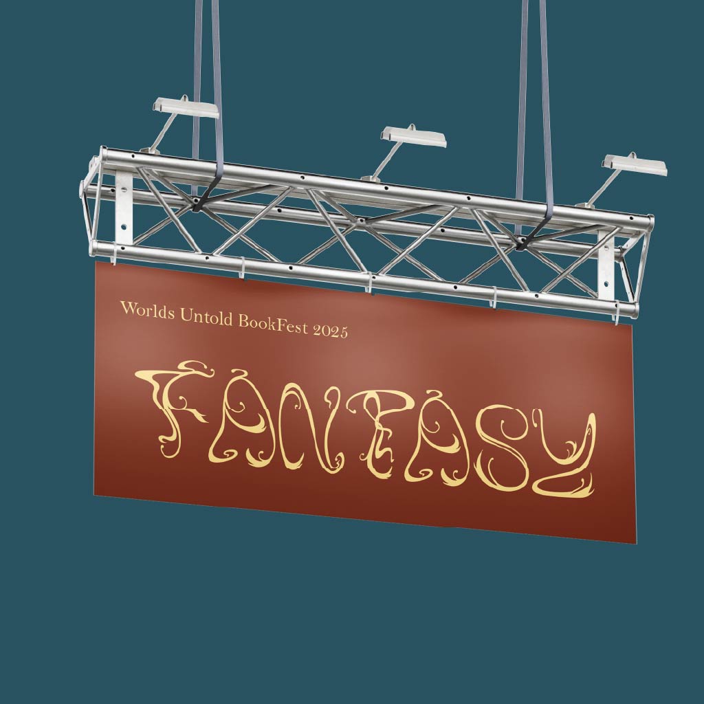
Aside from physical books, I considered other products related to reading and turned my attention to book festivals. These events typically use large banners to guide visitors to different sections based on genre or category. Similarly, many book festivals are ticketed, requiring printed tickets or paper wristbands. Following the themes of Art Nouveau, I chose to design a vintage-style ticket. Instead of using a traditional tag number, I incorporated a barcode to better suit the digital age.
You may test type Squiggly Regular here:
Initially, when I was told that nobody makes a font “just for fun” and that it requires a great deal of work, I foolishly thought to myself that it would be fine and that I would have many opportunities to create one for fun in the future.
This project has truly humbled me and taught me the importance of paying attention to details that I once believed no one would notice.
Typeface design has revealed itself to be less about creativity alone, and more about perseverance, precision, and the discipline of revising what I thought was already finished.