
So why design another stencil typeface? Xavier Dupré (2007) in the introduction of his typeface Malaga suggested two reasons for designing a typeface:
- type design carries a social responsibility so one must continue to improve its legibility.
- type design is a form of artistic expression.
In the context of the Stenz stencil typeface, the above two reasons were part of the motivation for its existence. The raison d’etre had to do with a dearth in choices available at the local stationery stores. To give you a clearer picture of the how and whys, I would have to go back in time to the year 2006.
During my rounds as a design and photography lecturer at the Malaysian Institute of Art, I observed students in the Foundation course using stencils to label their mounted artworks.
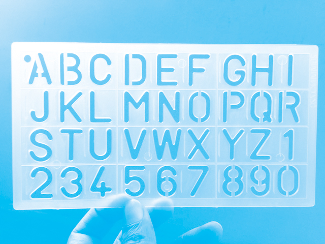
As I stood there and observed, I realised that all the students were using the same stencil typeface — the same stencil I used when I was in school. These are the ubiquitous blue coloured ABC stencils that are sold in most, if not all, stationery stores in and around Malaysia. These stencils were manufactured in Japan and sold here in the 1980s. They are sturdy, durable, common and easily obtainable in any stationery store.
Naturally, I wondered to myself why weren’t there any other options? When I visited stationery stores I would sometimes come across different stencils but these were rare and not too appealing—they were either too small or not very legible. Therefore, it dawned on me that perhaps it would be beneficial to create a stencil typeface as an option to the ubiquitous blue stencil that has served many children and students over the ages. This option will cater to those seeking an alternative stencil typeface that is friendly, appealing and unique.
Up until that point, I was designing typefaces on impulse or just for fun. I was at a point in time, where I was looking for more meaning in what I was creating. I wanted what I created to be of some benefit. Therefore, when I realized that the stencil typeface that I wanted to design could fulfill a perceived need, I was driven to design and create a new alternative.
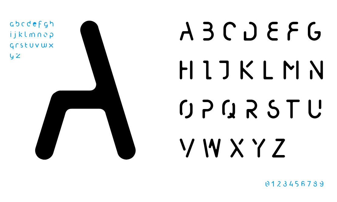
I decided that in order for the typeface to be friendly, I would need to design the stencil typeface with a minimum number of strokes. Therefore, I decided to use a rounded characteristic for users to stencil out the letters quickly and with ease. The rounded characteristic eliminated sharp angles that are difficult for pens or pencils to reach or fill.
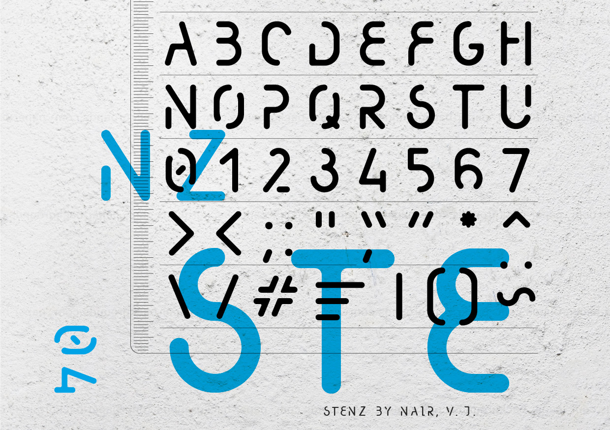
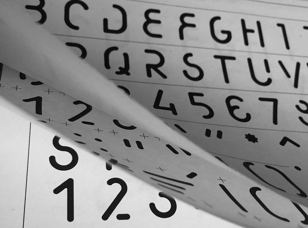
I also wanted to make a stencil typeface that seemed to flow from one letter to the next. Stencil typefaces tend to be halting in appearance due to the required gaps in-between the letter forms. As such, I wanted the gaps between the letters to become part of the design and character instead of it being an imposition.
The Process
When I began, I purchased the widely available blue ABC stencil from a local stationery store and analysed the lettering to understand its strengths and weaknesses. The knowledge gained from this analysis would help me create a stencil typeface that was practical but also stylish.
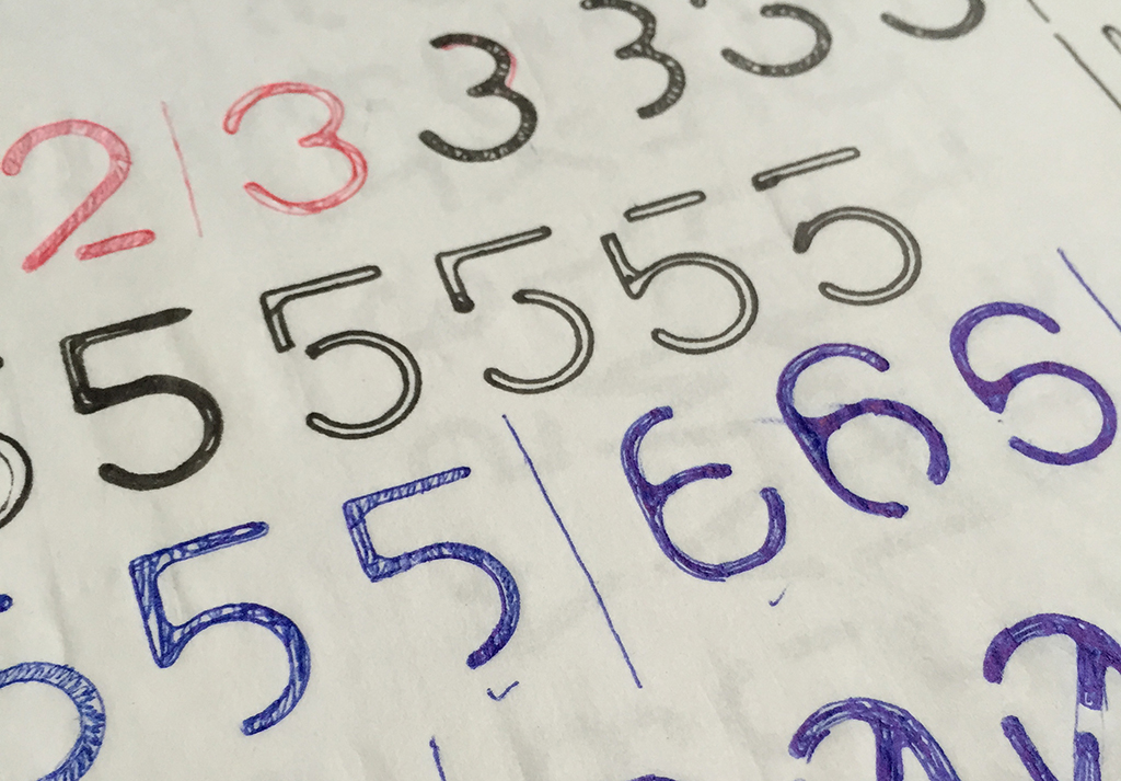
I started by stencilling out an uppercase letter from the blue ABC stencil, and then progressively developing, exploring and redesigning them. I took great care to insert gaps at places where it seemed most natural. During the design process, I remembered Phil Baines’s typeface FF Can You Read Me and knew that taking away certain parts of a letter wouldn’t affect readability and legibility a great deal. This is because the human brain reads by recognizing patterns.
As such, I set about integrating the gaps required in a stencil along with what I believed to be redundant strokes in the letters to develop whole new forms. I would only stop when a form seemed appealing and utilitarian in nature. The process of designing the upper and lower cases took approximately a month. However, the process of crafting the letters digitally took much longer. There were periods where I would have to stop because my objectivity was compromised. There were also periods where ‘real-work’ — the wage paying type — would interrupt the design, development and improvement of the stencil typeface that would become Stenz.
The Stencil
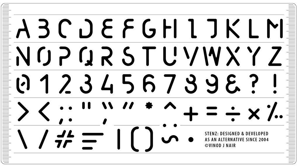
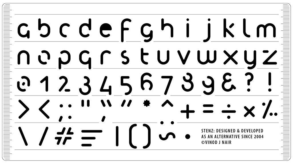
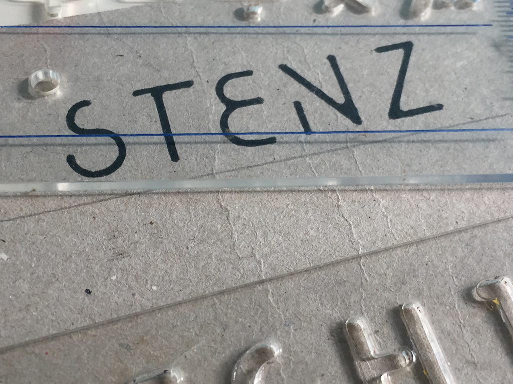
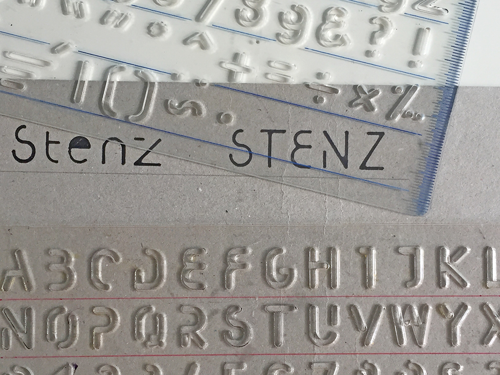
Once the designs had taken shape, I needed to determine how to assemble all these letters on a stencil not larger than 11 mm x 21 mm. A size just about right for hand holding. My goal was to add features that would give this stencil a distinct advantage. Therefore, the arrangement or the laying out the stencil was an arduous process in itself. Unlike the existing stencils out there, this version came with both upper and lower cases, punctuation, guide lines and millimetre measurements.
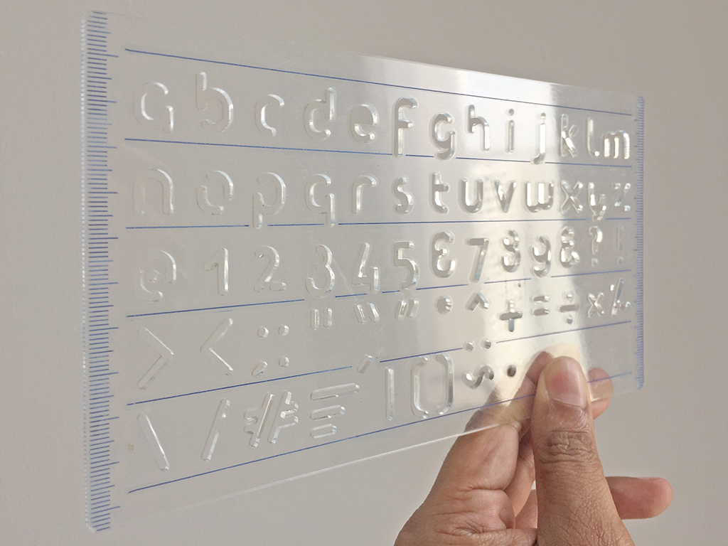
When the arrangement of the letters was complete, I reached my next stumbling block. How could I create a prototype of this stencil? Over many Teh-tarik sessions with fellow lecturers, some of them product designers, I was advised to try laser cutting on acrylic. There was a learning curve with regards to preparing the artwork for laser cutting but once that was overcome, the first prototype was ready to come to life.
Watching the prototype being lasered, seeing the letters cut-out and then finally holding the prototype in my hands is an experience that I will never forget — the culmination of a long and exhaustive process. I was thrilled, elated and overjoyed. I couldn’t wait to try it out. The first time I used it, I noted that there were many improvements that were needed to be made. In the subsequent days and weeks, I would make several trips to the laser cutter—a model making company for an architectural firm.
The last stumbling block was the manufacturing, marketing and distribution process, something I never overcame. Capital was required to take it to the next level; injection mould for mass production, market research, profitability forecast, target audience, distribution and sales etc. Since then, I have returned to the designs once in a while to make improvements. After a while, the prototype stencils remained in a drawer and forgotten.
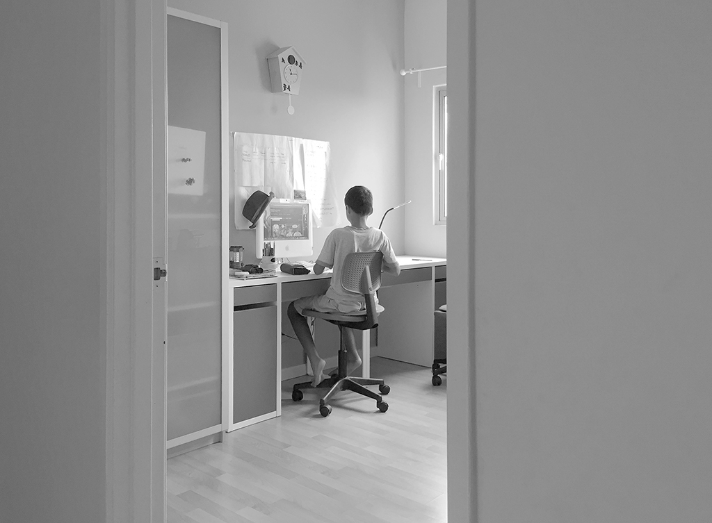
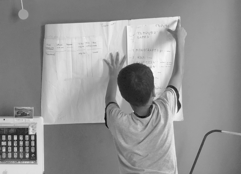
In 2015, my son stumbled upon these prototypes and in one of his personal projects — he has many — he utilized the prototype Stenz stencil and created a table with a list of items. This was put up on his wall. I was passing by when I noticed these letters on the wall. For an instant, I didn’t recognize them and I stopped to take a second look. It dawned on me several seconds later, that these were my designs. I was elated that he found and used them, and I was thrilled that I found my own creation worthy of a second look — I am my biggest critic you see.
I then decided that I should copyright the design and name it. I settled for Stenz as it is closest to the noun stencil. The design was copyrighted in January 2016.
The Stenz typeface was designed for use as stencils. It is a display typeface. I hope to make the typeface available to potential users soon and am at present identifying platforms (Google Fonts, FF Fonts, etc.) suitable for hosting and downloading.
I wanted to share this work which would have otherwise sat in my hard drive and known only to a few. Perhaps this will inspire others to share their own hidden or forgotten works of art — artworks must be shared, enjoyed and used. After all that was the intention underpinning the need to create the Stenz stencil typeface.
You must be logged in to post a comment.