The first consideration of designing for screen especially designing for the web is the ability to create a user-friendly user interface (UI). It is not as easy a task as preparing for print design— especially for students who have no experience in UI design. Not only is the process tedious, but it also needs careful planning to achieve an effective UI.
To ensure the effectiveness of any UI, professional web designer practices usability testing to evaluate it. According to usability.gov, usability testing is a process of evaluating a product or service on a group of representative users. In the process, the participants will be given a specific task to complete while observers watch, listen, and take notes. The objective of the test is to identify any usability problems, and to collect qualitative and quantitative data to define the user’s satisfaction with the product or service.
The best way to learn how to design a usable UI (regardless of the medium) is to understand what the user wants/needs. Don Norman, an expert of human-centered design, outlines in his book, The Design of Everything, six key principles in designing effective UI: visibility, feedback, constraints, mapping, consistency, and affordances. In order to achieve these, the designer has to go through several iterations of user testing— for example, designing UI for an information kiosk user interface for Taylor’s University.
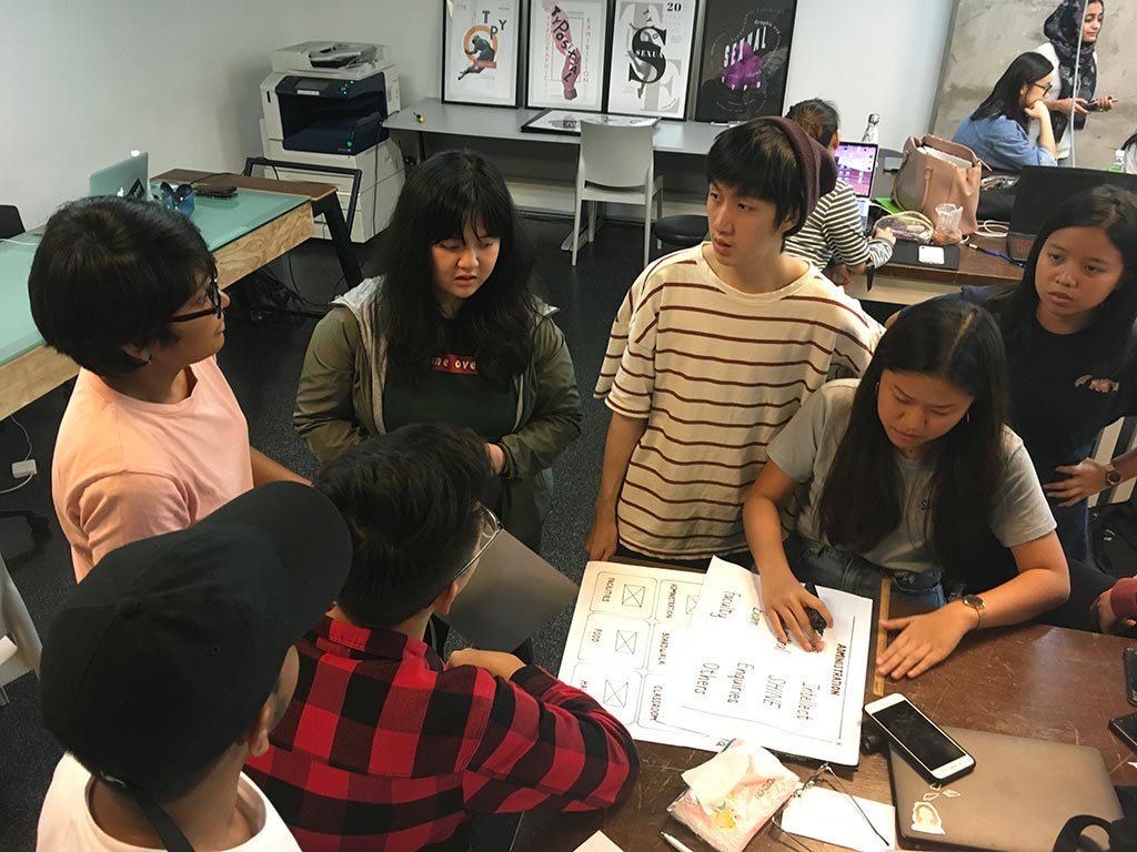
How to do it? At the beginning of the class, the lecturer showed a video about Norman Door. In the video, Norman explained the importance of human-centered design and how it can be applied in design. After the video, the lecturer described the differences between User Interface and User Experience during an hour lecture. After the lecture, the students were then instructed to create a paper prototype to complete the exercise. Students were divided into four groups to execute the exercise. During the exercise, the group was split into a content team and a design team.
The content team gathered information on how to categorize the content by walking around Taylor’s campus to observe/discuss the possible processes that are taking place in the actual setting while the other group analysed TU’s website to better understand the school. The students decided to assign the team to create a scenario for the user testing before they would create the UI. The process became effortless when they identified the type of task or process flow of TU’s student-related activity. Most of the group decided to create a scenario to aid students in selecting a place to eat.
“The tasks included collecting and organizing necessary information, categorizing the information, and designing as well as drawing out the pages.” Joanna Patrick, student
Later, the students regrouped with the design team to discuss how to categorize the navigation. Each group created categories based on their intended target
audience such as visitor, parents, new students, or possibly all. In a real setting, a professional experience designer would use card-sorting method.

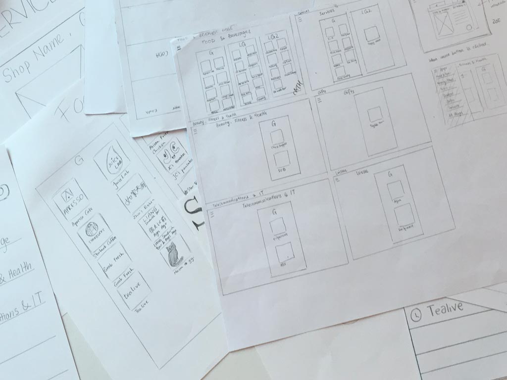
Once the decision was made for the navigation system, the design team sketched several wireframes for the prototype, while others observed or planned how the user testing would be conducted later.
It took a while to prepare the paper prototype because there are many considerations to be made. Each group must know the expectations of the target audience when they first look at the interface.
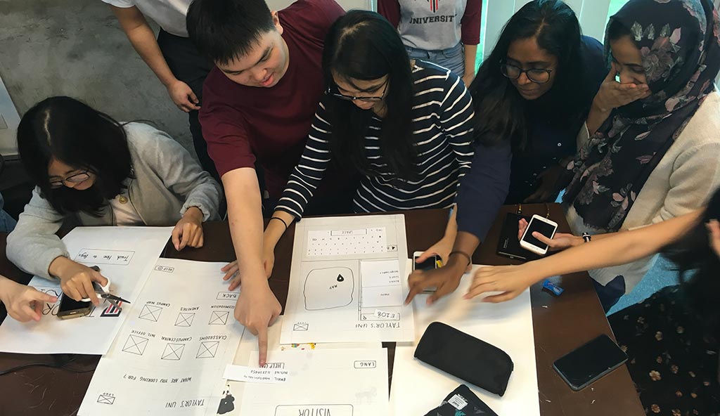
Toward the end of the design process, each group conducted a simple usability test for the other group’s paper prototype. During the test, group members observed, took notes, and documented the error or bugs that the user experience.

Although it’s a simple usability testing exercise, the students gained an understanding of how it would be done in a real setting. They began to realize the importance of user-centered design and how to utilize this strategy for their other class projects.
Reactions about the exercise from the students:
“I had a hard time designing a good user interface with my teammates because I was trying to not create lots of pages, but after seeing everyone’s design interface, I understood how crucial is it to have a good interface.” — Maydeline

“When designing a user interface or user experience design, always remember to think from a user’s perspective when using the application/website/product. Make sure to create a design which is easy and convenient for the users to use.”—Andrea
“I found out the importance of consistency from the interface exercise. Consistent design and flow will make it easier for users to access.”– Joanna Patrick
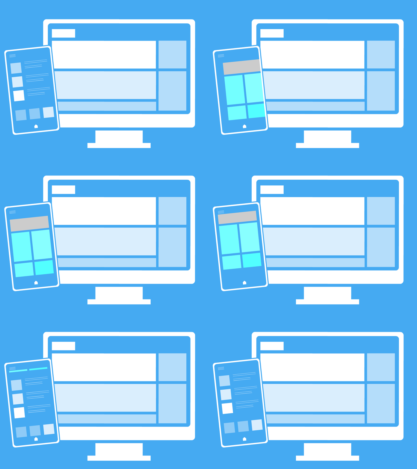
Motion graphic by: Shamsul Hamimi

