
As a student in the second semester of the Creative Media program at Taylor’s University Design School, I discovered in my advanced typography class that stencils for Thaana (Maldivian Language) letters are nearly non-existent and those that are available lack appeal.
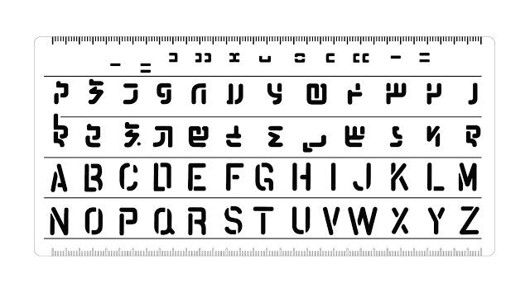
Therefore, I began the process of creating a suitable stencil font by analyzing the existing typefaces. The investigation gave me a sense of how the letters were constructed and helped to identify the characteristics that defined each letter. Thaana, like Arabic, is written from right to left while the diacritical signs called fili denote the short and long vowels.
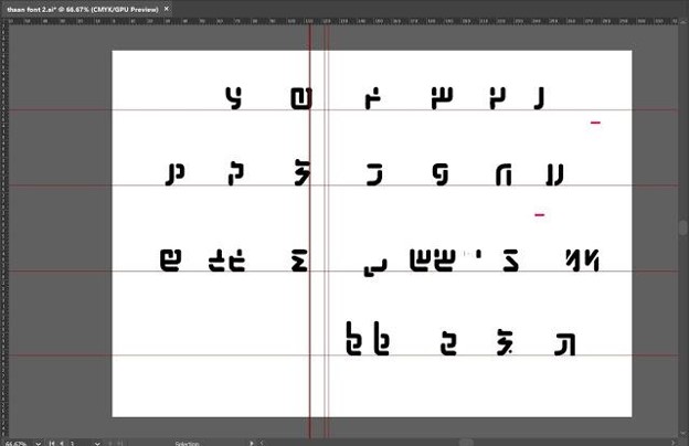
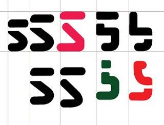
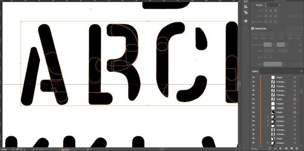
I started by writing down the Thaana alphabet and outlining the individual letters. I used the outlines as a guide to create a simplified font. Then I began developing and redesigning the alphabet. The following step of the font development was the insertion of gaps in letters with closed counters. I explored several ways to insert the gap in the letters so that it did not hinder the design of the font.
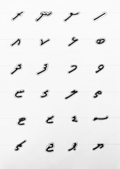
Next, I moved on to roughly digitizing the initial design. I was not completely satisfied with the results so before moving any further, I consulted my lecturer, Mr. Vinod, who pointed out that the problem may be the fact that the design was too simplistic and delicate. He suggested that I look into finding a way to construct the glyphs differently. He also explained that as part of the project I should create a compatible Roman alphabet for the MV stencil font.
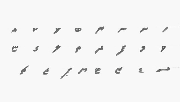
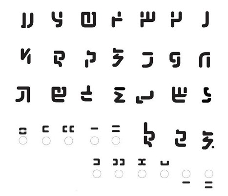
With this feedback, I started sketching ideas for a new design. Initially, I thought of redeveloping the style of writing that I had previously studied. However, after sketching out the different variations of the design, I realized that it would be difficult to reflect similar characteristics of the Roman alphabet. So, I began exploring other possible styles for the font. The design for the final font was rooted in a much older style of writing, Thaana script.
With the concept in mind, I began sketching, gradually developing the style and design of the letters. Afterward, I started the painstaking process of digitizing the letters. I must say, even though the process of refinement was tedious, the feeling of seeing the letter designs coming together as I progressed was incredible.
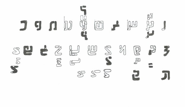
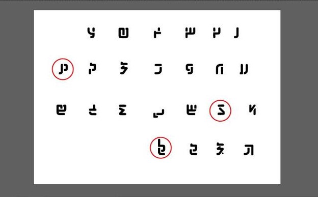
In order to evaluate the readability of the font, Mr. Vinod sent the typeface to a senior student Rausha Aminath, who is also Maldivian, to critique the work. She identified a few of the letters that she believed needed further improvement. I then began further letter refinements to fine-tune the letters and make them more recognizable. After reaching a satisfactory outcome with the letters, I then moved on to digitizing the final segment of the Thaana stencil font with the fili. This step was not too difficult since most of the elements required in the construction were available within the letters I had designed.
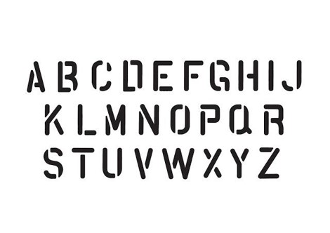
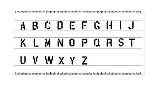
The completion of the Thaana script was, however, not the end. I still had to make the Roman version of the typeface. Instead of sketching these letters, I used elements from the Thaana letters that helped me to maintain consistency within the typeface. I also paid close attention to maintaining the same gap widths among all letters to preserve the uniformity.
The completion of the roman alphabet marked the end of my stencil font. Now, it would be a matter of refining it and finalizing it so that it is ready to be put on stencil boards.
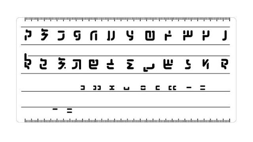
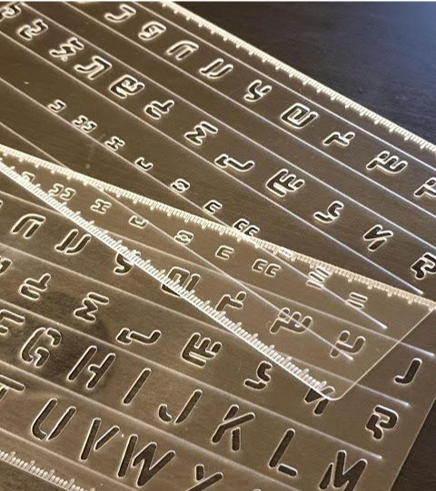
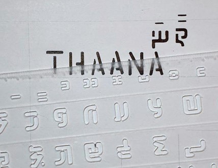
I found that the optimal size for a stencil board is no larger than 11 mm x 21 mm. I wanted to create 3 different stencil boards — the Thaana alphabet, the Roman alphabet, and both alphabets combined. Though the arrangement of the letters on the stencil was not too difficult, the challenge arose in developing the prototypes for the stencil boards.
After discussions with my lecturers, I decided to laser cut them on an acrylic board. The production of the prototypes was not an easy task. Although the first cut-out was faulty, holding the solid prototype of the fonts gave me a feeling of joy and excitement. This was, however, short-lived because I was facing issues with the diameters of the gaps in the letters. Some gaps in the design were very slight, making them very flimsy. This was obviously not ideal for stencil boards. Being a first-timer to laser cutting, I struggled to grasp the ideal dimensions for the perfect cut-out. After numerous late-night trips to the printing shop and the looming deadline, the stencil boards were finally ready.
WOW..so beautiful…so proud of you son.