
This is the first of three articles, read the second here, and the third here. The first functions as an overview. It focuses on what underpins the designs of Malaysian school badges. The second and the third articles examines the oldest school badges, and how the designs can be improved in accordance to the conventions of heraldry.
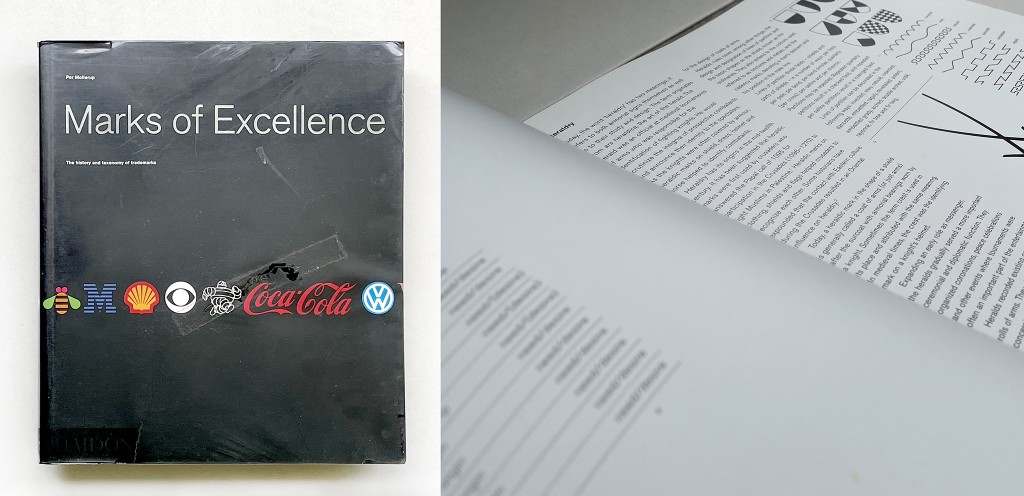
All this changed between 2004–2008. During this time period, I had purchased many books on design. One of them was Marks of Excellence by Per Mollerup, a Danish designer and author. The book began with a brief history on the origins of the trademark: “the historical forerunner of modern trademarks evolved from the need and desire for social identification on the part of the individual or group”. In the section under history, the book introduced the discipline of heraldry, which is a medieval practice to identify knights or royalty, more on this later. I found the level of complexity in its use of symbolism intriguing and fascinating. While I had never heard of the term heraldry before, I was very familiar with its visual form as I would come to learn. In reading about it, I was struck with a revelation that our public school emblems (and government coat of arms) are based on this medieval European heritage.
On the one hand I was elated to have discovered this knowledge but on the other hand I was disturbed that we are still held captive by the vestiges of colonialism in our visual communication.
Before I go any further, I am using the term ‘emblem’ as opposed to ‘badge’ because when a school emblem is worn on (or adorns) the school uniform, it is only then referred to as a badge, which indicates your allegiance. So, a more appropriate terminology when referring to representative school symbols, especially if it is heraldic based, would be ‘emblem’.
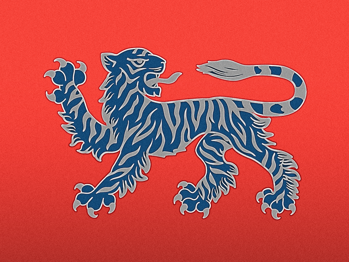
So, what is heraldry? Heraldry is of medieval European heritage. Heraldry are symbols of identification of distinguished persons or states, it is “the science and the art that deal with the use, display, and regulation of hereditary symbols employed to distinguish individuals, armies, institutions, and corporations”. They adorn banners, shields, or worn armour. Heraldry is created by a herald who is historically appointed by the sovereign of the state. Heraldry allows a fully-kitted knight (Figure 2) to be recognised through the heraldic devices (arms/armorial bearings) that adorn his coat of arms (worn on his body over his armour) or his shield (escutcheon). It allows armies to distinguish foe from friend during battle. Royal lineages would be assigned unique armorial bearings (cadency marks) to differentiate but also indicate hierarchy. “Many of the terms used in heraldry are French in origin because French was once the formal language in the civilised world of Europe.” But an etymological study would also reveal Norman-French, early English, and ancient Germanic words in the lexicon. Today heraldry is often used in branding, companies such as UPS (United Parcel Service), Porsche, Bank Negara Malaysia, or Tag Heuer.

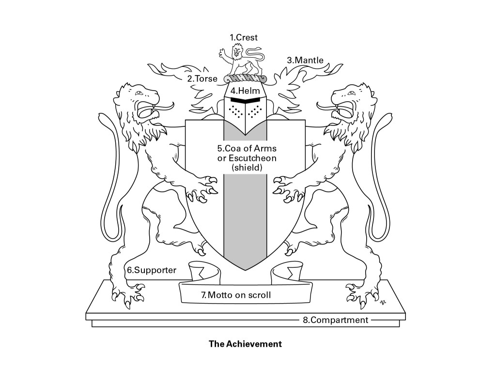
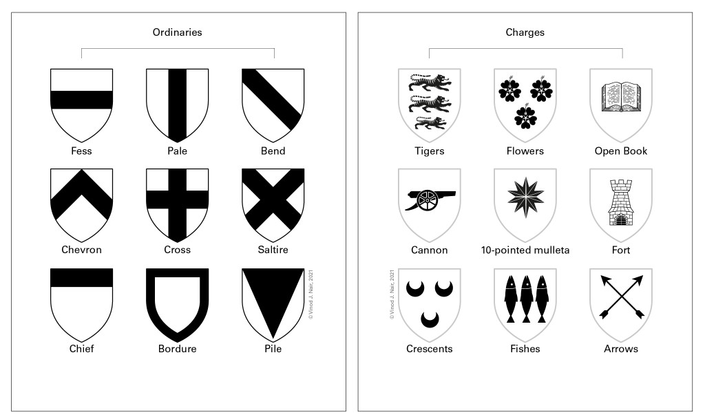
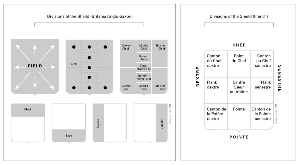
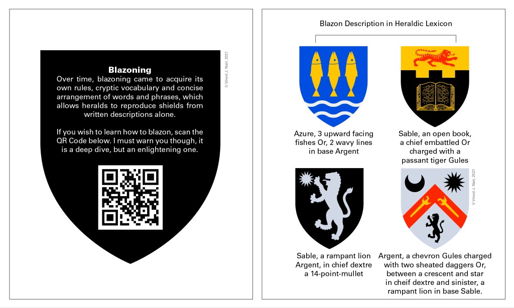
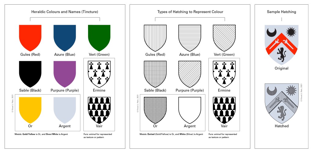
The basic components of heraldic achievement are the shield, motto, mantle, helmet, crest, and supporters (Figure 3). The shield is then decorated using ‘charges’ (Figure 4), which can be simple geometric shapes known as ‘ordinaries’ that constitute shapes like: cross, saltire, or chevron amongst others. Charges can also be in animal form or symbolic in nature: plant, object, building or other devices. All together, they are referred to as a ‘coat of arms’, and the formal written description of the arms is called a ‘blazon’. Heraldry has its own lexicon and formal language of description (Figure 6) and one has to learn to write it accurately for another to decipher it. In medieval times heralds would have to decipher the blazon and draw it out for it to be displayed in jousting competitions between knights from different regions. When armorial bearings are displayed in full (all the devices inherited and personal) it is then referred to as ‘achievement’ or ‘achievement of arms’—one has to accomplish something for it to be recorded in the achievement. A person who has inherited or was lawfully granted arms is referred to as an ‘armiger’. The level of complexity in the discipline of heraldry often leads to a life time of study—such is its depth.
Today, the UK’s College of Arms is an official body that continues this tradition and oversees the granting of coat of arms, flying of flags, and the maintenance of other national symbols among other duties within the UK. The College of Arms is headed by the ‘Garter King of Arms’, a position that has been in existence since 1417. This is the office that created the coat of arms for the Federated Malay States in 1915, which served as the basis of the updated coat of arms in 1952 and all subsequent amendments. It was also the office that designed the Federated Malay States’ ensign (flag), which is “a flag that is flown (as by a ship) as the symbol of nationality”. This ensign (Figure 7) was developed from the flags of 4 states namely Perak, Selangor, Negeri Sembilan (then spelt as Negri Sembilan) and Pahang.
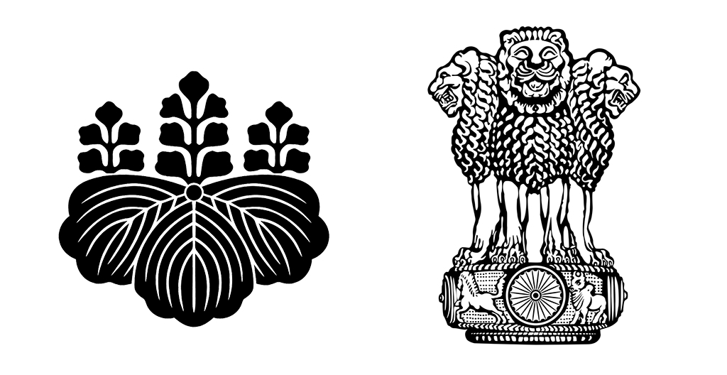
Curiously, due to its relative isolation, Japan has developed a unique visual language in the form of “Mon” emblems or Kamon symbols that have a similar function to heraldic emblems of Europe. Interestingly, unlike many other former British colonies, the newly independent Indian government bucked the trend of using a heraldic based coat of arms and chose an emblem from the Mauryan empire — an empire that produced the world’s oldest treatise on politics and philosophy, The Arthashastra — as its representative symbol.
We in Malaysia, sadly, were deprived of an opportunity to set our very own visual language due in part to the lack of visual literacy among decision makers then and now, and citizenry in general. It will take time and much effort on the part of visual communicators to educate and raise awareness in visual literacy, in so that we may take ownership of our national symbols and perhaps, someday, chart a new direction.
“A visually literate individual is both a critical consumer of visual media and a competent contributor to a body of shared knowledge and culture.” — Thompson D. S. (2019)
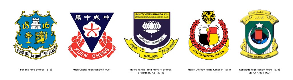
In Malaysia, the majority of our public and private school emblems are based on heraldic designs. It has become the visual form associated with education institutions and many do not question how this came to be. That said, Chinese medium school emblems do vary using geometrical shapes instead of shields, and more recently newer Islamic religious schools (sekolah agama) have begun to move away from the heraldic system. Even so, the vast majority still retain elements adapted from the heraldic system either in the use of a motto, charges, or division of field/space to place charges in. Unfortunately, many do not follow the rules and design conventions that govern the discipline of heraldry, as a result there are a great many schools, institutions, associations, foundations, government bodies with coat of arms that are of poor design. These of course can be rectified if there is increased awareness and if knowledgeable heraldic artist are consulted and commissioned.
In an era where we have become more conscious about our culture, heritage and lineages, I wonder what would have been the shape or form of the symbols we would have adapted were it not for the colonial presence (and subjugation), or if we had chosen to adopt a new visual language upon achieving independence. While colonialism is a thing of the past, the “colonial mentality” or an unquestioning mind held captive still persists amongst those who originate from former colonial states. Today western hegemony of media continues this insidious and subtle influence of culture and visual language. Thus, the “captive mind” is no longer a construct that only afflicts former colonies alone.
In my next article, I will touch on the history of some of the earliest ‘formal’ schools established in Malaya, and the emblems of these schools. I will also look into how these emblems have visually devolved over time and in many cases no longer conform to heraldic conventions (rules). I will attempt to correct or redraw some of these school emblems, which I think you might find exciting. So, stay tuned.
Let me leave you with a taste of what is to come.
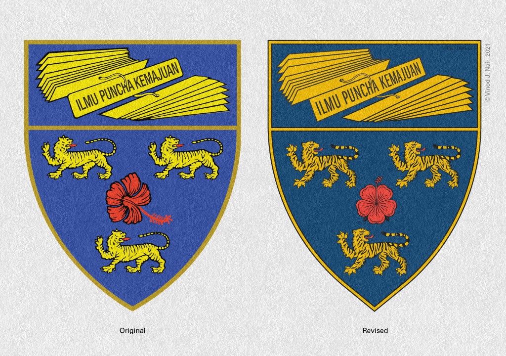
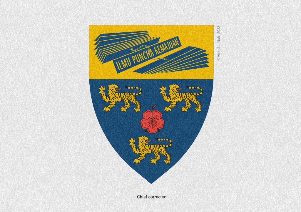
*Update: As the article made its usual rounds on social media, I received a comment from an Andrew Yong. It was very astute of him to catch this in the Universiti Malaya coat of arms, as I had outright missed it. He pointed out that the ‘chief’ did not comply with the rules of tincture. The rule of tincture states, to never put a colour on colour or a metal on a metal. The chief is the rectangular shape at the top of the Universiti Malaya shield (see Figure 4), and as an ordinary it is a charge in on itself. The chief is currently Azure (blue) which sits on a field of Azure, both are colours, thus breaking the said rule of never putting colour on colour (see figure 7 for what constitutes colour and metal). To correct this, the chief should be a metal; gold or silver (yellow/white) if the shield’s field is Azure. See the correction (Figure 11).
An insight of a biting truth – we are surrounded by many visual semiotics that place a grid of power over us which we unconsciously allow to continue to manipulate us. When the Imperialists left after signing formal treaties, natives assume we had won ownership to our lands. These emblematic imprints unfortunately suggest we have yet to claim our selves. Therefore, have we reached independence? Perhaps a more forward-thinking question, what shape of forms of symbols can we design for ourselves that can be powerful enough to liberate us?
That is, the question. I suspect that these forms/symbols will take shape only if we become aware of what ‘is’. I think there is much historically that can be leveraged on for forms and meanings, if, we are able to embrace our shared (regional) history openly and truthfully.