
This write-up follows a previous article on what underpins the design of Malaysian school badges. The article below examines the oldest school badges, and how the designs can be improved in accordance to the conventions of heraldry. The sequel to this article can be read here.
When this article was first completed, I had covered secular, missionary, vernacular, and religious school emblems and their revisions. I was excited to share these design revisions, but the article exceeded the word limit, so I divided the article into two parts: the first will cover oldest secular and missionary schools, and the second the vernacular and religious schools.
Formal schools in Malaysia began with the entry of the British into Malaya. All schools in Malaysia today are modeled loosely around these early pioneers, and many of the traditions and practices established then continue to be maintain until the present time.
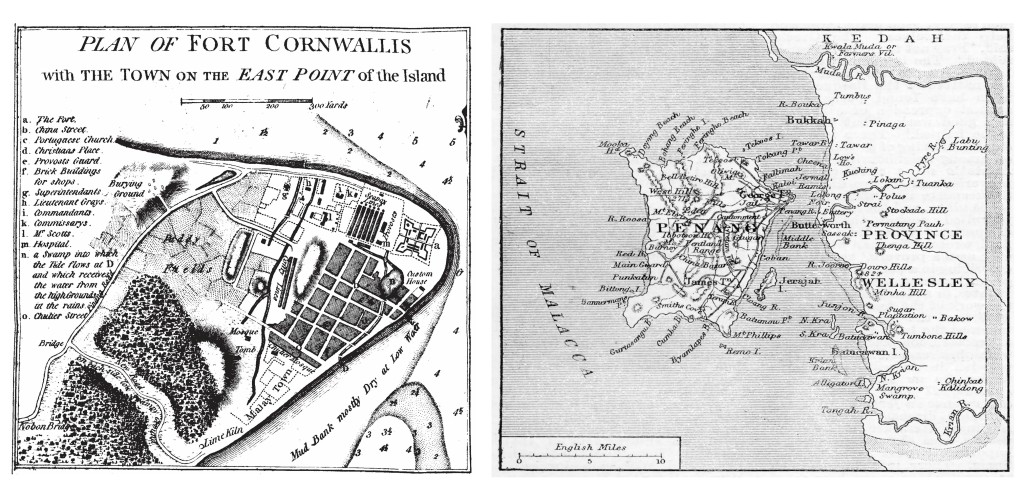
The first foothold of the British East India Company in Malaya was in 1786 when Captain Francis Light leased a sparsely populated island from the Sultan of Kedah, Abdullah Mukarram Shah, through chicanery from false promises, one of which being military aid, none of which he intended to keep. Light christened the island Prince of Wales, today known as Pulau Penang, and established George Town that very year. The island would serve as a free port and this would fuel its growth.
With this growth in commerce and population came certain needs, education being one of them. The first formal school was setup 30 years after Penang was established. More would follow as the years went on. Some of these schools were understaffed, underfunded, and many of the premises they initially occupied were temporary in nature. Thus, the focus in the initial days would have been on existential issues.
When school emblems were eventually created, the responsibility for creating them went to the foreign clergy, principals or teachers who had an idea of what school emblems looked like in their home countries but would have lacked, understandably, knowledge in the principles and conventions that governs the design discipline of heraldry.
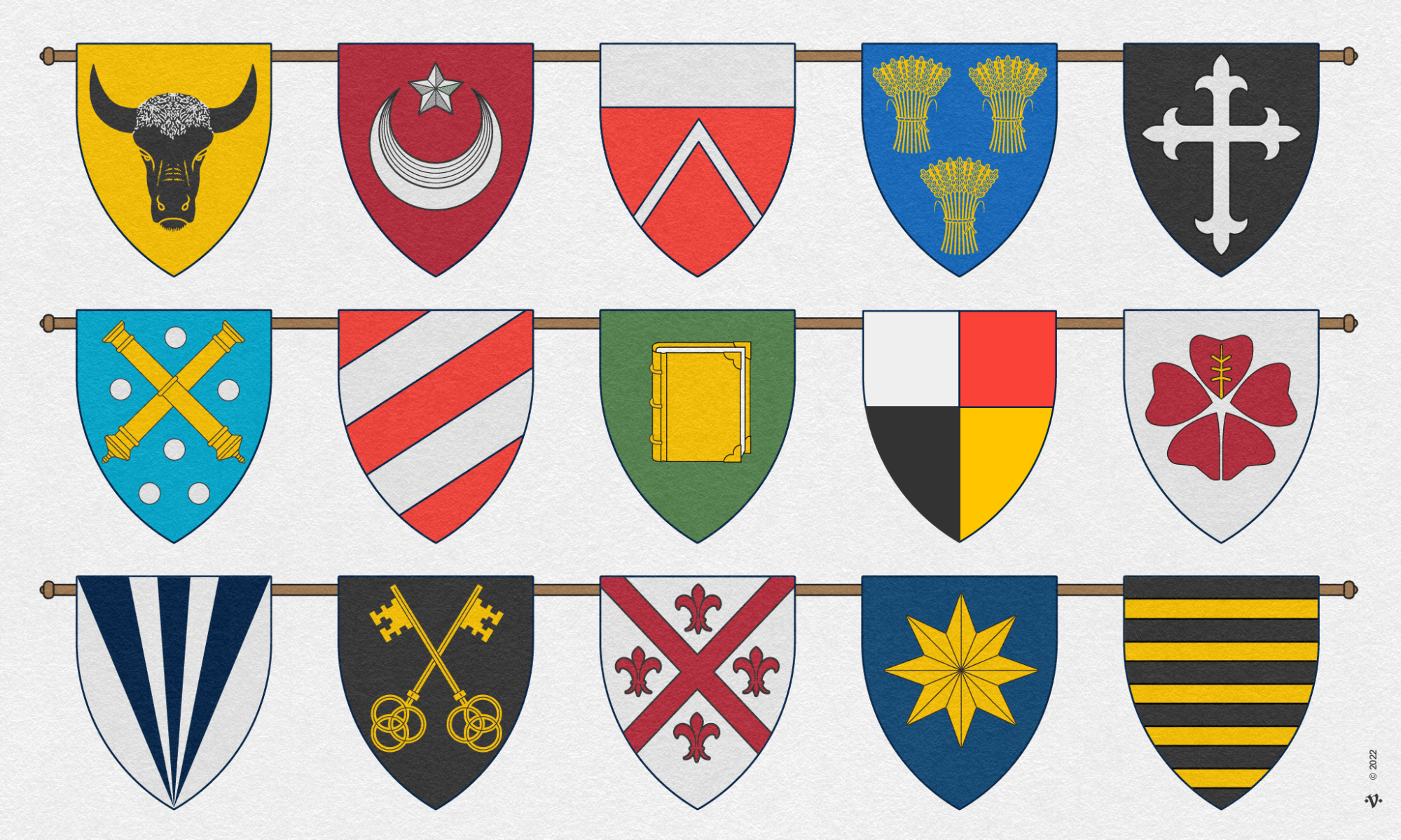
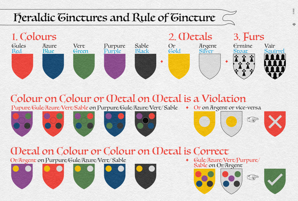
Most school emblems in Malaya and Borneo back then, and in Malaysia today, consist of a coat-of-arms and a motto. These devices are features of heraldic visual communication meant as distinguishing marks. A coat of arms colloquially referred to as the shield (a.k.a escutcheon) in a school’s emblem generally displays a ‘charge’ which is a symbol or shape that is unique to the school. The combination of symbols and shapes on the shield is collectively referred to as armorial bearings or ‘arms’. Hence the term, coat of arms. The school emblem is further differentiated with the use of tinctures consisting of 5 colours, two metals and two furs. Its use is governed by the heraldic Rule of Tincture (RoT).
So what is the Rule of Tincture? The rule states “to never put a colour on colour or a metal on a metal”. This rule exists to ensure that the coat of arms contrasts well and is legible at a distance — a good rule for logos too.
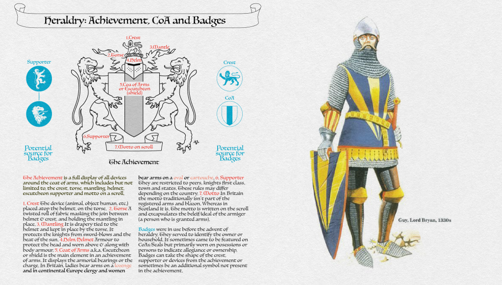
Before I continue any further, permit me to correct some common errors in terminology. If you have not read my previous article on the topic then I should clarify that the term school ‘badge’, is an incorrect term to describe what is a school’s emblem. When a school emblem is worn on person (or adorns belongings), it is then referred to as a badge. A badge is a mark of allegiance worn by those who are allied to an individual, family, royal house, or in this case a school. Another misnomer is the use of the term school “crest”. A crest is the device (animal, object, human, plant etc.) that sits atop the helmet on the torse of an achievement. An achievement is the full display or depiction of all the heraldic components of the armiger (a person entitled to bear heraldic arms). The central element of the achievement is the coat of arms (see figure 3).
In analysing Malaysia’s old school emblems, I was able to identify some common heraldic infractions prevalent amongst them:
- Rule of Tincture (RoT) violations
- use of written text in the coat of arms
- use of scrolls to write the school’s name in place of the motto.
The other problems were design related: like arrangement of the charges on the shield, the poor crafting of the charges or the emblem, and the overuse of certain charges which compromised uniqueness. As heraldry is strictly a pictorial form of communication, shields should not contain text unless on a book, i.e. Oxford University. Scrolls are conventionally used to place mottos (and not school names).
With that out of the way, let us look at these old Malaysian school emblems amongst the different types of schools in Malaysia — reflective of its pluralistic nature but also, the colonial strategy of division.
It must be noted that prior to the establishment of ‘formal schools’ — the type we are familiar with today — informal schools called sekolah pondok (Islamic religious schools) had been in existence in the Malay states. There are no reliable images of the Pondok Pulai Chondong (1820) or Kampong Pali Koran (1804), religious schools and thus far I have yet to come across any seal or symbol that represented the said pondoks.
Old Secular and Missionary School Emblems
The first formal school established in Malaysia was the Penang Free School (PFS) in 1816. It was secular in education and open to all. The oldest missionary schools in Malaysia are St. Xavier’s Institution (SXI) for boys, and Convent Light Street School for girls. Both were located in Penang Island and were established in 1852. While in Borneo, there are several schools that were established in the latter part of the 19th century, namely St. Teresa and St. Thomas in Kuching, Sarawak, and in the early 20th century the All Saints School in Kota Kinabalu, Sabah, initially known as King Edward VII, was established in 1903.
In the following I will feature the current school’s emblem on the left, along with my revision or redesign of the emblem in compliance with heraldic practices on the right.
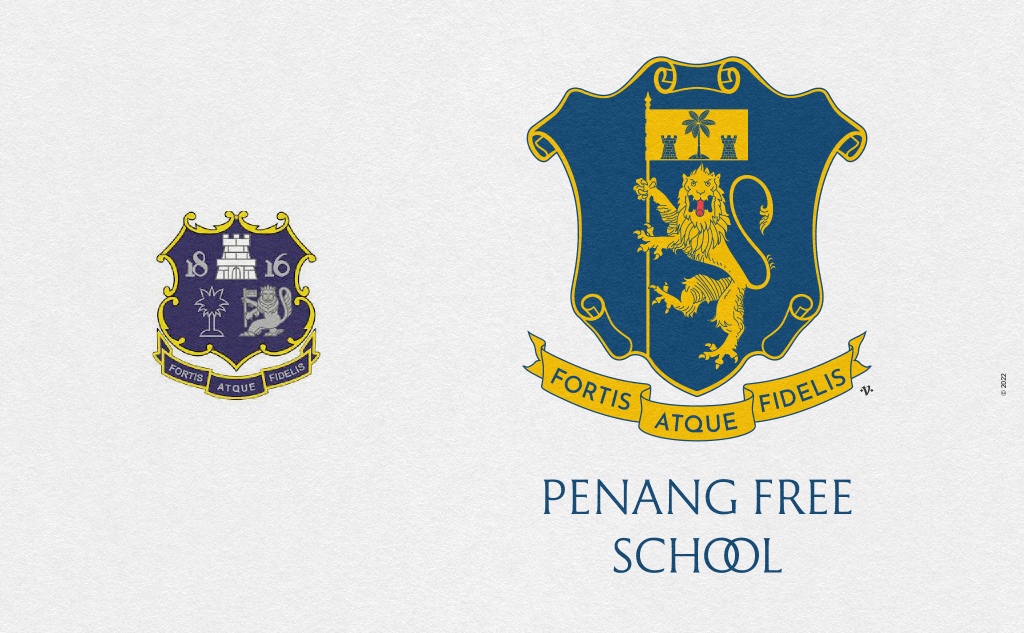
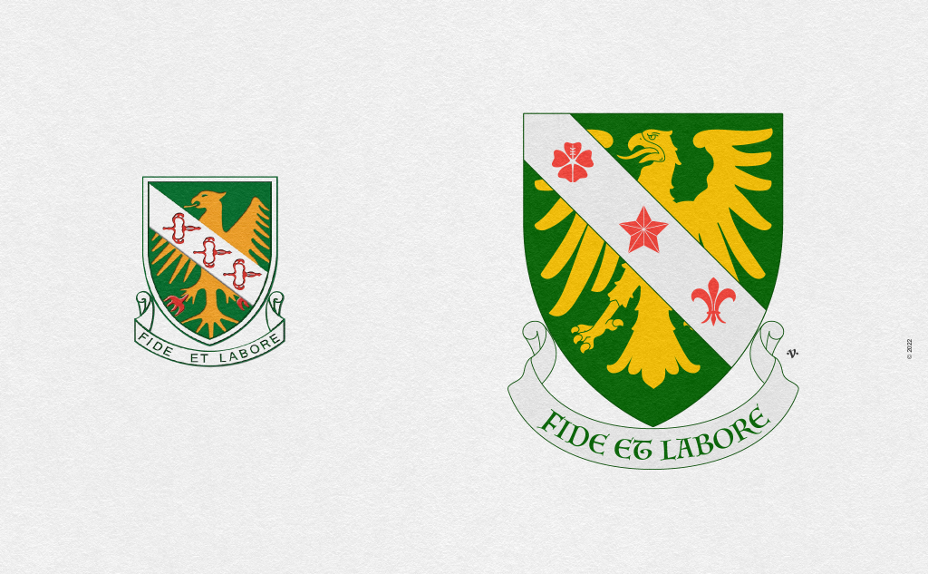
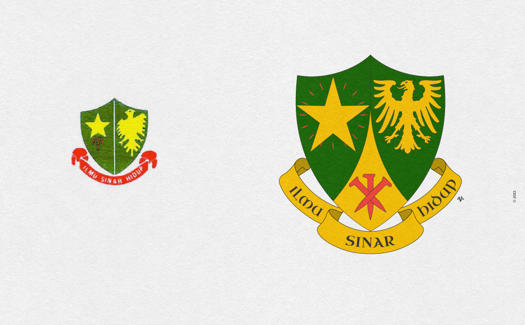
The Penang Free School was established in 1816 and is generally seen as secular in constitution. The current school emblem on the left consist of an elaborate shield that followed 18th century trends of the Rococo period — a rather decadent time for excesses in heraldry. The shield is charged with a lion holding a banner, a fort, a palm tree, and the numerals 18 and 16. The motto in Latin is “Fortis Atque Fidelis” and appears on the scroll. The tinctures used are Azure (blue), Or (yellow), and Argent (white). Not shown here, the school emblem appears to have two variations of Azure; a lighter blue (bleu celeste) and an oxford blue. The bleu celeste has less contrast and thus lesser legibility. The use of numerals on the shield or for that matter any form of writing is out-of-place and character because heraldry is a pictorial discipline, writing is generally confined to charges like books and rarely much else. On the right is my redrawing that attempts to refine and unify the design into a cohesive unit. In my research I noticed that the school’s emblem is similar to the devices used in the Straits Settlement’s coat of arms (Penang, Melaka, Singapore and Labuan, 1911), namely the lion, palm tree, and fort/tower.
In the subsequent revisions I shall try to refrain from detailed elaboration.
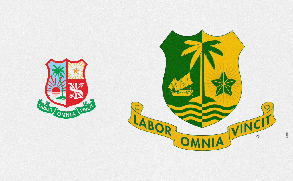
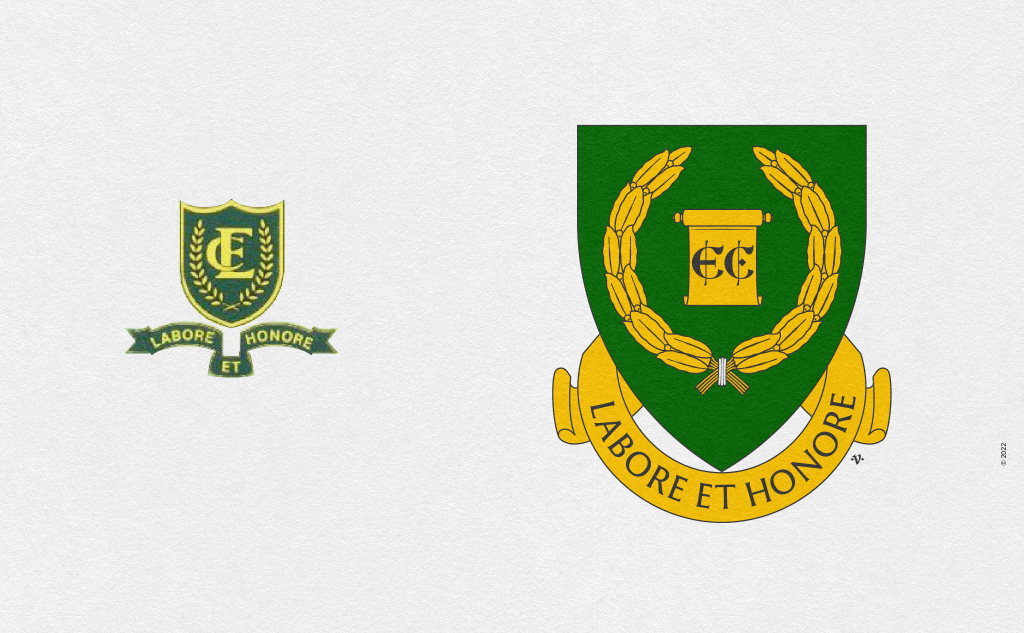
St. Xavier’s Institution was established in 1852 and is the oldest missionary school in Malaysia. The current school emblem’s tinctures has radically evolved over time. The earliest form in 1931 and later in 1950s presents the emblem in Vert (green) and Or (gold). However it is possible the Or is actually Argent (silver) faded over time. The shield consists of a rising/setting sun, a palm tree, and between the two, a body of water, a 5-point mullet (common for most schools established by the La Salle Brothers) and an SXI monogram. The issues in the current emblem are: RoT violations and use of written text (monogram) on the shield. In an attempt at redrawing the school emblem I decided to revert to the colour scheme of Vert (green) and Or (yellow) which are sound historical choices. I retained the palm tree and 5-pointed mullet (heraldic term for star) since the palm tree symbolised the island, and the 5-pointed mullet of the Christian brotherhood of La Salle. I introduced ‘three bars wavy’ and a Djong (ship) all counter changed, representing the islands free port status — which was revoked in 1969 but was an important feature in the development of the island.
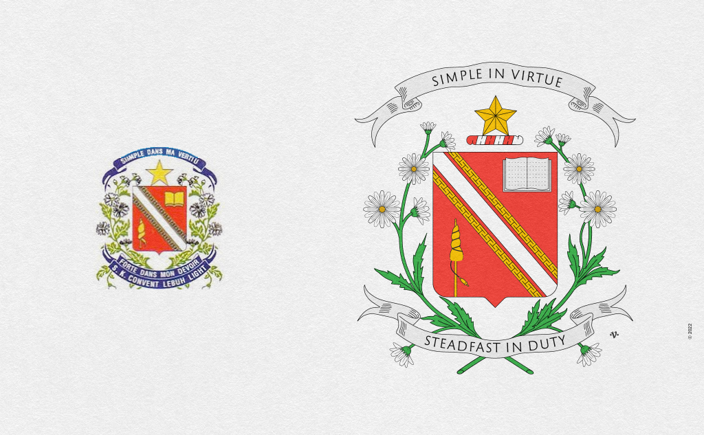
The Convent Light Street school was established in 1852 and is reportedly the oldest girls school in South East Asia. The current school emblem is featured on the left, while the original school emblem, surmounted with a cross, can be viewed here. Unlike the La Salle Christian brothers, the pragmatic Sisters of Infant Jesus used one standard school emblem for all their schools. This school’s emblem had the least number of heraldic infractions. The emblem consisted of a white diagonal ordinary (bend Argent) cotised in Or (gold), an open book wrapped in rosary, and a distaff and spindle. The shield is accompanied with Marguerites intersecting at the base and two scrolls at the top and bottom containing the convent’s motto. Post-independence the cross fleury was replaced with a 5-point mullet while the rosary was dropped from the emblem. The emblem would significantly devolve over time. The infractions had to do with the bend cotised (RoT violation) and the crest (lacking a torse). I won’t go into the details for fear lengthening the explanation. In my attempt at revising the emblem, I redrew the Marguerites, corrected the bend cotised and introduced the torse for the crest (the mullet). To a lay person, these differences may seem insignificant, but they matter in heraldry. The convent’s emblem was not altered significantly because it had the least number of heraldic infractions.
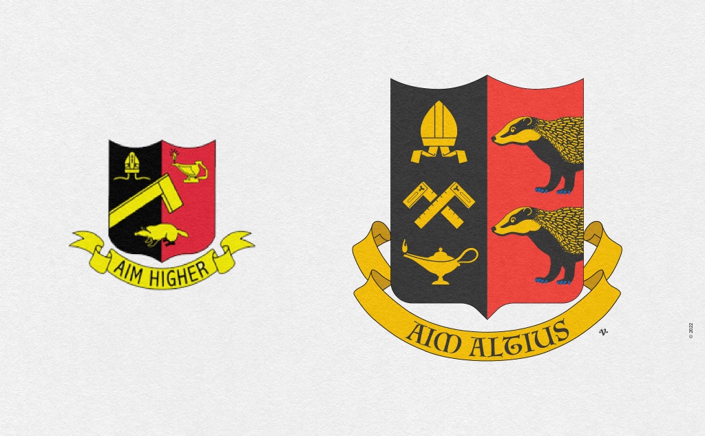
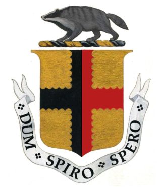
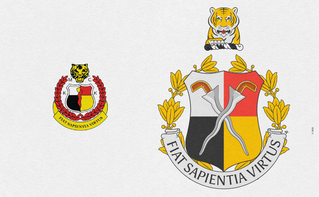
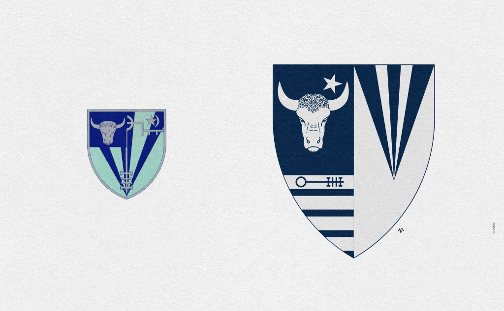
SMK St. Thomas in Kuching, Sarawak was initially established as a ‘home’ school in 1848 but would over time evolve into a ‘formal’ school. On the left is the current school emblem designed by Mr. Kong Yu Siung, one of the masters in the school. The shield is charged with a mitre, Arabian oil lamp, a carpenter’s square, and an Asian badger. The use of a badger is linked to the Brooks ‘royal’ family and the historical arms of Sarawak. In Old English a badger is called ‘brock’, which sounds like Brook. In heraldry this is called canting arms (talking arms). The shield is divided vertically black and red (per pale Sable and Gule). In the current design Master Kong did not commit tincture violations (RoT), used a limited number of tinctures and selected appropriate and meaningful charges. The weakness here lay in the arrangement and crafting of the various charges. Instead, I redrew the charges and positioned three of them in dextre, palewise (left side vertically), and on the sinister, I positioned two Asian badgers facing dextre as per convention. Traditionally shields were held in the left hand, hence any animal charge on the shield would face the sword hand. I translated the motto to Latin and crafted a scroll that draws your eye towards the shield. This new version presents a unified look and is compositionally well balanced.
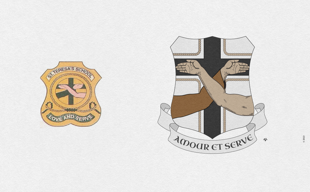
St. Teresa, Kuching Sarawak began with five pupils in 1885. On the left is the current school emblem. The shield charges are influenced by Franciscan iconology: the crossed arms of St. Francis and Christ on a cross, the rope is a likely representation of the cincture worn around the habit (tunic) of a friar, and the tincture tenne is influenced by the Franciscan habit. The colour tenne is an unorthodox choice in heraldric design — often frowned upon but tolerable — as it does not form the main heraldic colour palette. The motto is “Love and Serve”. The school’s emblem does have RoT violations, but more troubling and out of place is the shield shape, which is reminiscent of some police badges in the US. In my attempt to revise the school emblem I opted to maintain the central element of the charge, the crossed arms on the cross, the cincture rope, and the tenne tincture. The use of “proper” in heraldry refers to charges that are shown in their true colours which allows the artist to skirt the Rule of Tincture conflicts. In this instance the rope and crossed hands on the cross merited this escape clause and thus I judiciously employed it. In the revised version of the school emblem, I cottised the cross with a cincture rope, thus elegantly fitting all the charges in the design in a unified manner.
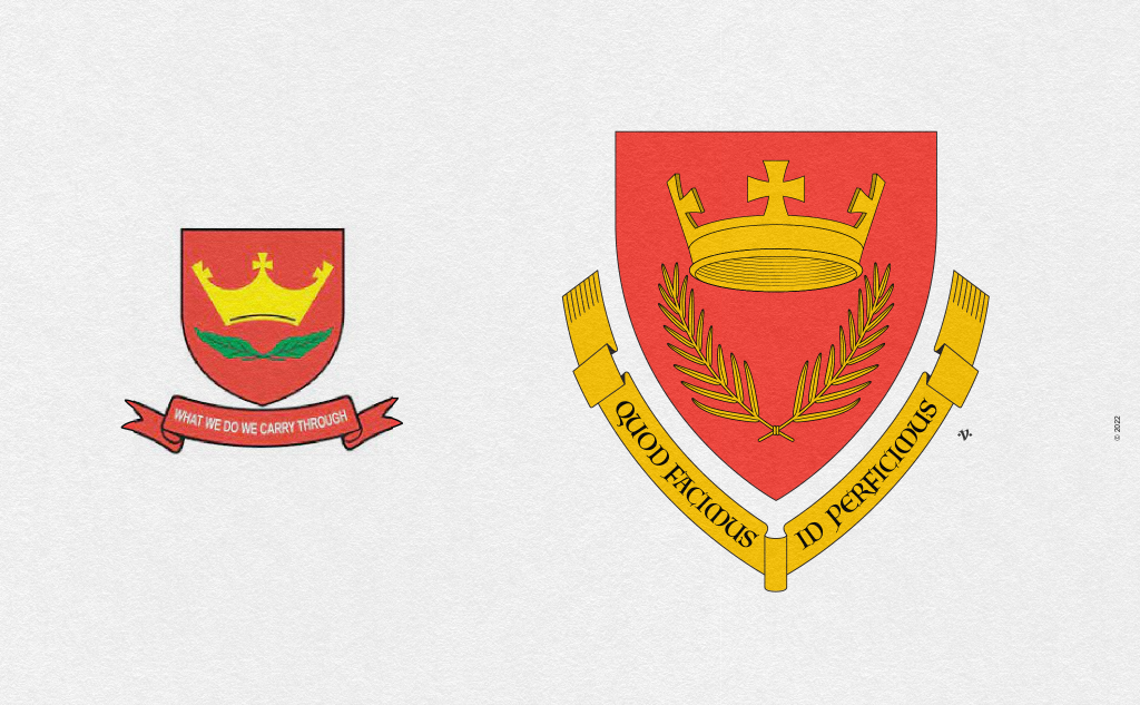
The All Saints school in Kota Kinabalu, Sabah was established in 1903. On the left is the current school emblem. The shield’s field is Gule (red) and is charged with a crown of three crosses (cross pattee) atop two undefined leaves in saltire, crossed at the ends in Vert (green). Below the shield is a scroll in gule (red) on it the motto “What we do we carry through” in Argent (silver). The school’s emblem does have a RoT violation — green leaf on red field. Apart from said violation, the charges (crown and wreath) could be crafted with a little more detailing, and the scroll could complement the shield better. In my attempt to revise the school’s emblem I opted to use a shield that is a little more tapered at the base to suit the shapes of the charges used, in particular the wreath. I then redrew the crown and wreath and emblazoned them in Or (gold), thus avoiding any RoT violations. I then set about redrawing the scroll to suit the shield in Or instead of Gule, as it offset the shield’s tincture better. There was no literature pertaining to the type of leaf used as the wreath on the school’s site, and thus I opted for a palm which is found abundantly in the tropics but also has some relevance to Christianity.
Conclusion (kind of…)
Heraldic visual communication and practice spread outside of Europe largely due to colonialism. Today it has become an integral part of our visual culture, albeit not quite well understood. Hence the many infractions in our uses, as evidenced in our school emblems amongst others.
In my previous article, I wondered what school emblems would have looked like were it not for the colonial subjugation. Knowing what we know now, should we consider throwing out the baby with the bathwater?
As I see it, we have two paths ahead of us: one, to take the cultural revolution route — think Mao — which is to extricate heraldry from our visual discourse and in doing so develop something new, or two, to embrace it as we have, even though improperly, and in doing so revisit and revise them in accordance with good practice.
While the allure to create something new is enticing, what I realised, is that in trying to discard something simply because it is a foreign introduction is myopic. Throughout history societies have exchanged knowledge and practices. The ASEAN region is emblematic of this shared journey. Heraldry is just one, in a long list of exchanges that we have embraced as part of our visual vernacular. It has influenced our flag ensigns, military insignias, governmental and state coat of arms, sporting clubs, corporations, associations, financial institutions and much more. Thus, with awareness and the increase in visual literacy, my hope is that we begin revisiting and revising our coat of arms, emblems, banners, badges, flags and more in accordance with set conventions. We must hire knowledgeable creatives, who understand the discipline and are able to create distinct and contextual symbols of representation.
With that I come to the end of the oldest Malaysian school emblems, in the secular and missionary school category. In reality, I had actually worked on many more school emblems, but as they aren’t the oldest of the old, I didn’t include them above. But nothing is stopping me from including them below *laughing*. Feel free to share my revisions with your schools. I am reachable here. You can also follow my work here and here. If you would like me to take a look at your school’s emblem, comment below — be sure to leave a link to your school’s website or Wikipedia page. Stay tuned for the next article and I hope you enjoy the bonus visuals below.
All artwork featured in this article, unless otherwise stated, remain the copyright of © Vinod J. Nair, 2022. For use contact here.
Hi Vinod, this is an interesting take on the subject! I would be interested to see your interpretation of my former school, Methodist Boys’ School Kuala Lumpur. I’ve always had issues with how the logo looked, especially that the white cross (argent) has a yellow border (or) – metal on metal. There are two versions of the school badge – the only difference being the removal of the white cross on the shield, which makes it accurate from a tincture point of view but leaves it looking very plain and probably heraldically incomplete.
Old logo pre-1980
https://upload.wikimedia.org/wikipedia/ms/1/14/Lencana_Sekolah_Menengah_Kebangsaan_%28L%29_Methodist%2C_Kuala_Lumpur.jpg
New logo post-1980
https://live.staticflickr.com/2812/10238961135_5ee2a6b920_b.jpg
I could not find an illustrated version of the “New” logo as all examples I found online were of a shortened and “rounded” version that was (supposed to be) only used for the Centenary celebrations in 1997.
Happy unpacking this one! I’ll be happy to assist if you require more context or interpretation of the elements in the logo or any information about the school. Cheerio.
Hello Darryn, Firstly apologies for this late reply. Thank you for the suggestion and links that you provided. I remember the MBS school emblem from my primary school days. I use to pass by the school (in Brickfields) on occasion, on route to La Salle Brickfields. In fact I even thought about looking into the MBS emblem when writing the article but decided against it due its use of the monogram “MBS” as a primary charge on the shield. As you know, heraldically speaking, the coat of arms conventionally features charges that are pictorial in nature. This is because in medieval times illiteracy was high, and so importance was placed on visual symbols. However, written letter forms are conventionally accepted when it appears on a charge like a book/scroll/or the like on the shield. So if a scroll is featured on the shield, and on that scroll are written letters/words, this was deemed somewhat acceptable. So revising the MBS school emblem might mean a significant alteration to the emblem. I have your email and will get in touch when I do begin looking into it. Thank you for the input, it is much appreciated.