
This article follows two previous articles: the first here, and the second here. The first functions as an overview that focuses on what underpins the design of Malaysian school badges. The second and the third (below) articles examine the oldest school badges and how their designs can be improved in accordance with the conventions of heraldry and good design practice.
As stated in the previous articles, the establishment of ‘formal schools’ in Malaysia started 30 years after the entry of the British into the country in 1786 on the island of Pulau Penang, then known as Prince of Wales. Prior to the introduction of these schools, informal schools like the sekolah pondok (Islamic religious schools) had been in existence in the Malay states.
Due to the plurality of the people brought in by the colonial administration, different types of formal schools emerged: some were secular, the vast majority were missionary, others vernacular (Tamil or Mandarin), and a few religious. This diversity, whether by design or not, served colonial interest in keeping the population divided.
Along with the establishing of formal schools by colonial authorities and missionary orders came the introduction of heraldry, which is a form of symbol-based visual communication with its origins in medieval Europe. It was used to identify foe from friend on the battle field or to distinguish between fully kitted knights in jousting competitions.
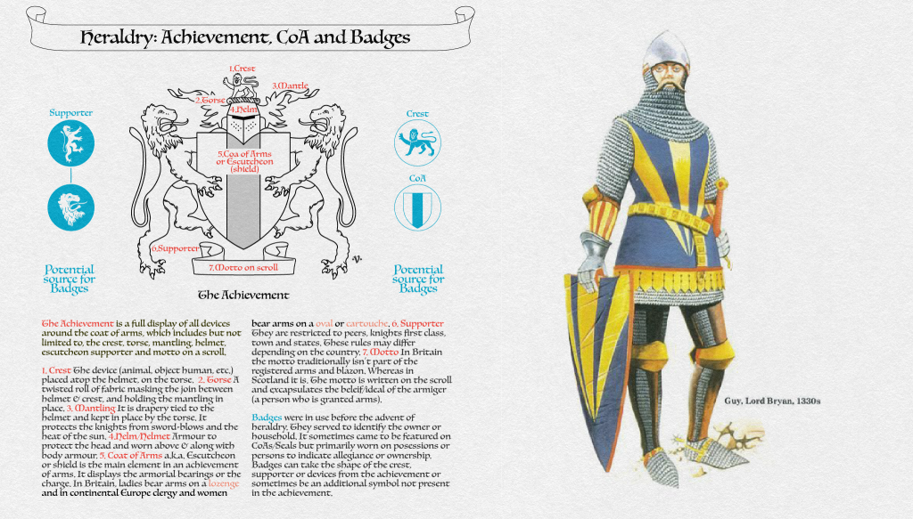
In essence it is an identification device that uses symbols (geometric or object-based) to adorn shields, banners, or tabards of knights. These symbols are known as armorial bearings and they adorn the coat of arms, colloquially known as a shield. Traditionally it is granted to distinguished individuals, armies, institutions, corporations, states, or schools, and in some countries it is regulated by a heraldic authority.
In Malaysia, school emblems are often mistakenly referred to as a badge or a crest. A school’s emblem is only referred to as a badge when it is worn on a person or adorns belongings. It is a mark of allegiance. A crest on the other hand is a device (animal, object, human, plant etc.) that sits atop the helmet on the torse of an achievement. Thus, the correct term of reference for a representative school symbol is emblem.
With all the above out of the way, let us look at some the older school emblems in the categories of vernacular and religious schools in Malaysia.
Oldest Tamil School Emblems
It is difficult to ascertain the oldest formal Tamil-medium school in Malaysia in part because many were poorly funded and as such closed down, others evolved, changed names or were consolidated. That said, it must be noted that Tamil-medium classes were already conducted at Penang Free School at its inception in 1816. Noteworthy among the earliest schools are the Java Lane school or known today as SJK(T) Lorong Jawa (established in 1897), Thamboosamy Tamil School (established in1906) known today as SJK(T) Thamboosamy, and Vivekananda Tamil School (established. 1914) known today as SJK(T) Vivekananda.
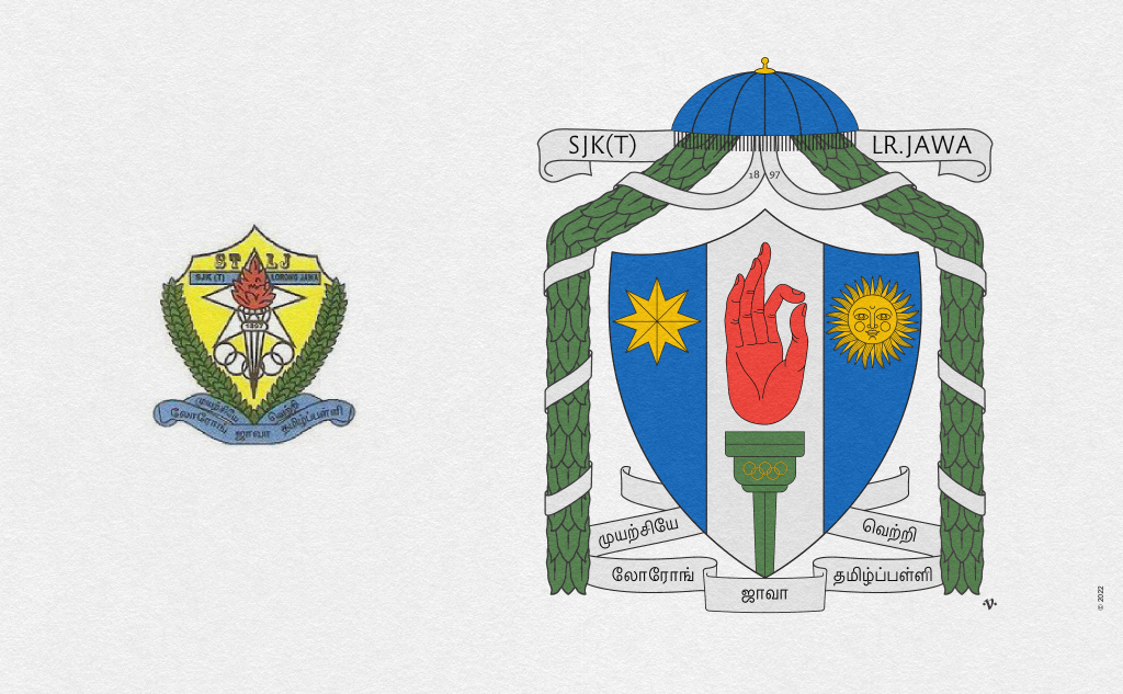
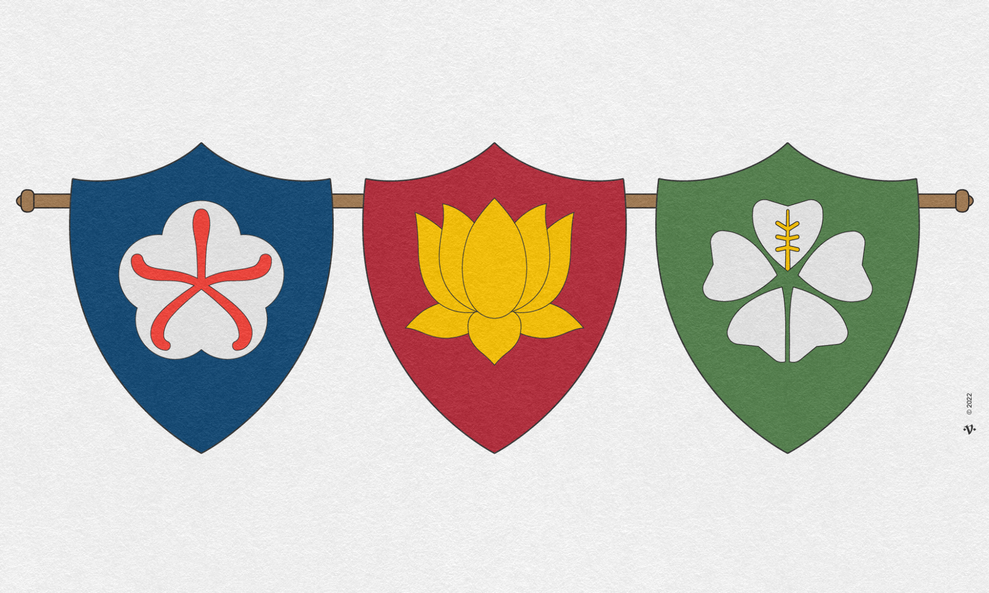
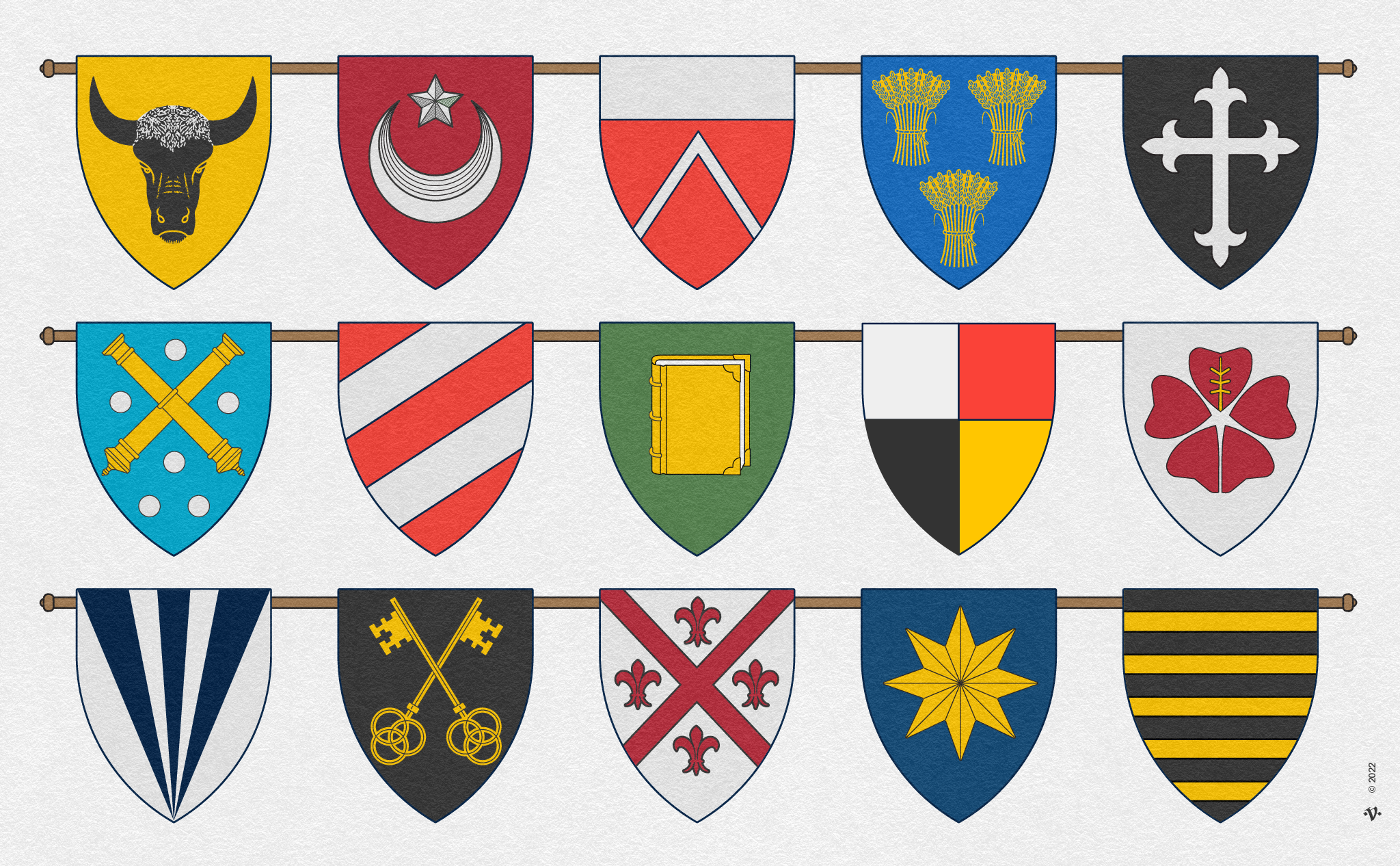
The Lorong Java School today known as SJK(T) Lorong Jawa (now spelt with a “w”) established in 1897 in Seremban, Negeri Sembilan. The current school emblem on the left was designed in 1999 by then headmaster Shri. B. Muniandy. The top section of the shield features “four engrails” referring to the four curves, while the rest of the shield is in the “Stuart” shape. The shield’s field is or (gold), and is charged with what appears to be a five-point mullet, five-Olympic rings, and a torch all in Argent (silver) with the torch’s flame in Gule (red). In my visit to Seremban, I found these charges and the unusual shield shape to be in common use by other schools as well. The dexter and sinister (left and right) sides of the shield are obscured by garlands of leaves in vert (green). The scroll below the shield is Azure (blue) and displays a motto in Tamil — which by the way is the oldest living language in the world. Apart from the Rule of Tincture violations, “to never put metal on metal” (yellow shield with white charges) there is also the issue of writing in the shield. Heraldic art is a pictorial discipline, writing is generally confined to charges like books and rarely much else. In my attempt to revise the school’s emblem I decided to pay homage to the school — it being one of the oldest, if not the oldest surviving Tamil school that endured many existential challenges. I placed a royal parasol (muthukkuda) at the top of the shield and emanating from it, two garlands of betel leaves that extend the length of the shield with a white ribbon coiled loosely around it. I retained the colours yellow, green, blue and white which are the colours associated to the various sporting houses of the school. I kept the Stuart-shaped shield but dispensed with the four engrails at the top — semi-curves that shape the top of the shield. I also retained the mullet (star) and the flamed-torch with an olympic symbol albeit with a twist. I introduced a charged pale where the torch’s flame is in the form of the vitarka mudra (teaching and discussion), and on either side: a sun (wisdom) and an eight-pointed mullet (excellence).
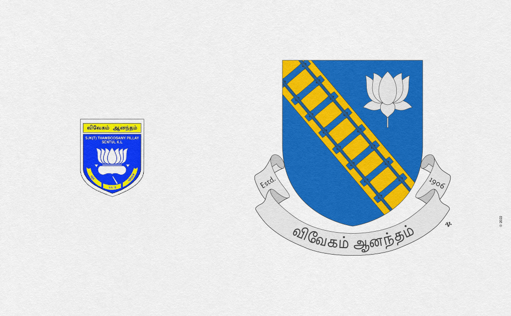
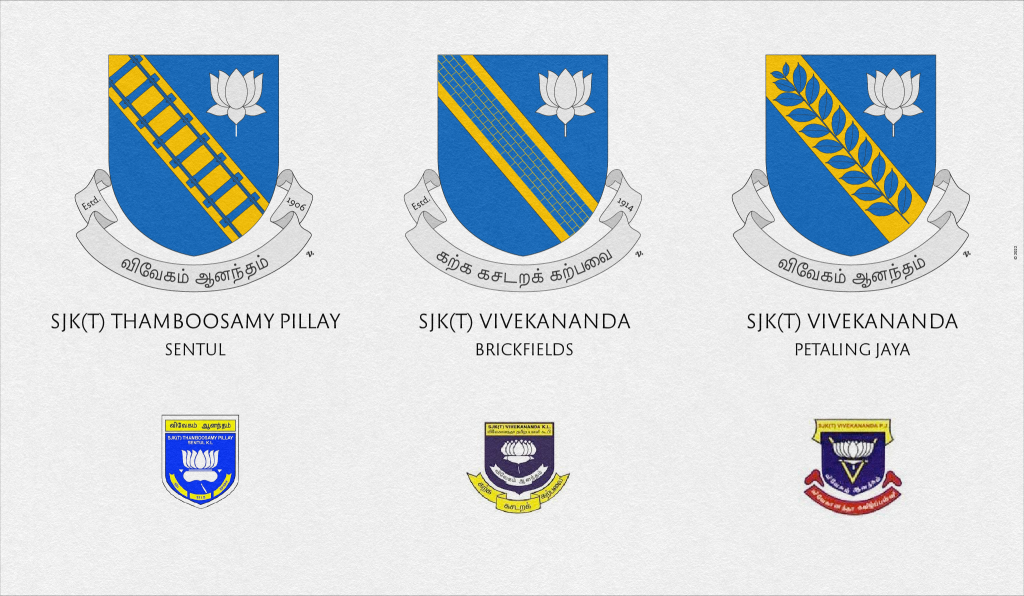
On the left is the current school emblem of SJK(T) Thamboosamy Pillay. The school was established in 1906 and named after a titan of industry K. Thamboosamy Pillay. The school was located in Sentul which had a large immigrant community that worked at the Sentul railway depot. The field of the shield is Azure (blue), within it is a charge in the shape of a lotus but described to contain the flame of a torch in the middle. Also unusually, the scroll which is conventionally placed below the shield has been placed within the shield. Located above the shield is a rectangle in Or (gold) featuring Tamil words. In revising the school’s emblem, I introduced a bend in Or (gold diagonal stroke) that is charged with a railway track to reflect the historical roots of Sentul as an important railway town. The lotus was redrawn but still featured in Argent (silver) the flame-shaped-form still visible in the middle. The lotus was placed on the sinister side (left) of the shield. The scroll in Argent (silver) was placed correctly outside of the shield with the motto written using the Tamil Sangam MN font that was designed by Malaysian Muthu Nedumaran and is the default UI font for Apple devices. Like many early Tamil schools, SJK(T) Thamboosamy Pillay too would go through many existential challenges. It would, in around 1960, come under the management of Vivekananda Kuala Lumpur Board of Trustees which also manages SRK(T) Vivekananda, Brickfields (1914), and SRK (T) Vivekananda, Petaling Jaya. As such, I thought it prudent to revise the other two schools’ emblems as well. The school in Brickfields was charged with a wall of bricks (English bond) in the bend since Brickfields was historically the site of an open brick-making site. The school in Petaling was charged with a tree’s stem with leaves from the Petaling tree in the bend. The lotus was retained in all three schools as the associative symbol.
Old Chinese School Emblems
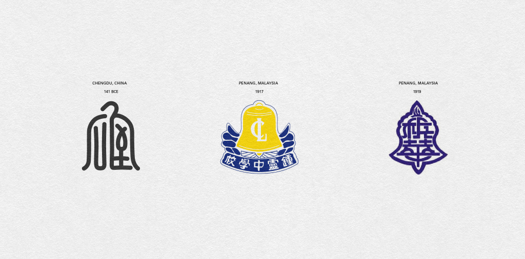
Among the oldest formal Chinese-medium schools to be established in Malaysia is Chung Hwa Confucian School founded in 1904, Pulau Penang — it is the only Chinese school outside of China to be accredited by the Qing Dynasty. Then there is Kuen Cheng Girls High School established in 1908, Kuala Lumpur, and Chung Ling School which was established in 1917 in Pulau Penang. There are other claims of older schools such as the School of the Fifth Happiness (1819) located in Penang as well as schools in Melaka in 1815, one said to be founded by the London Missionary Society. But these older schools no longer exist. Unlike their other counterparts, early Chinese-medium schools tended to follow trends set in China.
In mainland China, school emblems were contained within “triangles, rectangles, squares, circles, rhombuses and other such geometrical shapes” as opposed to heraldic shields. These shapes would contain the name of the school written in Chinese calligraphy and this was the main emphasis in the emblems — the writing. Visual devices were not a feature in school emblems unless they were Christian missionary schools. In Chinese symbolism, the circle and square are especially profound — although this is not unique to China. “The circle stands for “fulfilled”, “oneness”, “perfection”, “unity”” while the square “with its straight lines and sharp corners, represent laws and regulations” as seen in the description of Chung Hwa Confusion School. The square, rectangle, and rhombus — all with four sides — are seen as part of the same family.
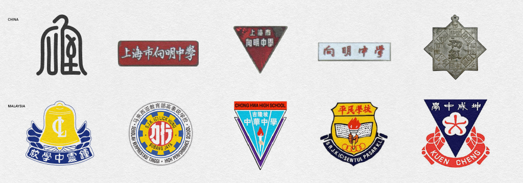
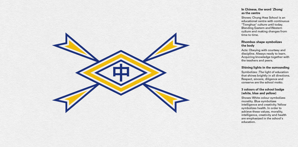
The Chung Hwa Confucian School uses a rhombus. There is absolutely nothing heraldic in its design. Inscribed in the centre of the rhombus of the school’s symbol is the Chinese character Zhong meaning centre or middle, which is a reference to China. While the school has provided an explanation as to what the various shapes represent (top right) I suspect over time additional meanings were ascribed to the symbol. I wonder whether the colours are influenced by the Qing dynasty flag, which has a yellow field and a blue dragon on it chasing a red pearl — yellow being a royal colour. The four arrow-like shapes seems to me to emphasise the belief that China is the centre of the world and all four arrow-shapes represent the 4 cardinal points of north, south, east, and west converging on the middle kingdom rather than the school’s description of shining lights. That being said, it cannot be ruled out. Note that the rhombus shape, as mentioned above, represents laws and regulations which is in line with the school’s description of “obeying” and “discipline”.
While Chinese schools in Malaysia were influenced by trends in China, not all of them were immune from the influence of heraldry. The Kuen Cheng Girls High School (today known as Kuen Cheng High School) marries two different traditions which is common among many Chinese school emblems in Malaysia. It uses an orchid as the charge in an inverted triangle with a scroll at its base. The shield is replaced with an inverted triangle — typically Chinese. Many later school emblems would adopt the heraldic visual language or as in the case of Kuen Cheng merge the two traditions. The most popular charges were often the cogged wheel, flaming torch, Olympic rings, and the open book. This sadly, greatly affected the individuality of these schools’ identity. It must be said that these common charges were not restricted to Chinese schools alone.
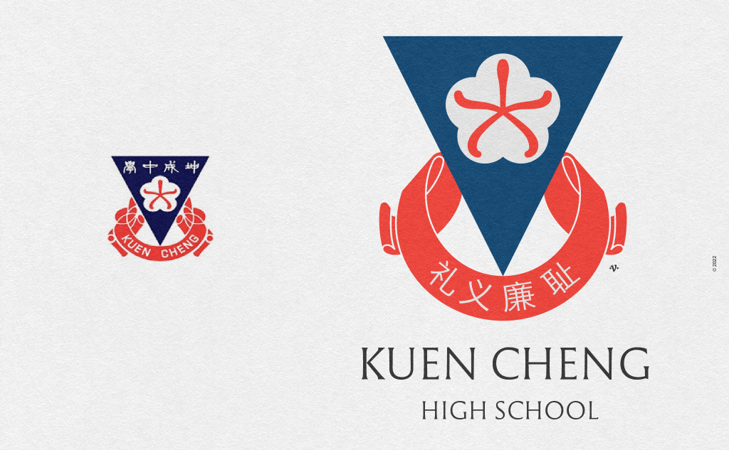
The Kuen Cheng (1908) school emblem on the left was designed by Mr. Chan Xin in 1953. It is an amalgamation of two traditions, Chinese and European. The use of an inverted triangle is typically Chinese, whilst the use of a symbolic device (a charge) in the form of the Orchid and the scroll at the base are European (heraldry) in influence. The field of the inverted triangle is Azure (blue) and on it in Argent (white) is a semi-circular form containing an orchid in Gule (red). Also contained within at the top of the inverted triangle are Mandarin characters. At the base of the inverted triangle in Gule is the scroll. There is no rule of tincture violations, the tricky inverted triangle is well balanced with the circular scroll at its base. The thin form of the orchid is cleverly placed within the semi-circular shape which contrasts well against the triangular field. In my attempt to enhance the school emblem, I chose a less dense shade of Azure (blue), reconstructed the scroll with cleaner lines, removed the mandarin words from the triangular field so that the orchid charge takes center stage — rightly so. I replaced the name of the school situated on the scroll with the motto in Mandarin (as per heraldic convention) and type set the name of the school below the emblem as is generally done. The name of the school can also be set in Mandarin in the same position. I noticed upon removing the Mandarin words from the inverted triangle, the combination of triangle, white semi-circle, and orchid increased the impact and magnetism of the devices. Mr. Chan had a good sense of symmetry, contrast, and balance. Among the many local Chinese school emblems, this by far is my favourite.
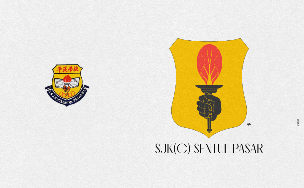
The SJK(C) Sentul Pasar was established in 1935 but renamed in 1961. The school is named after the famous old Sentul market — Sentul being the name of the area and pasar is market in the Malay language. The current school emblem contains the typical charges: a hand cut off from its wrist (couped) clutching a flaming torch juxtaposed in front of an open book and at its base five (Olympic) rings. This school emblem is typical of many of the newer Chinese school emblems. In my attempt to revise the school’s emblem I decided to retain the colour scheme, the often-used flaming torch with the hand clutching it, and dropped the overused combination of the open book and Olympic rings. In this instance I gave distinction to the flame of the torch by shaping it like a bok choy leaf — a type of Chinese cabbage — to retain its relationship to the Sentul market. The school did not have a motto thus I removed the scroll.
Old Formal Islamic Religious School
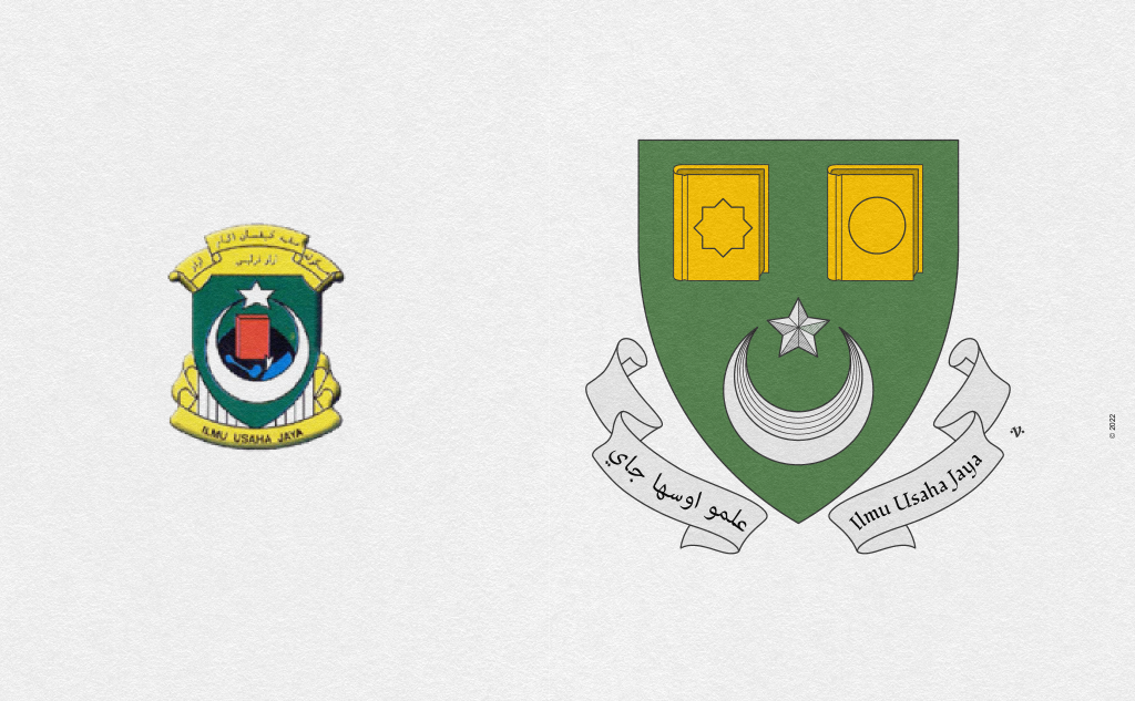
SMKA Arau, Perlis was established in 1933 as an attempt by the Ministry of Education in Malaysia to modernize both the curriculum and administration of Islamic-based education that were formerly the domain of independent providers (pondoks or madrasas). The current emblem’s field is vert (green) and is charged with a crescent, a five-point mullet, a globe, and a book. There are rule of tincture violations pertaining to the book and globe (colour on colour). The placement of the various charges needed better arrangement and composition. Thus, in my attempt to improve the school’s emblem, I introduced two books, one representing Islamic education and the other modern secular subjects, the circle could also represent worldly knowledge as opposed to spiritual. At the base is the crescent and mullet. I created a unique scroll with the motto in Jawi and Romanized Malay.
Conclusion
Heraldic visual communication and practice spread outside of Europe because of colonialism. While some may see it as a vestige and hangover from colonialism, others see it as a long line of exchanges between societies in this rich cultural belt that is ASEAN. Today heraldry has become an integral part of our visual culture and vernacular, albeit not well understood. This lack of understanding has led to infractions not only in its use in school emblems, but also in other organisational, institutional, and governmental uses of heraldry.
The lack of visual literacy among our leaders, and general public at large, facilitates further ignorance in the use of heraldry. A prime example is our current (Malaysia) governmental coat of arms, which has suffered revisions without proper guidance, and is a far-cry from its original 1915 form. Here is a poorly rendered copy of the 1915 arms. The original rendering is in the archive of the College of Arms, London. (I was provided a copy for research but under the terms agreed upon, I am not allowed to share it. This would require a higher fee payment.) The overly complicated nature of the current Malaysian government’s coat of arms (referring to the shield charges and divisions), unfortunately displays our lack of understanding in the discipline and use of heraldry. The current coat of arms must to be unified and thus ought to be revised and simplified.
Hopefully, with increasing awareness and visual literacy, we begin revisiting and revising our coats of arms, emblems, banners, badges, flags, and more in accordance with set conventions. We must hire knowledgeable creatives who understand the discipline and are able to create distinct and contextual symbols of representation.
While a committee is important to appoint creatives or to research and create reports, bad design is often the product of consensus. Thus, it is imperative that singular individuals be appointed by the committee to carry out revisions or redesigns.
We ought to seriously consider revisiting and revising our heraldic-based symbols in our visual communication. Maybe we can start the ball rolling with our public school emblems, which I think, perhaps wrongly, involves the least amount of red-tape.
Follow myheraldry on Twitter or Instagram. I will continue to feature revised school emblems and might also entertain requests.